Do you want to add a BigCommerce popup to your online store to increase sales, but aren’t sure how?
BigCommerce is one of the biggest eCommerce platforms on the market. It allows business owners to build a website and start selling their products in minutes. But just like any online store, getting more sales means connecting with your customers on a more personal level.
For that, there’s no better tool than a well-placed popup.
So, in today’s post, we’re going to teach you how to create a popup for your BigCommerce store. Then we’ll share 3 actionable tips that you can start using today to use that popup to boost sales.
Before we do, though, let’s get clear on why popups are so effective.
Why Do Popups Boost Sales?
Popups increase your sales because they help you draw attention to a product or promotion on your website. When people are browsing through your online store, it can be easy to get distracted by all the awesome products they see.
But with a popup, you’re able to focus their attention on the things you want them to look at. That could be a specific product, a notice to keep people from leaving your site, or a sale.
Here’s the popup we’ll build in today’s tutorial to bring attention to a sitewide sale:
These types of popups are the first step to transforming casual browsers on your site to loyal customers.
So the question is, what’s the best tool to build your popup? That’s where OptinMonster comes in.
OptinMonster is your best bet for increasing conversions on your site. That includes growing your email list, getting more social followers, and, you guessed it, generating more sales!
Plus, you can build more types of attention-grabbing campaigns than any other company on the market. You also have more ways to customize those campaigns to make sure your message is getting to the right people at just the right time.
In other words, OptinMonster gives you more ways to make more money with your BigCommerce store. That’s why, today, we’re going to focus on building a BigCommerce popup to increase sales.
Let’s get started!
How to Make a BigCommerce Popup That Works
Before we begin, the first thing you’ll need to do is sign up for OptinMonster. You can do so 100% risk-free with our 14-day money-back guarantee.
We also understand that not everyone learns the same way. Some people are more visual. That’s why we have this convenient video tutorial you can follow:
Otherwise, feel free to continue reading this step-by-step guide.
Step 1: Create a Popup for Your BigCommerce Store
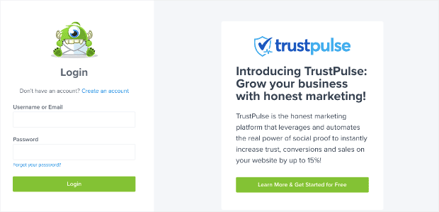
First, you need to log into your OptinMonster account:
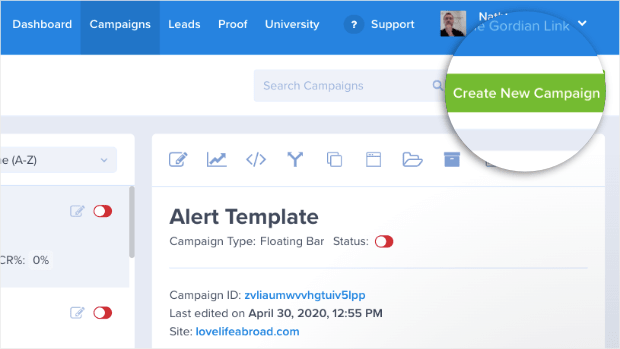
Once you’re in your dashboard, head to the top right corner and click Create New Campaign:
Then select your campaign type. For today’s tutorial, we’ll choose Popup:
Now you need to select a template for your BigCommerce popup.
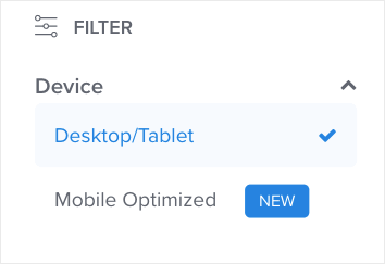
OptinMonster has over 50 pre-built templates that work for desktop, tablet, and mobile. Depending on how your customers shop, you can also filter templates for Desktop/Tablet or use Mobile Optimized templates.
Today, we’ll choose a Desktop/Tablet filter:
But don’t worry about your mobile users if you choose this filter. These templates also display and function very well on most smartphones.
Now we need a template. Today, we’ll choose the Shopping template:
This is the perfect choice of any online retail store. That’s because it lets you display your brand or products on the left and your call to action on the right.
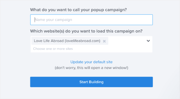
Now all you need to do is name your campaign, assign it to your BigCommerce website, and click Start Building:
Then you’re ready to design your popup.
Step 2: Design Your Campaign
In this tutorial, we won’t be getting into too much depth on how to design your popup campaign. But don’t worry, it’s really simple.
And if you ever get stuck, you can check out the Design section in this guide on how to create your first OptinMonster campaign.
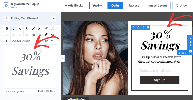
For now, all you need to know is that you can change any element of your campaign with just a few clicks. If you want to change the text, for example, simply click on the text elements to pull up the editing tools on the left:
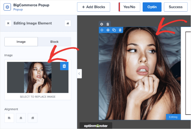
You can also change the image by clicking on the image block in your editor:
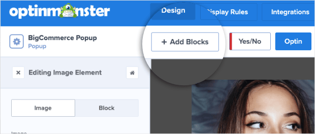
And if you ever want to add an element, you can click +Add Block at the top of your editor:
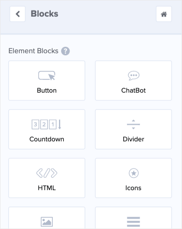
This allows you to add tons of new features to your campaign, including:
- Button
- ChatBot
- Countdown Timer
- Divider
- Text
- Images
- Video
And more.
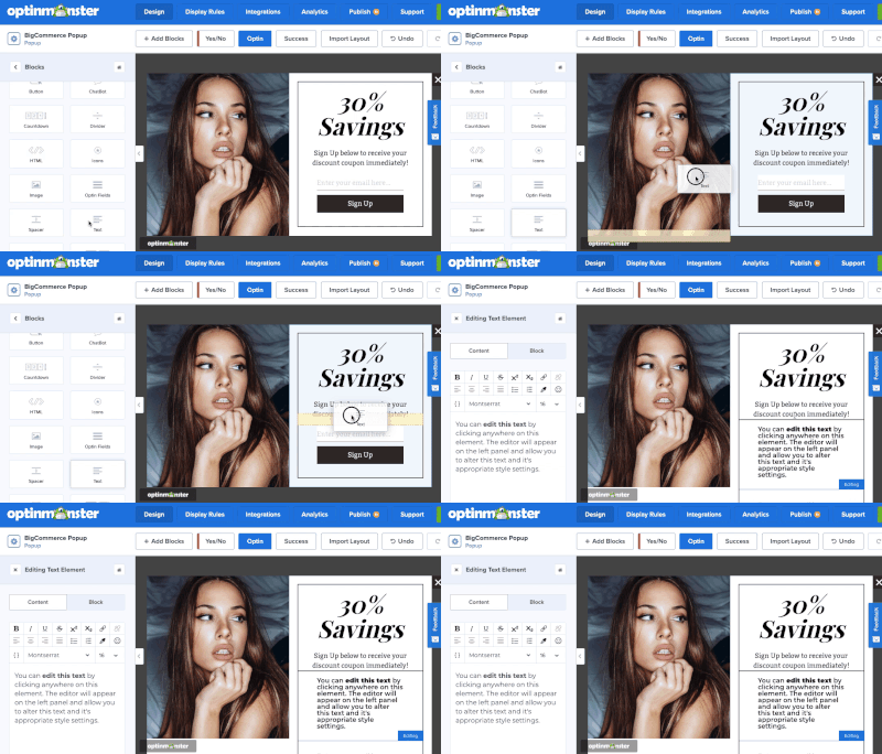
All you need to do is select a block to drag and drop it into place:
You can customize your BigCommerce popup to match your brand’s voice, style, and message. You can also customize it to help you reach your company’s goals. Popups can help you:
- Grow your email list
- Increase your page views
- Generate more profit
- Get more social media followers
And so much more. Your design will largely depend on what you want to achieve. For today’s tutorial, we want to increase sales, so our BigCommerce popup will display a sitewide sale.
Here’s a demo of the popup we built in just a few minutes for this tutorial:
When you’ve got your design exactly how you want it, it’s time to figure out where you want it to display on your site.
Step 3: Display Your BigCommerce Popup
When you set your display rules, you’ll need to get clear on your BigCommerce popup’s goal. That’s because where and when you display your campaign will depend on the popup you build.
That said, OptinMonster allows you to customize your popup campaign display rules to reach your goals.
In the top of your editor, head over to Display Rules:
By default, you’ll have 2 display rules set:
- Time on page is at least 5 seconds
- Current URL path is any page
That means that your BigCommerce popup will show to users who are on your site for longer than 5 seconds, regardless of what page they visit.
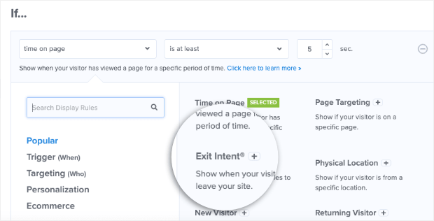
For today’s tutorial, we’ll keep the 2nd condition, so our campaign appears on every page. But we’ll change the 1st condition to use an Exit-Intent® trigger.
Exit-Intent® triggers display your popup campaign any time someone tries to leave your site. In the past, this feature was limited to desktop only but has recently made its way to mobile devices.
Check out this article to learn more about how mobile exit-intent popups work.
This is a very powerful trigger to use. Exit-Intent® is how the company Crossrope increased its email list by 900% a month!
To change this condition, click on the Time on page field box to bring up your targeting and trigger options. Locate and click Exit-Intent®:
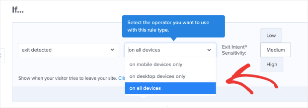
Then select which device you would like to use for your exit-intent popup. You can choose desktop only, mobile only, or all devices:
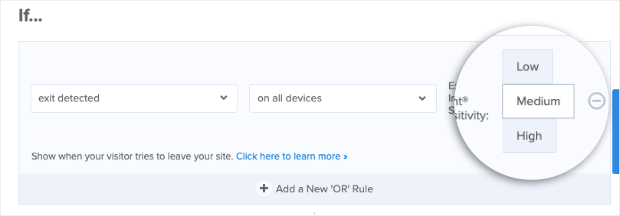
Your safest bet is likely on all devices. Then you simply need to select your Exit-Intent® Sensitivity:
We’ll keep it set to Medium as it comes by default.
But keep in mind, Low and Medium sensitivity create a scroll up trigger on mobile devices. High sensitivity, on the other hand, creates a back button trigger.
Read this post to learn more about each type of mobile exit-intent trigger. That resource will help you determine the best option for your BigCommerce popup.
Now your campaign will have an exit-intent trigger for all devices on every page of your site. Again, you can customize these settings as much as you need to completely personalize your popup campaign.
Before moving forward, though, we should mention another feature of OptinMonster’s display triggers.
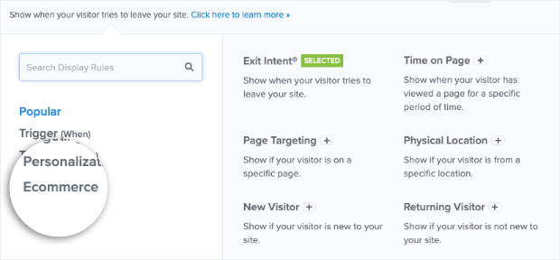
If you go your drop-down menu for your trigger options, you can click on the eCommerce category:
Then you’ll see options that can be used exclusively for your BigCommerce store, including BigCommerce Cart:
- Total
- Subtotal
- Contains
These options let you go one step further in targeting your BigCommerce customers. Depending on your popup’s goal, you can use these triggers to reduce cart abandonment, make product suggestions, and more.
Once you’ve set the right display rules for your popup campaign, all that’s left is to Save and Publish your popup!
And that’s it. Your BigCommerce popup will be live and ready to get you more sales.
Now let’s turn our attention to a few types of campaigns you can build for your BigCommerce store that specifically generate more profit.
3 Ways to Get More Sales With Your Popup
Here are 3 actionable methods you can use to increase your site’s overall sales with popups.
1. Running Sales or Promotions
One of the easiest ways to boost sales is to run a sitewide promotion or sale. That’s exactly what we did in this tutorial with the popup we built:
For more information on how to get the most out of your promotional popups, you should check out these articles:
- 22 Stunning Sales Promotion Examples to Win More Customers
- Flash Sales 101: How to Get More Money (and Clients) Fast
- 18 Proven Ways to Increase Your Conversion Rate Throughout Your Funnel
2. Upselling Products
Upselling is one of the best ways to get people to spend more at the checkout process. You can use the data you have on your customers to make targeted product recommendations.
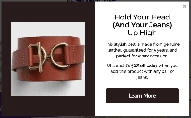
So if you know your customer has been looking at jeans, you could show them the following promotion:
How do you make these popups more personal? You can use the BigCommerce triggers discussed earlier in this campaign to create a Cart Contains trigger.
Then when your shoppers put a product in their cart, you can display a related product to make an upsell.
Or, you can use Page-Level targeting to make upsell suggestions on specific product pages.
To learn more, read this post on 15 upselling tips and examples proven to boost average order value.
3. Reducing Cart Abandonment
Shopping cart abandonment is one of the biggest problems business owners face. It accounts for over $4 trillion in lost eCommerce sales each year.
But one of the easiest ways to fight cart abandonment is to create a popup to re-engage your customers as they’re trying to leave their cart.
You can do that with a simple Exit-Intent® popup like the one we built for this tutorial. Want to learn more ways to reduce cart abandonment?
Here are 11 ways to reduce shopping cart abandonment to see more revenue.
We hope you enjoyed our BigCommerce popup tutorial. Also, we’re sure that if you follow the 3 actionable tips listed above, you’ll see more sales form your popup campaigns in no time.
That means there’s just one question left: Are you ready to get more sales for your BigCommerce site?
Try OptinMonster today risk-free with our 14-day money-back guarantee!











Add a Comment