You know the problem with most conversion optimization guides out there? They all give generic tips and tricks that SOMETIMES work to give you a quick conversion boost. But they never address the root of the problem – and they’re not tailored to your audience.
What if you want to get deeper into the conversion rate optimization issues you, specifically, deal with? You need data – and the best way to get that data is with a conversion rate audit.
What Is a Conversion Rate Audit?
A conversion rate audit is the first step of a successful conversion rate optimization process. Through a conversion rate audit, we can learn about visitor behavior, find the holes in our conversion funnels, and use our knowledge of visitor behavior to fix those holes, boosting our conversion rates.
Most of the time, people see the word “audit” and their eyes glaze over as they envision endless hours staring at pages and pages of numbers that don’t seem to have any real meaning. Your conversion rate audit will be a lot more fun than that, we can just about promise you.
In this guide, we’re going to share a scalable and repeatable conversion rate optimization audit template that you can use for your own company or for your clients if you offer CRO audit services.
Quick TipIf you conduct audits for clients, be sure to prepare a conversion rate optimization proposal to outline agreed upon duties and expectations.
When Are You Ready for Conversion Rate Optimization?
There is no “perfect time” to get started with conversion rate optimization. That being said, there are a couple of things you need to see a return on investment for a conversion rate audit: a minimum viable product and some site traffic.
Minimum Viable Product
A minimum viable product is simply a product that has enough features to be attractive to early adopters. It’s basically the first version of a product that offers enough value that people are willing to pay for it.
Site Traffic
If your website is up and running and you have traffic with the potential to become customers, you’re ready to consider optimization.
Step-by-Step Conversion Rate Audit Guide
There is no one-size-fits-all optimization strategy that can fit every industry or customer. If you want to create an effective conversion rate optimization strategy there’s no better way than putting in the time to do your own CRO audit.
We’ve pulled together this step-by-step guide to provide a conversion rate audit template that you can use again and again, without needing to recreate the process each time. Simply follow each step to analyze your content and strategies and identify areas that need attention.
Related ContentConversion Rate Optimization Statistics You Need to Know
Step 1. Set Goals and Definitions
Everything in your business needs to have a purpose, so it should come as no surprise that the first step in your audit is to set goals and definitions.
For every page and every asset on your site, you should be able to clearly state its purpose and how a visitor’s interaction with the asset supports your business objectives.
When you have a clearly defined objective for an asset you are able to create a more engaging call to action that urges visitors to complete the desired action.
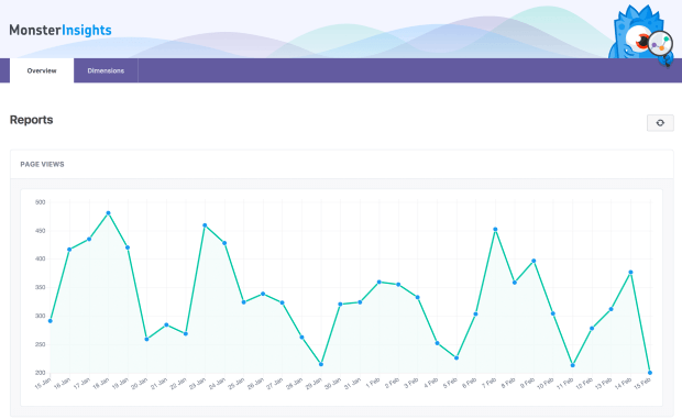
If you have a WordPress site, you should definitely look into MonsterInsights for Google Analytics. You can add your goals to Google Analytics to track your conversions and MonsterInsights lets you view everything easily from within WordPress.
Step 2. Know Your Audience
Now that we know what it is we want our visitors to do, we need to figure out who these people are and what they’re actually doing on our site.
For each of the desired actions listed in Step 1, detail what your visitors are doing instead. Are they clicking away, going to a completely different page, scrolling the entire page before clicking away? Something else entirely?
Your visitors aren’t choosing the action you want for them because they don’t believe it is the best action for them to take. This is an excellent chance to do some passive analysis using heatmaps or activity tracking analytics, or collecting visitor feedback.
Tools like MouseFlow and Woopra, among others, can give you insight into user behavior that you can use to make changes to your site.
Step 3. Analyze Your Traffic
Tools like Google Analytics come in handy to let you know how visitors get to your site. Is your traffic mostly from social media posts, organic search results, paid ads? Knowing where your traffic originates helps you create content that is optimized for their needs.
Using a personalization tactic like detection referral with a popup can build trust with your site’s visitors and help you provide on-point content that is directly related to what they were reading when they clicked.
This means that the content that they’re coming to on your page could provide deeper insight or offer a solution and encourage the visitor to take action, scoring a conversion.
Learn more about referrer detection with OptinMonster.
Step 4. Evaluate Your Current Content and Assets
Don’t just publish content and let it sit around forever. Content goes stale. It needs to be refreshed, entirely rewritten, or occasionally trashed.
At a minimum, your landing pages have to have:
- Engaging headline
- Persuasive subheadline
- Great pictures
- Clear explanation of what you’re offering
- Value proposition or benefits
- Acknowledgment of pain points and how you’re going to fix them
- Testimonials
- Methods of contact
- A guarantee
- A compelling call to action
For articles or blog posts the list is similar:
- Engaging headline
- Compelling lead
- Useful subheadings
- Informative body text
- Appealing graphics and visuals
- A powerful call to action
- Relevant internal links
- Good meta description and SEO
Go through your content and site assets and make note of what needs to be refreshed, rewritten, or trashed.
Step 5. Test Your Forms
Pay attention to form length and try to match it to the purpose of the form.
For example, if you’re trying to build an email list, your form should be short and to the point; you may just want to collect a first name and email address like this:
If you’re looking for highly qualified leads, however, you may want to create a lengthier form and ask for more information up front.
The purpose of this is twofold.
First, longer forms are a deterrent to uninterested parties. If a visitor takes the time to fill out a longer form it’s more like that they really are a more highly qualified lead.
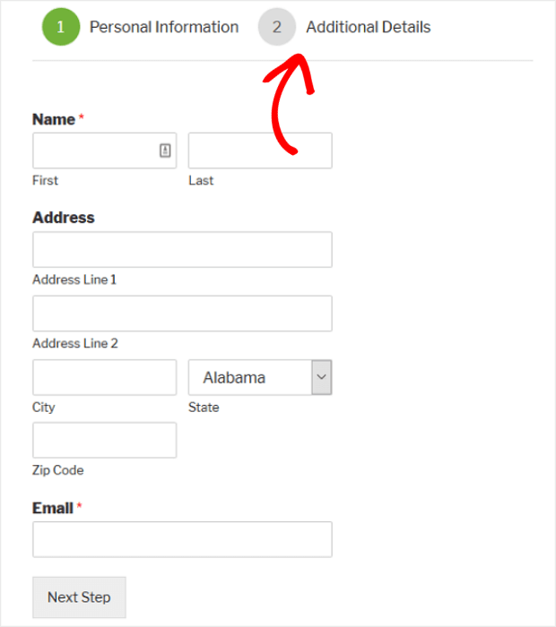
Second, longer forms provide more data about a lead and therefore provide more insight into their needs. Here’s an example of a longer forms that’s been broken into multiple pages to make it less overwhelming to the user.
WPForms, whose forms we’ve used above, is a truly great way to quickly and easily create forms for your site. And, it’s beginner friendly.
You can also split test your lead generation forms and popups using OptinMonster’s built-in split testing tool.
Step 6. Evaluate Your Checkout Process
The checkout process is where most sales are lost. Kind of ironic, right? Sad but true, 70% of shoppers will abandon carts.
A large chunk of that is simply the nature of online shopping; people browse and compare pricing, but aren’t ready to buy just yet. This is where analytics can be very helpful.
If your analytics are showing that shoppers are adding products to the cart, but never starting the checkout process, it’s likely that they were just browsing.
But, if you’re seeing a lot of shoppers begin the checkout process only to abandon the transaction, it’s likely that they’ve run into some friction that’s frustrated them enough to give up.
Session recording and replay tools like the ones mentioned in Step 2 can help you identify sticking points in your checkout process.
There are many excellent ways to reduce cart abandonment, but one of the easiest ways is to make sure that your shipping costs are listed up front. You can also create some pretty cool exit intent offers that will keep your shoppers engaged on your page like SnackNation does with this fullscreen exit offer that converts nearly 32% of abandoning visitors.
Have a look at some more ways to reduce shopping cart abandonment.
Step 7. Analyze Your Design and Layout
We’ve talked about knowing your audience in terms of content, but that also applies to site design and layout as well. As part of your CRO audit, you’ll want to evaluate all aspects of your site’s design and layout to see if they can be improved to increase conversions.
You’ll want to pay particular attention to how your calls to action are performing. If they aren’t converting, ask yourself why. Are they getting lost in the surrounding text and images? Try testing a call to action with greater contrast.
If you have pages or posts with high bounces rates, try to look at those through the eyes of a visitor. Is there enough whitespace or other visual interest, or is it just a wall of text? Try playing with the formatting or changing up the images you’re using to see if that helps.
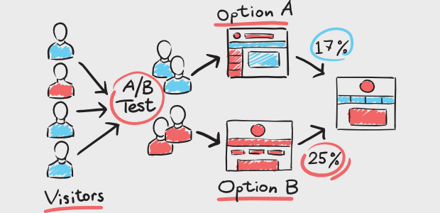
As you can probably tell, when it comes to design and layout, split-testing is going to quickly become your best friend.
Check out this post for in-depth instruction on how to create a split test correctly. And, be sure to take a look at these A/B mistakes before you make them so you don’t waste your time.
Looking for ideas on design principles to test out? We’ve got you covered with these design principles that will boost your conversion rate.
Step 8. Evaluate Your User Experience
The whole of your site makes up the user experience and so far we’ve talked about each piece on its own. As part of a successful conversion rate audit, you’ll also want to consider the entire user experience.
Peter Morville’s User Experience Honeycomb helps us break down the different elements that make up the user experience and see how we’re doing.
To provide a great user experience, we want to make sure that visitors find value in the information we’re providing and the way we’re providing it. As you’re going through the user experience evaluation, you can test each piece against the elements from the UX honeycomb:
- Is the content useful? Does it solve a problem or fulfill a need?
- Is the site usable? Is it fast, responsive, and free from errors like broken links?
- Is the design desirable? Do the images and other elements support the brand’s identity?
- Is the information findable? Is the site easy to navigate with good search functionality?
- Is the content accessible to people who are differently-abled in hearing or vision?
- Are the brand, website, and content credible?
Every part of your website, from the way it flows even to your 404 error pages, adds to the user experience. Take the time to make sure that every aspect of it represents your brand the way you want your visitors to see you.
Step 9. Identify Where CRO Strategies Can Be Used
As you go through your CRO audit, you will find areas for improvement, but please don’t try to make changes as you go. Instead, note your findings thoroughly.
Before making any changes based on your findings, it’s important that you create a specific hypothesis about each problem you find, as well as proposed solutions and desired outcomes. Then, set a goal so that your CRO strategies are measurable.
We are not throwing things at a wall and seeing what sticks. We are going through a repeatable and methodical process that will actually get you results.
If you’re not familiar with creating and testing a hypothesis, don’t worry. This isn’t chemistry, and you’re not going to blow up the lab. Here are a couple of examples of what we mean by this:
Example 1
During your audit, you found that shoppers abandon their carts when they see the shipping costs.
- Hypothesis: Shipping costs are too high.
- Proposed Solution: Test using a popup to offer some shoppers free shipping
- Desired Outcome: Shoppers offered free shipping are more likely to convert
- Goal: Increase conversions by 5%
Example 2
During your audit, you found that visitors clicked away from your landing page after starting to complete a form.
- Hypothesis: The form is too long.
- Proposed Solution: Test a landing page with a shorter form and another landing page with an incentive to complete the form (lead magnet, discount).
- Desired Outcome: One strategy will be more effective than the other at converting.
- Goal: Implement the more effective strategy and increase conversions 5%
That’s it! 9 simple steps to a successful conversion rate audit. To learn more about conversion rate optimization, check out our complete beginner’s guide; it’s a great resource for non-beginners, too.
If you’re looking for inspiration from OptinMonster customers, we have an awesome selection of case studies where you’ll find tons of examples of the things our customers have done to improve their own conversion rates with OptinMonster’s help.
Not using OptinMonster yet? What are you waiting for? Join us today and see what OptinMonster can do for you!











Add a Comment