Is your online store performing as well as it could? Unless every single person who visits your store makes a purchase, there’s always room for improvement. But here’s some good news: eCommerce optimization may not be as much work as you think.
If you know where to look, then just a few small tweaks can skyrocket your sales.
(But changing the wrong things could just be a waste of your time. Or worse, it could even have the opposite effect and hurt your conversions. It’s tough to know where to start when there are SO many possible aspects to optimize.
That’s why we’ve put together this guide to eCommerce optimization.
This article will take you step-by-step through the most important conversation rate optimization (CRO) strategies for your eCommerce store. When you apply these tips, you’ll get more customers, make more sales, and recover lost revenue from abandoning visitors.
Ecommerce Conversions—What’s a Good Rate?
Before we talk about optimizing eCommerce conversions, let’s define what a conversion looks like and discuss what’s a good eCommerce conversion rate.
Typically, a conversion means someone has saved an item to buy later, added an item to their shopping cart, or made a purchase. The conversion rate is the number of people who take action, as a percentage of the number of people who see your page.
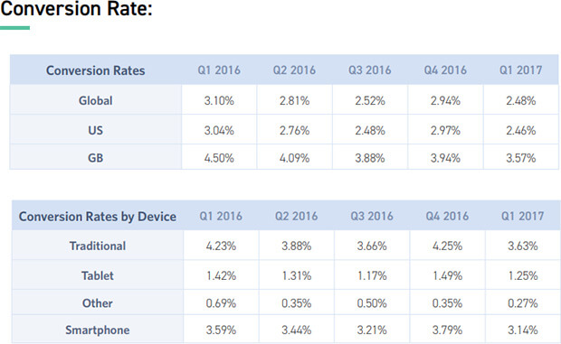
According to BigCommerce, the average eCommerce conversion rate is around 2.5-3%.
However, there are wide variations depending on location, the device people are shopping with, and the actual conversion action.
You can find out your own eCommerce conversion rate in Google Analytics, and from there you can set a concrete goal to improve it. The eCommerce optimization ideas below will help you take your business to the next level.
Related Content40+ eCommerce Stats You Need to Know for a Successful Online Store
13 Tips for eCommerce Optimization
Here’s a table of contents to help you jump straight to the area you want to optimize first.
- Improve Product Pages
- Optimize Your Pricing
- Use Personalization
- Optimize for Mobile
- Use an Upsell
- Create Urgency With Flash Sales
- Overcome Other Specific Objections
- Reduce Cart Abandonment
- Build an Email List
- Split Test Your Email Optins and Campaigns
- Automate Your Email Marketing
- Get Feedback
- Troubleshoot Common Errors
Ready? Let’s get started …
1. Improve Product Pages
Your first step should be to make sure your product pages are convincing visitors to buy. Here are some tips on achieving that.
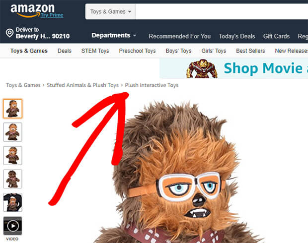
Make it easy to navigate your eCommerce site so shoppers can find new products wherever they are. Baymard Institute recommends using breadcrumbs based both on product hierarchy (where they fit within a range) and history (where people have visited on the site). Here’s an example of breadcrumbs from Amazon:
You can also help your product pages do better with catchy, SEO-friendly titles for your products. That’ll help the pages rank in search engines, so you can get more organic traffic. Good titles also help shoppers to more easily find what they need.
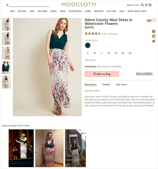
Product images are key to letting shoppers see what they’re getting. Include images that show different angles or aspects of your products. You can also show the product used in different ways and contexts.
For example, Modcloth shows customer photos as well as model photos for its products.
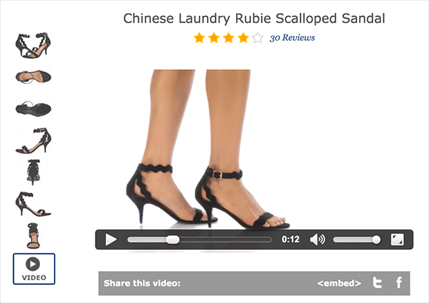
Similarly, use video to let shoppers see what products look like and how they really work. Zappos does this with shoes, and it’s pretty effective.
Product descriptions help shoppers see what their life would look like with your product. At least, the best ones do. Stay away from standard product descriptions from manufacturers and craft your own.
Other ways to use eCommerce optimization on your product pages include:
- Using product details to flesh out specifications
- Using ratings, reviews, views, and likes to provide social proof of your product’s appeal
- Getting the pricing right—we’ll talk about that in the next section
Learn more in our guide to creating high-converting product pages.
2. Optimize Your Pricing
It’s vital to get your pricing right. If your prices are higher than the perceived value of your product, no one will want to buy.
There are all kinds of tweaks you can make that help you earn more. Here are a few that can have BIG impacts.
Compare Two Products
For example, did you know that putting two products side-by-side can increase eCommerce sales for the lower-priced product? In this older case study about Williams-Sonoma, the retailer was having trouble selling a breadmaker, until they put it side-by-side with a premium version. All of a sudden, the lower-priced item got very popular, and sales almost doubled.
Have a Clear CTA
If you want people to buy, you need to make it easy for them. That’s why it’s important to have a clear call to action (CTA) that:
- Uses action words
- Lets shoppers know what to do next, like “buy now”, “add to cart” or “get this item”
If your CTA is on a button, make sure the color stands out so it’s highly visible.
Reduce Analysis Paralysis
Sometimes visitors can be overwhelmed by the number of options. Fortunately, eCommerce optimization can help with that.
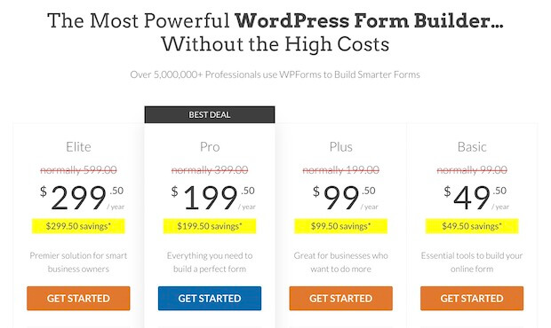
On a pricing page, it’s best to keep the copy short and highlight the preferred option to reduce choice paralysis. Here’s an example from the WPForms pricing page:
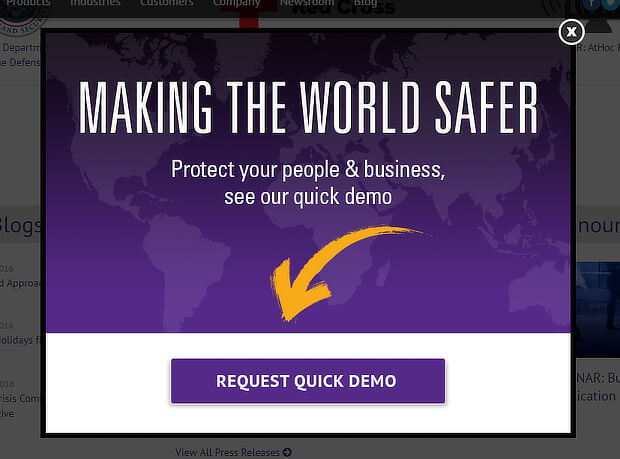
You can also get visitors to commit to a small action first, like viewing a demo.
This strategy relies on the Zeigarnik effect, which says that people who start an action are more likely to complete it. It’s why OptinMonster’s Yes/No Forms work so well. In fact, AtHoc used them to get a 141% boost in sales-qualified leads.
Try Charm Pricing
Another eCommerce optimization to get more sales is to use charm pricing. Charm pricing is when you you make your price a few cents less than a round dollar number. Examples include:
- Charging $4.99 instead of $5.00
- Charging $19.90 instead of $20.00
- Charging $1,487 instead of $1,500
Consumers tend to focus on the left numbers in a price, making these prices seem less expensive. This tactic is proven to increase conversions.
In Koningle’s study of 1.5 million online stores, they found that eCommerce businesses using charm pricing had 4% higher revenue than those that don’t.
4% may not sound that big, but it’s a huge increase for a tactic that requires very little work.
Want to know if charm pricing is right for your eCommerce store? The best thing to do is split test different versions of product and pricing pages to see which type of pricing works best for your customers.
Use Live Chat
Live chat, mentioned when we talked about product pages, also works well for pricing. That’s because online shoppers like the chance to talk through their questions with a real person.
Live chat lets potential customers get answers quickly, so they can go ahead and make the decision to buy.
In fact, marketing expert Neil Patel helped one client use live chat to boost conversions by 45%!
Check out our roundup of live chat solutions to get started with this strategy.
Other ways to optimize your pricing include:
- Highlighting product benefits
- Building trust with trust seals and secure payment logos
- Offering free trials
See our guide for more help with pricing page best practices.
3. Use Personalization
In the past few years, personalization has been a hot topic for eCommerce.
Personalization means showing relevant, personalized offers and content to your target audience. You can do this based on the data and metrics you already have. Just use your web and social analytics that show who your users are, what they like, and where they’ve been on your site.
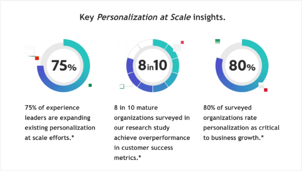
According to Adobe’s Personalization at Scale report, 80% of the organizations they surveyed cited personalization as critical to their business’s growth.
Here are a few tips to help you improve your personalization
Be Relevant
First of all, the best personalization is smart and targeted. Visitors hate seeing irrelevant content. OptinMonster can help you segment and target marketing campaigns on your site so they’re always relevant.
Highlight Related Products
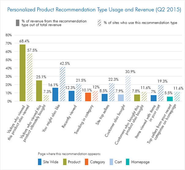
If you’re looking for a shortcut, try highlighting related or recommended products. Smart Insights‘s 2015 research showed that 68% of eCommerce revenue comes from recommending products with the language “visitors who viewed this product also viewed”.
Of course, customer preferences have likely changed since 2015, so experiment with which wording is best for your eCommerce optimization.
Adjust Site Navigation
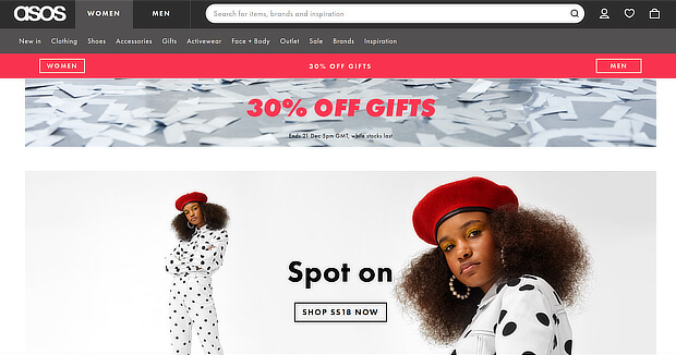
You can also get smart about personalization by adjusting site navigation based on visitors’ interests. When we looked at women’s products on ASOS, the next time we logged in, the site took us straight to the right page.
Personalize Marketing Emails Based on Behavior
You can personalize eCommerce marketing even when people leave your site. That’s a smart trick Amazon uses. If you look at a product, the next couple of emails you get from them will tell you about related products and deals. One tool to help with this is Barilliance, which lets you trigger emails based on how a user interacts with your site.
Show Discounts By Category
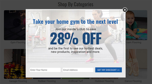
Another eCommerce optimization option is to tailor your offers to the section of your site a visitor is browsing. OptinMonster’s Smart Tags can help with that.
Inc Stores grew their list by 300% with the same feature, creating a version of their flooring campaign to target home gym users.
Here are some more ways to use eCommerce personalization:
- Personalize onsite search results
- Adapt homepage banners to user behavior
- Use visitors’ location to personalize offers
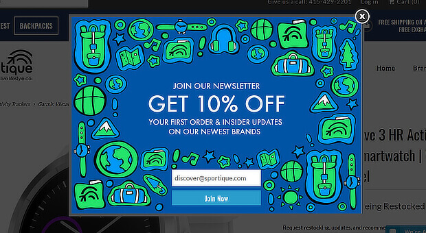
OptinMonster’s geo-location feature can help with that last point. This was one of the features that helped Sportique boost conversions by 200%.
Get more examples of eCommerce personalization.
4. Optimize for Mobile
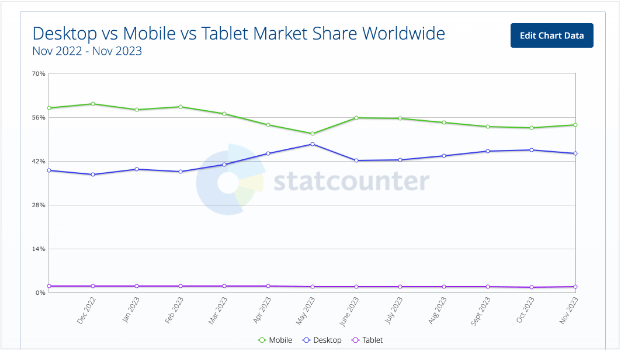
One eCommerce optimization you can’t afford to skip is mobile. That’s because more people use mobile devices than desktops, as you can see in this data from December 2022 through November 2023.
That means it’s need to improve your mobile conversion rate. Here are some tips on mobile eCommerce optimization.
Speed Up Your Site
Mobile users have limited patience. If your site takes more than 3 seconds to load, many visitors will simply leave your site.
That’s why you have to monitor your render start time (RST). That’s how long it takes for the first content to show up on your site.
Sites with great RST boost engagement by 50% over sites that load slowly, giving you more chances to get and increase conversions.
To speed up your site’s load times:
- Use a responsive theme
- Check your page speed with Google’s checker
- Use a caching plugin to serve content quicker
WordPress site owners can also follow these tips on improving website speed from WPBeginner.
Use Videos
According to our video marketing stats roundup, 90% of consumers watch videos on mobile devices. Even more important, 84% of consumers have made a purchase after watching a video.
That’s why it makes sense to use video marketing to boost mobile conversions. Explainer and product videos are a good start. You can also grab mobile visitors’ attention with a video popup. This is easy to create with OptinMonster. Check out the video below to see how to do it.
Optimize For Mobile Search
Mobile SEO is an important part of winning conversions. With Google’s mobile-first index a reality, you can’t ignore this if you want mobile users to find your content. To do this:
- Optimize page titles and descriptions for mobile search
- Find the search terms mobile visitors use and integrate them into your content
- Look after mobile user experience, which affects search ranking
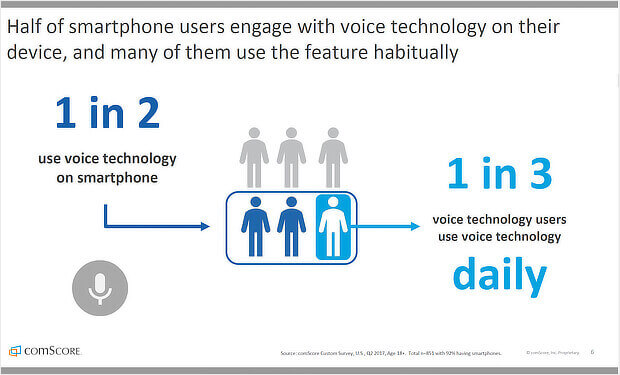
- Optimize for voice search, which is used by 50% of all mobile users
Learn more about mobile SEO in our guide.
Use Mobile Marketing Campaigns
To win more conversions from mobile users, it’s essential for your marketing strategy to include campaigns that target them specifically. OptinMonster can help you create high-converting campaigns that comply with the latest mobile marketing best practices.
In addition to having a wide range of mobile themes, OptinMonster gives you a mobile version of our advanced exit-intent® technology. It’s called the InactivitySensor™, and it lets you show campaigns to mobile users whose attention has wandered. Here’s how you can target inactive users with a popup.
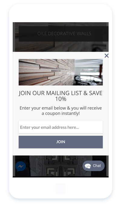
You can also easily create mobile optins, like this campaign that boosted conversions by 150% for White River.
Read our guide for more tips on increasing your conversion rate from mobile users.
5. Use an Upsell
Upselling is a proven tactic for increasing eCommerce revenue. You can encourage people to buy a more expensive version of a product they’re already interested in:
- On the product page
- During checkout
- After checkout
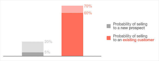
You can also upsell to your current customers. It’s way easier to sell to existing customers than new ones. Plus, targeted recommendations bring in about 30% of eCommerce revenue. And there’s a rise in customer lifetime value. That means over time, you earn more.
To use upselling effectively:
- Make sure you show why the upsell is valuable
- Get the pricing right – Kissmetrics recommends 60% cheaper than what’s in the cart
- Use social proof to make it more appealing
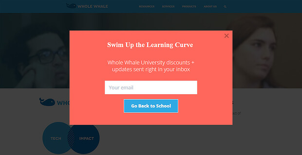
OptinMonster customer Whole Whale used upselling to double conversions. Some other ways to upsell include:
- Display your upsell on the cart page or high converting webpages with page-level targeting
- Use Smart Tags to personalize offers based on what’s in the cart, as in the example shown earlier
- Use A/B testing to see which offer works best
Here’s a guide to boosting eCommerce revenue with an in-cart upsell.
6. Create Urgency With Flash Sales
SALE – for some people, those are the best four letters in the alphabet. And they can pay off big for eCommerce retailers. In 2017, holiday sales alone totaled $50 billion.
How can you get your share? By using urgency. People are wired to act when a situation’s urgent. Basically, we all want to grab something good before it’s too late. And the right marketing can trigger that reaction.
One good option for eCommerce retailers is a flash sale. To make this work, you’ll need to:
- Use urgency-based language to do with time, speed or scarcity
- Trigger the fear of missing out (FOMO)
- Include an active, urgent, CTA, like “Get Your Discount Today!”
You can also make your sale more urgent by:
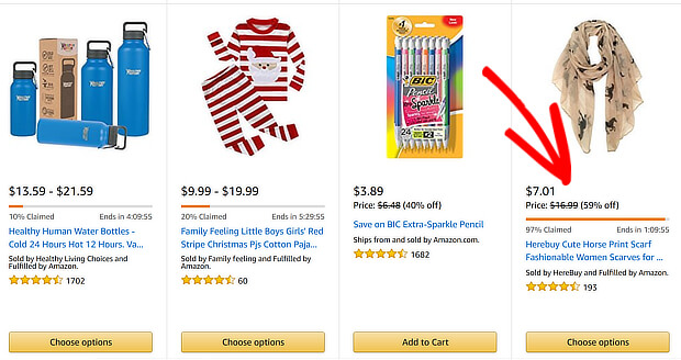
- Showing the competition for an offer, as Amazon does below
- Displaying stock levels
- Offering a doorbuster, which is a sale within a sale
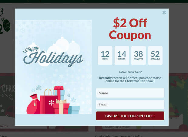
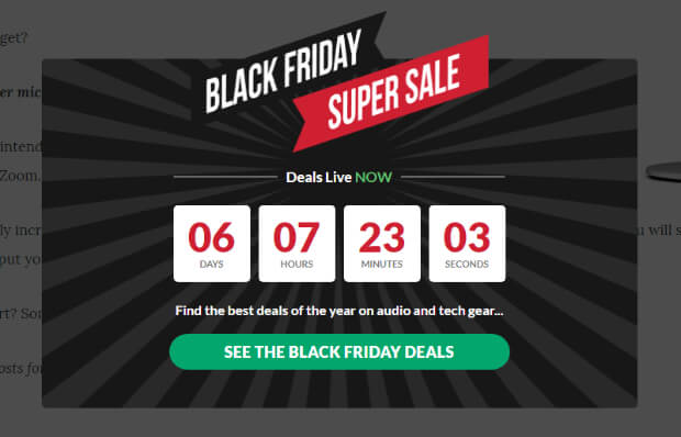
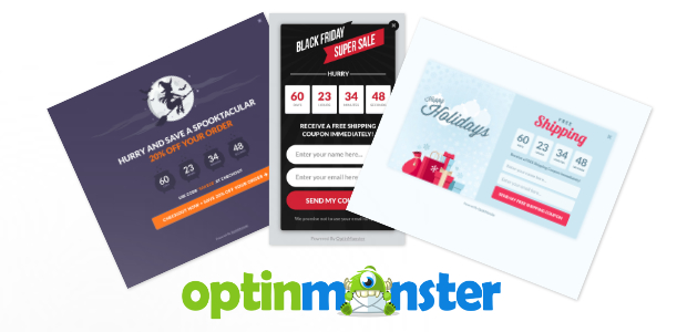
One easy way to highlight a sale is to use OptinMonster’s countdown timer theme. You can also offer countdowns via our Black Friday, Spooktacular, and Holiday themes. For example, Christmas Lite Show converted 16.49% of abandoning visitors with an expiring coupon offer.
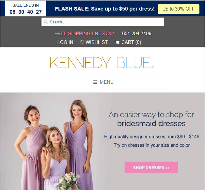
And Kennedy Blue used the countdown timer to boost sales by 50%.
Here’s how you can boost your sales with a countdown popup. And here are some more ways to increase conversions with urgency.
7. Overcome Other Specific Objections
Occasionally, it can take a while for your customers to decide to buy. Sometimes that’s because of a long sales cycle. At other times it might be because of three common objections to buying:
- Price
- Product fit
- Competition
Price can be a sticking point for many buyers. However, you can overcome that objection with flash sales, as described earlier, or discount offers.
Product fit is all about buyers determining if the product is right for them. One way to do that is to make that process easier. For example, Kennedy Blue lets customers offer free color swatches so they can choose their colors before selecting wedding and bridesmaid dresses.
And of course, sometimes prospective customers think your competitors have an advantage over you. You can solve this by collecting customer feedback.
This can help you to learn why they are leaving your site, and optimize the process for the future. Here’s how we do that at OptinMonster, with an exit-intent popup:
We’ll talk more about customer feedback later in this guide.
8. Reduce Cart Abandonment
One of the biggest issues for eCommerce retailers is shopping cart abandonment. Baymard Institute says the average cart abandonment rate is 69%. Even if you accept this as normal, every business wants to earn more, right? That’s why this is such a crucial eCommerce optimization to implement.
Here are some proven techniques for reducing cart abandonment.
Use Exit-Intent®
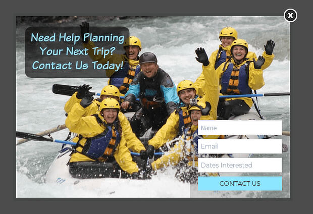
OptinMonster’s advanced exit-intent® technology detects when visitors are about to leave the page and pops up an offer to get their attention. It’s proven to reduce abandonment, helping Wild Water Adventures to recover sales worth $61,000.
Here are some more ways to use exit-intent popups on your site.
Cut Out Surprises
Shoppers hate getting surprises when they’re ready to check out, especially when it comes to cost. In fact, 60% of people abandon carts because of shipping and other costly surprises.
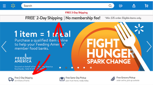
If you can afford it, offer free shipping. It’s one of the top incentives for shopping online. And if you do, let people know multiple times, like this example from Walmart.
And a customer-friendly return policy is helpful, too.
Include Multiple Payment Options
There’s nothing worse than getting ready to buy and finding that the retailer doesn’t accept your credit card, or your electronic or mobile payment solution. In contrast, the right payment options can triple conversions.
Wondering which ones to choose? The most popular options are:
- Credit cards
- Debit cards
- Paypal
- Cash
Mobile payment solutions are getting more popular, too.
Keep a Visible Cart
One way to keep potential purchases top of mind is to use a persistent cart, that shoppers can see from every page of your site. It’s a reminder that there are items they want to buy. A simple way to do this is to have a cart icon, like this one from Amazon:
Offer Guest Checkouts
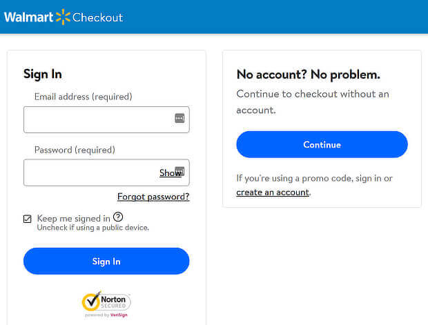
Having to create an account can be a major turnoff for 37% of shoppers. Our advice? Save the sale by offering a guest checkout process. Let people buy, and then offer them the chance to save their information. They’ll be much more receptive after a successful purchase.
Send Abandonment Emails
If you want to get people to complete a purchase, remind them there’s something in the cart. If you have their email address, abandonment emails can recover the sale.
Ideally, you’ll send the first one within a couple of hours after abandonment. Send a second email a day later, and a third a day after that.
Your abandoned cart email series could look something like this:
- Ask if recipients experienced issues with the checkout process
- Show the items left in the cart
- Offer a coupon as an incentive to complete the purchase
Here are some abandoned cart email examples to inspire you.
Use a Coupon
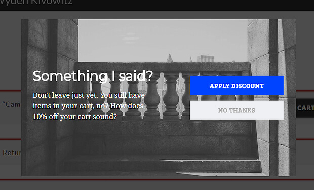
Coupons are a big factor in making a purchase, so it makes sense to offer one when you’re looking to reduce abandonment.
Offer your coupon at the right time and people will want to buy. As well as an in-cart upsell, mentioned earlier, you can target your coupon to people shopping on high-value pages, and to those who have already reached the checkout page.
Scott Wyden used discount coupons to recover 21% of abandoned carts.
Here are some more ways to optimize your checkout page to reduce cart abandonment.
9. Build an Email List
One of the best ways to build a relationship with your customers is through email marketing. Email marketing is proven to have great ROI, which means more sales for you.
Here are some ways to use email marketing effectively to promote your online store.
Nail the Subject Line
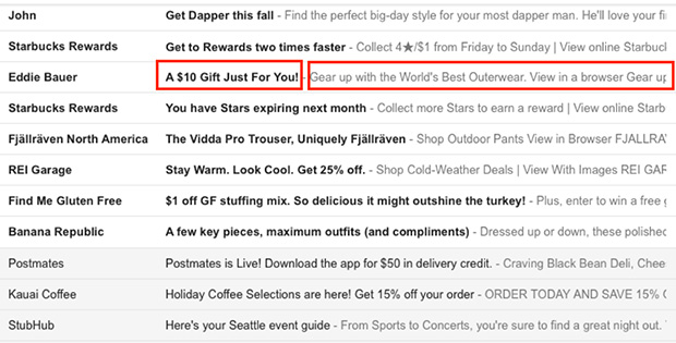
The first thing email recipients see is the email subject line and the preview text. If they like them, they’ll be motivated to open your emails. That’s why it pays to optimize them both.
Start by creating an enticing email subject line that tells recipients what your email is about. Follow that up by teasing the contents in the preview text. That can help convince recipients to open your email.
Personalize Your Emails
Everyone knows that personalization makes people more engaged with your emails and your marketing.
But it’s not just about using email recipients’ first name. Make recipients happy by tailoring emails to:
- Their gender (like showing male clothing to male recipients)
- The emails they’ve engaged with before (if they’ve clicked a link in a previous email, your next one can showcase a related item)
- What they’ve bought on your site (highlighting complementary products)
Here are some more examples of eCommerce personalization.
You can also use OptinMonster’s onsite retargeting to show special offers to subscribers who visit your site after clicking an email link.
PodcastInsights grew subscribers by 1099% with onsite retargeting.
Go Seasonal
The holidays are an important time for eCommerce retailers. They’re responsible for 20% of annual sales. That’s why it makes sense to use major holidays and other special occasions to give your emails some extra interest.
The period between October and January includes a lot of holidays, but it isn’t the only time of year you can do holiday sales. You can also brand emails for observances like:
- Valentine’s Day
- Memorial Day
- Back to school
- The first day of fall
- The winter solstice
OptinMonster makes it easy for you to match holiday emails to onsite marketing campaigns with several holiday themes. In fact, Christmas Light Show used one of our holiday themes to convert 30% of visitors with an exit-intent lightbox popup.
Here are some more tips on holiday email marketing.
Use Transactional Emails
If you’re not marketing to customers via transactional emails, you’re missing an opportunity. Most people open order confirmation and shipping emails, so use that space to:
- Brand the emails for a seamless customer experience
- Recommend related products
- Make a discount offer recipients won’t want to refuse
For more help with eCommerce email marketing, check out our tips.
10. Split Test Your Email Optins and Campaigns
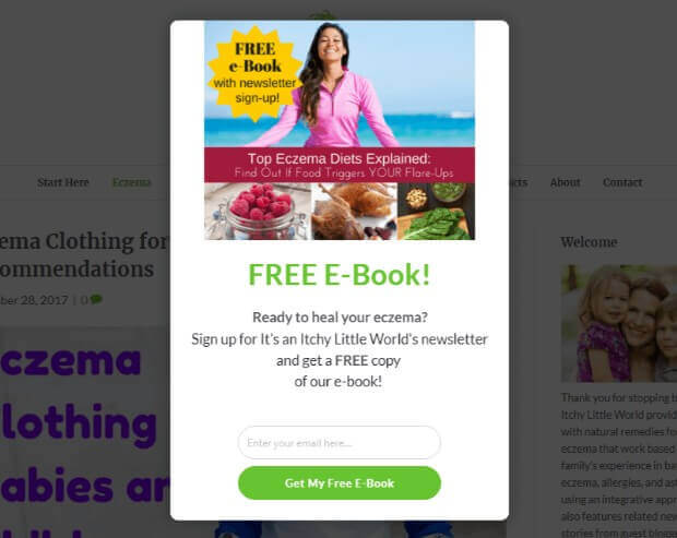
We briefly mentioned split testing above, but it’s worth coming back to. That’s because it’s such a powerful strategy for improving eCommerce marketing. Eczema Company improved conversions by 158% simply by split testing its campaigns.
A lightbox campaign that integrated the Yes/No forms we mentioned earlier outperformed other variations.
If you want to get started with split testing, check out:
- Our guide to creating split tests
- A/B testing best practices
- Split testing mistakes to avoid
11. Automate Your Email Marketing
Using automation in email marketing is a proven way to drive more sales and get more repeat customers without having to spend a lot of money on paid promotions.
We mentioned a shopping cart abandonment email sequence earlier. But beyond abandonment, you can try other email automation sequences. For example, you can create a popup to offer abandoning visitors a coupon, freebie or another lead magnet. Then you can send a series of emails to let them get to know you and build trust.
Welcome Non-Buyers
Welcome emails are also important, as they get 4x the click rate and 23x the conversions as regular marketing emails.
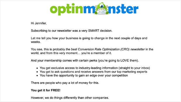
Here is an example of one of OptinMonster’s welcome emails. This one is sent to new subscribers to our email newsletter.
A good welcome email series for non-buyers could include:
- An introduction, along with delivering the incentive you offered for signing up
- More detail about your brand, with an invitation to ask questions
- Showing off some of your bestsellers and related customer reviews
- Sharing a piece of great content that subtly educates buyers about your products and services
- Social proof such as testimonials
Check out some more welcome email examples here.
Reward Your VIPs
Most of your sales will come from a small percentage of customers who buy repeatedly. So it’s worth nurturing these customers a little.
You can easily identify and segment these customers in your email marketing software, then send a series of emails that show you recognize their loyalty to your brand.
In other words, let them know they’re important to you by offering a free gift or coupon that’s exclusive to them.
Win Back Disengaged Customers
At the other end of the scale, don’t ignore the customers who seem to be ignoring you. Instead, make an effort to win them back with a re-engagement campaign.
To do this, you can send a series of emails including:
- Noting that they’ve been quiet and asking why
- Highlighting anything that’s new since last they visited your store
- A coupon or offer that makes them want to come back
- Offering the chance to unsubscribe if they’re really not interested – this helps keep your email list clean
Learn more about email marketing automation in our eCommerce automation guide.
12. Get Feedback
Want to eliminate the guesswork in eCommerce marketing? Get customer feedback. It’s the only way to know if your customers are happy, and how you can provide a better service for them.
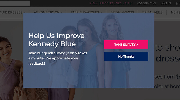
Kennedy Blue uses an OptinMonster popup to convert 7% of abandoning visitors, just by inviting them to complete a survey.
That’s a lot of sales to save. In fact, Kennedy Blue saw sales increase by 50%!
You can easily use OptinMonster to collect feedback from your customers. For example, you could ask:
- Did you find the items you wanted today?
- How can we create a better experience for your next visit?
- Would you like to hear about new deals?
These questions give you the chance to connect with potential customers.
Read our tutorial on using OptinMonster and WPForms to create a survey popup.
You can also collect customer feedback by:
- Putting a button on your website
- Offering a coupon or other incentive
- Using live chat
Learn the best ways to collect customer feedback in our guide.
13. Troubleshoot Common Errors
We’re almost at the end of our eCommerce optimization guide. Before we go, let’s look at a few common errors that affect the user experience on eCommerce websites, and can reduce conversions.
People Are Bouncing
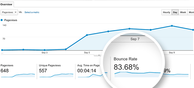
Your bounce rate is the percentage of website visitors who leave your site after visiting just one page.
Getting visitors to stick around longer will help you increase sales.
A high bounce rate could be due to site speed, usability errors, or just a lack of engaging content.
You can find your bounce rate easily in your Google Analytics dashboard.
To keep your visitors on your site longer, see our guide on ways to reduce bounce rate and boost conversions.
SEO Is Poor
We mentioned SEO earlier, and this is crucial to improve eCommerce conversions. Optimizing your pages helps people find your products online when they search for related terms. That means more visitors and more potential sales.
But you only get the conversions if your site delivers what’s promised. That’s where our earlier tips about optimizing product pages and pricing come in.
Use our ultimate guide to SEO to really nail this eCommerce optimization step.
External Factors Are Tanking Your Sales
Sometimes a drop in conversions isn’t about you; it’s about what’s happening beyond your online store.
For example, maybe your target customers are distracted by something new your competitors are offering. If you’re aware, you can adjust your marketing campaigns to try to win back those customers.
To do that, you’ll need to pay attention by setting up alerts to see what your competitors are doing. Google Alerts can help with this. You should also monitor social media activity with a tool like Mention.
Learn more about improving eCommerce conversion rates in our guide.
Get More Sales With eCommerce Optimization
That’s it! Now you know how to handle eCommerce optimization, step by step, to really boost sales and revenue.
Want more tips to grow your online business? Take a look at these resources:
- eCommerce Best Practices: Set Up Your Business for Success
- 11 eCommerce Case Studies to Inspire Your Success
- The Ultimate Guide to Growth Hacking for Exponential Success in 2023
And remember: one of the best ways to optimize your eCommerce site is to use OptinMonster to capture more leads!
With our software, you can create high-converting popups and signup forms in just minutes. Our Exit-Intent Technology and other targeting and triggering tools are proven to convert your website visitors into subscribers and customers.









Add a Comment