Are you looking for the best eCommerce email examples? You’ve come to the right place!
Email marketing has a median ROI of 122%. It consistently and overwhelmingly beats other marketing formats like social media and paid search. To put that in perspective, this is more than four times higher than any of those other marketing formats.
Is anyone out there wondering if email marketing is dead? It clearly isn’t.
If you’re not using email for your eCommerce business, you’re leaving money on the table.
In this blog, we will dive into some of the best eCommerce email examples to inspire you and help you take your email marketing game to the next level. As a bonus, we will also share best practices for writing email copy for eCommerce sites.
eCommerce Email Examples
There are several excellent reasons why you should reach out to clients. eCommerce email marketing communication tends to fall into one of four categories:
- Welcome emails
- Promotional/Offer emails
- Cart abandonment emails
- Transactional emails
Let’s look at some eCommerce email examples of each type.
Welcome Emails
Welcome emails have the highest open rate of any emails you send to subscribers. The open rate for welcome emails is an astounding 60%.
They’re also typically pretty short: 65% of welcome emails are 50-150 words long.
For such a short length, welcome emails pack quite a punch. Emails sent as part of the user onboarding process can help to boost app retention by 71%.
Here are some eCommerce welcome email examples to start building that important relationship with your new subscribers immediately.
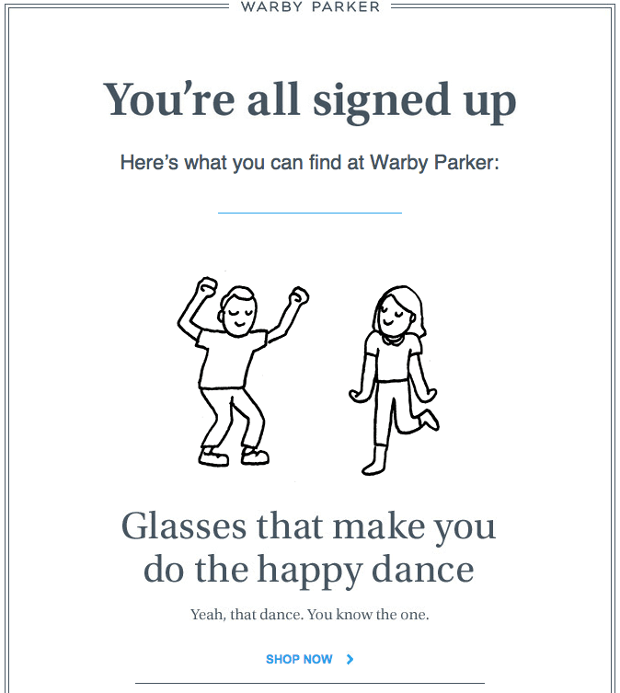
Warby Parker Welcome Email
Warby Parker’s welcome email is simple, clean, and easy on the eyes, with lots of white space. They’re also super fun and modern.
Subscribers are given a subtle-yet-effective call to action right away with “SHOP NOW” text in a contrasting color.
There’s even an animated graphic.
This type of messaging and use of high-energy animations is true to Warby Parker’s branding and their mission to make shopping for glasses simple, easy, and fun.
Key takeaway: White space is a wonderful thing. Increase your padding to create a modern and easy-to-view email. Also, a few things add a bit of fun, like a well-placed GIF.
Some email programs, like Outlook, ignore set padding and margins around images. To make sure that you get to keep your lovely white space you can use an image editing program to add a border around your image that’s the same color as your campaign background. Then you can upload the image to your campaign with your white space built in.
Several image editing programs range in price from free (like GIMP) to PhotoShop. A lot of us at OptinMonster use Affinity to edit our images.
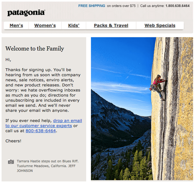
Patagonia Welcome Email
Patagonia’s welcome immediately punches you in the gut with a stunning image of a “typical Patagonia customer.” This could be you, and Patagonia will support you every step of the way. After all, you’re now “family.”
To generate more sales, Patagonia should add a clear call to action that takes subscribers to their online store.
Key takeaway: Your imagery and wording should be on brand. Also, when using text and images in a side-by-side format, make sure that the layout is responsive so it automatically changes to a single column on mobile devices.
The most commonly used email marketing services, including MailChimp, ConvertKit, Constant Contact, and the like, will have easy-to-use tools to keep your emails responsive. Just be sure to send out test emails so you can make final tweaks before going live.
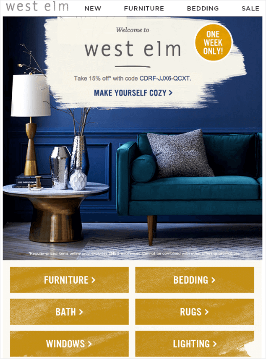
West Elm Welcome Email
With a coupon code right at the top, gorgeous photography, and a clickable menu, West Elm nails their welcome email. They know their market, and it shows.
The wording of their call to action is warm and familiar and inspires a sense of trust and comfort. If you want to be “cozy,” West Elm can get you there.
Key takeaway: Clear navigation, an image that speaks to your market, and a coupon code go a long way to removing barriers to online shopping.
If you’re starting to build sales, you might not be able to offer discounts to everyone, but there’s probably something else that fits with your brand that you can put up as an incentive.
Check out our list of lead magnets to get some ideas.
A great welcome email includes most, if not all, of these six components:
- A “thank you” to your new subscriber or customer
- The lead magnet or whatever incentive was promised in exchange for subscribing (coupons are common)
- Information about what the subscriber can expect from your emails
- An introduction to your company
- Instructions for whitelisting you
- Contact information and links to social channels
Next stop, promotional emails.
Promotional Emails
Offering subscribers something of value is a great way to get and keep their attention, endear them to your brand, and generate sales. And it works.
A study by VWO found that 72% of Millennial shoppers respond to retargeting campaigns that offer discounts.
Of course, you must figure out a balance that works for your business. Offering discounts and promotions all the time may negatively impact your bottom line if you already have thin margins.
If this is the case for you, you can focus most of your promotional emails on prospects or customers already engaging with your campaigns.
You can also offer additional value without discounts by including exclusive content like email newsletters, webinars, white papers, templates, etc.
Interested in sending promotional emails that engage and inspire your subscribers? Here is a great example.
REI Promotional Email
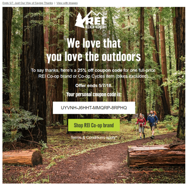
REI loves to let you know about their sales. If you’re an REI member, you also get special promotional emails offering greater discounts and coupons.
The image with a simple text overlay is very effective here. The text is unobtrusive, even fading into the background in some places. The call to action is muted compared to the star of the show: the coupon code.
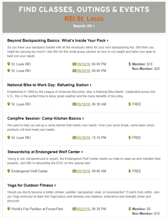
REI also sends promotional emails that contain a calendar of events from your local REI. These emails are very simple and let customers know that REI doesn’t just want to sell them stuff; it wants to teach them stuff.
Key takeaway: You don’t always have to include discounts in your promotional emails. Things like events and quality content add value for your subscribers too.
Cart Abandonment Emails
Did you know that an average of 69% of shoppers abandon their carts, costing eCommerce businesses an estimated $260 billion in lost revenue?
The good news is that there are ways to reduce shopping cart abandonment. One of the easiest ways is to remind shoppers that there’s something in their cart with an abandoned cart email.
Abandoned cart emails are effective. According to Salesforce data, 60% of shoppers returned to purchase within 24 hours of receiving personalized emails after abandoning their shopping carts.
Not only that, but ¾ of people who abandon their carts usually plan to come back. If you’re not sending abandoned cart emails, you’re leaving money on the table.
Glossier Abandoned Cart Email
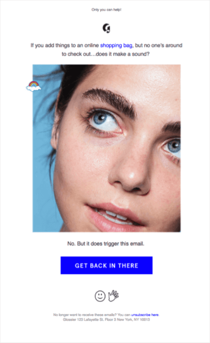
Glossier immediately tells shoppers that this email is automatically sent because they left things in their cart. It’s a funny and refreshingly honest approach that plays well with online shoppers.
We’d suggest that Glossier do some testing to see if they get better results by including an image of the item in the cart. Aside from that, the email is on-brand, eye-catching, and to the point.
Birchbox Abandoned Cart Email
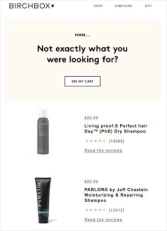
We like this abandoned cart email from Birchbox. They hit on one of the important reasons that a customer abandons items in their cart: they just realized they don’t want the item in there.
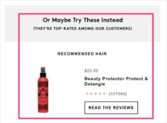
Birchbox shows the shopper the items in their cart and includes a recommendation for a different, related product.
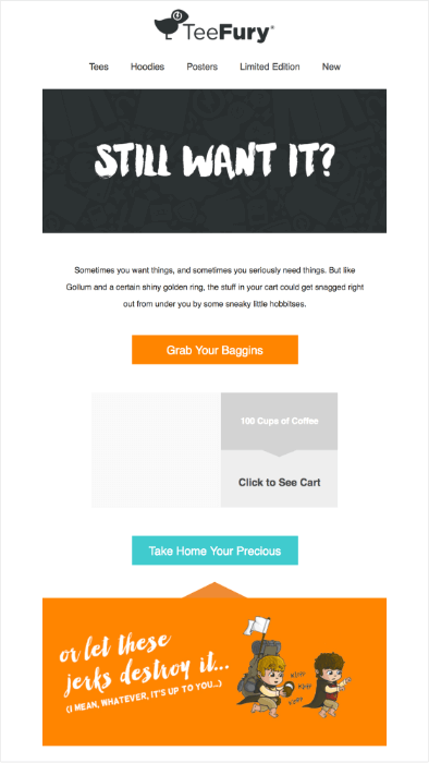
Teefury Abandoned Cart Email
Teefury does an excellent job of using their distinctive brand voice. The CTA “Grab Your Baggins” speaks to many of their shoppers and is just really fun.
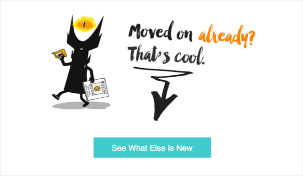
At the bottom of the highly entertaining email, Teefury doesn’t mention the abandoned cart again. Instead, they give shoppers the option to “see what else is new.” Like Birchbox, Teefury understands that sometimes folks just change their minds.
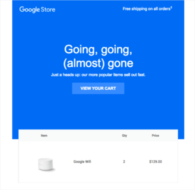
Google Store Abandoned Cart Email
A lot is happening in this beautifully simple abandoned cart email from Google Store.
For starters, Google Store highlights free shipping on all orders at the top of the email. Free shipping removes a common barrier to online shopping.
Next, they create a sense of urgency with the copy “going, going, (almost) gone.” Including the “heads up” underneath changes the tone of the urgency from a scare tactic to a friend who wants to make sure you don’t miss out on something you want.
After that, they just move on. This is a subtle nod to the urgency that they’ve created.
Key takeaway: Cart abandonment emails are a must. They can be fun and lighthearted or understated and urgent, but you need to be sending them.
Here’s a step-by-step guide showing how to create a cart abandonment campaign with OptinMonster.
Resource: 14 Abandoned Cart Email Examples Proven to Boost Revenue
Transactional Emails
Transactional emails are automatic emails sent in response to a specific trigger. Order and shipping confirmations, account creation, and billing emails are all considered transactional emails.
There are several more types of transactional emails, but let’s focus on a couple of post-purchase email examples.
These emails can serve a few different purposes, like building excitement for the product or inviting shoppers to tell friends about their purchase.
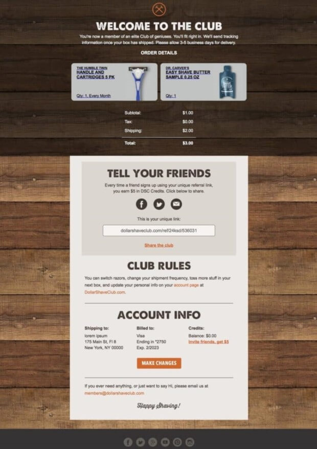
Dollar Shave Club Order Confirmation
Dollar Shave Club’s order confirmation email is tame and no-nonsense compared to their quirky website. They welcome the shopper to the “club” and recap the order.
After that, they are incentivized to share Dollar Shave Club with a friend.
They finish off the email with more business information.
This email from Dollar Shave Club checks all the boxes of an outstanding order confirmation email. It’s eye-catching and informative and reminds customers you can be fun and professional.
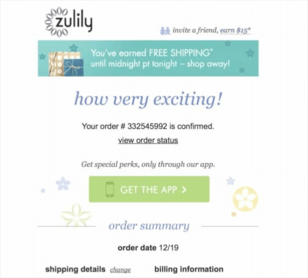
Zulily Order Confirmation Email
Zulily’s order confirmation is light and bright. Again we see the “invite a friend” incentive. In addition to that, Zulily offers free shipping until midnight the night of the email. This encourages shoppers to revisit Zulily and shop after confirming their recent order.
Key takeaway: Don’t ignore transactional emails. They offer another opportunity to engage with your customers and build brand loyalty.
Take some time to plan out a transactionally triggered drip campaign using an email marketing automation tool, and see our guide on getting started with eCommerce email marketing automation.
For more examples, don’t forget to explore these 8 Product Recommendation Email Examples to Drive Sales.
Best Practices for Writing Email Copy for eCommerce Sites
To ensure that your eCommerce emails are effective, follow these best practices:
Write attention-grabbing subject lines: The subject line is the first thing your customer sees when they receive your email. Therefore, it’s crucial to make sure that your subject line is attention-grabbing and compelling. Use action-oriented language and keep it short and to the point. A good subject line can increase the open rate of your email.
Personalize your emails: Personalizing your emails by addressing your customer by their name can significantly impact the success of your email campaigns. Personalized emails have higher open and click-through rates than generic emails. You can also use your customer’s purchase history and browsing behavior to personalize your email content and offers.
Use clear and concise language: Keep your email copy clear and concise. Make sure your message is easy to understand, and avoid using industry jargon or technical terms. Use short sentences and paragraphs and focus on the benefits of your products.
Include strong CTAs: A strong call-to-action (CTA) can encourage your customer to take action and complete the desired action, such as making a purchase or signing up for a newsletter. Make sure your CTA is clear, visible, and compelling. Use action-oriented language and avoid generic phrases like “click here.”
A/B Test: Testing your email campaigns can help you improve the performance of your emails. Test different subject lines, email copy, images, and CTAs to determine what works best for your audience. Analyze the results of your email campaigns and make changes accordingly. A/B testing can be a great way to decide which email copy works best for your audience.
That’s it! Now you understand how to write email copy for eCommerce sites for creating effective and engaging emails that generate more sales.
However, even the best email copy doesn’t help if you don’t have any email addresses in your list.
The bigger your list, the more sales you will generate with these emails.
Take the Urban Southern case study as an example. Urban Southern started without an email marketing strategy to speak of. After using OptinMonster to grow their email list, they increased sales by 400%!
What’s cool about Urban Southern’s success is that any business can do the same with a strong email marketing campaign and great content.
By improving their blog content, Urban Southern increased their site traffic. Then, they took advantage of the increased site traffic to grow their email list by adding a single lightbox optin to their site.
You read that right. Better content and a single lightbox optin lead to a 400% increase in sales. Let’s take a look at the optin that got this ball rolling.
Simple.
They follow up with an on-brand success message, delivering the promised coupon code and directing subscribers to confirm their subscriptions.
Requiring a double optin ensures everyone registering for your list wants to receive your emails. In addition to increasing sales by 400%, Urban Southern grew their email subscriptions by 2150% and added 8600 subscribers to their email list. All by using a single lightbox optin from OptinMonster.
Quick TipHere are step-by-step instructions to build your own lightbox optin with OptinMonster!







Add a Comment