Are you losing customers on your checkout page? Checkout page optimization is what you need!
Shopping cart abandonment is a big issue for eCommerce retailers. Research tells us that the average cart abandonment rate is around 70%.
In other words, most people who put an item in the shopping cart don’t buy it. And that’s money you can’t afford to lose.
Cart abandonment costs eCommerce stores hundreds of billions of dollars in lost sales, but it doesn’t have to. If retailers optimize their checkout pages, they can recover billions in lost spending.
You need to optimize your checkout, too, because recovering even a few of those sales could make a BIG difference to your business, and give you the revenue you need to succeed or grow.
This article will help you do that.
We’ll show you the checkout page optimization tips that’ll make your visitors want to complete the sale.
We’re going to focus on issues related to the checkout page itself. By the end, you’ll know the best ways to optimize your checkout process so you can make more money.
Here’s a quick list of the checkout page best practices so you can jump straight to your most urgent issue.
- Use Exit-Intent®
- Use Urgency and FOMO
- Avoid Surprise Costs
- Send Abandonment Emails
- Include Multiple Payment Options
- Highlight Security and Trust Seals
- Ask For Payment Info Last
- Use Live Chat
- Offer Guest Checkouts
- Simplify The Checkout Process
- Reduce Form Fields
- Consider Single-Page Checkout
- Optimize Your Checkout Button
- Improve Cart Management
- Offer Save Options
- Show the Checkout Flow
- Remove Page Distractions
- Use Mobile-Friendly Design
- Highlight Customer Reviews
- Add An Upsell
- Offer a Downsell
- Test and Measure
Reasons For Cart Abandonment
So, why do so many shoppers abandon their shopping carts? There are quite a few reasons:
- Shoppers don’t like being surprised by fees for shipping and other unexpected costs
- If they can’t work out the cost upfront, that’s a red flag, too
- Having to create an account to complete a purchase is a turnoff
- Complex checkouts drive shoppers away
- Many don’t trust the site they’re shopping on
Most shopping cart abandonment research cites many of the same reasons.
Statista’s research includes a couple more. Shipping is a biggie, whether that’s lack of free shipping, uncertainty about shipping costs, or slow shipping.
But there are also a bunch of people who are just browsing or researching and aren’t quite ready to buy. And poor site navigation is also a turnoff for some.
All of these issues can drive potential shoppers away, costing you income.
But you don’t have to lose money on your checkout. Instead, use our tips to optimize your checkout process and win more sales. Here are the checkout page optimizations we suggest.
1. Use Exit-Intent®
One of the most effective ways that online retailer eCommerce sites can recover abandoned carts is to use exit-intent popups. This advanced OptinMonster technology figures out when visitors are about to leave your site and shows them a targeted message at the right time.
Exit-Intent® has successfully reduced abandonment for dozens of OptinMonster customers.
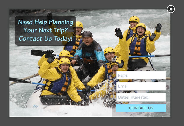
For example, Wild Water Adventures recovered $61,000 in sales by displaying this message to abandoning visitors:
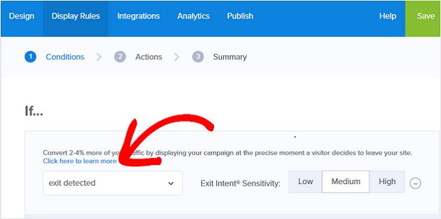
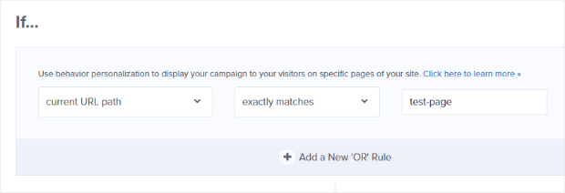
You can combine exit-intent with our page-level targeting feature to show your exit-intent popup on the checkout page only. And you can also grab people’s attention by:
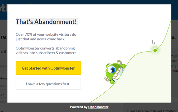
- asking a question (as we do on the OptinMonster checkout page and elsewhere)
- offering a coupon to encourage them to shop
- asking them to sign up so you can send them a coupon
Capturing email addresses makes it easier to do email marketing in the future. Coupons are popular, and this is a great way to get people back to your site or to follow up with abandonment emails. We’ll look at those in a later tip.
2. Use Urgency and FOMO
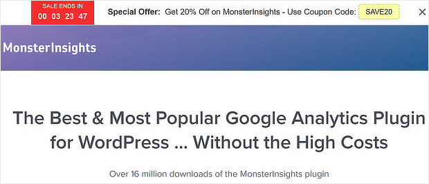
Urgency and the fear of missing out (FOMO) are two marketing tactics guaranteed to get results. People just don’t like the thought that they might miss out on a good deal, and if that deal’s about to run out, there’s even more of an impulse to take it. Here’s an example from MonsterInsights:
We mentioned offering coupons above, but you can make them more appealing by limiting the time visitors have to get or use them. And of course, if the item in their cart is on sale, flagging up the discounted price is definitely a help. You can also show stock levels to encourage shoppers to complete the sale.
Not sure about this tip? LifterLMS recovered $23,700 in lost sales with a simple OptinMonster floating bar with a countdown timer. Read our guide to creating a holiday sales timer to see how you can do the same. You can also get this effect with a Shopify announcement bar.
3. Avoid Surprise Costs
There’s nothing worse than thinking you’re spending one sum, only to find it’s a heck of a lot more by the time delivery costs and taxes are added.
Extra costs are an issue for 60% of cart abandoners. That means it’s an important area to address with checkout page optimization.
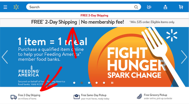
The reason so many eCommerce retailers offer free shipping is that it works—people love it!
If you can’t offer free shipping, then show clearly what items will cost once people buy them. And make sure your shopping cart page always reflects the final price.
Similarly, if you offer free shipping and returns, or low delivery costs, make this clear on every page of your site.
4. Send Abandonment Emails
Did you know that most of the people who leave items in their shopping carts plan to come back?
The thing is, sometimes they forget.
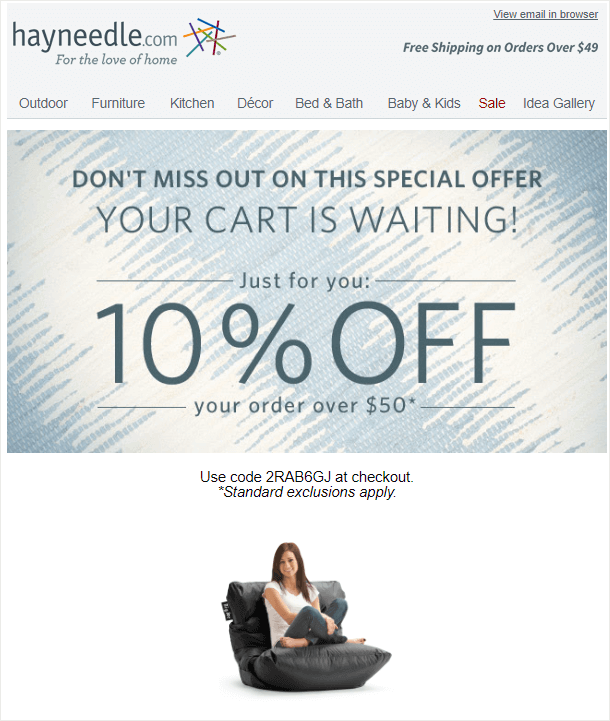
That’s why triggering an abandoned cart email series when people leave your page is a great way to recover lost revenue.
According to Salesforce, sending an abandoned cart email within 24 hours recovers 60% of lost sales.
When people follow the links in that email back to the cart page, you can even use OptinMonster to give them an additional incentive to buy. Our onsite retargeting feature lets you show these visitors a personalized offer to sweeten the deal. Learn more about this in our email retargeting guide.
Want to know how many abandonment emails to send? The research suggests three.
The first one should go within a couple of hours of abandonment to make sure there aren’t any technicalities getting in the way of buying. The second should go within 24 hours, and the third within 48. After that, you’ve probably lost the sale.
Use these abandoned cart email examples to guide your own strategy.
More Tools You Can UseCheck out our roundup of cart saver tools that will boost sales and delight your shoppers!
5. Include Multiple Payment Options
Some 8% of people abandon the checkout page because they can’t find the payment option they want. And another 4% leave if their credit card is declined.
Offering multiple payment options is one of the best ways to keep these visitors shopping. Including a digital payment option can triple conversions, BigCommerce found.
The most popular payment options worldwide are credit cards, Paypal, debit cards, and cash. And 14% of online shoppers want mobile payment options.
Need payment solutions that work for mobile? Check out our list of the best mobile payment solutions to find the right one for your business!
6. Highlight Security and Trust Seals
Here’s another payment issue. Around 19% of visitors abandon checkout pages because they don’t trust sites with their payment information.
This is often a gut feeling, so it’s important to change that perception.
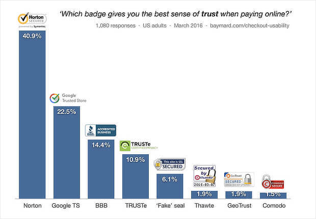
Baymard says there are several ways eCommerce retailers can create a more positive perception:
- Use SSL seals to show the site is secure (the Norton seal is the most trusted)
- Include trust seals that show the business is trustworthy
- Use symbols – like padlocks – to denote security
- Make the credit card area stand out with unique shading
The bottom line: a seal of approval reassures visitors that their credit card information is safe and removes a purchase barrier.
7. Ask For Payment Info Last
You wouldn’t hand over YOUR credit card to a stranger, would you? So, if you want shoppers to trust you, don’t ask for payment information upfront.
Instead, ease into it. Get less sensitive information like the customer’s name and email address first.
Move onto shipping information, and then go to the billing address, phone number, and so on before asking for the credit card number.
8. Use Live Chat
Live chat has become an essential customer service tool. And it’s proven to increase conversions. That’s because customers who have the chance to ask questions are more likely to buy when you answer those questions.
And there’s a bonus. When you know the questions customers ask before the sale, you can include those answers in your marketing material. That’ll make your product pages even more effective, and make more customers want to buy.
Get started by using one of these live chat solutions.
9. Offer Guest Checkouts
In the Baymard research, we cited earlier, 37% of shoppers abandoned carts because they had to create an account to shop. That’s a huge number of potential customers to lose.
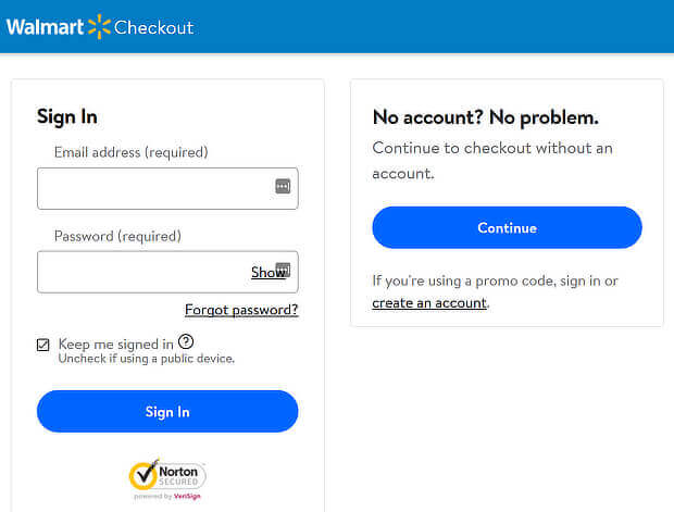
And the answer is simple: include a guest checkout option so visitors can shop without needing to create an account.
Of course, it’s easier for you when shoppers DO create an account. That lets you connect with them for future marketing.
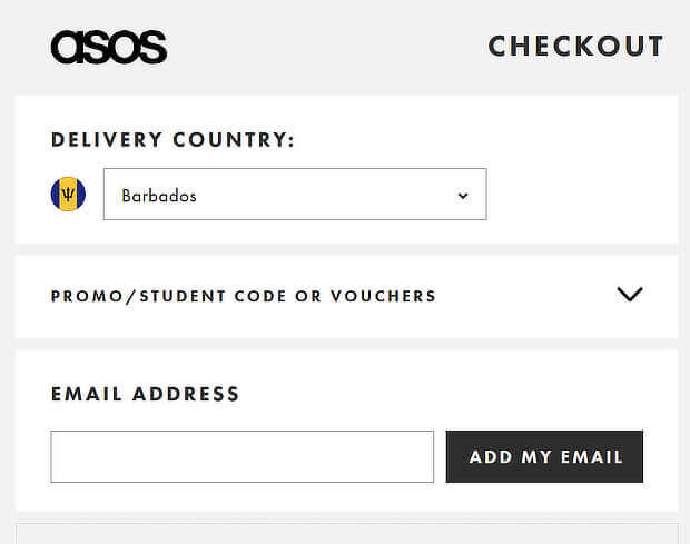
So it makes sense to provide an incentive for account creation, like an additional discount. Or you can just ask, as Asos does below:
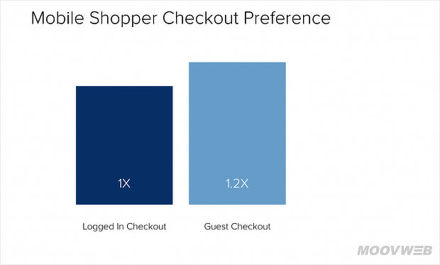
In the end, it’s all about choice. It also matters for mobile users, who are more likely to prefer a guest checkout option.
10. Simplify The Checkout Process
A complicated checkout process puts off 28% of customers. That’s why it makes sense to keep checkout as simple as possible. Some ways to do that include:
- Use an address lookup service to automatically find addresses and zip codes
- Autofill form data from information stored in a browser or password manager
- Retain customer information so repeat customers don’t have to enter it again
- Automatically copy shipping information to the billing information field if they’re the same
If you’re asking shoppers to create an account, one simple fix is to ensure your password requirements don’t drive them away. Invesp found that doing this reduced the checkout abandonment rate for one site from 95% to 28%.
11. Reduce Form Fields
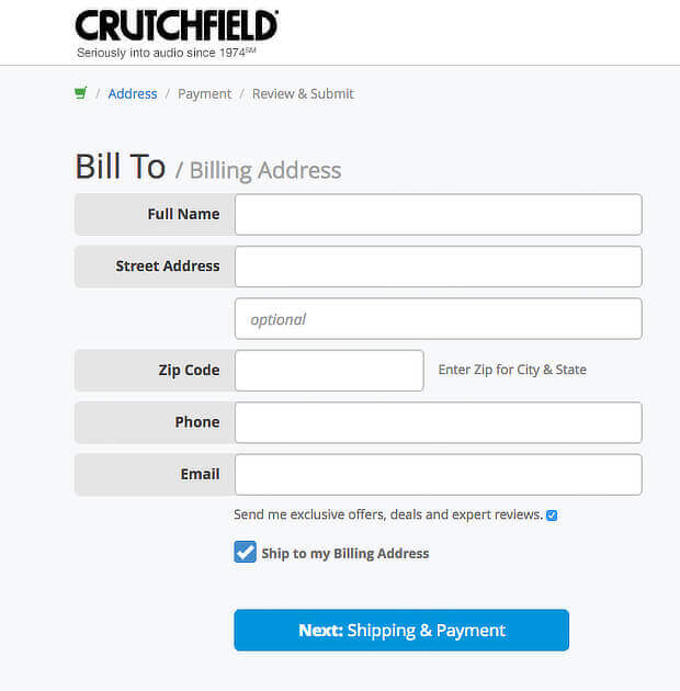
Another way to simplify the checkout is to reduce the number of form fields. Many checkout pages have double the number of fields needed. Cutting some out makes it more likely visitors will become customers.
Options for doing this include:
- Using a single field for the customer’s full name, rather than separate first and last name fields
- Replacing optional address fields with a link to load them if needed
- Making the shipping address the same as the billing address, unless the customer requests different
This optimized checkout page from Crutchfield is a good practice example:
12. Consider Single-Page Checkout
Another way to simplify your checkout is to use a single-page checkout. In some cases, this can result in a simpler, faster checkout, and better conversion rates.
For example, GetElastic found that a single-page checkout outperformed its old multi-page checkout by 21.8%.
But multi-page checkouts have advantages, too. For example, they can make it easier to track conversion bottlenecks at different stages of the checkout flow.
You may also be able to display information more clearly on several pages rather than squashing everything onto one page.
In the end, the solution is to test and see which version works better for your customers.
13. Optimize Your Checkout Button
Your call to action is an essential part of checkout page optimization. This is usually on a button and will include text like “buy now”, “place your order” or, simply, “checkout”.
Whatever the wording, it’s important to make your checkout button stand out, so customers can complete their purchase at any time.
Another tip is to put checkout buttons both at the top and bottom of the page or cart contents.
That means visitors won’t have to look for them when they’re ready to complete their purchase.
And have the add to cart button available anywhere, so shoppers can buy at any time.
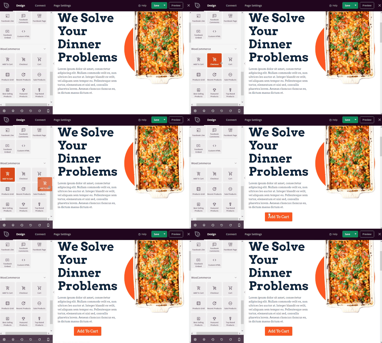
If you use WooCommerce to run your online store, you can use SeedProd to place add to cart buttons anywhere on your site.
SeedProd is the best drag and drop landing page builder for WordPress. With this tool, you can easily create sales pages, product pages, email optin pages, coming soon pages, checkout pages, and more.
You can place an add to cart button on any page simply by dragging and dropping the block.
Plus, you can customize the button by selecting the style, color, text, size, and more.
14. Improve Cart Management
You know what else helps shoppers? Making it easier to manage their shopping carts.
One way to do this is to confirm when items have been added. But it’s also good practice to use a persistent cart. This keeps track of items added to the cart, even if shoppers leave the site and come back later.
It’s also a good idea to make the cart accessible from any page on the site and to show that there are items in the cart.
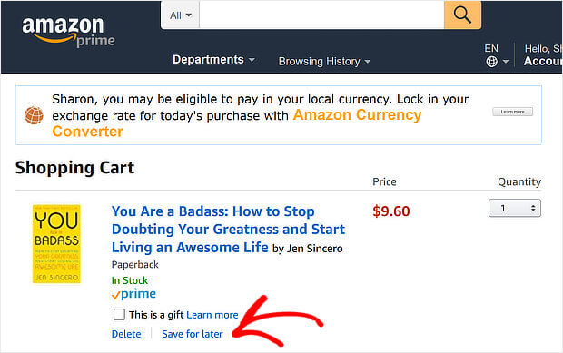
Shoppers also need an option to quickly review what’s in the cart, and edit the cart, without having to start again. Remember, simple is best when it comes to checkout page optimization.
Amazon’s approach works well. You can edit your cart at any time up to actually making payment.
15. Offer Save Options
Sometimes people aren’t quite ready to buy, even if they’re already mid-checkout.
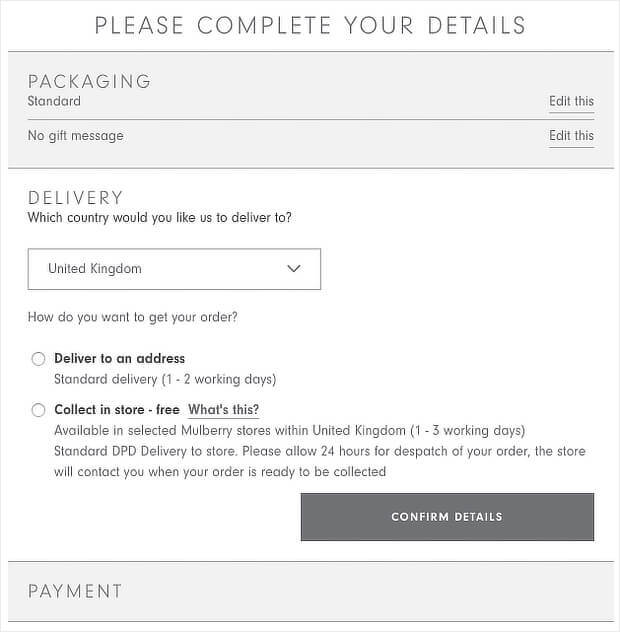
One way to save those sales is to let people save items for later, or move items to a wishlist.
That makes it easy for them to find items again when they’re ready to buy. It also lets you send abandonment emails targeted to the items they’re already interested in.
You can even increase your average order value by making it easy for people to keep shopping even after adding items to the shopping cart.
16. Show the Checkout Flow
A good way to reduce visitor frustration is to show where they are in the checkout process. You can do this by numbering the steps, or by using a progress bar. If people can see a visual indicator that they’re making progress, they’re more likely to stick around.
17. Remove Page Distractions
One optimization that’s the same for checkout pages and landing pages is removing distractions. You don’t want anything to get in the way of shoppers completing the transaction.
That’s why it’s a good idea to remove navigation bars, sidebars – anything distracting. Keep the page focused on the cart and checkout process. Remember, complicated checkouts lose sales.
18. Use Mobile-Friendly Design
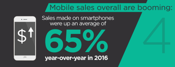
Did you know that between 2015 and 2016 the number of sales made on mobile devices went up by 65%?
So unless you optimize mobile checkout usability, you’re losing sales. To make your checkout page more mobile-friendly:
- Ensure your mobile checkout works
- Reduce checkout steps
- Use guest checkout
- Show checkout progress
- Use auto-fill
- Offer mobile payment options
Yes, we’ve mentioned some of these optimizations before, but they’re especially important for mobile checkout.
19. Highlight Customer Reviews
As the Statista chart showed us earlier, 40% of people abandon carts because they’re just browsing. And 38% leave the checkout page because they’re just researching products.
Sometimes visitors need to know they’re making the right decision. Customer reviews can help with that.
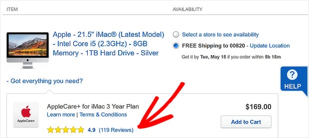
Ever noticed that most products on major online retailers show a star rating wherever you see them? That happens in the checkout, too. It’s a great way to make shoppers more confident they’re doing the right thing.
20. Add An Upsell
When it comes to checkout page optimization, don’t just think about getting shoppers to complete the current sale. Consider getting them to buy even more.
One way to do this is with an in-cart upsell. You can do this by:
- Showing shoppers items relevant to what they’re already buying
- Offering an upsell just after a purchase
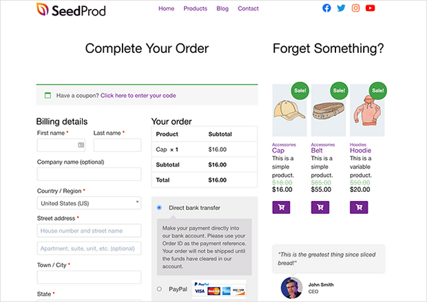
You can easily display products on the checkout page using SeedProd and its custom WooCommerce product grid blocks.
Here’s an example:
21. Offer a Downsell
If customers aren’t completing a purchase, and don’t respond to an upsell, a downsell is another option. This can help to build trust by providing an option that meets the shopper’s budget.
You’ll know if it’s time to offer a downsell if your customers look at a particular item, then keep checking back for a cheaper version of it. You can find this information in the Behavior Flow report in Google Analytics, which tracks visitors’ progress through the site.
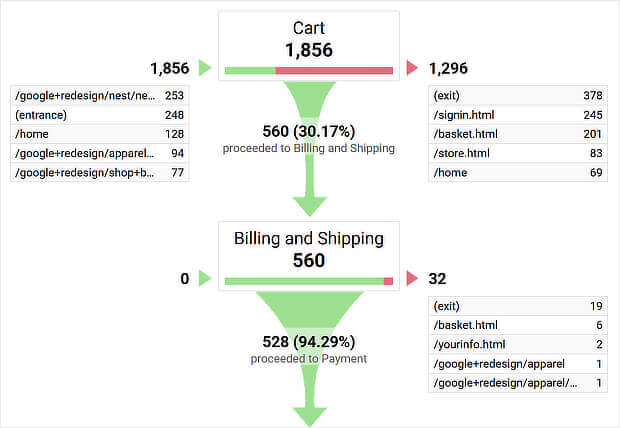
You can also use OptinMonster’s page-level targeting feature to make a time-limited price reduction for people who have items in the cart but don’t seem to be completing the sale. To find that, log in to Google Analytics, and go to Conversions » Goals » Funnel Visualization. That’ll give an overview of shopping cart conversions.
22. Test and Measure
Finally, use analytics and testing to work out where you need to optimize your checkout flow.
As we’ve seen, analytics will show you where you’re losing customers. And A/B testing will help you experiment with ways to keep them on your site. Here’s how that could work.
You send an abandonment email, and recipients follow a link back to your site. You can use the A/B testing built into OptinMonster to show two different versions of an offer designed to make those visitors buy. Then you can see which one gets the best response, and use that campaign to win more sales.
See the video below for more details of OptinMonster’s split testing feature.
This is an ongoing process. You’ll measure and test till you have the best-optimized page you can create, and then you’ll likely do it again.
That’s it!
Now you know the best practices for eCommerce checkout page optimization. If you want to optimize other areas of your eCommerce site, check out our tips on improving product pages, boosting eCommerce conversion rates and eCommerce personalization.
If you’re using Shopify, be sure to check out our complete guide to Shopify Abandoned Cart Recovery.
And follow us on YouTube, Facebook, and Twitter for more eCommerce marketing tips and guides.







Add a Comment