Are you interested in some inspiring abandoned cart email examples?
And why shouldn’t you be? Research shows that the average cart abandonment rate is 69.99%, responsible for $18 billion in lost eCommerce sales annually.
Email marketing for abandoned cart recovery is one of the easiest ways to recover lost sales. It aims to remind the customer of their interest, address any concerns or objections they may have had, and ultimately prompt them to complete the purchase.
But how do you create cart recovery emails that look great and get the job done?
In this article, we’re showcasing 14 effective abandoned cart email examples designed to significantly boost your sales.
We’ll also provide you with customizable abandoned cart email templates, serving as a perfect starting point for your campaigns.
Let’s begin!
- What Are Abandoned Cart Emails?
- Abandoned Cart Email Sequence
- 14 Abandoned Cart Email Examples
- Abandoned Cart Email Templates
- Abandoned Cart Email Best Practices
- Capturing Emails During Cart Abandonment
- 4 Ways to Recover Abandoning Users’ Email
What Are Abandoned Cart Emails?
Abandoned cart emails are marketing emails sent to customers who have added items to their online shopping cart but have not completed the purchase.
Abandoned cart emails typically include information about the items left in the cart, encouraging the customer to return to the website and complete the purchase. It may also include personalized messages, coupon codes, or incentives to entice the customer to take action.
Abandoned cart emails are a popular tactic in eCommerce business and have proven effective in increasing conversion rates and generating additional revenue.
Resource: 29 Best Email Automation Tools to Transform Your Business
Abandoned Cart Email Sequence
Here’s a concise structure for the abandoned cart email sequence:
First Email – Initial Reminder (24 hours post-abandonment)
- Content: A friendly reminder about the items in the cart.
- Subject Line Example: “Looks like you left something behind!”
Second Email – Personalized Follow-Up (48 hours)
- Content: Personalize the message, possibly suggesting related products.
- Subject Line Example: “Still thinking about your cart items?”
Third Email – Incentive Offer (3-5 days)
- Content: Offer a discount or free shipping to encourage purchase.
- Subject Line Example: “Here’s a special discount to complete your purchase!”
Fourth Email – Urgency Note (1 week)
- Content: Create urgency by noting limited stock or offer expiry.
- Subject Line Example: “Hurry, your cart items are in demand!”
Fifth Email – Feedback Request (10-14 days)
- Content: Ask why they didn’t complete the purchase for insights.
- Subject Line Example: “Tell us what stopped you?”
Key Tips:
- Keep the tone friendly and helpful.
- Ensure clear, direct links back to the cart.
- Optimize emails for mobile devices.
- Use clear calls-to-action.
This sequence aims to re-engage customers, recover sales, and gain insights into shopping behaviors.
Let’s look at the best abandoned cart email examples you can use to recover as many lost sales as possible.
14 Abandoned Cart Email Examples
1. Amazon
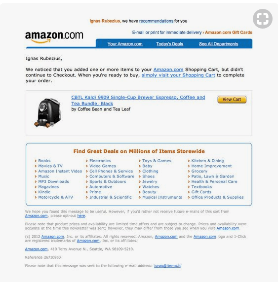
As the world’s largest online retailer, following Amazon’s lead is a good bet. It’s pretty clear that Amazon uses a simple cart recovery email template that works for any of their stores. By the way, they also send follow-up abandoned search emails related to what you’ve been looking at.
What we liked:
- This is a very simple email campaign that gets straight to the point.
- It reminds you where you were shopping.
- It includes a photo of the item left in the shopping cart as a reminder.
- There’s a link to the item so the recipient can head straight to checkout, removing obstacles to completing the purchase.
What we didn’t:
- The bottom of the email is a mess. Is there really a need for all of those Amazon links?
- We’d love to see an incentive for completing the purchase, like discount code. However, this approach clearly works for Amazon.
2. Asos
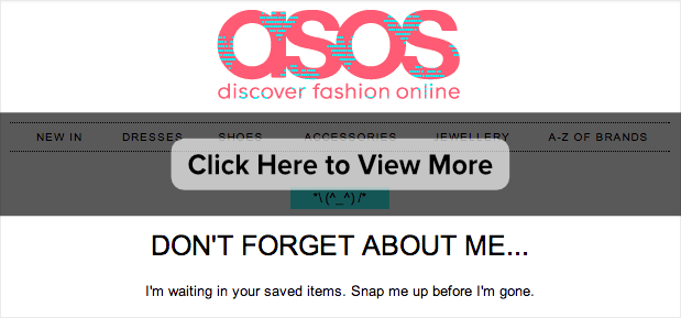
The abandoned cart email template from Asos is also pretty simple.
What we liked:
- ASOS has nailed brand recognition with this email. It looks very similar to the store’s homepage.
- The messaging is also on-brand, with some playful humor in the headline and copy. The ASOS marketers clearly know their buyer personas.
- The email campaign includes a picture of the item in the cart to jog the recipient’s memory with a visual.
- The email reminds recipients about the return policy and that there’s no shipping cost. This removes the risk of completing the sale, which will help with conversions.
What we didn’t:
- To be honest, we liked everything about this email from ASOS.
3. Barkbox
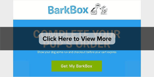
Barkbox brings the fun in with this abandoned cart email example, and we think it works – mostly!
What we liked:
- The GIF of an excited dog receiving the order is absolutely right for the audience and guaranteed to get attention.
- There’s a reminder of what’s inside a typical Barkbox to reawaken recipients’ interest.
- The copy is cute: “show your dog some ruv” will melt any dog owner’s heart. This is mirrored by the cartoon drawings of dogs at the top and bottom of the email.
- The email includes 2 identical calls to action (CTAs) at the top and bottom of the email.
- There’s a cart expiry warning to trigger action based on urgency, which is usually a good marketing tactic.
What we didn’t:
- One possible improvement would be to show the actual Barkbox the recipient ordered to make it more personal. In eCommerce, personalization helps to make sales.
4. Chubbies
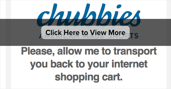
Does beachwear have anything to do with sci-fi? If you believe this example from Chubbies, there’s definitely a link.
What we liked:
- Chubbies clearly knows its audience. The words “transport” and “teleport” in the email subject line, copy, and CTA are designed to appeal to them.
- There’s humor throughout the copy in encouraging readers to go back to the cart.
- You can’t miss the call to action.
- There’s an eye-catching image early in the email, related to Chubbies’ products.
What we didn’t:
- Like the Barkbox example above, this would have been even better with a specific photo of the item in the recipient’s cart, but generally, this email works.
5. Dollar Shave Club
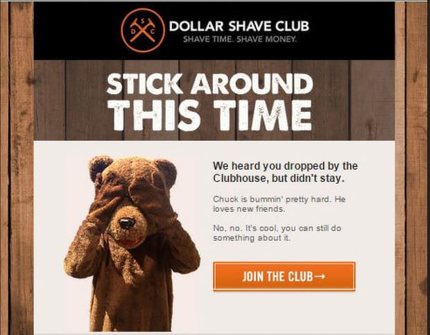
Dollar Shave Club is known for excellent marketing, so it’s no surprise that it’s one of the most appealing of our abandoned cart email examples.
What we liked:
- The bear covering its eyes is intriguing and will encourage recipients to read the email.
- The copy is written in everyday, laid-back language, which is perfect for the company’s audience.
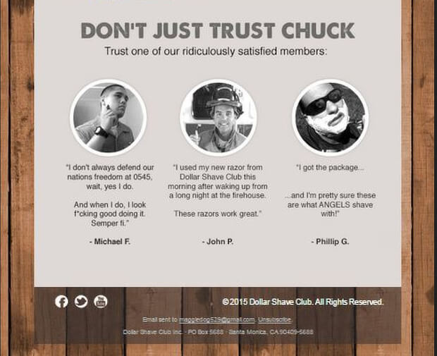
- This carries through to the customer testimonials, introduced with a “Don’t Just Trust Chuck” subhead:
Overall, there’s a sense of fun and personality that really appeals to their target audience.
What we didn’t:
- We’d like to see Dollar Shave Club could add another call to action under the testimonials for recipients who read that far down.
6. Glossier
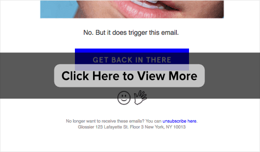
As you’ll see, Glossier’s got a pretty cool cart recovery email.
What we liked:
- Glossier is upfront about the fact that this is an automatically triggered email and plays with that in the copy.
- The eye-catching brand image is designed to get attention.
- It’s short and to the point, with an explicit link to the shopping back near the top of the email.
- The “Get back in there” CTA button is amusing.
What we didn’t:
- We’d suggest testing if including an image of the item that’s in the cart makes a difference to conversions and sales.
7. Google
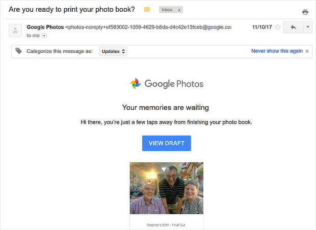
Google is known for keeping things simple, and this cart abandonment email for a Google Photo Book is no exception.
What we liked:
- The email includes a photo from the book, and photos always get attention.
- The subject line reminds the recipient of the next stage in the process.
- The simple and clear CTA.
What we didn’t:
- This email campaign is almost too minimal.
- A bigger photo would get more attention.
8. Hayneedle
Home furnishings retailer Hayneedle knows how to sweeten the deal for shopping cart abandoners.
What we liked:
- The email highlights an incentive discount in the subject line and first image.
- There’s a reminder of what’s in the cart.
- The CTA highlights the benefit of completing the order.
- Their images of related products are on point – exactly what someone considering purchasing this item might want to look at.
What we didn’t:
- Actually, we liked everything. This cart abandonment email works.
9. J. Crew
Retailer J. Crew goes for simplicity with this abandoned cart email example.
What we liked:
- The email mimics the look of the main site, with menu links for the main shopping categories.
- There’s a large picture of the item in the cart to remind the recipient what they were buying.
- The words “shopping bag” in caps are another instant reminder.
- The positive reinforcement of “Nice picks, btw” is designed to appeal to the shopper’s vanity in a small way.
- The email tries to entice recipients by mentioning other items on sale.
What we didn’t:
- It could have been helpful to mention a shipping incentive or show product recommendations from the sale.
10. Jessops
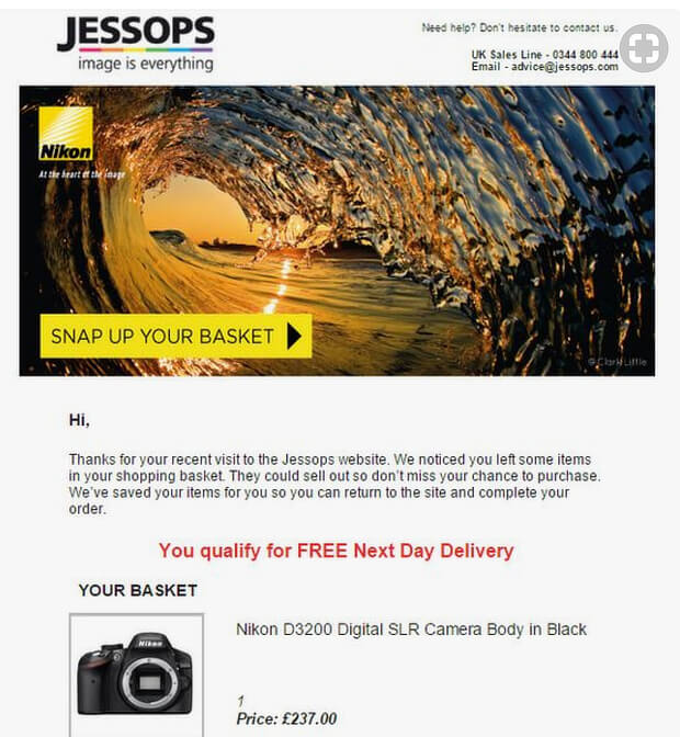
As you’d expect, abandoned cart email examples from photography company Jessops take a more visual approach than most.
What we liked:
- Killer images – every version of this we’ve seen has an eye-catching image right at the top.
- The “snap up your basket” CTA is a photography pun that will appeal to the audience.
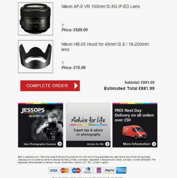
- The email includes product images of the items in the basket, followed by a regular CTA.
- There’s a reminder about free delivery as an incentive to complete the order.
- The bottom of the email design includes boxes highlighting other Jessops Academy features, and multiple payment options. Both of these may remind recipients why they were shopping there in the first place.
What we didn’t:
- It would have been good to use the shopper’s name in the email to get their attention even more.
- Links to the Jessops Academy and, presumably, the blog, seem wasted in an email going to someone who hasn’t completed a purchase yet.
11. Microsoft
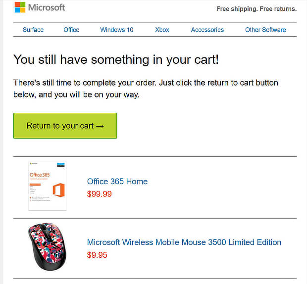
This reminder from the Microsoft Store is pretty minimal.
What we liked:
- There’s nothing to distract the recipient. The copy is short and to the point.
- There’s a visual reminder of the item in the cart.
- The abandoned cart email features a single, clear, CTA.
What we didn’t:
- There’s no incentive to complete the purchase, perhaps because this isn’t an expensive item.
12. Orlebar Brown
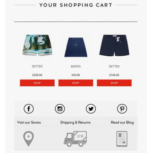
Here’s an example from clothing retailer Orlebar Brown.
What we liked:
- The main image is similar to images on the company’s website, reinforcing the brand.
- There’s a clear reminder of what’s in the cart.
- It shows where to get shipping and returns information.
What we didn’t:
- The “Shop” CTA seems a little dull, and could easily be replaced by a single CTA going straight to the cart.
- 3 identical buttons is definitely overkill.
13. PacSun
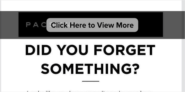
And here’s another example of an abandoned cart email from a clothing retailer, this time from Pacsun.
What we liked:
- You can’t miss the headline.
- There’s a large image of the abandoned item.
- The “view my bag” CTA button uses curiosity to encourage recipients back to the site.
- The copy uses urgency with the words “hurry back”.
- There are links to related and popular items the recipient might like.
What we didn’t:
- We think the links in the top half of the email should all go back to the cart. In the example we looked at, the first image linked to the product page.
14. Russell Brunson
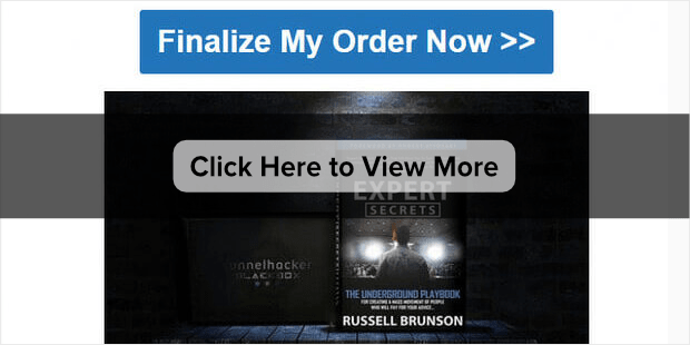
We haven’t yet had abandoned cart email examples for info products, so here’s one from Russell Brunson for his Expert Secrets launch. Four follow-up emails are in the sequence, though we’ll look at the first one.
What we liked:
- The abandoned cart email subject line appeals to the emotions, trying to generate excitement and improving the open rate.
- The copy is friendly, just one person talking to another.
- There’s a big, bold, unmissable call to action to complete the order.
- The email copy reminds recipients of what’s included in the deal.
What we didn’t:
- It’s not a personalized email, though that’s probably because the recipient hasn’t yet provided a name.
And that’s it! These have been 14 of the best abandoned email examples from around the web.
Abandoned Cart Email Templates
Here are three abandoned cart email templates you can use as a starting point for a text based email:
Template 1
Simple Reminder Subject: You left something behind – Complete your purchase!
Hi [Customer’s Name],
We noticed that you left items in your cart, and we wanted to remind you to complete your purchase. Don’t miss out on the great products you selected! Click the link below to return to your cart and finalize your order.
[Call-to-action button: Return to Cart]
If you have any questions or need assistance, our friendly customer support team is here to help. We appreciate your consideration, and we hope to see you back soon!
Best regards, [Your Company]
Template 2
Limited-Time Offer Subject: Complete your purchase now and enjoy 10% off!
Hello [Customer’s Name],
We wanted to let you know that the items in your cart are still available, and we’re offering a special discount to encourage you to complete your order. For a limited time, enjoy 10% off your purchase. Just use the code CART10 at checkout.
[Call-to-action button: Complete Your Purchase]
If you need any assistance or have any questions, please don’t hesitate to reach out to our dedicated support team. We’re here to ensure your shopping experience is seamless.
Thank you for considering our products. We look forward to serving you!
Warm regards, [Your Company]
Template 3
Social Proof Subject: See why others love our products – Don’t miss out!
Hi [Customer’s Name],
Your cart is waiting for you, and we wanted to share some customer reviews with you. Our products have received rave reviews from happy customers just like you. Take a look and see what others are saying!
[Include 2-3 positive customer reviews or testimonials]
Ready to make these fantastic products yours? Simply click the link below to return to your cart and complete your purchase.
[Call-to-action button: Return to Cart]
If you have any questions or need further information, our customer support team is ready to assist you. We appreciate your interest in our brand, and we hope to see you back soon!
Best regards, [Your Company]
Feel free to customize these abandoned cart email templates based on your brand voice, specific products, and any additional incentives you may want to offer.
Abandoned Cart Email Best Practices
Listed below are the best practices for creating effective abandoned cart emails that provide the best customer experience.
Make it personal: Use the customer’s name and mention the items they left in the customer’s cart to make the email feel more personal.
Create a sense of urgency: Let customers know that the items in their cart might run out or offer limited-time discounts to encourage them to buy quickly.
Use clear call-to-action buttons: Make it easy for customers to return to their cart by using big buttons that stand out and lead directly to the checkout page.
Use social media: Include links to your social media accounts in the email so customers can connect with your brand and stay updated on promotions.
Offer an unsubscribe option: Give customers the choice to unsubscribe from future emails if they want to.
Send reminder emails: Consider sending a series of cart reminder emails to remind customers about their abandoned carts over time.
Show customer reviews: Include positive reviews from other customers to build trust and show the quality of your products.
Provide good customer support: Let customers know how to contact you if they have questions or need help. Being helpful can increase the chances of customers completing their purchases.
Remember to test different elements of your emails and analyze the results to see what works best for your customers.
Capturing Emails During Cart Abandonment
While we are on the topic of abandoned cart emails, it’s equally important to talk about grabbing your potential customers’ emails before they leave your site forever.
In other words, your abandoned cart email strategy is only useful if you have an email list of potential customers and leads.
And for that, there’s no better tool than OptinMonster:
OptinMonster is the world’s #1 lead generation software, making recovering sales from abandoned carts easier. That’s because it allows you to create professional-looking and highly effective optin campaigns.
“Optin campaigns” are simply notifications that display via popup, floating bar, fullscreen welcome mat, and more.
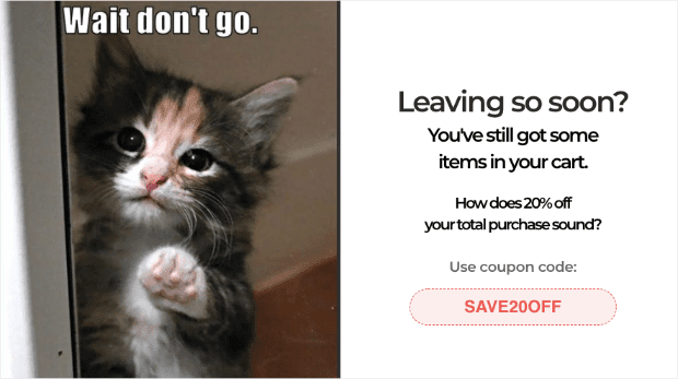
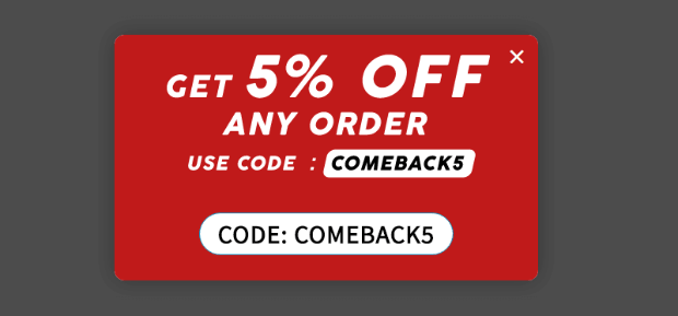
In fact, you’re probably familiar with optin campaigns. They look something like this:
The popup example from above was specifically designed to reduce cart abandonment. Plus, it only took 5 minutes to build.
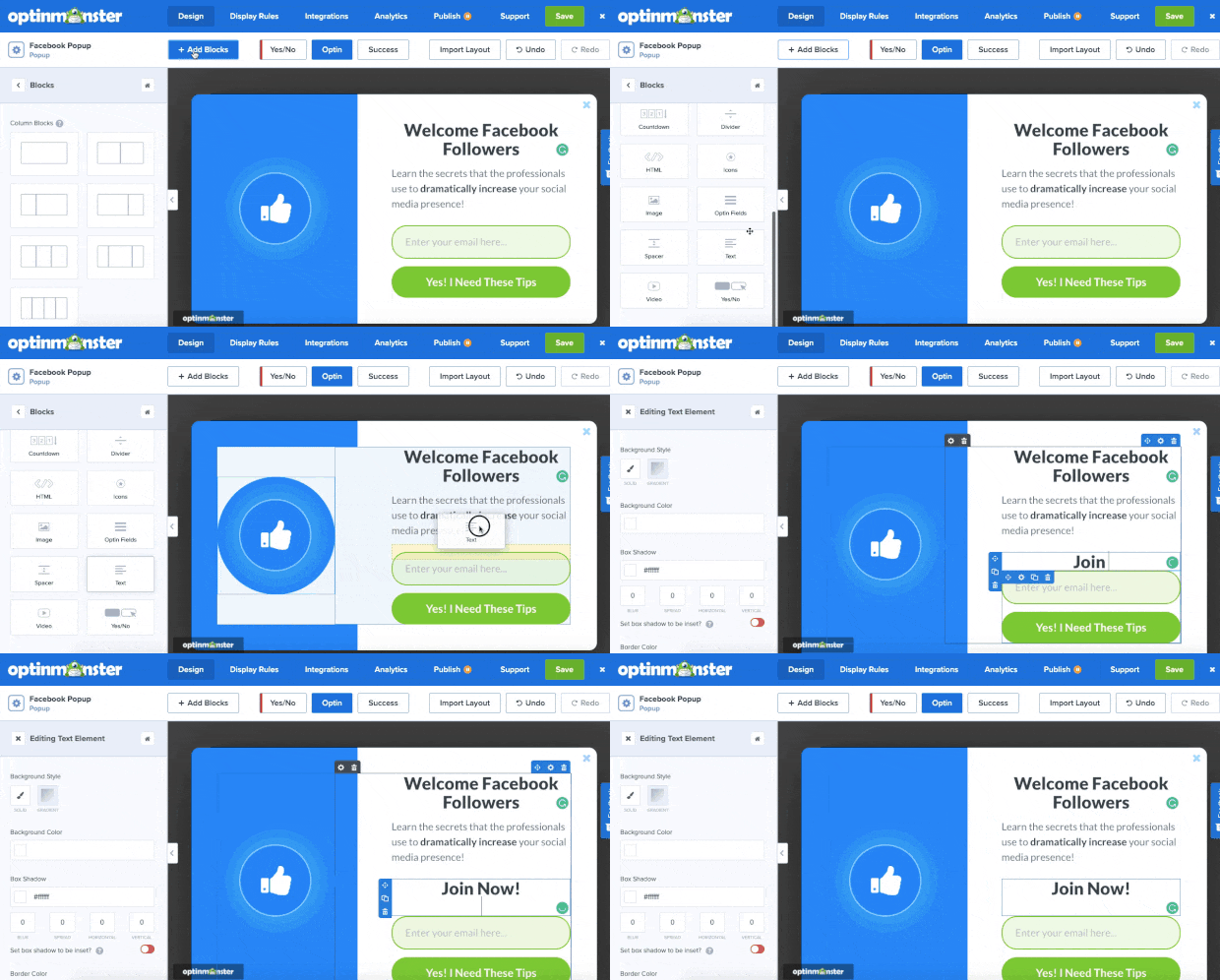
That’s because OptinMonster has over 100 pre-made templates that look stunning across all devices. And when you select the template you want (or build one from scratch), making changes to your campaign is easy.
OptinMonster has a drag-and-drop editor, which means there are zero coding or “tech skills” required to design the perfect campaign for your business:
But creating the right campaign is only half the battle when you’re trying to recover abandoned carts.
You’ll also need to show these campaigns to the right people, in the right places, and at just the right time in their customer journey.
OptinMonster gives you more targeting rules and triggers to make this happen. Some of the more popular rules include:
- Exit-Intent® Technology: Engage users as they’re actively leaving your store.
- MonsterLinks™: Turn any campaign into a clickable button or anchor text.
- Page-Level Targeting: Target specific pages of your site (like checkout pages or product pages, for example).
- Geo-Location: Display campaigns based on where your visitor is physically located.
- OnSite Retargeting®: Create drip campaigns to show new offers based on how users interacted with previous messages.
And much more.
These are just a few examples of the targeting rules you can use, though there are many others. But how do these rules help you?
By targeting a specific group of your site’s visitors, you can personalize the messaging of your campaigns. This will connect more deeply with the person who sees it, ultimately leading to higher conversion rates for you.
This is how Scott Wyden recovered 21% of abandoned carts on his website.
Want to see it in action for yourself? Click below to start your 100% risk-free OptinMonster account today:
But now you may be wondering: “How would I use popups to capture emails for abandoning users?”
Let’s look at four ways you could make that happen.
4 Ways to Recover Abandoning Users’ Email
1. Leveraging Exit-Intent® Technology
The first and easiest way would be to create an exit-intent popup.
This allows you to show a campaign when someone leaves their browser page on mobile and desktop devices.
Here’s how it works:
- You build a beautiful campaign
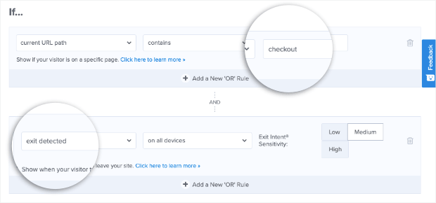
- Add a page-level targeting rule to target your user’s checkout page
- Add an exit-intent rule to the same campaign
And that’s it! You would have two rules that look something like this:
When someone tries to leave their checkout page before paying, you can re-engage them with an enticing popup.
2. Building Urgency With a Countdown Timer
Ready to take things to the next level? The last tip was a great place to start.
But you can boost the conversion rate with your exit-intent popup by adding a countdown timer to create a sense of urgency.
This is important because many people abandon their carts with the best intention of returning to pay. The problem is that a million things distract them, and they never remember to come back.
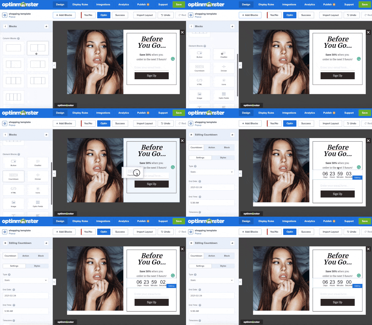
You can prevent this by adding a countdown timer to your exit-intent popup. The fact that the user sees a limited time (expiring) offer will trigger their FOMO (fear of missing out), making them more likely to take action.
This can quickly be done with OptinMonster using drag and drop:
This can motivate your customers to finalize their purchase before they forget.
Check out this helpful resource to learn how to add a countdown timer to your campaigns: How to Create a Countdown Timer Popup to Skyrocket Sales.
3. Keeping Things Fun With a Gamified Popup
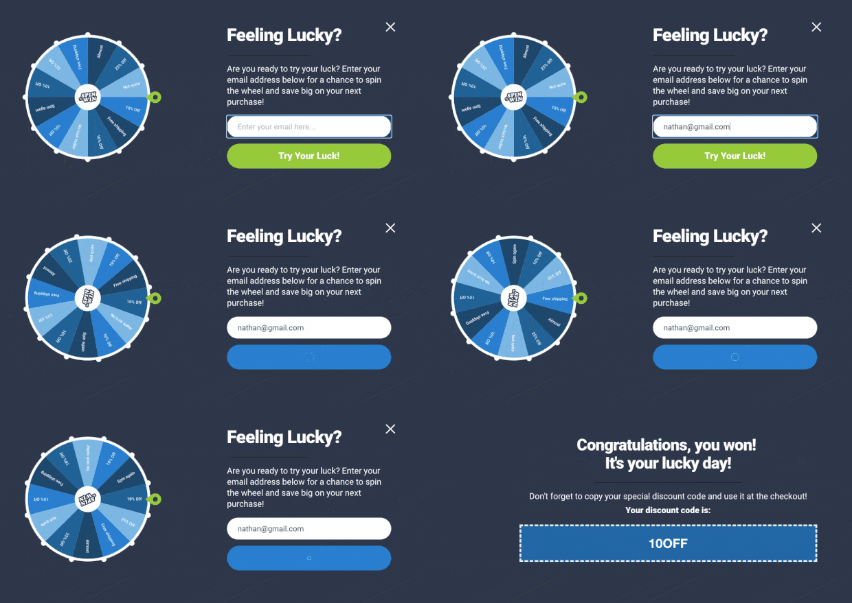
Another option is to use a “spin to win” discount wheel popup. This is an excellent way of adding some fun to your online store.
It’s also incredibly effective at increasing conversion rates. Here’s what these campaigns look like when you build them with OptinMonster:
Putting this on your checkout page is an excellent way of capturing your users’ email addresses before they leave your store for good.
Want to learn how to make one of these? Try starting here: How to Create a “Spin to Win” Wheel to Drastically Boost Engagement.
4. Re-engaging Inactive Users
When customers are ready to purchase, you need everything to go smoothly. Even the slightest distraction makes people forget about their items on hold.
So as users hit their checkout page, they may wander off looking for a credit card, talking with their partner about the purchase, or do one of a million things that might steal their attention.
That’s where an inactivity sensor campaign comes in handy.
This trigger will wait until users have stopped interacting with your website or page for a specified time.
Then it shows your popup where you can offer an incentive for users to hand over their email addresses.
And this doesn’t need to be complicated. Check out this inactivity campaign by Skates.co.uk:
This one campaign was responsible for increasing sales by £2000 per day.
We hope you found this article helpful. If you did, you might want to check out the following resources:
- 7 Proven Ways to Reduce Shopping Cart Abandonment
- 5 Cart Abandonment Stats to Help You Win “Lost” Sales
- How to Create an Abandoned Cart Email Strategy
- 30+ Proven Ways to Use Social Proof to Increase Your Conversions (Updated)
- Unlock the Power of FOMO: 17 Clever FOMO Marketing Examples
These posts will have everything you need to recover more abandoned shopping carts and bring in higher profits to your eCommerce store.
FAQs on Abandoned Cart Emails
1. What do you say in an abandoned cart email?
In an abandoned cart email, you typically start with a friendly reminder about the items left in the cart. Highlight the benefits or features of the products to rekindle interest.
You can also include an incentive like a discount or free shipping to encourage completion of the purchase. It’s important to keep the tone helpful and customer-centric, showing concern for the customer’s needs or potential reasons for abandonment.
2. How do you write an abandonment email?
- Start with a Catchy Subject Line: Grab attention and clearly indicate the email’s purpose.
- Personalize the Message: Use the customer’s name and reference specific items in their cart.
- Be Clear and Concise: Clearly state the purpose of the email and what the customer should do next.
- Include a Call-to-Action (CTA): Direct them back to their cart with a clear CTA button or link.
- Offer Support: Provide contact information for customer support in case they have questions or issues.
- Consider Incentives: Optionally, include a special offer to encourage them to complete the purchase.
3. What is the headline for abandoned cart emails?
The headline for abandoned cart emails should be attention-grabbing and directly related to the purpose of the email.
Examples include: “Did You Forget Something?”, “Your Cart Misses You!”, or “Complete Your Purchase Today!”. The headline should create a sense of urgency or curiosity to encourage the recipient to open the email.
4. Is it legal to send abandoned cart emails?
Yes, it is generally legal to send abandoned cart emails, but it’s important to comply with email marketing laws and regulations such as the CAN-SPAM Act in the United States, GDPR in Europe, and other regional data protection laws.
These laws typically require that the recipient has provided their email address willingly (e.g., during the account creation or checkout process) and that there is an easy way for them to opt-out or unsubscribe from further emails.
Always ensure that your email practices comply with the legal requirements of your customers’ locations.









Add a Comment