Do not read this post unless you want to create a high converting website that will drive website conversion. In other words, unless you want more customers or clients via your website, stop reading right now.
Still there?
Great, let’s talk about how we can make your website a customer generating machine!
The problem with many websites out there (and probably even yours) is that it was built as either a graphic design masterpiece to show off your designer skills or as a hastily put together after-thought in a rush to start your business.
So, in an effort to take you from “meh” to “OMG—I can’t believe all these customers are contacting me,” let us show you how to refocus your website into a customer-luring siren song!
1. Start With a Great Website Foundation
Every website needs a solid foundation.
Just like your house, there’s no point painting the walls if you built it on quicksand.
Same goes with a website. You’re not going to get a website conversion from visitors who stay for a second then bounce.
Ideally, your website needs the following in place in order to get things off to a great start:
An Attractive Design
If you want to show potential customers that you’re serious about your business, you need to present a professional face to the internet. This means having your website professionally designed or, at the very least, looking that way.
If you owned a brick and mortar business, you wouldn’t let a novice paint your storefront. It’s too important—you’d want to make sure it was done right. Well, your website needs a professional coat of paint too!
You won’t get a second chance to create a great first impression, right? And this post from ConversionXL shows that first impressions are 94% design related.
So make sure yours is up to scratch!
Pro TipIf you’re using WordPress as your website builder, check out ThemeLab. They build good-looking, high-quality themes for WordPress that are easy to use.
Keep Your Website Running Like a Well-Oiled Machine
Like a fine-tuned car, a website needs to be maintained and tuned to run optimally and avoid hiccups. Although this may not seem that important, a lot of the things you do to keep a website running actually impact your visitors as well. Think of it this way: what would you do if your eCommerce store was down for an hour?
Some examples of good website maintenance include:
- Ensuring your software is up to date (in the case of WordPress, this means updating plugins, themes and WordPress itself)
- Keeping your website running fast with a CDN, so you don’t lose customers before they even arrive
- Adding site security to keep the hackers out, and your website up and running
Make the Most Important Things Easy to Find
This is where your navigation and links in places like the sidebar and footer come into play.
You need to ensure the most important pages on your site are easy to find to promote website conversion.
Things like your contact page, your product or service pages, or any other pages of primary importance in generating income (or leads) for your business need to be super easy to find.
Don’t assume someone will go hunting. It ain’t hide-and-seek, it’s a business.
So, make it as easy as possible for your visitors to get in touch and buy stuff. If you need an example, look no further than OptinMonster’s navigation menu:
As you can see, each important element—from OptinMonster’s list of features to its pricing information to its blog—is easy to find.
Many of the above points may not seem like they have anything to do with conversion, but think about it: if your website doesn’t look great or load fast, you’re going to lose your potential customers before they even start getting to know you.
So, a solid website foundation is crucial to your success online.
2. Drive Your Visitors Toward Your Goals
Your website exists to get people to fulfill your main business goals. Write it down. Memorize it. This is the key to your online success.
Sure, your site needs to look great and run smoothly, but layered on top of that is something we’ll call conversion-focused design.
Sounds pretty complex, huh? It’s actually not that hard once you know what it means.
The idea is simple: always keep in mind that you’re trying to get visitors to a specific goal (or goals) on your site.
What those goals depend on is you and the type of website you have.
Focusing on micro conversions will really set you up for website conversion success. Some examples include:
- Getting visitors to sign up to your email list (blogs, businesses, etc)
- Luring visitors to sign up for a free trial (SaaS—online tools, memberships, etc)
- Asking users to fill out your contact form (services or coaching businesses)
So, now that you see what kinds of goals you may have, how do you get users to them?
The easiest way is with a call to action.
This normally consists of a headline and other supporting text along with a button that takes the visitors to your goal (a page, a form, etc). Calls to action can be scattered throughout your website in strategic locations (eg. when a user is thinking about something related to your goal) as well being placed in some more common places such as:
…and many more.
One of the best places to grab people’s attention is in the first section of your homepage since it’s typically the most visited page on your website. Often, this is called the hero section of your site as it showcases your hero. No, not superman—a product, service, or offer!
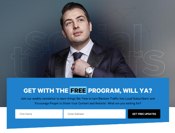
One of the best examples of this on a blog is Derek Halpern’s Social Triggers. He has been promoting this idea for a long time, and his latest version is very sleek indeed.
As you can clearly see below, he’s focused on getting you onto his email list:
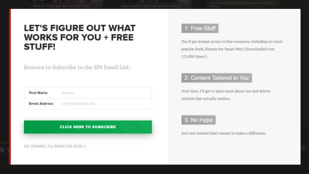
Another classic example of a strategically placed call to action is Pat Flynn’s about page. He knows people who are reading about him are very interested, so he gives them a call to action to sign up to his email list so he can keep in touch:
Obviously, these examples are focused on growing your email list, but you can take the ideas and tweak them to your business goals quite easily.
3. Keep The Search Engines Happy
A lot of people think search engine optimization is all about Google (and maybe Bing).
That certainly used to be true, but the search algorithms have changed so much in recent years that the tables have truly turned.
Today, SEO is all about your visitors.
Which is perfect for making more sales too!
So, when we talk about keeping search engines happy, we are actually referring to your visitors/customers too.
There are a lot of factors that come into play on a website to make your search engine dreams come true, but they’re all worth it in the long run. We have touched on a few of them in the first section, by taking care of your website fundamentals, but now, let’s dive a bit deeper.
1. Mobile-first
Mobile search overtook desktop search in 2015. And, Google made it very clear mobile is critical to search when they released their mobile website tester. This test can quickly tell you whether your site will look good, and function well, on a mobile device.
So, if you’re not sure about your site, give it a try now. If the results are negative/red (and you’ve checked it on a few phones too) get this issue solved ASAP.
2. On-Page SEO—Tweak Your Pages
Even if you are not an SEO expert, it’s worth spending an hour or so learning how to tweak your website to get the most search engine traffic. This is what we call on-page SEO, and this article from Brian Dean of Backlinko will show you what a perfectly optimized page looks like.
This may seem like something really small and not worth your time. However, we’ve seen clients increase traffic 20% in a single month from these kinds of simple changes.
So, ignore on-page SEO at your peril!
4. Build Your Email List
Your email list is actually one of your most important business assets aside from your website or online store.
The reason for this is that it gives you direct access to the inboxes of the people who have given you permission to contact them via email. Not only that, but email is one of the most effective sales channels there is.
So, although you may be having a lot of success with your shop, your website or your offline networking, it’s always worth building your email list and sending out an email newsletter.
There are many different ways to increase subscribers, but one of the simplest ways to get started is to come up with a simple offer for your future customers. This could be anything from:
- A simple checklist
- A how-to guide
- A list of resources
- A small video course
Just make sure your offer is helpful, actionable, and solves a common problem most of your potential customers will have. However, always leave them wanting a little bit more and suggest they get in touch if they need further help. After all, that “further help” could mean using your services or products.
Expert Level TipCheck out OptinMonster University’s course: How to Create a Lead Magnet for step-by-step instructions for creating your first—or 5,000th—lead magnet. FREE to OptinMonster customers!!!
Another trick to using an email list effectively for growing your customer base is to continuously feed it with new content. That might mean a weekly newsletter, previous blog content, helpful tips and case studies (all thrown into a handy autoresponder series).
The idea is to build trust, show expertise, and demonstrate you understand your customer’s problems. Eventually, it will lead them right back to your door.
Marketing automation is such a game-changer. Take a look at our article on email marketing automation tools to find the right tools to make it super easy.
Actionable Tips:
Luckily, there are many helpful tools for getting people on your email list. OptinMonster is a great and cost-effective solution. With features such as Exit-Intent Technology, the Floating Bar, a drag-and-drop form builder, MonsterLinks, and Mobile Templates, OptinMonster has a solution for every list-building need.
The other part of this puzzle is to get yourself an email management system, which is usually online. Don’t think you can maintain it in your contacts, you’ll find yourself on the email naughty list real quick.
We highly recommend Constant Contact. Want more options? Here’s a list of Mailchimp alternatives or SMTP services for you to have a look at.
You’ll also need a place to host your site. Bluehost is a very popular website hosting service, but if you’re looking for something else, here are our picks for Bluehost alternatives in 2019.
Time To Optimize Your Site for Website Conversion
You have everything you need to improve your site and get more customers; it’s time to take action to actually get yourself a website conversion… Preferably more than just one.
To start, find the lowest hanging fruit for your website/business and start there. This would be things like improving site speed, adding a contact form, or including compelling calls to action.
Then, move on to the next most important change you think will help drive more business.
Take it one step at a time, always improving and watching out for ways to make your website better, faster, more goal-focused, and customer-helping!
Now, go get those customers!


Add a Comment