Do you want to improve user experience and reduce shopping cart abandonment on your WooCommerce site?
A WooCommerce Stripe popup can help you do that. It gives customers a fast and easy way to check out so you can increase your sales and conversions with minimal effort.
Today, we’ll show you how to create a Stripe popup for your WooCommerce store.
Plus, we’ll also show you how to create targeted WooCommerce popups to recover abandoning customers.
But first, let’s get clear on why you’d want to use a WooCommerce stripe popup at all.
Why Use a WooCommerce Stripe Popup
More often than not, shoppers add products to their cart and then leave without checking out.
70% of these shoppers never return to your site. Some of the reasons for this include:
- The checkout process was too long
- Cart page took time to load
- Final price of items in cart was too much
- Customer changed their mind
To improve user experience (UX) and get your customers to buy more, Stripe lets you add an easy and fast way to check out on your site.
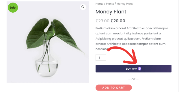
You can enable a ‘Buy Now’ button on your product pages. This button will appear as soon as a visitor adds the product to cart.
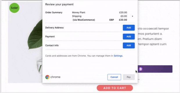
When they click on ‘Buy Now’ button, a checkout popup appears to instantly buy the product without leaving the page.
Once this is set up on your site, it will help increase sales and conversions.
Creating a WooCommerce Stripe Popup
Adding a WooCommerce Stripe popup to your site only takes a few minutes.
In this tutorial, you’ll learn how to enable the Stripe ‘Buy Now’ button with the checkout popup.
Ready to add this option to your store? Let’s get started.
Step 1: Sign up for Stripe Payments
The first thing you’ll want to do is sign up for Stripe so you can add the payment option to your store.
Simply visit the Stripe website and create a free account.
You’ll only need to pay for Stripe when you start collecting payments on your site.
To register your account, Stripe will ask you to add relevant business and website details. This will vary according to your country’s laws and financial regulations.
Once you’ve submitted your details, follow the verification process to activate your Stripe account.
Next, you can add the Stripe payment option to your store.
Step 2: Enable Stripe Payments in WooCommerce
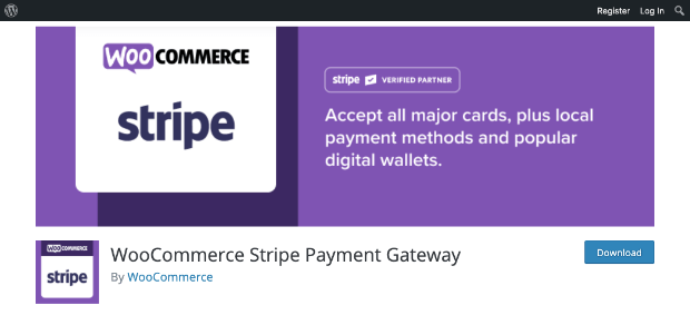
The easiest way to enable Stripe payment options on your store is by using the WooCommerce Stripe plugin.
You’ll need to install and activate it on your site. For more help, follow this guide on how to install a WordPress plugin.
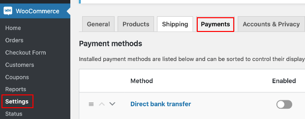
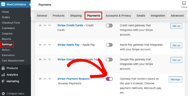
Once you’ve activated the plugin, head over to the WooCommerce » Settings page.
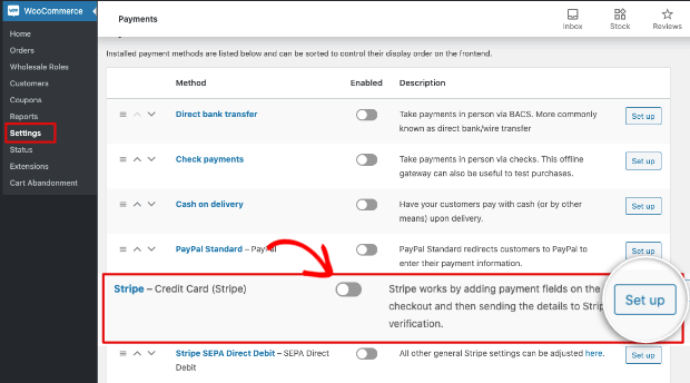
Open the Payments tab and you’ll see the Stripe options available in your country such as credit card, Apple Pay, Google Pay, and Payment Requests.
For this tutorial, we’ll set up the Stripe credit card option. First, you can turn on Stripe credit card payments using the toggle switch.
Then, click on the Set up button.
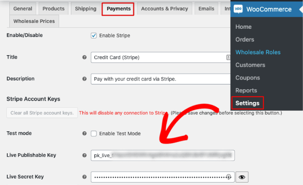
This will open the Payments page where you’ll need to add your Publishable key and Secret key.
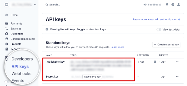
You can find these keys in your account on the Stripe website. Navigate to the Developers » API keys tab.
You’ll see both the keys here. Simply copy them and paste them in the fields on your WordPress site.
Once you’ve set up your API keys, hit the ‘Save’ button to store your changes.
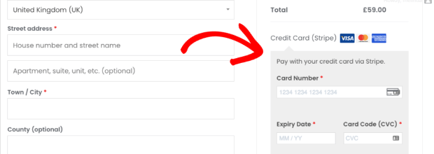
When you visit your website’s checkout page, you’ll see the Stripe payment option available.
Now you’re ready to activate the ‘Buy Now’ button.
Step 3: Enable the Stripe ‘Buy Now’ Button
To enable the checkout popup on your site, you’ll first need to add the Stripe ‘Buy Now’ button.
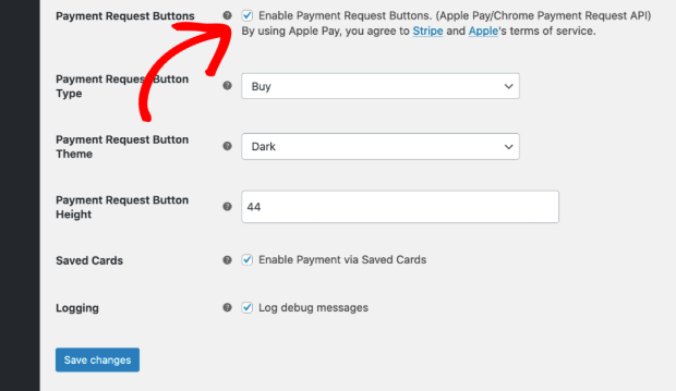
On the same Payments page where you entered your API keys, scroll to the bottom to find the Payments Request Buttons section.
You can enable the button by ticking the checkbox here.
Then, you can customize the button type, color theme, and its height.
Save your changes and visit any product page on your site.
When you add a product to cart, you’ll see the Stripe ‘Buy Now’ button appear.
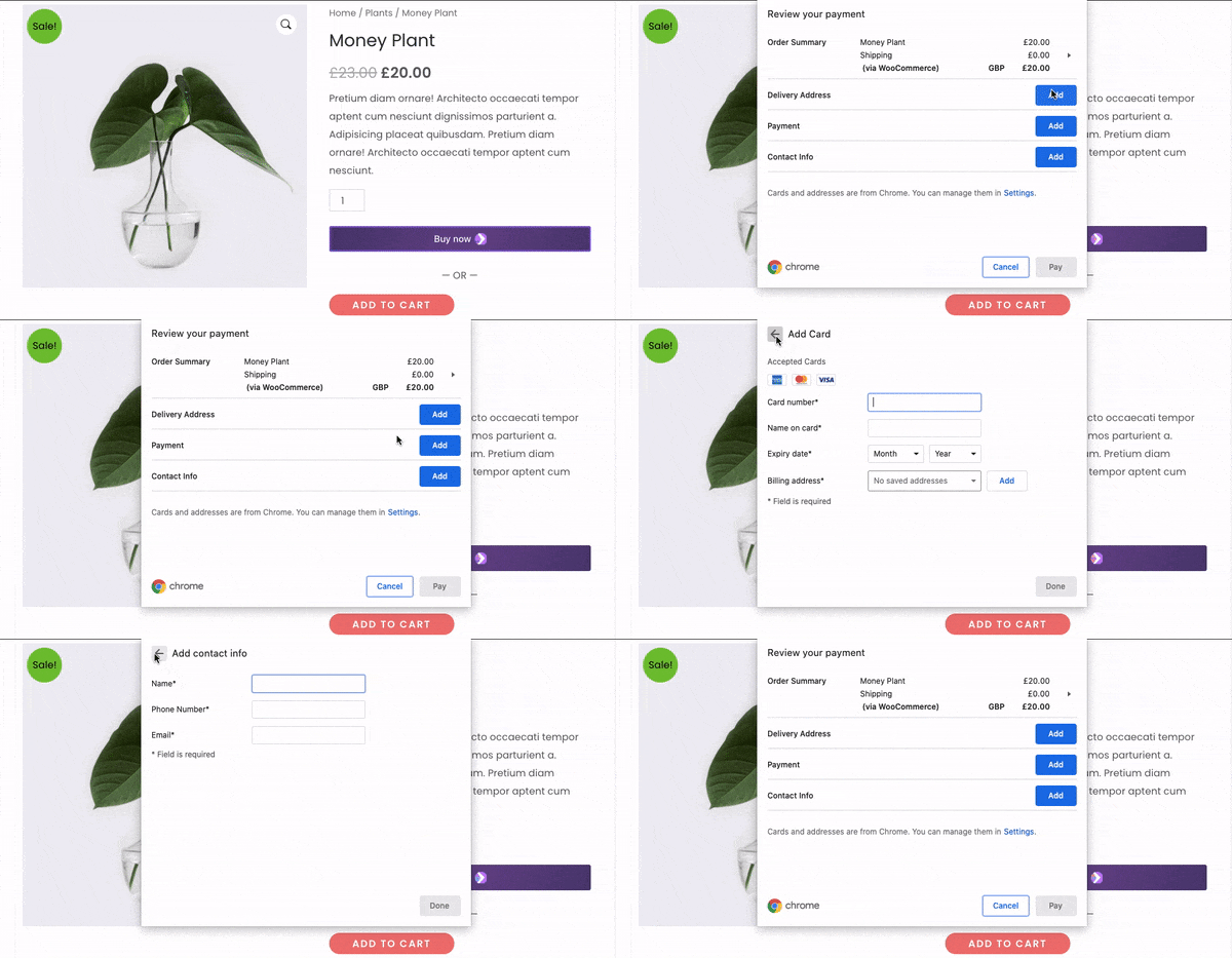
By clicking on this button, you’ll see a modal popup with options to enter a delivery address, payment info, and contact info.
With that, you’ve successfully added a WooCommerce Stripe popup to your site.
Your customers will now be able to buy products directly from the product page their viewing.
Step 4: Enabling Other Stripe Buy Now Buttons
Stripe payment has a number of payment options you can enable on your site. This gives your shoppers a wide variety of choices to complete their purchase.
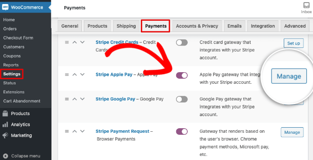
To enable different payment options, navigate to the WooCommerce » Settings » Payments tab. You’ll see the list of payment options available.
Now that you’ve set up your Stripe API keys, you can simply use the toggle switch to enable any Stripe payment option here.
Then you can either set up or manage your settings.
Once inside the settings page, you can choose to display payment specific buttons on your site.
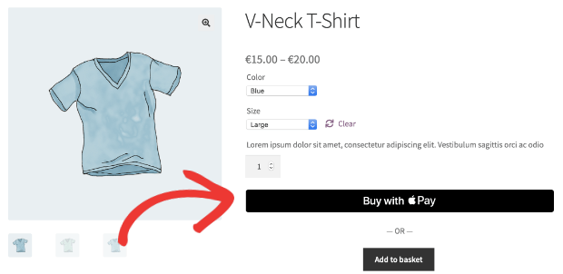
For instance, if your shoppers generally use Apple Pay, you can make it convenient for them by display a button that says ‘Buy with Apple Pay’.
To enable this option, first, turn on the Stripe Apple Pay switch to enable this payment mode. Then select the ‘Manage’ button. If this is the first time you’re enabling Apple Pay, this button will say ‘Set up’ instead of ‘Manage’.
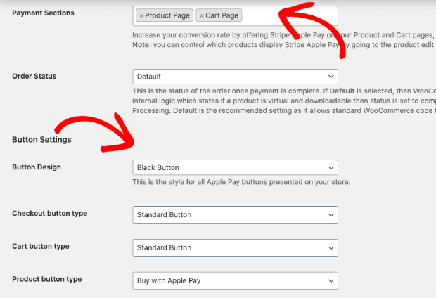
Next, scroll down to see customization options. First, you can choose where you want to display the button. By default, it appears on product and cart pages.
Then, you can customize the button’s design, text, and type.
Once you save your changes, Stripe will display the ‘Buy with Apple Pay’ button on your product pages.
You can follow the same steps to enable other payment buttons like Google Pay.
With that, you’ve learned how to add different WooCommerce Stripe buttons to your site so customers have easy payment and checkout options.
While the WooCoomerce Stripe popup has its benefits, it won’t help much in recovering abandoning visitors or giving them a push to buy.
Customers will also be limited to buying a single product.
That’s why, now, we’re going to show you how to create a WooCommerce popup that will allow customers to check out with all the products in their cart.
Create a High-Converting WooCommerce Popup
WooCommerce has a native popup app that lets you create popups for your store. But it’s very limited in what you can do.
For instance, it only lets you trigger popups based on whether the customer is new, logged in, or existing. This won’t be enough if you want to recover abandoned carts and improve sales.
In this section, you’ll learn how to display a popup based on a shopper’s behavior or actions on your site.
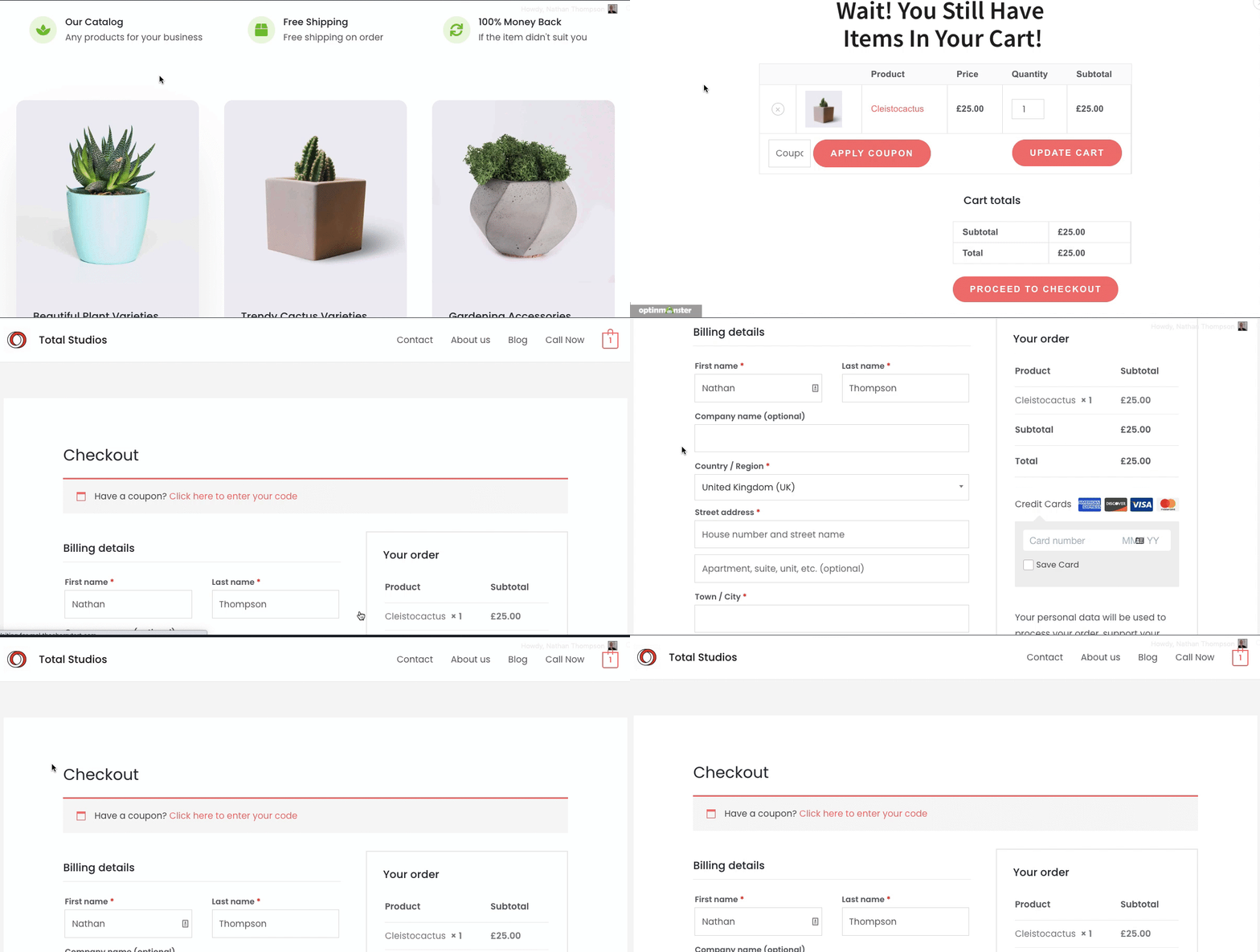
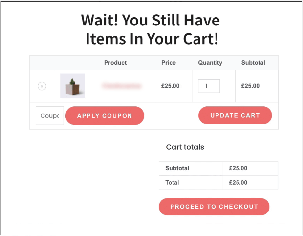
For example, if a shopper has items in their cart and is about to leave without checking out, you can trigger a popup that reminds them to complete their purchase:
This popup displays the cart and lets them check out easily with Stripe or any other payment options you offer.
The best way to create targeted popups in WooCommerce is using OptinMonster.
OptinMonster is a premium WordPress plugin that lets you create lead generation campaigns like popups, inline forms, slide-ins, and more.
It’s also the world’s #1 conversion optimization tool that makes it easier to recover sales from abandoned carts.
With OptinMonster, you get access to powerful targeting features to display popups based on what the visitor likes and what actions they take on your site.
OptinMonster comes with Exit-Intent® technology that detects visitors leaving your site. It then triggers a popup to ask them to complete their purchase or sign up for your newsletter.
It also has an InactivitySensor™ to display campaigns to customers that have stopped engaging with a page.
This rule allows you to recapture your visitor’s attention before they become too distracted and forget about the items in their cart.
OptinMonster also lets you control which pages your campaigns appear. So for the WooCommerce popup, you can choose to display it only on the cart or checkout page and exclude all other pages.
You’ll also love these other features offered by OptinMonster:
- 50+ beautiful templates to create campaigns in minutes
- Drag and drop builder for easy customization
- Add countdown timers to build urgency
- More targeting options than any other tool
- Seamless integration with email service providers
- A/B testing and actionable insights to optimize campaign results
But, of course, there’s nothing like seeing how the tool works first-hand. Click below to start your 100% risk-free OptinMonster account today:
Now that you know what OptinMonster has to offer, we’ll show you how to create a targeted WooCommerce popup.
To follow along in this tutorial, you’ll need to install OptinMonster on your site.
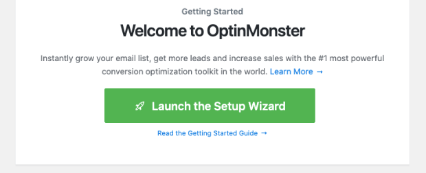
When you’re done, you can access OptinMonster from your WordPress dashboard and launch the setup wizard to upgrade your account.
When you’ve set up your account, you can follow the steps below to create the WooCommerce Stripe Popup.
Step 1: Create a New Campaign
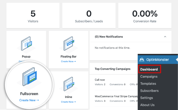
To create your first OptinMonster campaign, from your WordPress dashboard menu, click on the OptinMonster tab.
This will open up the OptinMonster dashboard where you can select a campaign type. Today, we’ll use a fullscreen mat to draw the attention of the user to the cart page.
Next, OptinMonster will display a list of templates you can use to create your popup.
By hovering over any template, you’ll get an option to preview it. And then you can click on the ‘Use template’ button to select it.
We’ll use the ‘Canvas’ template that lets you start from scratch as our popup design will be quite simple.
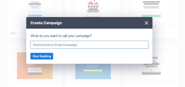
OptinMonster will ask you to name your campaign. You can name it ‘WooCommerce popup’ or ‘abandon cart popup’.
Then click on the ‘Start Building’ button to design your popup.
Step 2: Design the Targeted WooCommerce Popup
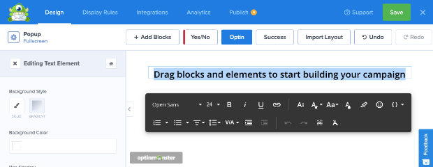
In the drag and drop builder, you’ll see a preview of your popup along with a menu on the left.
This is a visual builder so you can make changes directly in the popup preview. Simply select any element to edit it.
You can delete unwanted elements by selecting them and clicking on the trashbin icon.
When you select the text element, you’ll see a toolbar with options to change the text, font, color, and more.
Next, you’ll need to embed the cart page in the popup.
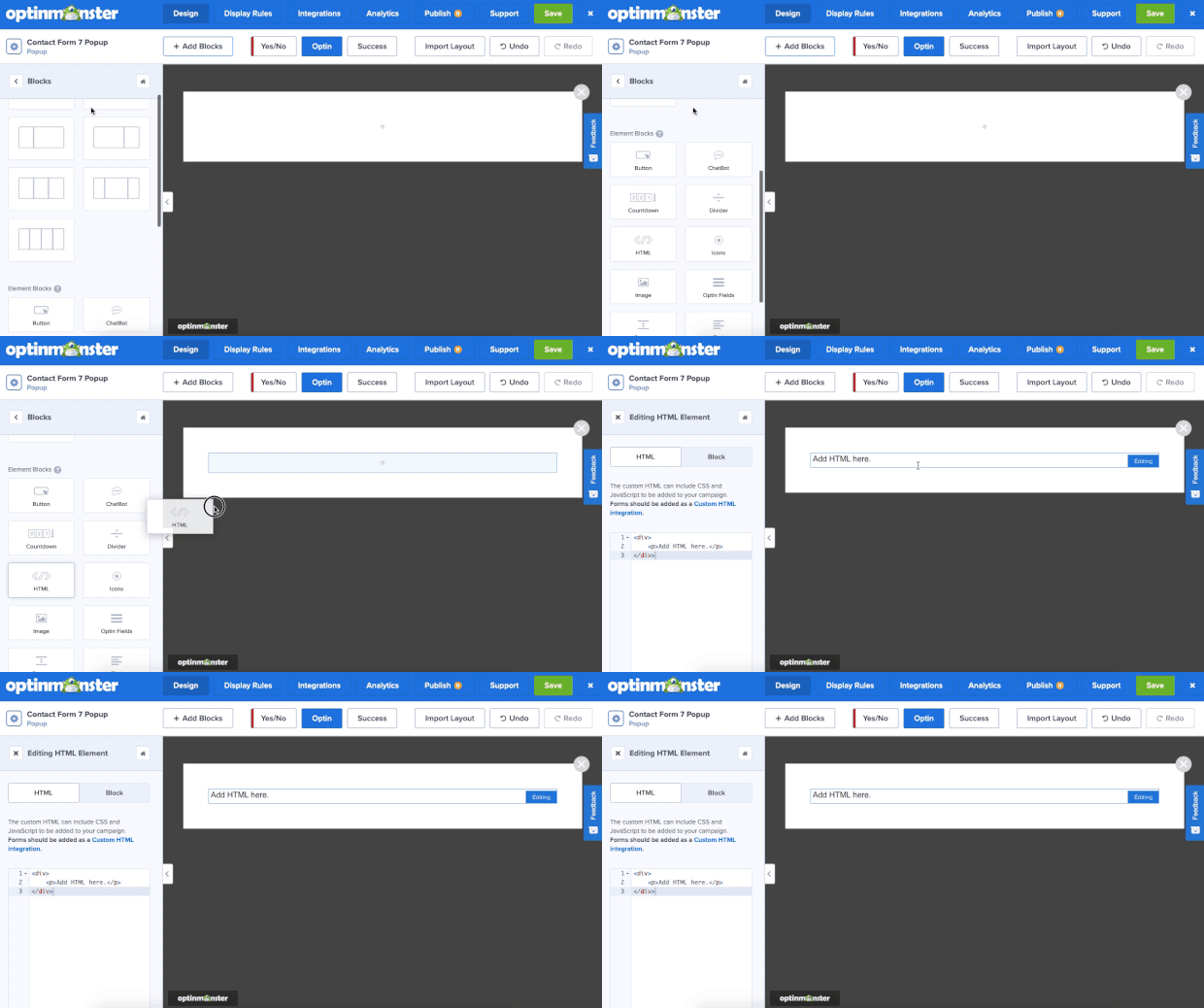
To do this, select the Add blocks button and you’ll see the available blocks in the left menu.
Select the ‘HTML’ block and drag and drop it into your campaign. The settings for the block will open up in the menu on the left.
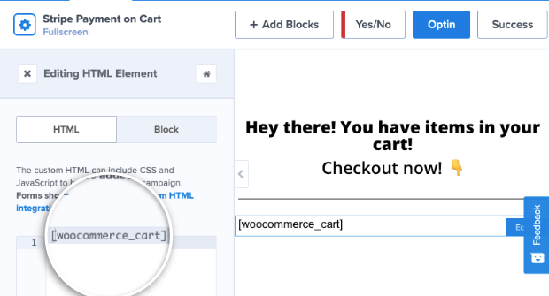
Here, you’ll need to delete the default code and replace it with this shortcode: [woocommerce_cart].
This code will embed the cart page in the popup. However, you’ll only see the shortcode in the preview. The cart page will appear in the popup once the campaign is published on your site.
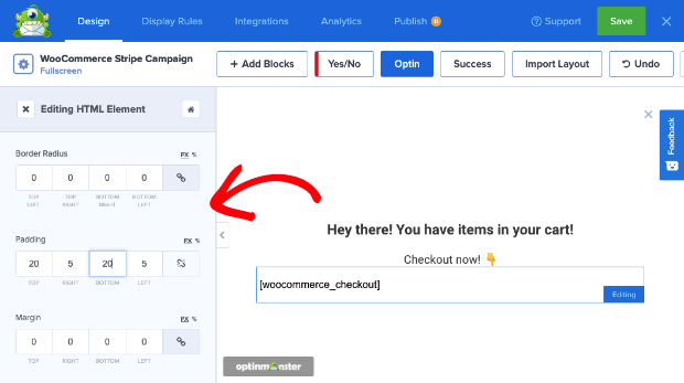
Next, you may want to style this block by adding a border or padding. In the left column, switch from the HTML tab to the Block tab.
You’ll see options to style the background so you can make it vibrant and eye-catching.
You can also add a box shadow, border, margin, and padding to style your form.
OptinMonster has some really powerful features that you can use to optimize your popup for conversions.
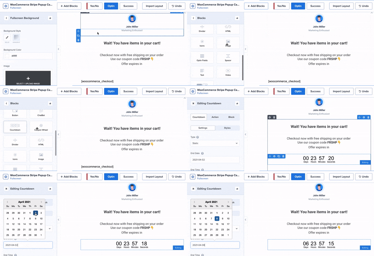
For example, you can display a countdown timer to create a sense of urgency. That way, you can offer a discount or free shipping and make it a limited-period offer.
To add the countdown timer, select the ‘Add Block’ button and drag and drop the countdown timer into your campaign. You can then select the date and time on which you want the offer to expire:
The clock will reset according to the expiry period you pick. With that, customers will have an even better reason to complete their purchase.
Again, this is just one example of what you can do with your OptinMonster campaigns.
With all the features available to you, though, the sky really is the limit.
Step 3: Set Up Display Rules To Target Customers
Now that your popup is designed, you can apply rules to control when, where, and to whom it appears.
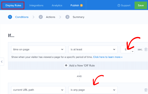
Switch over to the Display Rules tab and you’ll see that, by default, OptinMonster displays the popup after the user has spent 5 seconds on any page on your site.
We’ll change that to target customers that are abandoning their cart.
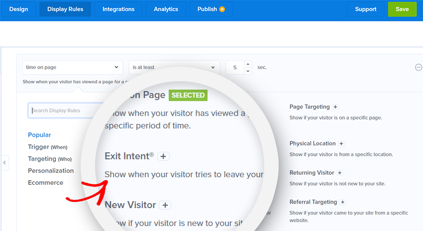
Click on the ‘time on page’ dropdown menu to open the targeting rule options.
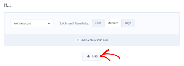
Here, select the Exit Intent® rule.
Then add a new rule by clicking on the + AND button.
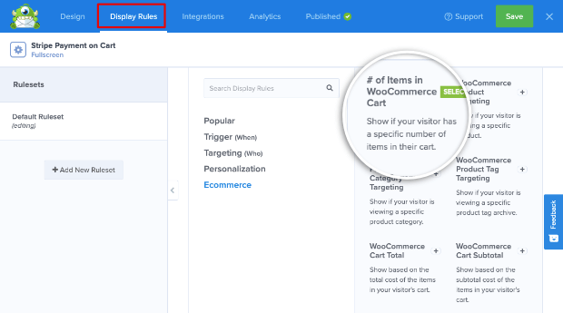
Search for ‘woocommerce’ to get the WooCommerce targeting rules.
Select ‘# items in WooCommerce cart’ to display it to any customer who has products in their cart.
Next, set the item amount to ‘1’.
With that, the popup will appear to every customer that has a product in their cart.
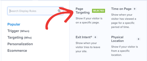
Finally, we’ll add one more rule to make sure it displays on any page on your site.
Using the + AND button again, select the Page Targeting rule.
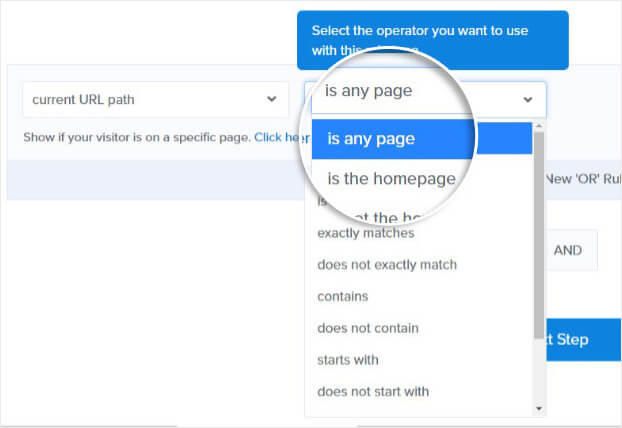
Then use the dropdown menu to select ‘is any page’. You can also display it only on specific pages or exclude certain pages on your site.
Now your campaign will appear to customers who have products in their cart and are leaving your site without completing their purchase.
Step 4: Change the Display Settings
OptinMonster lets you control when the campaign reappears to a visitor after they’ve seen it.
We want to show this campaign to visitors any time they leave the site with items in their cart.
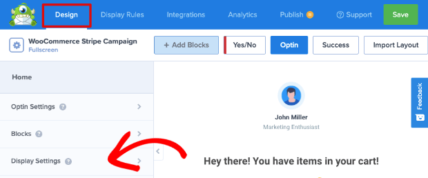
To make this happen, switch over to the Design » Display Settings tab.
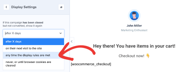
Using the drop-down menu, set the rule to ‘any time the display rules are met’.
You’ll want to configure this setting using your best discretion.
You may not want to show the popup every time a customer leaves your page, so you can adjust those settings here.
Now it’s time to style our WooCommerce popup.
Step 5: Style the WooCommerce Stripe Popup
By default, OptinMonster campaigns look great. But since you’re using a shortcode here, we recommend adding a small snippet of code to make sure the cart appears nicely.
We’ll be using Javascript, but don’t worry if you don’t have coding experience. All you need to do is copy and paste the code that we’ve created for you.
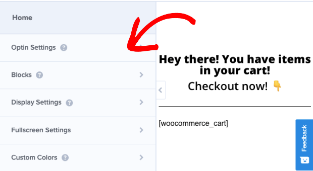
Go to your home menu in the OptinMonster campaign editor and open the Optin Settings tab.
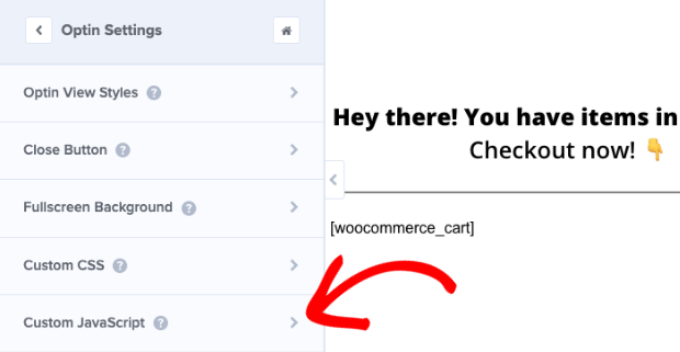
Scroll down to the Custom JavaScript section.
Enter this code in the Javascript field box.
This will add a few styling rules to your cart popup so that it looks much nicer.
This code is enough in most cases. However, if you’re experienced with Javascript and CSS, you can customize it even further.
Now you’re ready to publish your campaign.
Step 6: Publish the WooCommerce Stripe Popup
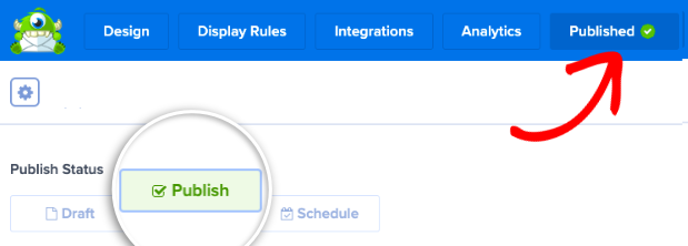
To activate your campaign, head over to the Publish tab and click on the ‘Publish’ box. This will activate your campaign.
Then head over to your WordPress site and open the OptinMonster page. Here, make sure your campaign is set to ‘Published’ status.
Lastly, refresh the OptinMonster dashboard page to make sure the new campaign appears on your site.
In case you don’t see it, you might need to clear your cache. This will make sure your site shows the latest changes you made.
With that, you’ve successfully added a targeted WooCommerce popup to your store! You can test different versions of your campaign using split testing to find out what your customers prefer.
Also, keep in mind that we’ve only covered only the Exit-Intent® display rule here. OptinMonster has so many targeting rules you can use to create all sorts of lead generation and conversion optimization campaigns.
If you’re looking for inspiration, check out these eCommerce popup examples that actually convert.
We hope you liked this article, and if so, you may be interested in these resources to improve sales and conversions:
- How to Create a Discount Wheel Popup (the Easy Way)
- How to Create a WooCommerce Popup to Cross-Sell (Step-by-Step)
- How to Recover Abandoned Carts: 12 Ways to Skyrocket Sales
These posts will have everything you need to drive more sales from your WooCommerce store.












Add a Comment