Do you want to create a splash page to greet your website visitors?
A splash page is a great way to grab people’s attention the instant they land on your website.
Since it’s impossible to ignore a splash page, it’s an incredibly powerful tool for sharing important updates, content, and offers.
By the end of this article, you will know how to create a splash page that converts your website visitors.
- What is a splash page
- Pros and cons of splash pages
- Splash page examples to get inspired
- How to create a splash page that converts
What is a Splash Page?
A splash page is an introductory screen visitors see before they can enter your website. It will direct people towards a single, strong call-to-action, like ebook download or newsletter signup. Typically, the site visitor will need to complete some kind of step to close the page, even if it’s simply closing the message.
Splash pages work best when they’re offers and updates your site visitors absolutely should not miss.
There are different reasons publishers and site owners use splash pages:
- Choose language or region
- Ask for age verification
- Show limited-time offers
- Announce new products
- Highlight top content
So, should you use a splash page on your website? Yes, a splash page is wildly effective in the right context, but a closer look at the pros and cons may help you decide.
Pros and Cons of Splash Pages
Before you create a splash page, you might want to consider these pros and cons.
Using a splash page has the following advantages:
- Display important information prominently
- Direct people to key pages and offers
- Grow email list faster
But, that doesn’t mean you should always use them.
Splash pages also have their detractors:
- It interrupt your site visitor’s experience. Most times, your site visitor will need to close the splash page before they can access your website.
- It can affect your SEO since it’s a kind of intrusive interstitial. The best way to tackle this issue is by enabling the splash pages only for desktop users
Fortunately, you can use quick fixes to deal with these problems.
- Personalization: you could show the splash page based on user behavior, visitor’s location, and more.
- Limited offers: show offers that are only valid for a specific time period
- Conversion templates: use prebuilt splash templates that have been designed to improve conversions
Now that you know what a splash page is, take a look at a few examples of Splash Pages used on popular websites.
14 Splash Page Examples
Below, we’ve handpicked the best splash page examples. We looked for beautiful splash pages with compelling offers that were tailored to a specific target audience.
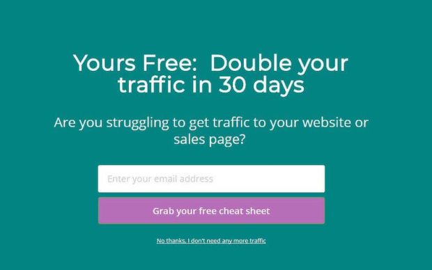
1. Lilach Bullock
Lilach Bullock used this welcome mat to greet site visitors, converting 5.09% of new visitors.
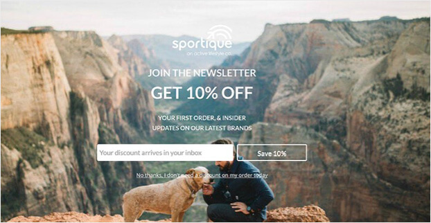
2. Sportique
Sportique used this fullscreen optin to convert 4.92% of visitors. They first showed this offer after the visitor had been on the site for at least 4 seconds.
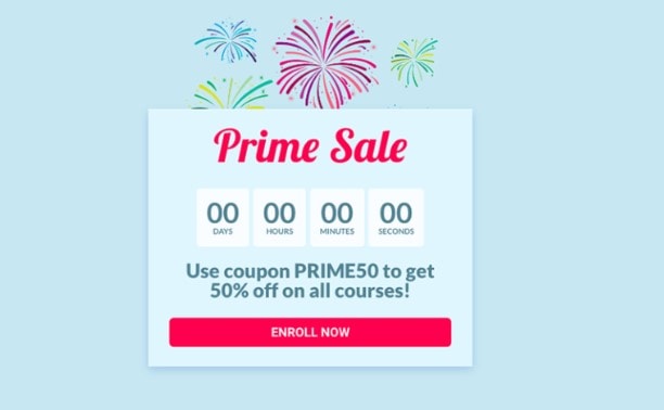
3. Cracku
Cracku added a countdown timer to its splash page to create urgency. This simple countdown timer converts 3.50% of all site visitors.
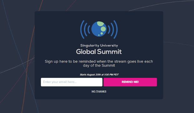
4. Singularity University
Singularity collected 2,000 new email signups in under 9 days using this fullscreen optin.
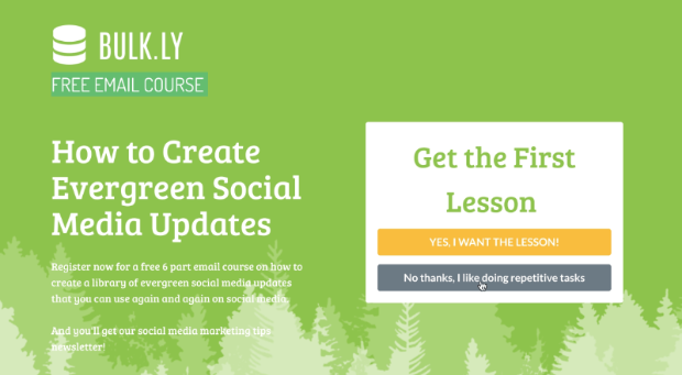
5. Bulk.ly
Bulk.ly used a splash page to offer a free email course. This fullscreen campaign converted 4.76% of abandoning visitors. It’s perfectly matched with Bulkly’s ideal customer profile. People who want to share evergreen social media content signed up for this course, and then ended up starting a free trial of Bulkly.
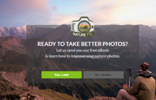
6. Nature TTL
Nature TTL offered a free eBook and their fullscreen splash page looked like this:
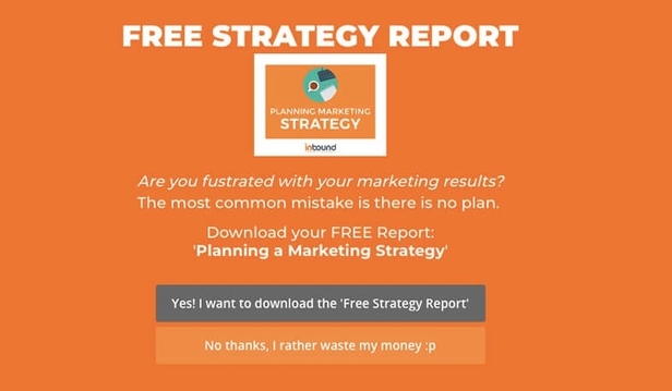
7. Inbound Marketing
Inbound Marketing uses a fullscreen welcome mat to offer a free strategy report. Visitors need to be on the site for at least 10 seconds in order for the campaign is displayed. It converted 5.75% of visitors.
8. Contest Domination
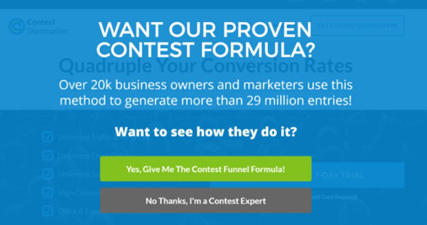
Contest Domination displays a Yes/No form on their splash page.
9. Kindlepreneur
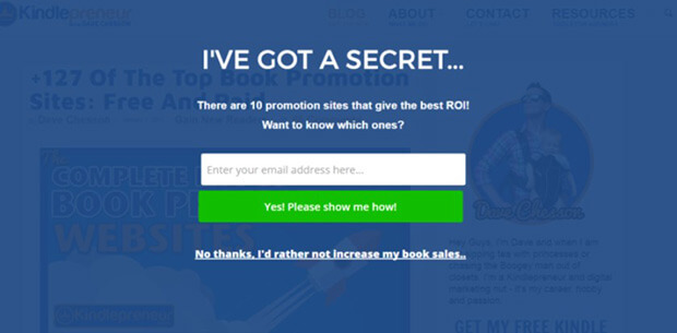
Kindlepreneur offers a resource in exchange for an email address. This is a great example of a compelling lead magnet. Most Kindle authors would want to know which promotion sites provide the best return on investment.
10. LeadsBridge
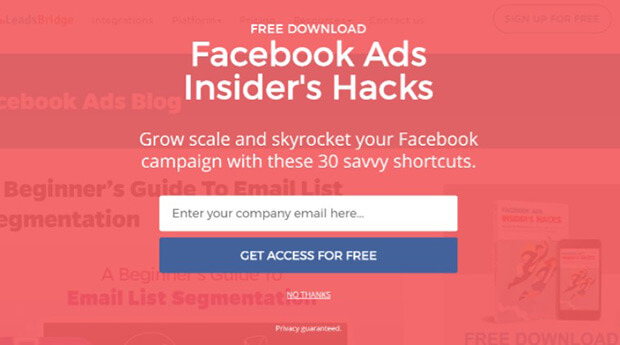
Presenting a free download, like this example from LeadsBridge, is a great splash page strategy.
11. Penniless Prairie Girl
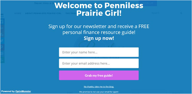
Penniless Prairie Girl offers a free personal finance guide to site visitors who sign up for the newsletter.
12. WP Starters
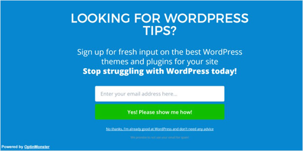
WP Starters addresses key struggles and pain paints on its splash page.
13. The Spinsterz
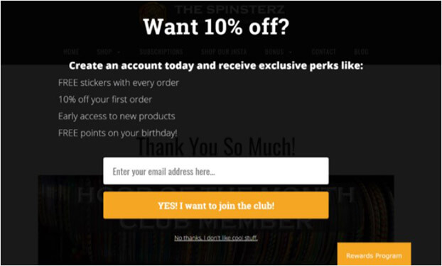
The Spinsterz presents a discount coupon and other perks to entice site visitors to join its rewards program.
14. Loaded Landscapes
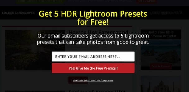
Loaded Landscapes uses its splash page to grow its email list. Like some of the other splash page examples, Loaded Landscapes offers the site visitor a valuable resource for free.
How to Create a Splash Page That Converts
Today, we’ll use OptinMonster to create a splash page. OptinMonster is the best tool for creating a splash page. With OptinMonster, you can easily build a stunning splash page using a visual drag and drop editor.
OptinMonster comes with beautiful ready-to-use splash templates that are super easy to customize.
You can also use targeting options to personalize your splash page. For example, show only to new or returning visitors.
With OptinMonster, you can choose to show your splash page based on:
- Visitor’s physical location
- Only on certain pages
- The time they’ve spent on site
One great feature is that OptinMonster connects easily with any email service provider. And, you can use it on any website platform, including WordPress, Shopify, Blogger, and so on.
It’s simply the easiest way to create a stunning splash page that gets you business results.
Sign up for OptinMonster 14-day risk-free trial today.
Step 1: Create a New OptinMonster Campaign
First, you need to log into your OptinMonster account and click Create New Campaign.
Next, you must select your campaign type.
Click Fullscreen.
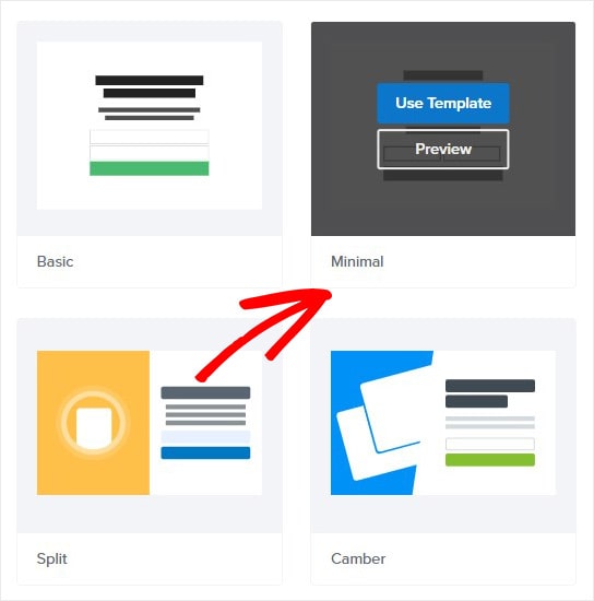
Now, choose your template.
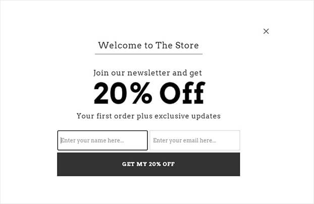
Today, we’ll go with Minimal because it’s perfect for the timed offer we’re showing.
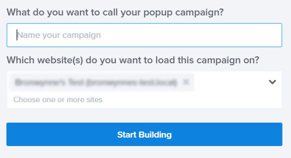
Give your campaign a name. Click Start Building to enter the editor.
Now, you’re ready to design your splash page.
Step 2: Customize Your Splash Page
Customizing your splash page in OptinMonster is easy.
You don’t need any coding or design skills to create a beautiful splash page in minutes.
All you need to do is click on any part of your splash page to edit it.
Let’s see how that works in action.
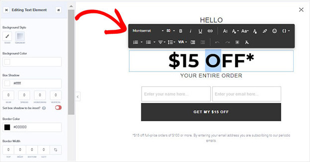
So, to change the text, click on it.
From here, you can edit the colors, fonts, and copy.
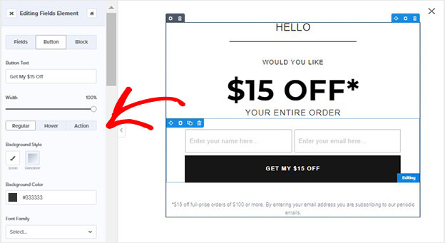
Next, customize your button text and style to match your splash page.
You can also easily add features to your splash page. And, to do that, all you need to do is click Add Blocks.
From here, you’ll be able to add:
- Video
- HTML
- Chatbot
- Image
And more.
Then drag and drop the element you want into place on your splash page.
Plus, if you like, you can set your splash page to slide down from the top of the browser instead of fading in.
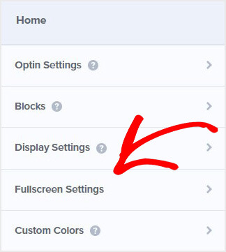
Click Fullscreen Settings.
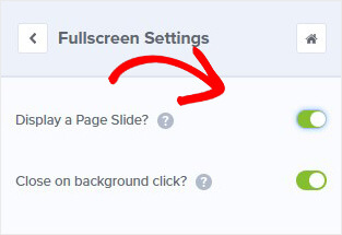
Next, toggle the Display a Page Slide button to green.
That’s it for now. But keep in mind that you can change anything about your splash page to match your website and brand.
Once you’re happy with the look of your splash page, you’re ready to determine your display settings.
Step 3: Display Your Splash Page
One of the advantages of OptinMonster is you have full control over when and where you can show your splash page.
You’ll get several targeting options, such as:
- Show special offers to returning visitors
- Display after someone has viewed a certain number of pages
- Appears as someone tries to leave the site
For a splash page, you might want to show the splash page the moment your site visitors land on your website.
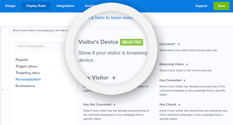
Select Display Rules at the top of the editor.
Find and select Time on Site.
Set the time to immediate.
You can refine this even further using Page Targeting. Using Page Targeting, you can choose to hide or show your splash page on certain sections of your website. For example, you might choose to show the splash page only to site visitors who land on your home page.
For the best experience, you can show your splash page only to desktop visitors. Look for Visitor’s Device, select it, and then choose Mobile.
When you’re happy with your display settings, you can connect OptinMonster with your email marketing platform.
Step 4: Connect Your Email Service Provider
If you want to use your splash page to grow your list, you’ll need to connect OptinMonster to your email service provider.
OptinMonster makes it easy to sync with any email service provider.
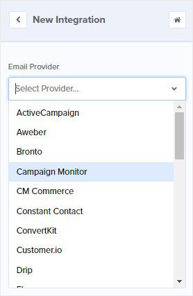
Simply click Integrations.
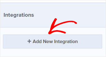
Select Add New Integration.
Find your platform from the Email Service Provider dropdown.
Follow the prompts to complete the integration.
Step 5: Publish Your Splash Page
The final stage is publishing your splash page on your website.
Hit Publish at the top of your editor.
Change status from Draft to Publish.
Finally, you need to add OptinMonster to your site. Don’t worry. Connecting OptinMonster with your website doesn’t get any easier.
If you’re using WordPress, check out this article: How to Integrate OptinMonster With WordPress
Not using WordPress? Use this easy guide to add OptinMonster to any website.
There you go. Now, this splash page will show to your site visitors.
Getting started with a splash page is incredibly easy with OptinMonster. You can select from a wide range of stunning templates and customize your design with a visual drag and drop builder. Without a doubt, you’ll be on your way to converting your site visitors in minutes.
We hope you enjoyed this article.
If so, you might find these resources useful:
- How Singularity University Generated New Leads With From a Splash Page (Fullscreen popup)
- 11 Best Website Welcome Message Examples to Greet Your Users
Ready to convert your website visitors? Get OptinMonster today.















Add a Comment