Have you been looking for the best popup to use on your site, but you just can’t seem to sort through the terminology?
Popups are an amazing tool that can help grow your business in many ways–when done correctly. But popups also come in all shapes and sizes, and it can be difficult to know which type of popup is best suited for your goals.
That’s why, in this guide, we’re going to answer the following questions:
- What is a popup notification?
- Why do you NEED to start using popups on your site?
- What are the different types of popup notifications, and when should you use them?
- How do you personalize each type of popup to improve user experience
By the end of this guide, you’ll have a clear understanding of what popup notifications are and when to use each type to grow your business.
Let’s get started.
What Is a Popup Notification?
A popup notification is a message that appears on your users’ browser or desktop. They’re designed to grab your audience’s attention and engage them in some way.
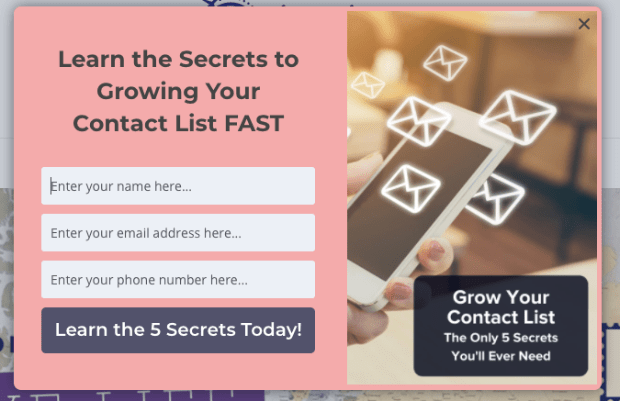
Here is an example of a popup that would be used to capture an email address and phone number:
This is a standard lightbox popup that you’re probably familiar with.
But one of the most confusing aspects of popups is that they’ve taken on so many roles for marketers. And as a result, they go by lots of different names. In fact, you’ve probably seen different terms like:
- Lightbox popup
- Exit-intent popup
- Toast notification
- Snackbar popup
- Passive popup
And many more. With all these types of popups, it can be difficult to know what each type of popup does and when you should use them.
It’s no wonder so many people go back to the basics and try to answer the simple question: “What is a popup notification?”
But before we start teasing out each type of popup, let’s make sure we’re clear on why you should be using popups on your site in the first place.
Why Should You Use Popups on Your Site?
One of the best parts about popup notifications is that they’re super flexible in terms of functionality. As we already covered, popup notifications are designed to grab your users’ attention.
Once you have their attention, you need to figure out what to do with it.
That’s because as a marketer or online business owner, you may use popups to accomplish different goals, such as:
- Growing your email list
- Building brand awareness
- Gathering feedback from surveys
- Engaging your audience
- Improving UX with transactional content
- Increasing pageviews
- Boosting webinar signups
And much more. As you’ll see, popup notifications can serve many purposes and are among the quickest ways you can grow your business.
But you may be wondering, do popup notifications still work? In a word, YES.
Just check out some of these success stories that our clients have seen using popup notifications in various ways:
- Crossrope explodes its email list by 900% using a simple popup
- Shockbyte more than doubled their sales with this popup
- How Adam Enfroy grew his mailing list to over 11k subscribers in under a year
Now that we know what a popup notification is and how you can use it to grow your business, let’s look at 9 different types of popup notifications.
9 Types of Popup Notifications
Before we start, we should mention that the type of popup notification you choose will depend on your marketing goals.
But regardless of which type you need, 2 factors will make or break your popups’ success. Your popup needs to:
- Look visually appealing
- Reach the right people
To do this consistently, you should be using a lead generation software that allows you to quickly and easily create popups with both qualities mentioned above.
And for that, there’s no better tool than OptinMonster:
OptinMonster is hands down the world’s best popup builder on the market.
In a matter of minutes, you can create stunning popups that convert like crazy. With our drag and drop builder, you don’t need any technical or coding experience at all.
Plus, with our many targeting rules, you can show the right message to the right people at just the right time in their customer journey.
This improves UX, connects you more deeply with your target audience, and leads to much higher conversion rates.
Ok, let’s dive into our list.
1. Lightbox Popup
The term “lightbox” is used to describe a popup that appears over your users’ browser page, usually making the screen’s background darker. This forces the users’ attention to the content on your popup and leads them to your call to action (CTA).
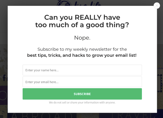
Here’s an example of a lightbox popup:
The outer sides of the image above are the main browser page. Notice how the lightbox appears and makes the background darker to draw attention to the popup’s content.
When to Use Them: Lightbox popups are great for just about every marketing goal you could have. They can be used to grow your mailing list, boost pageviews, get more webinar signups, collect feedback, drive sales, and more.
Lightbox popups are extremely flexible and can be used with different display rules to create sub-types of popups. These include things like:
And many more. While these types of notifications are different in terms of when, where, and to whom they display, they all tend to appear as a lightbox popup when the message is finally shown.
At the end of this post, we’ll discuss what the term “display rule” means and how you can create these different sub-types of lightbox popups.
For more details, check out how to create a lightbox popup + 6 ways popups win you more leads
2. Modal/Dialogue Box
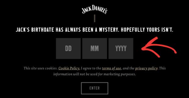
A modal popup (or “dialogue box”) is similar in design to a lightbox popup. Modals bring the notification to the center of your users’ attention by darkening the background browser screen.
So what’s the difference? Modal popups force the user to interact with the content before allowing them to get back to the browser page.
Here’s a great example of a modal popup:
When to Use Them: Modal popups are great when you need to verify some type of information from your users before letting them access your site.
This could include gathering login information for exclusive content, verifying age for adult products, or letting users select their language preferences before entering your website.
For more details, check out how to add age verification popup to your website.
3. Slide-in Popup
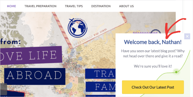
A slide-in popup is a notification that appears on your users’ browser page that doesn’t block the background content. That means the user can still see and interact with the site they were browsing while the message rests on their screen.
As we just saw, modal popups force the users to interact with the message before continuing their browsing experience. Slide-ins, on the other hand, don’t interfere with the users’ browsing experience.
Here’s an example of a slide-in scroll box popup:
Again, the distinguishing factor here is that non-modals don’t interfere with how the user interacts with the main browser page.
When to Use Them: Non-modal popups are a non-intrusive way of presenting information to your audience. These are good for showing promotional deals, redirecting users to related content, alerting users about changes to your site or business, and much more.
For more details, check out 11 high-converting ways to use slide-in popups to boost conversions
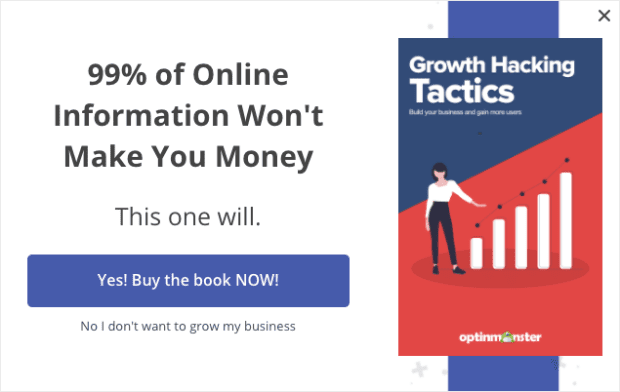
4. Fullscreen Welcome Mat
A fullscreen welcome mat is exactly what it sounds like: a popup that takes up the user’s entire screen. But this doesn’t mean the user is forced to engage with the content or CTA because they can still close the window.
Instead, the main advantage of a fullscreen welcome mat is that it’s impossible to ignore. That means you’ll be sure to have your users’ attention.
Here’s a great example of a fullscreen welcome mat campaign:
When to Use Them: Fullscreen popups are great when you need your user to see an offer or deal. They can also be used like sales, pres-sell, or any other landing page that shows unique offers related to the content on the main browser page.
For more details, check out how to create a welcome mat popup to increase conversions
5. Floating Bar
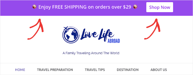
Floating bars can be used at either the top or bottom of your browser page. They can be used for either promotional or informational notifications.
Like slide-in scroll boxes, floating bars provide a non-intrusive way of getting the right information to the right people on your website.
Here’s an example of a floating bar:
When to Use Them: Floating bars serve many purposes, such as providing:
- Updates, alerts, or general changes in company informaiton
- Promotional deals like free shipping
- Time-sensitive offers (and they work best with a countdown timer)
And much more. Again, like slide-in scroll boxes, floating bars can be an excellent complement to other types of popups on your site to boost overall conversions.
For more details, check out 6 floating bar hacks to boost conversions
6. MonsterLink™ Popups
So far on this list, we’ve covered different types of popups that aren’t connected to display rules or user behavior. But MonsterLink™ popups are so effective that they deserve a mention here.
Basically, a MonsterLink™ allows you to display a popup when the user clicks a link or button.
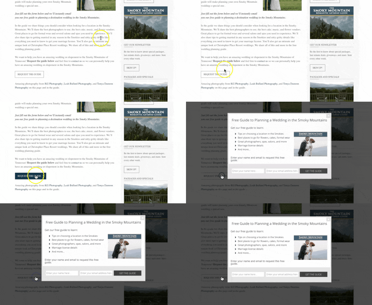
Here’s what a clickable MonsterLink™ popup looks like in action:
When to Use Them: You can use MonsterLinks™ for just about all of your marketing goals. They produce really warm leads because it’s the users’ behavior that drives the popup to display. As a result, people who see the popup are more likely to be interested in the content or CTA.
For more details, check out, 2 step optins: why they work and how to make them
7. Social Proof Notifications
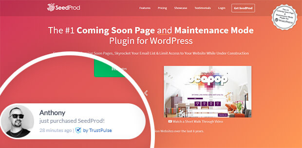
A social proof notification is a specific type of notification. It displays how other people are interacting with your website to leverage social proof and boost overall conversions.
Here’s an example of a social proof notification:
When to Use Them: Social proof notifications can help you with just about any marketing goal you have. Again, they use FOMO (“fear missing out”) to motivate other people to take action. You can use social proof notifications to:
- Increase pageviews
- Grow your mailing list
- Drive sales
And much more. While there are many social proof notification tools available, the best is definitely TrustPulse:
TrustPulse allows you to quickly and easily create social proof notification popups to increase conversions. Plus, you don’t need any tech or coding skills to get started.
And the best part is that it’s only a fraction of the cost compared to other social proof notification software available.
For more information on how TrustPulse stacks up to the competition, check out this post: FOMO vs. UseProof vs. TrustPulse: Which Is the Best for Social Proof.
Get started with TrustPulse today!
8. Push notifications
Push notifications are a type of popup that make connecting with your audience incredibly easy. So far, every popup we’ve seen requires users to be actively visiting your website.
On the other hand, push notifications can appear on your user’s desktop or mobile screen even if your users aren’t on your site. Once a user gives you permission to send them push notifications, you can send them these popup messages for both promotional and transactional content.
And there are plenty of push notification tools that help you set this up in minutes.
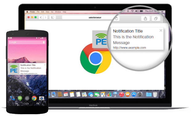
Here’s an example of a push notification for desktop and mobile from PushEngage:
When to Use Them: You can use push notifications for all of your major marketing and sales goals. Since they don’t require the user to provide personal contact information (like an email address or phone number), your users will be more likely to sign up to receive them.
And since people don’t need to be on your site to see these popup notifications, they allow you to instantly engage your audience and:
- Increase pageviews for new content
- Alert users about changes or updates in your company
- Offer new promotions or deals
And much more. Want the best tool for creating push notifications? Then you need to try out PushEngage:
PushEngage makes creating push notifications simple. You can send these popup messages to mobile and desktop users once they give you consent to do so.
Then, PushEngage lets you quickly and easily create these notifications to reach your marketing goals. And you don’t need any coding skills to use this intuitive software.
Want to give it a try? Get started with PushEngage today!
And for more information, check out this post on how to add push notifications to WordPress.
Now that we’ve answered the question “what is a popup notification?” and we’ve shown 9 different types of popups, let’s look at a few ways you can personalize your notifications to improve UX.
How to Personalize Popups to Improve UX
Creating stunning popup campaigns that are visually appealing is only half the battle. The other half is making sure that you show these popups to the right people and at just the right time in their customer journey.
That way, you can get the most out of your popups and ensure that you never harm your users’ experience. In fact, when done correctly, popups should HELP improve UX.
The best way to do this is by setting “display rules” to whichever type of popup notification you’re using.
Display rules are settings that you can add to popups to determine whether the campaign should appear. These display rules break down into 2 categories:
- Targets
- Triggers
Targets are rules that will show a popup based on your users’ characteristics. This can be things like where the user is located, what type of device they’re using, or how they’ve interacted with your site in the past.
These are just a few examples of targets, though there are many more.
Triggers, on the other hand, are rules that use your site traffic’s behavior to determine if a popup should appear. This would be like when users are leaving the browser page, if they click a link or button, or how far down the browser page they scroll.
Again, these are just a few of the many examples of triggers that can make your popup notifications more effective.
Whenever you’re using a popup creating tool, you want to make sure there are plenty of display rules to help you personalize your popup notifications.
Out of all the tools out there, OptinMonster definitely has the most targeting and trigger options.
For more information about this, here’s a helpful resource: Is OptinMonster Worth It? An Extensive Review.
So Which Is the BEST Type of Popup?
At this point, we’ve answered the question, “What is a popup notification?” But now, you may be wondering what the best type of popup is.
That answer is less clear cut. That’s because the type of popup you use will depend on your marketing or sales goals.
And as we’ve already discussed, it will also depend on who your target audience is and how they interact with your site.
That said, the best place to start is an exit-intent popup. These appear as users are leaving the browser page and are great at recovering abandoning visitors.
In fact, exit-intent popups are how Fastrack recovers 53% of its abandoning visitors.
The best part is that OptinMonster’s Exit-Intent® technology is now available for mobile devices, too. For more information on that, check out this helpful post: How to Create Exit-Intent Popups for Mobile That Convert.
And that’s it! We hope this guide answered the question, “What is a popup notification?” And we hope that, in the future, this article helps you choose which type of popup is most suited for your marketing goals.
If you enjoyed this post, you should definitely check out the following resources:
- 37 Types of Popups to Use on Your Website
- How Does OptinMonster Work? 3 Use Cases
- Email Marketing Made Simple: A Step-by-Step Guide
These articles will have everything you need to learn more about popups, popup creation, and how you can use popups to grow and monetize your mailing list.
Want to try the BEST popup lead generation tool on the market? Sign up for your RISK-FREE OptinMonster account today!






Add a Comment