Do you want to make a welcome popup to turn new visitors into subscribers, or even loyal customers?
A welcome popup can make visitors feel seen and cared for, even if it’s their first interaction with your brand. You can also use a welcome popup to grow your email list and keep in touch with visitors who aren’t ready to buy just yet.
In this guide, we’ll go over the basics of welcome popups, show you some examples, and teach you how to create your own.
Let’s get started!
- What Is a Welcome Popup?
- Website Welcome Message Examples
- How to Create a Welcome Popup
- Welcome Popup Best Practices
- Next Steps: After the Welcome Popup, What Now?
What Is a Welcome Popup?
A welcome popup is a message that appears when a visitor first visits a website. Think of it as the person greeting guests at the door if you had a brick and mortar store.
Most of the time, you don’t ask new website visitors to buy something right away. You offer them something valuable instead. That might be product recommendations, a lead magnet, or a coupon code.
Imagine if someone came to your home for the first time. Would you immediately ask them to wash your dishes or fold your laundry? Probably not! You’d be much more likely to invite them to sit, offer a snack or beverage, or ask whether they need anything to be comfortable.
Welcome popups are just like that. Let’s take a look at some website popups that do a great job of grabbing visitors’ attention and inviting them to keep reading.
Website Welcome Message Examples
1. Welcome Popup With Countdown Timer
- Goals: Email signups
- Incentive: Special offers and updates on new products
- Special Features: Countdown to next newsletter
PodBike is a bicycle company that has reinvented the velomobile with its FRIKAR e-bike. They used OptinMonster to create a floating bar that welcomes visitors to the website and encourages them to sign up for the email list.
PodBike has a cool total conversion rate of over 18%. Check out the case study to see what else they did to get such great results!
2. Welcome Popup With New Visitor Targeting
- Goals: Email signups
- Incentive: Up to 75% discount on affiliate products
- Special Features: Targeting new visitors
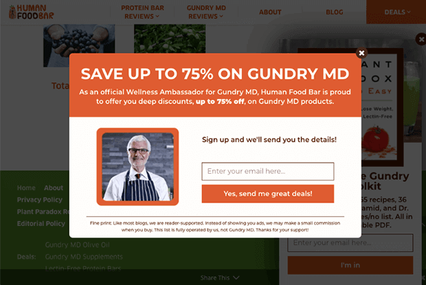
Human Food Bar is a blog focused on nutrition and energy bars. To drive more affiliate income, it’s essential for them to get more email subscribers. Their welcome popup instantly offers up to 75% on affiliate products, but is only shown to new visitors. Such a big incentive is a great way to persuade new readers to join the email list. This welcome campaign helps drive over 1800 new subscribers for Human Food Bar every month.
3. Welcome Popup With Yes/No Optin
- Goals: Email signups
- Incentive: Free email course
- Special Features: Yes/No optin, fullscreen welcome mat
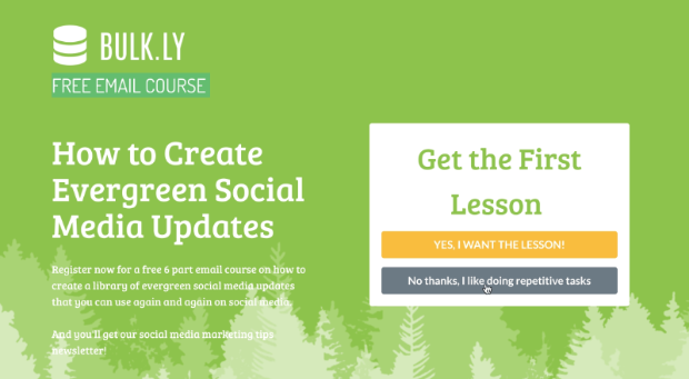
Bulk.ly is a social media tool that recycles your social media updates through Buffer, making it easier to create social media content consistently. They used a fullscreen welcome popup to promote their free email course on evergreen social media updates. They also added a Yes/No screen, which takes advantage of the Zeigarnik effect. Visitors who click Yes will be more likely to finish the process of signing up with their email address on the next screen. Bulk.ly used this 2-step campaign and other OptinMonster popups to boost free trials 134%.
4. Welcome Popup for eCommerce
- Goals: Email signups
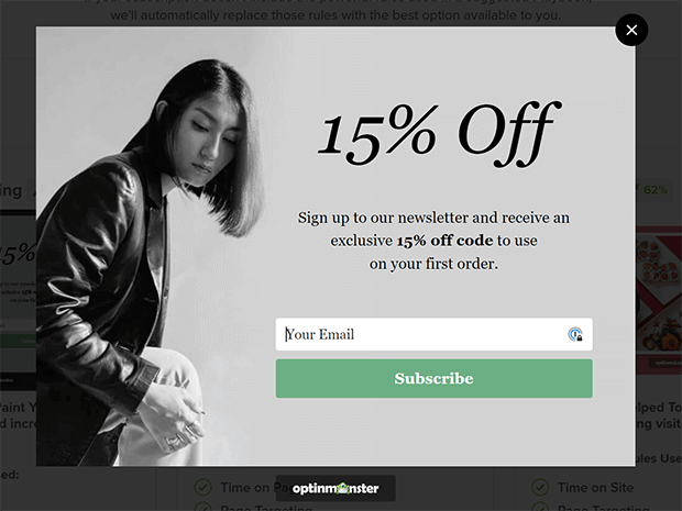
- Incentive: 15% discount
- Special Features: Time on page, page targeting
You’ve probably seen welcome popups on eCommerce sites that offer a discount on the first order. It’s a popular strategy because it works! We like the simple design and clear copy in Woodhouse Clothing’s welcome message.
5. Welcome Popup With Exit-Intent
- Goals: Free trials, email signups
- Incentive: Coupon code for free trial, valuable email content
- Special Features: Exit intent, success view
It may seem somewhat counterintuitive to display a welcome message when visitors are leaving. But it can be an important opportunity to recapture traffic that would otherwise be lost.
Imagine walking into a store and feeling a bit overwhelmed by all the options. As you turn around to leave, the store owner calls out to ask what you’re looking for and shows you where it is. Isn’t that much more welcoming than letting you walk away empty-handed?
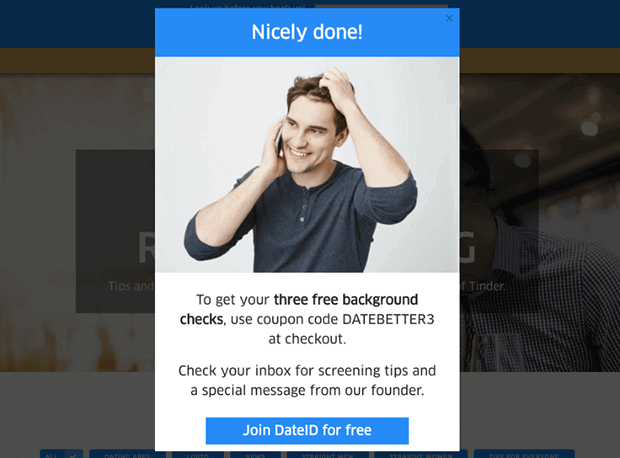
DateID uses exit-intent popups that appear as visitors are about to leave their website. They offer 3 free instant background checks and helpful content sent by email. This and other campaigns resulted in 75% more paying customers every month for DateID.
6. Welcome Popup With Lead Magnet
- Goals: Email signups
- Incentive: Cheat sheet
- Special Features: Fullscreen welcome mat, page targeting
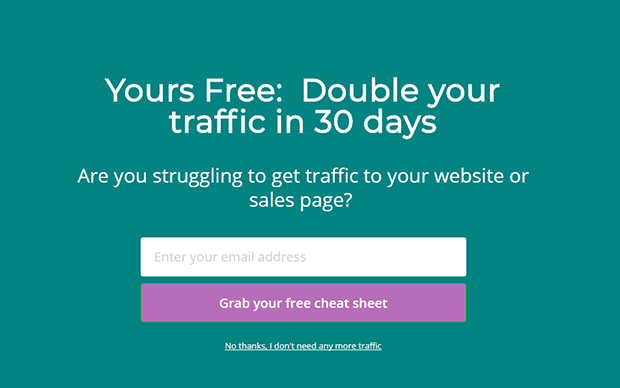
Marketing expert Lilach Bullock uses a fullscreen welcome mat to offer a tempting cheat sheet as a lead magnet for her email list. This campaign appears right when visitors open the website. A similarly styled campaign offering a different lead magnet appears when visitors are about to leave. If the first lead magnet wasn’t appealing, perhaps the second one will be. That’s the power of repetition in marketing. See how Lilach Bullock converts 57% of visitors to subscribers.
7. Welcome Popup for Lead Generation
- Goals: Lead generation
- Incentive: Personalized outreach, humor
- Special Features: Page targeting, time on page
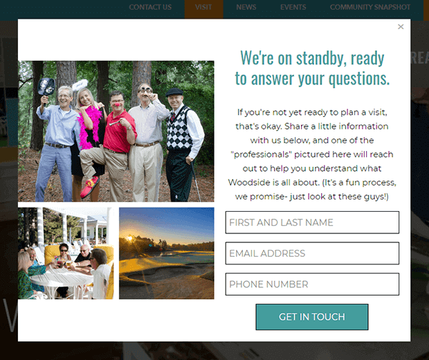
Woodside Communities uses this welcome popup to collect leads that are interested in their real estate developments. They timed the popup for 5 seconds after the page loaded to give new visitors a chance to get their bearings before seeing an offer. Their only incentive is personalized outreach from the sales team, but leads who sign up for this are likely highly qualified and ready to make a decision. This welcome popup and others helped Woodside Communities increase lead generation by 476%.
8. Welcome Popups for Nonprofits
- Goals: Redirect traffic
- Incentive: Sense of personal satisfaction from helping
- Special Features: Page targeting, content recommendations
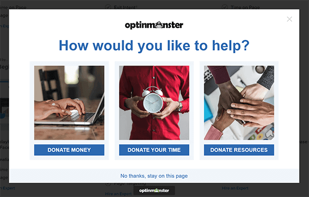
Nonprofit audiences often want a variety of things. They want to know how to volunteer, where to donate money, and other ways to help out. This welcome message from Food for the Poor is a great example of how to redirect that traffic. Each link goes to a different page with relevant information. From there, you can use page targeting, MonsterChains, or OnSite Retargeting to follow up with relevant offers and asks.
Now that we’ve seen some examples for inspiration, let’s learn how to create your own welcome popup with OptinMonster.
How to Create a Welcome Popup
The easiest way to create a welcome popup is to use OptinMonster.
OptinMonster is the best welcome popup maker for boosting traffic, subscribers, and conversions on your website. OptinMonster works on every major website and eCommerce, including:
- WordPress
- Squarespace
- Shopify
- Wix
- and much more!
So wherever you want to welcome new visitors, you can use OptinMonster. Here’s how to do it.
1. Create a Campaign
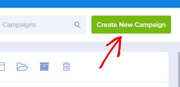
First, sign up for an OptinMonster account. Log into your account and click on Create New Campaign.
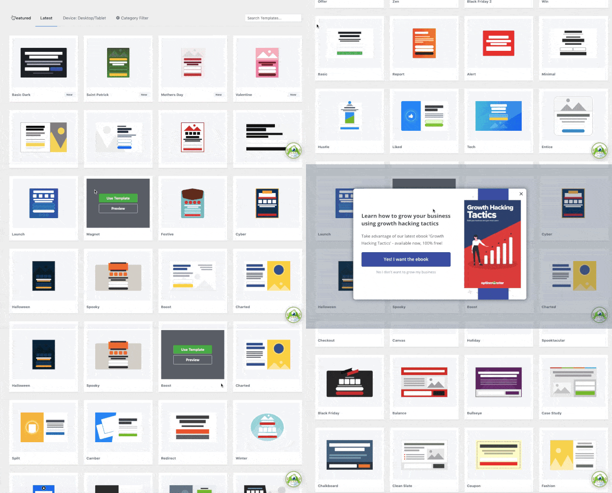
Scroll through the different popup templates until you find one that you like. In this tutorial, we’ll customize the Discover template. You’ll be able to change the colors and fonts to match your branding in the next step. You can also build your own popup design from scratch using the Canvas template.
Enter a name for your campaign and click Start Building. We’ll add a website in the last step.
2. Customize Your Welcome Popup Message
Next, you’ll be taken to the popup builder screen. OptinMonster has a super easy drag-and-drop builder, which lets you see exactly how your welcome popup will look. Customizing each element is as easy as pointing and clicking.
The default text on the placeholder is better suited for an exit-intent popup, so let’s change that to something more appropriate for a welcome message. Click on the text to edit it. You can also change the font style and size by highlighting the text.
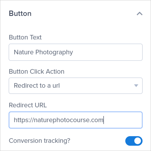
To change the text on the buttons, click on a button you want to customize. You can edit the button text as well as the click action. The button can redirect to a page, copy text, close the campaign, and more. For this tutorial, we’ll keep it as a link and just add the relevant URL.
Repeat this process for any other elements you want to customize.
3. Target Your Welcome Popup
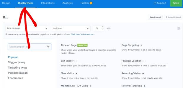
Next, we want to choose who sees this welcome popup and when. Click on the Display Rules tab in the header.
You can mix and match as many display rules as you want. This lets you target the right visitors at the right time.
Some good display rules for welcome popups include:
- New Visitor for those visiting your website for the first time
- Page Targeting for showing to visitors of specific pages
- Referral Targeting for visitors coming from a specific website
- Time on Page for when visitors first land on your website
To choose a display rule, click on the dropdown menu and choose from the display rules list. Edit the relevant options as needed.
4. Connect Your Email List (Optional)
If you’re creating an email popup as your welcome message, you’ll need to connect OptinMonster to your email marketing platform. If your popup doesn’t have an optin form, like the default Discover template, you can skip this step.
OptinMonster integrates with every major email service provider (ESP) and customer relationship management (CRM) and connecting is super simple.
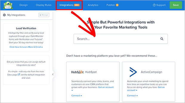
Click on the Integrations tab in the header and search for your marketing tool. In this example, we’ll use ConvertKit.
Every ESP and CRM is a little different, so follow the specific instructions given to connect your account. We also have full documentation about OptinMonster’s many integrations.
5. Publish Your Welcome Popup
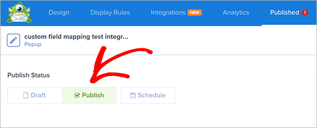
Finally, click the Publish tab in the header. Next, change the Publish Status to Publish.
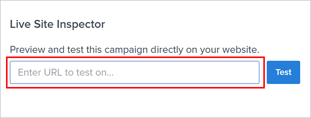
To preview how your welcome popup will look, you can enter a page URL into the live site inspector.
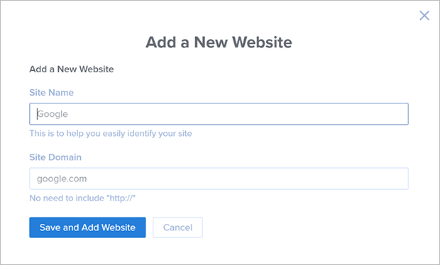
Let’s add a website to your OptinMonster account. Scroll down to websites and select Add New Website from the dropdown menu. If you’ve previously added your website to OptinMonster, just choose it from the dropdown and you’re done. If not, continue to the next step.
Add your site name and domain where indicated.
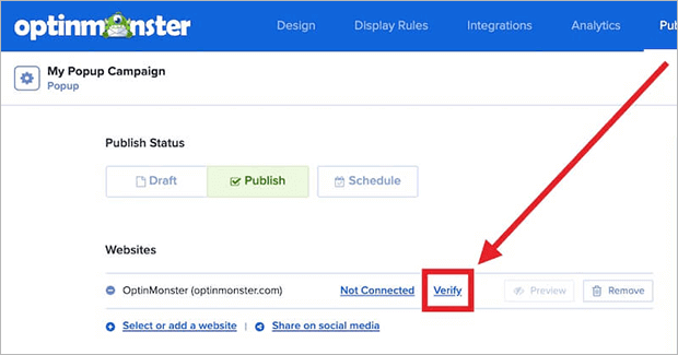
After this, you need to add the OptinMonster embed code to your website. This process varies depending on what platform you’re using, but you can use the website integration guides in our documentation to help. Once you’ve added the embed code, come back to the OptinMonster Publish screen and click Verify.
And you’re all done! Your welcome popup is ready to start generating traffic and growing your email list.
Welcome Popup Best Practices
Before we wrap up, we wanted to share a few tips that you can use on any welcome message popup for your website.
1. Compelling Incentives
Make sure that your welcome popup offers something that your visitors actually want. If you went to someone’s house and they offered food that you’re allergic to, it wouldn’t leave a very good impression despite their best intentions.
Welcome popups are a great place to offer a lead magnet, such as:
- Checklists
- Cheat sheets
- Discount codes
- Free trials
- Exclusive access
Make sure your popup offers match the intent of the visitor. For example, someone reading a post on party planning might appreciate an event checklist. They’d be less interested in an eBook on dogs.
OptinMonster has advanced page-level targeting to help you place campaigns on relevant posts and pages, like this one targeting readers interested in healthy meals:
2. Simple Copy
Your welcome popup appears in an overlay, which blocks the content of the page behind it. That’s why your message needs to be very simple and easy to read quickly. You only have a few seconds to convince a visitor to stay in the modal window, so don’t try to cram too much information into one popup. On the other hand, you also want to be specific enough so readers understand what they’re getting.
We suggest including:
- A catchy headline
- What the incentive is
- Who benefits from the incentive
- A call to action (CTA)
Let’s look at the CTA in more detail.
3. Clear CTA
Your call to action should be very obvious. Visitors shouldn’t need to hunt for the optin form or link to the recommended content.
Make sure to use a contrasting color for the CTA button as well as large, readable fonts for the button text. That way there’s no question about the next step to take.
We also suggest making it easy for visitors to close your welcome popup. Of course, we know you’d prefer for them to take the desired action. But not everyone is going to, and it’s better to let them move on to their intended destination than risk them leaving your website completely.
Speaking of intention, let’s talk about timing for your welcome popups.
4. Intentional Timing
It would be strange and not very welcoming if you didn’t greet a guest within the first few seconds after they arrive at your home. But it could also be off-putting if you greeted them before they even stepped through the door. Your welcome popup also needs to strike a balance.
You can certainly set your welcome message to appear as soon as the page loads. But this may annoy some visitors into leaving. This can decrease your overall conversion rate and traffic.
A better strategy would be to allow the visitor to fulfill some of their original intent. Let’s say that someone is searching for how to take care of houseplants. Your blog has a guide on this topic and you also sell pots for indoor plants. You want to offer a discount on their first purchase.
The visitor’s intent is not to buy a nice pot for their plant. They might really like your products, but that’s not their intent just yet. Let them read a bit of the article first to make sure it answers the questions they have. Then show your welcome message.
OptinMonster makes it easy to set the timing of your welcome popup. You can choose time on page, distance scrolled, inactivity, and more.
Next Steps: After the Welcome Popup, What Now?
We hope this post gave you some inspiration for how to welcome visitors to your online store, blog, or website.
Continue building relationships with your new guests with a welcome email series. Other ways to stay in touch with visitors and boost traffic include push notifications and SMS marketing.
Ready to roll out the welcome mat for your website? Get started with OptinMonster today!









Add a Comment