The welcome email plays a crucial role in email marketing and customer relationship management, so it’s important to get it right.
Welcome emails boast a staggering 60% email open rate, the highest for any emails you send to your target audience. They also help to boost customer retention by 71%.
These are impressive email marketing statistics. So, if you are not writing a perfect welcome email series, now is the time.
You’ve landed at the right place if you are looking for the best welcome email examples and templates.
In this blog post, we’ll explore 14 effective welcome email examples businesses can use to make a positive first-time impression and kickstart their customer journey on the right foot.
- What Is a Welcome Email?
- Key Elements of a Great Welcome Email
- Welcome Email Best Practices
- Integrating Welcome Emails With Overall Marketing Strategy
- Measuring the Success of Your Welcome Emails
- Advanced Tips and Strategies
- Welcome Email Examples
- Welcome Email Mistakes To Avoid
- Welcome Email Templates
What Is a Welcome Email?
A welcome email is the first email communication sent by a business or organization to a new subscriber, customer, or member. It serves as an initial point of contact after someone signs up for a mailing list, makes a purchase, registers for a service, or joins a community.
The purpose of a welcome email is to introduce the recipient to the brand’s story, provide them with relevant information about their account or subscription, and thank them for choosing to engage with the business.
A well-crafted welcome email can also help set expectations, guide the recipient through the next steps, and encourage them to take further action, such as making that first purchase, filling out a profile, or joining a loyalty program.
Welcome emails are an important part of a business’s customer engagement strategy and can help build a strong relationship with potential customers from the outset.
Key Elements of a Great Welcome Email
1. Crafting the First Impression: Welcome Email Subject Line
Your subject line is your first, and sometimes only, chance to grab attention. Make it intriguing, clear, and aligned with your brand’s voice. A personal favorite of mine was a client’s email campaign that used, “Welcome Aboard, [First Name]! Your Adventure Begins Here.”
Recommended reading: 15 Best Practices for Email Subject Lines That Can Boost Open Rates
2. Personalization: Making Each Recipient Feel Special
Personalization goes beyond just using the recipient’s name. Tailor your email body content based on their interests or actions. For instance, if they signed up after downloading a guide from your site, reference that guide in your email.
Recommended reading: eCommerce Personalization: Strategies & Examples to Boost Sales
3. Clear and Engaging Content: Setting the Tone
Your welcome email should reflect your brand’s personality. Consistency is key, whether professional, quirky, or somewhere in between. Use a friendly, conversational tone to make your new email subscribers feel at ease.
4. Call-to-Action: Encouraging Immediate Engagement
Your CTA button should be clear and compelling. Whether it’s to check out your latest blog post, follow you on social media, a discount code or browse your products, make sure it’s relevant and easy to find.
Recommended reading: 130+ Email CTA Examples That Can Boost Your Conversion Rate
Welcome Email Best Practices
Welcome Email Design: A visually appealing email can significantly increase engagement rate. Use high-quality images (or gifs), a clean layout, and a color scheme that reflects your brand. Remember, the email should be easy to read and navigate.
Brand Consistency: Your welcome email is an extension of your brand. Ensure that it aligns with your overall branding in terms of tone, colors, and messaging. This consistency helps build brand recognition and trust.
Mobile Optimization: With the majority of emails now opened on mobile devices, your welcome email must be mobile-friendly. Use responsive email design to ensure your email looks great on any device.
Welcome Emails Sequence: Timing is everything. Send your welcome email immediately after someone subscribes. This instant response shows that you’re attentive and sets the stage for future emails and communications.
Follow-up Emails: Don’t bombard your new subscribers with too many emails too soon. Space out your communications to maintain interest without overwhelming them.
Integrating Welcome Emails With Overall Marketing Strategy
Aligning with Other Marketing Channels
Your welcome email should be part of a larger marketing strategy. Ensure it aligns with your social media, content marketing, and other channels for a cohesive experience.
Using Welcome Emails to Boost Social Media Engagement
Encourage new subscribers to connect with you on social media. This not only increases your social media presence but also provides another avenue for engagement.
Cross-Promotion Opportunities
Use your welcome email to introduce new subscribers to other aspects of your business, like your blog or upcoming events. This cross-promotion can lead to increased engagement across your platforms.
Measuring the Success of Your Welcome Emails
1. Key Metrics to Track
Track open rates, click-through rates, and conversion rates to gauge the effectiveness of your welcome emails. These metrics provide valuable insights into what resonates with your audience.
2. Analyzing and Interpreting Data
Use the data you collect to refine your strategy. If certain elements of your welcome email are underperforming, don’t be afraid to tweak them.
3. Continuous Improvement: A/B Testing and Iteration
Experiment with different elements of your welcome email, like subject lines or CTA placements, through A/B testing. This ongoing process of refinement is key to email marketing success.
Advanced Tips and Strategies
Email List Segmenting: The more targeted your emails, the better. Use data like purchase history or engagement level to segment your list and tailor your communications accordingly.
Email Automation: Automate your welcome email process to ensure timely and consistent communication. Email automation tools can also help you segment your audience and personalize your emails.
Recommended reading: What Is Email Automation? A Beginner’s Guide to Email Marketing Automation
Welcome Email Series: Consider sending a series of welcome emails, each with a specific focus, to keep your audience engaged over a longer period. This approach allows you to provide more information without overwhelming your subscribers in a single email.
So, how do different companies welcome new users? Let’s take a look at 14 welcome email examples that work.
Welcome Email Examples
1. Google Adwords
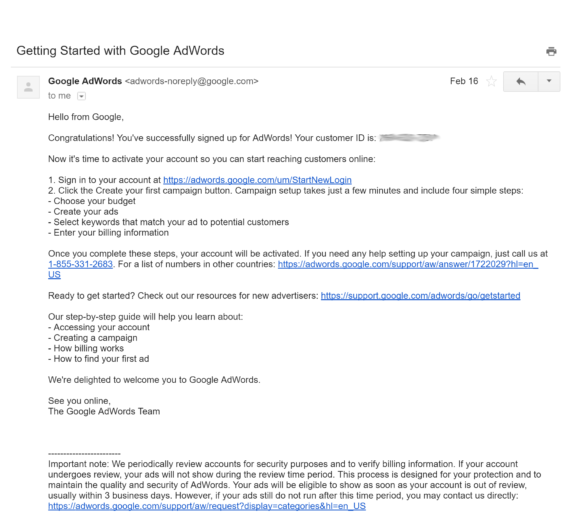
Google AdWords sends a couple of welcome emails, which seems overkill if you ask us, but they serve two different purposes.
What we liked:
- It’s short, making it easy for people to read it quickly.
- It gives the recipients some steps to follow.
- It includes helpful resources.
- There’s a call to action (CTA).
What we didn’t:
- The subject line is bland.
- There’s no personalization, although Google almost certainly knows the recipient’s name.
- It’s too plain, looking like a wall of text at first glance.
- The no-reply email address means there’s no way for people to respond to the email.
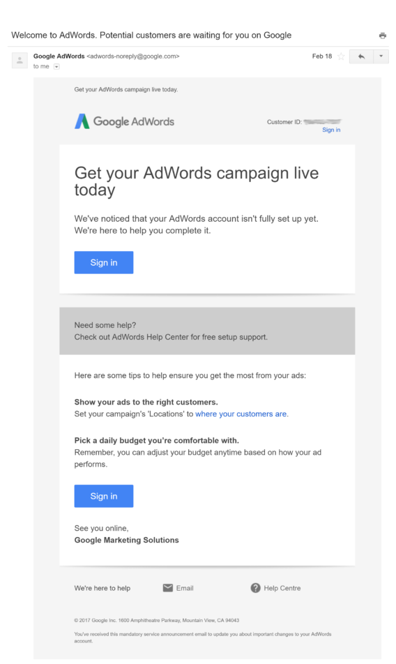
The second email from Adwords is a contrast. We liked everything about it, including:
- The subject line draws recipients in about a task they’ll all want to complete.
- The email is branded, inspiring trust.
- A single CTA is repeated three times to sign in and complete the account setup.
- It’s more visually appealing.
2. Ancestry
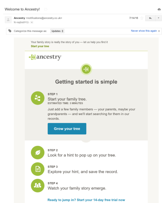
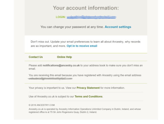
The color scheme leaves no doubt about who this Ancestry email is from.
What we liked:
- The email includes a tutorial, clear list of steps to follow to get started with its services.
- The design also highlights the first step in a shaded box.
- There’s a clear CTA early in the email.
- It’s branded.
What we didn’t:
- Including a second, different CTA in the box below could be confusing and make recipients decide to do nothing.
- Repeating the signup information twice is unnecessary.
- There’s no clear unsubscribe link, which opens them up to spam complaints.
3. Asana
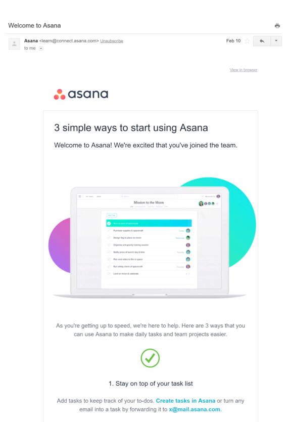
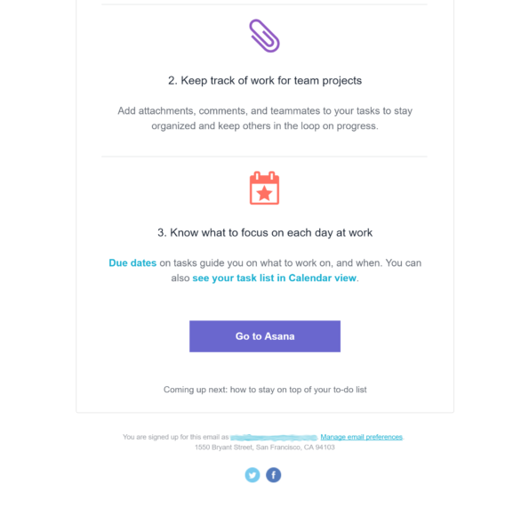
The design of this Asana welcome email example splits it into panels, each showing an icon and a short description of an Asana function.
What we liked:
- It looks like Asana, which is great for brand recognition and trust.
- The three-panel design works.
- There are links you can follow to complete different tasks in the app.
- The email would work even without the images.
- There’s a clear link to where subscribers can manage email preferences.
What we didn’t:
- We’re probably picky here, but the CTA could have been nearer to the top of the email.
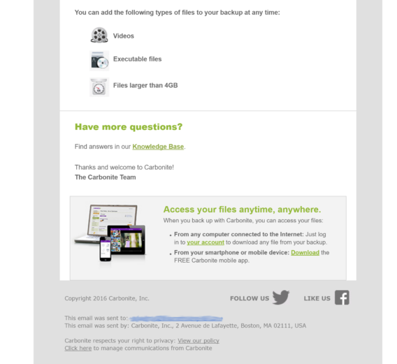
4. Carbonite
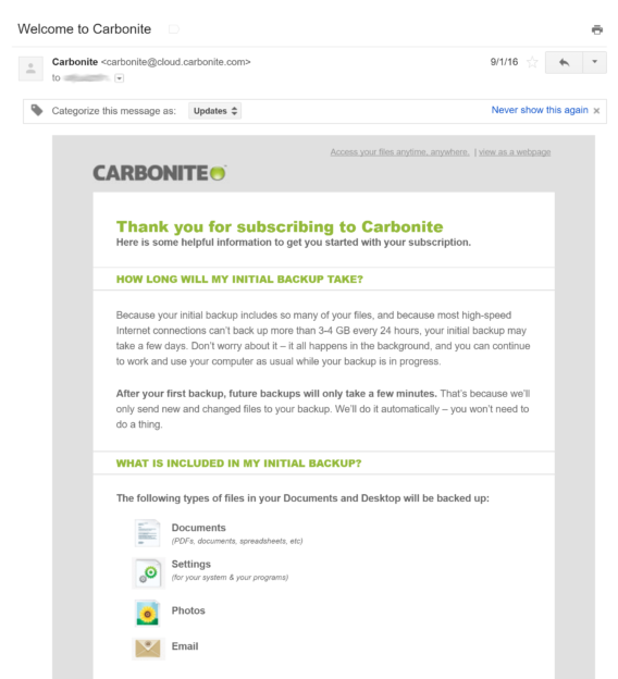
With the company’s logo at the top of this welcome email example, there’s no mistaking who it comes from.
What we liked:
- The email is branded.
- It answers two common questions people have about using Carbonite for backup. That’s pretty useful and will likely reduce the number of support requests from new users.
- It includes social media links, which are a big trust factor.
- The icons help make the content easier to understand.
What we didn’t:
- The email should be shorter.
- There is a CTA once you reach the end of the email, which many people may not do.
- There’s no clear unsubscribe link, though there is a link where you can manage email communication preferences.
5. Envira Gallery
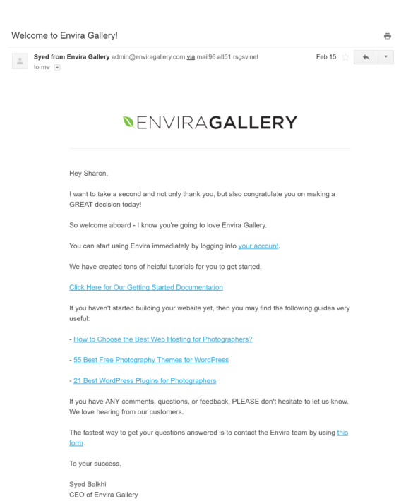
Let’s see how this welcome email example from Envira Gallery stacks up.
What we liked:
- Personalization: the email addresses the recipient by name.
- The product logo is included for brand recognition.
- The copy has a friendly tone.
- There’s a visible unsubscribe link.
- It comes from a real person.
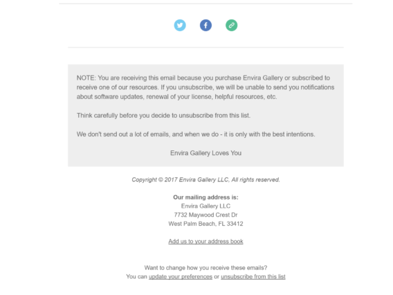
We couldn’t find anything to dislike in this email. The social links are visible, and there’s a callout box showing how people subscribed and why they should remain on the list. That’s why the Envira welcome email is an example of good practice.
6. GSuite
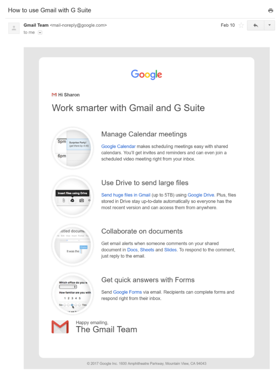
You get this email after you activate a GSuite account, and you’d hardly know this came from the same company as the AdWords email above.
What we liked:
- The email has a clean, uncluttered design, keeping with Google’s branding.
- There are short descriptions of four things you can do with GSuite and helpful links.
- The combination of text and icons makes it visually appealing, and they still work even if people have images turned off.
What we didn’t:
- The “no-reply” email address feels impersonal.
There’s no unsubscribe link, but who’s likely to want to unsubscribe from their GSuite account?
7. LawTrades
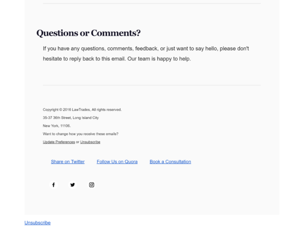
This welcome email example from LawTrades came after signing up for a deal via a third-party deals provider.
What we liked:
- The subject line tells you what you’ve signed up for.
- The email is branded.
- There’s a link to the company so you can check them out. This inspires trust.
- The clean, three-panel design makes the email easy to read, and the text is short.
- Social media links and address info are included.
- There’s a clear unsubscribe link.
What we didn’t:
- There are two different CTAs at the top of the email, and the second one is arguably more useful to new readers, so it should be first.
- The early attempt to get people to book a strategy session feels rushed.
- Although there’s an image of the sender, he doesn’t sign the email.
8. NDash
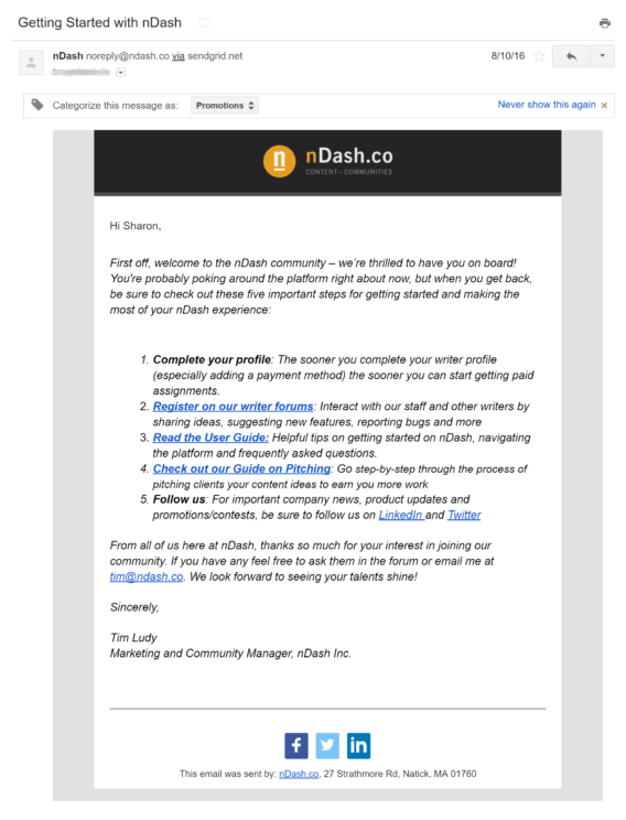
NDash takes a two-in-one approach, combining welcome and onboarding process.
What we liked:
- One email does it all; helping people get started rather than sending two separate emails is a good approach.
- Social media links are there to build trust.
- You can take multiple actions next (which is also a problem, as you’ll soon see).
- The one-column template works for any device.
- It includes the logo and social links.
- A real person signs it.
What we didn’t:
- There are too many actions to take from the email.
- The no-reply email address feels impersonal.
- There’s no unsubscribe link.
9. PostPlanner
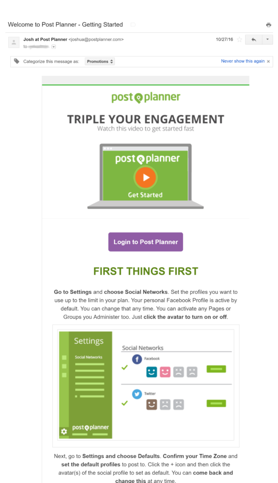
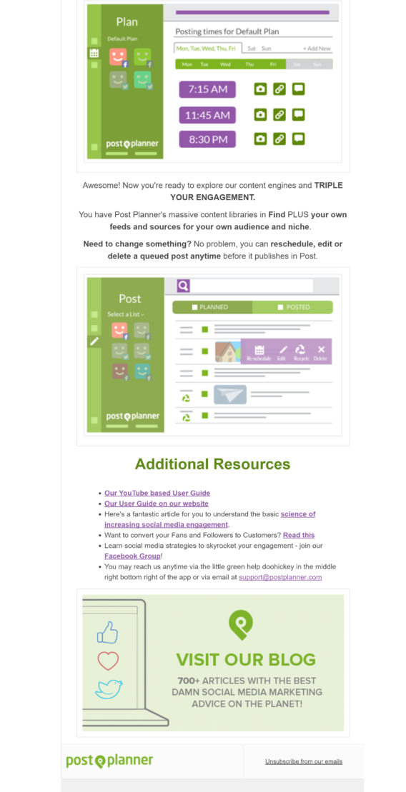
PostPlanner takes a kitchen sink approach with this welcome email example; they have thrown everything in. It just goes on:
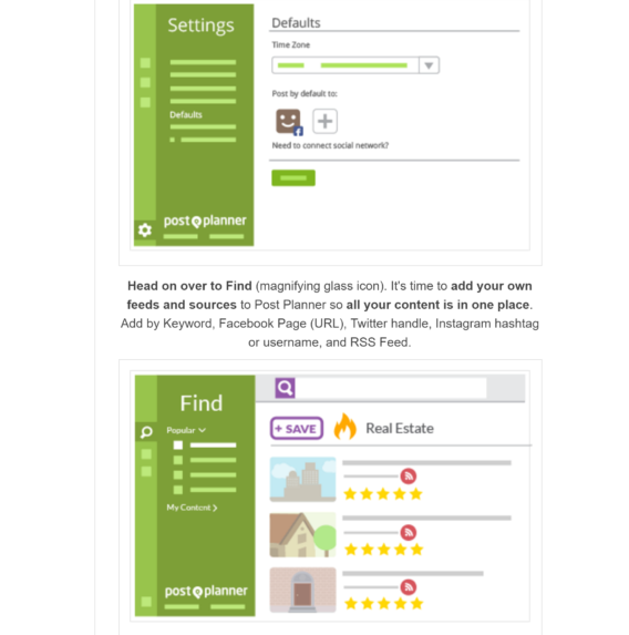
and on:
and on:
What we liked:
- It’s branded.
- It comes from a real person.
- The CTA is near the start.
- There are social media links.
- There’s a clear unsubscribe link.
What we didn’t:
- This email is way too long. With images not displayed, it’s a little more reasonable, but many email clients now display them by default.
PostPlanner’s email is a complete walkthrough, and we wonder if this is the best way to do it. No doubt, they’ve tested, and this is what converts well for them, but to us, it’s a bit too much.
10. Powr
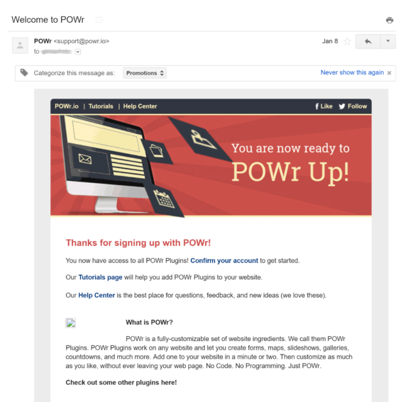
This email comes from WordPress plugin maker Powr.
What we liked:
- Links to some key areas are in the email header.
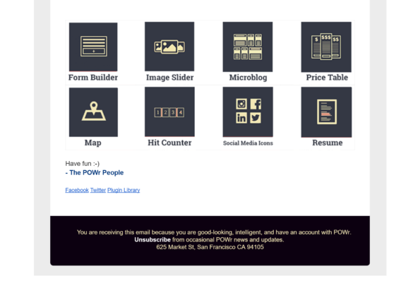
- The icons are eye-catching.
- Social media links are included.
- There’s a clear unsubscribe link.
What we didn’t:
- See that broken image icon? That means they were running a promotion at the time that has now ended. Anyone revisiting the email later won’t see anything, which is not good.
- There are too many things to do and CTAs.
- It doesn’t come from a real person.
11. Quuu
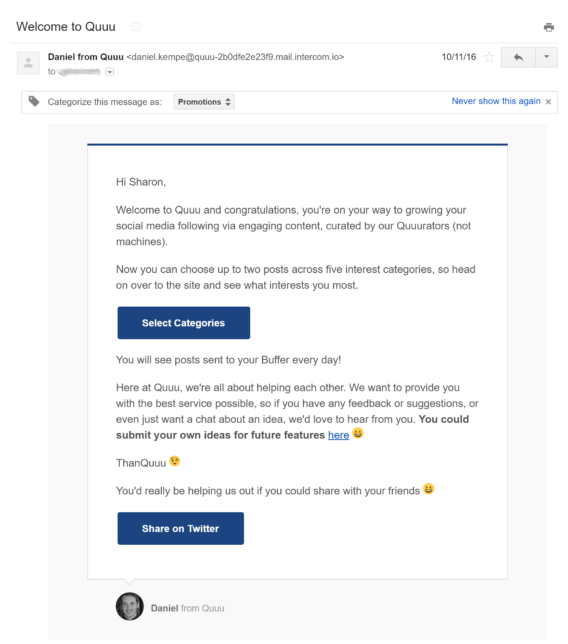
This welcome email example from Quuu is a bit unusual. That’s because it comes via the Intercom communication system.
What we liked:
- This email is short, easy to read and a minimalist design.
- It comes from a real person, with a photo and email address.
- It’s a little bit funny; see the “ThankQuuu” signoff
- It’s conversational in tone.
What we didn’t:
- If we’re being picky, we could point to multiple CTAs.
- You could say there are too many emojis, but that could be part of the brand’s personality.
- There’s no unsubscribe link; you get that in later emails.
12. Smarter Artist
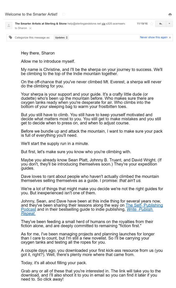
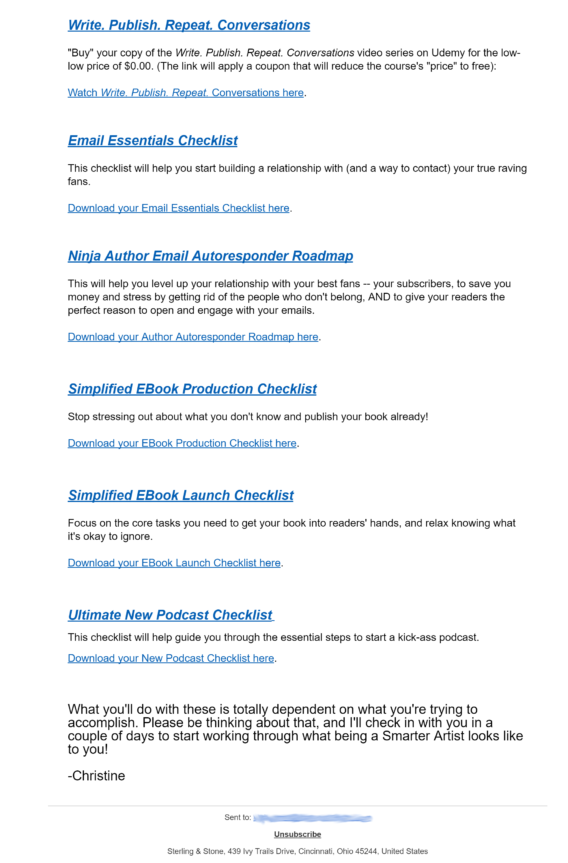
Can you have too much of a good thing? We think you can, as this welcome email example from Sean Platt’s and Johnny Truant’s Smarter Artist shows.
What we liked:
- It’s from a real person.
- It’s got lots of personality and humor.
- There’s tons of social proof in the form of links to successful products.
- There are freebies.
- There’s a clear unsubscribe link.
What we didn’t:
- It is way too long, though at least it’s not boring.
- The freebies people signed up for are near the end. People usually want the incentive immediately.
- There are too many links.
- It’s a wall of text.
13. TNW Deals
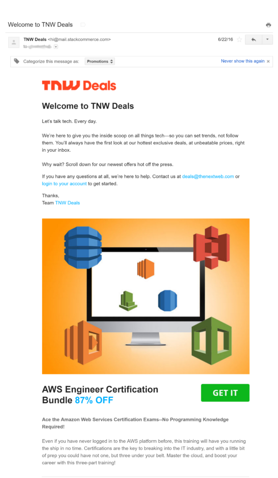
When you sign up for a deals email, you’ve got to expect people to try to sell to you, but does this email from TNW Deals go too far?
What we liked:
- The initial welcome message is short and sweet.
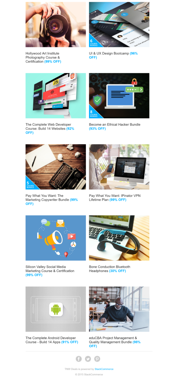
- They deliver what people are asking for: deals, and lots of them.
- There are lots of images that make it visually appealing.
- There are social media links.
What we didn’t:
- This is another very long email.
- It’s busy; there’s too much going on.
- There’s no unsubscribe link.
14. WiseStamp
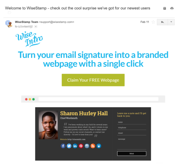
This WiseStamp welcome email arrived after an upgrade to its pro service:
What we liked:
- The headline is appealing, showcasing the value proposition right upfront.
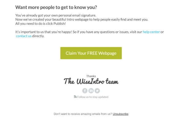
- There’s a single CTA, repeated twice.
- There’s an image showing what your landing page could look like.
- The unsubscribe link is clear.
- Social media icons are included.
- It’s short.
What we didn’t:
- There was only one thing to dislike here. The email came from the team rather than a person.
Welcome Email Mistakes To Avoid
In these welcome email examples, we’ve seen some key mistakes that might send your subscribers straight to the unsubscribe button if they can find it. Things that confuse people include:
- Sending more than one welcome email, like Adwords.
- Sending ridiculously long emails, like PostPlanner.
- Not being clear about who’s sending the email.
- Including multiple CTAs.
- Poor design.
- Failing to include trust factors like social media links.
- Being overwhelming.
Other good practice tips for welcome emails include:
- Don’t make them all about you; consider the new subscriber’s needs.
- Though we didn’t see it in this roundup, some welcome emails include passwords in plain text. This is an unnecessary security risk.
Now let’s look at five welcome email templates you can use immediately.
Welcome Email Templates
1. Welcome Email Template for New Customers:
Dear [First Name],
Welcome to [Brand Name]! We are thrilled to have you as our new customer and look forward to providing you the best possible service.
We want to extend a warm welcome by offering you [Insert Offer Details], which you can redeem during your next purchase.
We are confident that you will enjoy your time with us, and we look forward to building a lasting relationship.
Thank you for choosing [Brand Name], and we hope to serve you for years.
Best regards, [Your Name]
2. Welcome Email Template for a Newsletter Subscriber:
Dear [First Name],
Thank you for subscribing to the [Brand Name] newsletter! We’re excited to have you on board, and we can’t wait to share all our news and updates with you.
As a new subscriber, you’ll be the first to know about our latest products, promotions, and events. We’ll also send you exclusive content and special offers you won’t find anywhere else.
If you have any questions or comments, please don’t hesitate to contact us at [Insert Contact Details].
Thanks again for subscribing. We’re thrilled to have you on board!
Best, [Your Name]
3. Welcome Email Template for Trial User:
Dear [First Name],
Welcome to [Brand Name] trial! We are delighted to have you on board and look forward to helping you achieve your goals.
During your trial period, you will have access to all our features and tools, enabling you to test our product thoroughly. If you have any questions or need assistance, please don’t hesitate to contact our support team at [Insert Contact Details].
After your trial period, we would love to hear your feedback and insights on our product, which will help us improve and provide you with better service.
Thank you for choosing [Brand Name], and we hope you enjoy your trial period.
Best regards, [Your Name]
4. Welcome Email Template for App Download:
Dear [First Name],
Thank you for downloading the [Brand Name] app! We are thrilled to have you on board and look forward to providing you with an excellent mobile experience.
As a new user, we want to offer you [Insert Offer Details], which you can redeem within the app.
In the meantime, explore our app and check out its features. If you have any questions or feedback, please don’t hesitate to contact us at [Insert Contact Details].
Thank you for choosing [Brand Name], and we hope you enjoy using our app.
Best regards, [Your Name]
5. Welcome Email Template for Introducing Your Product:
Dear [Recipient Name],
We are thrilled to introduce you to [Product Name], the latest addition to [Company Name] product line.
[Product Name] is designed to help you solve [specific problem/need], and it will provide you with [unique benefit]. Our team has worked hard to ensure that [Product Name] is user-friendly and effective.
Thank you for choosing [Company Name]. We look forward to hearing your feedback and hope [Product Name] exceeds your expectations.
Best regards, [Your Name] [Company Name]
Using the welcome email examples above and our free templates, you can start thinking about what kind of emails you want to send your subscribers.
After that, see our guide to email marketing for more help with your email marketing strategy.
The success of your welcome email strategy is closely tied to the quality of your email subscriber list. If your email list lacks subscribers who have willingly opted in to receive your newsletters, your email marketing efforts are unlikely to yield the desired results.
If you want to populate your email list with subscribers who want to hear from you, it’s important to deploy an effective email opt-in tool on your website.
OptinMonster is an excellent choice, trusted by over 2 million businesses for its ability to grow email lists effectively.
Here’s How PodBike Gets 18.22% More Email Subscribers with OptinMonster’s GeoTargeting feature.
Want to start grow your email list fast?







Add a Comment