Do you want a simple way to increase your business’s conversions and sales? Welcome messages for websites have the power to catch visitors’ attention, show them relevant offers, and give them a reason to stay on your site.
The best website welcome messages make a strong first impression. They improve user experience (UX), set the tone for your brand, and often offer an enticing call to action (CTA).
The right welcome message can be the first step to transforming new users into loyal, life-long customers.
In this article, we’ll share the top 11 ways you can use website popups to create a sales-driving greeting message.
- What Is a Website Welcome Message?
- Why Are Welcome Messages Important?
- 11 Types of Welcome Messages (With Examples)
But before we dive into our examples, let’s take a look at what a welcome message is and why it’s so valuable.
What Is a Website Welcome Message?
A website welcome message is a popup or notification that website visitors see as soon as they arrive on your homepage. You can use these messages to greet new visitors and set the tone for future interactions. They help you establish your brand’s voice and start a relationship with potential customers.
These messages are more than just a way to say “welcome to my page.” They let you alert your visitors to important information, such as special offers or events. And you can put this information front and center, without making major updates to your website’s homepage.
Why Are Welcome Messages Important?
In addition to greeting new customers and visitors, welcome messages also provide concrete, measurable benefits.
The best welcome message examples can increase conversion for certain goals. In fact, welcome messages are 1 of the best strategies you can use to:
- Increase traffic to specific pages
- Grow your email list
- Make more sales
- Get more social media followers
You can collect email addresses or provide a coupon code directly in your welcome message. You can also use your welcome message to direct users to the pages you want them to visit, such as specific blog posts or product pages. When done correctly, this strategy will boost conversions across your site.
In short, welcome messages are powerful tools that more business owners and marketers should take advantage of.
But how should you use welcome messages on your website?
We’ll be taking a look at 11 types of welcome message examples, categorized by goal. You can use these examples to get ideas for reaching your business’s goals through effective welcome message campaigns.
11 Types of Welcome Message Examples
For this post, we’ll be sharing welcome messages that have been made with OptinMonster, the top lead generation software on the market.
Why make welcome messages with OptinMonster? Because we offer everything you need to greet your visitors with the right messages. Our popup formats include:
- Lightbox popups
- Full-screen welcome mats
- Slide-in scroll boxes
- Floating bars
Below, you’ll see examples of all of these pop-up types, so you’ll have a clear understanding of how to use them for your own welcome messages.
And the best part? You can build every one of our website welcome message examples in 5 minutes or less.
With our pre-made templates and easy drag-and-drop builder, you can create high-converting welcome messages in a snap. See how easy it is in this step-by-step guide to creating a pop-up campaign in under 5 minutes.
And you can create them without any coding or developer skills. That means even small businesses and first-time entrepreneurs can use these examples on their websites
Let’s dive into our list. We’ll share each example based on the goal of the welcome message.
- Build your email list
- Showcase a sale
- Display business updates or alerts
- Welcome back returning users
- Verify the user’s age
- Increase webinar registrations
- Announce free shipping
- Get more app downloads
- Grow podcast listeners
- Redirect to different areas of your site
- Boost social media followers
1. Build Your Email List
Growing a solid email list is vital for every business. Email marketing is 1 of the best ways for you to earn more income. In fact, it offers a return on investment (ROI) of 36:1.
But how do you get more interested leads on your email list?
One easy way is to use a welcome popup to entice website visitors to become email subscribers.
A popup is a great way of catching your users’ attention. As soon as they arrive at your site, they’ll be immediately greeted with a welcome message popup that asks them to subscribe.
But you have to make them WANT to subscribe.
Here are 2 ways to attract new signups:
Use a lead magnet to make your offer more enticing.
A lead magnet is a piece of valuable content that you offer in exchange for an email address.
Examples of effective lead magnets include:
- Coupon or discount codes
- Free courses or webinars
- Exclusive one-time content, such as a free ebooks or PDF guide
- Exclusive ongoing content, such as a weekly newsletter
A well-crafted welcome message will communicate the value of your lead magnet.
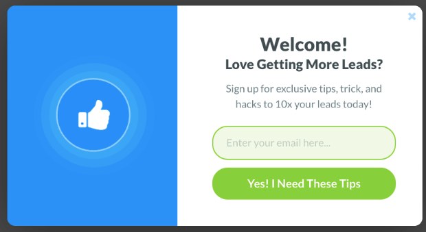
Here’s an example of a lightbox popup that promotes an email newsletter:
This popup offers a friendly greeting and promises that email subscribers will receive valuable tips for increasing their leads. The message also states that the tips in the newsletter are exclusive. Website visitors have to subscribe to the email newsletter in order to receive this special information.
If you have a great lead magnet, why not show visitors how valuable your business can be right off the bat?
This makes a welcome message popup the perfect tool for growing your email address.
Don’t have a lead magnet? No worries. Here are 60+ lead magnet ideas that you can start using today.
Create a gamified campaign to give people more incentive to sign up.
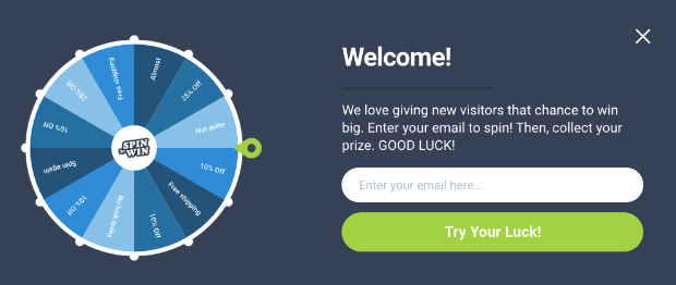
A gamified campaign creates a game-like experience for users. When they enter their email address, they get the chance to win a prize:
You can quickly create a gamified campaign with OptinMonster and set the rules for what people can win and how often.
That way, you never run out of your prizes!
Gamified campaigns are an easy-to-build solution for quickly growing your email list.
Next Steps: Make sure all your new subscribers receive a welcome email series! Welcome emails thank new subscribers, provide more information about your business, and move potential customers toward their first purchase. Your emails can also walk new users through the onboarding process of your service.
You can automate your email campaigns to make sure every new subscriber receives your welcome series. This is important because welcome emails have some of the highest open rates and conversion rates of all email marketing campaigns.
2. Showcase a Sale
If you run an online store, your users are probably there specifically to check out your products. And hopefully to make a purchase!
That means that you should welcome them with a sale to keep them on your site longer. This will motivate them to search through your store and take advantage of your offer.
For a big sale, you probably want something that really captures your audience’s attention.
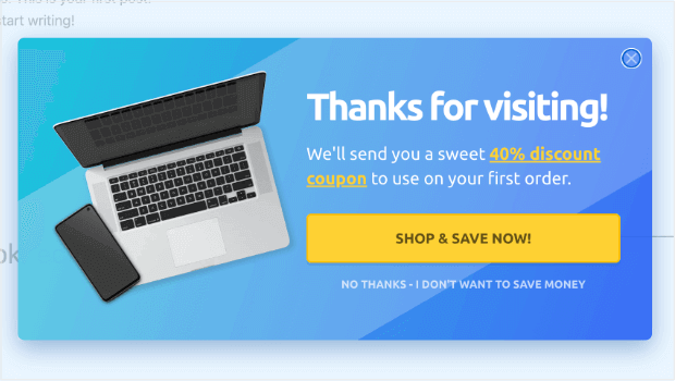
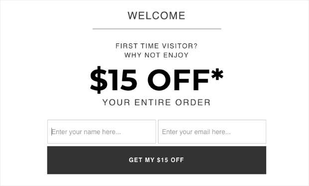
A fullscreen welcome mat can make sure every visitor knows about your special offers:
The campaign above is also an example of using a coupon code as a lead magnet.
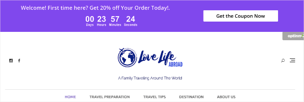
If you want something less intrusive than a full-screen popup, another option is floating bar campaign with a countdown timer:
A floating bar, also known as a hello bar, sticks to the top of your web pages as your user scrolls. The example above alerts users to a coupon opportunity. Floating bars keep your offer at the top of every page as your user browses.
And when you add a countdown timer, you create a sense of urgency that motivates people to act.
Countdown timer campaigns can be an excellent way of boosting your sales.
Next step: Learn how to create a countdown timer popup to increase sales.
3. Display Business Updates or Alerts
Sometimes, you may have changes in your company that affect users. When that’s the case, your welcome message should let them know right away.
These changes could include:
- New store hours
- Weather closings
- New locations
- Out-of-stock notices for a product
Or it could be any other information that your visitors need to know.
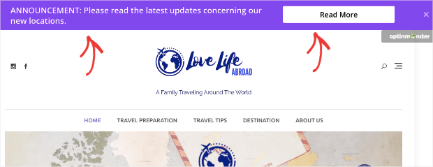
For this type of alert, a standard floating bar campaign is the best option:
A floating bar lets users know about important changes. But, it won’t overtake the entire screen or interrupt their browsing.
Instead, you can make a small but bold announcement at the top of the browser. If necessary, you can include a button that links to a page with more information.
This lets you inform your site’s visitors of company updates in an unobtrusive way.
Next step: Learn the steps for creating a website notification bar to keep users informed.
4. Welcome Back Returning Users
One of the best ways to increase user loyalty is to personalize your messaging. You can do that by creating a welcome message specifically for returning users.
OptinMonster’s OnSite Retargeting® feature lets you show different messages to repeat visitors. You can tailor your message for a different target audience: users who liked your site enough to visit again.
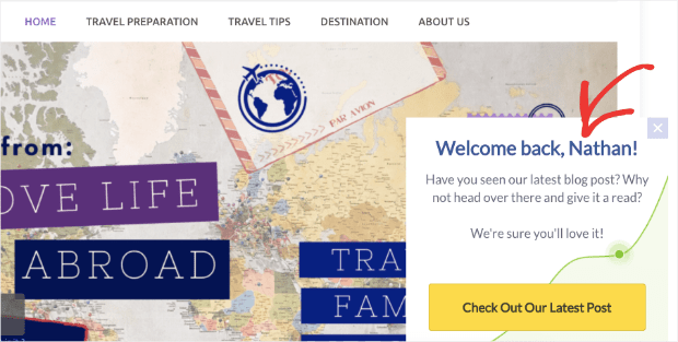
A slide-in scroll box is a great choice for returning users:
In the slide-in campaign example above, the website welcome text is friendly and familiar. This is a great tone to strike with someone who has already visited your website.
Was your welcome message for first time users a coupon? Consider offering an even better offer for returning users who did not engage with your first welcome offer.
Welcome back messages give you the opportunity to improve your initial offer and continue building a relationship with potential customers and subscribers.
The example above also addresses the user by name.
You can accomplish this with OptinMonster using Smart Tags. Smart tags allow you to personalize the way you communicate with your audience. You can use smart tags for:
- Names
- Locations
- Dates and times
- Customer journey phase
Nesxe Step: Learn the steps to using smart tags in your welcome messages and optin campaigns.
5. Verify User’s Age
If your online store sells products for adults only, you can create a welcome message that verifies your user’s age.
In fact, many states will require this by law.
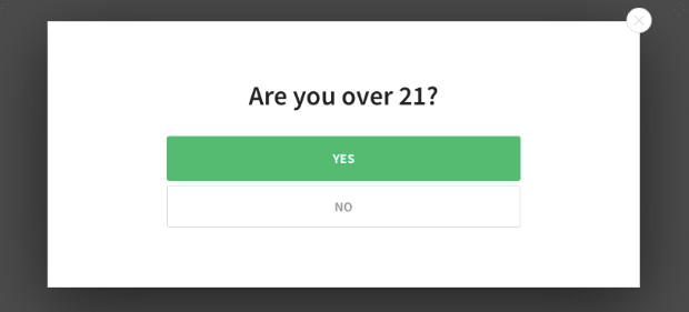
Fortunately, you can build a fullscreen welcome gate that requires users to verify their age before accessing your site:
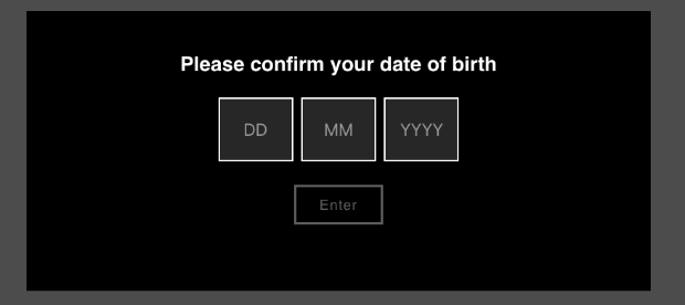
Or, you can create a custom popup to make users enter their birthday:
These campaigns will keep your website legally compliant and socially responsible.
Next Step: Check out this tutorial on how to add age verification to any website in minutes.
6. Increase Webinar Registrations
Webinars are 1 of the best tools in your sales funnel. They’re effective, build authority within your niche, and make for an excellent lead magnet.
You can use webinars at every stage of your customer journey to move users towards a sale.
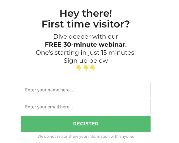
But how do you get users to sign up for your webinar? That’s where a welcome message popup comes in handy.
You can create a popup letting users know about your upcoming webinar. For this, you have 2 options:
- Create a signup form and send a follow-up email
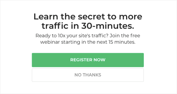
- Make a Yes/No popup campaign that redirects to a landing page
Both options are simple. With OptinMonster, you can choose 1 of our templates to create an optin form for your webinar:
When users give their email address, you can send them a follow-up email with details about your webinar. Plus, you’ll now have a new lead on your email list!
Alternatively, you can use a Yes/No popup to redirect users to a landing page:
If users choose, “Register Now,” they’ll be directed to a landing page where they can register.
Yes/No campaigns are great because they won’t scare away your users. Rather than asking for contact information right away, you can get the process rolling by asking a simple “yes or no” question.
Next step: Follow our guide to creating a webinar landing page that converts.
7. Announce Free Shipping
Free shipping is an excellent incentive for people to purchase your products. After all, customers will often abandon their cart when they see unexpected costs in the final total.
One of these unexpected costs is shipping.
Want to reduce cart abandonment and drive more sales? Use a floating bar campaign to let people know how to get free shipping:
This is a wonderful welcome for people entering your site. Knowing that the price they see is the price they’ll pay is an added incentive to put more items in the cart!
It’s also a great upselling tactic because customers will purchase more to qualify for free shipping.
Next Step: Here’s a full tutorial on how to add a free shipping bar to your eCommerce store.
8. Get More App Downloads
Many companies create apps to encourage users to engage with their brand. Apps are great at building customer loyalty, as they often offer rewards to keep users coming back.
Now, you just need people to download your app!
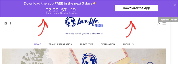
Like our last tip, we recommend using a floating bar but adding a countdown timer:
One of the best ways to get your website visitors to download the app is to let them know about it. Floating bars are the perfect tool for getting your user’s attention without interrupting their experience on your website.
From there, use a countdown timer to build urgency. You can give away your app totally free for a limited amount of time.
And with a dynamic countdown timer, you don’t need to set a fixed end date. Instead, every user will have a certain period of time that starts when they first see your campaign.
This builds enough motivation for your users to download your app while keeping everything fair for all your site’s visitors.
Next step: Try out our 7 methods for boosting app downloads.
9. Grow Podcast Listeners
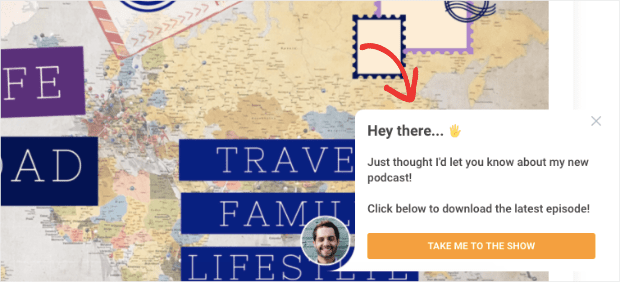
If you have a podcast, you need to get the word out. And one of the best times to do that is when a visitor reaches your site.
A slide-in scroll side box is perfect for drumming up new listeners from your site’s traffic. That would look something like this:
In addition to a welcome message, make sure you continue to promote your podcast through your site.
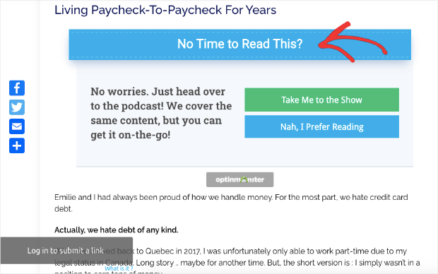
For instance, blogs can use an inline campaign to redirect to your podcast.
That way, people who enjoy your content have a second way to consume it.
This is particularly useful if you create podcasts from blog posts or visa-versa. By putting an inline campiagn in your blog’s introduction, you welcome your blog readers with a way to consume your content on the go.
Next Step: Are you new to podcasting? These podcasting plugins will let you host your podcast directly on your WordPress website.
10. Redirect to Different Web Pages
Welcome messages aren’t all created equally. What works for one business won’t work for another.
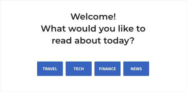
If you’re a publishing company, for example, you may want to create a welcome message that redirects users to different content categories.
With OptinMonster’s drag and drop builder, you can add buttons with redirect options for content categories of your website:
This strategy helps users find what interests them the most. It’s especially useful if you have a lot of content on your site from a wide range of niches.
Next Step: Once you’ve directed visitors to the blog posts they’re most interested in, follow our tips for attracting more blog subscribers.
11. Boost Social Media Followers
Exact percentages vary, but most sources agree that the vast majority of first-time website visitors never go to your site again. That’s a lot of traffic that goes to waste.
You can increase your odds of repeat traffic by connecting with people on social media. Or, more specifically, having them connect with you.
OptinMonster has a template specifically designed to get you more social followers on:
- X (formerly Twitter)
You can provide buttons to follow you as a welcome message:
That way, if they leave later, you can still market to them through social media.
Convert More Website Visitors With Welcome Messages
And that’s it! You have 11 types of welcome message examples that will improve UX, increase sitewide traffic, grow your email list, and boost sales.
As you’ve seen in these examples, OptinMonster makes it easy to create welcome messages for every goal.
If you’re welcoming people into your website, you may also want to send them a message as they leave. Exit-Intent® popups are a great way to recover abandoning visitors and abandoned carts.
In fact, the fitness company Crossrope was able to grow its email list by over 900% with exit-intent popups.
Plus, you can now use mobile exit-intent campaigns that work on smartphones. For that, you’ll want to check out this article on how to create a mobile exit-intent popup that converts.
Ready to get started with OptinMonster? Sign up for your risk-free OptinMonster account today!








Add a Comment