Are you struggling to create engaging visual content for your audience? It may already feel like maintaining your blog is a full-time job. And that’s just the writing.
So when you add visual content into the mix? It can be a lot.
Fortunately, we have 15 visual content creation tips to make life a little easier for you.
In this article, we’ll look at why you need different types of visual content for each platform. Then we’ll break down 15 visual content tips for social media, blog posts, and video.
But first, let’s explore what makes visual content such an important tool.
The Power of Visual Content for Marketers
You know how they say a photo is worth a thousand words? Well, they’re actually worth a lot more to digital marketers.
It turns out that the human brain can process an image in just 13 milliseconds. And it processes images 60,000 times faster than text.
Plus, content with images is shown to get more views and more shares. In other words, visual marketing can attract more clients to your business.
And this isn’t only true of static images.
Videos can generate enormous amounts of traffic, as well.
Nearly every video marketing statistic points to how powerful videos can be for your content marketing strategy. They show that the majority of video marketers (80% or more) claim that videos:
- Boost traffic on their site
- Attract more leads
- Increase overall sales
- Provide a good return on investment (ROI)
Using some kind of visual marketing strategy is a surefire way to engage your readers, get more exposure through shares, and drive more conversions.
So why isn’t every company creating awesome visual content to bring in more leads?
Many are trying, but it can be tough to keep up. Mainly because there are so many different platforms to create visual content for.
Nevertheless, it’s more important than ever to use visuals across a variety of mediums to reach your audience.
Why You Need Different Types of Visual Content
Humans are creatures of habit. When most of us go online, we create little routines.
- Twitter? Check.
- Facebook? Check.
- YouTube? Got it.
- Blog updates? Nice.
The problem for marketers is that our consumers’ routines are never the same. Some people prefer to view a brand on Instagram, while others will go to the company website for information.
The goal of a successful marketer is to distribute engaging content on the audience’s favorite platform.
And because of that, there is no “cookie-cutter” approach to creating visual content. You need to adjust your visual creation techniques to the platform you’re using.
But now it’s time for some good news: creating visually compelling content across a wide range of platforms doesn’t need to be overwhelming.
In fact, it can be quite simple.
All you need to do is follow these visual content creation tips, and you’ll be well on your way to driving traffic, boosting conversions, and increasing sales with visual campaigns.
15 Visual Content Creation Tips for Social Media, Blogs, and Video
When it comes to the different types of visual content to create, you have loads of options. You can create optin visuals, photos, cartoon images, infographics, GIFs, videos, quizzes, and more.
But rather than going through each specific type of content, we’re going to focus on visual content creation for three of the most popular types of content marketing strategies:
- Social media posts
- Blog images
- Videos
But first, let’s check out a few general tips for visual content creation that apply to every type of visual content you create.
General Visual Content Creation Tips
Before diving into each specific category of visual content, let’s quickly go over some visual content creation tips that are true for just about any type of visual content you can make.
1. Stay Consistent Across All Platforms
As we’re discussing how to make visual content for social media, blogs, and video, keep in mind that you should be using the same branding for each platform.
One good tip is to create a “brand kit” for your company that has:
- A good logo
- A color palette for your brand
- Font styles
When you have your color and font nailed in, maintain those elements for all of your visual content. You want to be consistent with your visuals across multiple platforms to increase your brand recognition (even if it’s a personal brand).
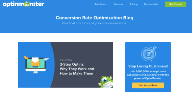
OptinMonster does this on our website, blogs, and YouTube videos. You can see the color scheme for our site:
Which matches our YouTube videos:
This helps our users immediately recognize that they’re looking at content by OptinMonster.
2. Invest in and Use Your Logo
Logo creation can be expensive, time-consuming, and tedious. But it’s also incredibly valuable.
Your logo will likely stick with your brand for as long as it exists. Once it becomes popular, you don’t even need to add your company name to be recognized.
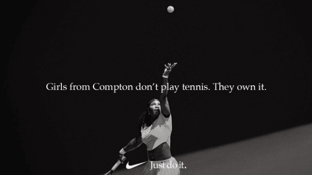
Nike is a great example of this. On many of their ads, they don’t mention their brand’s name. They simply include their logo and tagline:
But despite not placing their name on the image, everyone knows this is a Nike ad as soon as they see the “swoosh” sign at the bottom.
You should be working toward the same level of brand recognition.
When you’re making your logo, you don’t need to spend thousands of dollars. But if you don’t have money, you should invest the time in creating a logo that is perfect for your brand.
Remember, don’t settle for anything you aren’t 100% happy with because you’ll be looking at it a lot.
Your logo can come in two forms. A text-based version for your company name:
Or an image-based version that represents your brand:
Ideally, you’ll create both.
Check out some of these free logo-making tools if you’re designing on a budget:
- Canva Logo Maker: A popular image designer that can help you make a logo
- Looka: A logo maker that uses artificial intelligence to create the perfect design
- LogoMaker: Just like their name suggests, LogoMaker makes logo creation simple and straightforward
These tools aren’t the only ones around (there are many other visual content creation tools out there), but they’re a great starting point for small businesses creating a logo.
3. Align Your Visual Elements
Whether you’re creating an infographic or a personalized image for your blog, make sure to follow the basic rules for image alignment.
Everything should be spaced equally apart, and nothing should be too close to the borders of the visual content. Elements like text or images should be aligned both horizontally and vertically (in most cases).
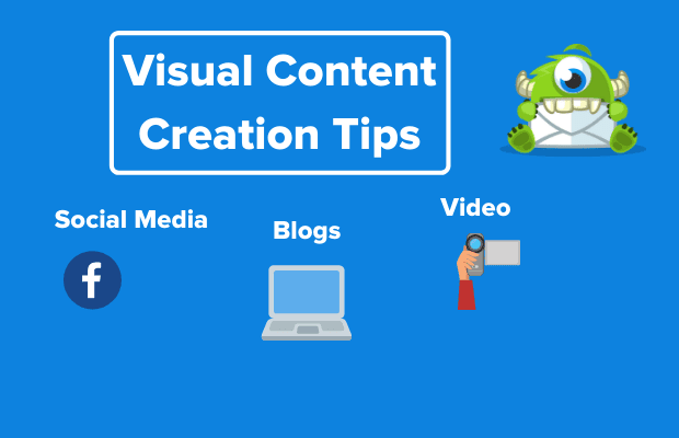
Here’s an exaggerated example of an image with poor alignment:
Again, most companies wouldn’t publish something this sloppy, but it highlights common mistakes.
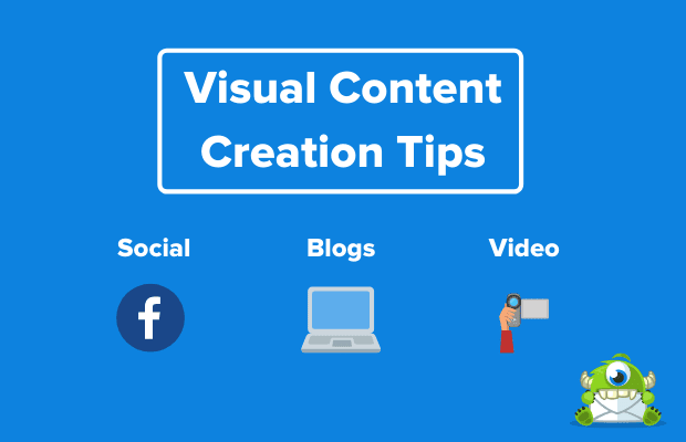
The main title phrase should be centered. The text for Social Media, Blogs, and Video should be aligned horizontally. And the images underneath those words should be aligned vertically with the text above.
There should also be appropriate spacing around the borders, and the main logo should be placed somewhere more subtly off to the side.
Here is the same image properly spaced with text that is aligned horizontally and vertically:
Remember, these are general rules that can sometimes be broken. Infographics, for example, may require you to work diagonally or use more complex web design best practices.
That said, it’s best to stick to these general rules until you’re more comfortable with visual content creation.
Social Media Content Creation Tips
4. Get the Dimensions Right
When you’re making images for social media, there’s truly not a “one size fits all” solution. Each platform has its own dimensions that work best. Some have multiple dimensions depending on where the image will be displayed on the platform.
Here are the dimensions for basic profile posts for the most popular social media platforms:
- Facebook: 180 x 180 (displays 170 x 170 on desktop)
- Twitter: 440 x 220 (minimum)
- Instagram: 161 x 161 (for photo thumbnails)
- Pinterest: 236-pixel width for the main page and board (height is scaled accordingly)
- LinkedIn: 1104 x 736
- YouTube: 1280 x 720
NoteImage sizes are specifically for posts on each platform. As mentioned, there are different size guidelines for banners, profile pictures, hero images, and others. The dimensions listed above are in standard form: width x height (in pixels).
When creating visual content for your social media strategy, take the extra 15 minutes to reformat your images to the specific platform you’re using. Here are 3 free tools to help you:
5. Show Your Creativity by Being Original
One of the best parts of visual content creation is that you get to show how creative you are. Visuals are a great way to demonstrate your brand’s personality. And like humans, every brand has a unique personality that is worth showing off.
If you’re funny, create things that are funny. If you’re serious, create things that are serious. But whatever you do, be original.
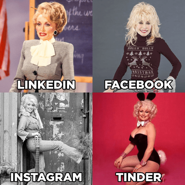
Dolly Parton recently went viral with this visual post:
It was simple. It was funny. And it was original.
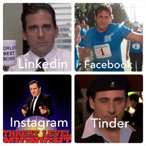
Thousands of people joined in on the Dolly Parton challenge and recreated the photo with their own images or images from their favorite celebrities:
But Dolly Parton (the person and the brand) will forever be remembered for having kicked it off.
When it comes to your visual content, be creative, and make something no one has ever made before.
6. Use Images Relevant to Your Business
When social media first came out, it was an excellent way for people to share bits of their lives with family and friends. Then as it got more popular, people started realizing not everything needed to be shared.
Case in point? Remember all those images of “food selfies” that filled your Instagram feed a few years back:
Those may be fine for personal social media accounts. But unless you work in the food industry, it has no business on your brand’s page.
Your visual content should always be related to your niche and should serve a specific purpose.
Before creating an image for any social media account, ask yourself:
What is the specific purpose of this visual content? Is it meant to be funny, promotional, thought-provoking?
Or did you just feel like you were running low on social media content and needed a quick post?
You should never start creating visual content to share on social media until you have a specific vision for what that image will accomplish.
Blogging Visual Content Creation Tips
7. Find the Right Width and Height for Your Blog’s Images
Just like you need to get the dimensions right for social media platforms, the visual content for your blog should also be formatted correctly.
The trouble is that these dimensions may change depending on your blogging platform.
To find the right dimensions for visual content in your blog, go by your blog’s width.
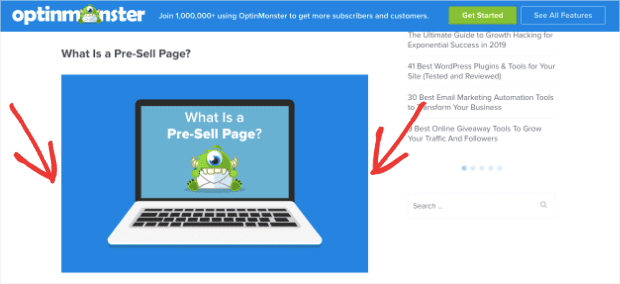
OptinMonster’s blog has a width of 620 pixels, so our images follow that format:
But remember, you don’t want your images to be too tall, either.
A good rule of thumb is your image should never take up an entire screen at one time. That’s why, as a general rule, the width of your image should be larger than its height.
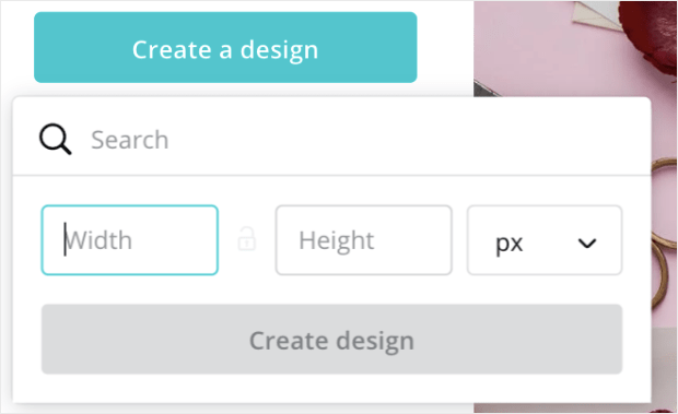
Once you’ve found the right dimensions for your blog, most image creation tools allow you to create custom images. Canva, for example, lets you design visual content with custom dimensions:
Or, you can always take an existing image and crop it.
A great tool for that is iloveimg, which allows you to upload, crop, and download any image for free.
8. Avoid Stock Photos (But Don’t Break Copyright Laws)
When it comes to finding visual content, a lot of companies try to save time with stock photos.
Stock photos are images that professional or amateur photographers take and allow anyone to use without any copyright restrictions:
Plenty of sites like Unsplash or ShutterStock have royalty-free images that can be used as visual content. However, you should avoid using stock photos when you can. Here’s why:
When it comes to building a solid brand, consumers really like authenticity. They view your brand as a human being with a unique personality. The more you let that uniqueness shine through, the more connected they feel to the brand.
Stock photos may be convenient, free, and often very beautiful, but they simply aren’t personal.
The point of your visual content is to engage your audience. So when it’s time to create visual content for your blog, you should use custom photos that show off your brand’s personality.
Here are some alternatives to using stock photos:
- Create images with software like Canva, Adobe Photoshop, or Affinity
- Ask for user-generated images
- Take your own photos (most smartphones now create high-quality photos)
- Use screenshots
- Create a meme with MemeGenerator
Creating your own visual content rather than relying on stock photos may take longer, but it will build a more authentic connection with your audience.
9. Compress Your Images
Most people think that the last step of creating visual content is hitting save. Unfortunately, they’ve forgotten a crucial step for their blog’s performance:
Compressing the images.
Using visual content on your blog is an excellent way to engage your readers. But it’s also a great way to slow your site down.
When you compress an image, you shave off some of its “weight,” which helps your website run faster. Here’s an example of an image that went from 108.21 KB to 23.68 KB:
The image is now 78% lighter. Since site speed is a factor in optimizing your blog for SEO, compressing your photos is an absolute must.
Here are three tools for compressing images and GIFs:
- CompressJPEG
- CompressPNG
- Compressor.io (good for GIFs)
These tools reduce the amount of weight for your visual content and keep your blog running fast.
10. Use Alt Tags (Not Just for SEO)
If you’ve ever read any expert advice on SEO, you’ve likely run across the term alt tag. This is a small description of your image that can help your SEO.
Google bots can’t view an image the same way humans can. They need some text to help them out. Your alt tag helps search engine bots see your visual content.
But there’s an even more important reason why you need to add alt tags to your blog post’s visual content:
To help your readers with low vision or those who are blind.
When someone in your audience can’t see your visual content, their screen reader will tell them about the image through the alt tag.
So, yes. Alt tags are great for SEO.
But they’re even better for improving user experience (UX) for all of your users.
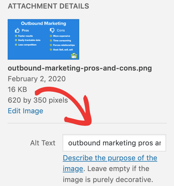
If you’re running a site with WordPress, you can add alt tags directly in your Media Library by clicking on the image you want to modify:
11. Don’t Load Images With Too Much Text
This visual content creation tip is closely related to the last one. If your image has too much text, some of your readers might miss out on some critical information.
If you’re using visual content in your blog to represent some kind of data, make sure that you repeat that information somewhere in the actual text.
Again, screen readers can’t decipher images the same way humans can. So if you have important information in your visual content but can’t be found in your blog’s text, an entire segment of your audience won’t get that message.
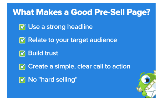
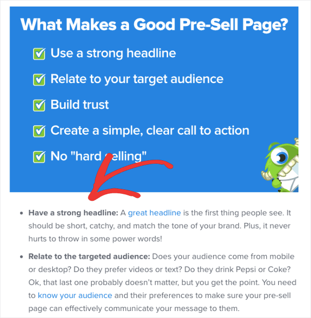
Sometimes we at OptinMonster need to use images to make a quote or a statistic stand out that uses a lot of text:
When that’s the case, we simply repeat the information either before the visual content or directly after:
That way, our entire audience has access to all the information we have to offer.
Video Content Creation Tips
12. Write the Script First and Record After
Creating awesome, topic-relevant videos for your audience can be a really fun process. It allows your creativity to shine in ways that static images don’t.
But before you start, you need to know exactly what you’re going to say. And that means doing the least fun part of the process upfront:
Writing the script.
By writing out a detailed script or outline, you’ll make sure your video is organized and coherent. In other words, it will prevent you from rambling on.
So before you call “Action,” make sure you have a solid script in place.
13. Check Your Lighting
If you’re showing your face on video (rather than doing a screen recording), then you need to make sure you’re in a well-lit area.
Here are a few quick tips for lighting:
- Get your light source as close as possible without being in the frame. The closer the light, the softer the lighting
- Use natural, indoor lighting when possible
- Light should come from behind the camera toward the person being filmed and never directly behind the person on camera
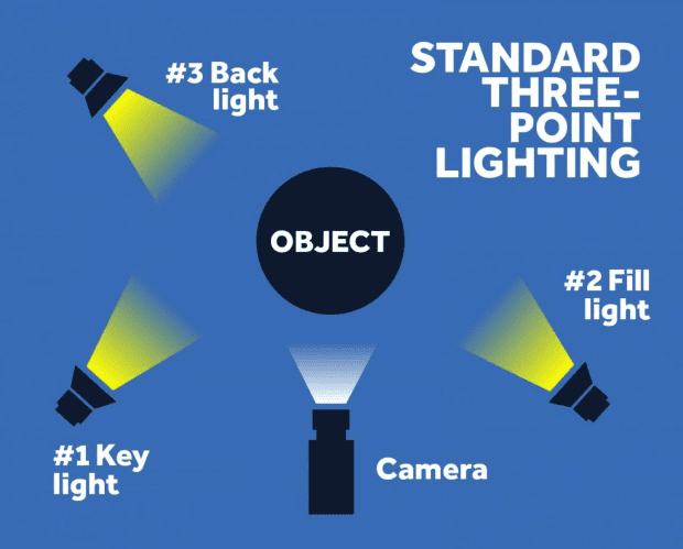
One popular method is called three-point lighting that places lights in the following way:
This puts the key light (the main lighting source) above the object and off to the left or right. The fill light goes on the other side of the object. And a low backlight behind the subject and slightly off to either side.
But honestly, if you’re recording simple YouTube videos, don’t overthink this. The best way to test your lighting? Film a little bit of your video, go back, and watch it yourself.
Play around with the lighting in your environment until the image is something you would like to watch.
For more professional lighting tips, check out this guide to three-point lighting.
14. Invest in the Right Audio Equipment
Even though this article is about visual content creation tips, audio is still a big part of the video marketing component.
Get a decent microphone to record any speaking or narration for your videos:
You can have the most appealing visual graphics in the world, but if your audio isn’t quality, your audience will likely lose interest and move on.
Fortunately, you have tons of options for microphones that are affordable but produce high-quality sound. Here are a few options under $100:
And when it comes time to edit your sound, you don’t need to spend a ton of money on fancy software. For most of your video content, the free sound editor Audacity has everything you need.
15. Invest in the Proper Video Editing Tools
This tip comes directly from OptinMonster’s video creator, Sarah Miller:
Her #1 recommendation for creating professional videos is for people to “stop relying on default movie makers and just dive deep with FinalCut Pro, AfterEffects, or Wondershare.”
Yes, these paid software cost more than many of the default video editors that come with most computers (like iMovie for Mac, for example).
But if you want to create high-quality videos, investing in a video editing software will produce better results in less time.
Don’t spend hours trying to figure out how to “hack” a free video editor to get the effect you want. Instead, find a reliable software that you can work with quickly and efficiently.
A Quick Word on Visual Content Creation Tips for Optins
In this post, we looked at visual content creation tips for the most popular platforms, including social media, blog posts, and videos.
But there are plenty more platforms where visual content is needed.
The one aspect of visual content that hits closest to home for us here at OptinMonster is how you use visuals for your optins.
Many of the same tips you’ve read today apply to creating visuals for your optin, regardless of the optin campaign you choose. You should:
- Use your brand’s fonts, colors, and logo
- Align and neatly space all the visual elements in your optin
- Customize images and avoid stock photos
- Provide adequate text for screen readers
However, there is one aspect of using visual content for optin pages that we need to emphasize:
All the visual content for your optin pages should lead your customer’s eyes to a call to action.
The visual aspects of your optin page can be funny, entertaining, or thought-provoking. But none of those things is the overall goal for that page.
The objective is to convert readers into customers.
The visual content on your optin page should help achieve that goal by grabbing your audience’s attention and lead their eyes to your call to action.
Luckily, if you aren’t a web design expert, most companies who specialize in conversion optimization can help with the design process.
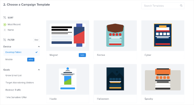
OptinMonster, for example, has loads of premade templates that have been proven to convert. These templates help you avoid many of the common design mistakes even professionals make.
You can keep the layout of these templates but change the images, fonts, and colors to match your brand and your brand’s message.
These templates allow you to create a personalized piece of visual content in a matter of minutes (rather than hours).
Plus, they’re all specifically designed to lead your audience to your call to action.
So whether you are trying to grow your email list or redirect your customers to a landing page, your optin template is always working for your goals.
But now, we’d love to hand the conversation over to you: do you have any hidden visual content creation tips up your sleeve?
We’d love to hear about them! Reach out to us on Facebook or Twitter and let us know your favorite way to make visual content.
Or perhaps you’re less of a designer and simply looking for ways to create powerful optin campaigns that still look great.
If so, come join our awesome community and sign up for OptinMonster today!
















Add a Comment