Do you know what makes your customers happy?
Even before they pay for a product, customers want a positive experience learning about it. And that’s why the onboarding experience is so important. In this article, we’ll share 7 user onboarding best practices that will easily boost customer success.
What is User Onboarding?
The term gets thrown around a lot, but what is user onboarding, exactly?
User onboarding is the process of actively guiding users to find new value in your product or service. It begins even before a user signs up and continues after that.
1. Map Customer Journeys
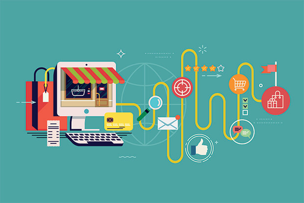
To help people understand why they need to use your product, you’ll need to help guide them through the journey. Give them a guided tour of what their customer journey will look like. This will also help you prioritize and organize your message.
To start, you’ll need to have a clear image of your product’s user. Create a concrete user persona by answering the following questions:
- What are their needs?
- What motivates them?
- What are their goals and values?
- Do some users need more education about your product than others?
- Who will be the final decision maker to make the purchase?
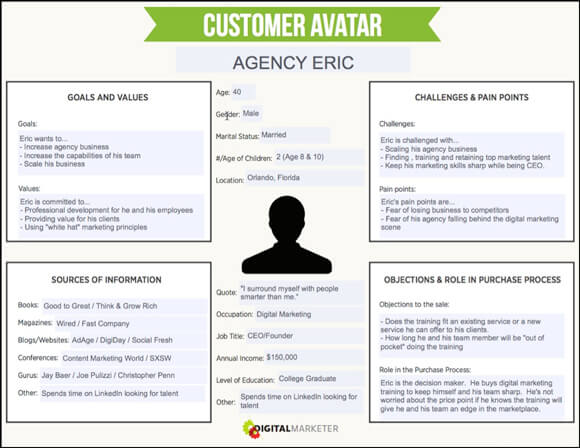
Use these insights to build your customer avatar, which is a fictional character that represents your ideal prospect.
Digital Marketer created an example customer avatar for a new product they were offering: certification classes. With this new product offering, Digital Marketer will have new ideal customers, and that meant creating a new ideal customer avatar. Here’s what it looked like:
There are 3 main stages of a customer’s journey which includes awareness, evaluation, and conversion. Connect with your customer at each stage. Done correctly, you can even capture leads throughout each stage of the customer journey.
For example, during the awareness stage, the prospect is just becoming aware of your product. They may have a problem or need, but don’t specifically know of the solution yet.
At this stage, your main goal is to capture their email address so they can become aware of your product. You can use features such as page-level targeting or exit-intent to create high-converting optin forms.
2. Show Value Immediately
Before using a product, you’d want to know what’s in it for you, right?
Onboarding is more than just showing users how to use your product. To be successful, you have to show them why they need to use it. And it’s important to show them the value immediately.
This means giving users a compelling value proposition: a simple, clear description of what makes your product unique.
Potential users shouldn’t have to guess or work hard to understand your product. They should be able to understand what it is and why they should use it in less than 5 seconds. These 5 seconds are called the “aha” moments.
But why are these moments so important?
Research shows that improvements in a user’s first 5 minutes can drive up to 50% increase in lifetime value.
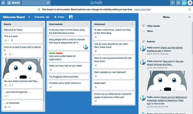
For example, Trello is a digital project management platform whose new user onboarding is very simple but effective. Its value proposition is to help users manage everyday projects quickly and easily.
The welcome board does this by showing users exactly how the product works. Trello offers users onboarding tools such as drag and drop features.
Trello’s “aha” moment is when the user is able to successfully drag and drop a card.
3. Create Onboarding Flows and Connect Teams
If your product or service is meant to be used by teams, make sure to get as many people on board as early as possible.
Once you’ve shown the value to an individual user, give them an opportunity to show others. Create an onboarding flow that includes other teammates so your teams will stay connected. As part of your user onboarding strategies, give each user the necessary access and resources they need to understand the product or service.
4. Reduce Friction and Use Progressive Profiling
From a user’s perspective, each part of the onboarding should be easy enough so they don’t have a reason to not do it. Make onboarding as smooth as possible by identifying areas that could cause friction.
One area many companies forget to look at is the start. Where does the user sign up and log in? Is it necessary for them to create a new account, or can they use their social login?
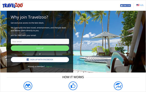
Travelzoo, an online curator of travel and entertainment deals offers users a super easy signup experience. To sign up, all users need to do is enter their email or sign up with Facebook.
Offering a social login makes it easy on the user, giving them an option to join without having to create a new account.
Another area to look at is the amount of information the user has to provide upfront.
Does the user only need to give you their name and email address to get started?
Or do they have to fill out their life story before they can see any value from the product?
Although you want information from your users, it’s important to keep this initial request short or you’ll risk losing potential customers. No one wants to fill out a super long form just to check out your product. Don’t make the mistake of losing a potential customer before they even had a chance to try it. Stick to the absolute minimum.
Gradually build a profile of your customers using progressive profiling each time they interact with your product. By keeping surveys short and to the point, you can gain valuable insight about your customers.
5. Use Tutorials, But Avoid Super Long Ones
Continue to reduce the friction of your user experience by showing less, but providing more.
Educate users on how to use your product by showing the most common actions. Almost every mobile app on the market has tutorials, introducing the user to the product. And they keep tutorials short, teaching users how to use the app in just a few steps.
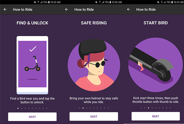
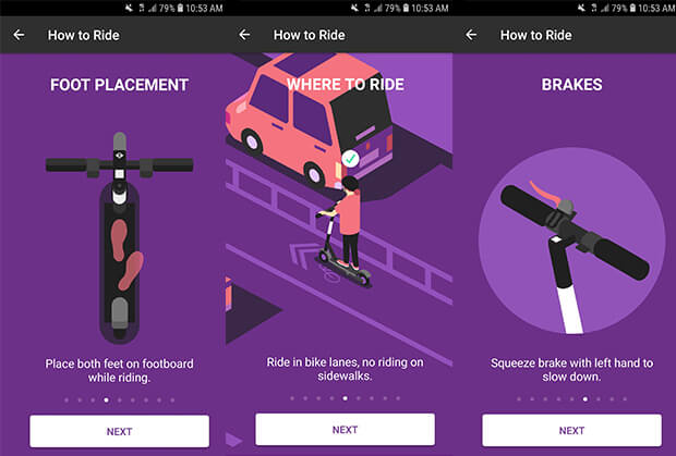
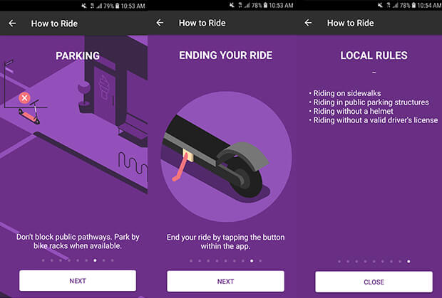
Here’s an example of how Bird, an electric scooter app, shows users how to use their app:
In less than 10 steps, Bird is able to educate users on how to use their app. It’s helpful, yet quick and easy to understand.
6. Customize the User Experience
Some users will want a step-by-step guide throughout the onboarding process, while others will want to jump right in.
Give the user an option to skip the tour in the very beginning if they’re in the second category. This puts the user in the driver’s seat, giving them the option to leave the onboarding flow whenever they want. If they’ve already seen enough, or are getting bored, they can skip the rest of the process at any point and jump straight into using the product.
Snapseed, a mobile photo-editing app, customizes the user onboarding experience by offering tutorials of different content and length.
Users can select from a variety of tutorials, such as how to create a black and white (4-minute tour) or a frozen look (2-minute tour) for their images.

Customize the user experience to fit different user needs.
7. Use Email Marketing to Educate
In the U.S. alone, more than 85% of adults send or read email. DMA Insights shows that 99% of people check email daily. In terms of sales, people who buy products marketed through emails spend 138% more than those who don’t receive email offers. In fact, the ROI on email marketing is 3800%! Today, email is still one of the most effective ways to convert prospects to buyers.
With these staggering statistics, it’s clear that email should be an essential part of your new user onboarding. Use email as a means of engagement and new customer referrals, but remember to keep a few things in mind:
- Email should support your on-boarding process.
- Make sure you include one clear call-to-action (CTA). Focus on getting the user to do one specific thing.
- Provide a direct link with your CTA, leading your prospect to do that specific thing on your website or app.
Northface uses a simple “SHOP NOW” as the CTA for their Black Friday Sale email.
As we said earlier, the user onboarding process doesn’t stop after a user signs up but continues even after that. Use email marketing to build the relationship with your users. Help them grow from a newbie to a pro! ?
Now you’ve learned how to provide customers with a positive onboarding experience that will boost customer success. Once they’ve signed up for your product, remember to continue building the relationship by customizing the user experience journey. And finally, be sure to include email marketing as part of your onboarding strategy. If you need help with that, check out our beginner’s guide to email marketing for a step-by-step tutorial.
Can’t get enough of OptinMonster’s awesome articles and tutorials? Check us out on YouTube!









Add a Comment