Are you looking for the right types of popups for your website but aren’t sure about your options?
Most people think that popups are a “one-size-fits-all” kind of deal. But actually, there are tons of different types of popups you can use depending on your goal.
In today’s post, we’ll show you 37 types of popups that you can use for your website. We’ll break these popups down into 3 sections:
With these 3 categories, you can create over 1,300 different types of popups. That means you can get the most conversions possible without leaving anything on the table.
But first, let’s make sure you understand the basics of what popups are and why they work.
What Are Popups & Do They Work?
A popup is some kind of informational or promotional offer that displays on top of your content, designed to capture your users’ attention quickly.
Typically popups include a call to action (CTA) in an attempt to get your visitor to go do something you want them to. As you’ll see in a minute, the action you want your visitors to take can vary depending on your marketing goals.
And while you’re probably familiar with what popups are, you might be wondering, “Do popups work?”
Spoiler Alert: Yes, they do…if you know how to do them right.
See, many marketers fall into the trap of using one kind of popup in every situation. They’ll take a generic popup campaign and put it on every page on their site. Then they’ll wonder why conversion rates are so low.
In other words, they don’t understand why no one is following their call to action.
But popup technology has gotten a lot more sophisticated over the last few years. Now you can show your popups to specific people, at specific times, and in specific places on your website.
That means you can show your popup to the portion of your audience who would be most likely to take the action you want them to. As a result, your conversion rates go up, your audience grows, and you make more sales.
And here’s the thing: when it comes to which type of popup you choose, you’ve got lots of options.
Here are 37 types of popups you can use on your site broken down by:
Let’s get started.
37 Types of Popups to Use on Your Site
Popups by Type
In this first section, we’ll categorize different types of popups you can use on your website. It’s good to vary the type of popup to avoid ad fatigue. This occurs when users see the same ad or type of popup so often that they start tuning it out.
By using different types of popups on your website, you can consistently grab and hold your audience’s attention.
Let’s take a closer look at the types of popups you can choose from.
1) Lightbox
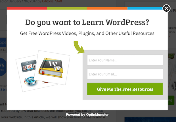
Lightbox popups are the most common type of popup. You’ve probably seen these before:
They appear in a smaller new window over the web page you’re currently browsing. When a lightbox popup shows up, it makes the background of your browser look darker to really grab your attention.
Though lightbox popups can be used for many purposes, they’re most commonly used to grow your email list.
Resource: 17 Best WordPress Lightbox Plugins for Your Site (Compared)
2) Yes/No
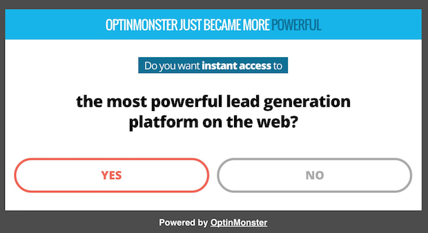
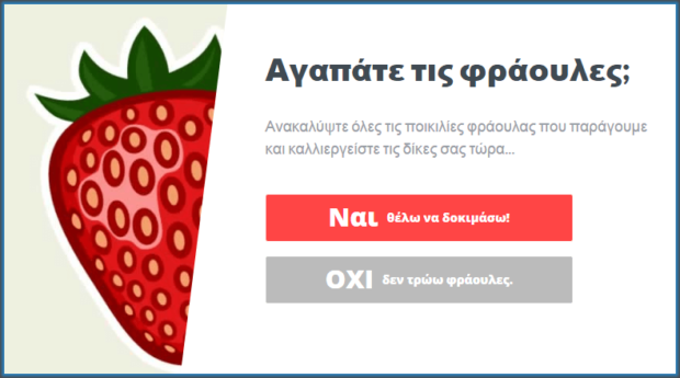
A Yes/No popup is a 2-3 page web form (depending on if you add a “thank you” page), which shows a simple “yes or no” question to your visitor:
While you may think adding an extra step to your popup would lower conversion rates, the opposite is actually true.
That’s thanks to a psychological phenomenon known as the Zeigarnik effect. This shows that people are more likely to finish a process once they’ve started.
Since many popups ask for a name and email address right away, it can scare some hesitant visitors away. But by asking a simple “yes” or “no” question upfront, you’re more likely to get people to take action after they click “yes.”
Yes/No popups are actually how InternetSuccessGids boosted its conversions by 250%.
3) Yes/Yes
Yes/Yes popups are similar to Yes/No popups but have a twist that makes them even more effective.
In a typical Yes/No campaign, your “yes” option will redirect users where you want them to. Or they’ll show a new page where they can provide their email address.
The “no” option simply closes the campaign.
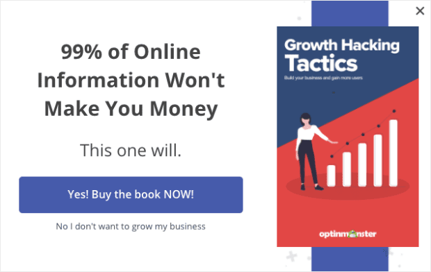
In a Yes/Yes popup, both options lead to the same place, but for different reasons.
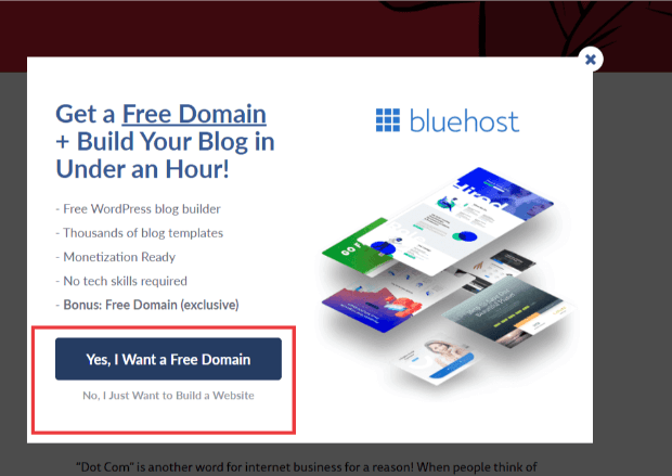
So, for example, we made a popup that talks about how the web hosting provider Bluehost offers a free domain name when you signup with them:
The “yes” option takes users to the Bluehost website where they can get their free domain.
The other “yes” option takes them to Bluehost, too, because not everyone needs a new domain. They simply want a web hosting service.
Either way, both types of users want to get to Bluehost even if they don’t want exactly the same thing.
This technique works really well if you follow these general tips:
- The initial offer takes users to the service or product + something else of value
- The second offer simply takes users to the service or product
- Users have another way of closing the campaign, typically a small “X” button in the top-right corner
If you follow these rules, you can expect massive conversions from your Yes/Yes campaigns.
4) Gamified
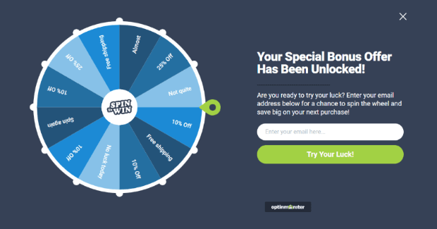
Gamified popups are really effective. They turn your standard popup campaign into a game that people can play. The most common of these is a spin wheel popup:
These are excellent at grabbing your users’ attention and gives them an extra incentive to follow your call to action.
To make your gamified popups effective, you need to make sure that what you’re offering as the “prize” is worth the action you want them to take.
5) Scroll-in
Not every popup needs to be in the form of a new window. In fact, some of the most effective popup campaigns are more subtle. Scroll-in campaigns are a great example.
These are small sideboxes that appear on a webpage to give information or promotional offers to your visitor. They look something like this:
Scroll-in popups are a great way to reach out to your visitor in a way that is less intrusive to their browsing experience.
These campaigns add a bit of variety to your overall strategy and can be an excellent tool for combatting popup fatigue.
6) Floating bar
Another type of popup is a floating bar. These campaigns typically look like this:
Now, you may be thinking, “But floating banners aren’t popups… they’re just campaigns that rest on your site.”
But remember that you can add rules to make your floating bars appear when and where you want. That gives them the same eye-catching power as a standard lightbox popup.
In other words, your floating bar campaigns don’t need to be static elements on your site. They should “pop up” to the right visitors at key times in their customer journey.
Floating bars are perfect for informing customers about site-wide news, free shipping deals, or creating urgency around time-sensitive sales.
Learn how Kennedy Blue used a floating bar popup to increase sales by 50%.
7) Fullscreen
Fullscreen popups are more aggressive in nature than standard lightbox popups but in a good way. These cover the entire browser screen that your visitor is viewing:
This is a great way of making sure you catch your visitor’s attention. In fact, fullscreen popups are how OptiMizeMyAirBnB grew its email list by 650% and increased sales by 66%.
8) On-click
On-click popups are really cool because they’re seen by users who are interested in what you have to offer. That means you’re getting super warm leads to these campaigns.
As a result, you can expect much higher conversions.
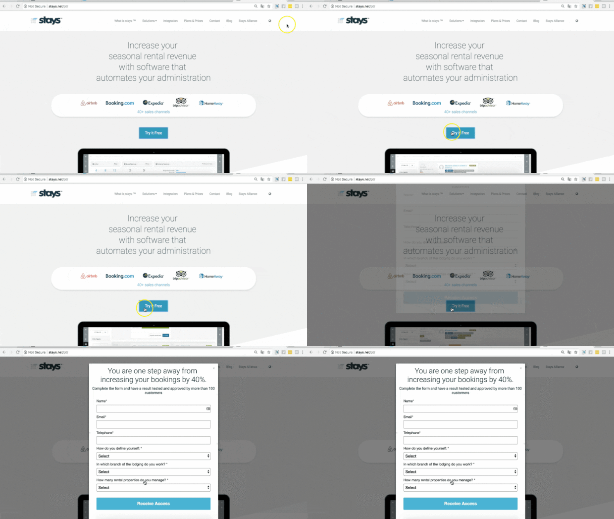
They work by embedding a popup campaign trigger into an anchored text. Embedding them is simple with our MonsterLinks™. Any time a user clicks on a MonsterLink™, your popup campaign will appear:
Stays.net was able to increase its monthly sales by 10% using one of these MonsterLinks™.
Ready to start using OptinMonster? Sign up today risk-free with our 14-day money-back guarantee.
Popups by Goal
Now that we’ve covered the types of popups, it’s time that we check out different goals for your campaigns.
Remember, popups don’t just work to get you more emails. They serve a variety of functions to grow your business.
Let’s take a look at 19 different goals your popups can have.
9) Informational Alert
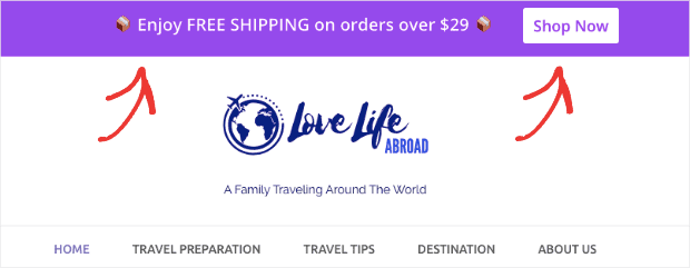
Information alerts let users know something about your company. It can be purely informational like changing your store hours or information that leads to a call to action.
This would be something like informing customers about a free shipping offer you have with a Shop Now button next to it:
Whatever the goal may be, these popups give your customers the information they need about your company and products.
10) Page redirect
Page redirects will take your visitor to a related post or product page. These are often Yes/No or Yes/Yes campaigns where the “yes” option opens up a new window.
These campaigns are great for increasing page views on your website by redirecting readers to related content.
This is the same strategy Olyplant used to increase its page views by 157%.
Or they work well for your affiliate marketing strategy. You can use your “yes” option to redirect customers to an affiliate product page.
11) AdBlock workaround
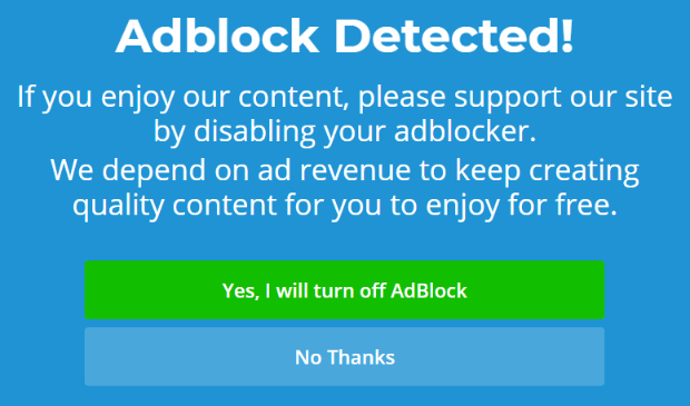
Did you know that over 616 million people use some kind of AdBlock technology? That means even if you have the perfect popup campaign, the right customer may never even see it.
That’s why OptinMonster created a trigger that allows you to specifically ask users to turn off their AdBlock. That’s right, a popup to help users see your popup!
Most people only want to block spammy ads but don’t realize the special offers they’re missing. We’ve found that roughly 77% of users are more than happy to turn off their adblockers to see promotional deals.
12) User login
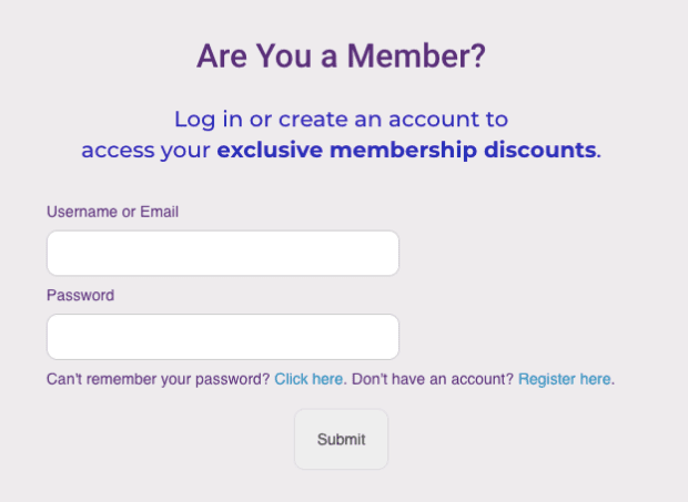
User login popups are perfect for improving user experience. In many cases, users are redirected 2x before being successfully logged in:
- Once to get to the login page
- And again to return to the shopping area
But you can create an on-click login popup that avoids these annoying redirects:
Your user will simply click “login” to make the popup appear. Then they enter their details, click Submit, and can continue browsing your site.
13) Survey form
There’s an old saying, “Knowledge is power.” But in business, that’s wrong. It’s more like, “Knowledge is profit.”
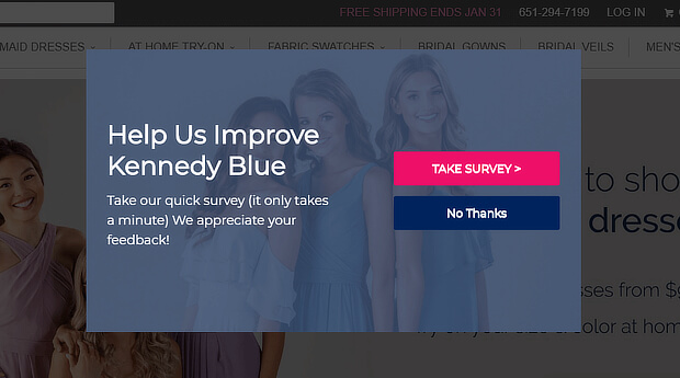
And the best way to get this knowledge is through customer surveys:
With a survey form popup, you can learn more about your customers. With that information, you can personalize your marketing campaigns or improve your product.
You can also get a better understanding of your buyer persona.
14) Lead magnet download
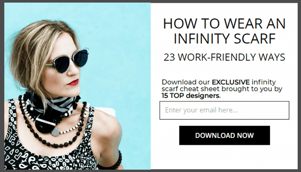
If you’re trying to grow your email list, you should be using a lead magnet. Lead magnets are something that your audience will find valuable. This could be an eBook, infographic, special blog post, and more.
Here’s a list of 69 lead magnets you can use if you’re struggling to find ideas.
Lead magnet popups display your lead magnet in exchange for some contact information. Users can enter their email address to download your lead magnet:
Your customer gets something of value, you grow your list, and everyone wins.
Inbound Marketing was able to increase conversions by 189% using this lead magnet strategy.
15) Webinar registration
Webinars are an awesome part of any marketing strategy. But how do you get people to sign up from your website?
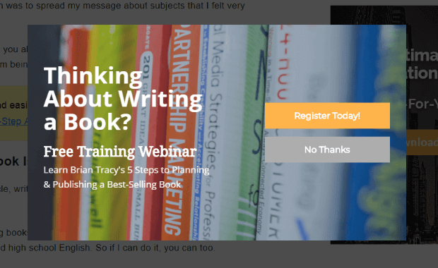
You can create a webinar registration popup to let users know about your upcoming presentation:
Then you can either redirect them to a webinar landing page or cut to the chase and get their email address to send follow-up information.
Whichever strategy you use, a webinar registration popup is a great way to get more attendees to your event.
16) Pre-order signups
A lot of marketers make the mistake of thinking that they can only sell a product when it’s ready and available.
But a good way of increasing overall sales is to start taking pre-orders. This can also help you fund some of the cost it takes to create the product.
With a pre-order popup, you can introduce your new product to visitors. Then, just like we saw with the webinar registration, you can either:
- Redirect users from your pre-order popup to a landing page
- Gather contact information to send interested customers a pre-order form
Either way, a pre-order popup will drastically increase your odds of getting sales early on.
17) Coupon Code/Promotion
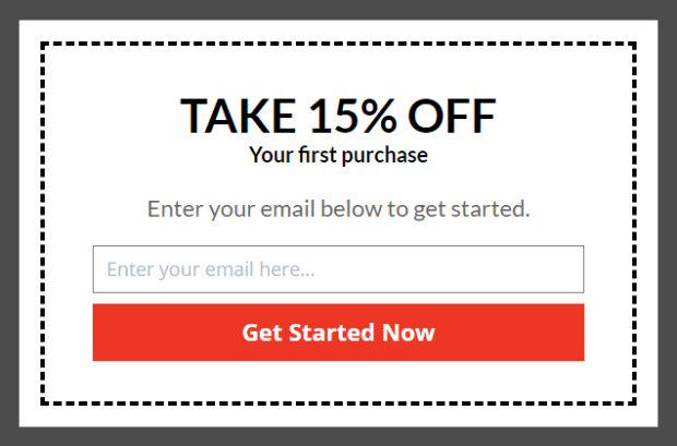
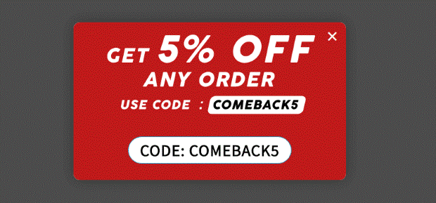
Want to grow your contact list and make your customers happy at the same time? Show them a coupon code or promotional popup like this one:
This lets users save money and gets you valuable contact information.
Just be sure to update your campaigns as your promotion changes. There’s nothing more annoying than being offered an expired coupon code.
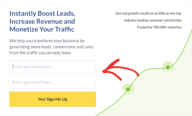
18) Email optin
This a popular goal for popups: getting an email address from your customer. The reason this gets a unique spot on the list is that these popups focus only on getting an email address.
They don’t get your address, occupation, age, or any other demographic information that can prevent users from signing up. These popups are designed to get a name and an email address.
That’s it.
If you need help with your email marketing strategy, you may want to check out these in-depth guides:
These resources have everything you need to make your email campaigns more profitable.
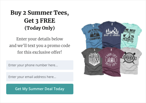
19) Phone number optin (for SMS)
Similar to an email optin popup, phone number optins get your customer’s phone number. That way, you can improve your SMS marketing strategy.
New to SMS marketing? You might want to read this post: SMS Marketing: The Good, the Bad, and the Don’t You Dare.
This resource will give you more reasons why phone number optin popups may be the best strategy for your business.
20) Product recommendations
If you want to increase the overall amount your customers spend, you should consider a product recommendation popup.
As your customers are browsing certain product pages, a popup appears with another item that they’ll find interesting.
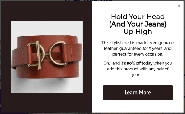
Here’s a quick example:
In this example, the user can add a belt to any pair of jeans that they purchase. As a special incentive, there’s even a promotion if the 2 items are bought together.
21) Product upsells
Similar to product suggestions, product upsells recommend related products, too. But, the items suggested are more expensive than whatever the customer is currently looking at or recently purchased.
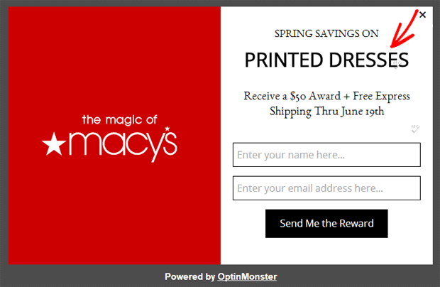
Macy’s does a great job with product upsells:
Here, they show an upsell popup that sends customers to more expensive summer dresses. This popup appears when the customer has added less expensive items to their cart.
The goal of a product upsell popup is simple: train your customers to spend more money on your products over time.
22) Product downsells
In contrast to upsells, a downsell popup will show customers a less expensive offer than they previously looked at.
The best way to use these is when someone has looked at an item but left the page without taking any action.
That’s a good indicator that the product may be too expensive for where the customer is in their journey.
If you can show your customer a related item at a lower price point, you can more easily send them into your sales funnel. Over time, you can increase their average purchase until you have a lifelong loyal customer.
23) Tripwire trigger
A tripwire popup is used when you want to push people into what’s called a “Tripwire funnel.”
Here’s the basic concept:
Offer your audience something that they simply can’t refuse because it’s such a good deal. Then, after they pay, you show them a more expensive product (an upsell). If they don’t buy that, you suggest another product at a lower price point (a downsell).
In the end, your tripwire popup gets your customers into this funnel an even pays for some of the advertising costs along the way.
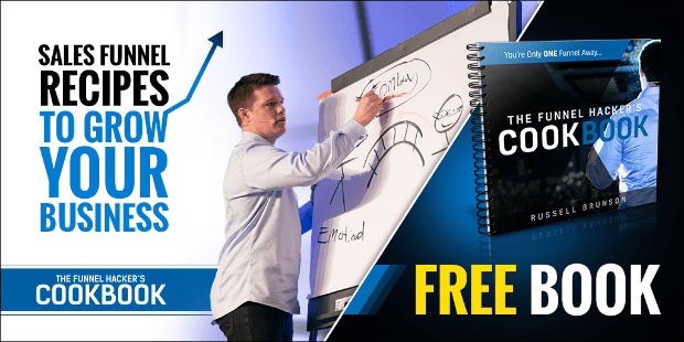
Russel Brunson from Click Funnels is a master at this. He’ll offer you a hardcover book totally free so long as you cover the $5 shipping:
How does this make money?
Because once you pay that $5 and get on his email list, he can use a combination of downsell and upsell products to generate more revenue. Over time, every user who pays $5 ends up spending a much higher average on his products.
A tripwire popup is perfect for getting customers into your sales funnel so you can sell them.
Want to learn more? Check out this post on how to make a tripwire funnel.
24) Cart Abandonment
It’s no secret that shopping cart abandonment is a huge problem for eCommerce business owners. In fact, cart abandonment accounts for over $4 trillion in lost sales each year.
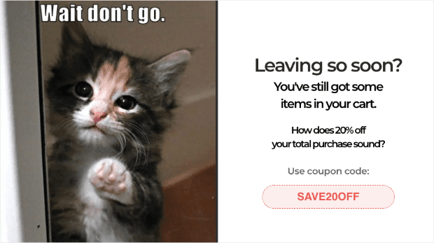
A cart abandonment popup can change that, though. With a simple popup, you can recover visitors who were leaving their shopping cart:
Photographer Scott Wyden uses a cart abandonment popup to recover 21.06% of his WooCommerce customers. That means for every 5 customers trying to leave before checkout, he gets 1 of them to come back.
25) Giveaway popup
An online contest can do so many things for your business. It can:
- Grow your email list
- Increase your social following
- Attract warm leads
- Generate more paying customers
And more. But sometimes creating and promoting the online contest can be tough.
Using a combination of RafflePress and OptinMonster makes this simple.
Just create your viral contest with RafflePress, the best giveaway plugin for WordPress.
Then use the shortcode to embed the contest in your OptinMonster popup.
When users visit your site, your contest will get more exposure. That leads to more signups, more followers, and more sales for your company.
If you need help with this process, check out the following 2 articles:
- How to Publish RafflePress Contests (Using Shortcodes)
- How to Use WordPress Shortcodes With OptinMonster
Those resources will have everything you need to build a custom giveaway popup.
26) Countdown timer
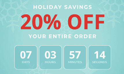
Countdown timers are perfect for creating a sense of urgency with your customers. They show your site’s visitors how long they have to act before a deal or promotion goes away.
This motivates hesitant buyers to pull the trigger and take action. Here’s a look at a standard countdown popup:
With OptinMonster, you can make a countdown timer popup in just a matter of minutes.
27) Recent activity notification
Recent activity notifications are a powerful form of social proof for your website. These small popups let users know when someone is interacting with your brand online.
They build instant trust with your audience because it shows your brand has an actual following.
This can be activity on your website like when someone signs up for a newsletter or registers to a webinar:
Or these can be actions off your site like when someone leaves you a review on a 3rd party site, such as Yelp or Google My Business.
Whatever activity is taken, you can show a popup to let your site’s traffic know about it. And the best tool for this is TrustPulse:
TrustPulse creates recent activity notifications in minutes with no coding required. You can customize your popup to look, say, and link to whatever you’d like.
Plus, it’s literally a fraction of the cost of other platforms. Just look at the pricing section of the following review:
Want to get started? Sign up for TrustPulse today!
28) Recent sales notification
Similar to the recent activity notification we just saw, a recent sales notification popup is more specific.
These popups show when someone purchases a product on your site in real-time:
This leverages the marketing tactic known as FOMO (fear of missing out). When users see that other people are buying your products, they get the urge to purchase it for themselves.
Otherwise, they feel like they may be missing out on the benefits of your product that other consumers are now enjoying.
Again, the best plugin for recent sales notification popups is TrustPulse. In terms of features and pricing, there’s simply no better option on the market.
Sign up for TrustPulse, totally free!
Popups by Trigger or Targets
Now we’ve covered the different types of popups you can choose from, and 19 different goals they can have.
We’re going add another layer to the equation: triggers and targets.
Popup triggers refer to what makes a user see your popup campaign. The best part is that triggers are based on user behavior. That means you’re only showing your popup to people who have indicated an interest in your content.
In the end, you get warmer leads and set yourself up for higher conversions.
The same can be said for popup targeting rules. These make sure that your popups are shown to the right segment of your audience based on the content they’re viewing.
Let’s see 10 types of popup triggers and targets you can use for your campaigns.
Or ar you ready to get going with OptinMonster to test these out? Sign up for OptinMonster today, risk-free.
29) Exit-Intent®
Exit-Intent® popups are an excellent way of recovering abandoning visitors. These popups appear whenever someone is actively trying to leave your website:
This is huge because, as it turns out, 70% of people who visit your site never come back.
You can recover these visitors by grabbing their attention if they try to leave. Plus, exit-intent popups now work for mobile visitors, too. That means you can even target your site’s traffic coming from their smartphones.
But how effective are these popups? Very.
Crossropes used a simple exit-intent popup to grow their email list by 900%.
30) Scroll trigger
Scroll trigger popups make the campaign appear when the user has scrolled down the page to a certain percentage.
This means that you can sync your popup with different content on your page. How does this work?
Let’s say you have a blog post that talks about getting more traffic halfway through the content. You can create a scroll trigger popup to appear when your user has scrolled down 50% of the page:
When your users reach that section, they’ll see the popup with a related product or offer.
Scroll triggers are effective because they appear to users who have a clear interest in the topic of your content.
31) Time on page
A time on page trigger makes your popup appear when a visitor has rested on your page for a certain amount of time (usually between 10–60 seconds).
Like a scroll trigger, time on page popups only appear to users who show that they have enough interest to stay on your page.
Since your users have a higher interest in your page’s content, they’ll be more likely to act on your CTA.
32) Page-based
Like we said at the start of this article, many marketers make the mistake of creating a generic popup and putting it on every page of their website.
But with OptinMonster, you can make a page-based popup to show a unique campaign for any page on your site.
That means you can always personalize your popup’s message to match the content your viewers are browsing. So when users reach a certain page of your site, the popup will appear.
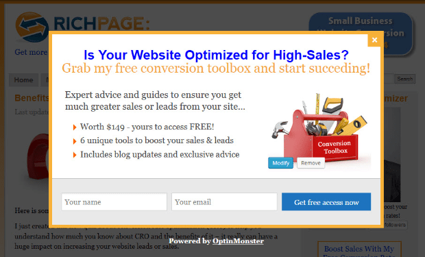
Rich Page this page-level targeting popup to increase its optins by 316%:
With OptinMonster, you can build a similar campaign in just a matter of minutes.
33) Location-based
Did you know that you can target your users based on their IP address? That means you can show users from a specific location a unique popup campaign.
This comes in handy for several situations. If you have a brick and mortar store, for example, you may want to offer special promotions to people in your area.
Or, if you offer services in multiple countries, you may want to make campaigns appear in the language spoken in your user’s region:
Location-based popups are great at personalizing your campaign for your audience.
And the more personal you can make your message, the more likely you’ll be to convert your visitor.
34) Cookie-based
Cookie-based popups help you retarget campaigns for your site’s traffic. In fact, retargeting has been shown to boost revenue by up to 4x.
Using the data you already have on your customers, you can show specific popups to upsell, downsell, cross-sell… or any kind of sell!
Since you know what your customers’ interests are, you can use cookie retargeting popups to take personalization to the next level.
You can even use cookie retargeting with your email service provider to create custom campaigns for repeat customers. As a result of this personalization, you’ll see big boosts in profit.
35) Inactivity re-engagement
With OptinMonster’s InactivitySensor™, you can re-engage customers who have stopped interacting with your page.
If there hasn’t been any interaction with your site, but the browser window is still open, an inactivity popup will appear:
You can use animation or sound to really grab your customer’s attention.
This is especially useful for visitors using a smartphone. That’s because over 80% of mobile shoppers never finish purchasing their product.
With a simple inactivity re-engagement popup, you refocus your customer’s attention and get them through checkout.
36) Campaign-scheduled
A campaign-scheduled popup is one that appears at specific times during a range of dates.
These are great for holiday or seasonal sales. They can also be used for product launches and other time-sensitive offers.
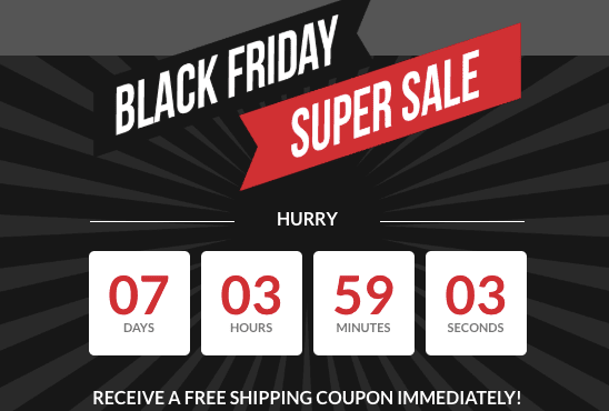
To boost their effectiveness, you should include a countdown timer to create a sense of urgency:
No matter how you use them, campaign-scheduled popups are a great way of building hype around your limited-time promotion.
Ready to kick-off the holiday season with Black Friday? Check out this list of the best Balck Friday marketing tools.
37) OnSite Follow Up®
OnSite Follow Up® popups are incredible. They take into account how users are interacting with your website to show other popups at a later time.
The benefits of this are huge.
You can drastically increase signups and sales by highly targeting your campaigns based on your visitor’s interests.
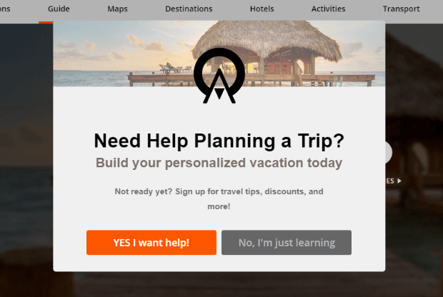
This is the strategy used by travel agency Anywhere® to recover 56.24% of abandoning visitors with this popup:
They also increased email signups by 20%.
Final Thoughts
At the end of the day, popups are one of the most powerful tools in your marketing arsenal. And as we’ve seen, there is no one-size-fits-all approach.
Quite the opposite, actually.
And if you liked this article, here are a few you might also enjoy to improve your marketing strategy with popups:
- How to Create a Lightbox Popups to Grow your List
- 40 Popup Hacks to Grow Subscribers and Revenue
- 40 Famous Brands Using Popups and Why You Should Too
- 15 Email Popups to Grow Your List
You can combine the popup types, goals, and triggers from this post to create whichever one you need in any given situation.
With OptinMonster, we give you the freedom to choose what works best for your business at a price you can afford.
Want to get started? Sign up for OptinMonster today, risk-free with our 14-day money-back guarantee!












Add a Comment