Are you worried about annoying your readers with multiple popups and optins on your website? Have you added only one lightbox to your site out of fear readers will be frustrated if you add more? If so, you’re likely not seeing the results you could be. In this case study, we’ll learn how Lilach Bullock overcame these fears and used strategic repetition in marketing to increase conversions 58%.
Meet Lilach Bullock
Lilach Bullock is an entrepreneur and business owner who helps clear a path through the confusion businesses face marketing online and shows them how to be successful.
Lilach’s goal using OptinMonster was to grow her email list without spending hours creating popups and optins. For each of the most popular articles on her site, she created related lead magnets. A lead magnet is a valuable piece of content shared in exchange for an email address. These lead magnets help further educate her readers, moving them closer to having all the information they need to make a decision about working with Lilach.
How Lilach Bullock Uses Repetition in Marketing
Many business owners get overwhelmed trying to design an optin that looks amazing, but don’t also give the same level of attention to the offer presented in it. Even simply designed optins can convert well if the offer is both targeted, and presented in a relevant manner.
Lilach uses our pre-designed templates, only changing the colors and fonts to match her branding. Instead of creating a new design every time she wants to launch an offer, she simply duplicates an existing optin. All she has to do then is change the copy and images used in the duplicated optin. This ensures the designs are consistent between offers.
Let’s take a look at some of Lilach’s best performing optins and what makes them convert so well.
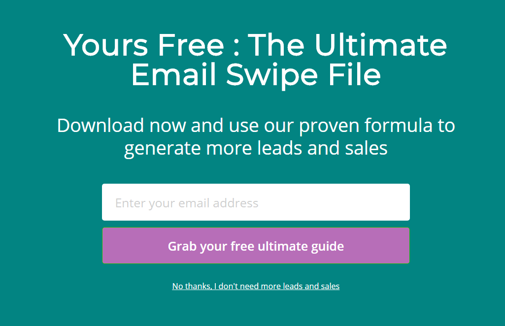
Lilach starts by greeting visitors with a fullscreen welcome mat, which helps you get visitors’ attention the minute they land on your site with an optin that appears over the entire content of your website. Welcome Mats are proven to increase conversions by as much as 80%.
The optin above converts 5.09% of new visitors.
A similar campaign is shown when the visitor attempts to exit the website, only with a different offer.
It converts 8.09% of abandoning visitors using our patented Exit-Intent Technology. Exit-intent optins monitor user behavior, sensing the precise moment they are about to leave. These behaviorally targeted campaigns give you a chance to capture your reader’s attention with one last valuable offer before they abandon your site for good.
Lilach is not the first OptinMonster customer to see gains by using lead magnets. Check out how Razor Social increased conversions 520% with the same technique.
Having taken care of visitors who are new to the site, and those who are about to leave, Lilach turned her attention to those who are actively reading blog posts and pages.
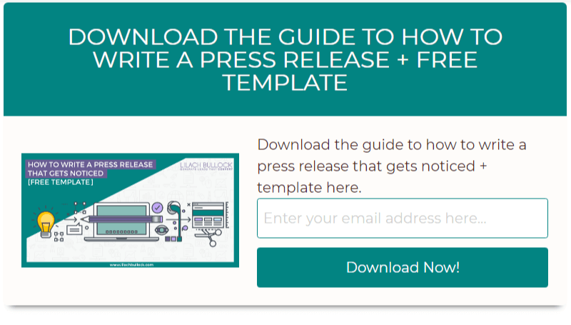
To do this, Lilach created content-specific lead magnets for several of her most popular articles. On an article about how to create a press release, Lilach offers a press release template as a free download.
Using an inline optin, Lilach makes sure her readers see the offer for the template right in the middle of the content they’re reading. Inline optins can be placed anywhere within the content of a page or post, or after an article entirely.
It’s what Lilach did next, though, that made a huge difference in conversions for this offer.
Instead of only placing one inline optin in the press release article, Lilach placed four identical optins on the page.
She duplicated the original optin and gave the new optin the same name, only with a number appended to the name, like Editorial Calendar 2, Editorial Calendar 3, etc…
Then, she placed each of those optins throughout the content, making her offer multiple times as the reader scrolled down the page. Doing this allowed her to track which of the four placements converted best.
Overall, the offer converted 28.32% of visitors. It’s interesting to see how many of those converted through each of the four placements:
- First optin on the page: 20.70%
- Second optin on the page: 4.17%
- Third optin on the page: 1.23%
- Fourth optin on the page: 2.27%
We frequently encourage customers to make their offers multiple times within a single article. Why use repetition in marketing? The simple fact of the matter is that messages are more effective when repeated.
A reader might not be convinced to convert at the start of your article. They may have forgotten the offer you made in the middle of an article by the time they reach the end of that same article.
The effective frequency theory states that there’s a certain number of times a person must be exposed to an advertising message before they respond to it. Often marketers refer to the rule of 7, meaning that your prospect should see your message repeated seven times before they convert, but the exact number will vary.
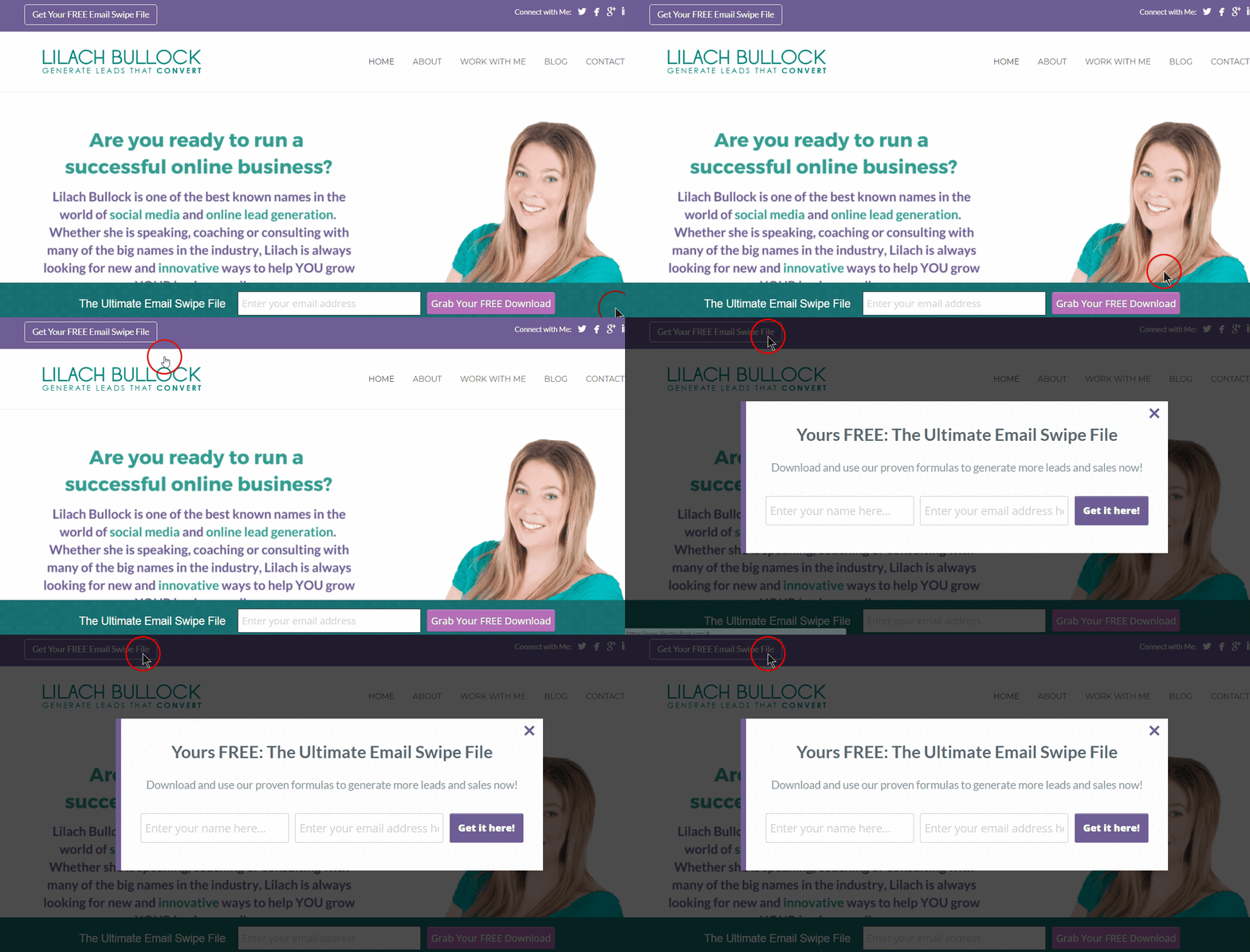
Lilach wanted to give her readers one more ever-present opportunity to join her list. To do that, she added a MonsterLink in the top left area of her navigation menu with an offer for an email swipe file. A MonsterLink is a link, button, or image that launches an optin when clicked.
The button “Get Your FREE Email Swipe File” converts 56.74% of readers. That’s a huge number of subscribers added to her list every month from one simple button.
Optinmonster has helped me get a very impressive conversion rate for some of my opt-in forms; one of them has a conversion rate of over 50% – something that I’ve rarely seen, if ever.
Results
Lilach Bullock kept her offers in front of her readers using repetition in her marketing campaigns, and her conversions increased as a result.
- Lilach Bullock adds 56.74% of visitors to her list using a MonsterLink.
- Lilach Bullock converted an additional 7.6% of readers by placing the same offer multiple times in a single page.
- Lilach Bullock captured 8.09% of abandoning visitors with a fullscreen exit-intent optin.
Summary
New visitors, exiting visitors and active readers should be presented with different offers based on their engagement. You can quickly and easily leverage repetition in marketing with a variety of optin types.
Since my main goal of using Optinmonster is to grow my email list, I would say it’s definitely helped me achieve that – and then some. But this has had a snowball effect; for one, my traffic goes up the more people I have in my email list, and two, I’m also able to generate new quality leads on a monthly basis. Some months, I add as many as 1000 new subscribers to my list (with no paid promotions).
Lilach Bullock


