Are you looking for the best product recommendation examples for online shopping?
Suggesting products to your site’s visitors throughout their customer journey is a great way to increase sales.
Not only does it get your visitors MORE of the products they love, but it also increases their average order value (AOV).
That means happy customers and more profits.
But how do you effectively recommend products online without harming the user experience (UX)?
That’s exactly what we’ll teach you today. We’ll look at 7 of the most creative product recommendation examples on the market.
Ready to get started? Let’s dive straight into the list.
7 Product Recommendation Examples
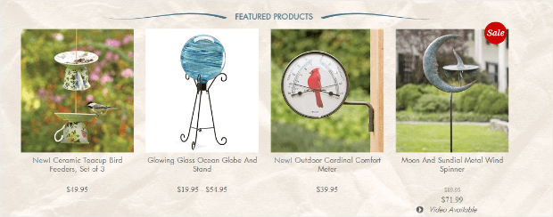
You’ve likely seen a lot of product recommendation examples that look something like this:
These are generic product recommendations that you’ll see most online stores using at or around checkout.
And while this method for suggesting products is definitely worth having, it’s also the bare minimum.
Which means if you want to increase your customers’ AOV and maximize profits, you’ll need a strategy that’s more targeted.
So, for this post, we’ll explore a lot of product recommendation examples from customers who were using OptinMonster:
OptinMonster is the best lead generation toolkit in the world. It’s also your best bet for making highly targeted product recommendations to your customers.
That’s because OptinMonster allows you to build a variety of optin campaigns.
The term “optin campaign” is something you’re probably already familiar with and includes things like:
- Lightbox popup
- Floating bar
- Fullscreen welcome mat
- Gamified spin-to-win wheel
- And much more…
These campaigns can be used to showcase offers and products around your store.
BUT these aren’t your everyday, generic product recommendations. These are campaigns you can target to specific users across your site.
You can use OptinMonster’s targeting rules, such as:
- Exit-Intent® Technology: Recover abandoning visitors who are leaving your site before checking out.
- OnSite Retargeting®: Keep users engaged by showing fresh campaigns to returning visitors.
- Geolocation: Increase conversions by targeting users based on their physical location.
- MonsterLinks™: Transform all your campaigns into clickable links to blog posts, web pages, email copy, and much more.
These are just a few of the targeting examples offered by OptinMonster, though there are many others.
And as you’ll see, these same campaigns won’t just help you sell more products; they’ll also help you grow your email list.
OptinMonster allows you to show product recommendation campaigns across your site. You can use discounts and special offers to incentivize your visitors to add items to their purchases.
But to redeem those special offers, customers will need to enter their email addresses.
Then, over time, you can continue to make product recommendations using our proven email marketing best practices.
Want to see it in action for yourself? Click below to start your 100% risk-free OptinMonster account today:
Now that we know the tool we’ll be working with, let’s look at our 7 product recommendation examples that you can learn from to boost sales.
And since these examples used OptinMonster, we can tell you exactly how successful they were.
Let’s dive into the list!
1. Human Food Bar
Human Food Bar is a niche blog that reviews energy bars.
They’re also in the process of creating their own line of energy bars. But, for the moment, they make revenue through affiliate marketing.
That means they’ve become experts on product recommendations.
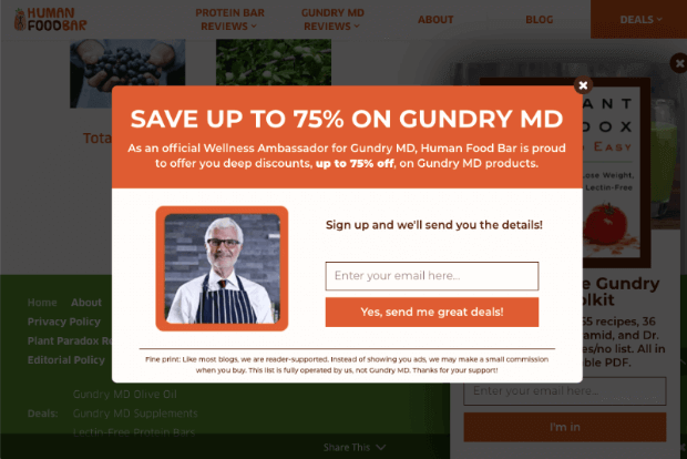
They used this campaign to recommend a specific line of products by their partner Gundry MD:
As a result, Human Food Bar saw:
- 1800+ monthly email subscribers
- $17,000 average sales profit
- 35% increase in web retention rate
Now they not only have a headstart in profits, but they’ve grown a MASSIVE email list, too.
Check out the entire Human Food Bar case study here!
2. DateID
Sometimes, you won’t be suggesting physical products from an online store.
Lots of SaaS companies, blogs, or affiliate sites charge for membership. And as part of that strategy, they need to recommend upgrades on their premium plans.
DateID is a great example of this.
They help online daters run background checks on potential partners before meeting in person.
This helps users feel more confident about transitioning relationships from the digital world to real-life meetups.
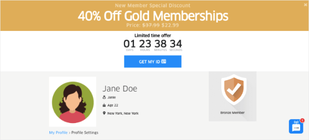
DateID was trying to boost subscriptions for their Gold membership. They created a floating bar that looks like this:
And since they could target this floating bar to specific users, conversions were much higher than expected.
Here’s what happened for DateID. They experienced a:
- 175% improvement in list growth
- 162.5% boost in freemium subscribers
- 75% increase in sales conversion rates
As consumer expectations have increased, these kinds of results are mostly due to the strong targeting features offered by OptinMonster.
They allowed DateID to show this campaign to the right people, in the right place, and at just the right time in their customer journey.
Check out the full DateID case study here!
3. Crossrope
Crossrope is a fitness website that sells weighted jump ropes.
You can also follow along with routines that help you exercise in a way that’s fun, positive, and feels like play.
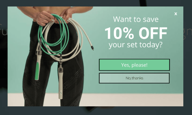
One thing that Crossrope did was create a basic campaign with a discount that looked like this:
While they don’t recommend a specific set of ropes, they’re unofficially recommending all their products in one fell swoop.
This is an important lesson for websites with a NARROW niche.
Most customers with Crossrope, for example, will only make a purchase once every few years.
After all, when someone has the equipment they need, they’re less likely to revisit the site for more product recommendations.
So Crossrope created a discount on any jump rope “set” to give users 2 things:
- Freedom to choose the product that suits them best
- An incentive to pull the trigger and follow through with checkout
Fortunately, that strategy paid off BIG. Here’s the success Crossrope had with this and similarly targeted popups:
- 13.71% of abandoning visitors converted
- 7.65% of abandoned shoppers recovered
- 900%+ email list growth
Check out the entire Crossrope story here!
4. Kinobody
Kinobody is another eCommerce business that focuses on fitness.
But rather than using a specific product (like jump ropes), they encourage visitors to incorporate fitness into their everyday lifestyle.
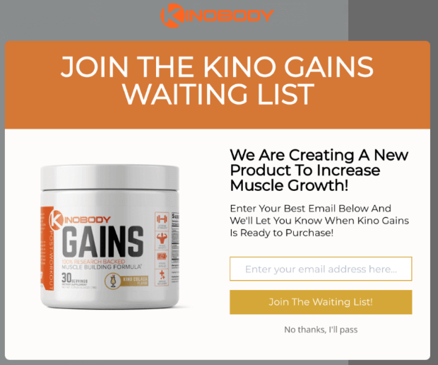
They began recommending a product before it was launched. Users could enter their email address to get on a waiting list for the product:
This is an excellent way of building excitement around your products before they’re even released.
It will also give you an idea of how much inventory you need to create in the first few weeks of launching your item.
But more importantly, here are the results from Kinobody’s product recommendation strategy:
- 39% of people added to Kinobody’s waiting list
- 7.01% of abandoned visitors converted
- 47% – 73% of visitors segmented
One of the things they did was turn this campaign into a MonsterLink™.
This allowed Kinobody to promote their product in all text-based content, like blog posts, web pages, emails, and more.
So when someone was reading an article related to their upcoming product release, they could show their campaign to gain more interest.
They also used OptinMonster’s Exit-Intent® Technology to recover 7.01% of abandoning visitors.
This is HUGE because the majority of visitors who leave your site will never come back.
Kinobody was able to make a targeted product recommendation, recover abandoning visitors, AND drastically grow their email list.
Check out Kinobody’s full story here!
5. KnivesShipFree
KnivesShipFree is an eCommerce store that sells premium knives online.
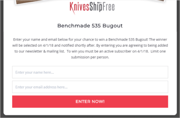
They had a very effective way of promoting one of their high-end products: by making it the prize in a giveaway.
This functions like a really powerful and non-intrusive product suggestion.
When you follow up the contest with a discount on that prize (for those who entered the giveaway), you’ll see sales SKYROCKET.
Here’s what KnivesShipFree.com ended up achieving:
- 5,000+ emails added
- $10,118.20 revenue made at launch
- $4,373.04 from first-time sales
Check out the entire KnivesShipFree.com story here!
Not sure how to make an online contest? That’s no problem.
We recommend checking out this in-depth tutorial: How to Run an Online Contest to Boost Conversions & Sales.
That resource will have everything you need to build stunning giveaways in no time.
6. Shotkit
Shotkit is a blog that specializes in photography reviews. And much like we saw with Human Food Bar, they make their money through affiliate marketing.
That means in order to grow as a business, they need to make targeted product recommendations across their site.
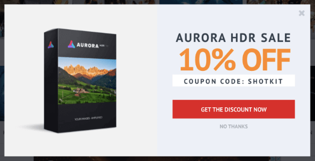
Here’s an example of Shotkit’s campaign for a popular photo editing software:
Combining this product recommendation with a discount is how Shotkit saw:
- 60% increase in conversion rates
- 40+ NEW leads every single day
This product recommendation example didn’t lead to selling millions overnight. It did, however, build a large email list with warm and interested leads.
That means future product recommendations can be sent via automated email campaigns to generate more revenue over time.
Check out Shotkit’s entire story here!
7. ClickBank
If you’ve spent any amount of time in the marketing world, you’ve likely heard of ClickBank.
It’s an excellent resource for affiliate marketers to find high-converting products to pitch across their site.
But ClickBank had a digital product that they wanted more people to explore: ClickBank University.
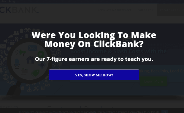
To get more people to subscribe, they recommended the product with the following optin campaign:
They used Exit-Intent® Technology to show this popup to people leaving the website.
The results were better than anyone had guessed. ClickBank University:
- Converted 32.67% of abandoning visitors.
- Increased conversions by 11.61% by split-testing optins.
- BOOSTED sales 100% as a result.
In other words, through this one product recommendation, ClickBank was able to grow its list, increase conversions, and improve sales.
Check out the entire ClickBank University story here!
And that’s all for today! These have been 7 of the most creative product recommendation examples we could share with the actual results of those suggestions.
We hope you found this post helpful. If you did, you’ll definitely want to check out the following resources:
- 11 eCommerce Case Studies You Can Learn from Today
- How to Make More Money With OptinMonster (in ANY Business)
- How to Create a Product Recommendation Popup (the Easy Way)
These articles will have even more information on how you can use OptinMonster to sell MORE products and grow your business in LESS time.






Add a Comment