Do you want to get more sales from your pricing page?
Your website visitors have discovered your product or service through research or word of mouth. They’ve browsed your website and started thinking that your product might be the right choice for them.
So they click your pricing page.
What will they see when they get there? Will your pricing page land the deal? Or will it cause confusion or spark doubt?
Your pricing page has one job: to get visitors to take action. You should optimize every aspect of your page to convince visitors to buy your product or sign up for your free trial.
If your pricing page isn’t convincing, users will simply click away. And they may never come back, costing your business sales, revenue, and long-term growth.
But don’t worry!
In this guide, we’ll share some of our favorite pricing page examples. We’ll discuss what each page gets right and how you can create your own high-converting pricing pages to boost your revenue.
- Elements of the Best Pricing Pages
- 6 Pricing Page Examples (With Analysis)
- One Last Chance: Land the Sale With an Exit-Intent Offer
Elements of Effective Pricing Pages
Before we dive into our list of pricing page examples, let’s briefly touch on some of the common elements and tactics you’ll be seeing throughout this list:
- Simple Layout: Your pricing page design should be clean, sleek, and uncluttered.
- Visible CTAs (Calls to Action): Your “Buy Now,” “Get Started,” and “Request a Demo” buttons should be bold and easy to spot.
- Compelling, Scannable Copy: The writing on your pricing page should be clear, interesting, and straightforward.
- Clear Pricing: It should be easy for visitors to understand exactly how much your product or service costs.
- Urgency and FOMO (Fear of Missing Out): Make a strong case for why your visitors should buy right now.
- Free trials or Money-Back Guarantees: Give visitors a chance to try out your product or service without any obligation.
- Highlight 1 popular price or plan: Visually emphasize the pricing option that offers the best deal.
- Value Proposition: Show visitors that your product is worth more than the price you’re asking.
- Limited Price Options: Varying price points help you land more sales, but too many can lead to choice paralysis.
- Social Proof: When you include testimonials and reviews, you’ll convince more visitors to buy.
Best Pricing Page Examples to Boost Conversions
Now that you have an idea of what your pricing page should accomplish, let’s look at some examples.
I’ve scoured the websites of top SaaS (Software as a Service) and subscription businesses to find pricing pages that are smart, attractive, and effective.
We’ll start off with our own pricing page here at OptinMonster since we know that it works.
1. OptinMonster
OptinMonster is the best lead generation software on the market. We help you grow your email list, display your lead magnets, and reduce cart abandonment with our popups, floating bars, inline forms, and more. Our industry-leading targeting and triggering rules let you always show the right message to the right people at the right time.
Basically, we have a lot to explain on our pricing page!
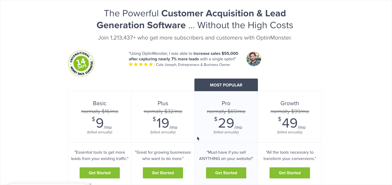
The screenshot above shows the above-the-fold section of our pricing page. As you can see, we fit a lot of information while maintaining a clean design. Just by scanning this section, visitors will see:
- Our value proposition: “The Powerful Customer Acquisition & Lead Generation Software . . . Without the High Costs.”
- Social Proof: We point out that we have over 1.2 million subscribers and customers, and we feature a quote from a 5-star review.
- Guarantee: The badge at the top left shows that we offer a 14-day unconditional money-back guarantee.
- Pricing options: 4 pricing options are shown, with the most popular plan highlighted. Each plan features a bright green CTA button.
Below each plan, we have an extensive list of key features, so customers can make sure they’re choosing the best plan for their needs.
As users continue to scroll, they’ll continue to see more important information:
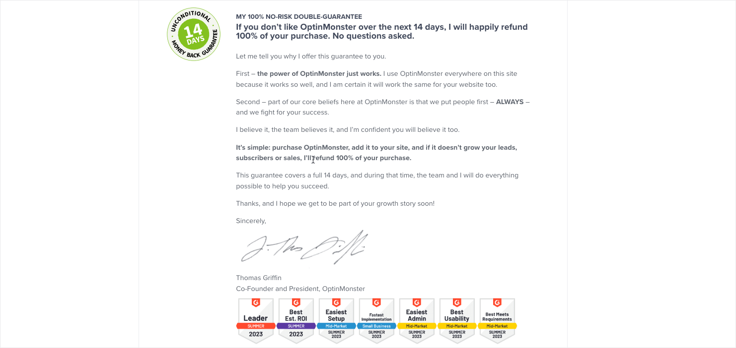
We provide more details about our money-back guarantee with this letter from our co-founder, Thomas Griffin. We also display badges for just a few of the 20 G2 Awards that OptinMonster won in Summer 2023.
Your pricing page isn’t the time to be humble. If you’ve accomplished great things, make sure potential customers know!
Finally, we include a Frequently Asked Questions section to make sure visitors can easily find the answers they’re looking for:
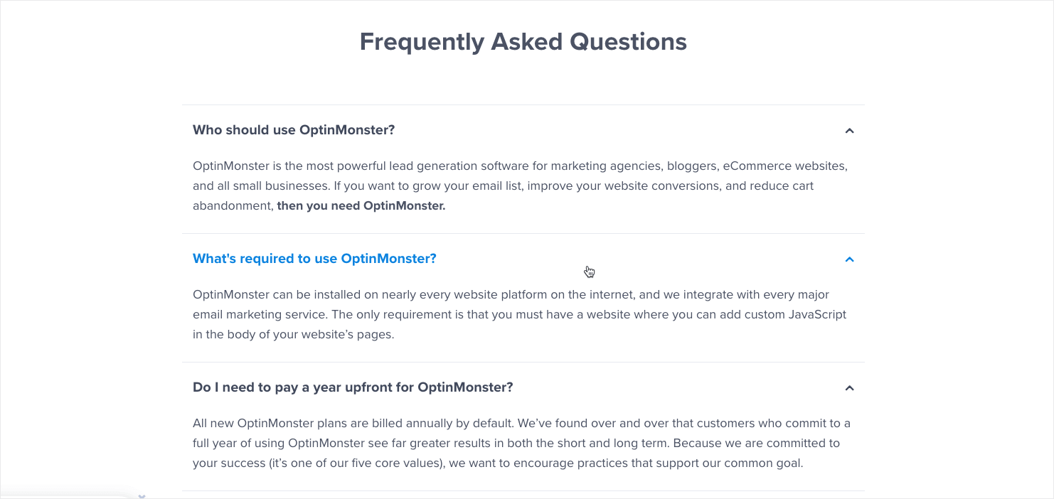
We have optimized every aspect of our pricing page to get the best conversion rates, so feel free to take inspiration from what we’ve learned!
2. Groove
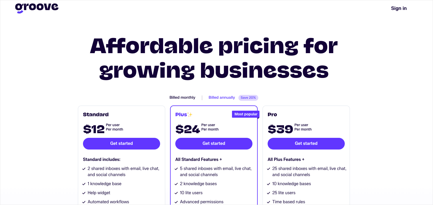
Our next example is from another SaaS pricing page. Groove is a customer support platform that helps businesses streamline their communication with customers. The top section of their pricing page is clean and simple and highlights the most popular plan. This section also includes a list of features for each plan.
Notice that Groove offers 3 pricing plans. Many SaaS companies find success with this simple pricing model. In fact, 41.4% of startups offer 3 choices. More complex products often need more plan levels, but 3 is a good place to start.
As you scroll down, Groove’s pricing page gets even better. I particularly like their pricing table that compares their cost to their competitors:
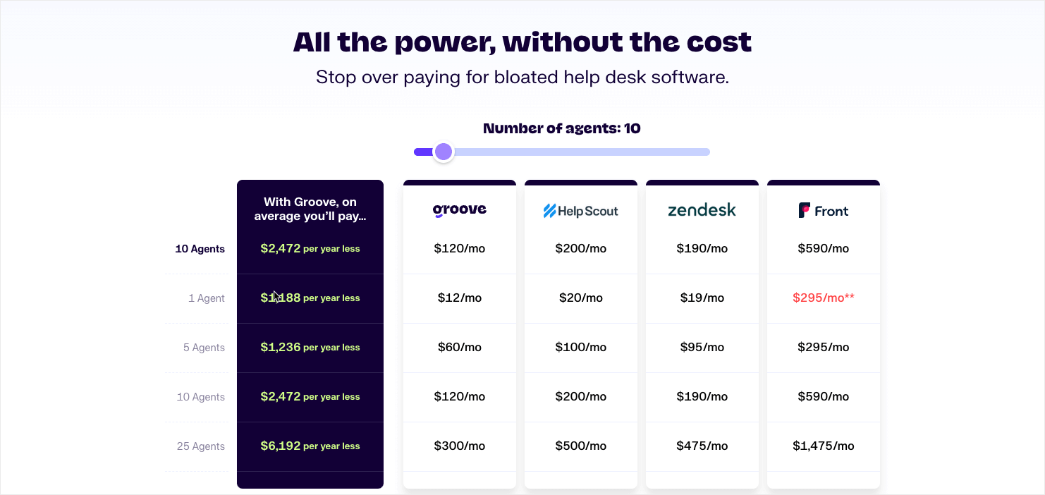
This comparison table goes a long way toward overcoming customer objections. With a simple glance, visitors can see how much they’ll save by using Groove instead of a similar product.
Groove’s full pricing page also includes a feature comparison chart, an FAQ section, and user reviews:
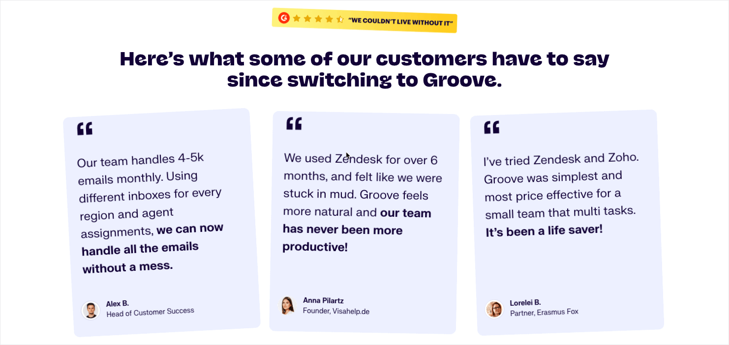
When designing their price landing page, Groove left nothing on the table. They answer practically any question a visitor could have, right there on the price page.
Top Tools AlertDo you provide customer support over the phone? Check out our picks for the best business phone systems and VoIP providers!
3. HubSpot
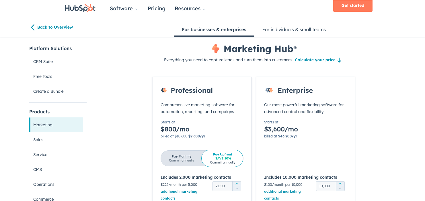
HubSpot is a comprehensive business growth management platform that offers a wide variety of tools, services, and products. As such, their pricing tiers are more complicated than our previous entries.
HubSpot still manages to keep the design of their pricing page clean and easy to navigate. Instead of trying to list all their different plans on a single page, they feature a navigation sidebar that lets users choose which tools they want to see the price options for.
4. New York Times
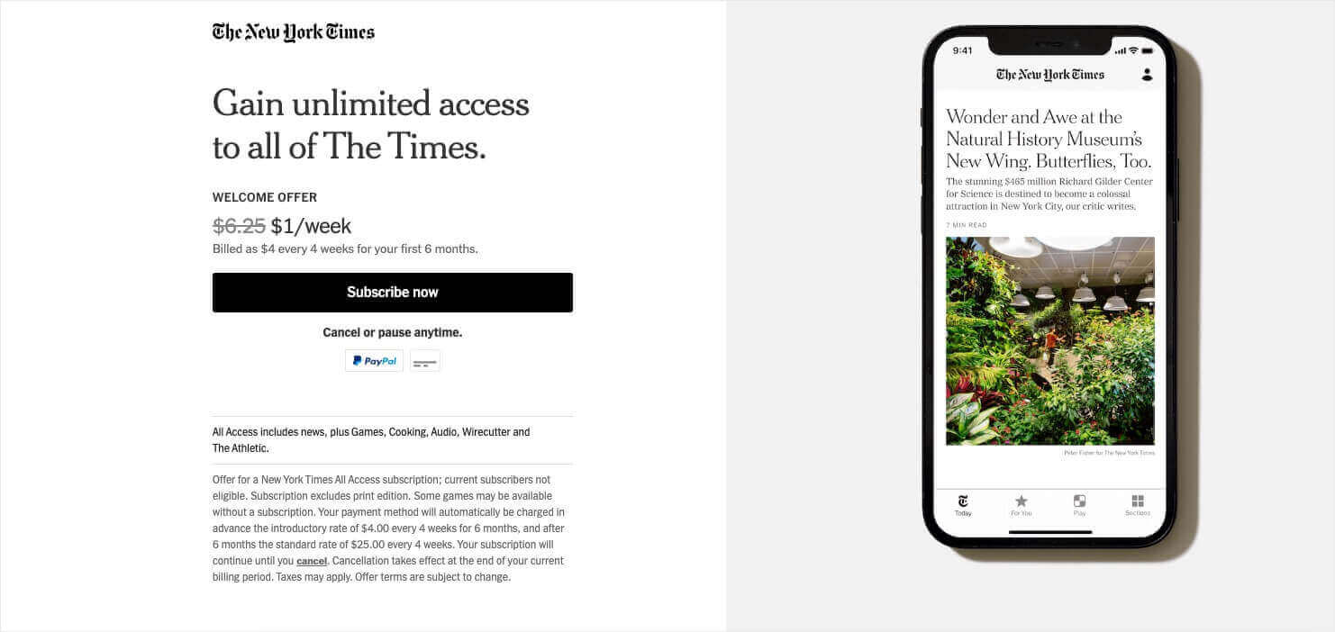
Now, we’ll shift away from SaaS to other types of online businesses. This page from the New York Times isn’t a full pricing page, but it offers an idea for a clever tactic.
When a visitor without an account visits nyt.com, they’ll see a call-to-action button that says “Subscribe for $1/Week.” This button takes them to the page above, which provides a special welcome offer.
New subscribers can get access to all of NYT‘s digital content for $1 a week for the first 6 months. After that, they’ll have different pricing options, with the all-access plan costing $25 every 4 weeks.
NYT funnels all new subscribers through a deeply discounted trial period of their most expensive digital plan. That means new subscribers will get used to having this high level of access. Then, they’ll be more likely to subscribe at a higher level after the discounted period is over.
If you offer a free or deeply discounted trial, consider including your best features. Doing so will help you with upselling after the trial is over.
5. HelloFresh
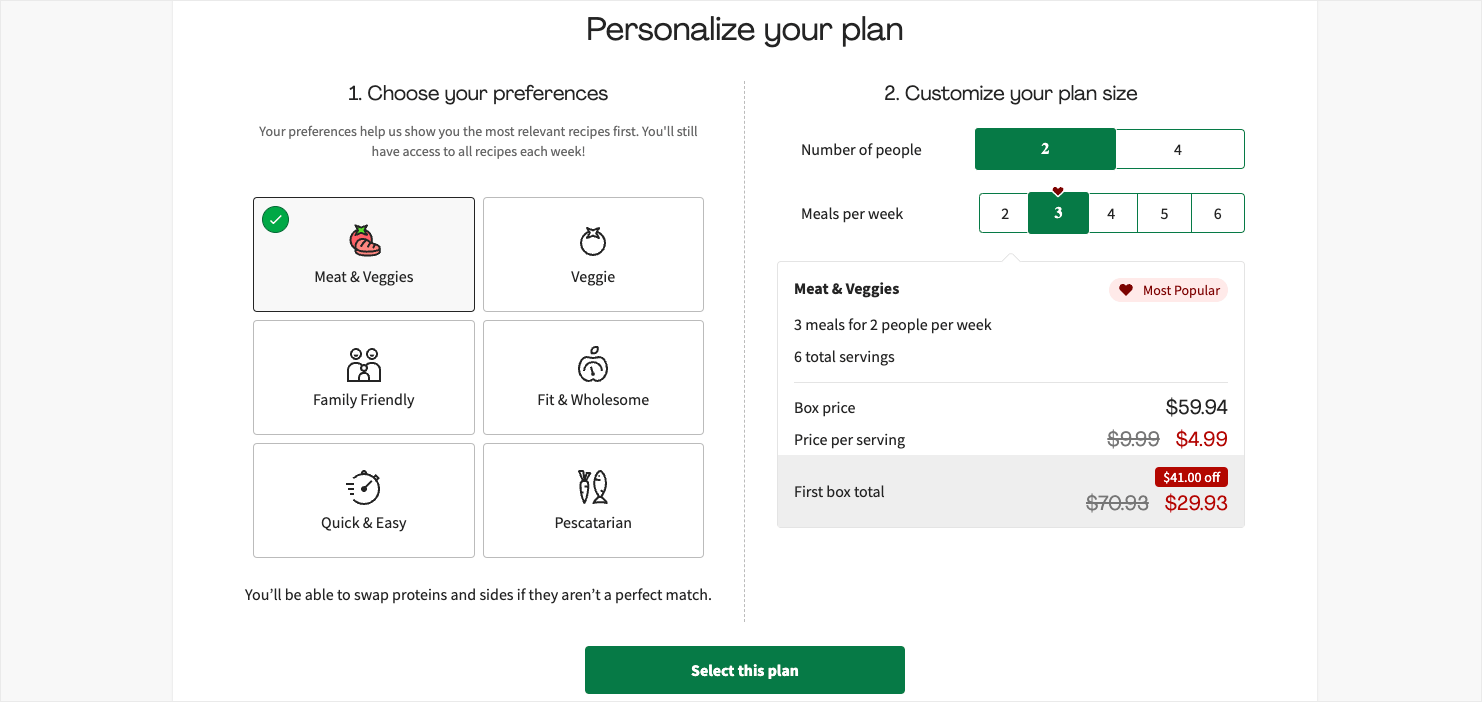
The meal delivery service HelloFresh has a pricing page that reflects its dynamic pricing strategy. Visitors can select the types of meals, the number of servings per meal, and the number of meals per week. The price will change depending on their choices.
This interactive element is very user-friendly, as it helps customers find the best plan for their household.
As potential customers scroll down, they’ll see mouthwatering photos of various meal options, as well as an FAQ section.
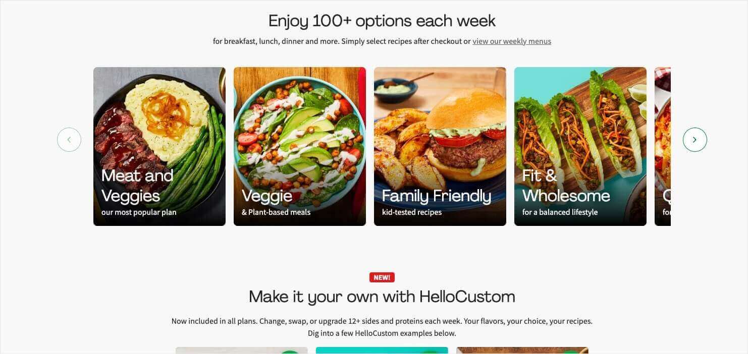
HelloFresh’s price page lets users customize their plan and shows a preview of the types of meals they’ll receive.
6. Second Nature
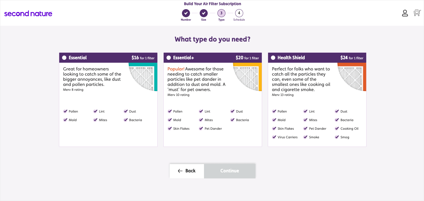
Second Nature (formerly FilterEasy) is a subscription service that ships air filters directly to homes and businesses. This service helps people keep their air filters fresh because they’ll receive new ones at their door every month.
Visitors will be prompted to choose the number of air filters they need, as well as the size. Then, they’ll see the price options that are available.
The price options will vary based on each user’s needs. In the screenshot above, you can see that Second Nature offers 3 different subscription plans for a single home filter. The price is determined by the quality of filter the user chooses. Customers can easily see what each filter type is best for and how much it costs.
LAST CHANCE: Land the Sale With an Exit Offer
Even when you’ve done everything right on your price page, a lot of visitors will still exit your website without taking action.
After all, your product may be great, but that doesn’t mean it fits in everyone’s budget.
That’s why you should present them with an offer they can’t refuse just before they leave your site.
You can easily do this with OptinMonster’s Exit-Intent® Technology. Our software detects when visitors are about to leave and shows the offer at just the right time. OptinMonster customers have used Exit-Intent® to increase sales by 10% and recover 21% of abandoned carts.
And yes, our exit popups work on both desktop and mobile!
Between perfecting your pricing pages and offering discounts in exit popups, you’ll see your sales and revenue grow higher and higher.
If you’d like to learn more about these strategies, check out a few of these resources:
- How to Write a Sales Page That Actually Converts
- How to Price a Product in 6 Easy Steps: A Guide for Beginners
- Exit-Intent Popups: 40 Hacks to Boost Conversions
And if you’re ready to add exit popups to your pricing page strategy, get started with OptinMonster today! Sign up for either our Pro or Growth plan to get access to our powerful Exit-Intent® Technology.





Add a Comment