The swoosh of a basketball that hits nothing but net. A team meeting where good ideas flow like a river and everyone is eager to do their part. Finding that perfect customer at the moment when they’re ready to really hear what your product can do for them. Writing a piece of copy you just know is going to make the sale.
Isn’t it great when things just work?
That’s what OptinMonster does – it just works. And it works really well.
Driven by Customer Success
You, the person reading this – our customer, visitor, subscriber, generally curious person – you are the driving force behind every single thing that we do here at OptinMonster. You’re the foundation of our core beliefs and values.
Seriously. That’s why we share so many case studies. ? We want you to see the awesome things that our customers do.
From the very beginning, we’ve set out to create a lead generation software that empowers people and businesses to succeed. We were even pioneers in bringing exit-intent technology to websites of any kind with the switch of a button! All with your success in mind. ?
Introducing Project Delight
Project Delight started out as just the internal name we gave to all of the user experience and user interface improvements that we have planned for OptinMonster. The process involves maintaining our commitment to excellence with high attention to detail while also working for simplicity in the use of the end product.
The end result is a powerhouse of a product that is (wait for it…) delightful to use.
OptinMonster’s President Thomas Griffin recently described Project Delight like this:
Project Delight is our way of saying that power doesn’t have to come at the expense of enjoyment. It’s our way of paying attention to the details, to reduce the number of clicks it takes to get what you need, to surface the things most important to you, to improve workflows so that you get more conversions faster. And, to make using OptinMonster something that you really get excited about.
Attention to Detail + Simplicity of Use = OptinMonster
OptinMonster just works. We’ve covered that. But we want it to be delightful to use, too.
That’s why we’re all so excited about Project Delight. And not just because it has an awesomely fun name.
Thomas was happy to share why he’s excited about Project Delight. His genuine passion for OptinMonster and our customers is infectious – consider yourself warned.
I’m thrilled because it’s an extension of who we are. We love helping people succeed. We love watching businesses be transformed when they use OptinMonster. We care about the details. We want you to see incredible results with minimal effort. But I’m most excited because it’s our way of saying we listen. You’ve told us you wanted things easier, more intuitive, more enjoyable, and because we care about you above all, we’re willing to take the steps to make sure you feel heard. Project Delight is simply the tangible proof.
A Better User Experience
The user experience and user interface improvements included in Project Delight have come about organically, according to Thomas.
We realized from lots of customer feedback, and from our own experience, that we could make OptinMonster so much better with better workflows, better customization, better stats, better experiences… and that those things ultimately lead to better results. We want you to see incredible results, and Project Delight is how we’re improving OptinMonster so that becomes more of a reality each day.
When asked if there’s a particular improvement that he’s most excited about, he was hard-pressed to choose just one.
It’s hard to pinpoint a single thing. We’ve already made so many improvements this year alone: site, integration and analytics defaults so you don’t have to set them every time you make a new campaign, vastly improved drag-and-drop experience (no more things shifting around!), campaign solutions and goals (to align with your needs) and an updated dashboard (that has better information and more logical sorting of campaigns). Not to mention 12+ entirely new, beautiful templates!
Here are some examples of the improvements Thomas mentions:
Set a Default Site for New Campaigns
You can now set a default site for new campaigns so you don’t have to set the site every time. And, of course, it’s super easy to do.
From your OptinMonster account page, go to Advanced Settings (at the bottom), and select a default site from your list of sites using the dropdown.
Set Default Analytics and Integrations for Each Site
From the sites page of your OptinMonster account and click Edit next to the site you’re setting default analytics and integrations for. From there, you’ll be able to select the default accounts you want to use and save the settings.
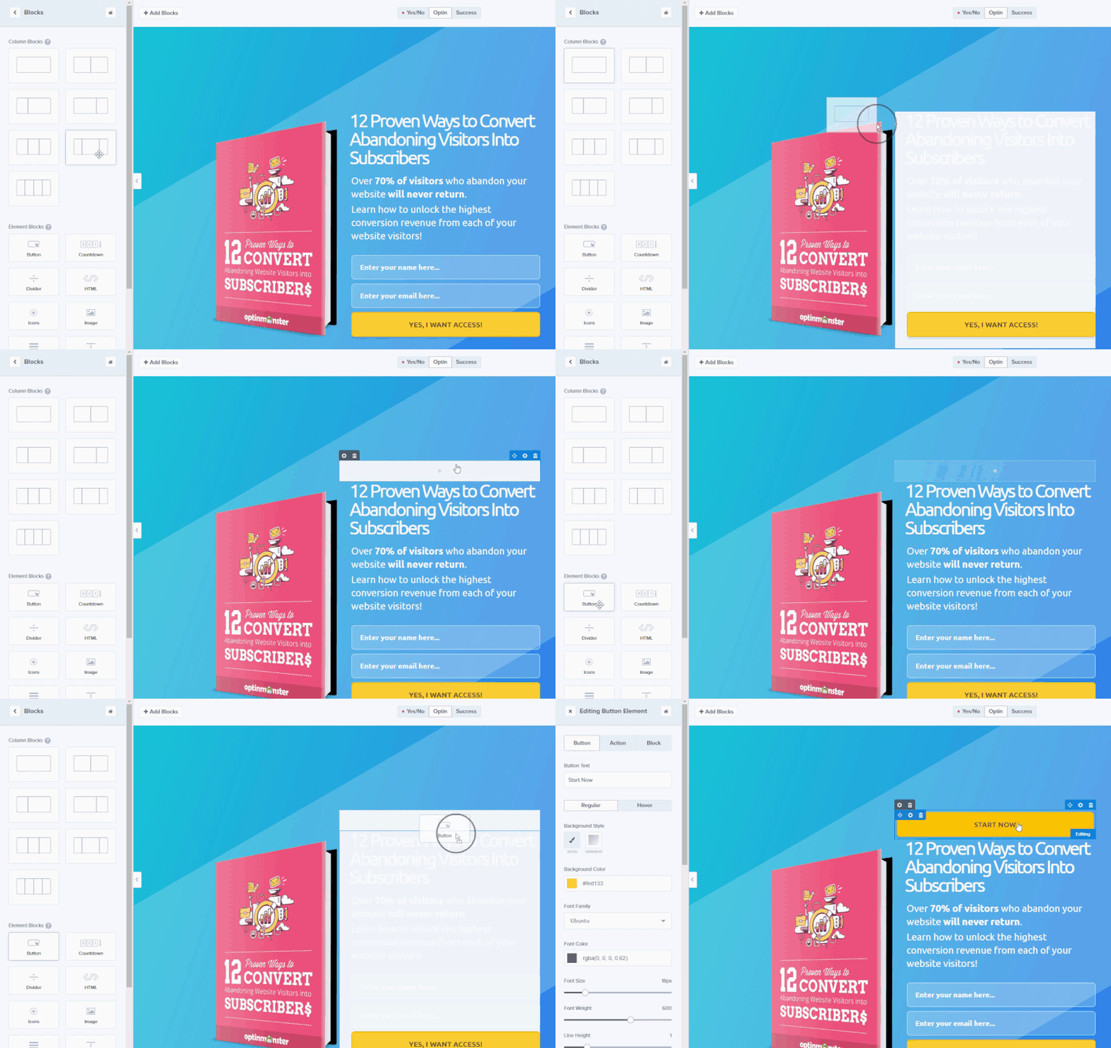
Improved Drag and Drop Experience
OptinMonster’s drag and drop user experience has been greatly improved with Project Delight:
So smooth.
Campaign Solutions and Goals
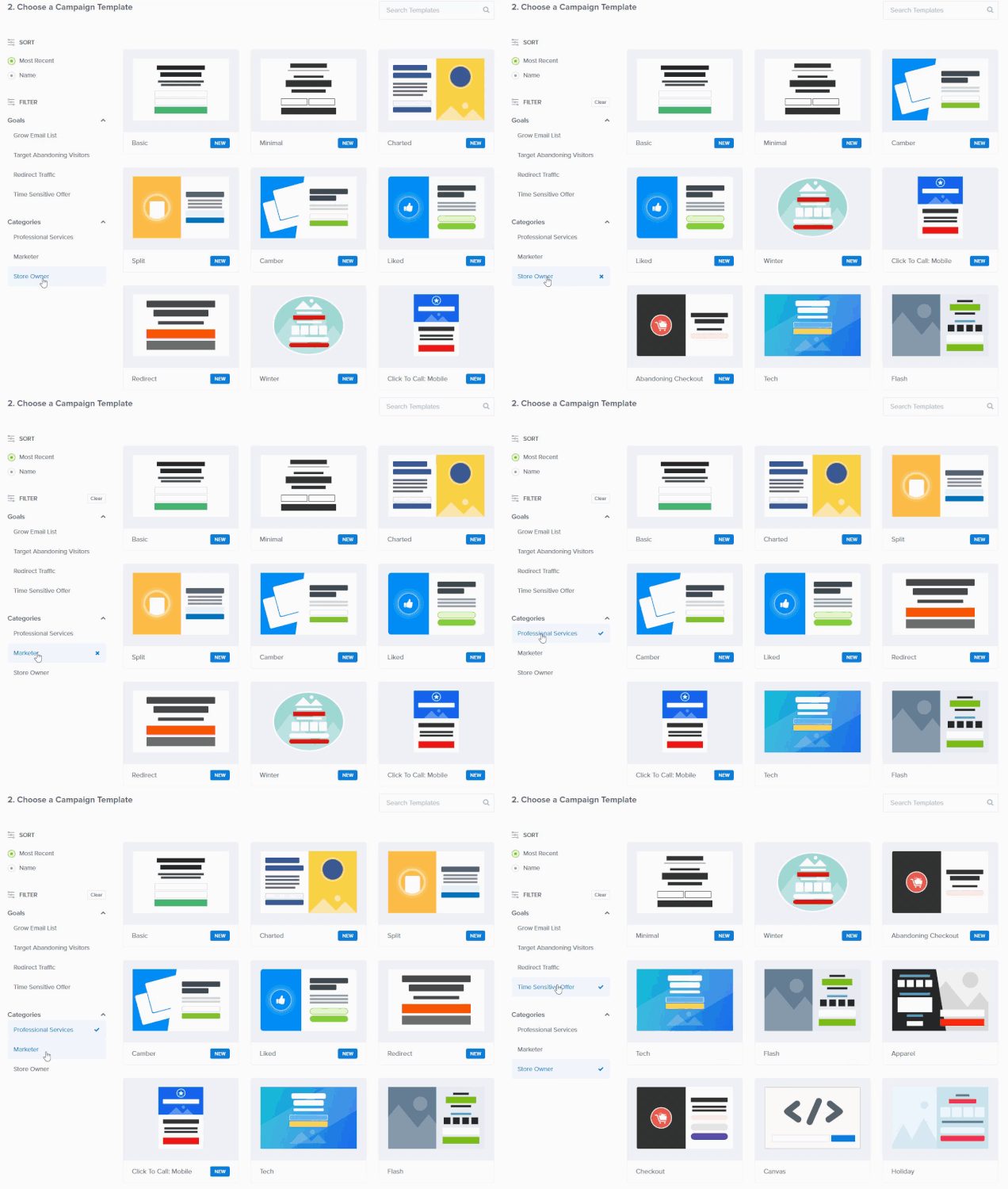
You now have the option of filtering campaign templates by goals and categories to find the perfect campaign that will convert the best for you.
Dashboard Improvements
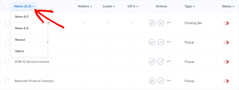
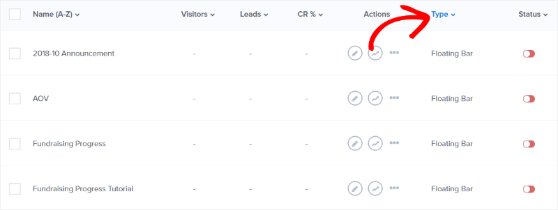
The dashboard has had a few improvements like improved sorting and the addition of campaign type to make it easier than ever to find the campaign you’re looking for.
You can sort campaigns by name and age…
Or campaign type and more!
What’s Ahead for Project Delight?
Ultimately, Thomas is most excited about a Project Delight feature that hasn’t happened yet.
If I had to say one thing I’m most excited about, it would be mobile specific campaigns. We know that we can do better in this area, so we have an update in progress where you can create mobile specific campaigns and still get all the benefits of customizing them in our drag and drop builder. You’ll get exceptional experiences on mobile devices to drive big results, and I can’t wait until it is launched next month!
There are awesome things going on at OptinMonster. Cracku increased conversions 300% by using OptinMonster’s countdown timers to create urgency. Flywheel used OptinMonster to increase engagement by 660% – and converted 4.7% of visitors using our page level targeting features. What will YOUR story be? Let’s find out – join today!

