Want to know how to make money with OptinMonster?
OptinMonster is packed with powerful features to help you boost your conversions and increase your traffic, subscribers, and revenue. In this article, we’ll share some of our favorite OptinMonster hacks to help you make money, no matter what’s going on in the world around you.
We want to make sure that you have the tools you need to succeed. And, we’ve found that OptinMonster is one of the best, most versatile tools around to help you do that.
What Is OptinMonster?
OptinMonster is the most advanced conversion optimization software in the market. With OptinMonster, you’ll be able to turn your anonymous website traffic into happy, paying customers.
Want more details? Check out this video:
Resource:
How to Make Money With OptinMonster
Whether you’re just starting out, or you’re an experienced OptinMonster user, this article is for you.
Some of these ideas will be quick to implement while others may take several minutes. Don’t worry! We’ve added a step-by-step tutorial with each tip, so you can easily use them in your campaigns.
Here’s a table of contents so you can skip to the tips that appeal to you. Or, just start from the top!
Table of Contents
- Increase Conversions on Your Popular Pages
- Turn New Visitors Into Paying Customers
- Drive Traffic to Your High-Converting Pages
- Boost Optins by 5X with Content Upgrades
- Double Your Optins using Multiple Triggers
- Improve Your Sales with Marketing Automation
- Recover Abandoning Visitors with OnSite Retargeting
- Improve Engagement with Custom Greetings
- Boost Your Conversions with a Welcome Gate
- Convert Engaged Visitors into Buyers
- Retarget Visitors with a Second Offer
- Instantly Turn a Blog Post into a Lead Magnet
- Reward New Subscribers with Instant Gratification
- Boost Affiliate Earnings with Targeted Offers
- Increase Your Mobile App Downloads
- Get Personal with a Video Optin
- Get More Facebook Likes
- Grab Your Visitor’s Attention with Animations
- Wow Your Subscribers with Smart Tags
- Boost Your Holiday Sales
- Improve Your Email Open rates with Whitelisting
- Boost Social Media Shares
- Tweak Your Optins with a Split Test
- Show off Those Testimonials
- Promote New Products
- Reduce Cart Abandonment
- Increase Your AOV (Average Order Value)
- Promote Your Loyalty Program
- Offer a Quote or Consultation
- Take OptinMonster Even Further with Canvas
Ready to get started? Let’s go!
1. Increase Conversions on Your Popular Pages
You may have heard of the 80/20 rule which says that 80% of your results usually come from 20% of your efforts. This is also true for online marketing: 80% of your conversions usually come from 20% of the pages on your site.
These pages are the most popular pages on your site. If you only increase your conversions on these pages, you can easily skyrocket your overall results.
With OptinMonster, you can optimize your popular pages by creating customized offers for them, and displaying those offers using exit-intent (or another trigger). But to do that, you’ll need to know which pages to optimize.
You can take advantage of OptinMonster’s native analytics without connecting anything, but if you want to use Google Analytics, we’ve got you covered.
If you don’t already have a Google Analytics account, follow the instructions here to create one.
Then, you’ll need to integrate your Google Analytics account with your optin forms. Simply edit one of your optin forms, and click on the Analytics tab. From here, you can select your Google Analytics account and the website profile that you want to use.
Hit the green Save button to save your changes. Now, you’ll be able to start tracking your pageviews right away (even if you’re just getting started with your Google Analytics account).
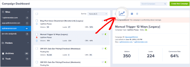
To view your highest converting pages, go to your OptinMonster campaign dashboard and click on the graph icon above your optin form.
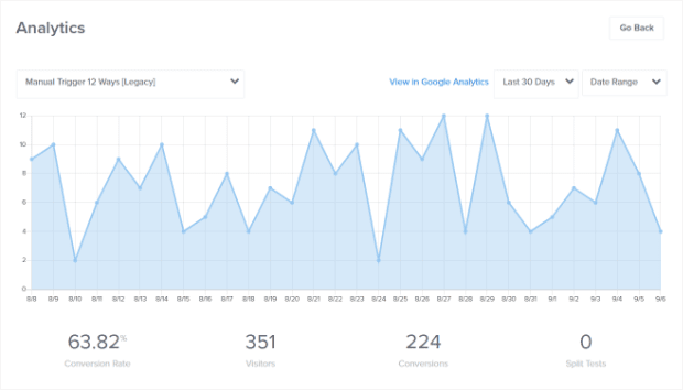
Now you will see an overview of your analytics for that optin.
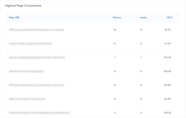
Scroll down to see your Top 10 Highest Converting Pages.
These are the 20% of your pages which yield 80% of your results!
Now that you know which pages you want to optimize, you can create custom lead magnets or content upgrades for them. Your lead magnet could be a checklist, eBook, mini-course, case study… basically anything that relates specifically to the topic of that page or post.
Once you’ve created your custom lead magnet, create an optin form for it. Then, set it to be displayed on exit-intent (or another trigger).
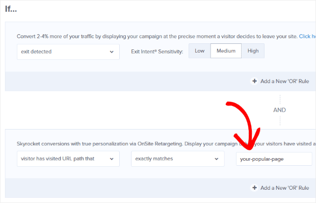
To set this up, go to the Display Rules tab and add an exit-intent condition. Also, set an OnSite Retargeting condition to show your campaign if visitor has visited URL path that, set the dropdown menu to exactly matches, and enter the URL path for the page you want to optimize.
That’s it! Now your popular pages are optimized for conversions.
2. Turn New Visitors Into Paying Customers
It’s pretty rare that a new visitor to your site is ready to make a purchase. But that doesn’t mean you can sweeten the deal and help them out a bit.
OptinMonster makes it easy to reach new visitors with a targeted campaign.
We use specific browser cookies to figure out if a visitor is new or returning to your site. Specifically, two cookies are set in the browser that we use to determine the visitor type:
- _omappvp is for visitor persistent
- _omappvs is for visitor session (expires after 10 minutes of inactivity)
If neither of these cookies exists, OptinMonster knows the visitor is new. If only the _omappvp cookie exists, we know the visitor is returning.
Targeting new visitors with discount coupons, lead magnets, and more can go a long way toward turning that visitor into a customer.
How to Use the New vs. Returning Rule
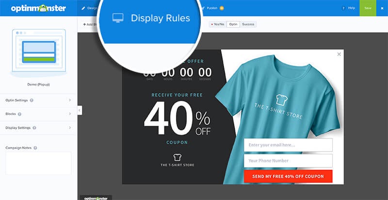
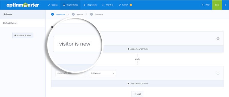
First, go to Display Rules.
To show your campaign only to new visitors, select visitor is new from the dropdown:
Save your changes and you’re done! Now you have a campaign targeted to new visitors.
3. Drive Traffic to Your High-Converting Pages
We started off our list of ways to make money with OptinMonster by showing you how to increase conversions on your popular pages. Now, we’ll show you how to find your highest-converting pages using either MonsterInsights or Google Analytics so you can create campaigns that drive traffic to them.
Track Landing Page Conversions with MonsterInsights
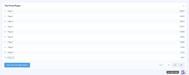
To find your top landing pages in MonsterInsights, go to Insights from your WordPress dashboard and click Reports. Scroll down to see the top posts and pages of your website.
Conversions mean different things depending on the focus of your site. For example, an eCommerce site’s conversions might be the number of products purchased whereas a blog might focus on visitors subscribing to an email list, filling out a form, or downloading a lead magnet.
To get your conversion information, you’ll want to install and activate the eCommerce addon in MonsterInsights.
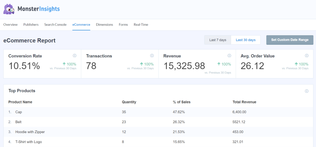
With this addon, you can see your eCommerce data at a glance by going to the eCommerce tab.
You’ll see your store’s conversions, transactions, revenue, and average order value.
Scrolling down brings you to more reports tracking conversions, like the sources that bring in the most visitors and how much they add to your revenue.
Tracking Landing Pages in Google Analytics
To track your high-converting landing pages in Google Analytics, you’ll want to set up Goals or eCommerce tracking.
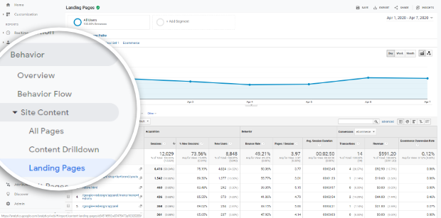
If you’re all set up, log in to Google Analytics and go to Behavior » Site Content » Landing Pages to see your landing pages report. By default, the report is sorted by popularity.
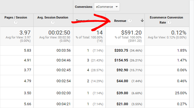
To see which landing pages lead to the most eCommerce sales, select eCommerce from the dropdown menu and sort the table by Transactions or Revenue by clicking on its heading.
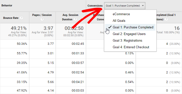
To see the landing pages that lead to the most goal conversions, choose a goal from the dropdown menu in the Conversions column.
Now you can use OptinMonster to create campaigns that direct traffic to these high-converting pages and posts!
4. Boost Optins by 5X with Content Upgrades
Did you know that blog posts with content upgrades covert 5X more email optins?
A content upgrade is a lead magnet that is specific to a particular blog post. For example, if your blog post is about how to grow an herb garden, you could offer a PDF checklist of all the supplies needed for planting an herb garden.
Here’s how to add content upgrades to your site with OptinMonster:
First, go to your OptinMonster dashboard and click on the Create New Optin button.
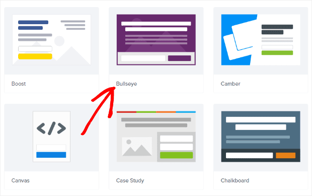
Select Popup as the optin type, and choose from any of our templates. We’ll use the Bullseye theme.
Name your campaign and choose the site you want to use.
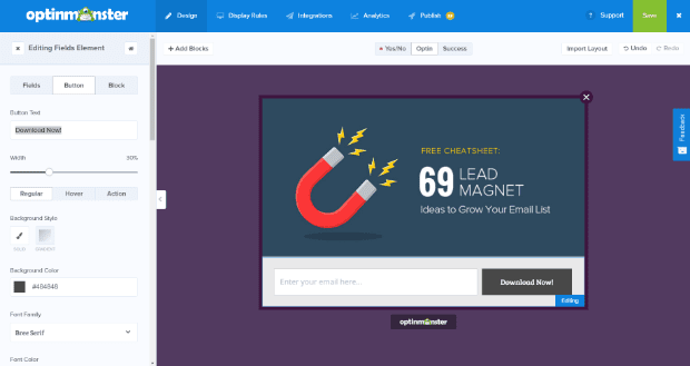
Next, upload an image for your content upgrade and change the colors, fonts, etc. to match. All of this can be customized by clicking on the element you want to edit.
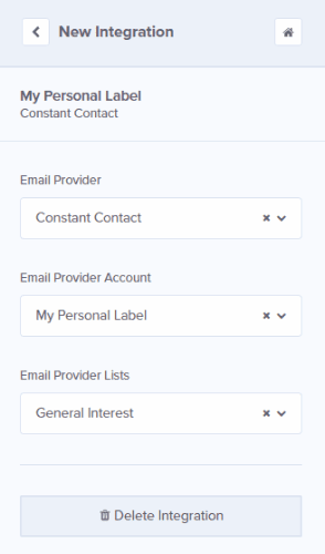
Once you’re happy with how your content upgrade form looks, go to the Integrations tab and select your email provider from the dropdown menu. Depending on your email provider, you’ll also have some additional options to choose from.
Now it’s time to set up the delivery of your content upgrade.
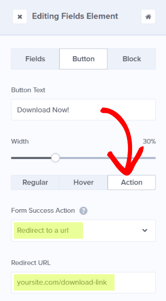
There are several different ways to deliver it, but the easiest way is by offering an immediate download. You can do this by redirecting the URL right from your Optin view.
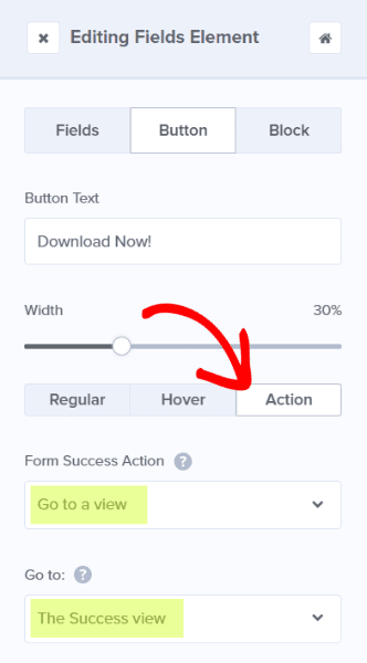
If you’d rather show the download after confirming that the user has signed up, you can create a Success view. In that case, you’d set the button action on your Optin view to Go to a view and choose The Success view.
Then, you’ll go to the Success view tab and import the layout from the Optin view.
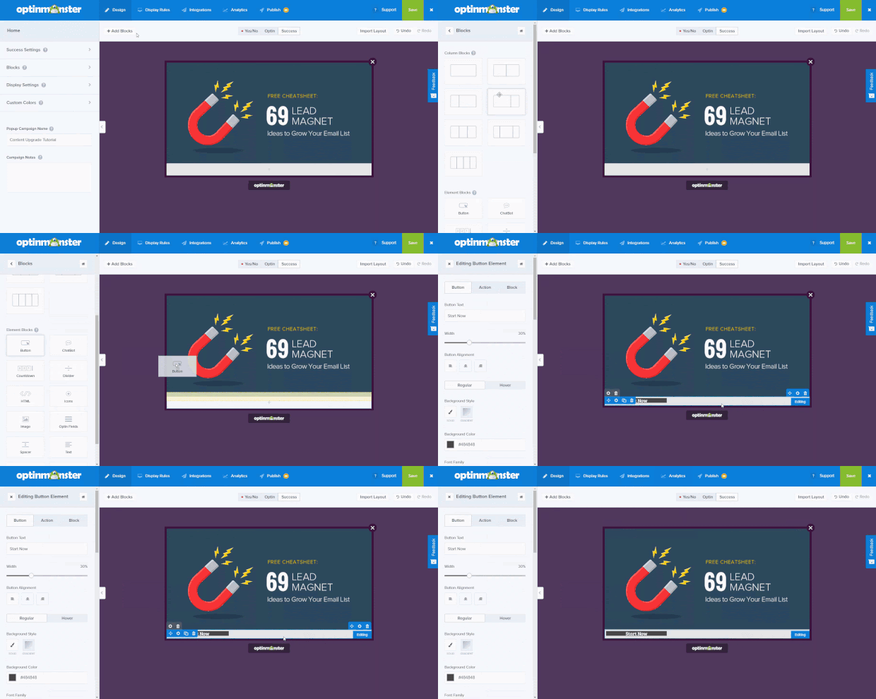
Next, we’ll add a button by clicking on + Add Blocks, choosing the button element block, and dragging it over to your live preview:
After that, format your button to look the way you want it.
Then, you’ll need to add a button action as we did earlier:
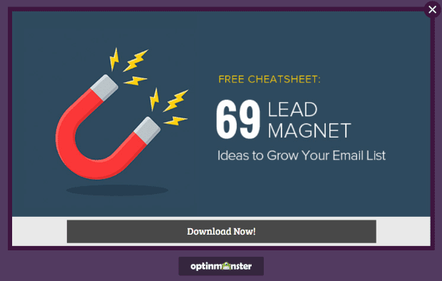
Now it’s time to turn this content upgrade form into a 2-step optin.
A 2-step optin is an optin form that loads only after the user initiates the process by clicking on a link. We always recommend that you use a 2-step optin for content upgrades because this converts the best by far.
To make your popup load on-click, go to the Display Rules tab and set a condition to visitor clicked MonsterLink™.
Once you’ve activated it, click on the blue Copy MonsterLink Code button.
Now the code for your MonsterLink has been copied to your clipboard.
Make sure to save your campaign regularly using the Save button at the top of the page before you proceed to the next step.
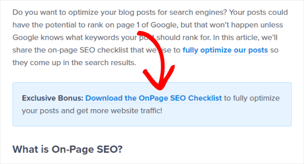
Next, you’ll need to paste the MonsterLink code you just copied into your blog post. Just paste it wherever you want your link to appear.
On our blog, we put the link inside a blue box like this:
After pasting the MonsterLink into your blog post, you’ll need to publish the optin form.
That’s it! Now your content upgrade optin form will load when your visitors click on the link in your blog post.
5. Double Your Optins by Using Multiple Triggers
Did you know that over 70% of your visitors abandon your website, never to return? You may have a timed popup on your site, but that won’t help to capture leads who leave your site before triggering it.
With OptinMonster, you can double your optins by displaying a campaign when someone is about to leave your site OR based on another trigger (depending on which happens first).
Here’s how to do it:
First, go to the Display Rules tab to set your first trigger. We’ll set our popup to appear when the user has scrolled down 50% of the page.
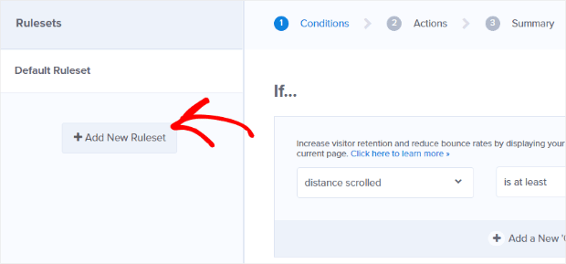
Then, add a second trigger by clicking + Add New Ruleset on the left side of the screen.
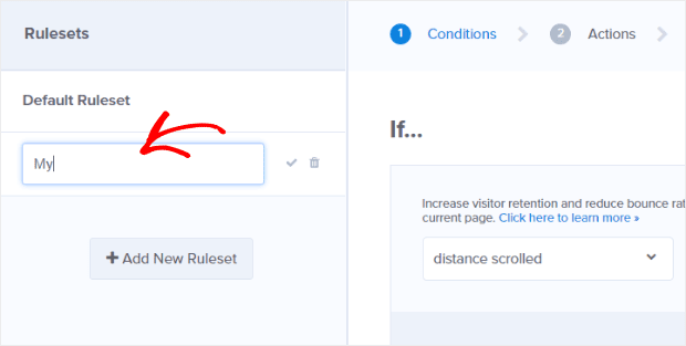
You will be prompted to give this new ruleset a name.
From here, add your exit-intent display rule:
Hit the green Save button at the top of the screen to save your new settings.
Now, if a user scrolls down 50%, your popup will appear, and they won’t see it again. But, if the user starts to leave your site before scrolling, the popup will appear, and they won’t see it again after that.
That’s it! You’ve just killed two birds with one stone.
6. Improve Your Sales with Marketing Automation
You already know that it’s important to tailor your sales funnel to the needs and interests of your buyer persona. But what if you have more than one buyer persona?
Each persona has their own interests, so you should send them targeted emails based on those interests.
With OptinMonster, you can target specific buyer personas based on their interests, and then segment or tag those people accordingly in your email marketing service.
This allows you to tailor your email marketing campaigns to each of your buyer personas, improving your overall sales.
Let’s go ahead and set this up with OptinMonster.
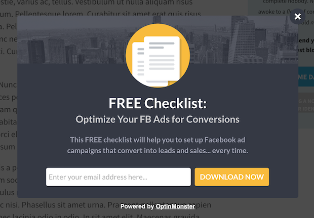
For the purpose of this tutorial, let’s say that you want to segment visitors who are interested in Facebook advertising. You could create a targeted offer for those people, like this:
Once you’ve created your targeted optin form, you’ll need to display it to the people who are interested in Facebook ads. For example, if you have a Facebook ads category on your blog, then you can target anyone who reads a post from that category.
To set this up, go to the Display Rules tab and add the condition current URL path.
Next, select contains from the dropdown menu and enter the URL path for your Facebook ads category (e.g., blog/facebook-ads).
Now, this popup will be displayed to visitors reading any post from the Facebook ads category.
Next, you’ll need to integrate this optin form with your email provider so that new subscribers are automatically tagged with the Facebook ads interest.
To do this, go to the Integrations tab. Then select your email provider. If your email provider supports tags or sequences, you’ll be able to select those, too.
That’s it! Now your optin form will be displayed to visitors with a specific interest. When they opt-in, they will be automatically tagged with that interest, so you can send them a targeted series of emails.
For help with creating your autoresponders, check out our post on 6 steps to create an effective email autoresponder series.
7. Recover Abandoning Visitors with OnSite Retargeting
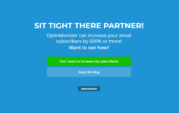
OptinMonster is not just limited to optin forms. You can also use OptinMonster’s onsite retargeting to convert users into customers before they leave.
Retargeting is when you bring a lead back to your offer after they abandon it. Retargeting usually requires paid advertising (like those ads that seemingly “follow you” around the web).
However, with OptinMonster’s onsite retargeting, you don’t have to pay a single cent to bring these leads back to your offers and increase your sales.
For example, let’s say someone visits your sales page but doesn’t put the product in their cart. Maybe they still have some questions before they are ready to buy, or perhaps the offer just isn’t quite enticing enough for them.
You can retarget that person by detecting when they are about to abandon your site (using exit-intent). Then, you can bring them back to your offer, and/or help them to overcome any objections or obstacles in the way of making that purchase.
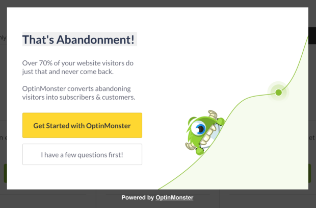
Here’s an example from our pricing page. This is what the user sees if they start to exit the page:
When you click on the “Get Started with OptinMonster” button, the popup closes and you return to the pricing page.
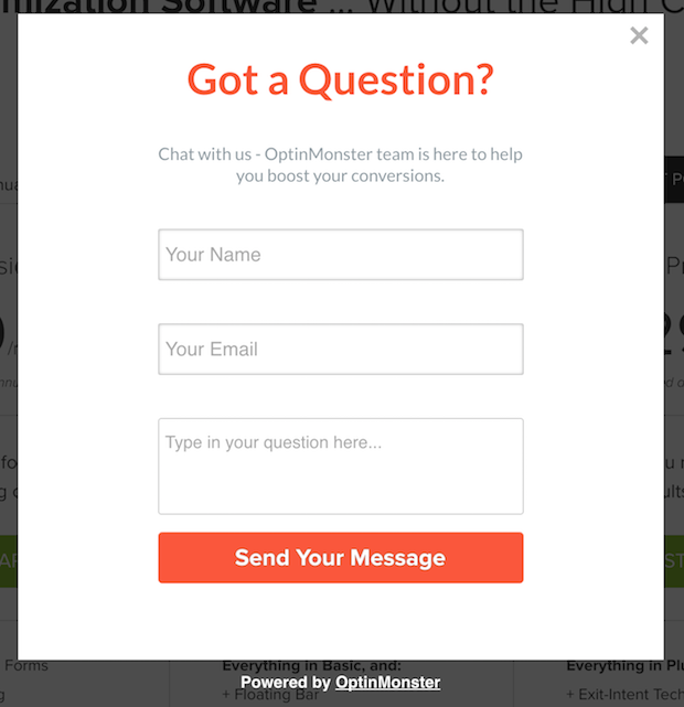
But when you click on the “I have a few questions first!” button, you’ll see a contact form that looks like this:
Here’s how to set up onsite retargeting with OptinMonster.
First, create a new optin form using one of our lightbox templates.
Next, you’ll need to have Yes/No buttons enabled. Go to the Yes/No tab, and activate the Yes/No view.
Now you need to set the actions for your Yes/No buttons.
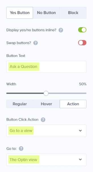
First, we’ll change the text for the Yes button to “Ask a Question.” Simply enter the new copy for your button into the Yes Button Text field to change it. Then, set the Yes Button Action to go to the Optin view.
Next, we are going to change the No Button Text to “No thanks, I’m ready to get started now!” We’ll set the No Button Action to Close the campaign.
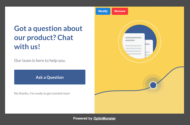
Now our popup looks like this.
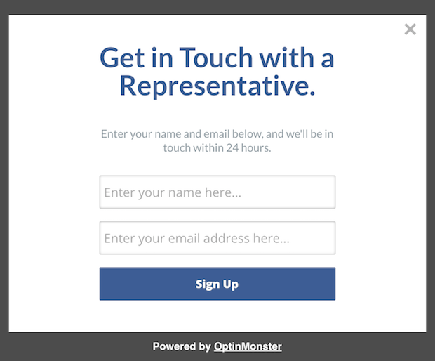
Next, you’ll need to change the form that appears when the “Ask a Question” button is clicked.
Go to the Optin tab to customize your optin form. Here’s what ours looks like using the Simple theme.
If you want to add more form fields, you can choose our Canvas template instead, which lets you create anything from scratch. You can even add a WordPress shortcode to your popup.
Finally, make sure that you set this popup to appear on exit intent.
You can set it to appear only on your pricing page by using the current URL path contains condition that we used earlier. Then set it to show when the URL path exactly matches the URL for your pricing page.
That’s it! Now you are all set to recover abandoning leads using onsite retargeting.
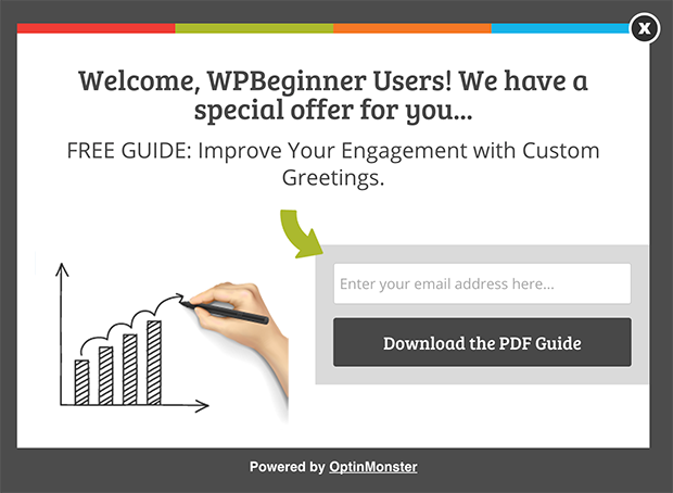
8. Improve Engagement with Custom Greetings
The more targeted your offer, the higher your conversion rate will be. It really is as simple as that.
If you expect to receive traffic from a particular source (e.g. from a popular publication you’ve just been mentioned in), plan on greeting that traffic with a targeted offer.
Here’s an example of a custom greeting with a targeted offer.
This popup was created using our Case Study template.
With OptinMonster, you can display a custom greeting like this using referrer detection technology.
To set this up, go to the Display Rules tab and use the referrer URL condition.
Now, anyone who comes to your site from any page on that domain will see your customized greeting.
Enjoy the high engagement in that traffic!
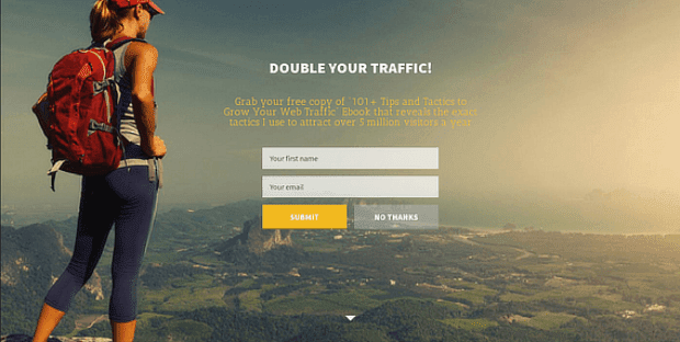
9. Boost Your Conversions with a Welcome Gate
Sales (and even customer satisfaction) actually decrease with the number of choices available. This principle is very important to keep in mind when it comes to your website visitors.
If you want your users to be happy with their decision to opt-in, then you’ll need to limit their choices as much as possible. The easier you can make the decision for them, the higher your conversions will be.
That’s why we created our fullscreen welcome gates. These optins minimize the choices on your site by making your call to action fill up the entire screen, keeping all other choices out of view. The links in your navigation bar, your recent blog posts, and any other elements on the page will not be visible until the user either opt-out or scrolls down the page.
To create a fullscreen welcome gate, simply go to your OptinMonster dashboard and create a new optin. Select Fullscreen as your campaign type, and choose a template. Then, enter a title for your campaign, and select your website.
Next, you’ll be taken to the edit screen. You can make any styling modifications to your welcome gate from the Optin tab: upload a new background, add our own logo, change the copy, and modify the fonts and colors.
Now that your welcome gate looks the way you want, you’ll need to tell OptinMonster where you’d like it to appear.
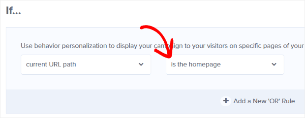
Go to the Display Rules tab to see your options. We want our welcome gate to appear on the homepage, so we’ll use the condition current URL path is the homepage.
Now your welcome gate is ready to be embedded on your site so you can boost your conversions on your homepage (or any page)!
For detailed instructions on embedding a welcome gate on many popular platforms, see our platforms doc.
Pro TipIncrease conversions with a pre-sell page!
10. Convert Engaged Visitors into Buyers
Wouldn’t it be great if you could target your most engaged visitors, and turn them into customers right away? With OptinMonster, you can.
People who have viewed 4 or more pages on your site are very interested in what you have to offer. Why not reward those people with an extra incentive to buy now?
If you sell information products, you could target these people with a popup that says, “Thanks for browsing my site! I’d like to give you a special discount on my course.”
Or, if you have an eCommerce site, you could offer a coupon code.
Here’s how to use OptinMonster to target your most engaged visitors and convert them into buyers.
First, start with one of our lightbox templates. We’re using the Shopping template for this tutorial. Then, go ahead and edit the optin form with your own copy and image (from the Optin tab).
Next, click on the Yes/No tab and activate the view (like we did in #5).
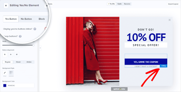
The actions for each button will already be set to the way you need them, but go ahead and change the copy, colors, fonts, etc. from this screen.
Now that your buttons look the way you want them to, let’s set the display rules for this popup.
Go to the Display Rules tab to view your options. We’re going to set our coupon to show up once the visitor has viewed at least 4 pages. To do this, add a condition of pages viewed is at least then put in the number of pages you want.
That’s it! Now your popup will appear to your most engaged visitors so you can convert them into buyers right away.
11. Retarget Visitors with a Second Offer
Not everyone is going to opt-in to the first popup you show them. In fact, many people will close out of your offer without even reading it at all. Do you have a plan for bringing those visitors back to your sales funnel?
With OptinMonster, you can set a second offer to appear if someone closes the first offer. These “second chance” offers convert really well, so there is absolutely no reason not to use them.
We recommend setting this up by showing a different optin type for the second chance offer.
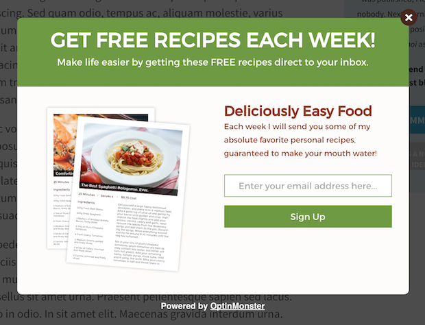
For example, you could display a timed popup on the first pageview, like this.
If the user opts-in to this popup, then they won’t see this offer again.
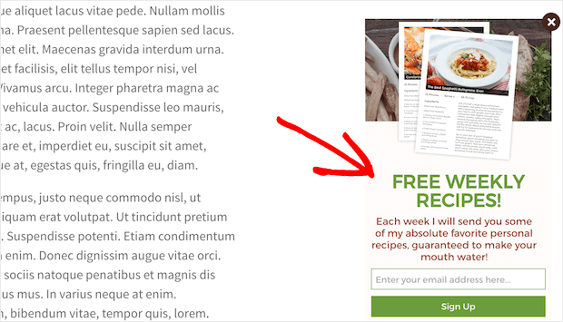
But, if they close out of this popup, then they will see a slide-in on their second pageview, like this.
To set this up, you’ll need to create a popup using one of our lightbox templates. Then, go to the Display Rules tab and set it to appear after a certain number of seconds by adding a condition of time on page is at least and enter however many seconds you want.
Next, you’ll need to create a second optin by choosing from one of our other templates, such as a slide-in or a floating bar.
Then, go to the Display Rules tab for that optin and add a condition of visitor has closed, choose Campaign from the dropdown, and choose the campaign showing the first offer from the Select a campaign dropdown.
You’ll also need to add another condition of pages viewed is at least then put in the number of pages you want. We’re going to use 2.
This way, they won’t see two optin forms on the same pageview. You only want the second chance offer to appear once they visit a 2nd page on your site.
That’s it! Now you can retarget visitors who close out of your first popup by giving them a second chance to convert.
12. Instantly Turn a Blog Post into a Lead Magnet
Want to spend less time creating lead magnets? With OptinMonster’s content gating feature, you can instantly turn any blog post into a lead magnet.
Content gating is when users can only see your content once they enter their email. It works really well as an incentive to get people to join your email list. And the best part is, you don’t have to create anything to download because the content lives right on your site.
You can even partially gate your blog posts so you can continue to use them for driving organic traffic.
For example, let’s say you have an ebook showing people how to mobilize their eCommerce business. You could allow anyone to read the first few pages, but in order to access the remaining pages, they’ll have to enter their email address.
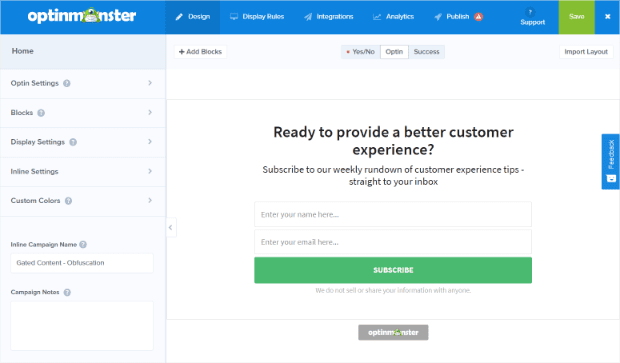
To set this up, you’ll need to start with one of our after post/in-line optin form templates. We’re using the Basic theme.
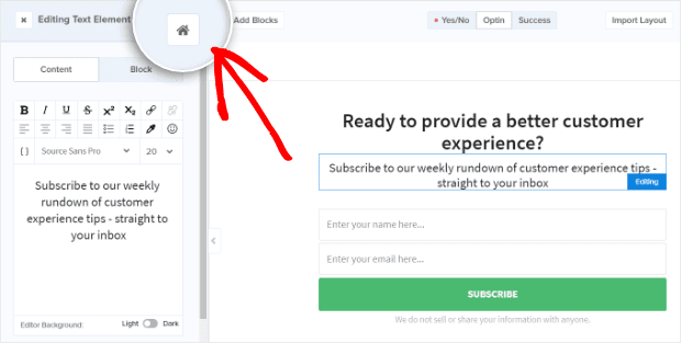
Once your optin form looks the way you want, go to the Inline Settings. You can easily get there by clicking on the little Home icon:
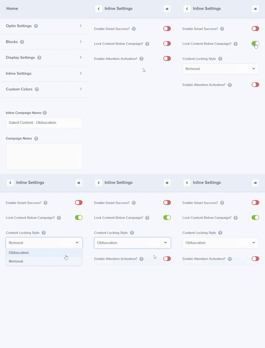
In your Inline Settings, toggle Lock Content Below Campaign to green. Then, choose the Content Locking Style you want (we’re using Obfuscation).
Once you are satisfied with your settings, set your campaign to Live from the Publish tab.
To show this off on your site, paste the embed code (or the shortcode if you are using WordPress) just above the content that you want to be gated.
For more help with content locking, check out our guide to gated content.
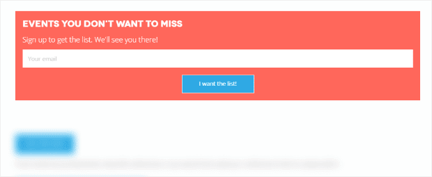
Now, all the content below your optin form will be blocked until the user enters their email address.
That’s it! Now you’ve instantly turned your blog post into a lead magnet.
13. Reward New Subscribers with Instant Gratification
If you promise to deliver a lead magnet, you better deliver it as soon as possible. People hate waiting to receive something, and they love instant gratification.
There are several different ways to deliver a download with OptinMonster, The quickest way is by using a success message with a download link. Here’s how to do it.
First, you’ll need to go to the Success view for your optin.
If there isn’t already a button on the view, you’ll need to add one by clicking on + Add Blocks, choosing the button element block, and dragging it over to your live preview.
Then, you’ll change the button action to redirect to your download URL.
That’s it! Now your users can download their lead magnet instantly, right after they enter their email address.
14. Boost Affiliate Earnings with Targeted Offers
Do you sell affiliate products on your site? You probably have some great content about those offers. But are you doing everything you can to make that content convert?
For example, you may have a review on your site for an affiliate product. When someone visits that review, you shouldn’t let them go without seeing your affiliate offer one more time.
OptinMonster’s exit-intent technology allows you to detect when someone is about to leave your product review post, so you can redirect them to the affiliate offer before they leave your site forever.
To set this up, first, choose from one of our lightbox templates and enable the Yes/No view. Then, edit that view to include your affiliate offer.
For the Yes button action, we’re going to select Redirect to a URL and enter the affiliate link into the Redirect URL field.
Now your affiliate popup is designed and ready to go. It’s time to set the display rules!
We’re going to include an exit-intent rule to start. But, we also want the campaign to appear when visitors are on a specific page (our review page for the affiliate offer we’re showing).
To do that, add the condition current URL path contains, then enter the slug for your affiliate review page:
That’s it! Now your exit-intent popup is ready to boost your affiliate earnings.
15. Increase Your Mobile App Downloads
Do you want more users to download your mobile app? OptinMonster allows you to create popups specifically for mobile users, so you can prompt them to download your app.
To create a mobile popup, start with one of our many mobile templates. For this tutorial, we’re using the Basic template.
Note: If you have just 2 download links, you can do this using the Yes/No view. We’re going to show you how to do this using the Optin view in case you only offer 1 download link.
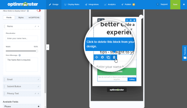
First, we’ll delete the optin fields by clicking on them in the live preview and then clicking on the little garbage can that appears above the element.
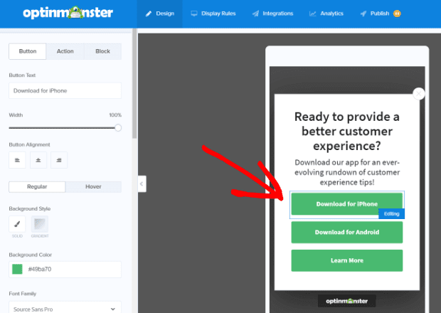
Next, you’ll need to add buttons by clicking on + Add Blocks, choosing the button element block, and dragging it over to your live preview as we did in hack #2.
Once you have the number of buttons you want, edit the button text and button action. We’ve changed our button text to give people 2 download options (iPhone and Android) as well as a third option to learn more about the app.
Now you’ll want to set the button action for each of your buttons following the same process we used in earlier hacks.
With OptinMonster’s mobile templates, there’s no need to specify the type of device you want to target! Since you’ve created a mobile-specific campaign, your campaign will only show up to visitors coming from a mobile device.
That’s it! Now users who view your site from their phones will be prompted to download your mobile app.
16. Get Personal with a Video Optin
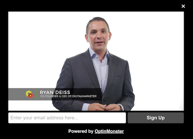
Videos are a really great way to grow your brand, make your optins more personal, and help your prospects feel closer to you. You can add a video to your optin form very simply with OptinMonster.
All you have to do to add a video is to select the Lightbox optin type and choose the Theater theme.
The Theater theme will allow you to add a video that has been uploaded anywhere on the web, including YouTube, Vimeo, Wistia or your own site.
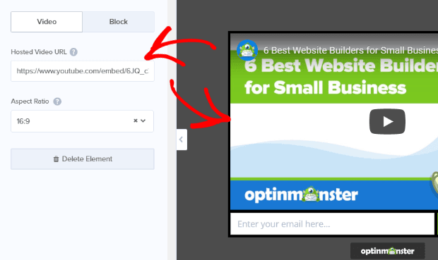
To add your video, click directly on the video in the live preview to bring up the editing tools. Enter the embed URL for the video in the Hosted Video URL box.
That’s it! Now you can use a video to make your optins more personal, convert better, and build your brand.
17. Get More Facebook Likes
Want to boost your Facebook likes? The perfect time to do it is right after someone has just subscribed. These people are very interested in what you have to offer, so they are the perfect candidates for your fan page.
With OptinMonster, you can add a call to action to like your Facebook page immediately after someone opts-in to your email list. Here’s how to do it.
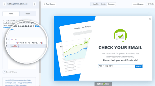
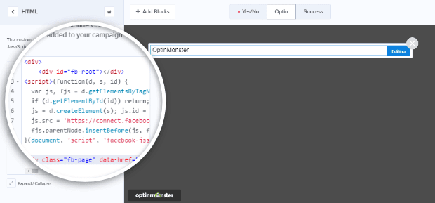
First, edit one of your optin forms. Then go to the success view, and add an HTML block to your campaign.
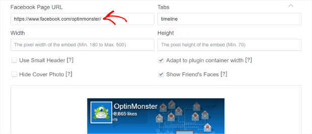
From here, you’ll need your Facebook code from the Facebook Page plugin site.
Enter the URL of your Facebook page.
Adjust the width and height to meet your needs. We’re using 500 px wide and 250 px high.
Adjust other settings as needed. For example, we selected Use Small Header so there’s more page content on display in our like box popup.
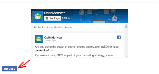
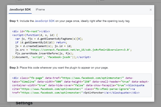
Click the Get Code button. A box will pop up.
Facebook provides two blocks of code.
Copy the first block. Keep the tab open, as you’ll need to come back to grab the second block of code.
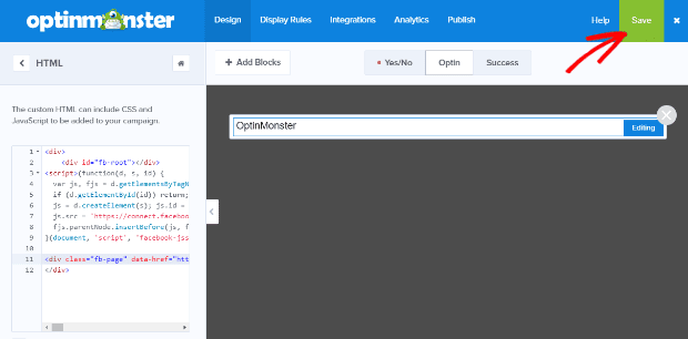
Go back to the campaign builder, and paste the first block of code you copied from Facebook. Return to the tab with the Facebook Page plugin website and copy the second block of code. Paste this code below the first block of code.
Save your campaign.
Take a look at your campaign by going to the Publish tab and setting the campaign’s status to Live. You’ll want to save your campaign again.
Now, select Shareable MonsterLink™ in the Platform section. Copy and paste the provided link in a new tab.
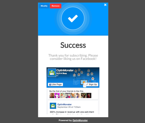
You’ll need to play around with the sizing to get it right, but here’s an example of what you can do:
That’s it! Now you can start getting more Facebook likes right after someone opts-in to your email list. Want the instructions from start to finish? Check out our tutorial on how to create a custom Like Us on Facebook popup!
18. Grab Your Visitor’s Attention with Animations
Want to really grab your visitor’s attention? A really cool feature that OptinMonster has is the ability to add animations. Let’s get started adding animations to your popups.
First, go ahead and create a lightbox optin form (or edit an existing one). Once your popup looks good, go to the Display Rules tab and set those up, too.
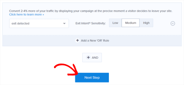
When you have your display rules set the way you want, click Next Step.
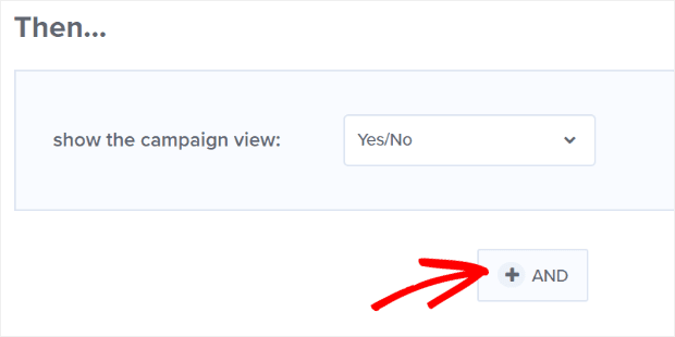
Here, you’ll be able to select the view you want to show. Then comes the fun part.
Click + AND to add another action:
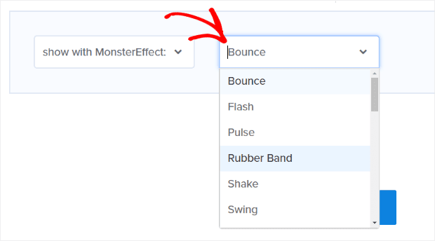
From the Select Action dropdown, you have 2 choices: show with MonsterEffect or play sound effect. We’re going to select show with MonsterEffect.
That will bring up another dropdown where you can choose the effect you want (there are 26 to choose from!):
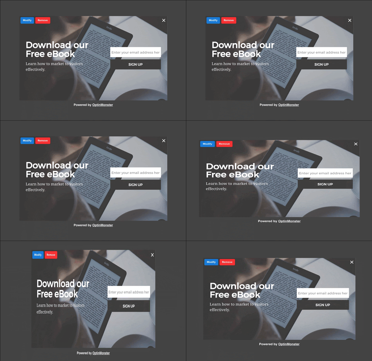
We’re going to use the Rubber Band animation. Here’s what it looks like:
That’s it! With your fun new animation, it will be impossible for visitors to miss your popups.
19. Wow Your Subscribers with Smart Tags
Do you want to really wow your subscribers and convert more of them into paying customers? Using OptinMonster’s Smart Tags feature, you can create personalized greetings on your site that welcome your subscribers by name.
For example, let’s say you have a special offer for your subscribers. You could send them an email with a link to the offer. When the page loads, they will see a popup (or a welcome gate) that addresses them by name.
Here’s how to set this up with OptinMonster.
Let’s say you want your popup to address subscribers by their first name. If no first name information is available, you want to say “Hey there!” as a fallback.
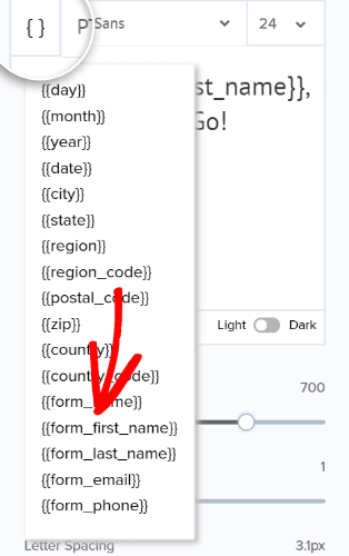
To do this, we’ll add the {{form_first_name}} merge field to our popup, by clicking on the merge field button, then selecting {{form_first_name}} from the dropdown:
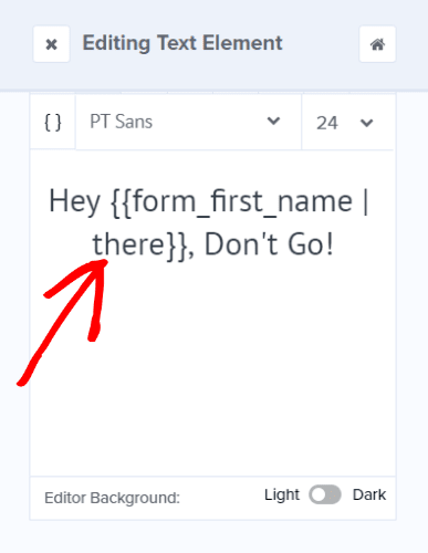
Remember, though, we want to have a fallback in case we don’t have data in that field. So, we’ll modify this in the text editor to {{form_first_name | there}}:
You’ll need to define the “name” variable so that OptinMonster knows what to put there.
To do this, you could add the subscriber’s first name to the URL as a query argument. For example:
http://yourwebsite.com/?name=Thomas
Of course, you can’t add this URL manually to each individual email. Fortunately, your email provider probably uses merge tags to insert variables, like a first name.
You can use those merge tags when adding the link in your email. For example, if you use ConvertKit, their first name merge tag is {{ subscriber.first_name }}. So when drafting your email in ConvertKit, your link would look something like this:
http://yourwebsite.com/?name={{ subscriber.first_name }}
ConvertKit will automatically change the merge tag to the subscriber’s first name for each individual email.
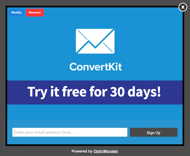
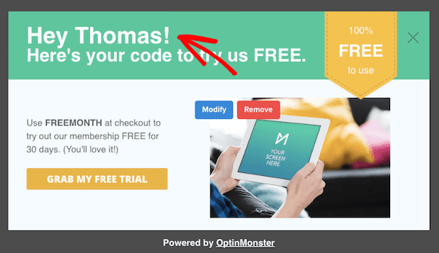
So, when your subscriber named Thomas clicks on the link, they’ll see a popup that looks like this:
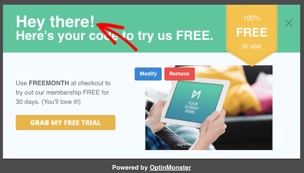
But, if a subscriber clicks on the link and there’s no first name information for that subscriber, they’ll see a popup that looks like this.
That’s it! Now you can wow your subscribers by greeting them by name.
Some users have asked what the difference is between OptinMonster and ConvertKit and why they need both. For more information, check out this post on OptinMonster vs. ConvertKit and which is best to grow your list.
20. Boost Your Holiday Sales
Have a holiday promotion coming up? You can boost your sales by adding a time-sensitive popup to your site. Here’s how to add a holiday offer to your site with OptinMonster.
First, go to your OptinMonster dashboard and create a new popup, floating bar, slide-in, or any optin type you like. For this tutorial, we’ll use the lightbox popup Cyber theme.
Go ahead and edit until your popup looks the way you want.
Now it’s time to set this to display during your sale in the visitor’s timezone.
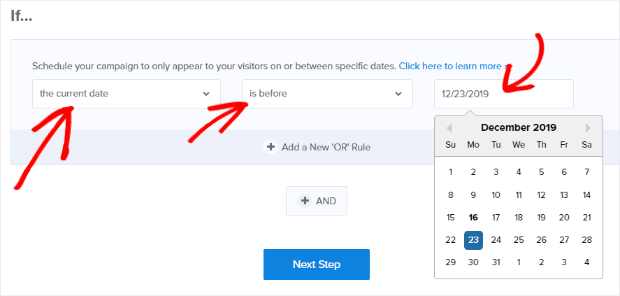
Go to the Display Rules tab and add the condition If the current date and choose is before from the operator dropdown. Then, select the end date for your campaign from the calendar.
That’s it! Now your popup is all set to boost your sales on the schedule you want. You can also set campaigns to appear based on time or date and time together.
21. Improve Your Email Open Rates with Whitelisting
Want to improve your email open rates? Get more subscribers to whitelist your email address!
Whitelisting ensures that new subscribers will receive your emails. Plus, the more people who whitelist you, the more reputable you look to spam filters (increasing the likelihood that you’ll land in inboxes across the board).
The right time to ask people to whitelist you is immediately after they have subscribed. That’s why we have a success template that you can use for this purpose.
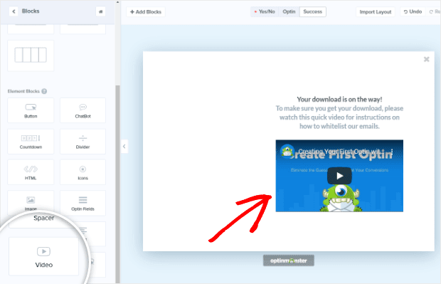
First, record a quick video of your screen explaining how someone can whitelist your email address. Then upload it to your website, or a video sharing platform such as YouTube, Vimeo or Wistia.
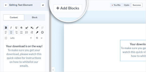
Next, go to the Success tab for your optin form and click + Add Blocks.
Drag and drop the Video block to your campaign.
That’s it! Now your optin form will display your whitelisting instructions right after someone opts-in.
22. Boost Social Media Shares
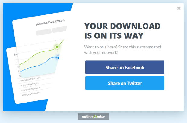
Do you want your new subscribers to spread the word about your lead magnet? Strike while the iron is hot by asking them to share immediately after they opt-in.
With OptinMonster, you can add a call to action with sharing buttons right inside your success message. Here’s how to do it.
First, go to the Success tab for your optin form and click the + Add Blocks button.
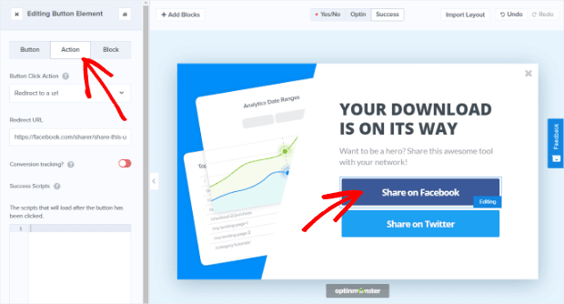
Drag and drop the Button block to your campaign. If you have multiple places you want users to share, you can drag more Button blocks. We’re going to use 2 buttons, one for Facebook sharing and one for Twitter sharing.
Now you need to edit the buttons so users can click them to share your lead magnet.
To do this, you’ll need to generate sharing links for your lead magnet. Share Link Generator is a great free tool for this purpose. Just paste the link to your lead magnet page, and it will generate a Facebook and Twitter share URL.
Once you have your sharing links, click on one of the buttons in your campaign and go to the Action tab. Once there, you’ll want to change the Button Click Action to Redirect to a url. Then, you’ll paste the URL into the Redirect URL field.
Now repeat the same process for your Twitter button.
That’s it! Now your popup will encourage new subscribers to share your lead magnet on Facebook and Twitter.
23. Tweak Your Optins with a Split Test
Are you curious to know which headline, image or offer converts best? With OptinMonster, you can split test your campaigns and make data-informed decisions about what to tweak.
Here’s how to create a split test in OptinMonster.
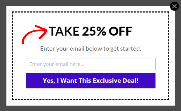
First, go ahead and create the primary version of your optin form. For this example, we’ll test which offer converts best: a 25% off coupon, or free shipping.
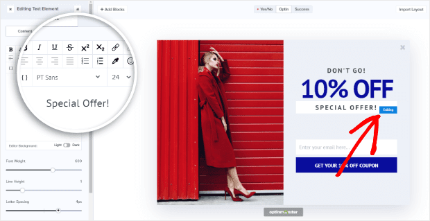
Here’s what the 25% off popup looks like. We’re going to split test the headline.
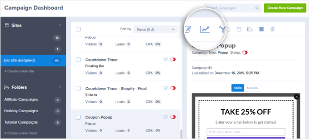
Once you’ve created the primary version of your campaign, save and exit to your Campaign Dashboard.
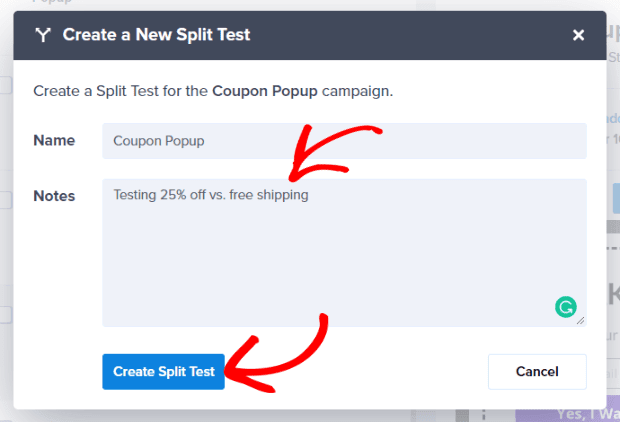
Click on the campaign you want to split test in your Campaign List. The campaign will show up to the right of the Campaign List with a row of icons along the top. Click the Split Test icon:
In the screen that comes up, enter any notes you want to track on the split test before clicking Create Split Test.
On the next screen, enter a name for your new variation (the notes you entered in the previous screen will come through automatically) and make the changes you want to test.
Once you’ve made the changes to your split test variation, save it, and exit to return to your dashboard. Your split test is now live!
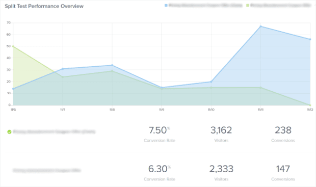
You can view the results of your split test from the analytics screen:
Once you’ve gathered some data, you’ll be able to see which variation is converting the best. The version that is winning will have a green checkmark next to it.
That’s it! Now you can make smart tweaks to your campaigns based on real data.
24. Show Off Those Testimonials
Customer testimonials are an excellent way to get more conversions and make money with OptinMonster. In fact, once the visitor interacts with a testimonial for your company, 58% of people are more likely to convert.
We recommend putting testimonial campaigns on your product pages, setting the display rules so the campaign shows a few seconds after the product page loads.
Here’s an example testimonial campaign we created:
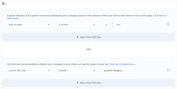
Once you have your campaign created, go to Display Rules. We’re going to leave the condition of time on page is at least 5 sec. and change the other default display rule to current URL path contains then add the URL you want to target. In our example, we’re targeting any URL path containing product-category.
Save and publish your campaign and you’re all set! Now you have a testimonial campaign that will show up on your product pages.
25. Promote New Products
Got some hot new products to sell? Create a campaign that makes it easy!
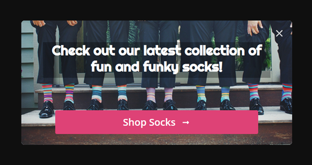
Here’s an example of a campaign we created to promote new products:
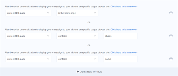
For this campaign, we’ll want to make sure that visitors see it even if they don’t go to our product pages. To do that, we’ll go over to Display Rules and set conditions of:
- current URL path is the homepage OR
- current URL path contains shoes OR
- current URL path contains socks
We’re using OR rules so the campaign shows up if any of those rules are met.
Save and publish your campaign and you’ll have a campaign that shows up on your homepage and other key pages to direct visitors to your new products.
26. Reduce Cart Abandonment
Did you know that in a single year cart abandonment is responsible for $4.6 trillion in lost eCommerce sales?
Fortunately, exit-intent popups are a great way for you to capture abandoning visitors and maximize your conversions.
Exit-intent popups can be installed on any page, but to capture abandoning visitors, we love them on shopping cart and checkout pages.
They work by detecting when a user is about to leave the page. Then, your popup message shows up, encouraging visitors to stay by offering a sweet deal or giving them more information.
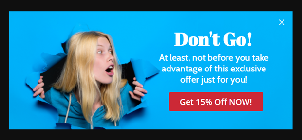
Here’s an example of an exit-intent campaign designed to keep visitors from leaving by giving them a special discount offer:
With OptinMonster’s exit-intent technology, you can show an even more targeted offer by displaying a different message depending on which items the shopper has shown an interest in, or which pages they’ve viewed on your site. See our guide on how to create an exit-intent popup on Shopify for step by step instructions.
For this campaign, we’re going to add exit-intent in Display Rules and set it to target all devices:
Then, since we want our campaign to show up for shoppers who have added an item to their cart or started the checkout process, we’ll add AND display rule conditions of:
- current URL path exactly matches cart OR
- current URL path exactly matches checkout
Again, we’re using OR for our page targeting rules because we want to show our campaign if any of the criteria are met.
Save and publish your campaign and you’re ready to capture abandoning visitors with a sweet deal and close the sale!
27. Increase Your AOV (Average Order Value)
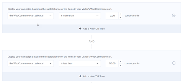
A great way to increase your AOV is by offering free shipping. All you need to do is create a campaign that shows up on the checkout page when the items in your shopper’s cart total less than the minimum order for free shipping.
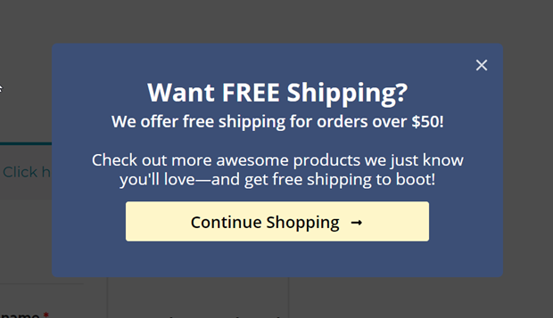
Here’s a campaign we created to encourage shoppers to keep shopping if their cart subtotal is less than $50.00:
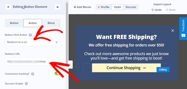
To set this up, just build your campaign as you normally would and set the Continue Shopping button action to Redirect to a url, using the URL of your store as the Redirect URL.
Then, go to the Display Rules and add conditions of:
- The [eCommerce Platform] cart subtotal is more than $0.00
- The [eCommerce Platform] cart subtotal is less than $50.00
We used WooCommerce to set up our display rules, but there are special rules you can use for Shopify and BigCommerce, too.
We also set this condition:
- The current URL path contains checkout
This means our free shipping notification will only show up if the shopper has gone to the checkout page.
Awesome! Now you can increase your AOV just by offering free shipping!
You can even set up your campaign to show related items by copying and pasting the code from your eCommerce platform. WooCommerce uses a shortcode. Shopify is a bit more involved, but you can find their process here.
28. Promote Your Loyalty Program
Loyalty programs are a great way to encourage repeat purchases and, well, increase customer loyalty. According to eMarketer, 58.7% of internet users believe earning rewards and loyalty points is second only to a quick and easy checkout as one of the most valued aspects of the shopping experience.
So, loyalty program = good.
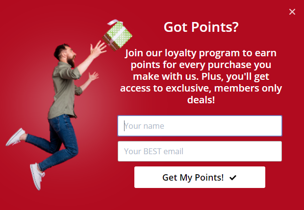
To promote your loyalty program and increase signups, we recommend targeting shoppers right after they’ve made a purchase.
Here’s an example of a campaign we created to get loyalty program signups from an order confirmation page:
We also want to set up display rules so the campaign shows up only on the order confirmation page.
To do that, go to Display Rules and add a condition of:
- current URL path contains confirmation
You’ll want to replace “confirmation” with the slug for your own order confirmation page.
That’s it! Now, when someone makes a purchase from you, they’ll be invited to join your loyalty program.
29. Offer a Quote or Consultation
One of the best ways to get potential customers to take advantage of your expertise and offer is to offer a free quote or consultation.
You can use OptinMonster to let them know about it. Here’s a campaign we created for this purpose:
You can use display rules to target the pages and visitors you want.
30. Take OptinMonster Even Further with Canvas
Did you know that you can use popups for more than just email optins? Using our Canvas theme, you can create many different types of popups to increase user engagement and pageviews, decrease bounce rate, and increase sales.
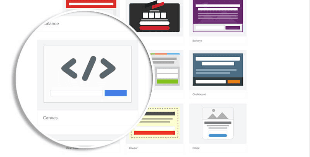
OptinMonster’s Canvas theme is a blank popup that allows you to insert anything you can imagine, including HTML, CSS, JavaScript, and even WordPress shortcodes.
With Canvas, you can create eCommerce integrations, related posts, quizzes, surveys, etc., all while enjoying our best features such as exit-intent and page-level targeting.
Here are a few ideas for taking OptinMonster even further with Canvas…
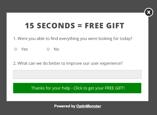
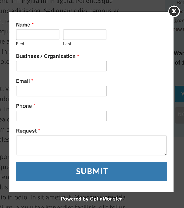
Create a Custom Survey: display a popup form to users who have successfully checked out. (Tip: Use WPForms to create the form, and then embed it into the Canvas theme.)
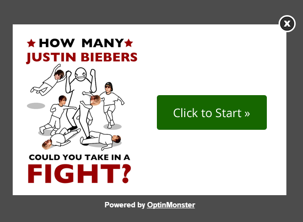
Create a Fun Quiz: create a quiz that delivers your results at the end.
Create a Related Posts Popup: suggest related posts on exit-intent to reduce your bounce rate and increase pageviews.
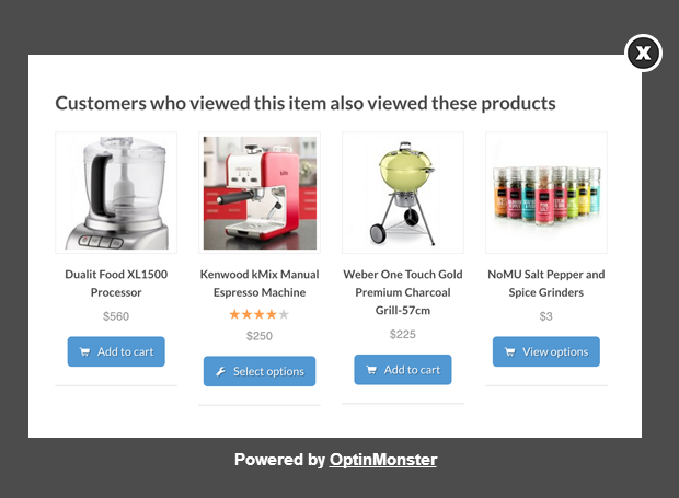
Create a Related Products Popup: recommend products on exit-intent based on the product the user is currently viewing using page-level targeting. Or, suggest up-sells and down-sells based on what the user has purchased.
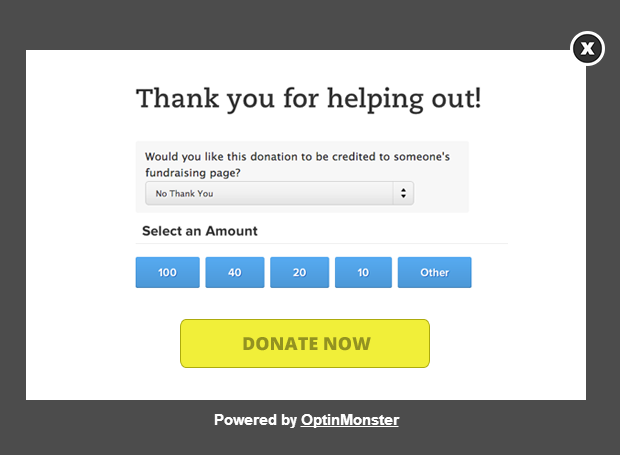
Create a Donation Popup: raise money for your non-profit or your campaign by adding a donation form to a Canvas popup.
For even more unique popup ideas, check out our post on 9 unique popups you can make with OptinMonster Canvas.
As you can see, the possibilities are limitless! Here’s how to create any type of popup using Canvas.
First, create a new lightbox popup using the Canvas theme.
Start by adding a block. We’re going to add a WPForms shortcode to our campaign, so we’ll just add a single column block and the HTML block. Then, we’ll paste our WPForms shortcode into the HTML block.
Note that you will not see a live preview of your code in action yet, but that’s OK.
Be sure to save your campaign!
Now you can visit the front-end of your site to see your Canvas popup in action and make sure it is loading properly.
Here’s what our popup looks like with the WPForms shortcode embedded in it:
If you need to make any styling adjustments, you can insert your own CSS into the Custom CSS field (from the Optin tab).
That’s it! I hope you will be leveraging some of these OptinMonster hacks to boost your conversions.
Not using OptinMonster yet? Get started today and start converting abandoning website visitors into customers!
Which was your favorite money-making tip? Have any questions about implementing any of these strategies? Let us know in the comments below!




































Add a Comment