Are you struggling with mobile lead generation, and you’re tired of leaving conversions on the table?
It’s no secret that over half of online consumers shop their favorite stores using mobile devices.
That means it’s more important than ever to ensure that your website and lead generation strategy are BOTH mobile-friendly.
Which is why, in this post, we’re going to share 5 expert mobile lead generation strategies that you can use to grow your business.
Before we dive into our expert tips, though, let’s get clear on why mobile lead generation is so important.
The Importance of Mobile Lead Generation
You probably know that your online store needs to cater to your mobile users.
And (hopefully) you’ve tested your website to confirm that it looks and functions well across a range of devices.
But having your website be mobile-friendly doesn’t automatically mean your lead generation strategy is, too.
That means you’re likely losing a lot of unnecessary leads and not because customers don’t want your offer. You’re losing leads because customers don’t like how your offer is presented.
See the difference?
In fact, there are 3 major benefits to improving your mobile lead generation strategy:
- Boost UX: Engage users with mobile campaigns that are easy to navigate, look great, and give your leads the information they’re looking for.
- Increase Conversions: Watch conversions skyrocket as you tap into an entirely new segment of your target audience.
- Drive Sales: Ultimately, creating a mobile lead generation strategy will get you more leads. And that means it’ll bring you more paying customers, too.
With these 3 benefits in mind, let’s turn to our 5 proven mobile lead generation strategies.
Mobile Lead Generation: 5 Expert Tips
The following lead generation strategies were specifically chosen to help you convert traffic visiting from mobile devices.
In this post, we’ll cover the following tips:
- Create optin campaigns for mobile
- Leverage 2-step optins
- Use mobile-friendly forms on your site
- Build landing pages for mobile visitors
- Add social feeds to your website
Ready to get started? Let’s dive in.
1. Create Optin Campaigns for Mobile
The first thing that you should do is create mobile-friendly “optin campaigns.”
Optin campaigns are things you’re likely already familiar with, such as popups, floating bars, fullscreen welcome mats, and more.
The goal of these campaigns is to capture your visitor’s contact information. This is usually in the form of their phone number or email address.
But let’s be honest: you probably already use these on the desktop version of your website.
The only problem? If you haven’t created some specifically for your mobile users, you’re likely hurting the user experience (UX).
And that means you’re losing conversions.
So how do you go about creating mobile-friendly optin campaigns that are still flexible, powerful, and won’t break the bank?
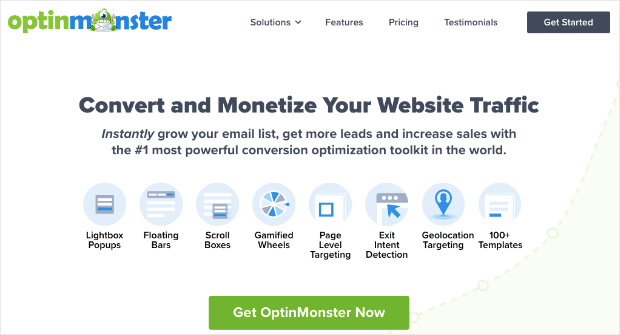
For that, you’ll want a tool like OptinMonster:
OptinMonster is the best lead generation software on the market. It allows anyone to quickly and easily create mobile-friendly optin campaigns.
How? Let’s take a quick look.
Everything starts by choosing one of OptinMonster’s many campaign types. These include optins like:
- Popups
- Floating bars
- Fullscreen welcome mats
- Slide-in scroll boxes
- Gamified spin-to-win wheels
- And much more…
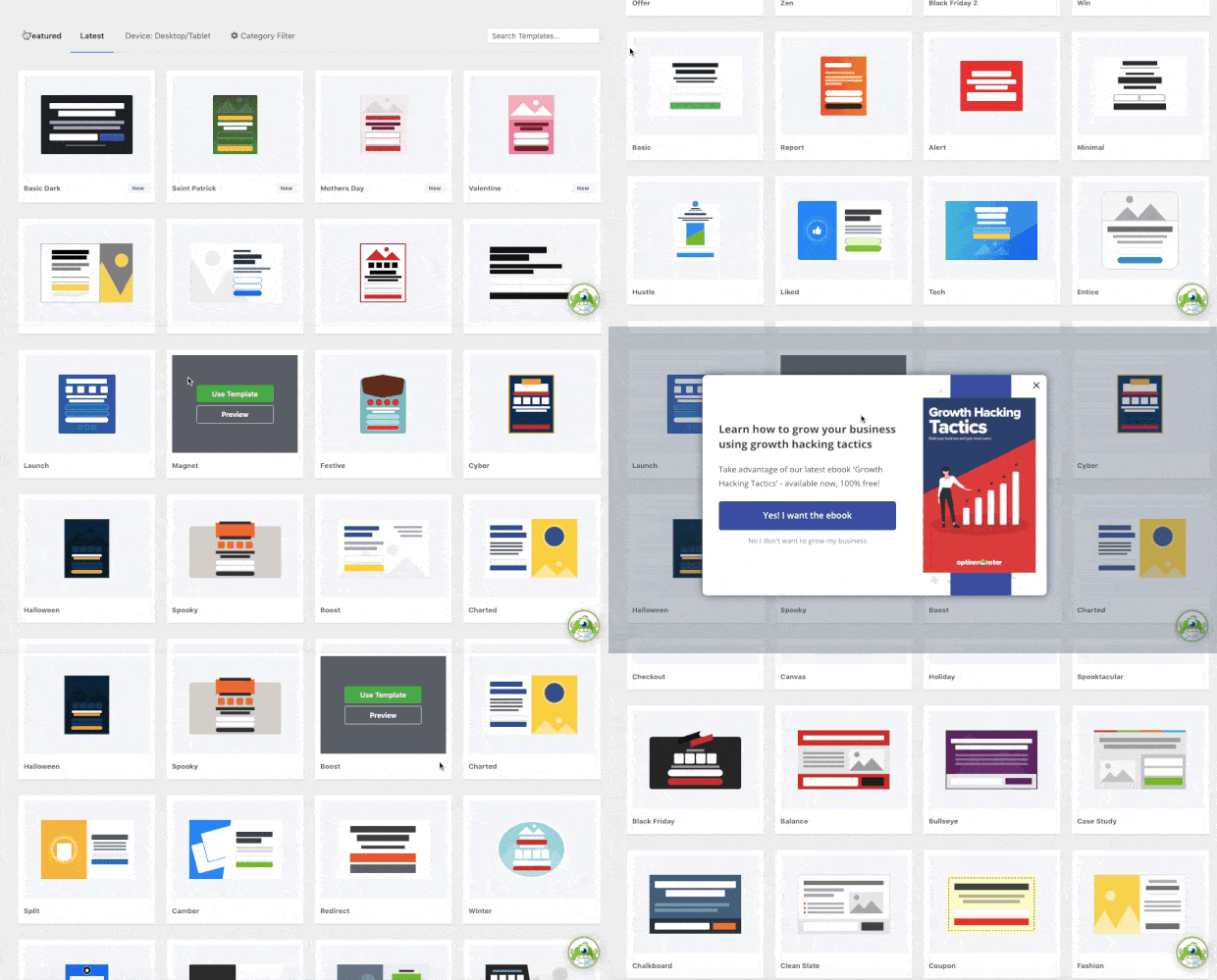
Once you ‘ve determined which type of campaign you’d like to use, you can select from 50+ pre-made templates:
These look great across devices and are all mobile-friendly.
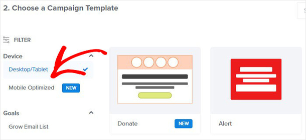
But if you want to go a step further, you can filter these templates to be mobile-first:
This will give you total confidence in the fact that your optin campaigns will look STUNNING for mobile visitors.
Now you have your campaign type and template. That means it’s time to start designing.
The good news is that OptinMonster doesn’t require any coding or “technical skills” to get started. Instead, you can use the inline editor or codeless drag and drop builder to make any changes you want:
This allows you to add new features to your campaign, including:
- Buttons
- Chatbots
- HTML
- Images
- Videos
- And much more…
You can also add extra fields to your campaign, such as:
- Text Area
- Number
- Dropdown Select
- Radio Button
- Checkbox
- Privacy notice
- And more!
Moreover, you can easily map any field to your marketing integration forms.
Read How to Use Field Mapping to Add Extra Fields to Your Campaign Form to learn more.
But the thing that really makes OptinMonster stand out is the display rules. These allow you to target the right people, in the right places, and at just the right times in their customer journey.
Some of the most popular rules include:
- Exit-Intent® Technology: Recover abandoning users as they’re actively leaving your site (now works for mobile devices, too!).
- Geolocation Targeting: Personalize UX by showing regional offers to people based on their physical locations.
- Referrer Detection: Boost conversions by displaying popups to users depending on the 3rd-party sites they’re visiting from (great for companies with a strong social media presence).
These are just a few of the most popular rules, though there are many others.
These are the same types of rules that White Rive used to increase mobile conversions by 150%. They ended up seeing a 35% boost in sales, too.
Want to see it in action for yourself? Click below to start your 100% risk-free OptinMonster account today:
2. Leverage 2-Step Optins
In the last tip, we talked about making sure your optin campaigns are mobile-friendly.
But in this tip, we’ll talk about a specific category of campaign: 2-step optins.
We call this a “category of campaign” because it can be used for any type of optin campaign you choose (popups, floating bars, slide-in scroll boxes, and so on).
2-step optins are an incredibly effective way to increase conversions for your website. And this is especially true for converting mobile users.
But you’re probably wondering, “Ok, so how do 2-step optins work?”
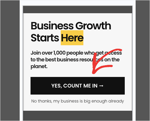
2-step optins present a simple Yes or No question to your user before asking for any personal information (like an email address or phone number).
You’ve probably seen these before. They look something like this:
When users click the Yes option, they’re taken to the optin form where you’ll ask for their email address.
So why are 2-step campaigns more effective for mobile users?
These campaigns work because they’re more likely to engage your visitors and help them begin the process of opting into your offer.
In fact, the technique is based on a proven psychological principle: the Zeigarnik effect.
This theory states that people are more likely to finish a process once they’ve begun.
When you get users to click the Yes option in your 2-step optin, they’ll be more likely to finish the process by handing over their email addresses.
Ready to make one for yourself? Check out this in-depth resource: 2-Step Optins: What They Are & How to Make Them.
3. Use Mobile-Friendly Forms on Your Site
One thing to remember is that just because your site is mobile-friendly doesn’t mean your site’s forms are mobile-friendly.
And when it comes to capturing leads, this is definitely a deal-breaker for many online consumers.
If your forms are too cumbersome to fill out, ask too many questions, or just look ugly, your visitors won’t engage.
That’s why it’s crucial that you load your website with mobile-friendly forms.
This includes using some mobile best practices for your forms, such as:
- Progressive profiling to limit the number of questions asked
- Large buttons to improve UX
- Multi-page forms to boost conversions
- Spam protection to fight bots and “bad” leads
- And more…
But how can you create forms that are mobile-friendly?
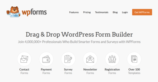
If you’re using WordPress, then you’re in luck. That’s because you can simply use WPForms:
WPForms is hands down the best form building plugin for WordPress.
It lets you create any type of form you’d need or a site, such as:
- Contact
- Payment
- Survey
- Newsletter
- Registration
- And much more…
This allows you to capture new leads from your website. But you need to make sure that these forms are also mobile-friendly, which makes WPForms the perfect solution.
That’s because WPForms has advanced features to help you increase mobile leads.
These features include things like:
- Conditional Logic: Limit the number of questions you present to new leads and ask new questions based on their responses.
- Multi-Page Forms: Boost form completions by showing 1 question per page (so you don’t overwhelm your user).
- Spam Protection: Rest assured that your new leads are genuine and not spambots or hackers trying to harm your business.
These are just a few of the reasons why WPForms is the best mobile-friendly form builder on the market.
And the best part is that WPForms will integrate with your favorite 3rd-party marketing tools.
That means your new leads will go exactly where you need them to, every single time.
Want to give it a try for yourself? Get more mobile leads with WPForms today!
4. Build Landing Pages for Mobile Users
If you’ve been running an eCommerce site or selling digital products online, then you know how valuable landing pages are.
But when it comes to mobile users, these pages are even more important.
If you’re driving traffic to a specific page, you should have a strategy in place to ensure that users get the best experience depending on the device they’re using.
That means your landing pages need to be responsive and mobile-friendly.
Or you need to design landing pages specifically for mobile visitors. Either way, you’ll see BIG increases in conversions from optimizing your landing pages for mobile.
And this is especially true when you’re running pay-per-click (PPC) campaigns.
That’s because mobile users are more likely to click the first few ads in Google’s search results.
So if you’re running PPC ads but sending traffic to a landing page that only looks good on desktop, you’re tossing money down the drain.
But how do you create a mobile landing page if you’re not a professional coder or web designer?
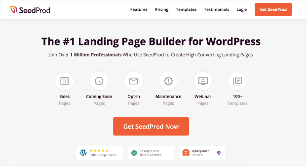
For WordPress users, this is where a tool like SeedProd can do all the heavy lifting for you:
SeedProd is the #1 landing page builder for WordPress and the best solution for creating landing pages for your mobile visitors.
That’s because SeedProd doesn’t require any coding to create high-converting pages in minutes. Plus, it comes loaded with all the tools and features you’d need to attract new leads.
That includes special blocks for adding reviews, testimonials, high-quality images, lead capture forms, optin campaigns, and much more.
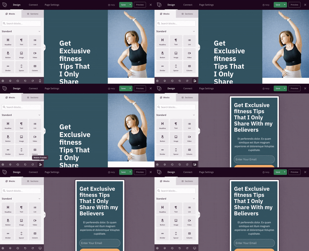
You can also ensure that your page looks good on mobile before you publish it:
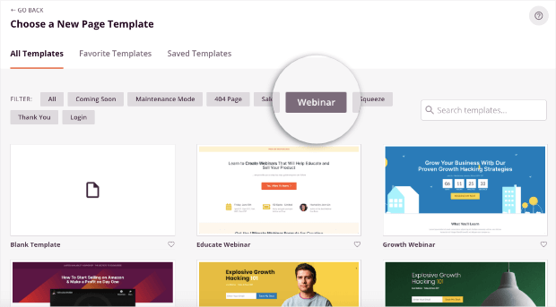
And if you’re totally new to web design, don’t worry. SeedProd comes with 100+ templates that you can use to design the perfect page for mobile visitors and increase your conversions FAST.
You can even filter these templates depending on your marketing or sales goals. Here’s an example of the Webinar template options:
At the end of the day, SeedProd is a landing page builder that checks all the boxes.
It’s easy to use, incredibly powerful, and, of course, mobile-friendly.
Build your mobile landing pages with SeedProd today!
5. Add Social Feeds to Your Website
The correlation between mobile users and social media is hard to ignore.
According to Backlinko, 99% or 3.92 billion social media users access social media networks from their mobile devices.
This is a huge opportunity for you to combine your website and social media to get more engagement from mobile users.
One of the easiest ways to do this is by adding your social media feed to your website.
The goal is to get your website traffic to engage with your social media profiles (which is something your users are already in the habit of doing from their smartphones).
This allows you to leverage your site’s traffic to grow your social media following.
Then you can nurture those new leads through your social media strategy and transform them into happy, loyal, and paying customers.
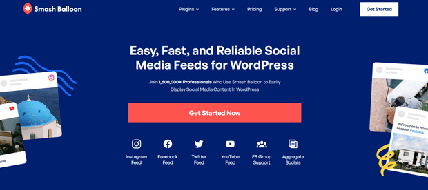
Need some help adding a social feed to your website? You just need a tool like Smash Balloon:
Smash Balloon is the world’s leading social media feed plugin for WordPress.
This tool will let you add social feeds from:
- YouTube
- Facebook Groups
Doing so gives more of your site’s traffic direct access to your social media profiles.
When users visit your site from their phones, they’ll be able to find your social channels and start following you.
You’ll now have brand new leads (in the form of followers) that you can guide down your sales funnel and boost sales from your online store.
But the best part is that you don’t need any technical skills to add customized feeds to your website. Smash Balloon makes everything EASY from start to finish.
Want to see it in action for yourself?
Drive more mobile traffic to your social channels with Smash Balloon today!
And that’s all for today!
These have been 5 proven mobile lead generation strategies that you can start using on your site today.
We hope you enjoyed this post. If you did, you definitely don’t want to miss the following resources:
- 9 Mobile Popup Best Practices to Increase Conversions
- How to Make Mobile Optins That Get More Leads
- The DIY Mobile SEO Guide: How to Be Mobile-First This Year
These articles will have everything you need to create a better UX for mobile users, get more leads, and drive MORE sales.







Add a Comment