Are you struggling to create the right lead capture form for your brand?
Attracting new leads to your website can be tough. And getting them to hand over their personal information?
That can be even tougher.
That’s why, today, we’re going to look at the best lead capture form examples that you can use for your own website.
Plus, you can rest assured that each of the examples you see below has been successfully used by real business owners just like you.
That way, when you see an idea you like, you can incorporate parts of it into your brand’s lead capture forms.
But before diving into the examples, let’s get clear on what makes a good lead capture form in the first place.
What Makes a Good Lead Capture Form?
There’s a large misconception about what a lead capture form needs to accomplish.
Many new marketers believe that your forms should grab as much information about your new lead as possible.
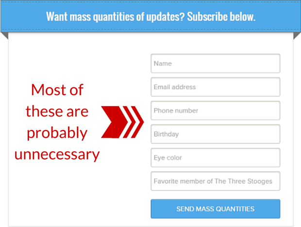
As a result, you’ll find tons of lead capture forms online that are asking for way too much information at once:
It’s an easy mistake for any new marketer to make, and their intentions are usually good.
Their logic is this: the more information I have about my new lead, the more personal I can make my messaging. That will translate into transforming more new leads into paying customers, right?
Well, yes and no. Here’s why:
Yes, the more personal you can make your messaging, the more likely you’ll be able to convert leads into customers. And yes, having more data about your new lead will help you write better copy.
But here’s the big problem: you’ll be losing more leads by asking too many questions up front.
Every new field box adds a new step of friction for your user and gives them another reason for NOT filling out your form.
So what should your forms look like?
If you’re trying to get new leads, there are 3 qualities your lead capture forms need to have. They need to:
- Be Simple: Ask only for the information you need right now. Usually, that’s simply a name and email address (or just an email address).
- Look Professional: Use high-quality images or stylish font and color schemes that match your brand’s look.
- Target the Right Users: Take the time to configure your lead capture form’s settings, so it’s only seen by relevant site visitors.
Worried that a name and an email address won’t be enough for you to successfully convert your new lead into a paying client?
No worries. Just check out this post on progressive profiling to get more of the data you need.
That resource will teach you how to gather the right information about your new lead over time, rather than asking all at once.
And now that we know what makes a good lead capture form, let’s dive into a few examples to help you build your own.
31 Lead Capture Form Examples
There are lots of articles out there on “the best lead capture form examples” that show images of various popups, floating bars, and more.
But in most of these articles, you don’t get to actually see the result of those campaigns in action.
Today, though, we’re going to not only show you 31 lead form examples, but we’ll also tell you the exact results that many of these examples have achieved.
How do we know about the results? Because in the examples you’ll see below, most were built with OptinMonster:
OptinMonster is the world’s #1 lead generation software that makes creating lead capture forms totally simple. It allows businesses of all sizes to create “optin campaigns” to grow their list, drive conversions, and get more paying customers.
By “optin campaign,” we’re simply referring to things you’re already familiar with: popups, floating bars, fullscreen welcome mats, and so on.
And the best part is that you don’t need any coding experience or “tech skills” to get started.
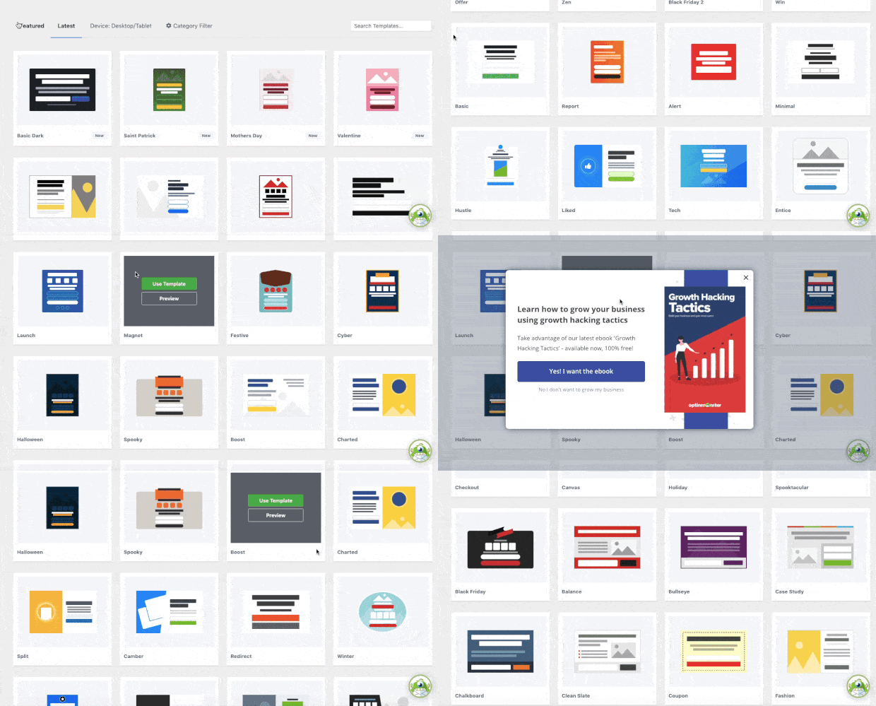
How does it work? Everything starts by selecting the right template for the campaign you want to build:
OptinMonster has over 50 pre-made templates that work out-of-the-box with only minor changes needed.
This makes it possible for literally anyone to create a stunning and high-converting lead capture form in a matter of minutes.
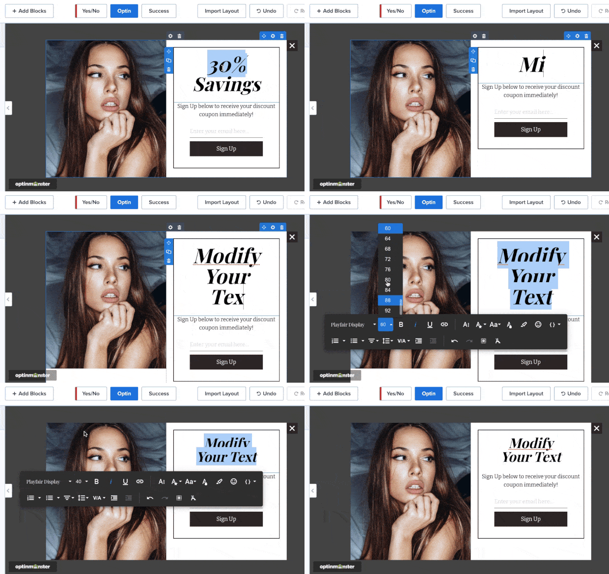
Because once you select the right template, making the changes is easy. To modify any text in your campaign, you can simply use OptinMonster’s inline text editor:
This gives you total control over your messaging, so you can use the most effective language possible to connect with your new lead.
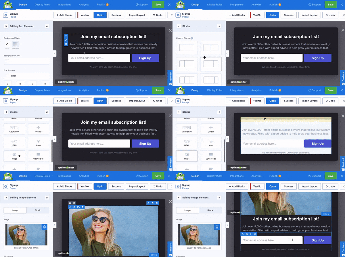
Want to add a new feature to your campaigns, such as a video, high-quality image, chatbot, or more? That’s no problem. In fact, you can do so with a drag and a drop:
Once you design the perfect campaign, you’re almost done! All that’s left is to configure a few targeting rules.
These allow you to show your campaigns to the right people, in the right places, and at just the right time in their customer journey.
A few of OptinMonster’s most popular targeting rules include:
- Exit Intent® Technology: Display campaigns as users are actively leaving your website to re-engage them.
- Geolocation Targeting: Make your lead capture form appear to users based on where they’re physically located.
- OnSite Retargeting®: Show new campaigns to returning users to avoid “popup fatigue.”
These are just a few of OptinMonster’s powerful rules, though there are many others.
From there, you can integrate your favorite email service provider (ESP) in seconds. That way, your new leads go exactly where you need them to.
Sound too good to be true? Why not see it in action for yourself by clicking below and starting your 100% risk-FREE OptinMonster account today:
Now without further ado, let’s dive into our list of the best 31 lead capture form examples.
Lightbox Popups
1. Crossrope
Crossrope is a fitness brand that specializes in high-end and weighted jump ropes to get an intense workout. Their goal is simple: to make fitness more fun!
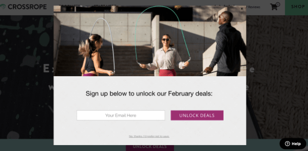
They were struggling to get more leads until they started using lead capture forms like the example below:
The results? They ended up growing their email list by over 900%!
We love the high-quality images and simple design. Plus, their call to action (CTA) button’s copy is incredibly powerful: Unlock Deals.
It’s easy to see why they had so much success with this popup form.
2. Woodside Communities
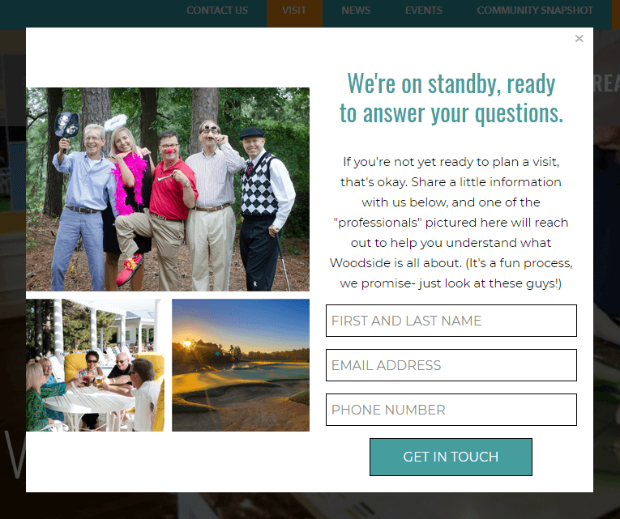
Woodside communities wanted to get more information from leads who were interested in buying properties in one of their 3 estates but weren’t quite ready.
You’ll note that this form asks new leads for a phone number as a big part of their outreach strategy is a 1:1 call.
The lead capture form itself converted 3.57% of the people who saw it. Plus, the example you see above brought a customer that generated over $295,000 in revenue.
3. Adam Enfroy
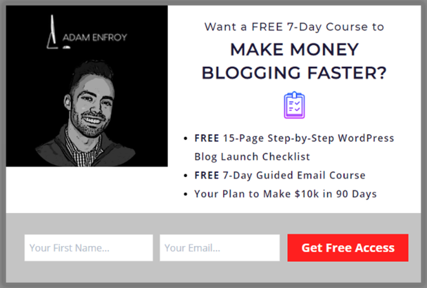
Adam Enfroy is a solopreneur and blogger who used OptinMonster in 2019 to grow his list. Here is one of his lead capture form examples:
With this form and a few others like it, Adam added 11,000 people to his email list in just one year.
Since that time, he’s gone on to monetize that list and his site. In 2020, Adam earned $812,718 from his blog.
And it all started with a simple lead capture form.
4. Shotkit
Shotkit is a professional photography site that helps photographers get their hands on the gear they need to take the best photos possible. They started using lead capture forms like the one you see below:
This converts at a rate of 5.77% and brings in 40+ new leads every single day.
5. BrianTracy.com
Brian Tracey is an author, speaker, motivator, and sales trainer. But as you can imagine, that’s a pretty competitive space these days.
Fortunately, Brian uses lead capture forms like the example below to get new business:
This campaign alone converts 6.8% of his site’s traffic. The form above (and similar ones like it) helped Brian grow his list by 0ver 150%.
6. Downtown Orlando
Downtown Orlando wanted to engage more people in the community. The goal was to make Orlando’s nightlife more appealing to a wider audience.
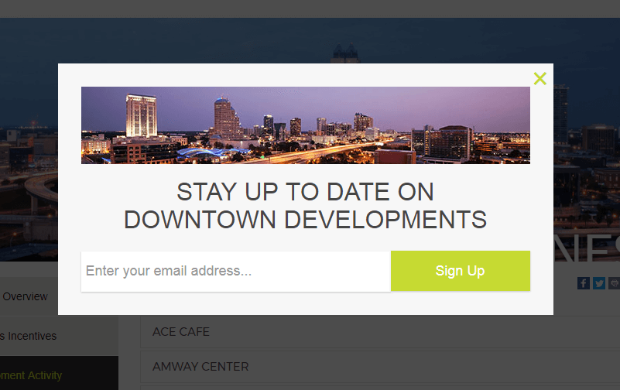
As such, they needed lots of emails to send people news, updates, and information about events. This is the form they used:
They ended up getting dozens of new leads every month and added over 4,000 people to their email list in just one year.
Floating Bars
7. Crush Empire
Crush Empire helps accounting students do better on their CPA exams. It’s an online training course that prepares students for the big test day.
They used a floating bar below to encourage more signups to their online training courses:
This is part of a 2-step optin form: when users click Get Discount, they’ll be taken to the part of the lead capture form where they can enter their email address.
Now you may be wondering, “But does that work?”
Crush Empire used this strategy and lead capture form to get over 460 sales in just one year.
8. AutoAnything
When you think of “optin campaigns,” you might not think about stores like AutoAnything. They sell car parts online as a cheaper solution to most of their competitors.
Though this lead capture form’s example is a bit small, the results were quite big:
AutoAnything was able to use this floating bar and a few other targeted campaigns to increase their daily signups by more than 2.5x.
9. Kennedy Blue
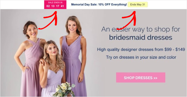
Kennedy Blue sells bridesmaid dresses that look great but won’t break the bank. To boost the effectiveness of this 2-step lead capture form, they added a countdown timer:
And the results were huge. From this campaign and others like it, Kennedy Blue increased sales by over 50%.
10. Brand Glow Up
Brand Glow Up (formerly known as “TwelveSkip”) added this simple floating bar to their website:
Though it’s simple, this lead capture form was highly effective. Here’s what we love about it:
- The main copy is short and to the point
- It only asks for a name and email address
- The CTA button is fun and effective (‘Gimme Now‘)
At the end of the day, this is a good example of how a simple form can go a long way.
11. ActiveCampaign
You might know ActiveCampaign as one of the world’s most popular email service providers (ESP). But what you might not know is the role OptinMonster had in helping them reach that popularity.
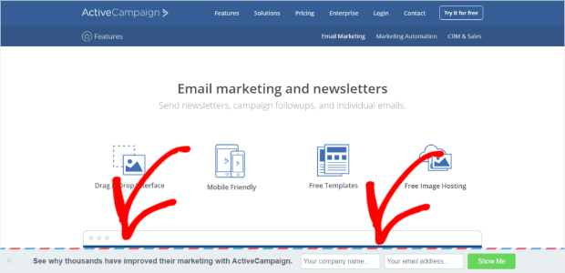
Though it’s hard to see, ActiveCampaign had a simple floating bar on the bottom of their website to capture new leads:
Though this example is a bit older, it worked incredibly well.
In fact, ActiveCampaign was able to get over 800 trial signups per month from this one lead capture form.
Fullscreen Welcome Mats
12. Singularity
Singularity created an email capture form as a way to remind enrollees about upcoming events:
In just 9 months, this fullscreen welcome mat generated 967 new subscribers from only 4 different pages on their site.
13. Rocketbots
Rocketbots is a platform that specializes in live chat. They use artificial intelligence (AI) to power their product and help owners manage all the demands of adding a live chat support service.
And to get new business, they used this fullscreen lead capture form:
The results were huge. This campaign converts 7.33% of abandoning visitors, and they saw a total growth of over 680%.
In all, this lead capture form played a big role in Rocketbot converting 2.65% of their sitewide visitors.
14. Mad Money Monster
Mad Money Monster’s mission is simple: to help people take control of their finances and get themselves out of debt. It’s a message the most people need to hear, but don’t necessarily want to.
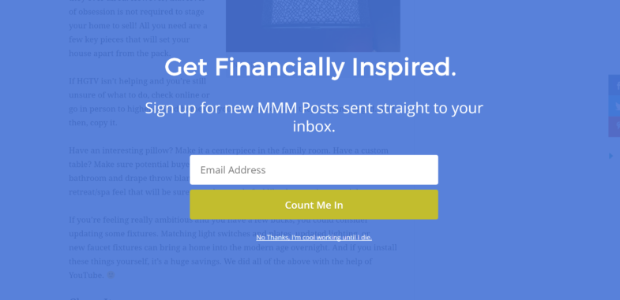
That’s why we love this fullscreen lead capture form:
It looks great, and the text isn’t intimidating. It doesn’t cause users to worry or try to scare people into signing up.
Instead, the campaign’s copy is straightforward and simple.
15. The Spinsterz
Earlier, we saw how the fitness company Crossrope was able to boost subscribers with OptinMonster. But before them, there was another fitness group with a similar goal: making fitness fun.
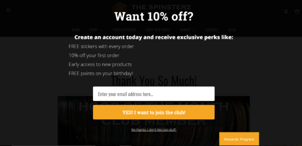
Only instead of doing it with jump ropes, The Spinsterz prefer hula hoops. Here’s the lead capture form example they used to get more subscribers to their list:
The only thing we would have changed about this campaign is the alignment for the body text.
The offer is awesome (who doesn’t love a discount?), but the text could have been centered for an even more professional design.
16. Sportique
Sportique is a French company that specializes in outdoor gear. Their products are both fashionable and high-quality, making them a great solution for adventure-seekers looking to get out and explore the world.
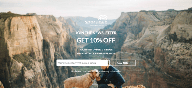
Here’s an example of a fullscreen campaign they ran on their site:
This campaign converts 4.29% of its visitors.
Plus, they grew their list by over 300% and saw 79% of their targeted subscribers convert.
Slide-in Scroll Boxes
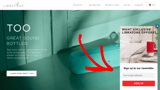
17. Libratone
You might not have heard of Libratone, but you certainly know their product. This was the first company to create wireless speakers.
They used this slide-in scroll box to capture new leads:
This campaign (along with others like it) helped them grow their email list by over 400%.
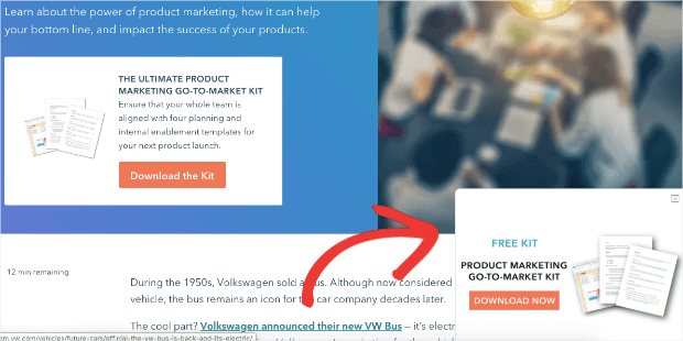
18. Hubspot
If you’re in the marketing world, then you’ve definitely heard of Hubspot. They’re an inbound marketing, sales, and service software that helps digital marketers manage their leads.
To grow their list, they used a 2-step slide-in lead capture form:
We love that this campaign is a compliment to whats’s already on the browser page: Download the Marketing Kit.
This is a great reminder that many of your site’s audience will need to see an offer several times before opting in.
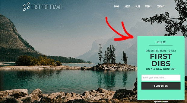
19. Lost for Travel
Lost for Travel is a blog that specializes in, you guessed it, travel! Here’s the slide-in scroll box lead capture form they used:
One of the best parts of this campaign is the color scheme.
It matches the website, but it still stands out by using a bolder turquoise to grab the users’ attention.
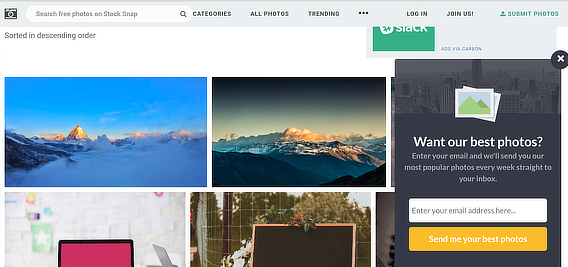
20. StockSnap
StockSnap is an online community that creates and shares stock photos for use online.
This is a valuable service that helps small businesses design their site without worrying about copywriter issues (or hiring an expensive photographer).
They used this slide-in scroll box to capture new leads:
They offer to send their best photos every week which gives them lots of opportunities to start a conversation and, ideally, transform users into lifelong paying customers.
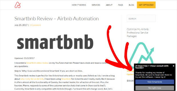
21. OptimizeMyAirbnb
OptimizeMyAirbnb is a service that helps Airbnb hosts get more bookings for their homes. It offers a 21-day free course and a 1-hour consult with the founder.
The offer is given through a slide-in scroll box, which includes the 2-step lead capture form:
From this campaign and others like it, they saw their list grow by over 650% and got 1500 new subscribers.
Plus, OptimizeMyAirbnb watched as sales increased by 66%!
Sidebar Widgets
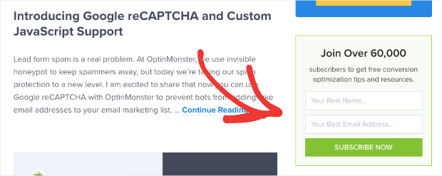
22. OptinMonster
We thought we’d use ourselves as an example for this one specifically. Many marketers don’t think sidebar widgets are worth the effort.
These are lead capture forms that sit in the sidebar of your browser page. They look like this:
But we’ve seen these get low-hanging conversions. That means people who visit the site and want to sign up but haven’t triggered a lead capture form to appear.
By putting a simple form on the side of your site’s pages, you can improve user experience (UX) by making it easy for new leads to get on your list.
23. MonsterInsights
Another great example of a sidebar widget is MonsterInsights. They’re the #1 Google Analytics plugin for WordPress.
Here’s the simple lead capture form they keep on the right-hand side of their site’s pages:
Again, the goal here is to help people who want to join your newsletter, but don’t have the offer in front of them.
While this may not convert as high as an exit-intent popup, for example, it can still lead to hundreds of new leads each year.
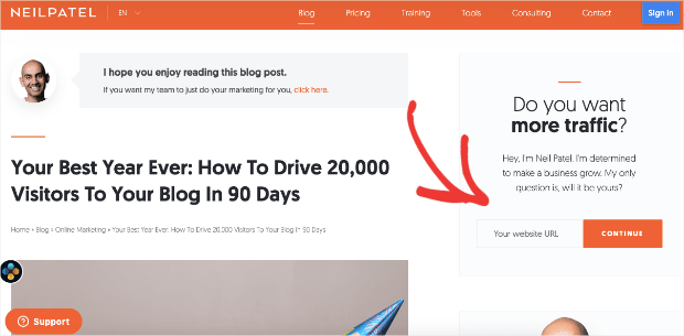
24. Neil Patel
Neil Patel is one of the most well-known digital marketers on the planet. And if he’s using a strategy to capture leads, you can rest assured that it works.
Here’s an example of the sidebar lead capture form that Neil uses on his site:
But rather than asking for the user’s email address right away, he asks them for their site’s URL.
This is a great way to filter out good vs. bad leads.
That’s because his target audience will certainly have a website. Otherwise, they won’t be a good fit for his services.
He asks for the website first and lets the user click Continue. Now that he knows they’re a potentially good lead, he’ll simply gather their email address later on in the signup form.
25. Louise Meyers
Louise Meyers is a social media expert. She helps businesses and entrepreneurs plan out their social content to get more followers.
Here’s the 2-step sidebar lead capture form she uses:
Once users click on the image of her lead magnet, they’ll be taken to the lead capture form where they can put in their contact information.
Inline Lead Capture Form Examples
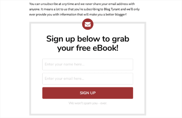
26. Blog Tyrant
Blog Tyrant is a site that helps people create a profitable blog. They release tips, tricks, and up-to-date strategies for helping your blog cut through the digital noise.
They use this inline campaign to get new leads:
The great thing about inline campaigns like this is that they’re embedded directly in your site’s content.
That means the people who see them are more likely to be highly interested in your niche or services.
27. Lilach Bullock
Lilach Bullock is an entrepreneur and consultant. She helps other digital companies manage their image online.
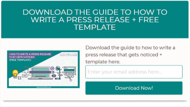
Here’s the inline campaign she users to capture new leads:
We love the design and layout of this campaign. The header stands out and is hard to miss. Plus, it’s loaded with valuable offers (the guide + the template).
Then there’s a professional-looking image of the lead magnet right next to the signup form.
This stylish layout can go a long way in boosting the overall conversions of your lead capture form. And with OptinMonster, it can be made in a matter of minutes!
28. Advisor Coach
Advisor Coach is run by James Pollard, an expert marketing consultant. He uses an inline campaign for his lead magnet, “57 Marketing Tips for Financial Advisors,“ to attract new clients:
As a result, James converted 58.33% of his readers. And since he started using OptinMonster, Advisor Coach saw an uplift of conversions by 360%.
29. Shawnee Mission Post
This is another great example of an inline campaign that was created with one of OptinMonster’s templates in minutes.
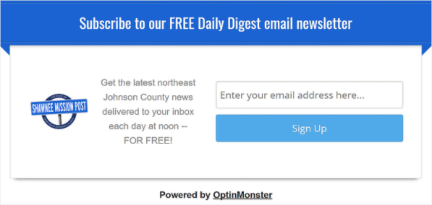
Shawnee Mission Post is a local newspaper that strives to keep its community informed and up-to-date on the latest news. To get more subscribers, they use the following lead capture form:
This stylish and professional-looking campaign is embedded in their post and page’s content. That means they’re converting readers who are already interested in the news they’re sharing.
Content Locker
30. Whole Whale
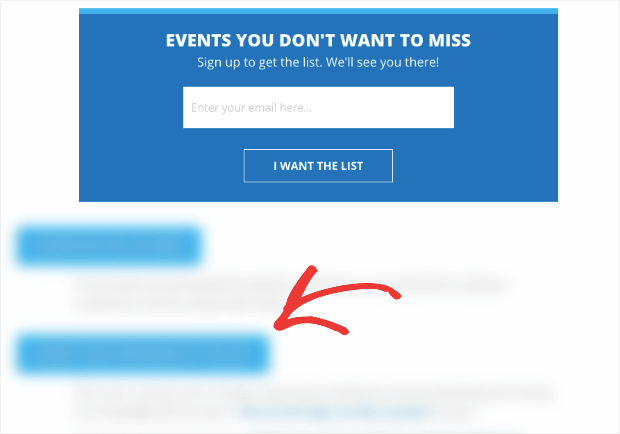
Whole Whale is a digital agency that uses data to increase revenue for non-profits. They hold lots of events to support these non-profits but need to boost attendance.
For that, they use a content locking campaign:
As you can see, users need to enter their email addresses to unlock the content, making this an incredibly effective campaign.
This had huge results for them, including a 100% increase in email signups, a 62% lift in conversions, and 21.42% of their readers turning into subscribers.
Coupon Wheel Optins
31. Spin to Win Wheels
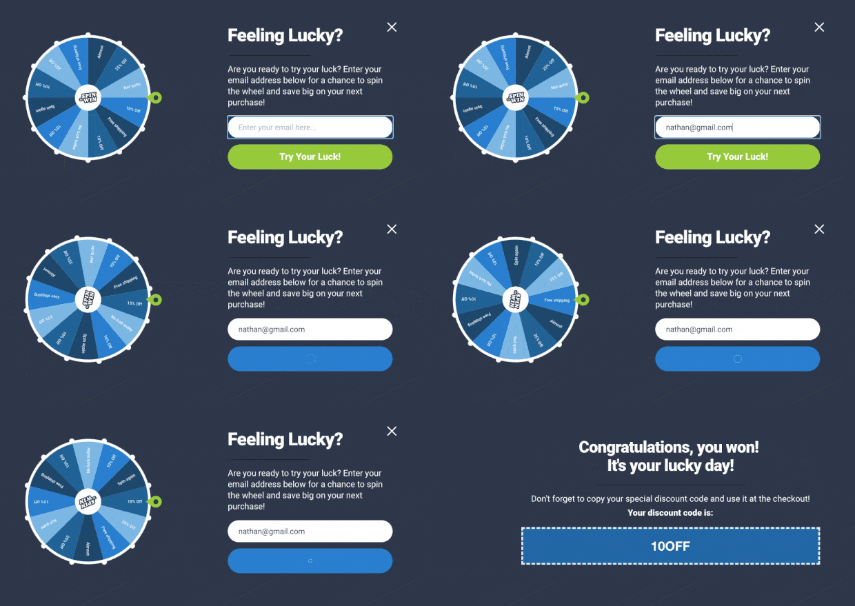
Spin to win wheels are one of the most effective ways to engage your audience. It uses the power of gamification to hook your audience and get them to subscribe.
Here’s an example of one of the three spin to win wheel templates provided by OptinMonster:
These templates can be modified in minutes, meaning you can change the color, prizes, text, discount amount, and more.
To learn how to create one, check out this helpful post: How to Create a Discount Wheel Popup (the Easy Way).
And that’s it! These have been 31 of the best lead capture form examples around. Here are some more lead generation form examples if you want some extra inspiration.
We hope you enjoyed this post. If you did, you might want to check out the following resources:
- Email Marketing Made Simple: Your Step-by-Step Guide
- How to Run a Successful Email Campaign
- 15 Email Marketing Best Practices to Build a Killer List
These articles will have everything you need to improve your email marketing strategy to generate more revenue from your new leads.















Add a Comment