Have you tried popups in the past but didn’t see the results you wanted? Frustrated by low conversions in your popups? Maybe it’s time to try a new technique. In this case study, we’ll learn how Wholesale Suite increased conversions from 2.5% using a simple popup to over 40% using two-step optins.
Meet Wholesale Suite
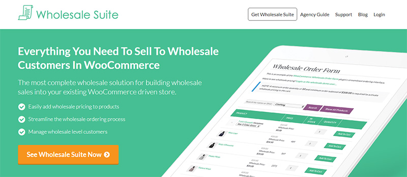
Wholesale Suite is a set of premium extensions for WooCommerce aimed at store owners setting up a wholesale side to their business. Josh Kohlbach, founder of Rymera Web Co, the company that developed the Wholesale Suite plugin, sat down with us to tell us how they’re using OptinMonster to increase sales.
The goal for using OptinMonster was to grow a list of qualified leads while easily triggering a sequence of emails designed to convert that lead. Prior to using OptinMonster, Wholesale Suite had no real email marketing funnel. And though Josh had tried using a standard lightbox optin, it never achieved anything higher than 2.5%.
This time, Josh knew he wanted to use OptinMonster and committed to launching a campaign using two-step optins that could drive results.
How Wholesale Suite Uses OptinMonster
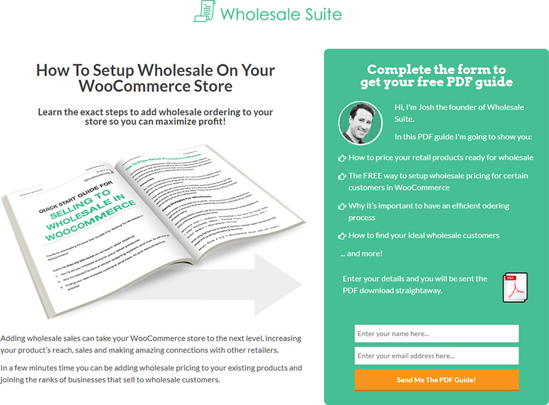
Josh developed a lead magnet, “How to Setup Wholesale on Your WooCommerce Store” and planned to offer it in exchange for an email address. He used an inline optin with the Action template to create a landing page specifically for this lead magnet.
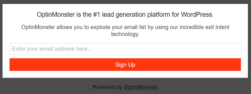
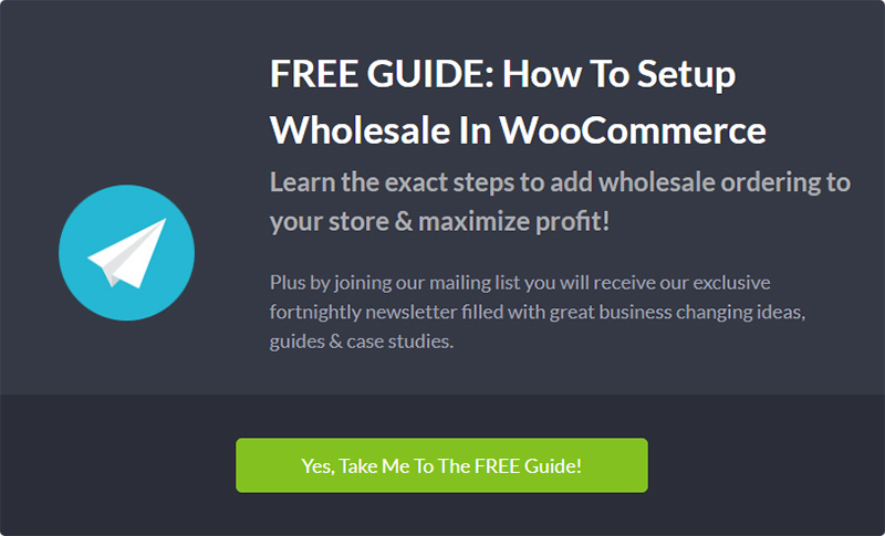
Here is the base Action template for inline optins, without any changes made to it.
After customizing the copy and colors, they added it to their landing page:
Because our inline optins can be added to any page of your website, additional landing page software like Clickfunnels or LeadPages is unnecessary. Any page on your website can become a landing page.
Driving Landing Page Traffic with Two-Step Optins
Josh guides traffic from the rest of the site to this landing page using optins with our two-step optin feature active.
A two-step optin requires the user to first click a button, link or image before they can access an optin form.
It uses the psychology principle known as the Zeigarnik Effect which states those who initiate are more likely to finish the process. Since the user has already begun an action (by clicking the link or a button), they are much more likely to complete the action. This makes two-step optins far more effective than any traditional subscribe form on your website.
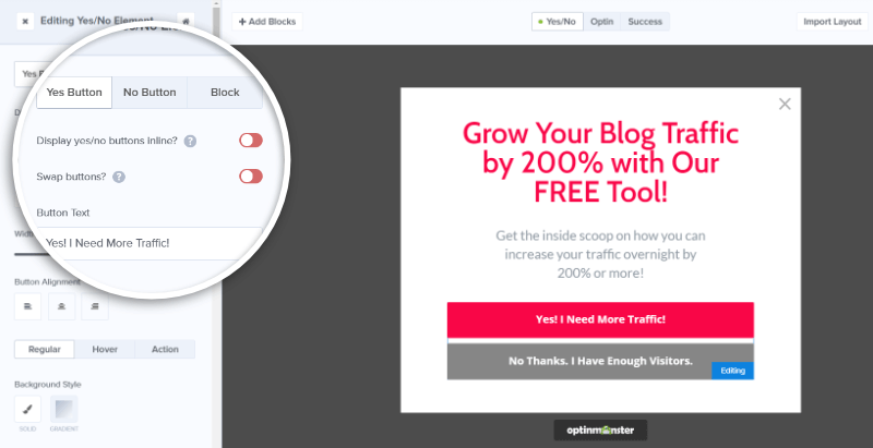
Our Yes/No feature can make a two-step optin out of any optin by adding buttons that can redirect the reader to another URL, open an optin form, or simply close the optin. The No button can even be toggled off, resulting in one single call-to-action button.
Josh uses this feature on three different optins, each one driving visitors to the landing page above.
Let’s take a look at each of these optins:
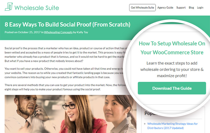
This sidebar optin appears on every page of the blog.
The headline and copy is clear, telling the reader exactly what they’ll discover by downloading the guide. This optin converts .36% of readers.
This after-entry optin shows at the bottom of every single blog post.
The headline and copy are identical to the sidebar optin, but this optin expands the offer with the addition of a newsletter. It converts .74% of readers.
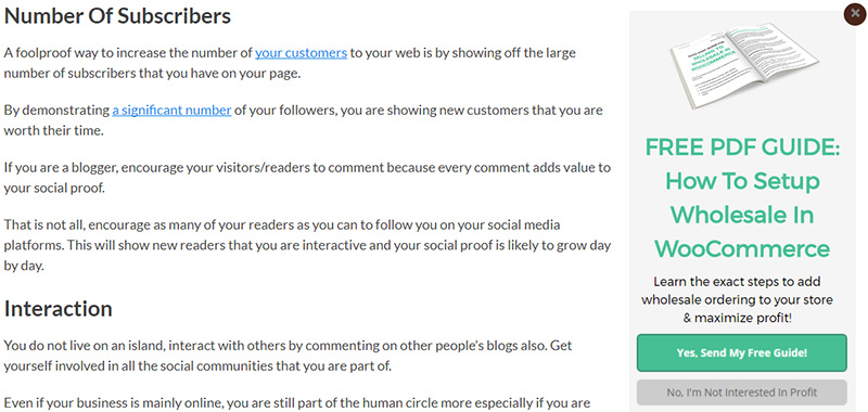
The slide-in optin below appears after the reader scrolls 30% of the page.
While the other two optins don’t utilize the No button, this one does. It makes clicking “Yes, Send My Free Guide” an easy choice compared to “No, I’m Not Interested in Profit.” This optin converts 3.61% of readers, directing dozens of readers a day to the landing page above.
The team at Wholesale Suite routinely conducts split-tests on each optin to improve conversions. For example, they increased conversions for the slide-in optin above from about 2.7% to 3.61% simply by adjusting the color of a button.
Creating a split-test in OptinMonster is easy. All you have to do is click on the split test button, and it creates a replica of your existing optin. From there, you can make any changes and tweaks you’d like to test and that’s it.
OptinMonster does the heavy lifting by randomly serving each variation to see which one convert best, then displays the results in your OptinMonster dashboard.
Josh said, “I can spend a couple of hours designing (what I think) is the perfect optin. Then set up a split test for it in three minutes, testing different colors or images or button text, and be completely proven wrong as to what I thought would work best.”
If you’re not already split-testing optins, learn how to create a split test, and why you should.
Results
Josh’s goal for using OptinMonster was to drive qualified leads to their email list so they could nurture them into sales. He more than met that goal:
- Wholesale Suite’s landing page currently has a 40.19% conversion rate.
- Wholesale Suite now gains 15-20 highly qualified leads every day from this single landing page using OptinMonster.
That’s over 6500 leads a year!
Summary
When asked how he liked using OptinMonster, Josh said,
“OptinMonster is a key part of our funnel and the good thing is, it’s sitting at the top of the funnel. Small tweaks to an optin might increase the conversion rate by only a small amount but it can literally mean thousands in revenue down the funnel. OptinMonster makes it super easy to setup optins and test them. I recommend it to every business owner who has a website.”
Would you like to use two-step optins to add thousands of leads to your business? Get started using OptinMonster today.


