Are you seeing your conversion rate plummet with the global rise in mobile traffic? Popups that aren’t responsive or that cover the entire screen will scare most mobile users away for good. In this case study, we’ll learn how White River increased mobile conversions 150% using responsive popups – without falling afoul of Google’s mobile popup penalty.
Meet White River
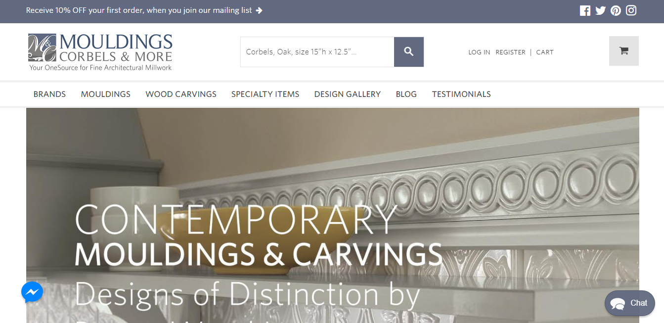
White River is a leader in the design and manufacturing of elegant hardwood mouldings and handcarved woodcarvings for the Millwork and Kitchen & Bath Industries. They offer over 3,000 decorative embellishments in hardwoods including mouldings, corbels, onlays, cabinet parts, and more at whiteriver.com and mouldings.com.
Richard Enriquez, Dir. of Marketing for White River talked with us about how they’re using OptinMonster to increase conversions.
How White River Got Started With OptinMonster
Mouldings.com is built using Shopify, while WhiteRiver.com is an HTML website. Richard needed an optin solution that would work easily and consistently on both platforms. OptinMonster can be used on any HTML website, including Shopify stores and many more platforms, so Richard got to work.
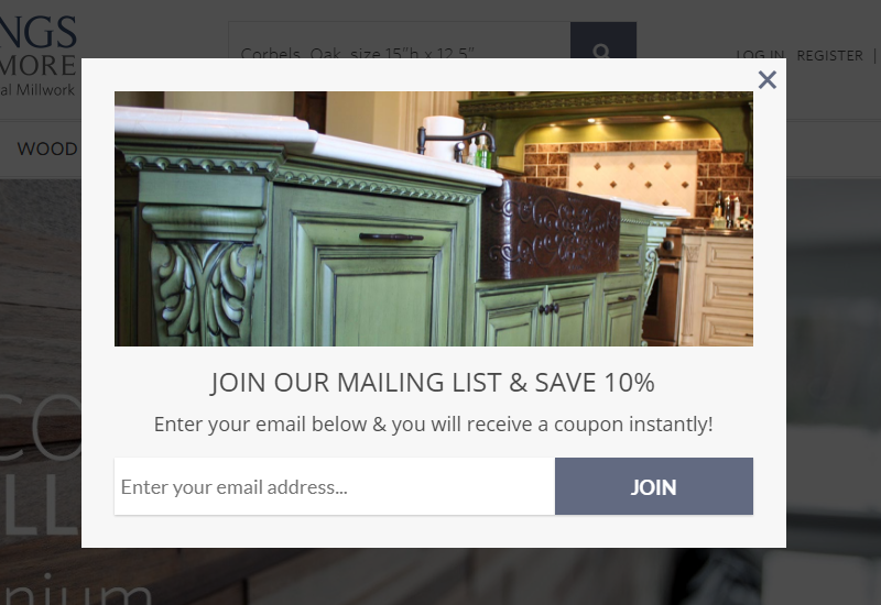
Richard started by adding a lightbox popup to every page of the site. It appears only to new visitors after they’ve been on the site for five seconds.
The optin converts 2.02% of new visitors.
It uses urgency to hack conversion rates by adding a time-based element to the offer. The reader will not get the INSTANT 10% discount if they don’t subscribe. They will pay more for their purchase if they don’t take action right now.
When our purchasing decisions are based on urgency (“either take action and get a win now or lose out later”), we automatically lean towards the “take action” route because we don’t want to miss the opportunity.
Increasing Mobile Conversions With OptinMonster
The lightbox optin above appeared only for desktop users. This is because lightbox optins take up a large portion of the screen, sometimes covering the entire screen.
While that’s fine on a laptop or desktop computer, it can become uncomfortable for the person viewing the website on a mobile device. Lightbox optins can cause a drop in mobile conversions. They will simply choose to leave the site rather than fuss with how to dismiss a cumbersome optin.
As we learned in the case study with Salt Strong, business owners are right to be concerned about optimizing their mobile conversion strategy.
In Jan. 2017, Google introduced a new type of mobile penalty for sites with interstitial ads taking up too much of the screen. Our responsive popups are a great way to avoid the issue entirely by showing optins optimized for mobile phones.
Learn more about how OptinMonster helps you avoid the mobile penalty.
Richard used one of our mobile-optimized popups to display the same offer shown in the lightbox above. The site remains scrollable behind the optin, and the optin can be easily dismissed.
This optin converts 2.35% of readers.
Results
White River paid attention to the needs of its users and made their offers accessible on any device. They were rewarded with increased subscribers and sales at every turn:
- White River doubled their email list using lightbox and mobile-optimized popups
- White River increased sales 35% since installing OptinMonster
- White River increased mobile conversions 150% using mobile phone popups
Summary
Optins targeted to the device your readers are using will convert better than those that aren’t. It’s worth it to take the time to create a mobile-specific popup to increase your mobile conversions.
“Since we installed OptinMonster we have seen a 35% increase in sales and a 150% increase in mobile newsletter signups versus the same period last year using a different app.”
Richard Enriquez, WhiteRiver.com


