Are you looking for ways to get more app downloads?
After launching your app, it can be frustrating when downloads aren’t as high as you want them to be. After all, you probably invested a lot of time, money, and energy into your app’s creation.
So why isn’t anyone interested?
Here’s the good news: you’ve probably got a large audience for your app. You just haven’t found them yet!
That’s why, in today’s post, we’re going to teach you 7 concrete ways you can get more app downloads. More specifically, we’ll teach you how to:
- Urge users with a mobile popup
- Grab attention with a fullscreen campaign
- Use a countdown timer to create urgency
- Promote on social media
- Ask for positive reviews as social proof
- Optimize your app description in the app store
- Create an email campaign
Ready to get started? Let’s dive in.
How to Get More App Downloads
Below are 7 actionable tips that you can start using today to get more app downloads. For the first 3 tips, we’ll be using OptinMonster, the world’s #1 lead generation software and plugin:
OptinMonster gives you various tools to boost your sitewide traffic, grow your email list, and increase your sales. How?
With different lead generating campaigns in the form of popups, fullscreen welcome mats, slide-in scrolls boxes, and more.
Plus, we provide you with more targeting and trigger options than any other software on the market. In other words, we’re the best at helping you determine when, where, and to whom you show your campaigns.
For more information, check out this article on how OptinMonster works.
1. Urge Users With a Mobile Popup
Since you want your target audience to download an app, they’ll likely be visiting your website from a mobile device. One good strategy is to create a popup campaign that is specifically designed to be viewed on smartphones.
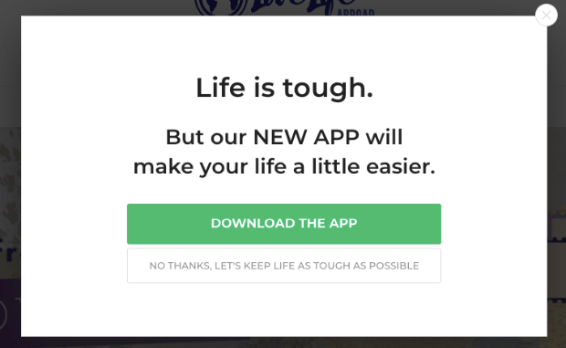
The goal of the popup would be to prompt users to download the app. It could look something like this:
This is a classic twist to a Yes/No campaign. Here, you present your visitors with a “yes or no” choice. The Yes option redirects users to the page where they can download your app.
Yes/No campaigns are super effective at increasing your conversion rates. That’s because they rely on a psychological phenomenon known as the Zeigarnik effect.
The Zeigarnik effect demonstrates that people are more likely to finish a process once they’ve started. Smart marketers use this concept to make the first step of their call to action (CTA) incredibly simple.
In this case, you’re simply asking users to click a button. Then, when they do, they’ll be more likely to download the app once they reach the app store.
But what kind of mobile popup should you design?
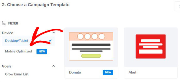
With OptinMonster, you’ve got tons of options. As you’re choosing from one of our 50+ pre-built templates for your campaign, you can filter your options to be optimized for mobile:
This makes sure that your popup campaign looks stunning across a wide range of mobile devices. Then with our drag and drop builder, you can modify your popup campaign to look, say, and appear to whomever you want.
The best part is that there are no coding skills required.
One popular trigger that we recommend is our Exit-Intent® technology. An exit-intent popup appears as users are attempting to leave your website.
In the past, exit-intent triggers were only available for desktop devices. But now, they’re open to mobile devices as well. Check out this post on how to create a mobile exit-intent popup that converts.
Exit-intent popups work so well, in fact, that they helped the fitness company Crossrope grow their email list by over 900%.
When people reach your website and begin to leave, you can use your exit-intent popup to grab their attention. Then you can recover abandoning visitors and redirect them to your app’s download page.
2. Build a Landing Page or a Fullscreen Campaign
If you have an app to download, you need somewhere to highlight what the app does and how it benefits your target audience.
There are 2 great options for getting this information across to your users:
- Landing pages
- Fullscreen campaigns
Ok, but what’s the difference between the two?
A landing page can be any page on your website where you direct traffic. In this case, it would be a page dedicated to your new app. Then when you drive traffic to that page, you’d use a mixture of persuasive web copy, images and video, social proof, and a call to action to get people to download your app.
Never built a landing page before? No worries. Just check out this post on the anatomy of the perfect landing page.
A fullscreen campaign is a little different. Rather than creating an entire page with a unique URL on your website, you would create a type of campaign that covers your users’ entire screen.
Fullscreen campaigns look something like this:
Not only does this totally capture your audience’s attention, but it gives you more flexibility than a traditional landing page. Here’s how:
Because your fullscreen campaign doesn’t have a fixed URL, you can make it appear to users depending on how they behave with your site.
So rather than drive traffic to a landing page, you take the traffic you already have, filter out potential leads (through their behavior on your site), and bring your fullscreen campaign to them!
This leads to higher conversions and more app downloads for you.
Head over to OptinMonster to start building fullscreen campaigns for your app today!
3. Use a Countdown Timer to Create Urgency
A lot of times, people need to interact with your message several times before they take action on your site. This is true with newsletter signups, sales, and, you guessed it, app downloads!
You can give your users an extra push by adding a countdown timer to your app launch. All you need to do is make your app available for free or at a highly discounted rate for a certain amount of time after your users visit your site.
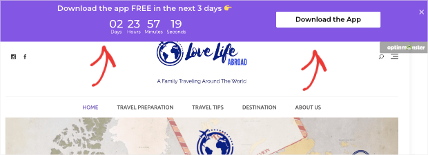
Plus, you can use countdown timers with any kind of campaign. But for app downloads, we recommend using a floating bar at the top of your user’s browser page. That would look something like this:
The countdown timer builds a sense of urgency for your website’s traffic. It lets them know that they only have a limited amount of time in order to download your app for free (or at a discounted rate).
But how can you be sure that all of your site’s visitors have the same amount of time to take you up on your offer?
We suggest using OptinMonster’s dynamic countdown timer.
A dynamic countdown timer starts when users first see the promotion rather than having a fixed start and end date (which is called a “static” countdown timer).
So you could set your dynamic countdown timer to give users 1-week to download your app from the first time they see the campaign.
This allows you to keep your campaign running for much longer than a static countdown timer. It also makes sure all of your site’s visitors have the same amount of time to download your app.
4. Promote on Social Media
Social media can be one of the best tools in your promotional belt. It’s free to use and allows you to get a message out to all of your followers.
If you have a strong online social media presence, it can be a great place to ask people to download your app.
But what about people who aren’t following you on social media but found you through your website? Well, you can still use social media for that with Smash Balloon:
Smash Balloon is the world’s #1 social media feed plugin for WordPress.
This plugin allows you to show your social media feeds directly on your website. That way, when you promote a post asking people to download your app, it will automatically enter into your site’s feeds.
In other words, your social media posts will appear to your website’s traffic, too.
You can use Smash Balloon to sync your feeds for:
- Facebook groups
- YouTube
This allows you to promote your app on various channels but put them all in one convenient place on your website. Not only will you get more app downloads, but you may just get some new social followers in the process.
Get started with Smash Balloon today!
5. Ask for Positive Reviews as Social Proof
Asking for positive reviews on your app downloads is a great way of getting more social proof for your app. And the more social proof you have, the easier it is to get more people to download your app.
You can ask people for positive reviews in different ways, such as:
- On social media
- In an email campaign
- Through a targeted popup on your website
And more.
But if you really want to get more reviews, there are 2 tools that can streamline the process:
- WPForms
- TrustPulse
Here’s how these 2 plugins work together to get you more reviews (and, ultimately, more app downloads).
First, you use WPForms to create a review form:
WPForms is the best drag and drop form builder on WordPress. It lets you build beautiful custom forms and even comes with a review template that you can quickly put up.
Then you can simply create a new page dedicated to getting reviews and ask people to let you know what they think of your app.
For some help with this, here’s an article on how to make and submit a review form with WPForms.
Or, feel free to head over to their website and get started with WPForms today!
Now for step 2: creating social proof notifications to display when you get a new review with TrustPulse:
TrustPulse is the best social proof notification software on the market. It’s been shown to boost sales and conversions by up to 15%.
You can sync TrustPulse to capture activity on your website. This includes any time someone leaves you a new review. Then, a small message will appear, letting your site’s visitors know when someone left you a 5-star review.
This reinforced display of social proof will motivate other users to download your popular app. When they do, you can invite them to leave a review and show another social proof notification.
And then the cycle repeats itself.
To understand how to use TrustPulse, check out this post on how to add social proof notifications to your website.
Or dive in and get started with TrustPulse today for FREE!
6. Optimize Your App Description in the App Store
Whether you’re asking people to download your app for Android or iPhone, you need to optimize your app store page. By that, we mean making sure that your app’s title, description, and other page elements are easily searchable.
Here a few tips for creating an app page that gets more views:
- Use a descriptive title
- Choose an appropriate keyword
- Pick the right category
- Write a killer description
- Include high-quality screenshots
At the end of the day, here’s the best advice for creating your app store page: take the time to make your page descriptive and appealing to viewers.
So many new business owners and marketers make a quick app page with limited descriptions, low-quality screenshots, and keep the app’s default category.
Take a few hours to really describe what your app does, who it’s for, and how it will benefit the user. This will make your app more appealing to anyone who finds it in the app store and will lead to more downloads.
7. Create an Email Campaign
One of the most overlooked ways of promoting a new app is leveraging the traffic you own. In other words, you should launch your new app with an email campaign.
Announce the fact that you have an app to your email list and ask your subscribers to download it. Then, after a few days, you can send out a few follow-up email campaigns as a gentle reminder.
Email marketing is one of the best strategies for modern business. Don’t have a solid email marketing strategy yet? No worries.
Just read the following resources to get caught up to speed:
- Email Marketing Made Simple: A Step by Step Guide
- How to Run a Successful Email Marketing Campaign
- How to Create an Effective Email Autoresponder Series
These posts will have everything that you need to start using email marketing to get more app downloads.
And that’s it! You now have 7 actionable tips to get more app downloads.
Are you ready to take your business to the next level? With OptinMonster, we’ll help you get more sitewide traffic, boost conversions, and increase sales in no time.







Add a Comment