Are you trying to customize your WooCommerce product page, but you’re not sure where to begin?
WooCommerce gives you a head start when it comes to having a quality product page. They’re well-designed and look “good enough” out-of-the-box.
But in the world of eCommerce, you should never settle for “good enough.”
That’s why, today, we’re going to teach you how to customize and personalize your WooCommerce product page.
Our goal is to help improve user experience (UX) across your site and generate more sales from your online store.
First, though, let’s get clear on why you’d want to customize your WooCommerce product page in the first place.
Why Customize Your WooCommerce Product Page?
When visitors shop on your WooCommerce store for the first time, the design and messaging speak volumes about your brand.
While you can stick with the generic version of your WooCommerce product pages, you can expect several benefits from taking the time to customize each page.
Here are a few of the advantages:
- Show Customers That You’re Serious: Customizing your product pages adds more credibility to your site and shows potential customers that you didn’t set up this shop on a whim.
- Set Yourself Apart from the Competition: By making your product pages unique, you’ll set yourself apart from competitors who were satisfied with WooCommerce’s standard design.
- Drive More Sales: As a result of your efforts, your product pages will be more appealing to your target audience. In the end, this leads to more sales for your WooCommerce store.
These are just 3 of the reasons why you should consider customizing your WooCommerce product page, though there are many others.
And now that we know a bit more about why you should take the time to work on your product pages, let’s dive into how you can make each page unique to your brand.
Customizing a WooCommerce Product Page
For this tutorial, we’re going to teach you how to create a fully custom product page with SeedProd:
SeedProd is the #1 landing page builder for WordPress. It has a drag and drop editor that allows you to create stunning and high-converting landing pages in a matter of minutes.
Plus, as you’ll see, it comes fully loaded with WooCommerce integrations which allow you to create custom landing pages that are totally unique to your brand.
This allows you to add features like social proof, lead capture forms, payment options, and much more to your custom WooCommerce product page.
Let’s get started.
Step 1) Download and Activate the SeedProd Plugin
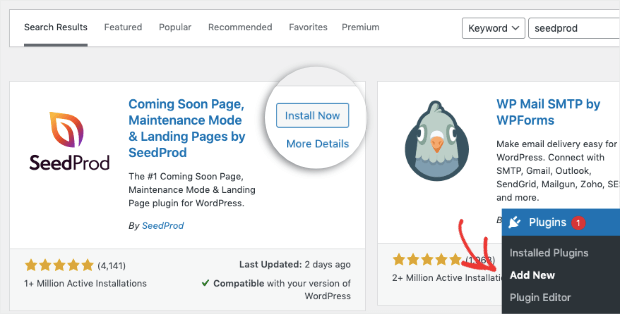
First, you’ll need to download the SeedProd plugin. From your WordPress admin menu, go to Plugins » Add New and search for SeedProd.
When you’ve located the plugin, click Install Now:
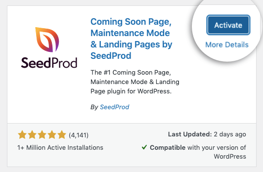
When it’s done installing, click Activate:
For advanced WooCommerce functionality, you’ll need a Pro plan or higher.
While you can create custom landing pages from their free Lite plan, we highly recommend upgrading to unlock all the WooCommerce page features.
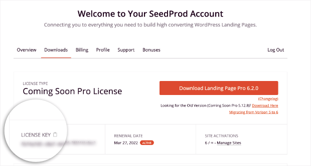
You’ll need to enter your license key. You can find this by logging into your SeedProd account and looking under Downloads:
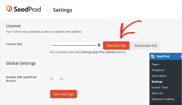
Then go back to your WordPress admin menu and click SeedProd » Settings and enter your license key:
Once you enter your license key, you’re ready to design your first WooCommerce product page.
Step 2) Create Your First WooCommerce Product Page
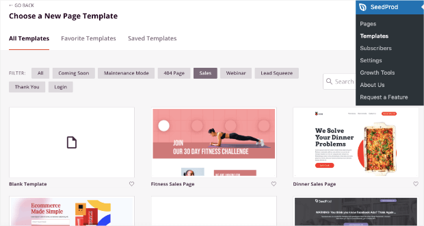
From your WordPress admin menu, click SeedProd » Templates. This will give you access to tons of pre-built landing pages that you can use to get started:
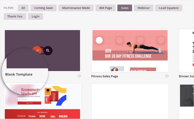
But for WooCommerce product pages, we’ll use the Blank Template:
This will let us start from scratch and will be the easiest template to follow along with for this tutorial.
That said, you should take a few seconds to look through the templates to see if you find a landing page template that already fits with the product you’d like to promote.
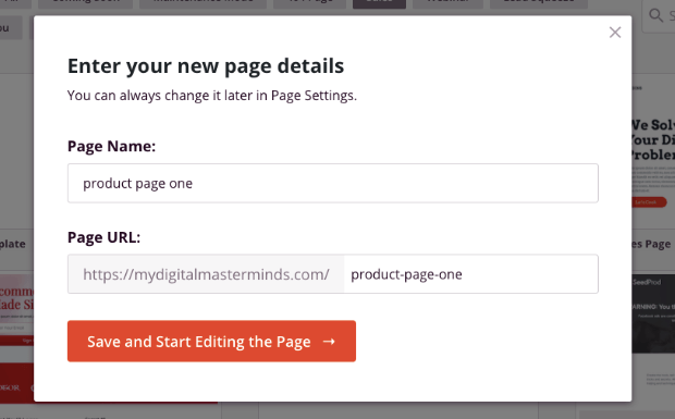
Now you’ll just need to give your product page a name that will also automatically generate a URL slug:
Click Save and Start Editing the Page.
Now you’re ready to build the perfect WooCommerce product page.
3) Customize Your WooCommerce Product Page
You’ll see the blank template in the SeedProd editor. As we mentioned earlier, customizing your product page couldn’t be easier.
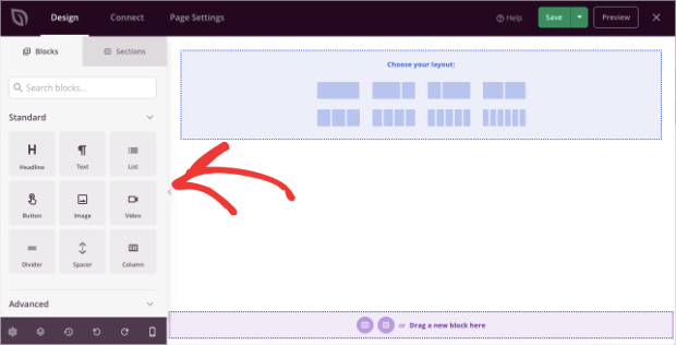
All of the elements you can add to the page are found on the left-hand side:
And you can add any of these new elements with a drag and a drop.
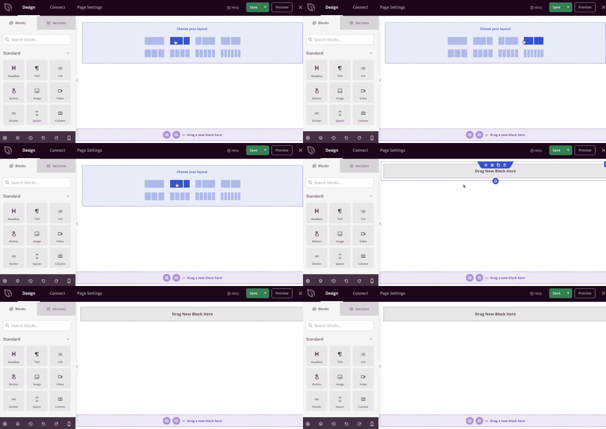
But first, we’ll start by choosing a single layout:
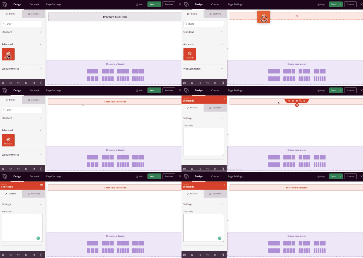
Now locate the Shortcode block from your editing menu on the left, and drag it into the center column of your product page:
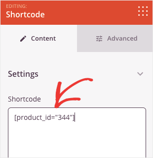
You can insert WooCommerce’s shortcode in the left-hand side editor to add your product to the page:
For a single product, you can use the following shortcode: [product id=”ID#”]
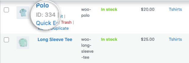
You can find your product’s ID# by hovering over the product in your WooCommerce products listing:
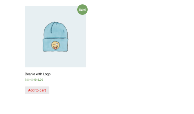
Once you enter the shortcode, you’ll see the product appear on a live preview of the page:
But as you can see, this isn’t the most exciting of pages. That’s why we’ll want to use SeedProd’s out-of-the-box features to edit the page.
With SeedProd, you can add:
- Images
- Headings
- Text descriptions
- Calls to action
- Videos
- Dividers
- Spacers
- And more…
Again, all of these features can be added in seconds with SeedProd’s drag and drop editor.
Plus, you’ll have full control over your page’s color, font family, text size, and other aesthetic elements that make your page stand out.
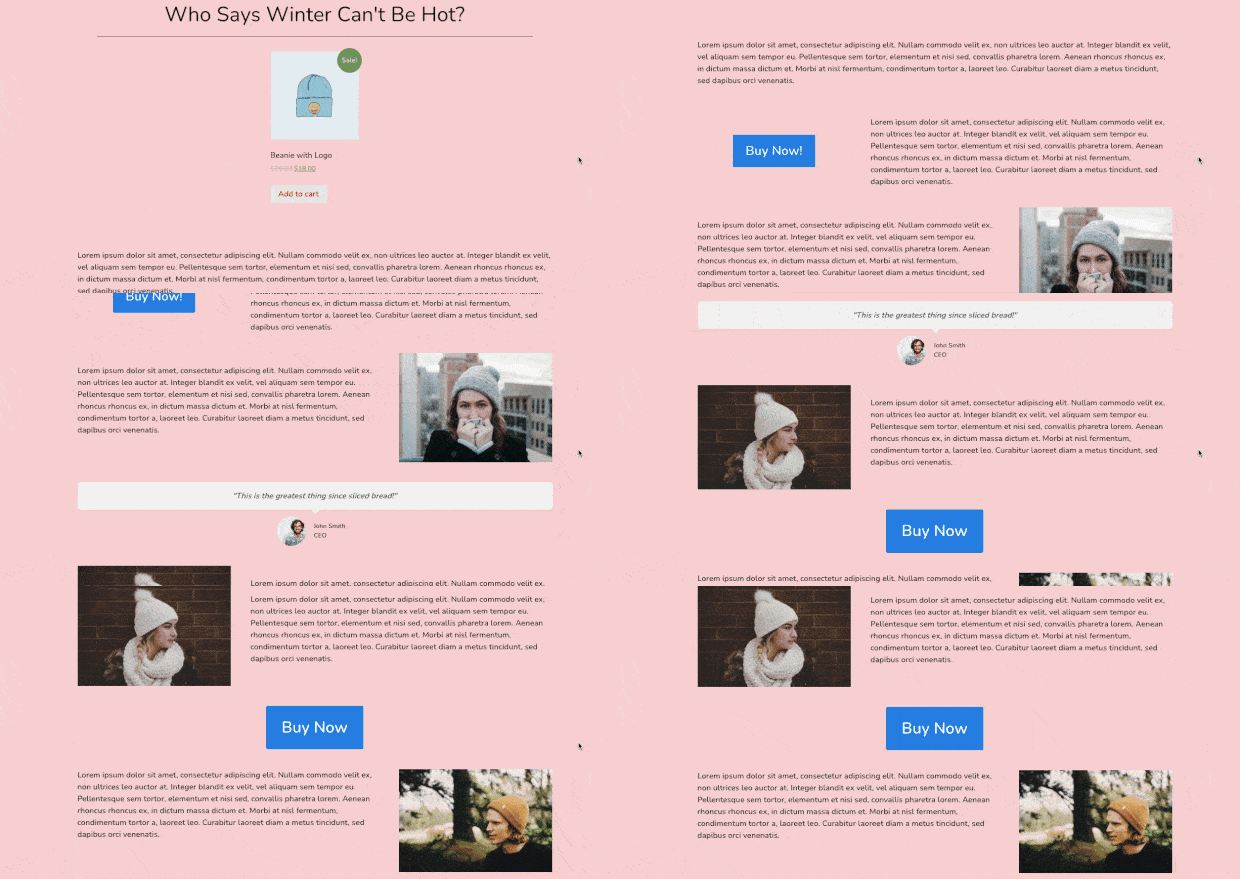
Here’s an example of the demo page we created in just 5 minutes:
By using SeedProd, we were able to add new images of the product, a few more call to action (CTA) buttons, and social proof in the form of a testimonial.
Plus, we had 100% control over the page’s colors, fonts, spacing, and more.
To learn more about how to use SeedProd to build the perfect landing page for your WooCommerce product, check out this helpful resource: How to Create a Simple Landing Page in WordPress (+ 3 Examples).
But now, let’s turn our attention to one last aspect of this WooCommerce product page to make it extra powerful.
Step 4) Add SeedProd’s Custom WooCommerce Blocks
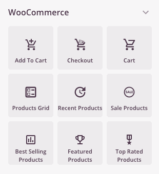
On your left-hand side menu of your SeedProd editor, scroll down until you find the WooCommerce section:
This gives you TONS of features to add to your custom WooCommerce product page. You can include:
- Add to cart buttons
- Go to cart
- Products grids
- Recent products
- And more…
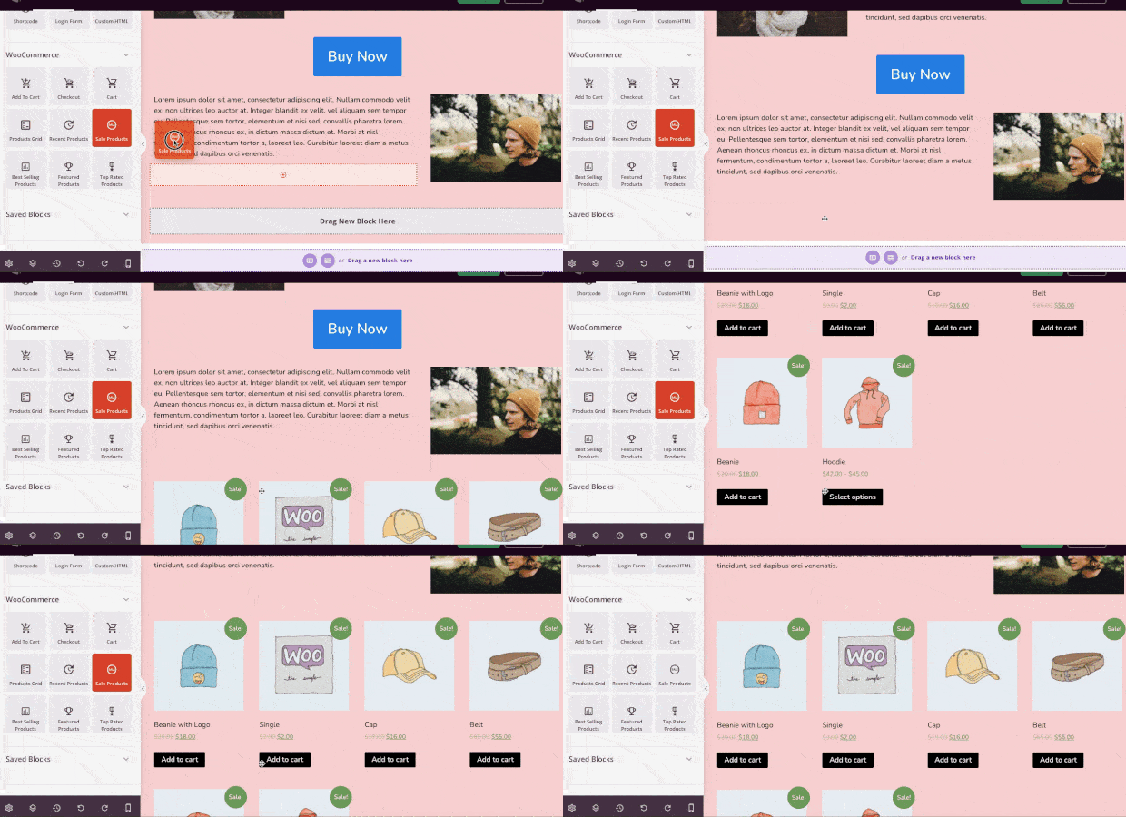
Let’s see how easy it would be, for example, to add Sale Products to the bottom of our WooCommerce landing page.
Simply find the Sale Products block and drag and drop it where you’d like on your page:
Now all of the items that are on sale in your WooCommerce store will be shown on your custom product page.
And adding the other advanced WooCommerce features to your product page is just as easy.
This has been a basic example of how you can modify your WooCommerce product pages. But hopefully, you’ve seen the customization options are limitless.
With SeedProd, anyone can build the perfect product pages for their WooCommerce store in just a few minutes.
Want to see it in action for yourself? Try out SeedProd today!
Now that you’ve seen how to customize a WooCommerce product page, let’s kick things up a notch. We’re going to look at 3 ways you can personalize your product page to increase sales.
Let’s dive in.
How to Personalize Your Product Page
1) Create an Exit-Intent Popup
It’s commonly known that many people who leave your website won’t come back.
And since most people don’t make a purchase on their first visit to any online store, that means you’re leaving tons of lost sales on the table.
To fix that, one of the best strategies is using an exit-intent popup from OptinMonster:
OptinMonster is hands down the best premium plugin for WordPress. It lets you build professional optin campaigns (like popups, floating bars, fullscreen welcome mats, and more) in a matter of minutes.
The campaigns can be used to accomplish any of your marketing objectives, such as increasing:
- Newsletter signups
- Webinar registration
- Survey respondents
- Testimonials and reviews
- Sales
Or any other marketing goals you want to reach.
But how does this help personalize your WooCommerce product page?
You can add an exit-intent popup to capture your audience’s attention as they’re trying to leave your website.
For this, there are 2 things you can do:
- Reduce cart abandonment by reminding customers they still have items in their cart
- Capture your visitor’s email to remain in contact with them
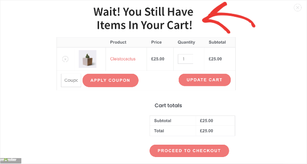
In the first scenario, you can create an exit-intent popup and add the WooCommerce shortcode [woocommerce_cart] directly to your popup.
This will show users the WooCommerce products they have in their cart and let them easily check out.
Here’s the fullscreen popup we built in less than 10 minutes to accomplish just that:
As users leave your website, this fullscreen campaign would appear to remind customers not to leave before checkout.
Then they can apply a coupon, update their cart, or proceed to checkout directly from your OptinMonster campaign.
This will boost overall sales for your WooCommerce product pages.
But you can also create an exit-intent popup designed to capture your audience’s email address.
Then you can use email marketing best practices to nurture the relationship until that new lead becomes a loyal (and paying) customer.
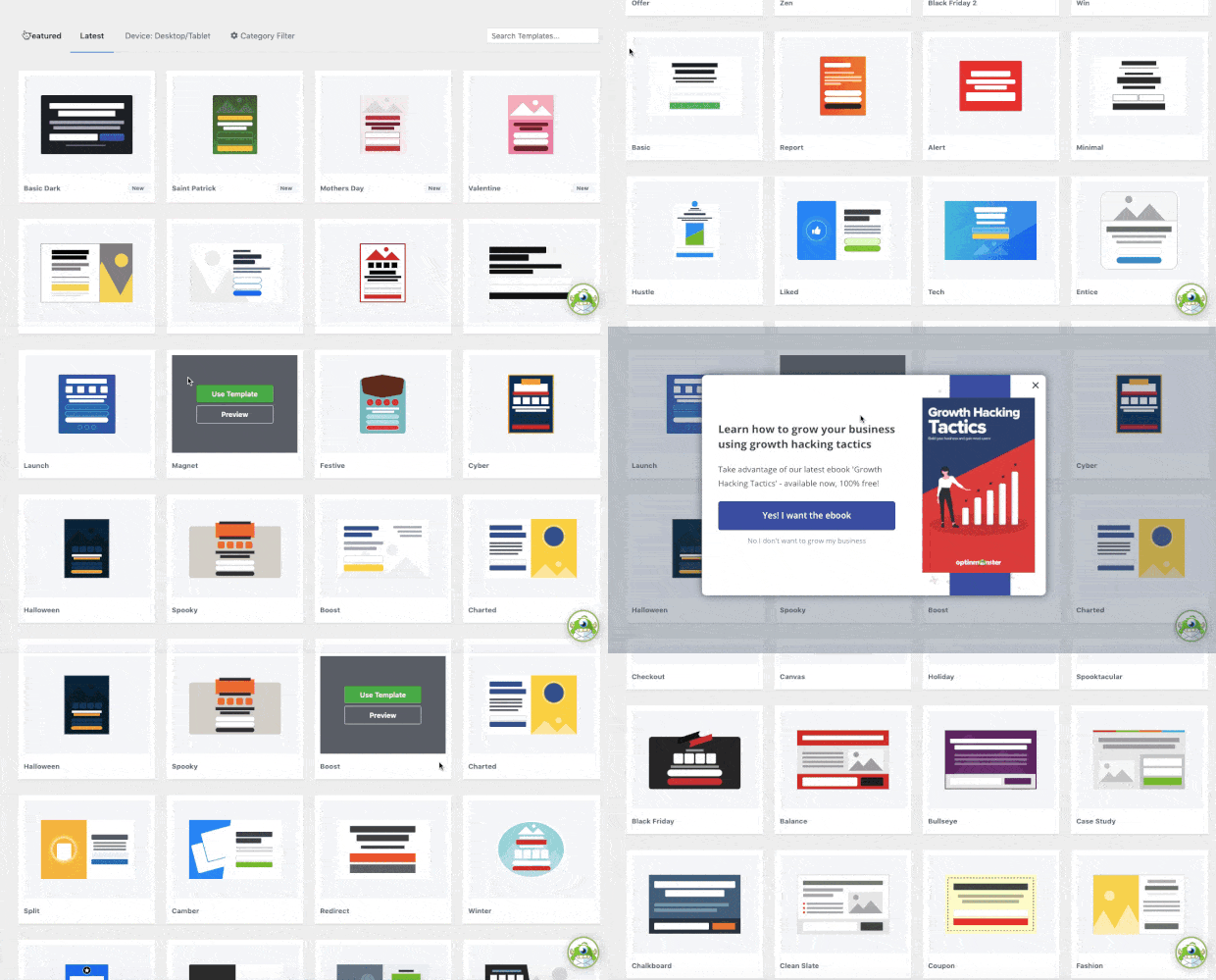
To create this kind of popup, you can use any of OptinMonster’s premade templates:
These templates save you hours of time, energy, and headaches as you find the right campaign for your target audience.
From there, you can create highly effective email capture campaigns like this one:
The best part is that you can sync OptinMonster campaigns with your email service provider (ESP) so your new leads go into an automated email series.
But now, you may be wondering, “Exit-intent popups sound good, but do they actually work?”
If you’re not totally sure, just check out this article on how Fastrack uses exit-intent popups to recover 53% of their visitors.
By adding an exit-intent popup to your WooCommerce product page, you increase overall conversions and sales for your online store.
2) Build a Popup for WooCommerce-Specific Actions
While exit-intent popups are incredibly effective, OptinMonster gives you another way to personalize your product pages:
By adding WooCommerce-specific triggers to show your campaign.
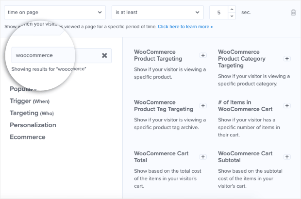
OptinMonster comes with advanced targeting rules built for WooCommerce. These let you display an OptinMonster campaign when someone:
- Adds a product ot their cart
- View a specific product page
- Look at a product category
- Reach a pre-determined cart total in your store
- Add a specific number of items to their cart
- And much more…
With these advanced targeting rules, you can create popups, floating bars, and more that appear when people interact with your WooCommerce store.
Imagine, for example, that someone is looking at the WooCommerce product page you built from this tutorial. And let’s say you’re selling high-end designer jeans.
But you’d also like your customer to add a luxury watch to the order.
When your visitors place a pair of jeans in their cart, it triggers the following campaign:
This is great because it accomplishes the same goals we saw earlier:
- You’ll capture your visitor’s email so you can reach them with reminders if they don’t complete checkout
- You’re more likely to increase the overall cart total from your WooCommerce store
In the end, both of these factors help grow your business and drive more revenue.
With OptinMonster’s advanced WooCommerce targeting rules, you can create sales and promotions that are as powerful as they are easy to set up.
Try out OptinMonster 100% risk-free today!
3) Add Live Sales Notifications to Boost Trust
We already mentioned how most people don’t make a purchase the first time they visit an online store.
This is especially true if your website doesn’t instantly look credible. To help with that, you should consider adding live sales notifications.
These are small messages that appear across your site or on pre-determined pages. They show your site’s visitors when other people have made a purchase.
Here’s an example of what live sales notifications look like:
These notifications leverage the power of FOMO (“fear of missing out”). This is something that affects nearly all online consumers.
The basic idea is this: people hate missing out on benefits they see others enjoying.
So when your visitor sees a notification that people are actively making a purchase, they’ll be more likely to do the same.
But how do you create these notifications if you aren’t a coder? For that, there’s no better tool than TrustPulse:
TrustPulse is the best social proof plugin for WordPress and can have a powerful impact on your WooCommerce product pages.
That’s because TrustPulse lets you add live social proof notifications to your site in a matter of minutes–even if you don’t have any technical skills to start with.
Everything about your TrustPulse notifications can be designed with drop-down menus, simple text field inputs, or choosing colors from a color wheel.
That makes the learning curve incredibly low.
To see just how easy it is, check out this helpful tutorial: How to Add a Live Sales Notification to WooCommerce to Increase Sales.
Not sure if live sales notifications will work for your store? TrustPulse users have seen an instant boost in sales by up to 15%.
That’s a big impact for such a small change.
Plus, TrustPulse is a fraction of the cost when compared with its closest competitors.
You can learn more about how TrustPulse stacks up to the competition by reading this post: FOMO vs UseProof vs TrustPulse: Which Is Best for Social Proof?
Or feel free to dive in and see the results for yourself by trying out TrustPulse 100% risk-free today!
And that’s all for today! This has been the best way to customize and personalize your WooCommerce product pages to get more sales.
We hope you enjoyed this post. If you did, you should definitely check out the following:
- 26 Best WooCommerce Plugins to Increase Sales
- WooCommerce SEO: Your Ultimate Guide to Ranking #1
- How to Add a WooCommerce Announcement Bar (the Easy Way)
These resources will have everything you need to improve engagement and sales with your WooCommerce product pages.










Add a Comment