Do you want to add a feature box to your site? A feature box is a highly effective optin form that smart marketers use to collect email subscriptions above the fold on their site. In this post, we will share how to create an optin feature box for your site, step-by-step, with examples.
What Is a Feature Box?
A feature box is an optin form that is placed at the top of your website, usually just below the header navigation and above your blog posts.
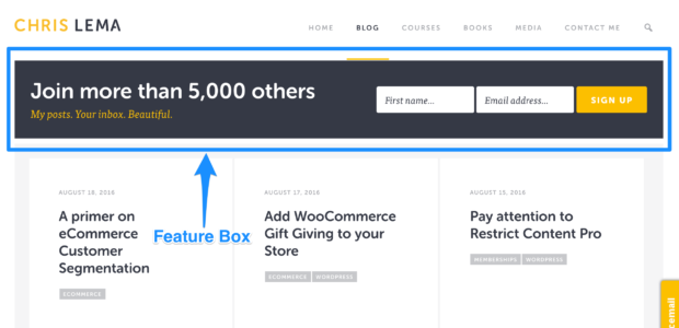
The reason feature boxes are so effective is because they are above the fold: that is, the optin form is immediately in clear view without having to scroll down the page.
When you combine this prominent placement with a compelling call-to-action and good design (using contrasting colors so that it really stands out from the rest of the page), you can increase your optins by 51.7% or even more.
11 More Feature Box Examples
There are so many different ways to design and use your feature box.
For example, if you have a special lead magnet to offer, like an eBook or a download, you can display an image of what subscribers will get along with a brief description.
Or, if you are a personal brand, you can kill two birds with one stone and use this opportunity to show your face. A full-bleed photo of you in the background, or just above your feature box, is a great way to make your optin more appealing and build your personal brand at the same time.
You could also use your feature box with a 2-step optin (so users have to click on a button before the optin form is displayed). This can save valuable real estate, and it may even convert better too.
Case StudyHow Cosmetic Packaging Now Grew Their Email List by 754% with 2-Step Optins
To help inspire you and get those creative juices flowing, here are some examples of awesome feature boxes around the web.
1. SmartBlogger
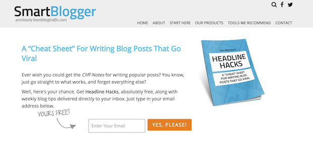
SmartBlogger’s feature box has all the necessary ingredients, without overcomplicating it. It’s got a headline, a description of the offer (a cheat sheet), an image of what you’ll get, and a simple optin form.
2. Michael Hyatt
Michael Hyatt’s feature box has the best of both worlds: there’s a full-bleed photo of Michael, plus you can also see an image of his free eBook next to the optin form.
3. Neil Patel
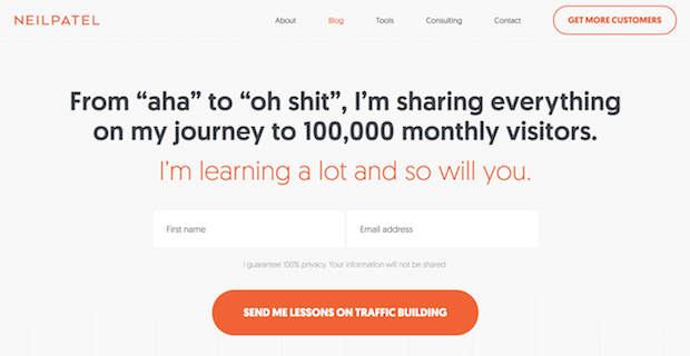
Neil Patel’s feature box lets the words do all the talking, with large fonts and plenty of whitespace.
4. Jeff Walker
Jeff Walker’s feature box is a bit unorthodox: it has one or two calls-to-action, depending on whether you are on the homepage or the “Programs” page. The homepage feature box allows you to click through to read more about his programs, but once there, it goes back to just one call-to-action: to optin to his email list.
5. Kissmetrics
Kissmetrics uses their feature box to promote the free 14-day trial of their software (which, of course, requires that you sign up for an account with your email address).
6. Mirasee
The great thing about Mirasee’s feature box is the video: it adds a real personal touch and interactivity that you don’t ordinarily see in a feature box.
7. Backlinko
Backlinko’s feature box is strikingly simple and to-the-point: you see Brian, a simple headline, a brief call-to-action and the form itself.
8. RazorSocial
RazorSocial uses a 2-step optin form in their feature box: click the button, and then you’ll see a lightbox popup with the form.
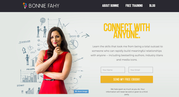
9. Bonnie Fahy
Bonnie Fahy’s feature box is filled with personality: the sly look on Bonnie’s face says it all! Plus, her eyes are directed at the optin form, which helps to increase conversions.
10. Social Media Examiner
Social Media Examiner’s feature box proves you don’t have to be a personal brand to show personality. What’s so great about this design is that the feature box looks like an old treasure map, in keeping with their “explorer” theme.
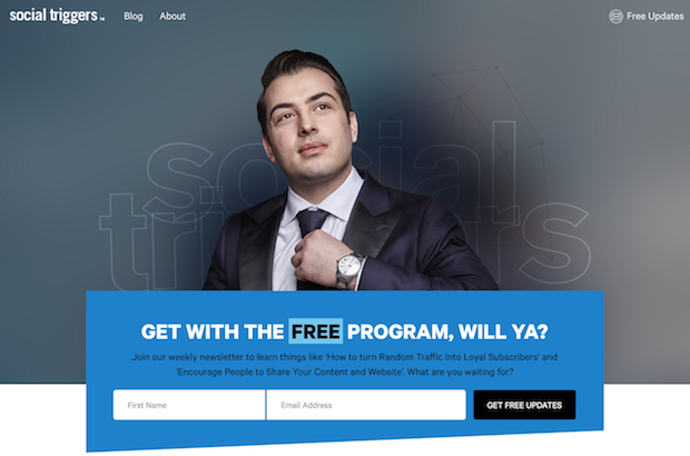
11. Social Triggers
Social Triggers’ feature box makes a bold statement with a dressed-up shot of Derek and ultra-casual copy that is almost pushy (in a humorous way).
4 Steps to Create an Optin Feature Box
So, how do you actually create one of these for your site? To add an optin feature box to your site, you’ll need to follow these simple steps:
- Step 1. Create an inline optin form
- Step 2. Insert the sitewide and campaign-specific embed codes (can skip if using WordPress)
- Step 3. Insert the shortcode (for WordPress users)
- Step 4. Customize with post- or page-specific lead magnets (optional)
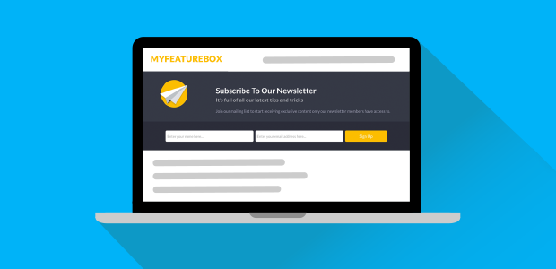
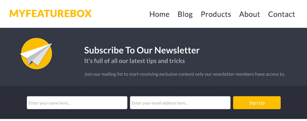
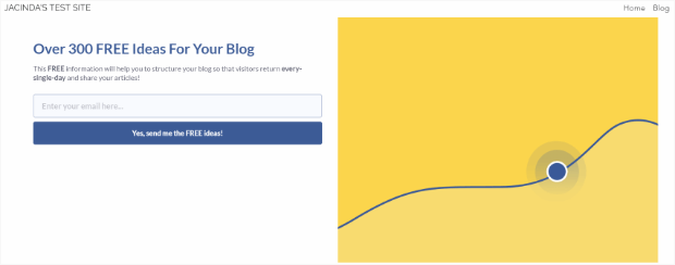
By the end of these steps, you will have a feature box that looks like this:
Ready to get started? Let’s dive into the nitty-gritty!
Step 1: Create an inline optin form
There are a number of different ways to create an inline optin form (i.e. an optin box that gets embedded somewhere within the content of your site). You could even code one of these from scratch if you know HTML and CSS. However, the easiest way is to use OptinMonster.
Once you have at least an OptinMonster Plus license, you can log in to your account and select the Create Campaign button.
Next, choose your campaign type. We’re using Inline.
Now, select a campaign template or theme. We’re going to use the Charted template.
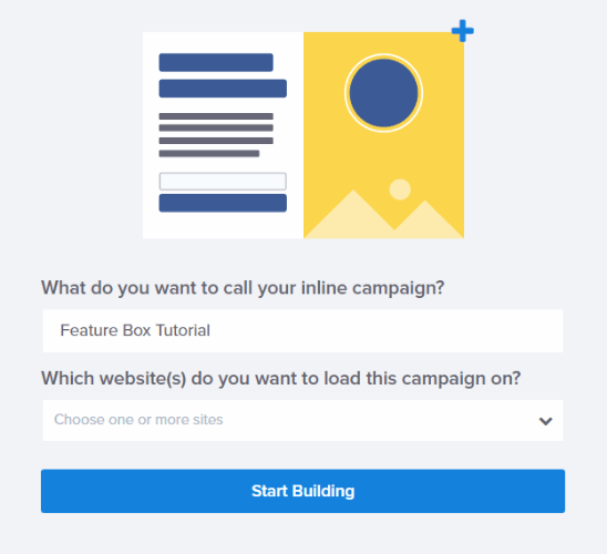
Then, name your campaign and click Start Building.
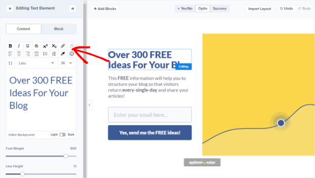
From there, you will be taken into the drag and drop campaign builder where you can edit the design of your inline optin form.
Make note of the green Save button in the upper-righthand corner. Remember to save your campaign often.
Editing your campaign is super easy. All you have to do to bring up the editing tools is click on what you want to edit in the live preview. That will bring up the editing tools for that element in the editing toolbar on the lefthand sign of the builder.
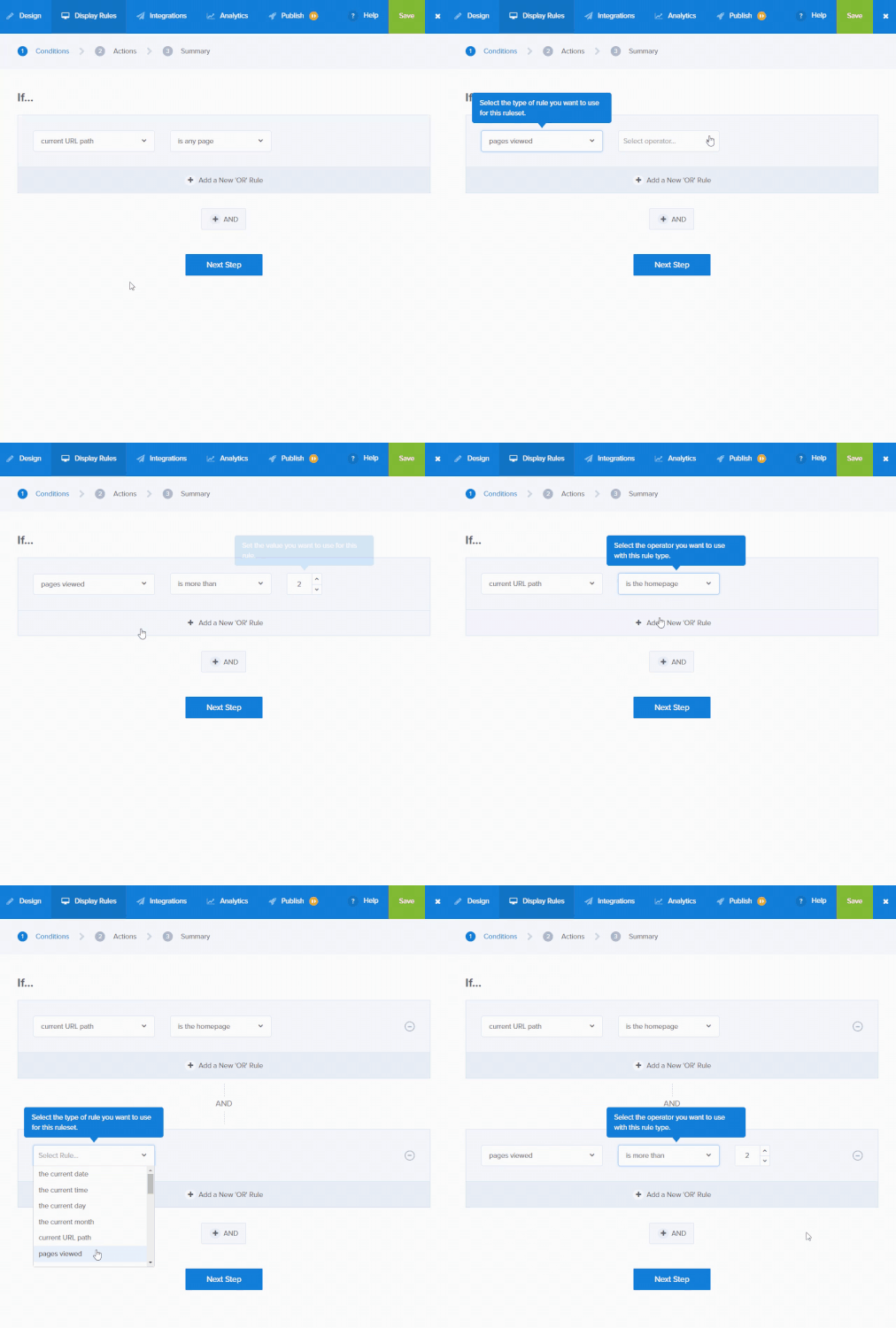
You can go to the Display Rules tab to choose where and when you’d like this optin box to appear. By default, the optin will appear on any page. We’re going to leave that alone for our tutorial, but it’s easy to change when your campaign appears by simply making selections from the dropdown and selecting the type of rule you want. You can also layer conditions by using AND / OR logic.
You’ll also need to add an Integration. OptinMonster integrates with every major email marketing service provider. Find the integration docs for yours here.
Once everything looks the way you want, click the Save button.
Now your feature box is ready to be installed on your site!
Step 2: Insert the sitewide and campaign-specific embed codes (can skip if using WordPress)
Go to the Publish tab and toggle the Status from paused to live, then click save.
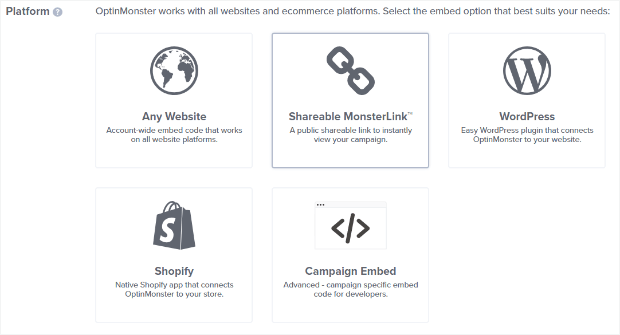
Scroll down and you’ll find all the ways you can publish your campaign.
Clicking on Campaign Embed will bring up an embed code that can be copied and pasted on your site wherever you want your campaign to load.
Step 3: Insert the shortcode (for WordPress users)
If you are using WordPress, installing the feature box is even easier. All you have to do is install the OptinMonster WordPress plugin.
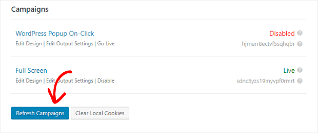
Once installed, you’ll see a new tab in your WordPress backend for OptinMonster. Click on that tab, and press the Refresh Optins button to view your list of optins that you’ve created.
Hover your mouse over the inline optin form that you created and select the Edit Output Settings option.
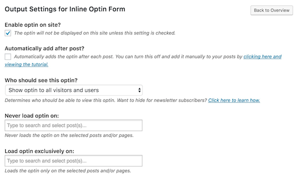
You will now see a list of settings to choose from. Make sure the “Enable optin on site?” option is checked (otherwise it will not load anywhere on your site). Then, choose your desired settings and click the Save Settings button.
Next, hit the Back to Overview button to return to your list of optin forms. Your inline form should now say “Live” next to it, with a gray code beneath it. This code is your “slug”. Copy this code.
Finally, go to the part of your WordPress theme where you want to add the feature box (in our case, right after the navigation bar). Then paste the following shortcode where you want the feature box to appear (replace “OPTIN_SLUG” with your unique slug):
Now your feature box will appear on your site like this:
Step 4: Customize with post- or page-specific lead magnets (optional)
This last step is optional, but if you want to really maximize the effectiveness of your feature boxes, then we highly recommend it.
To take your feature box one step further, go ahead and create unique lead magnets for specific posts or pages.
For example, you could offer post-specific content upgrades in your feature box, and display them on a per-post basis.
Let’s say we want our feature box to display different content upgrades for different blog posts. To accomplish this, go to the edit screen for your optin form and click on Display Rules.
From there, you can select current URL path. Select exactly matches from the dropdown menu, and insert the URL for one of your blog posts.
Click the Save button. Now your feature box will only be displayed on that specific blog post.
You can make a copy of this optin form from your OptinMonster dashboard by clicking on the ellipses to the right of the campaign and then selecting Duplicate.
Now you can simply insert the details for another content upgrade, and set your Display Rules to show this feature box on a different blog post.
That’s it! We hope this post has helped you to learn how to create an optin feature box for your site. If you enjoyed this post, you may also want to check out 14 High Converting Places to Add Email Signup Forms to Build Your List.



















Add a Comment