Do you want to capture email signups on your Shopify website?
Email marketing is crucial to the success of any eCommerce business. By adding a stunning email signup form to your Shopify store, you can encourage users to subscribe to your list and market your brand through emails.
This not only helps you build long-term relationships with your visitors but also increases conversions and sales.
Today, we’ll show you how to add Shopify signup forms that are designed to maximize your subscriber list.
But first, let’s get clear on why you might want a tool other than Shopify’s native email subscriber form.
Best Way to Add Email Signup to Shopify
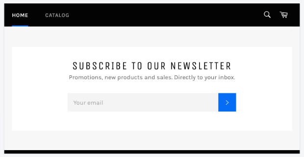
Shopify does have a basic newsletter form that comes with most Shopify themes.
However, this form isn’t recommended because it’s ineffective at growing your subscriber list.
Instead, you might want to use a conversion optimization tool like OptinMonster.
OptinMonster is the most powerful lead generation tool to skyrocket conversions and grow your email subscriber base exponentially.
It lets you set up eye-catching lead generation campaigns on your Shopify store. That way, you can target visitors and convince them to sign up for your newsletter and emails.
But you might be wondering, “Is OptinMonster really worth it if Shopify already has a signup form?”
Here are a few reasons why Shopify’s native email form won’t get you the results you’re looking for.
1. Every Shopify Store Has The Same Form
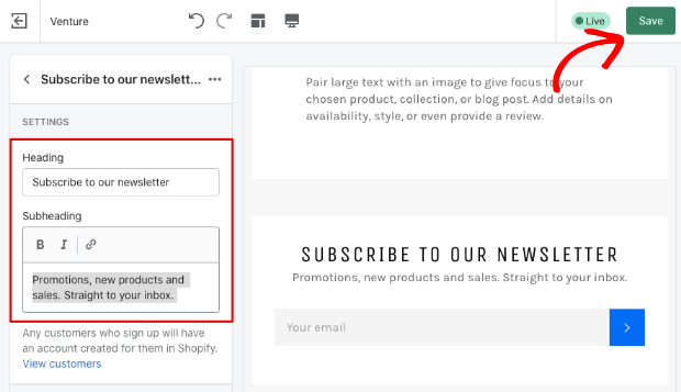
Shopify offers a generic signup template that every Shopify user has. When visitors see this form over and over again, it fails to grab their attention.
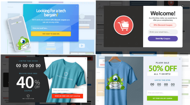
With OptinMonster, you get access to 9 campaign types including popups, floating bars, inline forms, and gamified wheels.
Plus, there are 50+ prebuilt templates to create campaigns. This lets you mix things up and create stunning campaigns in minutes.
But the best part is that there’s no coding required.
That means ANYONE can create a stunning form for their Shopify site with just a few clicks.
2. No Lead Magnet
The Shopify form only has a title, subheading, and an email address field, so there’s no room to add an incentive to get people to sign up.
Without a lead magnet, people won’t be convinced to engage with your form.
This is where OptinMonster can help you. It can turn boring signup forms into attention-grabbing campaigns where you offer discounts, free shipping, freebies, expert advice, and more.
Stunning campaigns tied together with an offer like this make it hard to resist. This gives your visitors a good reason to sign up.
Plus, OptinMonster comes with really powerful targeting features. This means you can display different signup forms based on your visitor’s activity and behavior on your site.
OptinMonster even has special targeting features just for Shopify stores.
This lets you maximize signup form conversions so you can easily grow your email list fast.
3. Minimal Customization Options
Shopify’s template is quite simple and there isn’t much else you can do with it.
You can change the heading and subheading, but that’s pretty much it. There’s no room for images, background, color, and any buttons.
Thankfully, you don’t have to be stuck with this template. OptinMonster lets you customize templates using its drag and drop visual builder.
You can edit everything about the Shopify signup form. And if you want to add more elements to it, you simply need to drag and drop them into your form.
Aside from this, with OptinMonster, you also get access to:
- Easy integration with email marketing services like Constant Contact and Mailchimp
- World-class customers support to help you with anything you need
- Block spam entries and collect genuine leads with TruLead®
- Valuable insights with analytics and A/B testing
With all that OptinMonster has to offer, you can minimize your work and maximize results.
Need proof? Check out how Nature TTL increased optins by 800% by replacing their generic newsletter signup form with OptinMonster campaigns.
Want to get the same results for your Shopify store?
Shopify Email Signups With OptinMonster
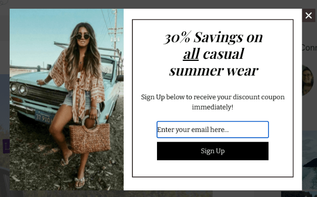
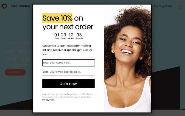
From this tutorial, you’ll learn how to create an email signup campaign for your Shopify store, like this:
And it’ll only take a few minutes to set up a beautiful campaign that’s designed to maximize conversions.
Step 1: Get the OptinMonster App
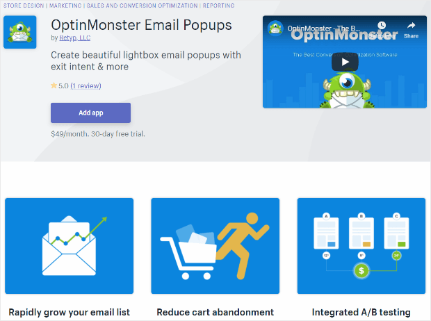
To get started, you’ll need to add the OptinMonster app to your Shopify store. Simply visit the Shopify App Store and find the OptinMonster Email Popups app.
If you’re already signed up for a premium plan with OptinMonster, make sure that you are logged into your account before you install the Optinmonster Shopify app.
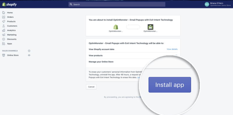
Then, click on the ‘Add App’ button. On the next page, you’ll be prompted to read the permissions and then select the ‘Install app’ button.
For more help on this, you can follow this guide on how to integrate OptinMonster with Shopify.
Step 2: Create a Signup Campaign
After you add the app to your store, the OptinMonster dashboard will open up. Here, you can start building your signup form by clicking on the ‘Create New Campaign’ button.
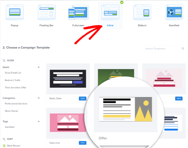
On the next page, OptinMonster lets you choose a campaign type and a template. You can select a lightbox popup, floating bar, fullscreen, inline, slide-in, or gamified wheel.
For this tutorial, we’ll create an Inline signup form to capture email subscriptions.
We’ll also choose the Offer template because it’s got all the fields we need to add a stunning newsletter signup form to Shopify.
That said, OptinMonster has tons of templates that we encourage you to explore. And in case you want to start from scratch, you can use the Canvas template for that.
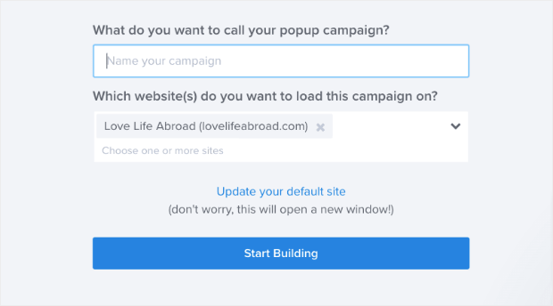
Once you select the template, you’ll be prompted to name your campaign, after which you can click on the ‘Start Building’ button to customize it.
Now you’re ready to design your campaign.
Step 3: Customize Your Signup Campaign
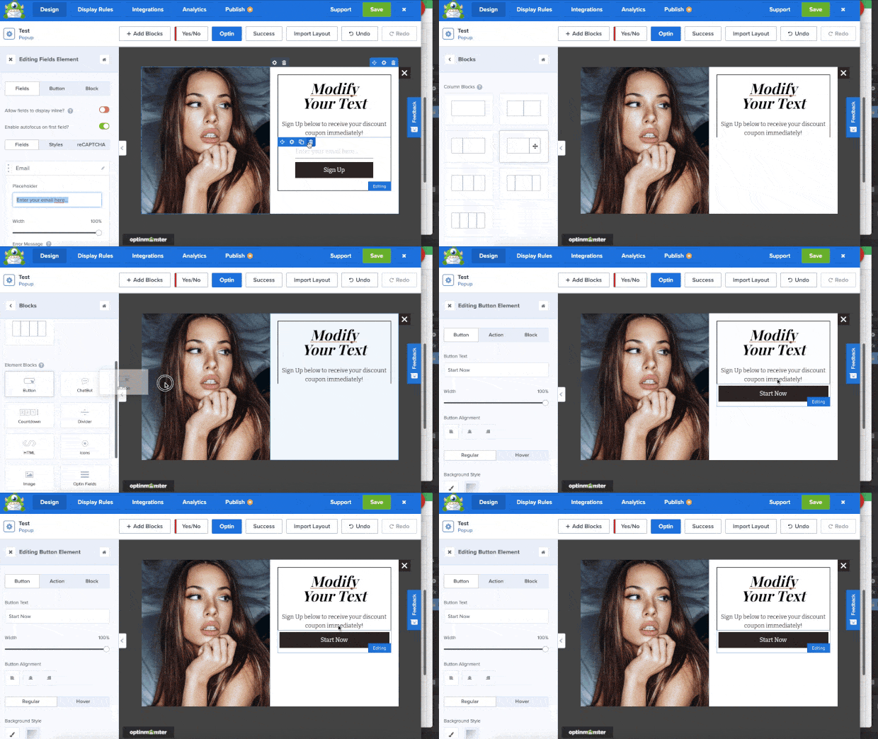
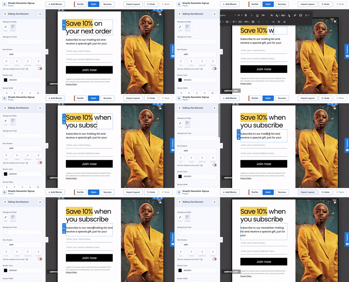
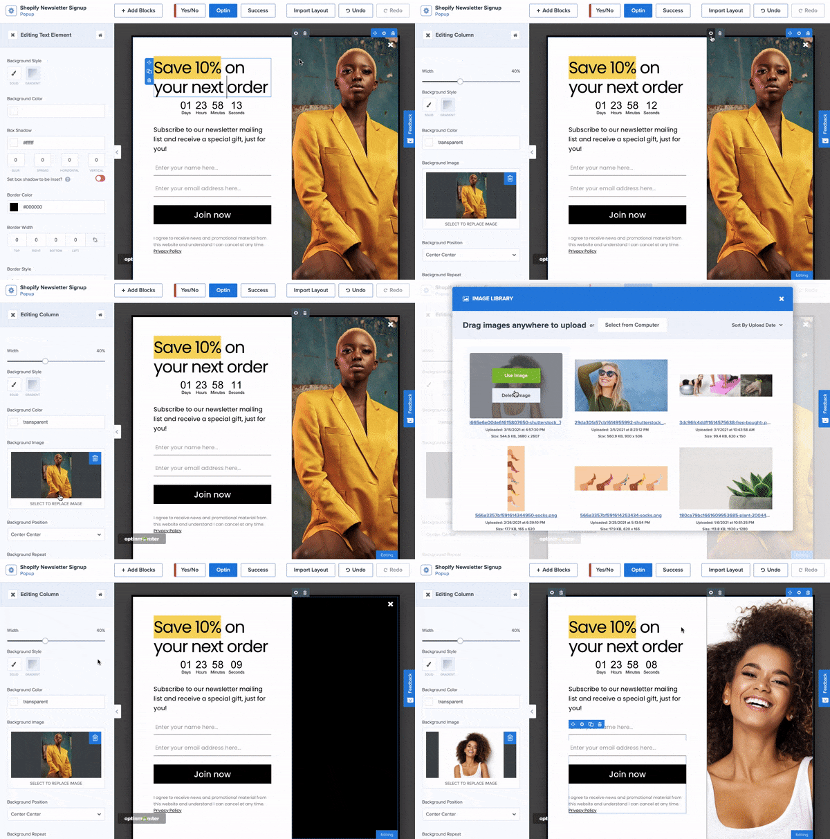
The OptinMonster drag and drop builder will open where you can make changes to the template you selected.
This is a visual builder which means you can click on any element in the preview and edit it.
That means you’ll be making changes to the campaign as it would appear when it’s live on your site.
The campaign is made up of blocks, so you can select any block to edit it. You’ll see that the block settings open up in the left menu where you’ll get more options to customize it.
You can change the text, font, background, and colors.
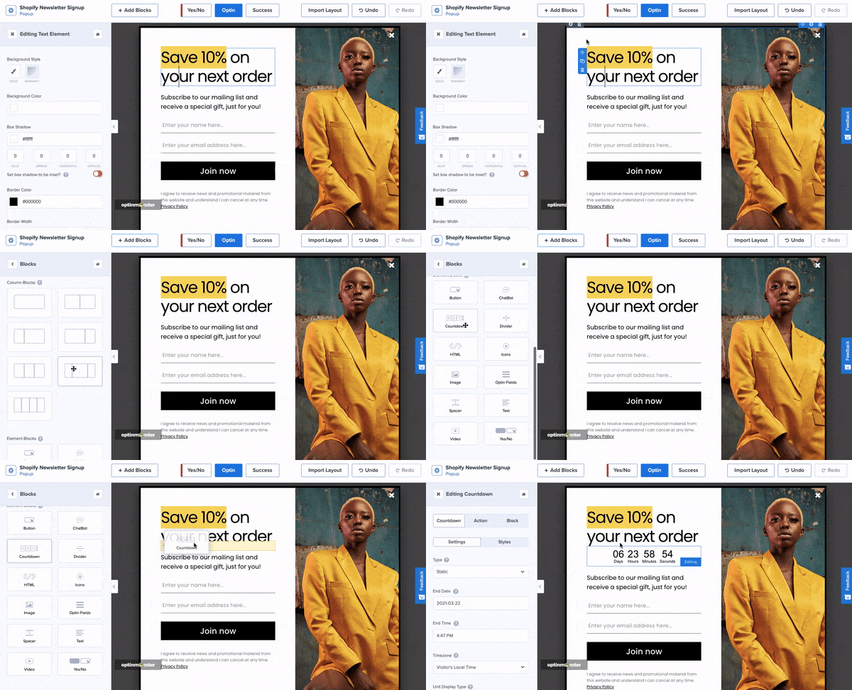
To add more blocks, select the ‘Add Block’ button and the available blocks will appear on the left.
Then, you just have to drag and drop the block into the template design.
We’re adding a countdown timer to create a sense of urgency for our offer. You’ll also see options to add buttons, icons, videos, optin fields, and even a chatbot.
Next, to change the image, simply select the image column.
You’ll see the image settings open in the menu on the left. Here, you can replace the image by uploading them from your computer or choosing one from your library.
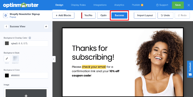
Once you’re happy with the look of your campaign, switch over to the Success tab to customize the message displayed to visitors after they sign up.
With that, your signup campaign design is ready.
Step 4: Set Up Display Rules
Display rules control when, where, and to whom your campaign appears. So instead of showing the same popup to every visitor, you can create different campaigns and target visitors according to their activity or interests.
By default, OptinMonster will display the campaign to every visitor after they spend 5 seconds on the page.
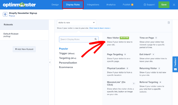
To change this rule, open the Display Rules tab on the OptinMonster dashboard.
You’ll see a list of rules such as time spent on page, new or returning visitors, and physical location.
For the newsletter inline form, we recommend using the default time on page rule or displaying it to new visitors.
We’ve selected the ‘New Visitor’ option. When you make your selection, on the next page, you can also select which URLs in which you want the campaign to appear.
By default, OptinMonster will show the inline form on every page on your site. But you may want to target your visitors better instead of bombarding them with the form on every page.
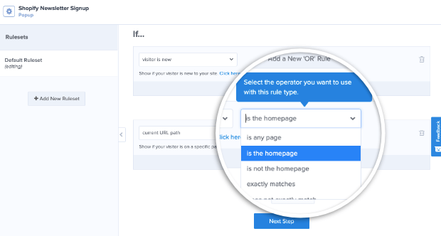
To do this, open the dropdown menu next to ‘Current URL path’. Here, you’ll see options to set an exact URL.
For today, we’re choosing to display our newsletter signup only on the homepage.
Keep in mind that OptinMonster has tons of display targeting rules.
For instance, the Exit-Intent® trigger will detect when the visitor is about to leave your site and display a popup.
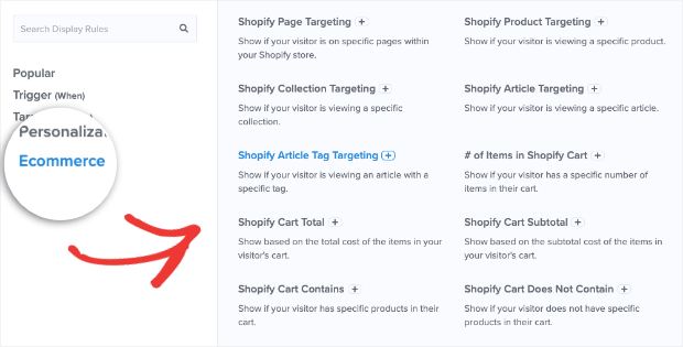
And if you switch over to the eCommerce tab, you’ll see options specially created for Shopify stores.
You can target visitors based on the page, collection, article, article tag, or product their viewing.
You can also set up campaign triggers if they add an item to their cart, or their cart total reaches a specific value or number of items.
That means you can choose the one that you feel best suits the campaign you’re building for your site.
Once you’ve finished, it’s time to integrate the campaign with your email marketing provider.
Step 5: Integrate With Email Marketing Services
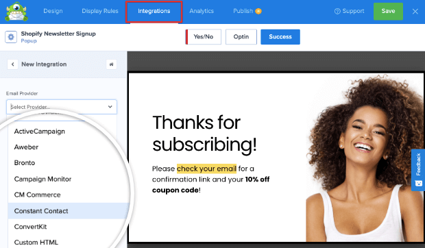
OptinMonster lets you seamlessly integrate with all popular email marketing services such as Constant Contact, Mailchimp, AWeber, Brevo, and many others.
To connect to an email marketing service, switch to the Integrations tab. Here, you’ll see an option to ‘Add New Integration’.
Click on it and you’ll get a drop-down menu of the list of email providers available.
Select the provider of your choice and then follow the instructions to integrate with your account.
In case you don’t have an email marketing service, you can rely on the default option which is Monster Leads.
This feature collects and stores all your email subscribers safely and you can access the list from the OptinMonster dashboard.
Step 6: Publish Your Signup Campaign
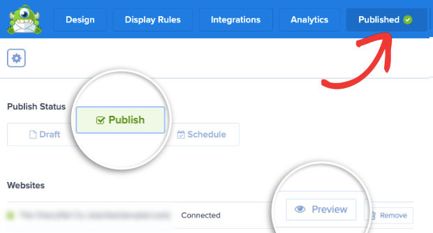
Now your Shopify signup campaign is ready to go live on your store. To do this, head over to the ‘Publish’ tab.
Here you’ll see an option to preview a sample of your campaign. And once you’re happy with it, you can change the status to ‘Publish’ and your campaign will go live.
And if you want more help on connecting to Shopify, you can always go back the resource in Step 1 of this tutorial (How to Integrate OptinMonster With Shopify).
And with that, you’ve added a stunning signup popup to your Shopify store with powerful campaign targets and triggers.
Step 7: Optimize Your Signup Campaign
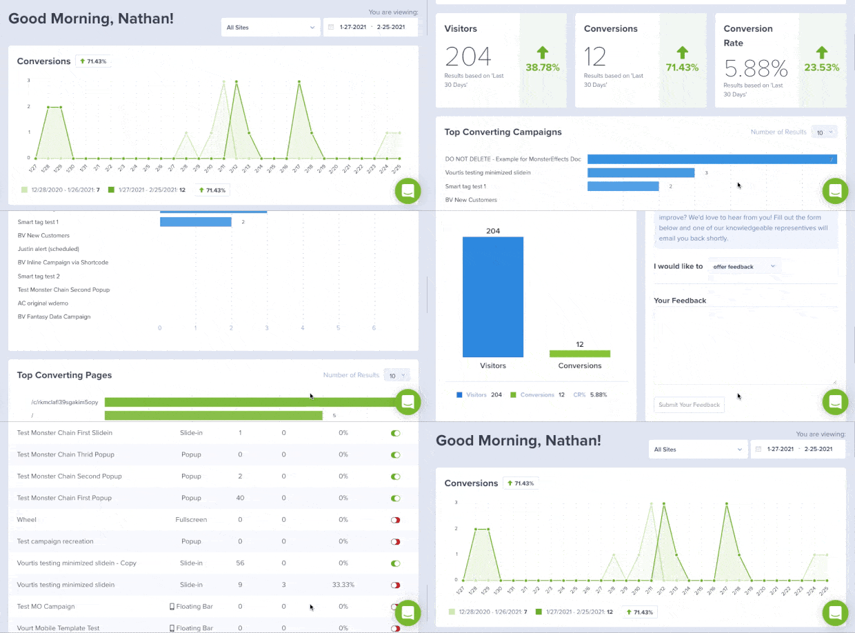
You can view the results of your campaign in the analytics section of your dashboard and even integrate with Google Analytics.
OptinMonster also lets you use A/B testing to see what works better for your store. You’ll find these options on the OptinMonster dashboard, like so:
These options will help you learn what your visitors are interested in and what they respond to.
In this way, you can maximize your subscription rate and reach your business goals faster!
Ready to add a high-converting lead generation campaign to your Shopify site?
We hope you liked this article and found it helpful in adding signup forms to Shopify. If you want to improve your marketing and sales strategy to grow your Shopify business, check out:
- Shopify Email Marketing: 7 Apps to Grow and Monetize Your List
- Shopify CRO: How To Make More Sales From Your Current Traffic
- 33 Best Shopify Apps to Increase Sales Instantly [Most Are FREE]
These posts will have everything you need to optimize your Shopify store to drive long-term success.









Add a Comment