Are you looking for ideas for your email newsletter signup forms?
A well-designed signup form can make a big difference in your conversion rates. The more newsletter subscribers you get, the greater your potential revenue.
In this article, we’ll share some inspiring newsletter signup examples along with best practices you can use to create your own.
Let’s get started!
What Is an Email Newsletter Signup?
An email newsletter signup is a form where visitors to your website can subscribe to your email marketing messages.
There’s a form field for the reader’s email address. Some forms also include a field for the visitor’s name, though this is optional. Depending on what email signup form builder you’re using, you can also include fields like checkboxes or dropdowns. These fields let visitors choose their email preferences, such as:
- Email topics
- Email frequency
- Their industry
- and more
In some ways, a newsletter signup form is like a lead generation form. By signing up, subscribers are indicating an interest in your business. You then have the opportunity to send them relevant marketing information.
What Makes a Good Email Newsletter Signup
Regardless of what industry you’re in, there are a few things that make email signups more effective. These include:
- Incentive
- Permission
- Expectations
- Consistency
Let’s look at each of these factors in greater detail.
Incentive
You have to give people a reason to join your mailing list. Sometimes, the content of your email newsletter is intriguing enough, such as this newsletter sharing freelance opportunities.
But other times, subscribers need more motivation to sign up. That’s where lead magnets come in.
A lead magnet is something you offer website visitors in exchange for their email address. It can be anything from a discount code to a free trial to a PDF download. Other incentives include loyalty programs, exclusive content, or access to preorders.
Permission
Next, you must receive permission to send marketing emails. In order to combat spam and online scams, there are now many laws such as GDPR that regulate how and when you can email people.
You cannot purchase an email list. You also aren’t supposed to add past customers to your marketing emails without direct permission.
When you offer your lead magnet or other incentive, you can include language on your email optin form that tells subscribers that they’re also joining your email list.
Another strategy is to use a double optin. This is where new subscribers receive a confirmation email after signup. They have to click on the confirmation link in order to confirm their subscription and receive their optin incentive.
Finally, make sure to include an unsubscribe link on all of your emails. Of course you don’t want subscribers to leave your list, but the alternative of reporting you for spam is much worse.
Expectations
Digital marketing relationships are built on trust, even though potential customers can’t see you face to face. Part of creating trust is being clear about what they can expect from you.
Your newsletter signup form should make it clear that they’re signing up for marketing campaigns, not just the free download or other lead magnet. It’s also best to give potential subscribers an idea of how often you’re going to email them and what kind of content to expect.
We also recommend putting this information in your welcome email. Someone who subscribes in a hurry to get your free eBook or other giveaway may not be paying a lot of attention.
Consistency
Your email signup forms should look like they belong on your website. Keep the colors, fonts, and messaging consistent with the rest of your marketing, especially the newsletters you send out. If your newsletter form doesn’t match, readers may not trust that it’s really your newsletter they’re signing up for.
Call to Action (CTA)
Finally, don’t forget to include a call to action on your email signup form. We suggest something more specific and engaging than “Subscribe to our newsletter.” Focus instead on the benefits of signing up, rather than the action you’re asking them to take. You can also experiment with flipping the usual “join our mailing list” wording to use the subscriber’s point of view.
Here are some examples of sign up for newsletter text:
- Get your [lead magnet] now
- Learn how to [useful skill]
- Send me my free [subject] tips and tricks
- Yes, I want the [lead magnet]
The CTA button on your email form should be high-contrast and easy to read.
Now let’s look at some real-world subscribe message examples!
Newsletter Signup Form Examples
1. Popup Form
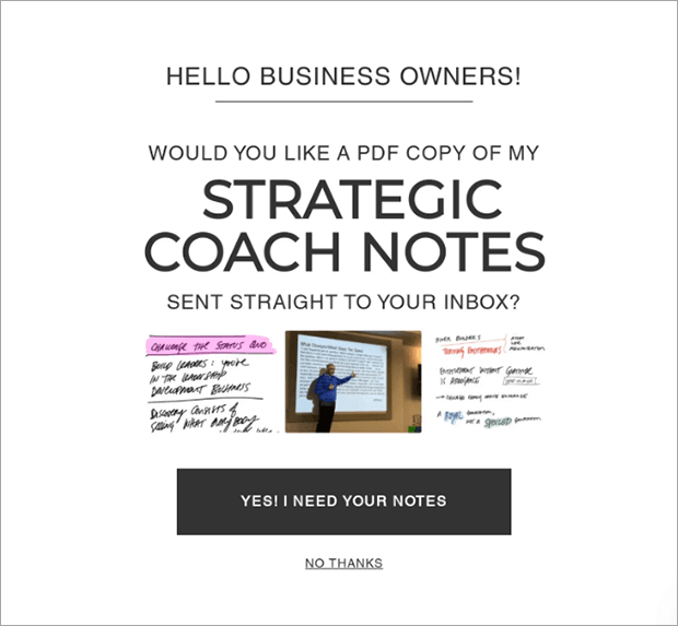
Entrepreneur Nick Gray used a popup campaign on a blog post he wrote about business tips.
- Incentive: PDF copy of Strategic Coach notes
- Newsletter Signup Text: Yes! I need your notes
- Special Features: Yes/No button, post targeting
See how this and other popup newsletter forms boosted Nick Gray’s subscribers by 600%.
2. Exit-Intent Email Signup
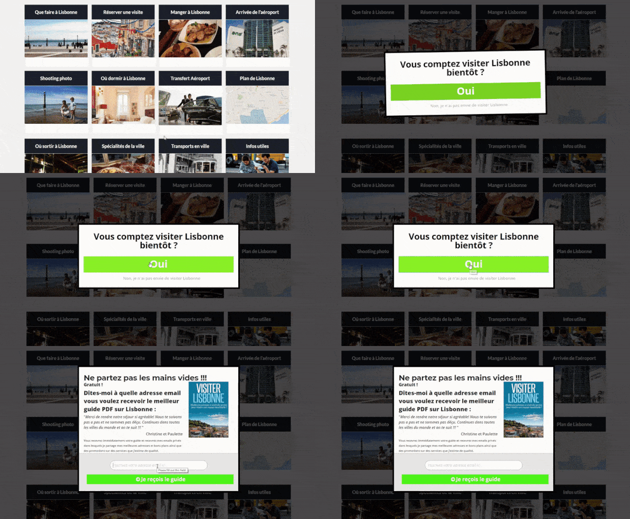
Bonjour Lisbonne is a French-language travel site. They used an exit-intent popup to catch visitors who were about to leave the website.
- Incentive: Visit Lisbon guide
- Sign Up for Newsletter Text: Get the guide! (in French)
- Special Features: Yes/No button, MonsterEffects
Learn how Bonjour Lisbonne increased sales by 30% with exit-intent optin forms.
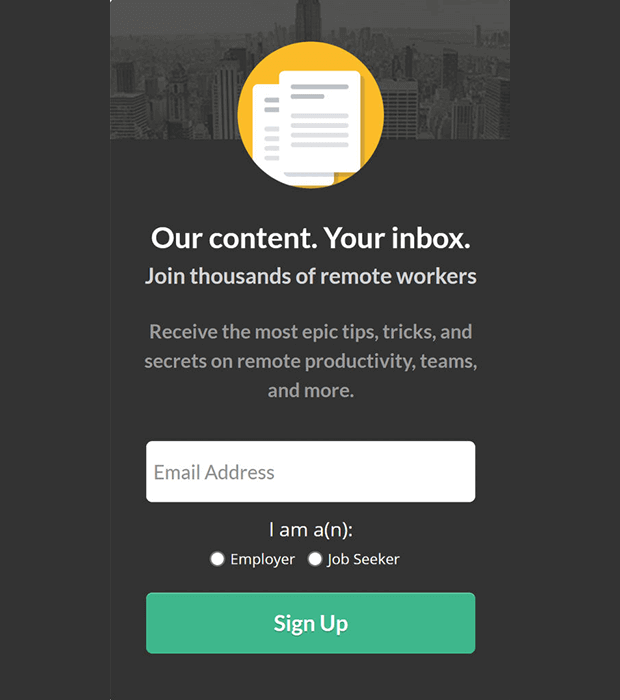
3. Sidebar Email Newsletter Signup
Sidebar newsletter forms are often a boring afterthought. Most just say, “Sign up for our newsletter” and leave it at that. But this sleek form offers a tempting lead magnet that’s perfect for the target audience of this website along with a field to select content that interests them.
- Incentive: Newsletter content for remote workers
- Call to Action: Sign Up
- Special Features: Radio buttons
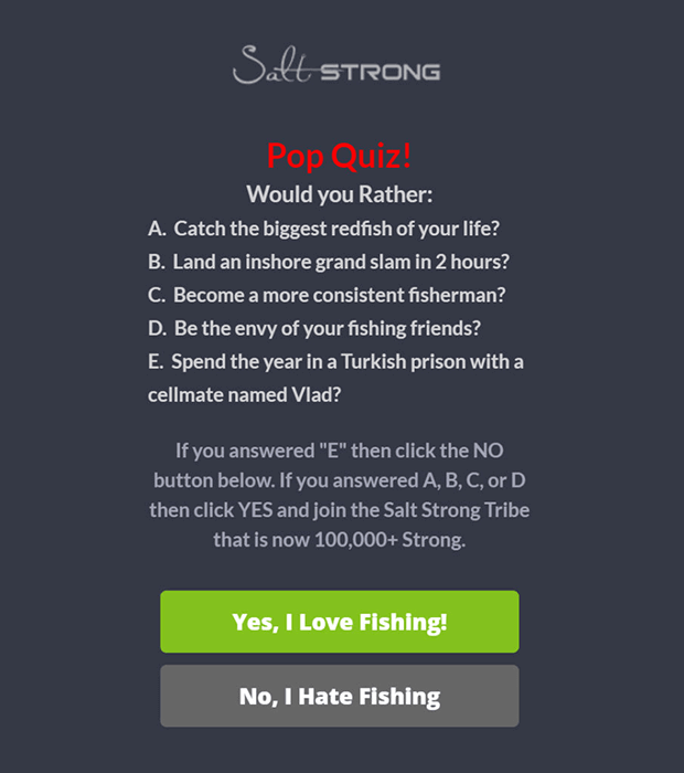
4. Slide-in Newsletter Subscription Form
Salt Strong used a smaller slide-in box with an engaging quiz. These scroll box signup forms don’t block as much of the screen, which can help create a better user experience. Their creative copywriting makes this signup form stand out.
- Incentive: Newsletter content for saltwater fishers
- Newsletter Subscribe Message: Yes, I Love Fishing!
- Special Features: Yes/No button, social proof
See the full Salt Strong case study for more details on how they boosted conversions by 185%.
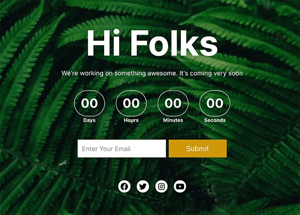
5. Email Newsletter Signup Page
Did you know you can collect email signups even if you don’t have an entire website ready yet? With a landing page builder plugin like SeedProd, you can create a coming soon page where interested visitors can leave their email address. This starts building your audience before you launch.
- Incentive: Website launch notifications
- Call to Action: Submit
- Special Features: Countdown timer, social media buttons
6. Floating Header Email Newsletter Signup
To save room on your homepage design, you can include a newsletter signup form in a floating bar above your website. Because the header goes across the whole screen, you still have space for engaging copy.
- Incentive: Financial advisor marketing ideas
- Newsletter Subscription Message: Get Them Now
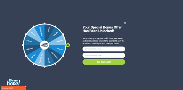
7. Coupon Wheel Signup Form
PortraitFlip uses a spin to win wheel to drive more email signups and purchases on their eCommerce business. Customers enter their email address for a chance to spin the wheel for a special discount. This type of gamification can be a great incentive for newsletter signups.
- Incentive: Discount
- Call to Action: Try Your Luck!
- Special Features: Gamification, fullscreen
See how PortraitFlip went from almost zero email subscribers to converting over 3% of visitors!
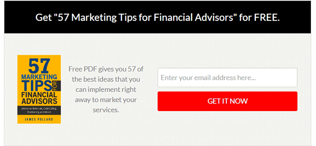
8. Inline Newsletter Signup Form
Inline email signups are perfect for converting visitors who are already reading content on your website. Because they’re already engaged, you can easily present your subscriber incentive without needing too many extra features on the form.
- Incentive: PDF of 57 marketing tips
- Newsletter Signup Text: Get It Now
- Special Features: Responsive designs, post targeting
Check out how The Adviser Coach converts 58% of readers to subscribers!
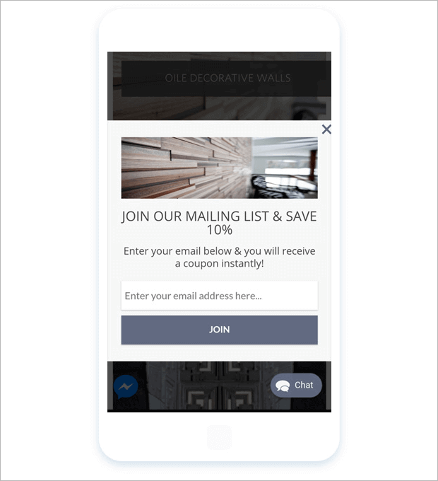
9. Mobile Newsletter Form
With more users than ever on mobile devices, your email forms have to be responsive. You can’t have a popup that covers the whole screen or doesn’t adjust properly. White River was able to increase mobile conversions while avoiding Google’s mobile popup penalty.
- Incentive: Discount coupon
- Call to Action: Join
- Special Features: Responsive design, easy optin dismissal
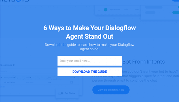
10. Fullscreen Email Subscription Example
Fullscreen email signup forms can get your visitors’ attention as soon as they land on your site, or right when they’re about to leave. This fullscreen newsletter form is targeted to pages about a specific software integration.
- Incentive: Software specific customer service guide
- Join Our Newsletter Text: Download the Guide
- Special Features: Customer segmentation, page-level targeting
See how Rocketbots grew their list by 680%!
How to Make an Email Signup Form
The easiest way to make all of the email newsletter signup examples in this article is with OptinMonster.
OptinMonster is the best email signup app you can find. Whether you’re using WordPress, Shopify, Squarespace, or any other website builder, you can create eye-catching newsletter signups with just a few clicks.
With OptinMonster, you can create:
- Popups
- Fullscreen signup forms
- Floating bars
- Slide-in boxes
- Spin to win wheels
- Inline campaigns
- Sidebars
- Content lockers
You can also target your newsletter forms with the most precise display rules in the industry, such as:
- Exit-Intent Targeting
- Geolocation
- OnsSite Retargeting(R)
- Page-level Targeting
- AdBlock Detection
These display rules ensure that the right visitors see your email newsletter signup at the right time.
Here’s how to make an email newsletter signup with OptinMonster.
Also check out: 5 Best WordPress Newsletter Plugins in 2023 for More Engagement
Step 1: Select a Campaign Type and Template
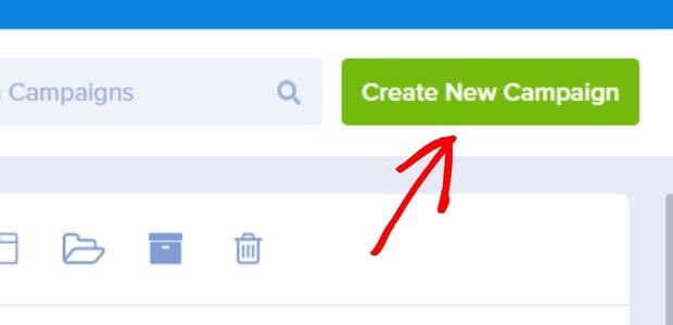
First, sign up for an OptinMonster account. Then click on Create New Campaign.
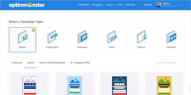
From there, choose a campaign type from the ones listed on your screen.
For this tutorial, we’ll choose a popup. It’s one of the most common types of email newsletter signup forms. You can of course choose any of the other types and follow a similar process.
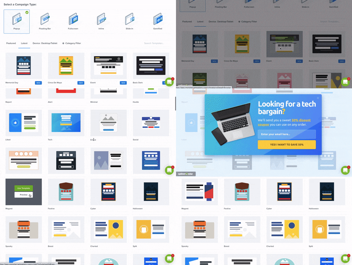
Once you choose your campaign type, you’ll see a huge list of templates to choose from. You can click the Preview button to see each design up close.
You can use a template just as it is or adjust it to fit your needs.
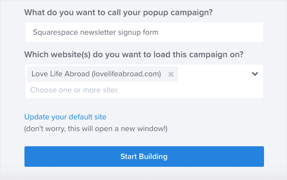
After you pick a template, you need to name your campaign and click Start Building. If you’ve used OptinMonster before, you can choose your website from the list. Otherwise, follow the directions here to connect your website.
Now you’ll be taken to the OptinMonster campaign builder.
Step 2: Customize Your Signup Form
While you can use any of OptinMonster’s campaign templates just as they are, it’s also super easy to customize them to fit your branding.
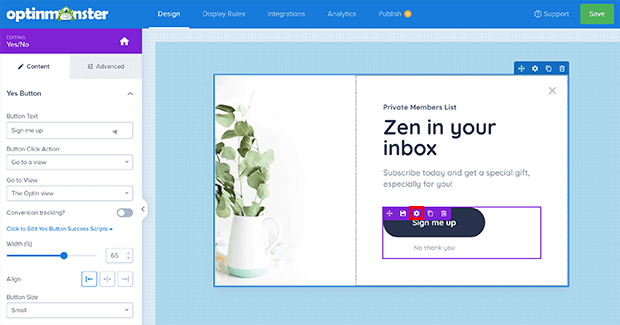
Click on any part of the template and modify the settings in the left panel.
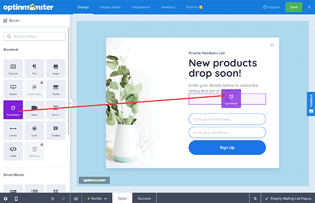
To add new blocks, just drag them over from the left panel into the builder screen. You’ll be able to see changes to your newsletter signup as you make them.
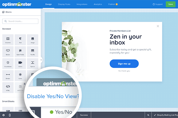
Your template may come with a Yes/No view. If you’d like to turn this on or off, click on Yes/No in the footer and disable or enable it as needed.
When you’ve got your email subscription popup the way you want it, click Save in the upper right.
Step 3. Set the Display Rules
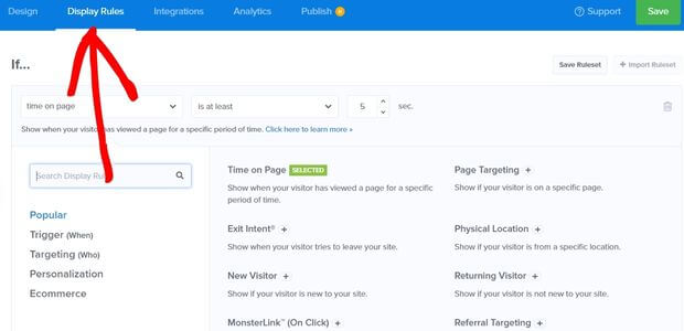
Now, we want to choose who sees your email signup form and when. Click on the Display Rules tab in the header.
You can combine different display rules to get precise targeting. Some good display rules for email signups include:
- Page targeting for visitors of specific pages
- Page views for visitors who have seen a certain number of pages
- Time on page for visitors who have been on your website for a certain amount of time
Choose the display rules you want and edit the options as needed.
Step 4. Connect Your Email List
OptinMonster connects to every major email service provider (ESP) and customer relationship (CRM) software on the market. Integration is very easy.
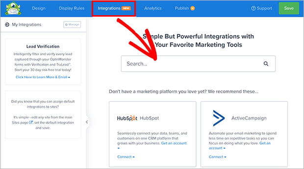
Click on the Integrations tab in the header and search for your marketing tool.
Every software is a bit different. When you select a software, you’ll see specific instructions for connecting your account. You can also search the documentation for full directions.
Step 5. Publish Your Email Newsletter Signup
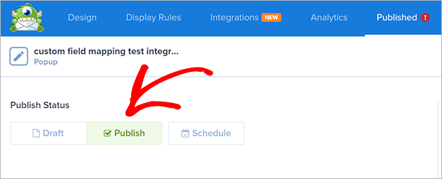
Once you’re done, click the Publish tab in the header. Look for the Publish Status box at the top of the page and click on Publish.
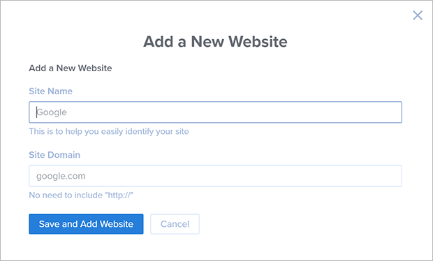
If you need to add a website to your OptinMonster account, it’s easy. Scroll down to Websites and select Add New Website from the dropdown.
Add your site and domain in the appropriate fields.
You will then need to add the OptinMonster embed code to your website. Like the email integrations, this process is different for each website platform. Use the website integration guides to help you add the code on your website.
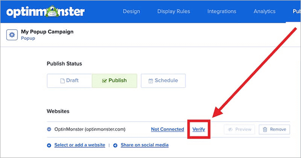
After you add the embed code, go back to the OptinMonster Publish screen and click Verify.
Now you’re all done! You can start growing your email list with your newsletter signup form.
Next Steps: Other Email Newsletter Resources
We hope this article gave you some ideas for your own newsletter signup forms. Once you have your form ready, check out our list of high-converting places to add email newsletter signups or awesome newsletter ideas if you’re stuck for what to send your new subscribers.
To start building your own email newsletter signups like the ones you saw here, try OptinMonster risk-free today!







Add a Comment