Placeholder text is the default text shown in form fields to indicate what information should be entered. You can either use the Campaign Builder settings or use CSS to customize the style of your placeholder text in OptinMonster.
In this article, we’ll provide some examples to style placeholder text.
Before You Start
Here are some things to know before you begin:
- This guide assumes you’re already familiar with our Custom CSS tool.
- Styling your placeholder text with CSS typically isn’t required. It is optional if you wish to change the default styling.
- You can style other aspects of your placeholder. However, we encourage you to keep styles minimal when it comes to modifying the default look of placeholder text — like color, font style, and font variant — to maintain professionalism and readability.
Style using Campaign Builder
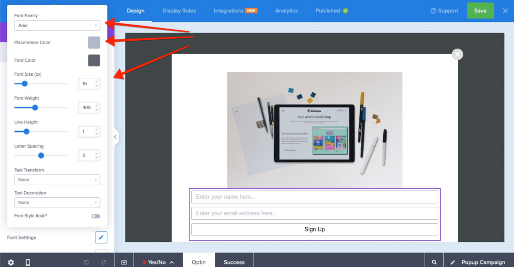
- Open the Optin Form settings in the Campaign Builder
- Click on the pencil icon to open the font settings panel and edit the color, font-family and other settings as per your requirements.
Style using Custom CSS
The following examples will help you style the Placeholder text using CSS:
Style Just OptinMonster Campaign Placeholders
html div#om-{{id}} ::-webkit-input-placeholder { color: #333 !important; } /* Chrome/Opera/Safari */
html div#om-{{id}} ::-moz-placeholder { color: #333 !important; } /* firefox 19+ */
html div#om-{{id}} :-ms-input-placeholder { color: #333 !important; } /* ie */
html div#om-{{id}} :-moz-placeholder { color: #333 !important; } /* below firefox 19 */
Style ALL Placeholder Text on Your Website
To change the styling of all placeholder text on your website and in your campaigns, we recommend adding the CSS directly to your website rather than in any individual OptinMonster campaign.
::-webkit-input-placeholder { color: #333 !important; } /* Chrome/Opera/Safari */
::-moz-placeholder { color: #333 !important; } /* firefox 19+ */
:-ms-input-placeholder { color: #333 !important; } /* ie */
:-moz-placeholder { color: #333 !important; } /*below firefox 19 */


