Have you recently gone through the process of changing your business hours, but you’re still not sure of the best way to inform all of your clients?
Well, you’re in luck. Because today, we’re not only going to teach you how to tell all your site’s visitors about your changing business hours.
We’re also going to help you grow your email list at the same time. “How?” you ask?
With a simple Fullscreen campaign.
That’s right. In this tutorial, we’re going to walk you step-by-step on how to create a fullscreen “change of business hours” popup that will also boost your email signup conversions.
So if you’ve found yourself wondering, “How do I tell my clients about new business hours?” then this tutorial is for you!
Ready? Let’s get started.
Changing Business Hours? A Helpful Fullscreen Popup
Letting your customers know about changing your business hours is super important. Especially if you’ve decided to reduce hours of operation.
The last thing you want is people to stand outside your store waiting for it to open!
With OptinMonster, creating a Fullscreen popup alert for your customers couldn’t be easier.
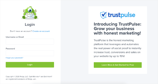
First, log in to your OptinMonster account:
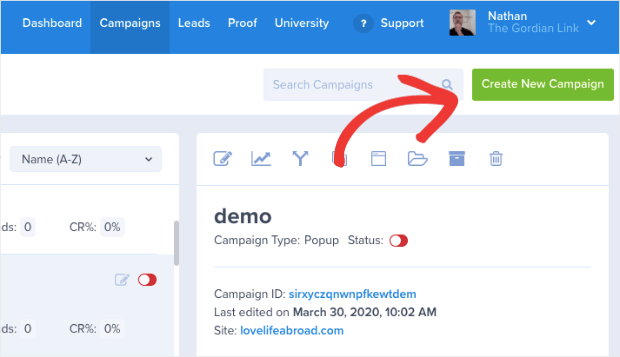
Now you’ll be in your OptinMonster campaign dashboard. Go ahead and click Create New Campaign in the upper right corner:
This is where you’ll choose your campaign type. For this particular alert to let customers know about your new hours of operation, we’ll use a Fullscreen campaign:
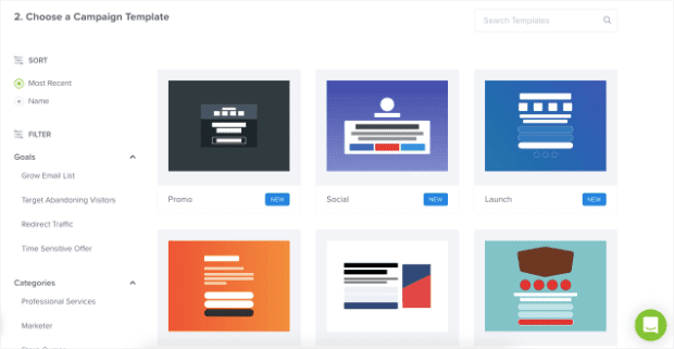
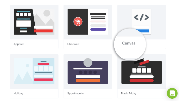
And now it’s time to choose a template:
OptinMonster has over 50 awesome templates to choose from. That means you’re likely to find one that already works with your company or personal brand’s style. So feel free to browse and choose the one that you think would best suit your brand.
And if you don’t find any, no worries.
You can always choose the blank template Canvas to start from scratch:
This will allow you to easily drag and drop any elements you want for your Fullscreen popup into place.
The second option is to choose one of our pre-built templates and customize each element. You can change font size, background color, button placement, and so on.
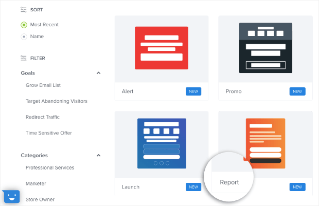
For today’s tutorial, we’re going to choose the Report template:
The Report template is a good choice for your changing business hours notification. It doesn’t include any images and uses a bold color background to capture attention.
And those are good visual design techniques for this campaign.
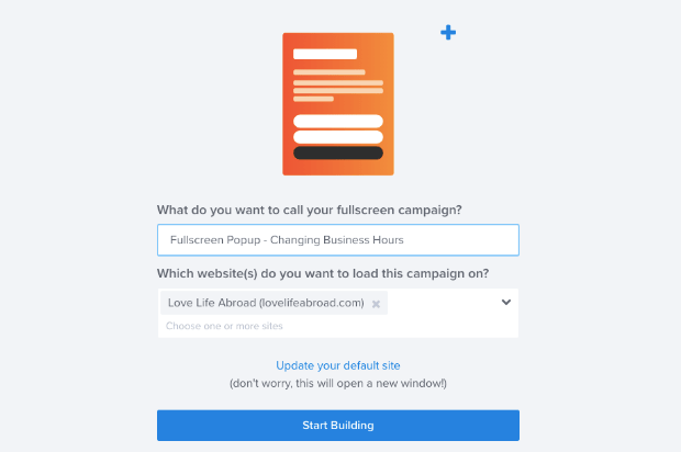
Once you’ve selected the template, you need to name your campaign and assign it to a website:
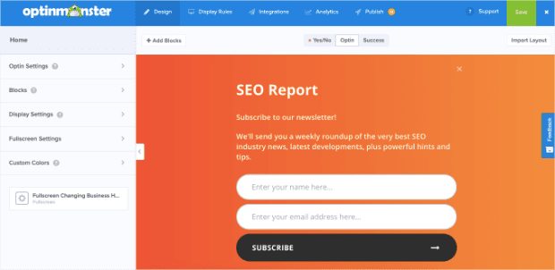
And now we can begin customizing our Fullscreen “change in business hours” popup with OptinMonster’s campaign editor:
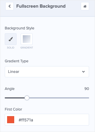
We’ll start by modifying the color. While the bright orange is great for grabbing your visitor’s attention, it may not match your brand.
To make this change, simply click anywhere on the background, and the editing tools will automatically appear in the left-hand side of your editor:
You’ll then see that you can change the first color in the editing tools:
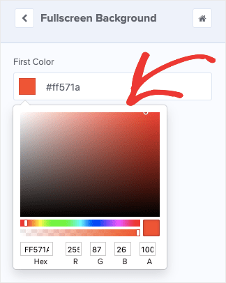
Simply click on the First Color icon, and select the color you’d like from the color palette in the editing toolbar:
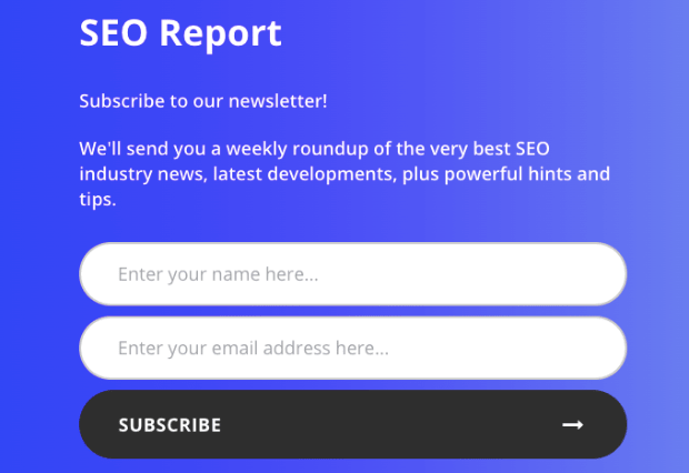
For today’s tutorial, we’ll go with a lighter blue. But as you can see from the image below, that can create a contrast in color:
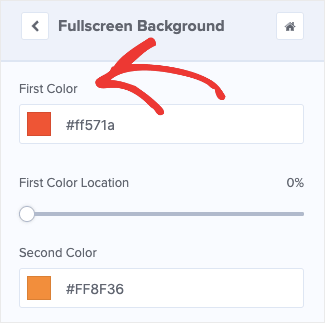
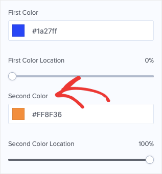
So we’ll want to choose a second color to make a better match. To do so, simply click Second Color:
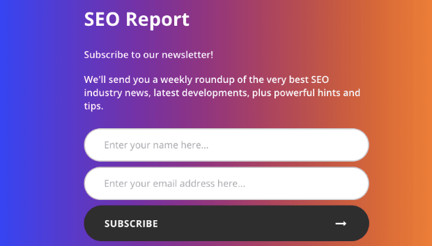
And select a color from the color palette exactly as you did from the first. You now have a more custom-looking campaign design:
NoteWrite down both your First and Second Color selections. You’ll need these for later.
Ok, at this point, you’re able to totally customize the background color for your changing of hours notification popup.
But what if you want to add an image? Doing so is just as easy as changing your background.
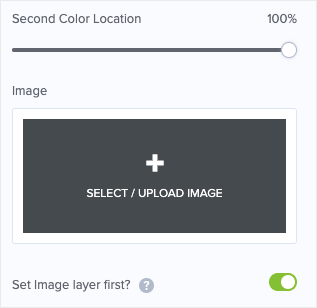
Simply scroll down in your Fullscreen Background editor tools (below where you chose your colors), and click Select/Upload Image:
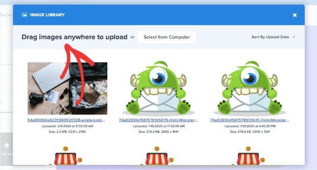
A window will pop up, allowing you to add images to your campaign. You can drag and drop them into the window:
Or simply select them from your computer like you would any other file. For this tutorial, however, we won’t be adding images to our background.
That’s because we’re trying to make this campaign as informational as possible. An image may distract some readers from the crucial information you’re trying to share: the changing of your business hours.
Now we need to change the text to customize your message. But, in today’s post, we’re going to do something special.
Like we said at the start of this article, we’re not just going to use your change of hours Fullscreen campaign to inform your clients.
We’re also growing your email list.
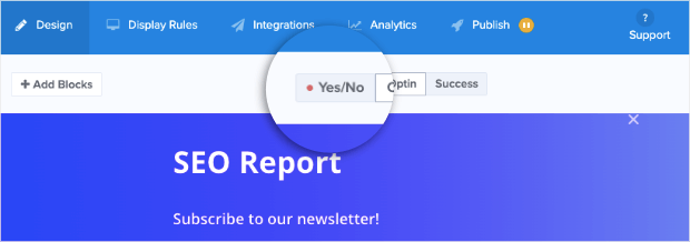
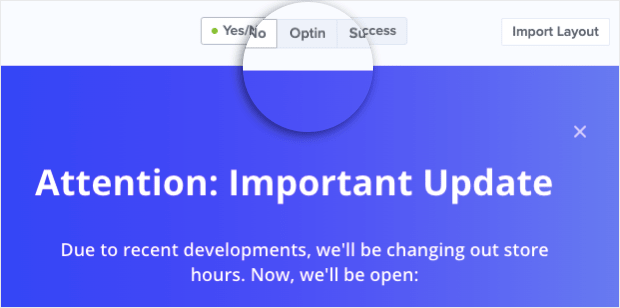
To do so, we simply need to change your campaign type by activating the Yes/No feature in the template. Go to the top of your editor bar and click Yes/No:
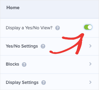
Then, activate the feature by clicking the toggle switch next to Display a Yes/No View:
But you’ll notice something different about the Yes/No form: the colors don’t match your Optin form anymore.
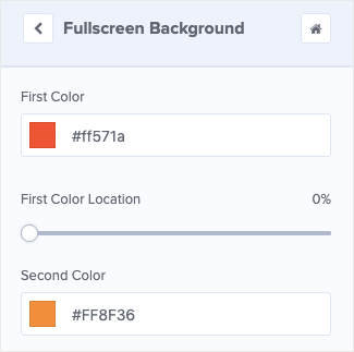
Luckily, you can change them in the same way as you did earlier. Simply click the background anywhere to bring up the editing tools and insert the First and Second Color you previously chose:
And that’s it.
Now your Yes/No form will perfectly match your Optin form. But, as you can see, we need to change the text.
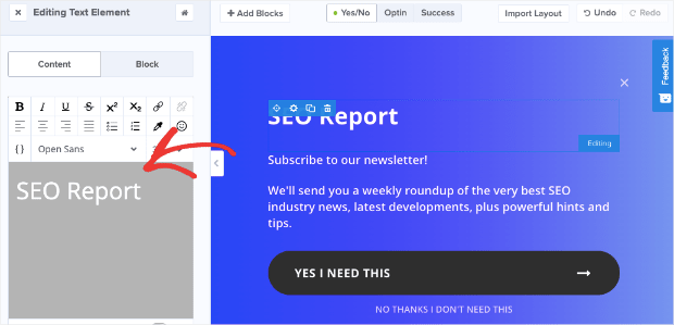
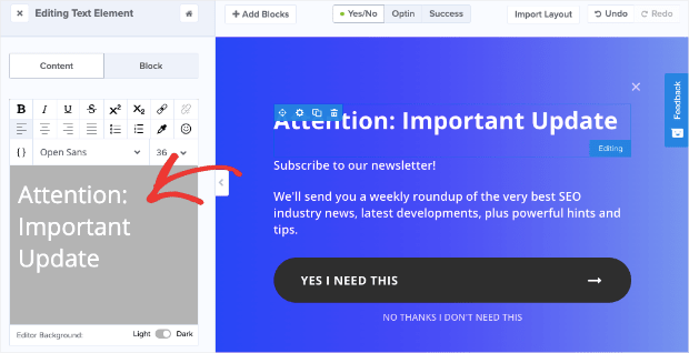
Click on the text block in your campaign editor to modify the text on the left-hand side:
Even though you’re just informing your customers about a change of hours, you still want your headline to be attention-grabbing.
We’ll be more straightforward in our campaign’s copy for this tutorial, but you should spend some time to find the right language to connect with your audience:
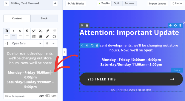
Once you’ve changed and formatted your headline, you can do the same for the subtext message:
Remember that people don’t read every word you write.
So be sure to make your new store hours stand apart. We did this by adding a space between the store hours and the text that came before it, as well as putting the new store hours in bold.
Earlier, we said that we were going to use this Yes/No form to grow your email list. We’ll do that by modifying both the Yes/No buttons’ text.
Here’s how:
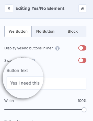
Click on the Yes Button in your editor. With this template, that’s the button that says, “YES I NEED THIS.” But the text could be different depending on the template you chose.
Then you can modify the text in the left-hand side editing tools:
Change the text to allow your visitors to get even more information. The text you choose will be up to you, but try to do something that builds some curiosity:
We edited the text to say, “Wait… how will this change affect me?” to make visitors want to know more information.
But as you might have noticed, the text looks a little funny in the button now. It’s aligned to the left side.
To change that, scroll down in the left-hand side editor to adjust the icon spacing:
You can also use the left-hand side editor to change the icon symbol or remove it altogether.
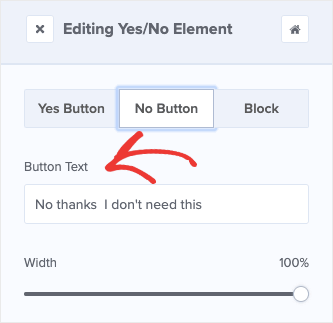
Then you’ll want to change your No button text to something more positive. Remember, your site’s visitors aren’t declining anything when they close this window.
By default, your visitors are simply getting the information no matter what. So having a text with “No thanks” misses the mark.
Simply click the No Button element to change the text in the left-hand side editor:
Ok, now for the real question: What will these buttons do, and do you need to change anything?
Luckily, for this tutorial, the button’s default settings do exactly what you want them to. If a visitor clicks Yes, they will be taken to your Optin form. If they click the No option, the campaign will simply close.
So let’s hope for the best and assume all your visitors click Yes. 🙂
That means you need to customize your Optin form. Simply click Optin button at the top of your editor:
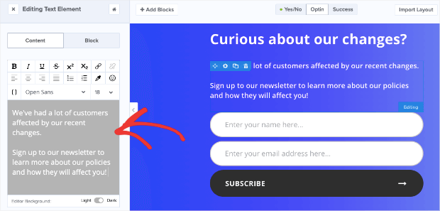
And you can now customize this form to suit your needs. We won’t spend a lot of time teaching you how to customize the text here because you can do it the same way we’ve already covered in this tutorial.
Just click the text element that you want to change, and modify it accordingly on the left-hand side menu:
And you can modify the Subscribe button’s icon spacing in the same way you did earlier:
And the best part is that most people who reach this page are likely to click Subscribe. That’s because you’re using the powerful 2-step optin Yes/No campaign. This is a psychological technique that marketers use called the Zeigarnik effect.
The Zeigarnik effect is something we’ve covered a lot in our blog. Mainly because it works so well.
The basic principle is simple: people tend to finish a process once they’ve started. So by getting your visitors to click your Yes option from the Yes/No form, you increase the odds that they’ll go all the way through the subscription process.
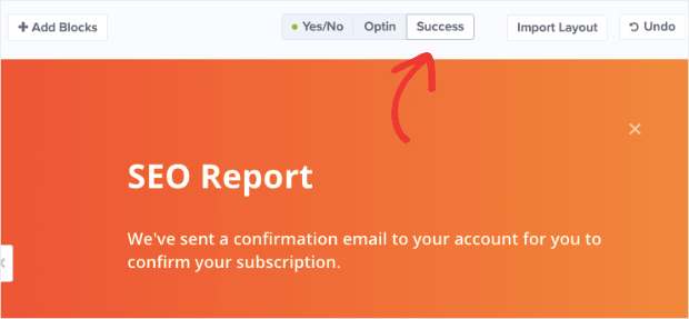
Now all that’s left is modifying your Success page view. To do so, simply click Success at the top of your editor:
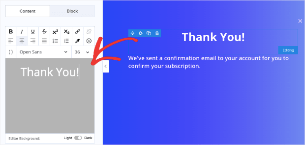
Then you can change the text and the background in the same way you did for both your Yes/No form and your Optin form.
Simply click on any element you want to change and use the editing tools on the left-hand side:
And that’s it! You now have a Fullscreen “change of business hours” popup notification for your clients that serves two purposes:
- Informs your audience about a crucial change in your company
- Grows your email list
But now that you have your campaign built, it’s time to set a few display rules.
Changing Your Display Settings and Rules
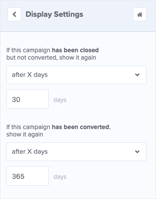
If you don’t change any settings, OptinMonster’s default campaigns will:
- Show only 1 time to the same user every 30 days if they didn’t optin
- Show only 1 time to the same user every 365 days if they do optin
For this particular tutorial, those are great parameters to keep. Most business owners try to avoid showing their visitors the same popup campaign too often.
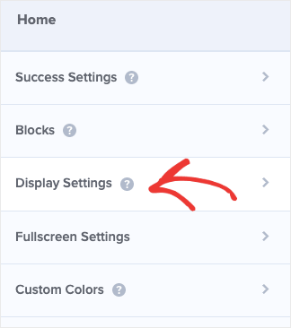
But if you do want to change them, you can simply click Display Settings on the left-hand side of your editor menu:
Then the Display Setting tools you need will be shown on the left-hand side menu:
But what about your display rules? Should you show the campaign immediately to all your visitors or wait a few seconds before it displays?
Because this is a “change of business hours” notice, we highly recommend showing this Fullscreen campaign immediately to all your visitors. That way, no one misses out on the information.
Simply click Display Rules on the top of your header menu:
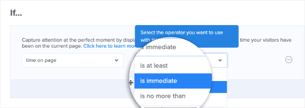
As you can see, the default setting is set to display this Fullscreen campaign after 5 seconds of your visitor being on the page. We’ll want to change Is at least to Is immediate:
And the settings are also set to display on all of your site’s pages, which we recommend keeping.
From there, you’re nearly finished.
All you need to do is set up your email service provider integration if you haven’t already. That way, you can collect all those new leads you’ll get.
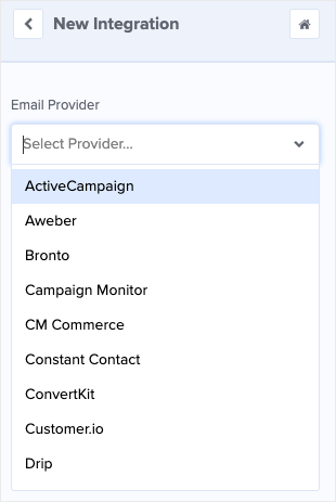
Click on Integrations in your header menu, Add New Integration, and select your provider from the dropdown menu:
NoteCan’t find your email service provider? No worries. Check out this resource on how to connect your email service provider with custom HTML or with a Zapier integration.
We recommend segmenting your email list to make your email marketing strategy all the more effective. That will help you automate your email series with more precision.
For now, just don’t forget one of the most important steps for completing your campaign: Hit Save.
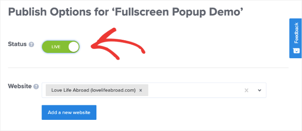
Then you’re ready to Preview and Publish, which can be done from the Publish tab at the top of your editor:
And that’s it. You’ve now updated your customers about changing your business hours with a Fullscreen popup campaign.
The best part is that you may also grow your email list in the process. That will go a long way in strengthening your email marketing strategy. As you know, we here at OptinMonster believe that a robust email marketing list is the best way to increase your business.
We hope you enjoyed this tutorial and, if you did, feel free to share it on the social media platform you use for your business.
Do you have other cool tips for showing your customers about changes in your company? If so, feel free to share it with us on Facebook, Twitter, or leave a message in the comments below.
And if you’re looking for even more tutorials on how to build awesome campaigns just like this one, head over to our YouTube channel. Just don’t forget to subscribe.
Finally, if you read through this tutorial, you’re probably already part of the OptinMonster community. But if not, you really should be.
Don’t wait any longer. Join OptinMonster today to start driving more traffic, boosting your conversions, and increasing your revenue. We’re excited to see you get started.







Add a Comment