Do you want to see a creative use of OptinMonster that both increases email subscribers and provides additional monthly income? It’s always exciting when we see our customers succeed. In today’s case study, I want you to join me in congratulating Joakim Rosén who increased his subscribers by 800% with an innovating popup.

Kampanjjakt is “Sweden’s largest Voucher-code site“, founded back in 2009. Working with SEO and targeting the users in their purchase-process has given them a very high conversion-rate.
However they ran into a problem.
You see, there were times when they didn’t have a voucher for a particular store which would result in them losing a quality lead causing them to spend more money in remarketing campaigns.
Well, that all changed with OptinMonster’s on-site retargeting features.
By combining OptinMonster’s lightbox popups and custom API, Kampanjjakt was able to effectively recover their abandoning website visitors and convert them into customers. Their overall signups increased by 800%.
How Kampanjjakt Started Using OptinMonster
The site is based upon a highly modified WordPress-installation, which means in Joakim’s exact words:
“Getting OptinMonster to work was a breeze, no customization was needed, and we were up and running in no time. Note that we’re only working with the exit-popup to minimize the disturbance to the users.“
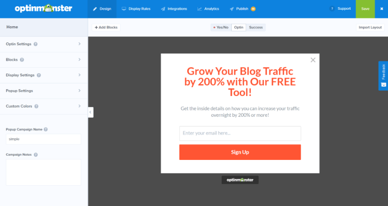
At the beginning they used OptinMonster’s Lightbox Popup Simple Theme, and used Exit-Intent.
The combination of the Simple Theme layout and Exit-Intent provided them a conversion rate of approximately 6% which is very good (and they thought so too, especially in their market!).
However after some A/B split-tests, they increased that conversion to 8% by only tweaking some minor details.
Innovative Popup Customization via OptinMonster’s API
While 8% conversion was great, they wanted even better results. Like any smart marketer, Joakim decided to be innovative and turned to our custom API.
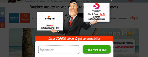
Aside from offering the email subscription field, he added two of their popular vouchers in the popup.
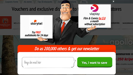
This allowed them to capitalize on users who normally wouldn’t subscribe for emails. You can see the popup in the image below:
See more details about OptinMonster’s custom API
This has proven to be a real success for Kampanjjakt. In short, they added a big image with some transparent form elements positioned on top of it.
In Joakim’s words:
“The integration itself was easy, we built a new theme based on the existing OptinMonster themes, and also built an admin-section where we could enter which vouchers we would like to show with the exit-intent [ed: optin form], using standard WordPress Options-API.
The integration in the themes was then like: get_option(’left_logo’). It took us approximately 1 hour to redesign a theme and integrate these boxes, and since we used the template from OptinMonster, it worked by default to use the fields to send the data to MailChimp.“
Result: They increased the signups on the free-vouchers by 800% with OptinMonster exit-intent lightbox popup which is visible to everyone who visits their site.
OptinMonster Pro Tip from Joakim Rosén
When I posed a question asking for their advice for effectively using OptinMonster, Joakim replied with,
“Do a lot of A/B testing to see what your your visitors’ likes/dislikes, we’ve seen a difference of over 10% between different themes. And also, just don’t mess around with the colors or position of elements, the biggest factor is actually the text/incentive that you show to the user to make them convert.
In Sweden people really hate email marketing, so they are in general careful [ed. “in regards to sharing”] their email somewhere, so be clear [ed. “in”] what will happen to the user if they sign up (number of emails per month etc.)“
If there is any lesson learned from Joakim and his team, it is this: “Think outside the box.”
To paraphrase Joakim, if you add to that mix some page-level tracking of your visitors, and you send automated emails based on what the user actually was interested in during their visit, you have the opportunity to send them a targeted message instead of a general one — therefore, you can greatly increase your conversions.
Results
With their innovative use of OptinMonster to display vouchers, they maintained their high conversion rate while also being able to generate a lot of new, extra income from the two vouchers in the lightbox popup.
- Kampanjjakt increased conversions 800% by offering a free voucher using a lightbox optin.
Summary
Listen to the users, if they provide you with feedback, always take it under consideration.
We really appreciate the ease of use that OptinMonster provides and I strongly suggest to those of you who don’t yet use it, START TODAY!
Joakim Rosén, Kampanjjakt


