Have you ever wondered if simply using a different color or copy can increase your conversions? Sometimes the smallest changes can produce big results. In today’s case study, we’ll highlight Escola EDTI, an OptinMonster customer, who increased conversions by 500% using split testing.
Meet Escola EDTI
Escola EDTI offers Lean Six Sigma and Analytics courses like Green Belt and Lean Manufacturing to professionals who want to improve their knowledge and career positioning. They are located in Campinas, Brazil.
Escola EDTI averaged 12k visits per month but less than 3% of those visits converted into leads. The only points of conversion were downloading an eBook or registering for a course.
With so few conversion opportunities, they knew they had to make the most out of every visit on the site.
EDTI turned to OptinMonster for a solution. Since they used a Brazilian email marketing platform, RD Station, it wasn’t listed in our native integration list which includes 23+ providers like MailChimp, Aweber, etc.
That wasn’t a problem for EDTI, though! Using our Custom HTML Form integration, they were able to easily use a form from RD Station in every optin.
Subscribers Increased 500% Using Split Testing!
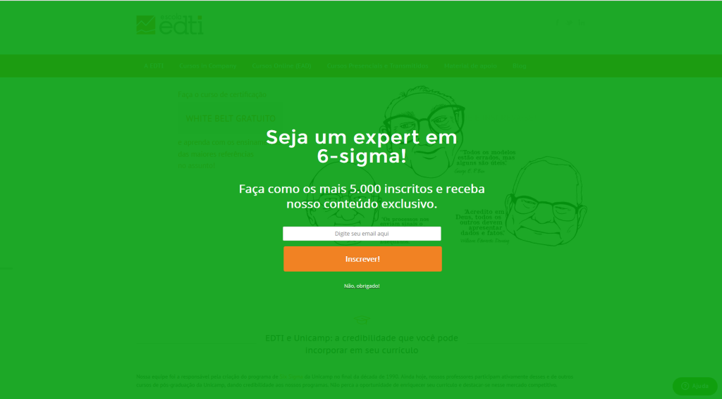
EDTI used a full-screen optin on every page of the website, shown to new visitors three seconds after arriving.
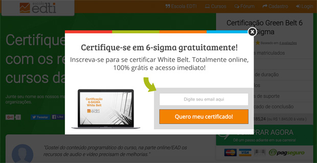
They also used our Exit-Intent Technology on several high traffic pages, offering an eBook or a free course.
Our exit-intent technology tracks the user’s mouse behavior and only show the popup at the precise moment they are about to leave the website.
The optin below was created using our Case Study Lightbox theme, and is triggered upon exit.
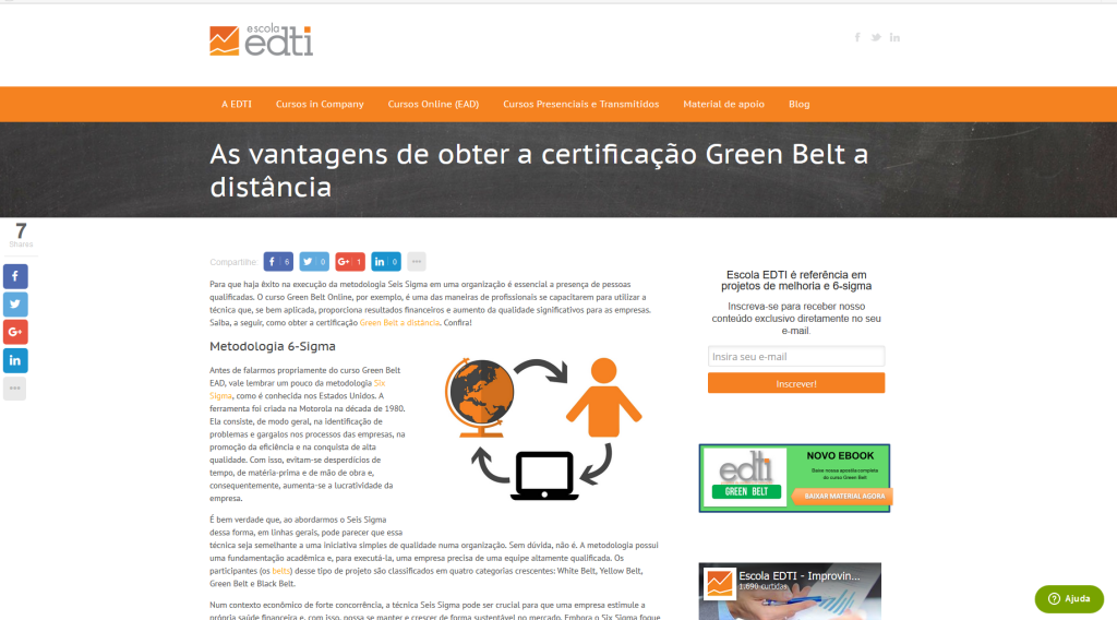
On their blog, they inserted a sidebar optin. They also used split testing on this optin, creating color variations like black, green and orange.
Related ContentHow to Create a Sidebar Widget in WordPress to Get More Subscribers
For more details see: 8 A/B Tests to Run on Your Popups to Get More Email Subscribers.
Orange won with 12% conversions, more than twice the number of subscriptions as the others.
Our split testing feature randomly serves each optin to see which variation has the best conversion. Determining the winner is simple because you have the data right in front of you.
Our conversion analytics track impressions, conversions, and the landing page where the conversion happens. These numbers will clearly indicate which option has the highest conversion for you.
Results
In the first week after launching OptinMonster, Escola EDTI immediately saw their conversions begin to rise.
- Escola EDTI used a fullscreen optin and a sidebar optin to increase conversions 18%.
- Escola EDTI increased conversions 500% in just the first week.
- Escola EDTI totally transformed their subscribers’ list, going from 400 a month to over 2600.
Summary
Even small changes in split tests can result in big wins. Learn more about how to grow your list using split-testing.
It’s simple, but powerful! It’s very easy to configure your first optin. After a few ones, I decided to personalize the popups’ fonts, size and button position and it was very easy with the CSS options. The conversion process, which we thought would be a big problem, was very easy with the blog articles about it and the support team’s help.
Escola EDTI


