Are you frustrated with the number of leads you receive? Are too few people visiting your sales pages to even begin to hit your sales goals?
In this case study, we’ll learn how ChinaImportal.com used OptinMonster to first increase their email list 200%. More importantly, you’ll discover how they used OptinMonster’s Yes/No feature to drive traffic to the most important pages in their funnel, increasing webinar registrations by 18%.
Meet ChinaImportal.com
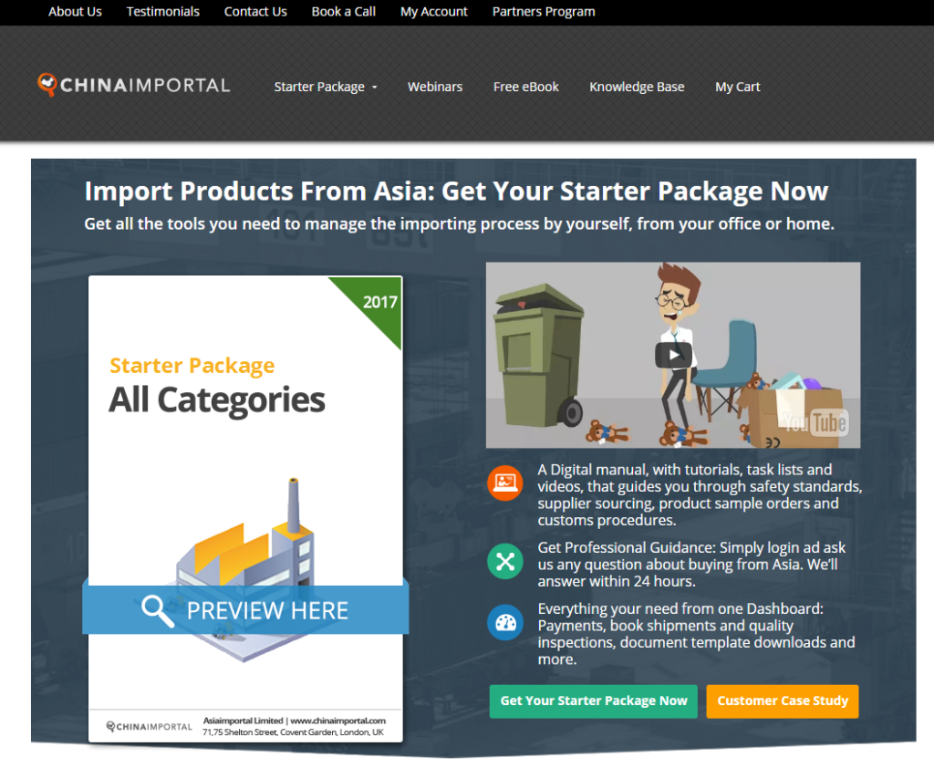
ChinaImportal.com offers standardized solutions for brands, eCommerce companies, and Amazon sellers, importing private label and custom designed products from China.
Their Starter Package includes a digital manual with tutorials, task lists, and videos that guide you through safety standards, supplier sourcing, product sample orders and customs procedures.
How ChinaImportal Uses OptinMonster
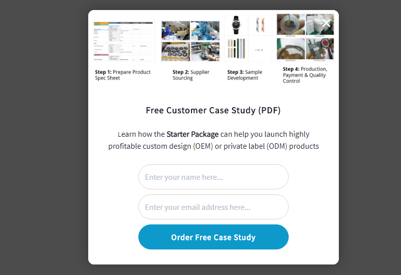
Initially, ChinaImportal’s goal was simply to increase their MailChimp mailing list. They did that easily, growing their list by 200% using optins like this:
This optin triggers using our Exit-Intent technology: it appears after the visitor has been on the page for 30 seconds and then attempts to exit the page.
It converts nearly 11% of abandoning visitors by offering proof in the form of a case study. Case studies are a great way to convince potential customers of the value of your service or product.
After increasing their list size dramatically, ChinaImportal created new goals for their use of OptinMonster.
They wanted to…
- Redirect visitors to webinar registration pages
- Redirect visitors to specific product pages
- Feature discounts on products continuously
While many customers use OptinMonster only to build their email list, OptinMonster can easily be used to offer any unique call to action using our Yes/No optin feature, like redirecting readers to a webinar registration page.
Both the Yes and No buttons can be used, or the No button can be turned off.
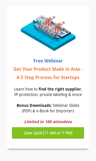
ChinaImportal turned off the No button in the sidebar optin below to present the reader with just one choice:
This sidebar optin converts .18% of readers. While .18% might seem like a poor conversion compared to their other optins, this optin passively adds hundreds of readers to their webinar funnel every month.
Sidebar optins naturally convert fewer readers than other optin types like lightboxes or slide-ins because they don’t interrupt the reader’s attention.
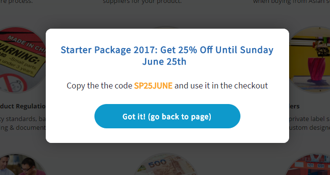
One of ChinaImportal’s other goals was to prominently display available discounts. They did this using coupon codes presented in lightbox optins, along with buttons directing the reader back to the product page.
Many eCommerce platforms provide an option to add a coupon to a product or cart using a unique URL. If yours does, you could eliminate the need to copy/paste the coupon and instead apply it automatically using that URL as the Yes action. This will increase your conversions even further. You can see an example of this in the WooCommerce URL Coupons addon, or Shopify’s Autofill Discount from URL addon.
ChinaImportal.com said,
We love your designs and the fact that we can easily collect statistics from each optin. The stats are not only important for split testing, but also for experimenting with new ideas. Say we try a top bar for a specific goal and it doesn’t drive any traffic. Then we can test the same in the sidebar or with a slide in.
Being able to easily assess how your campaigns are doing is simple in OptinMonster. Our conversion statistics are powered by Google Analytics. They show the number of pageviews an optin receives, and how many times that optin converts.
You can view even more detailed conversion reports in Google Analytics directly. Understanding how to measure conversions in Google Analytics and OptinMonster is key to creating effective split tests.
How ChinaImportal Uses Split Tests
Split-testing with OptinMonster is a breeze. With just a few clicks of the mouse, you can easily duplicate and test one optin against another optin of the same type.
Here are some of the lessons that ChinaImportal learned during split testing:
- Showing the popup after 30 seconds works best for them.
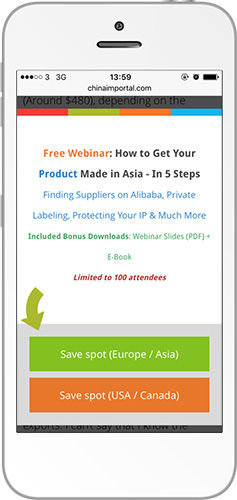
- Adding two options using the Yes/No feature made a huge difference in conversion rate, especially on mobile. The conversions skyrocketed from 2% with one button to 20% with two buttons!
- Simple is better: a simple layout without an image converted better, especially on mobile devices.
You can see the results of what they learned in the mobile optin below:
This optin converts about 7% of mobile users.
Results
ChinaImportal added leads to the top of their funnel using OptinMonster, pushing readers to register for webinars and to download case studies.
- ChinaImportal increased webinar registrations by 18% using Yes/No optins
- ChinaImportant recovered 11% of abandoning visitors using an exit-intent optin
Summary
OptinMonster can be used to build your email list, but has many other uses. Consider using it to redirect visitors to your most popular pages, or to send visitors to a registration page using a two-step optin.
It’s easy to configure, yet extremely flexible. We have used OptinMonster since 2014 for designing and split testing all our popups and sidebar. We highly recommend it!
ChinaImportal.com


