Do you have loads of traffic coming to your site, but your list is unfocused and filled with a huge variety of subscribers? Do you find it hard to speak to the variety of subscribers on your list because their interests vary so greatly? In this case study, we’ll discover how BrianTracy.com solved this problem and increased their list 150% in the process.
Meet Brian Tracy
Brian Tracy is recognized as one of the top personal success, productivity, and sales training authorities in the world today. He has authored more than 70 books and produced more than 500 audio and video learning programs.
His marketing partners, Brandetize manage all aspects of his online business and have done so since 2001. Ryan Moore from Brandetize talked with us about how they use OptinMonster at BrianTracy.com.
How Brian Tracy Increased Conversions 150% Using Content Upgrades
Ryan says that before using OptinMonster, they were collecting around 2,000 subscribers a month from the blog at BrianTracy.com. Their main goal was to get better at converting their existing traffic.
In particular, they wanted to capture visitors who were about to leave the site without subscribing. Over 67% of visitors to a site leave without taking an action. Ryan knew they had to at least try to retain some of those visitors.
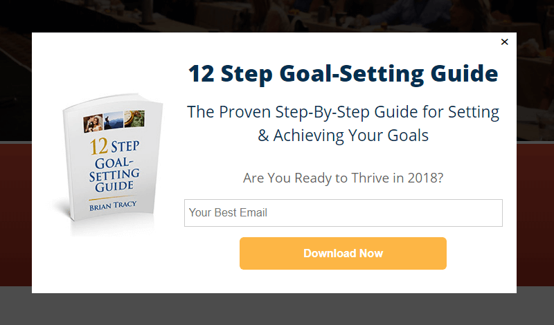
To start, they added a lightbox optin to the homepage that appears only when the visitor’s mouse motions towards the browser bar. That motion signals their intent to exit the site, whether by reaching for back button, or to type another URL in the browser bar. Our signature exit-intent technology triggers the optin below at the exact moment the visitor attempts to leave:
This optin retains and converts 6.8% of visitors. It adds thousands of new visitors to the BrianTracy.com email list who would have left without a trace otherwise.
Ryan was off to a great start on the BrianTracy.com site, and dove in to creating even more opportunities for visitors to subscribe.
Segmenting Leads Using Content Upgrades
The blog at BrianTracy.com is divided into multiple categories like personal success, business, and book writing. Ryan decided to create unique lead magnets for each of those categories. A lead magnet is a valuable piece of information like a checklist, ebook, or coupon, offered in exchange for an email address.
When a lead magnet is specific to the content the reader is viewing at the time, it is called a content upgrade. Content upgrades are a great tool for segmenting your visitors by interest. Later, you can create customized, automated emails based on those interests.
Segmenting visitors is worth your time, too. Personalized emails deliver 6X higher transaction rates. Segmented email campaigns also get higher open rates, more clicks, and lower unsubscribe rates than non-segmented campaigns.
Let’s take a look at one specific category of content to see how Ryan uses OptinMonster to segment leads at BrianTracy.com.
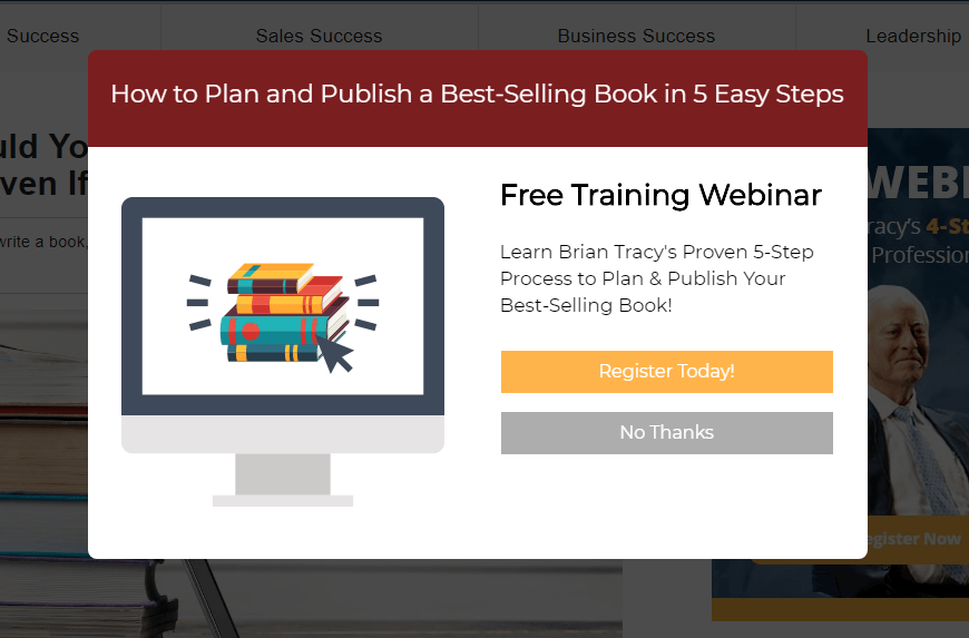
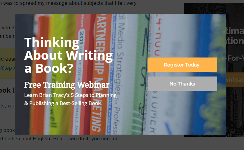
The optin below is targeted to display to visitors reading any article in the book writing category. It appears only when the visitors attempts to exit the site. When the visitor clicks the Register Today button, they are redirected to the webinar registration page.
This optin convert 6.88% of visitors.
That’s a great result, but Ryan wanted to try for more. He created a split-test, comparing the results from the optin above to the one below.
The same copy is used in each optin, but the order is different. Also, the background image is different.
This optin nearly doubled the conversions of the variation, converting 11.8% of abandoning visitors.
Split testing is super easy using OptinMonster’s A/B testing.
Every element of your optins can (and should) be split-tested. From the offer, to the headline and copy, to images and colors… even the smallest change can sometimes have surprising results.
Ryan uses our Floating Bar optins to communicate important, time-sensitive news and offers, like the one below advertising a special on a course about goal-setting. It appeared only to new visitors, after they’d been on the site for at least three seconds.
It converted 1.58% of visitors.
Ryan split-tested the offer, changing only the button copy from “Learn More” to “Shop Now.”
The new variation converted 9.05% of visitors, a 472% increase!
Once Ryan had success using the optins above, he began implementing similar offers across every category on the entire website.
Before using OptinMonster, BrianTracy.com collected around 2,000 subscribers each month. Now, they receive more than 4,500 every month. That’s a 150% increase.
Ryan said,
The biggest improvement we’ve seen using OptinMonster is in consistency from using the platform. It’s tough manually building popups and managing popups with different functionalities and rules on our websites. Keeping all of our popups in OptinMonster makes everyone in the company’s lives easier.
Results
Powerful features like our split-testing and exit-intent technology have made it easy for the team at BrianTracy.com to see huge improvements in conversions.
- BrianTracy.com increased their email list 150% using OptinMonster.
- BrianTracy.com increased conversions 472% using our simple split-testing.
- BrianTracy,com captured 11.8% of abandoning visitors using an exit-intent offer.
Summary
Use your existing content as a guide for segmenting your list by making offers specific to the content. Then, split-test those optins to dramatically increase conversions.
In my opinion, OptinMonster does everything better than other similar platforms. Before using OptinMonster, we were collecting around 2,000 subscribers a month from the blog at BrianTracy.com. Now, we collect around 4,500.
Ryan Moore, Content Manager, Brandetize


