Are you looking for the best signup form examples online that you can use for inspiration?
The right signup form is crucial in reaching your marketing goals. Not only does your offer need to entice your target audience, but the signup form you use needs to be sleek and professional.
But how do you know which signup form would be best for your site?
That’s the question we’ll answer in this article as we look at the 35 best examples of signup forms.
Because this is such an in-depth guide with so many signup form examples, we’ve broken the signup forms into the following categories:
- Lightbox popup
- Floating bar
- Fullscreen welcome mat
- Sidebar widget
- Inline campaign
- Slide-in scroll box
- Gamified wheel
What Is a Signup Form?
A signup form allows website visitors to join your marketing list by submitting their contact information.
The signup form can be a web page, popup, or modal. Most signup forms include simple input fields such as name, email address, and phone number.
Signup forms help e-commerce marketers generate leads that they can use later in their marketing automation.
Now, let’s jump into our list!
Lightbox Popup Signup Form Examples
Lightbox popups are one of the best ways to grab your visitor’s attention, build your email list, and share a targeted ad message.
Below are signup forms examples of websites using OptinMonster’s lightbox popups.
1. Shotkit
Shotkit is a photography platform that started creating discounts and newsletter signup forms for its website. This newsletter signup example was the second part of a Yes/No campaign:
The messaging worked well with the target audience, converting at a rate of 5.77%.
Check out this article to learn more about how Shotkit used signup form examples like these to generate over 40+ new leads per day.
2. Shockbyte
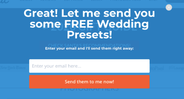
Shockbyte is another company that had great results with a lightbox popup signup form:
They used a lead magnet (the coupon code) to motivate people to sign up. Then, they added Exit-Intent® Technology to capture abandoning visitors.
This signup form example converts at a whopping 13.73%.
Learn more about how Shockbyte used this signup form and increased revenue by 52%.
3. Adam Enfroy
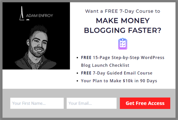
Adam Enfroy is a successful internet blogger. In 2019, he grew his mailing list to over 11,000 subscribers. Now, his blog generates over $80k every month. And it all started with a simple signup form:
You can learn more about how Adam used signup form examples like these to grow his business.
4. Cosmetic Packaging
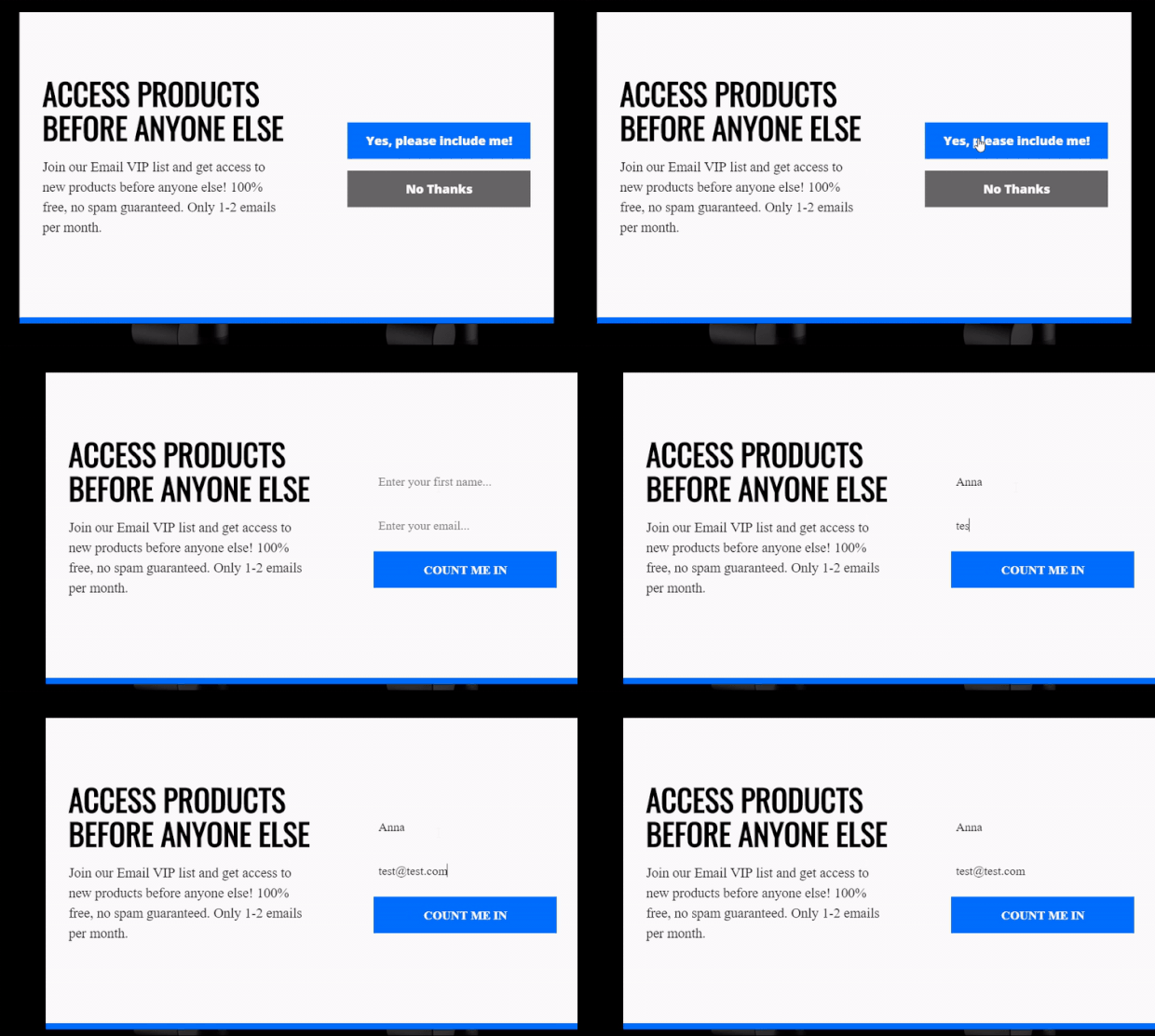
Cosmetic Packaging used a Yes/No signup form. This is excellent for boosting conversion rates because it doesn’t ask for information immediately. Instead, it poses a non-intimidating “yes or no” question:
Once the user clicks the Yes option, the signup form appears.
This one campaign increased their email signups from 396 subscribers to 2,985. Check out how they did it here.
5. Christopher Place
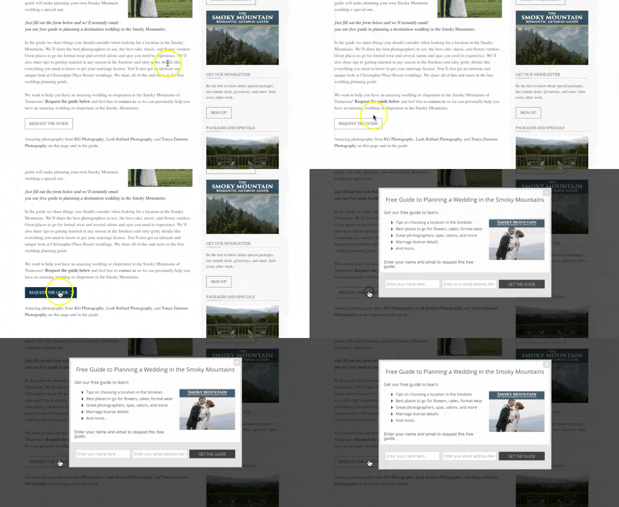
Christopher Place is an upscale B&B and wedding venue in the Smokey Mountains. They began using a clickable signup form (using MonsterLinks™). This meant the signup form only appeared when a user clicked the link:
This leads to higher conversions because people who click to see the campaign are highly interested in the product or service offered.
This signup form example converts nearly 6% of the site’s traffic. Learn more about how they did it here.
6. Crossrope
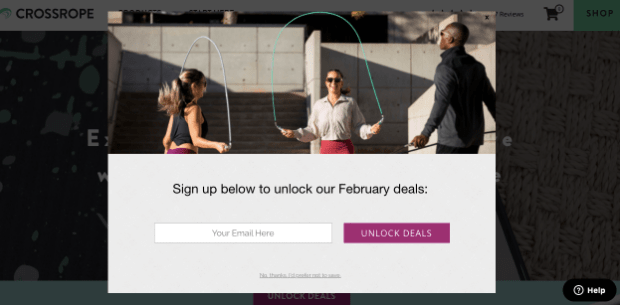
Crossrope is a fitness company that specializes in jump rope workouts. They started using signup forms to boost newsletter subscribers with campaigns like this:
As a result, Crossrope exploded their email list by 900%.
They also recovered 13.71% of abandoning site visitors and 7.65% of abandoned carts.
You can have similar results with the right signup form, too.
7. BrianTracey.com
Brian Tracey is a top speaker, motivator, and sales trainer. He uses signup forms to grow his email list and get more subscribers. Here’s an example of a signup form he uses:
This campaign converts 6.8% of visitors who see it.
Check out how Brian used signup forms like this to grow his list by 150%.
8. Woodside Communities
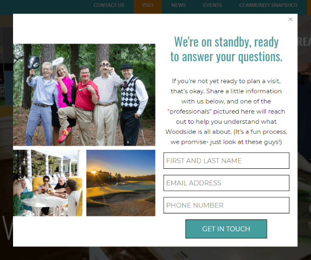
Woodside Communities has three real-estate developments. They used a signup form to gather information about prospective leads who were interested but not ready to buy. Here is the signup form example they used:
And their hard work paid off. This campaign converts at 3.57%.
One of the leads they captured brought a new client and generated over $295,000. That’s a great ROI from a simple signup form.
9. Downtown Orlando
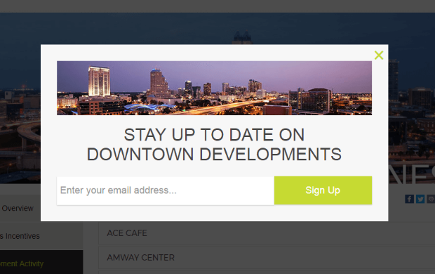
Downtown Orlando’s goal is to get more people involved with the community and nightlife of their town. But to get people more involved, then need to keep them informed. They do so with a newsletter signup example like this:
This campaign converts 2.27% but gives them dozens of new targeted leads every month.
Check out how they used these signup forms to grow over 4,000 subscribers in one year.
Floating Bar Signup Form Examples
Floating bars are sticky footer or header bar optins for marketing campaigns that are proven to boost email signups and sales without disturbing visitors.
Below are signup forms examples of websites using OptinMonster’s floating bar popups.
10. Crush Empire
Crush Empire is a website that helps students apply for and “crush” the CPA exam. They used a floating bar 2-step sign up form:
When potential students click the button Get Discount, they can enter their name and email address to redeem their coupon.
This optin converts 4.4% of visitors. Check out how Crush Empire used these signup forms to generate 460 sales in just one year.
11. AutoAnything
Though the signup form example is difficult to see, the results are impossible to ignore. AutoAnything made a floating bar for their website:
This signup form example is subtle, even for their site, but it had lots of success.
Between this and other campaigns, AutoAnything generated a nearly 2.5x increase in daily optins.
Read about how they did it here.
12. WPForms
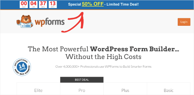
WPForms is the world’s #1 form building plugin. They make it easy for WordPress users to create professional-looking forms with powerful features in minutes. They use a floating bar on their pricing page to boost sales:
You’ll notice they have a countdown timer. This is a great way to build a sense of urgency and motivate users into action.
You can use floating bars like this to show your coupon. When customers click on the campaign’s call to action button (CTA), you can display your signup form.
Once you have their email address, you can send them the coupon code to redeem their offer.
If the world’s best form builder plugin uses floating bars, you might also want to consider it for your site.
13. Kennedy Blue
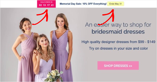
Another floating bar signup form example is with Kennedy Blue. They also used a countdown timer to build urgency:
Users can enter their name and email address when they click to redeem the coupon.
14. Brand Glow Up
Brand Glow Up (formerly known as TwelveSkip) used a floating bar to collect new leads:
This signup form example uses a lead magnet to entice their target audience. It also has a playful CTA button with the text “Gimme Now” that carries the brand’s unique voice.
Fullscreen Signup Form Examples
Fullscreen welcome mats turn any page on your website into your highest-converting page with an attention-grabbing call to action your visitors can’t ignore.
Below are signup forms examples of websites using OptinMonster’s fullscreen welcome mats popups.
15. Singularity
Singularity provides this signup form example to remind guests about an upcoming event:
Over nine months, this single campaign generated 967 new subscribers over four different pages.
Check out how Singularity got such massive results.
16. RocketBots
RocketBots is an AI platform that enables companies to manage and respond to customers via live chat. They created this simple fullscreen welcome mat, and the results were inspiring:
This campaign converts 7.33% of visitors.
Learn more about how they did it here.
17. Mad Money Monster
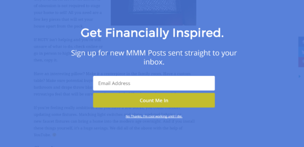
Mad Money Monster is a site dedicated to helping people get back on the right financial path. They made this fullscreen campaign to get more subscribers:
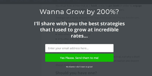
What we love is how straightforward the copy is. In just a few words, Mad Money Monster used this campaign to grow its email list drastically.
18. The Spinsterz
This company believes that adults should play, have fun, and exercise through movements with hula hoops. And while they might play hard, they’re also clever business operators.
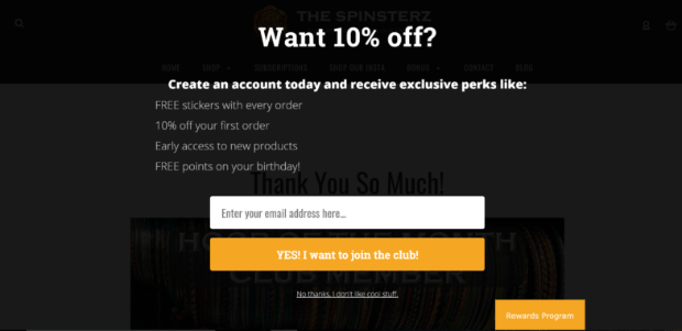
Here’s the fullscreen signup form example they use:
They can get new subscribers and boost sales by offering a discount as their lead magnet.
19. Pierre Lechelle
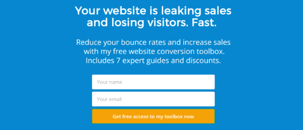
Pierre Lechelle specializes in marketing for SaaS companies. He uses fullscreen signup forms like the one below to get new leads:
When users sign up, he can successfully follow up with them by using email marketing best practices.
20. Rich Page
Rich Page is a conversion optimization specialist who offers to help people increase their conversions. He used the following fullscreen signup form example:
In the end, Rich Page increased his conversions by 225%. He then boosted that to 316% with A/B testing.
Learn more about Rich Page’s success here.
Sidebar Widget Signup Form Examples
Sidebar forms turn every page of your website into a lead generation opportunity with discreet yet high-converting sidebar campaigns.
Below are signup forms examples of websites using OptinMonster’s sidebar forms widget.
21. OptinMonster
We’d use ourselves as an example for this one. We use a sidebar widget signup form on blog posts:
While conversion rates aren’t as high for sidebar widgets, they pick up low-hanging fruit on people who want to subscribe to your post but don’t know how.
That’s because sometimes people close your optin campaigns (like a popup, for example) without signing up.
But by adding a signup form to the side, you can improve user experience (UX) for people who change their minds about subscribing to your site.
22. MonsterInsights
MonsterInsights is the best Google Analytics plugin on the market. And if they’re using sidebar signup forms, you know it’s a winning strategy.
They use the sidebar widget to collect new subscribers throughout their site.
23. Louise Meyers
Louise Meyers is a social media and visual marketing consultant. She uses a 2-step sidebar signup form:
Users can enter their contact details to download the lead magnet when they click on the sidebar campaign.
24. Wholesale Suite
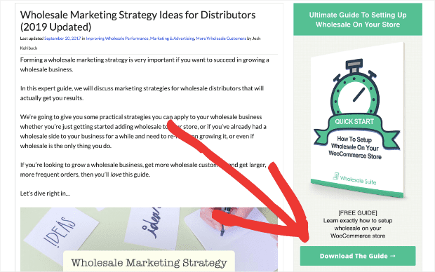
Wholesale Suite is a plugin that helps WooCommerce store owners add wholesale pricing to their product pages:
They also use a 2-step signup form and their free guide as a lead magnet.
Their sidebar form also has a large image to capture their readers’ attention.
25. Neil Patel
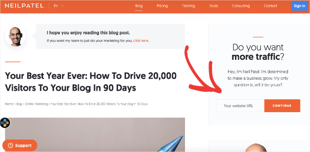
Neil Patel is an online digital marketer who’s made a name for himself, helping blogs grow. You can see his exciting signup form example below:
Rather than asking for contact information, he asks for the visitor’s website URL. This starts the signup process, and Neil can gather more data like name, email address, and more later on.
Again, when a marketing guru like Neil Patel uses a strategy, you know it’s winning.
Inline Campaign Signup Form Examples
Inline forms convert more visitors into subscribers and customers by seamlessly targeting website visitors already engaged in your content.
Below are signup forms examples of websites using OptinMonster’s inline forms.
26. Shawnee Mission Post
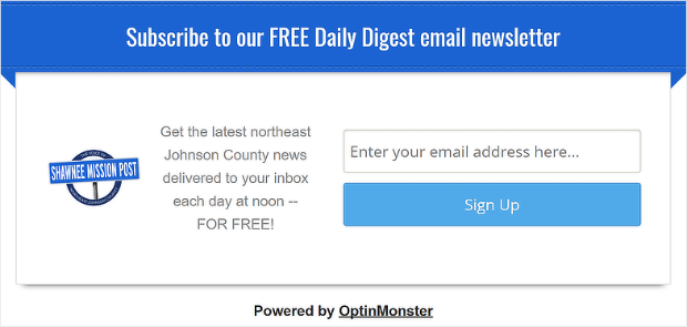
Shawnee Mission Post is a local newsgroup that runs an online blog and newspaper. They use this inline campaign email signup to get more subscribers:
By adding this signup form example directly to their site’s content, they’re more likely to grab their readers’ attention.
27. Advisor Coach
Advisor Coach is a private consulting firm run by James Pollard. He uses this inline campaign to get new leads:
And it’s been very successful.
With campaigns like this (along with a few others), Advisor Coach converted 58.33% of their readers.
28. Lilach Bullock
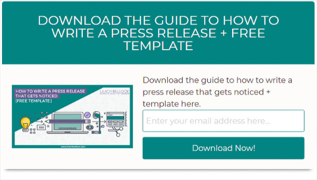
Lilach Bullock is an entrepreneur and business owner. She helps companies and businesses of all sizes improve their online marketing strategies. Here’s the inline signup form she uses:
What’s great about this is that she uses repetitive language in all the signup forms across her site.
By doing so, she converts 57% of new website visitors and grows over 1000 new subscribers monthly.
29. Blog Tyrant
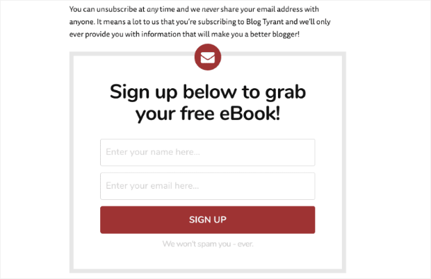
Blog Tyrant specializes in helping solopreneurs and businesses build successful blogs. One of the techniques they use is with an inline campaign like the signup form example below:
Again, by putting this directly in their blog posts, they make sure that readers won’t miss the chance to sign up.
30. Whole Whale
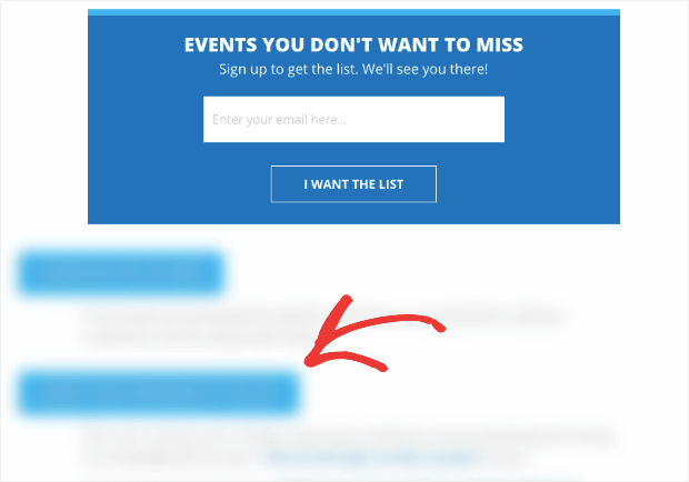
Whole Whale uses an inline campaign for their signup form, but with a twist. They give some of their content away for free, but they use a content locker to hide exclusive content for members:
This is a great way to turn your regular content into an email-growing machine.
The strategy worked so well that Whole Whale increased email signups by 100% and saw an overall boost in conversions by 62%.
Slide-in Scroll Box Signup Form Examples
The slide-in scroll box is a high-converting alternative to popups for increasing conversions, so you can grow your email list and make more sales.
Below are signup forms examples of websites using OptinMonster’s slide-in scroll box.
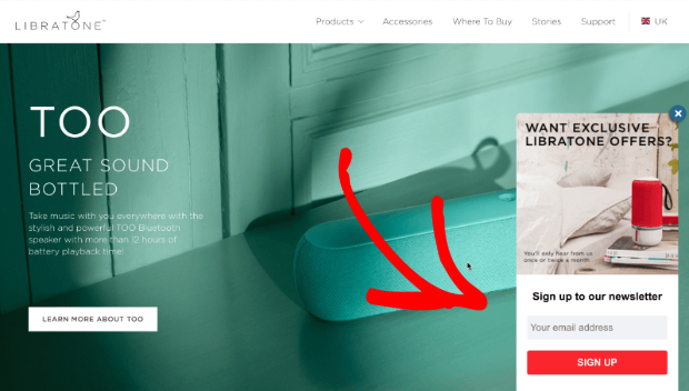
31. Libratone
Libratone used a slide-in scroll box to present their signup form to customers. Here’s what this looked like:
From this campaign and others like it, they boosted signups by 400%.
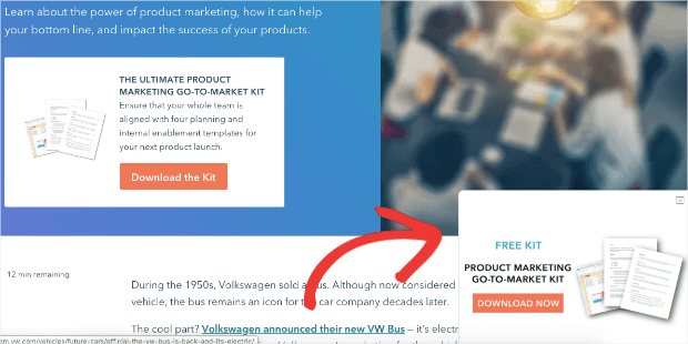
32. HubSpot
HubSpot is a site dedicated to helping online marketers. They added a slide-in signup form and used their free eBook as a lead magnet:
Users can enter an email address to get the free guide when they click Download Now.
They put this on popular blog posts, pages, and other areas where the lead magnet would appeal to their target audience.
This kind of personalized placement is what can make slide-in signup forms so effective.
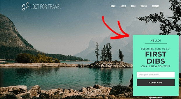
33. Lost for Travel
Lost for Travel is the story of a solo traveler who helps the communities she visits. Her slide-in signup form example looks like this:
This is an excellent idea for small businesses or entrepreneurs trying to grow their email list.
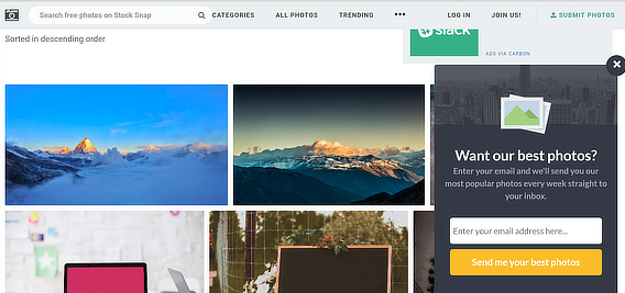
34. StockSnap
StockSnap is an online community that provides free stock photos for users. They use a slide-in signup form to send photos to members:
This can be a great way to nurture leads and keep people coming back to your site.
Gamified Signup Form Examples
Gamified forms turn your onsite campaigns into engaging and interactive spin-a-wheel games, proven to multiply sales and conversions instantly.
Below is a signup form example of OptinMonster’s spin-to-win wheel.
35. Spin-to-Win Wheels
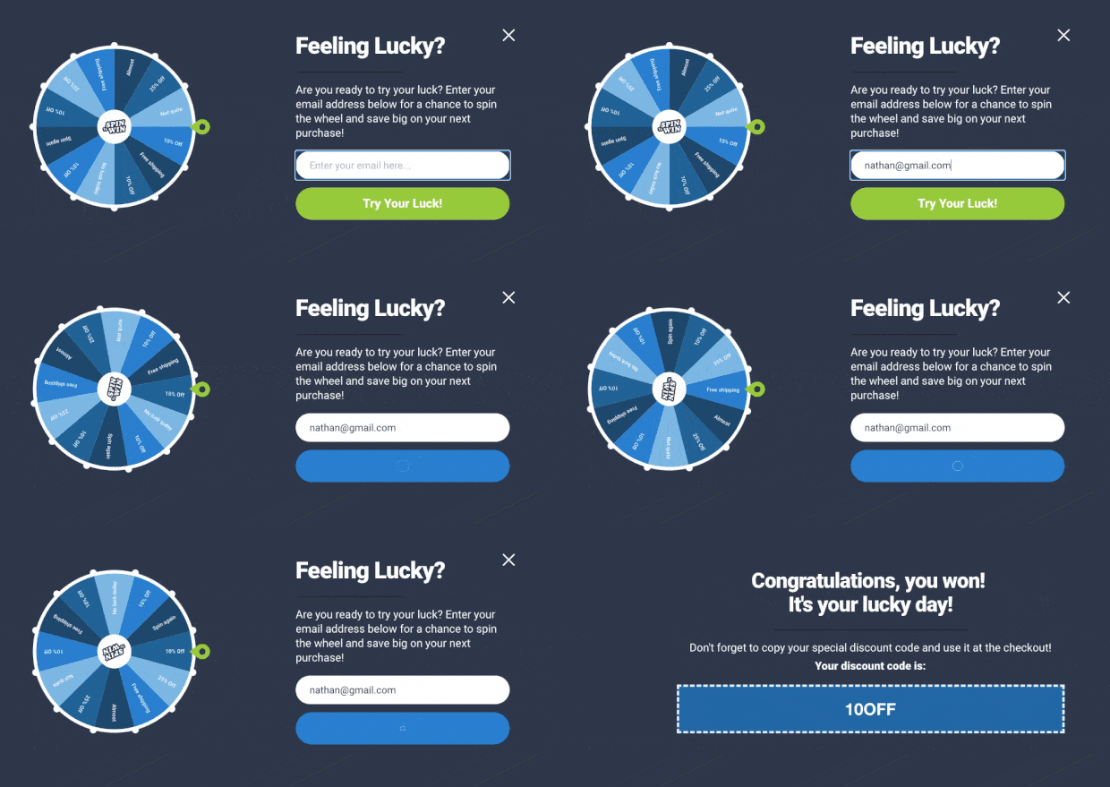
Rather than a specific company, we thought we’d show a spin-to-win wheel that anyone can use:
This was created with OptinMonster in under five minutes.
These gamified signup forms are an excellent way to grow your email list. Plus, they’re super easy to make.
Check out this resource for more details: How to Create a Spin-to-Win Optin to Boost Engagement.
And that’s it! These have been the best signup form examples from across the web.
How To Create a Signup Form?
All of the signup form examples above can be built using OptinMonster:
OptinMonster is the world’s #1 lead generation software that makes it easy to create professional signup forms in minutes, with no coding skills required.
With OptinMonster, you can start with over 100+ prebuilt templates that look great on mobile, desktop, and tablet devices. And thanks to its drag-and-drop builder, these templates only take a few minutes to customize to your site.
You can also do more than just capturing contact information by adding custom fields like:
- Radio buttons
- Checkboxes
- Dropdowns
- Text Areas
- And more!
Then you have powerful display rules that allow you to determine when, where, and to whom your signup forms will appear.
This lets you personalize your message to make sure you’re showing campaigns to the right people, in the right places, and at the right time in their customer journey.
Doing so will give you a guaranteed boost in conversions.
Want to try it out for yourself? Click below to start your 100% risk-free OptinMonster account today:

















Add a Comment