When you’re starting out with lead generation, how can you figure out which type of optin form will work best for you? Knowing which optin types are available and when to use them will make your list building strategy more successful so you can grow your business. This article will help you choose the perfect optin type to increase conversions from your site.
Create Your Optin Offer
Before you choose your optin type, it’s important to decide exactly what you’ll be offering subscribers. Here’s how to get started.
1. Know Your Goals
Different people want to achieve different things from their optins. Maybe you want to gain more social media followers and fans. Or perhaps you’re trying to build a community around your business as a longer term lead generation strategy.
You could create an optin with the goal of promoting a particular product or service, or maybe you’re simply thinking about generating leads you can capitalize on to grow your business.
2. Decide on the Audience
Your goals might vary depending on your target audience. Let’s face it; Amazon doesn’t send the same email to every customer, and neither should you. Just to give a few examples, think about whether your optin will target:
- All new site visitors.
- Repeat visitors who might need an incentive to sign up.
- Existing customers or people who are already connected with you.
- People referred from an external promotional activity, such as an ad, social ad or guest post.
- People located in a particular country or geographical area.
Segmentation will make your email marketing strategy more effective and will boost conversions. Check out our article on 50 Ways to Segment Your Email List Like a Pro for help with this.
3. Choose Your Lead Magnet
Next, you’ll need to decide what exactly you want to offer your target audience. Some optin offer ideas include:
- Free products and services
- Ebooks that solve customer problems
- Checklists and worksheets
- Community membership
If you’re stuck, we’ve got a great list of lead magnet ideas you can use for inspiration.
4. Pick an Annoyance Level
Ever visited a site where there were so many popups and slide-ins that you didn’t even know where to look? We have too.
While there’s no denying that popups work, using too many will backfire on you, raising your bounce rate and tanking your conversion rate. That’s why, when choosing your optin type, you’ll have to strike the perfect balance between annoying your visitors and meeting your goals.
The best option is to make sure your popups don’t suck by using rules to dictate when and where your optins appear and who sees them.
Selecting an Optin Type
Now you’re almost ready to create your first optin.
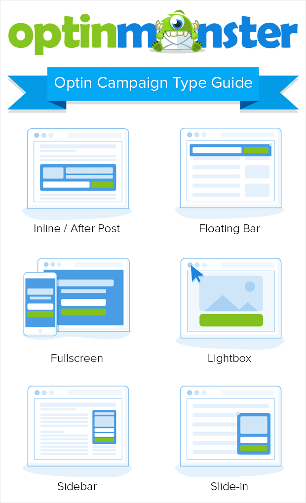
There are several optin types to choose from.
Here’s a rundown of the different types you can create, and their strengths and weaknesses.
After Post
An after-post optin, also known as an inline optin, is an optin box that appears at the end of your post. If people read all the way to the end of a piece of content, they usually like it, so that’s a good time to put an offer in front of them.
After-post optins are also great because they don’t interrupt users but still get their attention. And, of course, they work well for offering content upgrades.
If you don’t mind interrupting your readers, you can use an inline content lock. This allows people to read part of your content, but hides the rest till they sign up. If you produce high quality content, readers will be happy to subscribe to access more.
Pros:
- Great for readers who are already engaged.
- Can reawaken interest as people are about to leave.
Cons:
- Unless people read the whole post, they’ll never see it.
- Visitors to your home page won’t see the optin.
Floating Bar
A floating bar is also called a ribbon, a header bar or a footer bar. It typically sits at the top or bottom of the page, sometimes staying in place as users scroll. This optin type floats above the content so it doesn’t affect the user experience. You’ll need to pay attention to your conversion rate to see if this optin is too subtle for your audience.
Pros:
- Works well for regular visitors looking for your latest offer.
- Doesn’t interrupt your visitors.
Cons:
- So subtle that some people might miss it or ignore it.
- Not a great incentive for new visitors.
Fullscreen
A fullscreen optin is an overlay that covers your content and puts your optin offer in front of visitors as they land on your site. Also called a fullscreen takeover, welcome gate or welcome mat, this optin type usually appears before people get to see your content, but also works with exit-intent technology to grab their attention when they are about to leave.
Pros:
- A definite attention-getter.
- This type works well for site introductions.
Cons:
- If used on pages other than the home page, it’s a major interruption for visitors.
Lightbox
A lightbox optin puts a semi-opaque overlay over page content, while highlighting your popup. Lightboxes definitely get attention, so it’s no surprise that lightbox optins are among OptinMonster’s highest converting popups.
Pros:
- Can re-engage visitors who are about to leave.
- Works well on any page.
Cons:
- Can take visitors’ attention away from your content.
Sidebar
No prizes for guessing where to put a sidebar optin – in the sidebar of your website! This is a narrow optin suitable for the widget area of a WordPress-based site, but you can also embed the code can in non-WordPress sites.
Sidebar optin placement is both a strength and a weakness. Since sidebars show on most pages, people can see the optin wherever they are on your site. However, that also means they may become blind to it after a while.
Pros:
- Makes sure your offer is always visible.
- Doesn’t interrupt your visitors.
Cons:
- Might be a blind spot for repeat visitors.
Slide-In
Slide-in forms appear from the bottom left or right of the page on top of content. While you can use them to highlight your lead magnet, they also work well for enticing people to read a related piece of content.
Using the slide-in optin type allows you to avoid interrupting visitors while still keeping your content in front of them. They also work well with exit-intent technology to grab people’s attention before they leave your site.
Pros:
- Grabs attention without interrupting the reading experience.
- A common way to show off related content.
Cons:
- If you show it too early, people might ignore it.
Mobile
Did you know that more than 40 million people will only use a mobile device to access the internet this year?
That’s why it’s crucial to use mobile optins as well as other optin types. If you don’t, you’ll lose a growing number of potential customers who want optins that work well on the devices they use.
Pros:
- Enables you to get the attention of the growing number of mobile users.
Cons:
- Optins that fill small screens can be annoying.
Optin Form Design and Placement
When you’ve decided on an optin type, it’s time to design your optin form. You can customize existing templates to suit your needs.
The simplest optin forms have an email entry box, a brief message and a button, but you can make yours more appealing by adding an image. Depending on how you want to use the form, you can add other features as needed.
It’s always a good idea to make your form visually appealing, and make sure that your CTA stands out. If people can’t see it, how will they click on it?
Where to Place Your Optin Form
We’ve mentioned a couple of typical optin form locations above, but let’s recap quickly:
- The sidebar’s a good location to make sure people can see your optin wherever they are on your site.
- The end of your content works for those who are engaged with what they are reading.
- In the middle of content works for high-value content.
- At the top or bottom of the page also works to keep the optin available at all times.
- Covering your content with a fullscreen optin is a great attention-getter.
Don’t forget about popups, which really help to recover abandoning visitors. You can configure your optins to appear after people scroll down a page, after they’ve been on your site for a while or just as they’re about to leave.
You’ll have to use split testing to find out which optin types work best. Never assume a particular optin type, copy or placement is working. Let the data show you and guide your strategy.
Rules for Creating a Good Optin
If you want to create the perfect optin, there are a few guidelines to follow.
First, match up your idea, audience and format, and remember to test to get the balance right. The best optin lead magnets offer to solve a single problem for users. Avoid having optins with multiple calls to action (CTAs); your visitors are likely to get confused.
Make sure your lead magnet is easy to access and use so that when a visitor hits the button, they immediately get what you’ve promised.
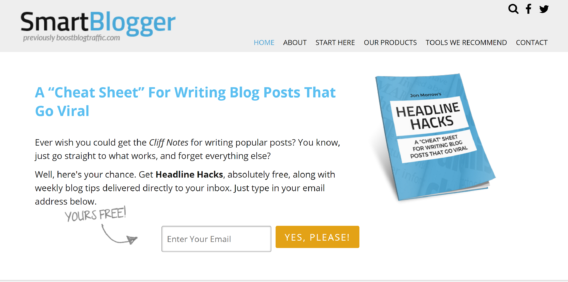
SmartBlogger has a box at the top of the page to promote his headline cheat sheet. A full page lightbox appears when you’re about to leave the site. The optin copy highlights just one issue, which people can start to solve the moment they get the ebook.
As in the example above, you’ll also need great optin copy on your site to give people a reason to optin.
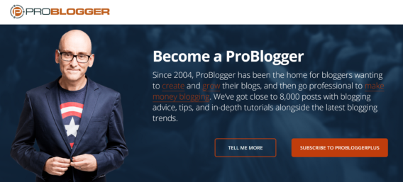
For example, you can include social proof to show your value, as Darren Rowse’s ProBlogger site does on the home page. His site says how much content is on the site, how many people subscribe and how long he has been giving advice on professional blogging. This makes signing up for his email list a no-brainer, which exactly the effect you want with your own optins.
Limit what you ask for. People can be scared of filling in long, complex forms. In most cases, shorter forms work better, or you can use multi-step forms to reduce the intimidation factor.
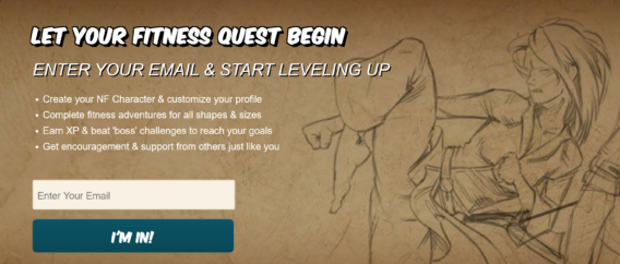
That’s even more important on mobile devices, where keeping it simple is the best option. Once people are on your email list, you can always get more information later. In the example below, Nerdfitness just asks for an email address.
Make your optin form visible, because people expect to see it. They may come to your site looking to sign up for your email newsletter or grab a download. Don’t make them search for your optin form, or you’ll lose them.
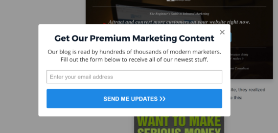
Campaign Monitor advises you to use frictionless words on your optin buttons. Words like “buy” and “submit” don’t have the same appeal as something like “give me the free resources”. It seems when people can take ownership of the action, conversions increase. Instapage uses this technique for its popup:
Examples of Good Practice
Now you’re ready to put an optin on your own site, but before you do, take a look at these examples of email popup best practices.
Digital Marketer used a countdown timer with a floating bar to create a sense of urgency, getting a conversion rate of 8.45% for this optin:
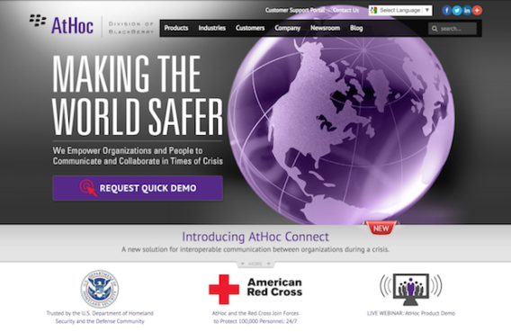
At Hoc used a lightbox optin to get more people to sign up for product demos, increasing sales qualified leads by 141%:
WebMechanix used an exit-intent popup to retain 1281 abandoning visitors in a single month.
FitSmallBusiness got a 1900% increase in subscribers by segmenting the audience and targeting optins.
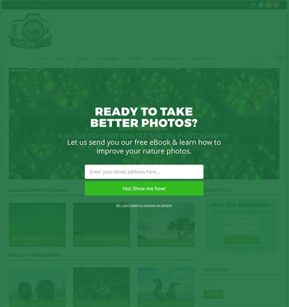
NatureTTL boosted optins by 800% with a welcome gate.
Now you’ve got everything you need to help with choosing the perfect optin type for your business. Take the next step with our beginner’s guide to email marketing. And don’t forget to follow us on Twitter and Facebook so you never miss one of our guides.







Add a Comment