Have you ever wanted to know how Pros improve their conversions and get more email subscribers? You’re in for a treat. In this case study, we’ll share how Social Media Examiner added 250,000 new email subscribers using OptinMonster.
Meet Social Media Examiner
Social Media Examiner doesn’t need an introduction, especially if you are in the marketing space.
But in case you’ve never heard of it, Social Media Examiner is the world’s largest social media marketing resource on the web. They help millions of businesses discover how to best use social media to connect with customers, drive traffic, generate awareness and increase sales.
They are the host of the industry’s leading conference, Social Media Marketing World and the Social Media Marketing Podcast.

He was kind enough to sit down with us and share how his team is increasing subscribers using OptinMonster so everyone in our community can learn from their experience.
A Little Background
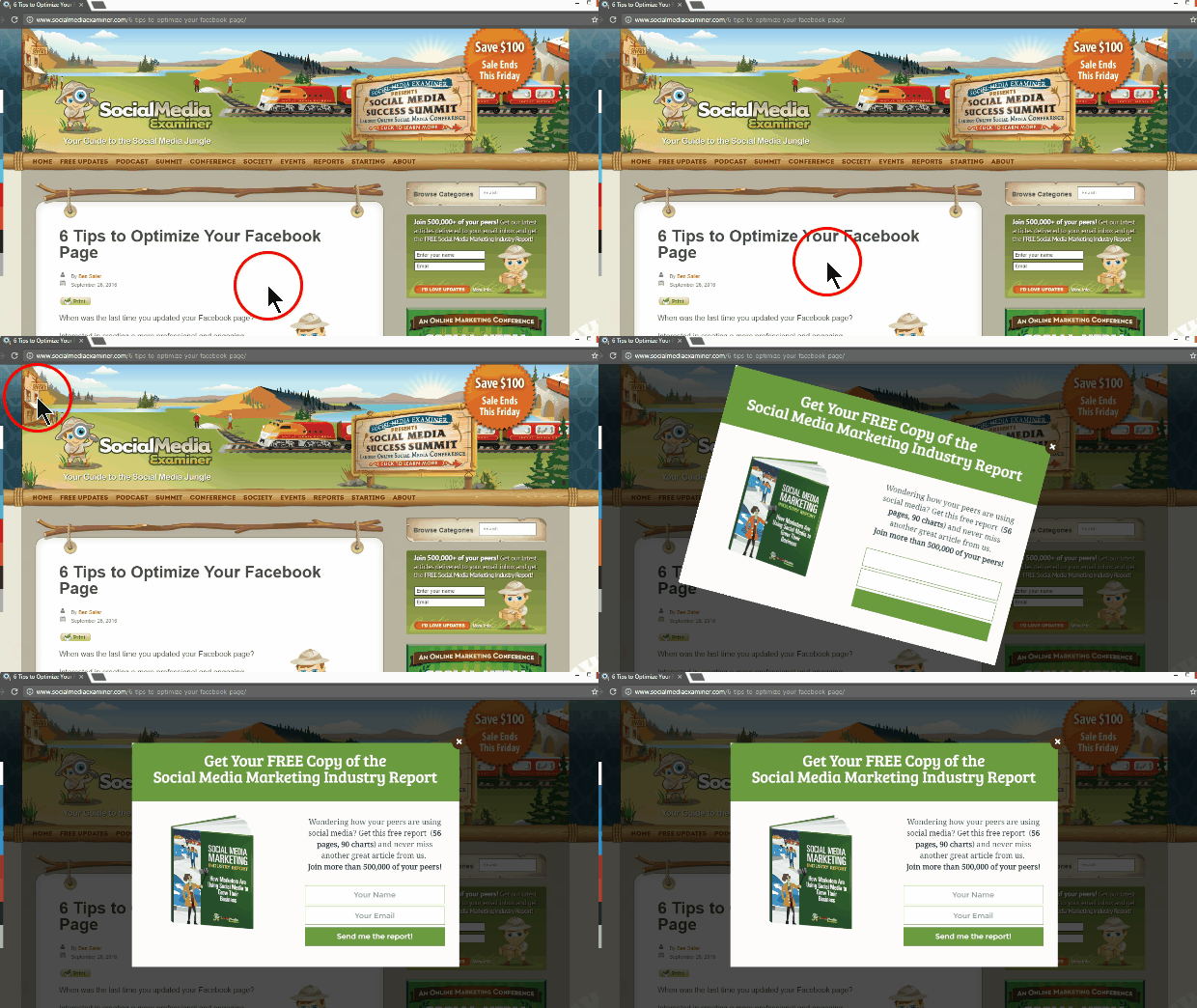
Prior to 2014, Social Media Examiner was using a default lightbox popup offered by AWeber to display an optin form. This popup was shown to all website visitors shortly after arriving on their website.
This single lightbox along with a subscription box in the sidebar allowed them to collect nearly 600 subscribers per day.
However, Michael was not satisfied with the experience of creating a lightbox in AWeber or the lightbox itself.
Due to the lack of customization options and missing conversion features like split-testing, Michael started searching for alternatives.
He chose OptinMonster because it met all of the criteria he was looking for:
- Easy Design Builder
- Mobile-friendly Optins
- Powerful A/B split-testing
- Behavior automation features like Exit-Intent, Page Level Targeting, etc.
- Integration with his email marketing service, AWeber.
Michael’s goal was simple: Convert more website visitors into email subscribers.
How Social Media Examiner Uses OptinMonster
Social Media Examiner started using OptinMonster in 2014. Michael started by adding an exit-intent popup and immediately saw a huge boost in conversions.
After enough testing and verification, he removed the default AWeber welcome popup and replaced it with an OptinMonster lightbox popup. This again boosted his subscribers.
So Michel started experimenting with multiple optin types and split-tests.
Today, Social Media Examiner uses four OptinMonster optins:
- A lightbox optin which displays shortly after visiting the site.
- An exit-intent optin which displays when a user motions to exit the site.
- A slide-in optin which appears after the user has viewed a page more than five seconds, and scrolled 60% of the page.
- A mobile-specific optin which appears soon after visiting the site on a mobile device.
Results of Using OptinMonster
Before using OptinMonster, Social Media Examiner gained about 600 subscribers per day. Since switching to OptinMonster, they’re gaining about 1000 subscribers a day. That’s a 66% increase!
In the first year Social Media Examiner used OptinMonster, they added 62,000 subscribers to their list. Last year, they added nearly 118,000. As of July 2016, they’ve added almost 70,000!
Social Media Examiner has added more than 250,000 subscribers since they began using OptinMonster.
Michael also shared an important tip for those looking to grow their lists. He said,
“There are two ways to grow a list: by increasing subscribers or decreasing unsubscribes.”
Earlier this year, Social Media Examiner decreased the number of days per week they send email from six to just three. Since then, they’ve seen their unsubscribe rates drop dramatically.
By increasing growth using OptinMonster, while at the same time decreasing unsubscribes, they’re adding 12,000 NET subscribers per month.
Split-Testing to Improve Conversions
Michael was quick to praise OptinMonster’s split testing as a driver of the additional subscribers.
“The thing I thought was so awesome about OptinMonster was the split-testing. You make it so easy to very quickly run variations on different types of forms to see which ones perform the best. That is something we were just never able to do before OptinMonster. It was always intuition. I think this is going to work. But there was always this fear to not try something new for fear of going backwards. Now, there’s no limit to what you can test. We are constantly tweaking.”
What is split testing?
Split testing is a way of comparing multiple versions of a web page or optin to find out which one converts best. When the test is run, traffic to the page is split among the different versions and their performance is tracked separately.
OptinMonster’s easy A/B split testing module helps you eliminate the guess work and make data-driven decisions on what works best.
You can try different content, headlines, layouts, styles, and opt-in triggers, to see what converts best.
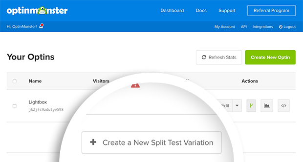
Simply click on the split test button, and OptinMonster creates a replica of your existing optin. From there, you can make any changes and tweaks by using our easy optin builder.
After that, OptinMonster does the rest for you. It randomly serves each variation to see which one has the best conversion.
Our conversion analytics track impressions, conversions, and the landing page where the conversion happens. These numbers will clearly indicate which optin has the highest conversion for you.
You can use these insights to make data-driven decisions and increase your overall conversions.
Related: 8 A/B Tests to Run on Your Popups to Get More Email Subscribers.
Examples of Social Media Examiner’s Split Tests
The team at Social Media Examiner has seen great results from their split tests.
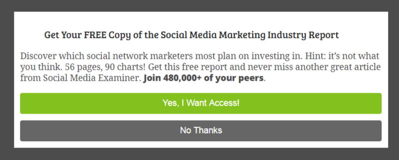
Below is the first mobile optin Michael tested. This is a simple yet proven optin design with a headline, copy and optin form. It converted at 1.24%.
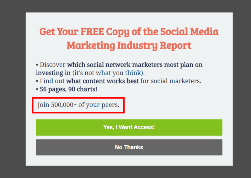
Next, they created a variation using bullets for the copy rather than a paragraph. They also increased the headline font size.
This optin beat the original, converting at 1.86%.
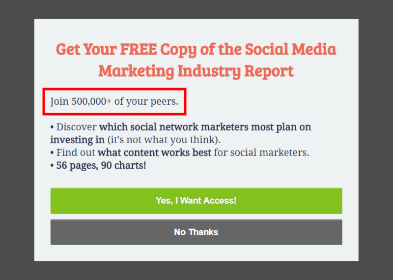
Two-step optins like the Yes/No optin above require the user to select one of two options.
Clicking “Yes, I Want Access” will cause the optin form to appear. Having confirmed the desire to receive the lead magnet (Step One), the user is more likely to follow through and subscribe (Step Two).
Choosing “No Thanks” simply closes the optin.
Another reason why Two-step optins convert so well is because they leverage the Fear of Missing Out (FOMO) phenomena.
Interestingly, Michael was extremely skeptical of the two-step process.
“I was always under the impression that if you just put the form there, people would have less friction, therefore more results. It wasn’t until I started split testing the yes/no optins that I began to see monstrous improvements at certain points in the process. It doesn’t work everywhere but where it does work, it works really, really well.”
Michael tested the two-step option on every optin type. He now uses it for every optin type except the exit-intent optin. He found that the two-step optin simply didn’t convert on exit as well as presenting the form itself.
“We could have assumed, but I don’t want to assume. I want to be sure,” he said.
Want to use a two-step optin on your site? Here are 6 Creative Ways to Use Yes/No Optin Forms.
Split Testing Lesson: Obvious Doesn’t Always Win
One of the tips that Michael shared from his experiments is that:
It’s not always the obvious variations that win a split-test, either.
We all know that adding social proof improves conversion.
Michael wondered if the placement of the social proof could increase conversions as much as the mere presence of the social proof. He split-tested it to find out.
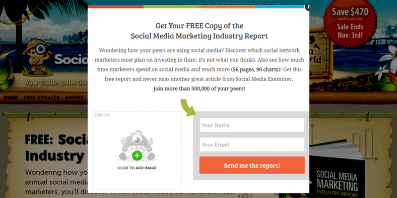
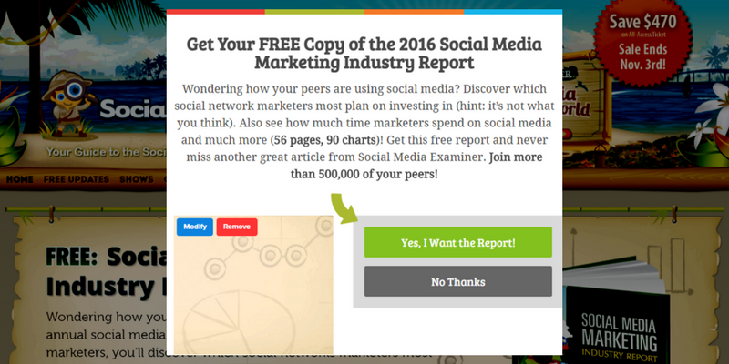
In the original optin, the social proof “Join 500,000 of your peers!” was below the copy of the optin. This optin converted at 1.65%.
In the variation, it was moved above the copy.
This optin converted at 1.71%.
Split Testing Tip: Try Different OptinMonster Templates
In another split-test, the Social Media Examiner team tested both the templates and the color of the templates.
Below was the original exit-intent lightbox which converted at 0.34%.
Next, Michael created a blue variation which converted at 0.66%.
Then, he created a green variation which crushed the previous two optins, converting at 0.77%.
Testing the templates, copy, and colors can produce dramatically different conversion rates. Testing the images used in an optin can too.
Split Testing Lesson: Image vs No Image
Michael wanted to test how the use of images impact conversion rate.
The original optin included an image of the e-book offered to subscribers. This optin converted at 1.98%.
Next, he tested the same optin with no image at all. This variation lost to the original optin, converting at just 1.72%.
Last, Michael tested an “ugly illustration,” as he described it. The image was not directly relevant to the lead magnet but hinted that it included data of some sort.
It beat the other two optins, converting at 2.28%
After running the test on popups, Michael tried this experiment on our slide-in scroll boxes as well.
He found that slide-ins converted best without any graphics at all, despite the success of the “ugly illustration” in other optin types.
He’s now combining his previous learnings and testing the copy of this optin in bullets rather than a paragraph.
“In the end, because OptinMonster makes it so easy to run these tests, we can just keep doing these tests. And once we learn something, we start applying those learnings to other optins, and sometimes they don’t work there.”
Results
In 2015, using only the Exit Intent® optin and mobile-specific optin, more than 50% of Social Media Examiner’s email subscribers came through an OptinMonster optin.
- Social Media Examiner grew their email list 66%
- Social Media Examiner added 250,000 new subscribers
- Social Media Examiner improved conversions 15% using split-testing
Summary
Michael’s final word on OptinMonster was:
“We are all in on OptinMonster. It works seamlessly for us. It has allowed us to dramatically increase our email subscribers.”
We are truly excited to be part of Social Media Examiner’s growth, and we want to thank Michael for taking the time to share all these amazing insights with our community.
Are you ready to get more email subscribers? Get started with OptinMonster today!


