Are you thinking about adding popups to your site, but not sure whether it will really work? Some of the world’s top brands using popups get more leads and sales.
And if popups work for them, they can certainly work for you too. In this post, we’ll share 40 top brands that are using popups to increase their conversions.
Hopefully, these big brands will show you how adding popups to your site can actually have some drastic benefits for your subscription rates. And why are these top brands using popups on their sites?
Because popups work.
But first, let’s go over the basics of creating popups that actually convert.
How to Boost Popup Conversions
A lot of business owners steer clear of popups because they think their audience will find them intrusive or annoying. However, nothing could be further than the truth.
SmartbugMedia sourced the following statistics to prove this point:
- Copyblogger.com found that popups immediately boosted their email optins
- BitNinja boosted their leads by 162% using popup campaigns
- Popups have roughly 2% click-through rates which is higher than any other kind of ad
Let’s think about that last one. While 2% click-through rates may not sound like a lot, that small metric can add up in a big way. If you have around 10,000 visitors to your site each month, you’re looking at roughly 200 visitors clicking through just from your popup campaign.
That’s 2400 per year.
Plus, UsabilityGeeks found that popups had no effect on bounce rates, so you don’t need to worry about your SEO efforts suffering.
And while adblockers have certainly become more popular over the last few years, popups are still an excellent marketing technique.
So why do popups get such a bad reputation? Because most people are simply doing them wrong. If you’ve been seeing low popup conversions on your site, there are a few questions you may want to ask yourself:
- Are your popups campaigns personalized to the visitor?
- Are you showing the same popup to the same visitor multiple times?
- Does your popup contain something of value like a lead magnet, discount, or special offer?
- Is the popup easy to close?
- Does the popup have good sales copy with one clear call to action?
More often than not, people simply make a popup campaign, let it sit on every page of their site, and force users to see the same ad over and over again.
A better approach, however, would be to spend 10 minutes to make sure your popup is highly targeted to new and returning visitors. That’s what many of the 40 top brands using popups listed below do to make their campaigns so successful.
At the end of the day, low popup conversions are usually a sign that you haven’t customized the campaign to your target audience.
But if you still don’t think popups are a good idea, here are 40 popular brands that are increasing their conversions. Hopefully, these multi-million dollar companies will help you see the power of the popup.
Top 40 Brands Using Popups to Boost Conversions
As you work your way through the list, it’s important to remember that popups can be highly targeted by location, URL path, language, time on page, and many other factors. If you visit any of these sites and don’t receive a popup, it’s likely because there was something about your profile that didn’t trigger that ad.
With that in mind, here are the top 40 brands using popups to boost conversions:
1. Amazon
When you first visit Amazon, you’ll see a popup box appear prompting you to create or sign in to your account:
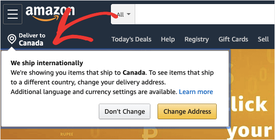
And for international shoppers, Amazon even shows a popup for delivery notifications:
A good rule of thumb? If Amazon thinks a marketing strategy works, then it probably works.
2. Walmart
Like Amazon, Walmart uses a similar popup on their website. The popup only appears for a few seconds on your first visit, but it is enough to draw your attention towards one of their company’s highlighting features: free next day delivery.
It’s a subtle reminder that this offer exists, but is very effective at grabbing a new visitor’s attention.
3. McDonald’s
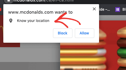
McDonald’s wants to get you into one of their restaurants, so their popup asks if they can use your location. Once you hit the “allow” button, they will display the nearest location to you:
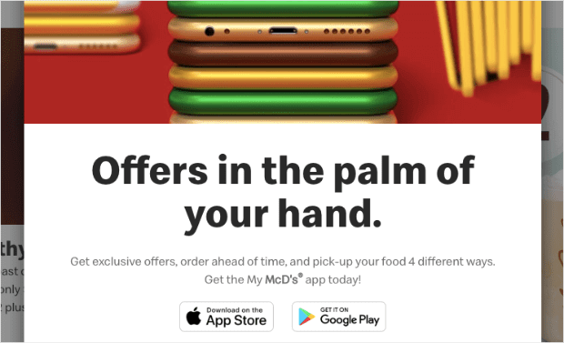
And lately, they’ve added a new popup to encourage more mobile interaction with their brand:
As McDonald’s is expanding into delivery services and online orders, popups are playing an integral part of their digital marketing efforts.
4. Kellogg’s
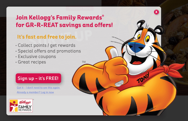
Kellogg’s uses a lightbox popup that appears just a couple seconds after page load. Their offer is to sign up for “family rewards,” which gets you special offers and coupons.
This is a great way of getting a new generation of parents to make Kellogg’s cereal a household name.
5. Colgate
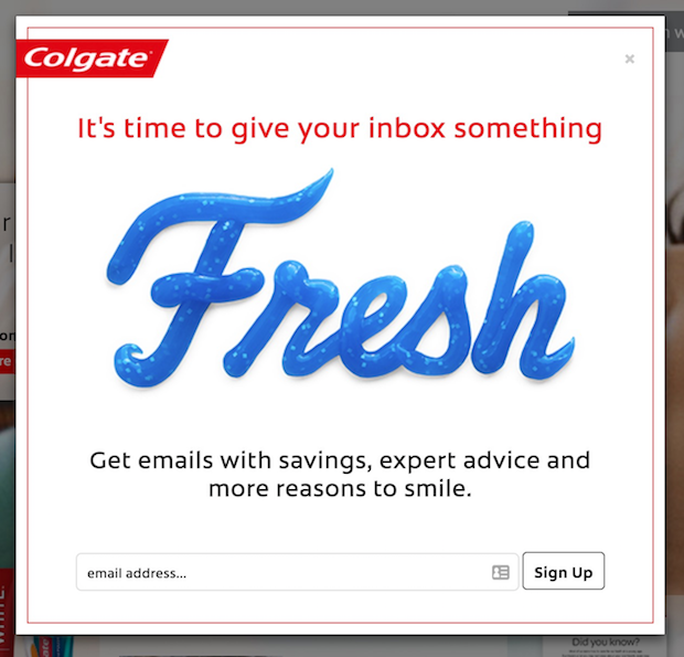
Colgate also uses an immediate lightbox popup on page load to capture your email address in exchange for coupons, promotions, and product updates:
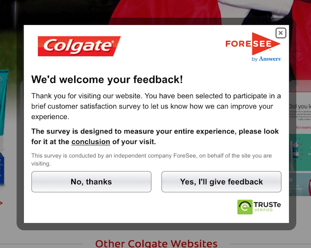
However, if you don’t optin, then they’ll show you a survey popup on your next visit:
This is smart because you don’t want to show your users the same popup ad too many times. Plus, their second popup (the survey) can provide valuable information so Colgate can improve their marketing strategy.
6. Pinterest
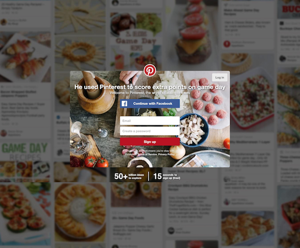
If you don’t have an account with Pinterest yet, you’ll see a popup that works essentially like a content lock. In order to see anything further on Pinterest, you’ll have to enter your email or connect with Facebook:
For a larger company like Pinterest, this is an excellent strategy. That’s because they have built up a ton of content and value on their site.
If you’re just starting out, however, make sure that you use content locks with caution. There’s nothing worse than a user unlocking content with their email address only to be disappointed with what they receive.
The best advice is to use them with content you’re 100% positive your readers will love.
Want to create your own Pinterest popup on your website? See our tutorial on how to add a Pinterest follow button popup to your WordPress site.
7. L’Oréal
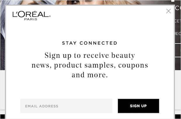
L’Oréal uses an immediate lightbox popup on page load when you are visiting the site for the first time. Whether you optin or exit out of the popup, you won’t see it again:
Make sure you’re distinctly targeting new and returning visitors with your campaigns.
8. Esquire
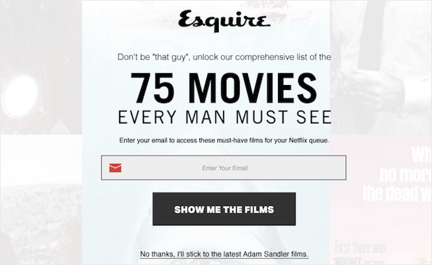
Esquire shows you a full-screen exit popup with their lead magnet when they detect that you are about to leave the site:
This is a great lead generation strategy because the popup has a killer value proposition.
9. Entrepreneur
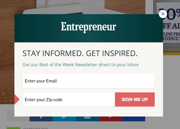
Entrepreneur also uses an exit popup with the offer to join their newsletter:
It’s a simple form that doesn’t ask for too much information right off the bat. That’s a helpful strategy for reducing form abandonment.
10. CountryLiving
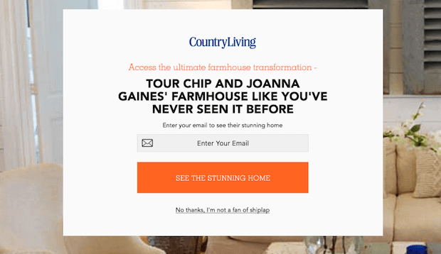
CountryLiving uses popups that are behavior personalized. For instance, you will see a different exit popup depending on whether you’ve been reading the design section or the food section of the blog:
This type of higher-level campaign targeting can do wonders for boosting your conversions and sales.
11. IKEA
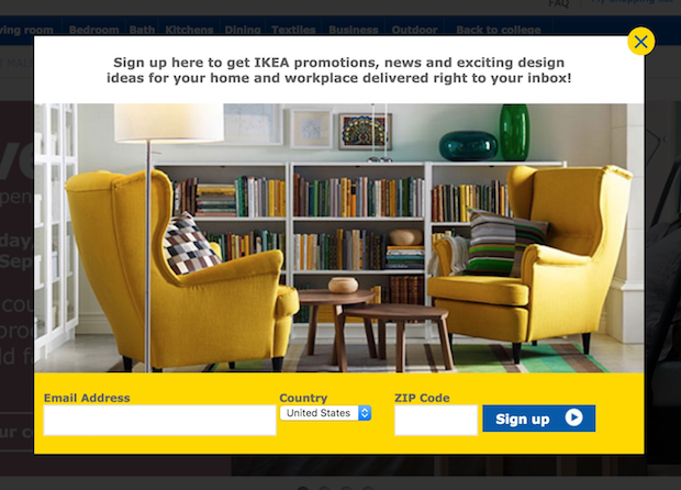
IKEA’s popup comes up right away and asks for your email, country (automatically filled in for you), and zip code:
This is another great example of how a simple form is all you need to get more leads. The trick is to reduce the number of steps needed to sign up for your service or newsletter. Think of each additional field as one more obstacle your visitors need to hurdle to join your community.
12. Orange
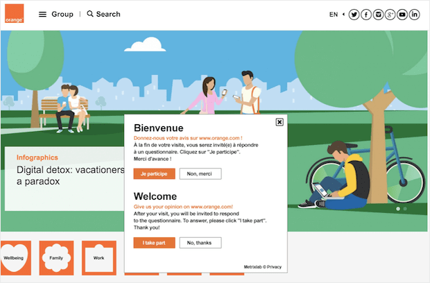
Orange uses a yes/no popup to ask whether users would like to participate in a survey about their experience:
The 2-step optin process is great because of the Zeignarik effect, a marketing technique that suggests people are more likely a task they’ve already started. By asking a simple Yes or No question and getting users to optin to Yes, they’re more likely to finish the optin process.
13. H&M
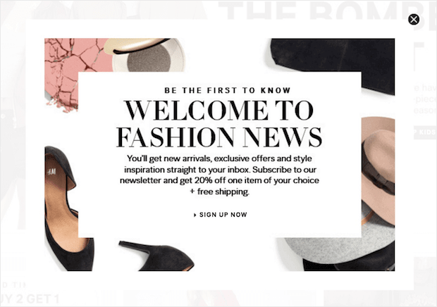
H&M’s popup is also 2-step optin which offers 20% off your first item plus free shipping when you sign up for the newsletter:
This is the perfect welcome popup to build a list of happy, lifelong customers.
14. Lowe’s
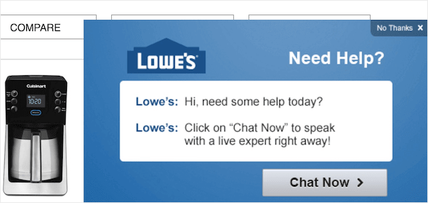
Lowe’s doesn’t display a popup until after you’ve been browsing the site a bit. Then they show you this popup which asks if you would like to chat with a representative:
Live chats are an awesome feature if you have the bandwidth to pull them off. But even for smaller teams, live chats can be automated so they’re still very effective. Popups are a great way of showing your users that you have a live chat service available.
15. Subway
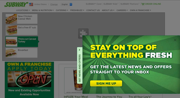
Subway uses a slide-in box pinned to the right-hand side of the screen:
We love this type of campaign because it’s different than your standard popup advertisement. It attracts the eye without intruding on the center of the screen.
16. Sony
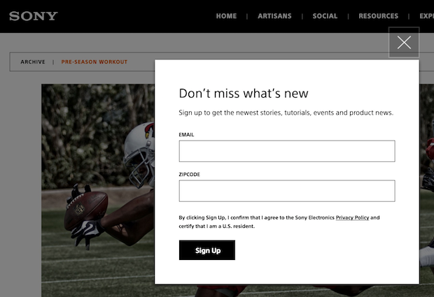
Sony’s popup appears after you’ve been browsing the site for a while. It simply asks if you’d like to sign up for the latest news, stories, tutorials, events, and product news:
While we’ve seen (and even designed) prettier popup ads before, it’s hard to argue with Sony’s success as a company. They’ve taken the less-is-more approach which, for some brands, is highly effective.
17. Adidas
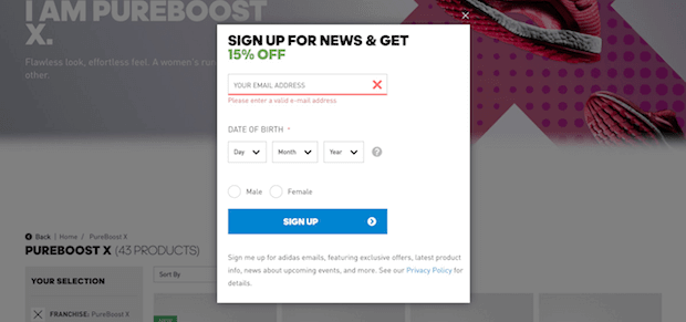
Adidas asks for your email, date of birth, and gender in exchange for 15% off your purchase:
It’s good to remember that for popup campaigns, you’re asking for personal information. Adding a discount can be a great way of coaxing your visitors into giving up those contact details.
18. Pampers
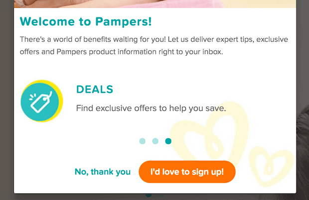
Pampers uses a popup on the second page, which features a polite yes/no optin and a slider with the perks you’ll get as a subscriber:
This is a very well-designed popup with a good color palette. Our favorite part is the use of a bright orange button for the call to action. This one area of the popup campaign really stands out above the rest.
19. Victoria’s Secret
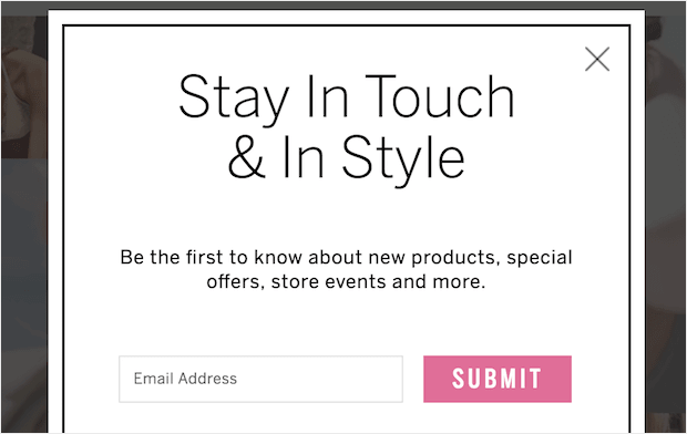
Victoria’s Secret uses a simple optin box that appears immediately upon page load:
Another great example of using colors to your advantage. They have a simple black and white design for the campaign, but the Submit button is an attention-grabbing pink.
20. Purina
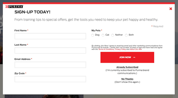
Purina uses a more complex optin form that asks what kind of pets you have. It appears immediately on page load. However, they used a fade-in effect to make the popup less jarring:
There are a few things we’d like to point out, however:
- The form is a little long and could simply ask for Name and Email Address
- To get more information later, they could simply use progressive profiling
- Rather than having an Already Subscribed feature, they could simply automate this with a targeted display rule
Nonetheless, Purina is a widely-known brand. So if this popup is working for them, far be it from us to judge!
21. Neutrogena
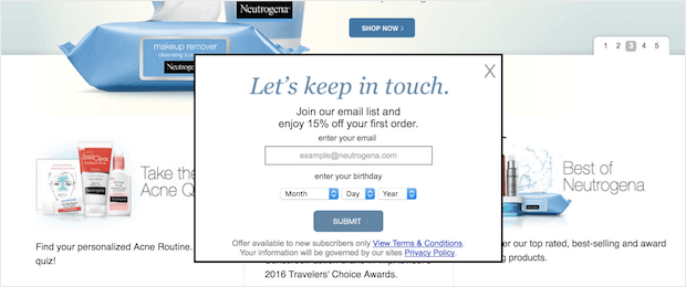
Neutrogena’s immediate popup asks for your email and birthday, promising 15% off your first order:
Note how well Neutrogena matches their popup with their website’s design. It blends in so well that it could hardly be considered intrusive. In fact, at first glance, it looks like a part of the page.
22. Bud Light
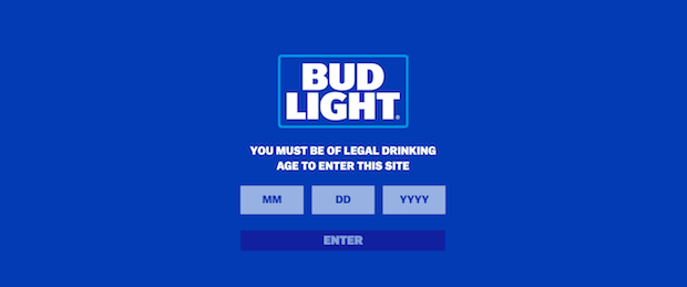
Bud Light uses a fullscreen welcome gate to confirm that you are of legal drinking age before entering the site:
This is widely used among alcohol and tobacco products with legal age restrictions.
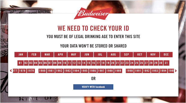
23. Budweiser
Budweiser also uses a similar welcome gate:
Though it looks a bit messy at first, this popup allows users to click their age rather than type it out. That can be a big benefit for mobile users.
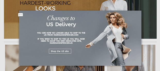
24. Marks & Spencer
Marks & Spencer uses an immediate popup to let you know about shipping changes. Once you click through to the U.S. site, you’ll see another popup offering 20% off your first order when you subscribe:
25. Domino’s
Domino’s uses a popup to prompt you to sign in and start earning points.
This is a very small popup like we saw with Amazon and Walmart. However, you’ll notice the creative use of capital letters on their call to action (sign in) and their value proposition (free pizza). The way the popup notification is designed, it almost looks like you get a free pizza just for signing in!
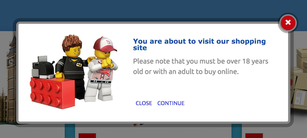
26. Lego
This company is one of everyone’s favorite brands using popups on the list.
When you click through to one of Lego’s products from their main site, a yes/no popup appears which notifies you that you must be over 18 years old or with an adult to buy online. This is great foresight and helps to improve the user experience, since many of their visitors may be children:
Plus, that little lego picture is adorable. ?
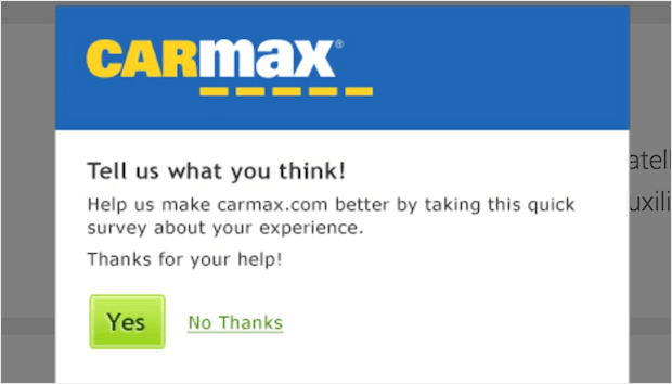
27. Carmax
After you’ve been browsing Carmax for a while, you’ll see a yes/no popup appear asking if you’d like to complete a quick survey about your experience:
Popups are one of the best ways to collect customer feedback to improve your services.
28. The North Face
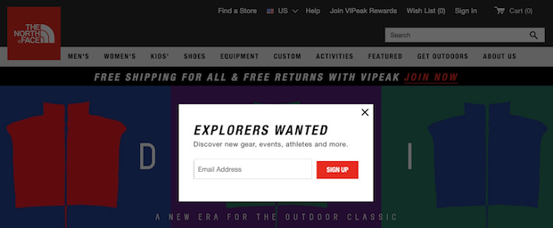
The North Face uses an immediate popup on their homepage with the simple promise to “discover new gear, events, athletes and more”:
One of the best parts of this popup is the strong headline, “Explorers Wanted.”
29. Under Armour
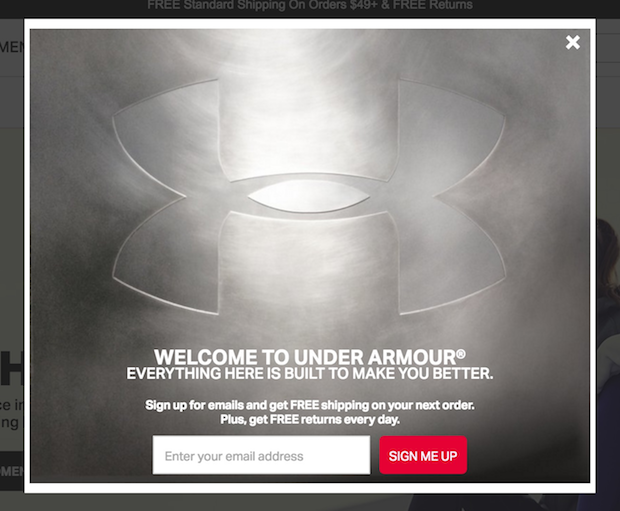
On page load, Under Armour uses a lightbox optin that offers free shipping on your next order, and reminds you that you get free returns every day:
And more than anything, their design just looks flat out cool.
30. Estée Lauder
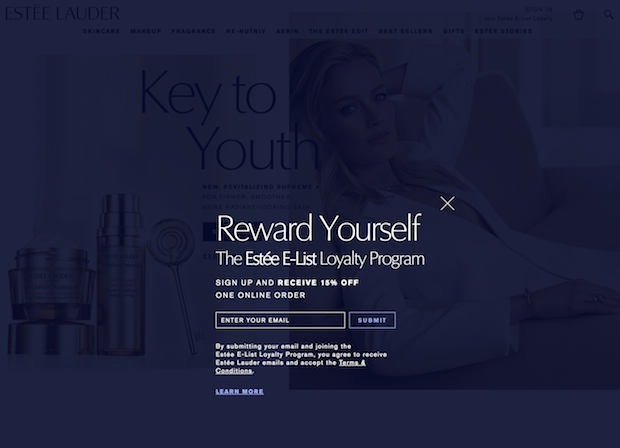
On Estée Lauder’s site, a fullscreen welcome gate fades into view with the offer of 15% off when you join the “E-List” loyalty program:
31. Priceline
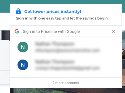
Priceline’s popup fades in for just a few seconds with an aggressive prompt to sign up or sign in with Google:
While this may technically be more of a notification than a traditional popup campaign, it still works the same way: encourages users to sign up for Priceline’s services.
32. Moo
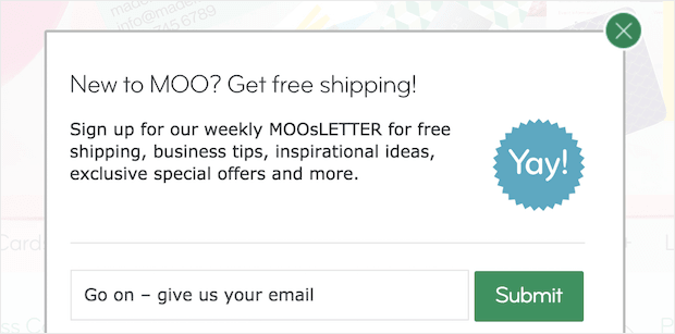
Moo’s popup (offering “free shipping, business tips, inspirational ideas, exclusive special offers and more”) only appears after you’ve been on the page for about 30 seconds:
Targeting your popups with timed display rules can make the campaigns feel less intrusive. Only displaying this to customers who have been on your site for 30 seconds or longer means showing it only to customers who are clearly interested in your site’s content.
33. Anthropologie
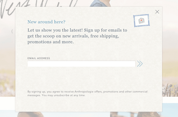
Anthropologie asks you right away whether you’d like to sign up for the latest scoop on new arrivals, free shipping, promotions, and more. However, you only see this popup on your first visit:
34. SEMrush
SEMrush uses a slide-in popup on their blog after you’ve scrolled through a certain percentage of the content:
Scroll triggers are an excellent way of making sure your popups only reach people who have shown a lot of interest in your product or content.
35. HubSpot
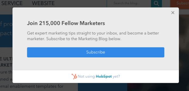
HubSpot uses a few popup campaigns. First, they have an exit-intent style® popup for new visitors:
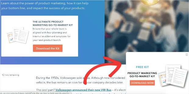
And then they have another slide-in style popup for their blog with a lead magnet:
This is a more aggressive popup because it is offered both in the campaign and on the page itself (upper lefthand side of the image above).
36. Backlinko
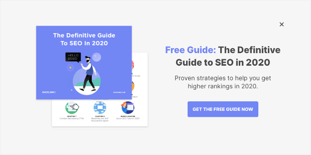
Backlinko is one of the most popular blogs on digital marketing and SEO around. So if they’re using a particular marketing strategy, it’s because it works. Here, Backlinko has a fullscreen popup for their newsletter triggered by the user trying to exit:
One thing we love about this is how catchy the headline is. Not so much because of the text, but because of the use of color. Their value proposition, “Free Guide,” really grabs your attention. Then the rest of the headline goes back to a simple dark black until your eyes are directed to the colorful call to action.
37. Starbucks
This is probably one of the most well-known brands using popups on our list.
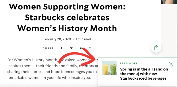
Most people don’t know this, but Starbucks has a surprisingly compelling news section on their website. And as you read different inspirational stories, you’re bound to run into one of these little slide-in popup campaigns:
Starbucks has always done a great job of making their products look appealing. They are excellent at taking professional, colorful images that attract that eye.
38. Visa
Since most of us have received endless pre-approved credit cards in the mail, it should be no surprise that Visa doesn’t mind showing you an advertisement. That said, many of their popup campaigns add value to the customer experience.
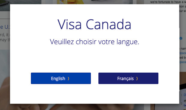
When shopping from Canada, for example, they allow you to choose your language upon arriving at the site:
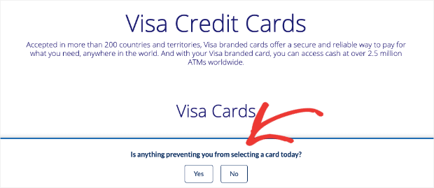
This prevents visitors from having to track down the language icon, which can be a pain. And later in your visit, you’re bound to see this little floating bar springing up with a friendly question:
Notice their use of the yes/no, 2-step optin. If one of the biggest credit cards on the planet is using this strategy, you know it’s making them a bit of money. ?
39. Decathlon
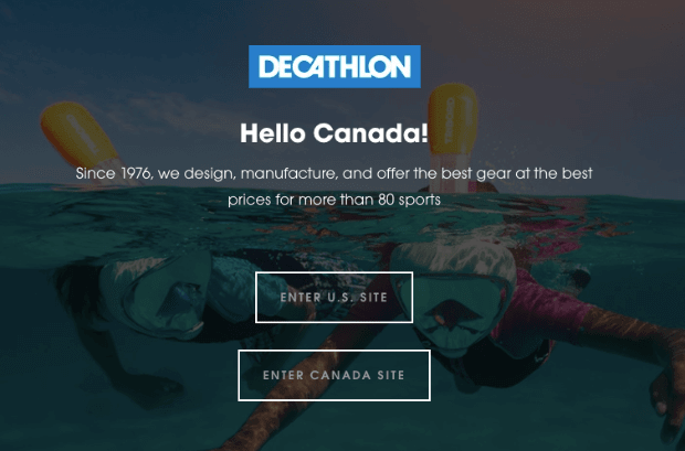
This French sports store has slowly worked its way to North America. As such, they’ve had to make some adjustments to their website. Now when accessing Decathlon, people in North America are greeted with the option to access the U.S. or the Canadian site:
You’ll notice, though, that this popup already knows the visitor is in Canada. They likely have a trigger for this popup by IP address. This is an excellent way to personalize your popups, as well.
40. OptinMonster
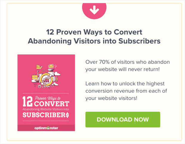
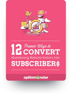
We couldn’t have honestly written this list promoting popup campaigns if we didn’t use them ourselves! Here’s a popup we used to have for our visitors who want to know how to convert abandoning users:
The guide proved so valuable, however, that it’s now a part of every blog page (take a look under the Author section below).
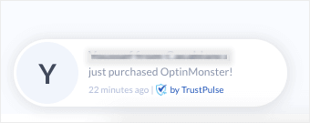
But we also use another type of popup for social proof. We use a positive action notification popup by TrustPulse to show visitors that other customers have responded to one of our calls to action. This could be through a site purchase or simply signing up for our email list.
Those look something like this:
This type of social proof can increase sales by up to 15%. That’s right, this little popup packs quite the punch.
And that’s it!
40 worldwide brands using popups to increase their conversions. So here’s the real question:
Are you using popups on your website yet?
If yes, let us know how it’s working for your company by contacting us on Facebook or Twitter. We love hearing from our readers. Or you can check out some awesome tutorials on our YouTube channel. Just don’t forget to subscribe.
But if you’re not using popup campaigns, hopefully, these world renown companies have changed your mind. Because remember, it’s never too late to start increasing leads, growing your email list, and driving sales.
If you enjoyed this article, you may also want to read this post, How to Use Popup Animation Effects for Eye-Catching Promotions. Or, you may want to check out this post on eCommerce popup examples that actually work.
So, what are you waiting for? Join the OptinMonster family today!









Add a Comment