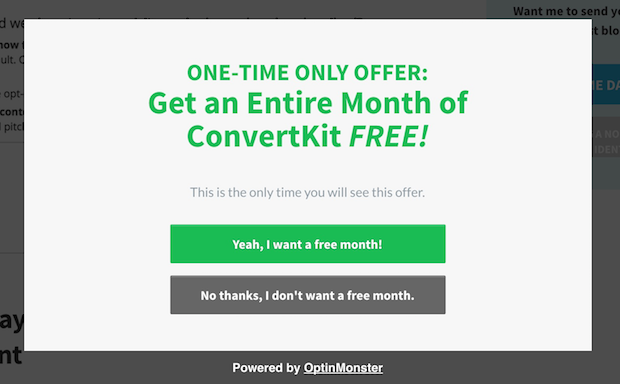
Looking for ways to boost conversions on your site? Give Yes/No popups a try. Yes/No popups are super versatile, proven to boost conversions, and there are so many different ways you can use them.
In this article, we’re going to talk about what makes Yes/No optins so effective and give you 6 creative ways to use them on your own site.
Why Use Yes/No Popups
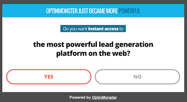
Yes/No optin forms are optins that include two different buttons: one button to opt-in, and one button to opt-out. Simple, right?
This type of an optin form converts really well for the same reason that 2-step optins boost conversions by as much as 785%: they use the Zeigarnik Effect.
The Zeigarnik Effect states that when people start a process, they’re more likely to finish it. With 2-step or Yes/No optins, you aren’t asked for your email address until you begin the process by clicking one of the buttons. Since you’ve already started the process of opting in you’re more likely to finish the process by entering and submitting your email address.
Case StudyHow Cosmetic Packaging Now Grew Their Email List by 754% with 2-Step Optins
Yes/No popups use psychology in another way, too. Researchers have discovered that the feeling of freedom leads to greater compliance with requests. Yes/No optins use that effect by giving you the freedom to decide for yourself. You can either pick the Yes button or the No button… the choice is yours. When given a choice, people tend to respond positively, resulting in more optins.
Pretty powerful.
And, don’t forget that there are even more ways to use Yes/No optins. Let’s take a look at 6 unique and creative ways to use these forms on your site.
1. Answer Questions
What if a visitor is looking at your pricing page or your sales page, but isn’t quite ready to buy yet? If they could talk to a representative and get their questions answered, that might be all they need to pull the trigger.
You can make it super easy for hot leads to get in touch with you with a Yes/No popup that uses a contact form.
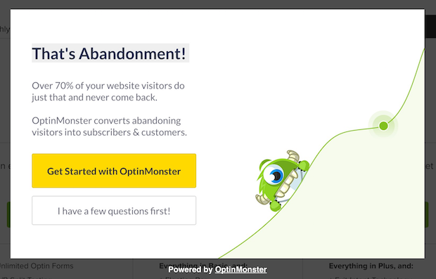
Here’s an example from OptinMonster’s pricing page. When a visitor is about to exit, this popup appears:
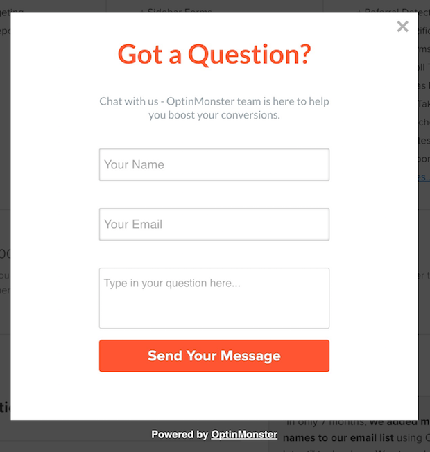
Click on the yellow button and the popup goes away, but when you click on the “I have a few questions first!” button, this form appears:
Here’s how to do it.
Step 1: Create a New Popup with Yes/No Buttons
First, go to your OptinMonster dashboard, select the green Create Campaign button, and choose from one of the templates (for this example, we’re using the Metro template).
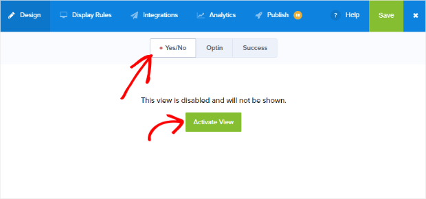
Then click on the Yes/No view tab and activate Yes/No by clicking on the green Activate View button.
From here, you can customize the text, colors, and images to your liking. If you need help doing that, take a look at our documentation to get you started.
Step 2: Configure Yes/No Buttons
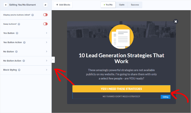
To edit your Yes/No buttons, click on the button element in the campaign preview to bring up the editing tools to the left.
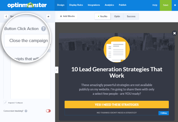
Let’s start by setting the Yes Button Action. We’re going to set it to Close the campaign since we want the visitor to be able to go back to the pricing page.
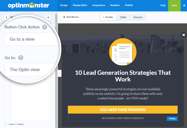
Next, we’ll set the No Button Action to Go to a view. Select to show The Optin view if this button is clicked.
Step 3: Edit the Form
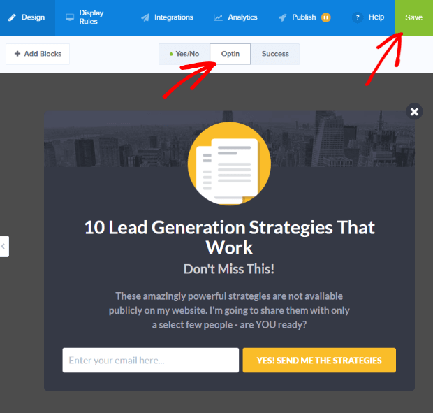
Click on the Optin view tab to edit the optin form. Edit the copy however you’d like and click the green Save button at the top right of the window to save your changes.
Step 4: Display on Exit-Intent
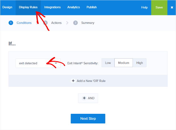
In Display Rules, set your conditions to If exit detected and click Next Step to set the Actions.
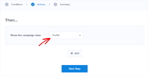
Set the Action to Show the campaign view Yes/No.
2. Warm Leads Up First
In some cases, visitors are so new to your site and your brand that they aren’t quite ready to optin to your lead magnet yet. But if they could consume a bit more content first, then they would be warmed up enough to enter in their email address.
For example, let’s say you have a timed popup that appears almost immediately upon page load on your homepage. Some of your visitors will optin right away, but some may just want to have a look around first.
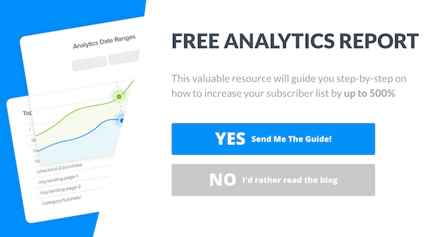
So instead of your typical Yes/No optin form, you could link the no button to your blog, or to a specific piece of content.
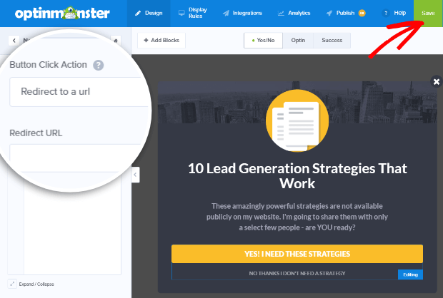
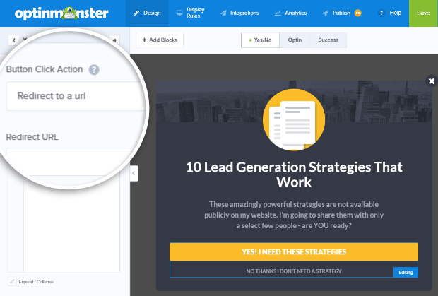
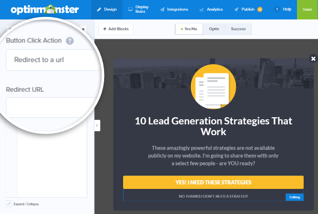
To do this in OptinMonster, simply go to the Yes/No view select No Button Action. Then select Redirect to a url from the dropdown menu.
Enter the URL for your blog, or a specific blog post, and hit the green Save button.
3. Politely Offer a Content Upgrade
Now we’ve covered some creative ways to use Yes/No popups for visitors who are looking at your sales page or your homepage. But what about visitors who are reading one of your blog posts?
If you offer content upgrades (a lead magnet that is specific to a particular blog post), you may have some visitors who only briefly skim the post, or only read the first few paragraphs before they are ready to opt-in. However, other visitors will need to read the entire post before they are ready to grab your content upgrade.
You can address both types of visitors with a polite, timed Yes/No popup or scroll box.
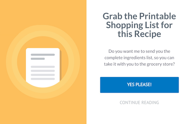
For example, you could install a timed popup that appears after a visitor has been reading your blog post for 60 seconds. The popup offers the content upgrade, but if they aren’t ready for it yet, the “no” option will allow them to continue reading the blog post.
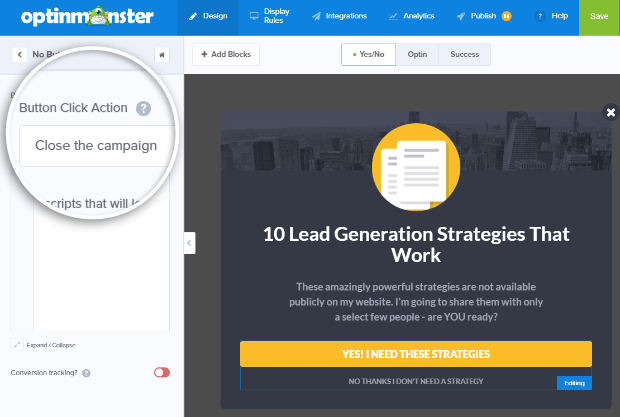
To create a popup like this with OptinMonster, simply go to the Yes/No view and configure the No Button Action to Close the campaign.
4. Promote an Affiliate Product
If you’ve written a piece of content that promotes an affiliate product you can use Yes/No popups to increase conversions on that content.
To do that you can use exit intent to show a popup like this one if someone tries to skip out.
The Yes button goes to the affiliate link, and the No button closes the optin form. You can also set the display rules so that if your visitor opts out they won’t see this popup again.
To create a popup that promotes your affiliate product, simply set the Yes Button Action to Redirect to a url. Then enter your affiliate link in the Redirect URL field.
The No Button Action can be set to close the optin (just like we did in #3 above).
Let’s go ahead and set our display rules so that a visitor who has opted out won’t see this popup again.
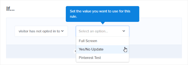
In Display Rules set a condition to If visitor has not opted in to and select the campaign from the dropdown.
Quick TipOnly active campaigns will show up in the dropdown.
5. Design a User-Friendly Splash Page (or Welcome Gate)
Do you want to use a full-screen welcome gate or a splash page to increase your email subscriptions? The only problem with these is that they make it more difficult for the visitor to navigate around your site. However, Yes/No buttons can give you the best of both worlds.
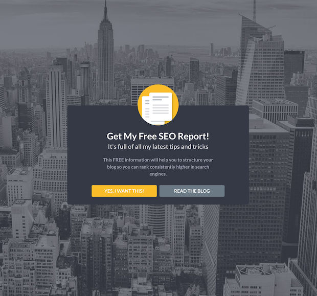
For example, when a visitor goes to your homepage, instead of seeing your navigation bar, a list of your recent blog posts, etc., they could see a welcome gate that looks like this:
The visitor is forced to make a decision between opting in to your email list and reading your blog posts. Unlike a conventional homepage with a ton of options, you’ve narrowed it down to these two choices, which helps to boost conversions.
To do this, just use one of our fullscreen optin templates and enable Yes/No buttons.
Then, set the No Action to Redirect to a url and enter the URL for your blog into the Redirect URL field.
6. Offer a Different Option
Sometimes visitors simply need a different choice of lead magnet in order to entice them to opt-in. Some people may prefer to attend a live webinar, but others might want written content to read at their own pace.
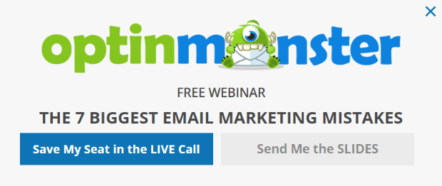
You can use a Yes/No optin form to offer more than one choice. The Yes button could go to a webinar registration page, and the No button could go to an optin form for a download.
To create a popup like this, you’ll want to set the Yes Action to Redirect to a url. Then enter the URL for your webinar registration page in the Redirect URL field.
Then set the No Action to show an optin form.
Don’t Forget to Integrate with Your Email Provider
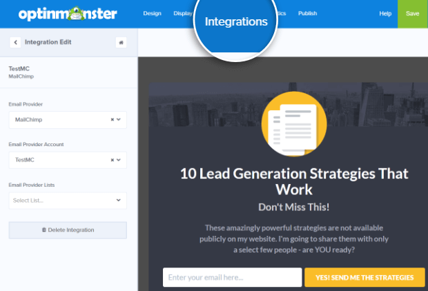
Be sure to integrate all campaigns with your email provider (select the Integrations tab to configure).
That’s it! You now have 6 more ways to boost conversions and engage visitors using Yes/No optins. Have another cool way you’re using our Yes/No popups? We’d LOVE to hear about it.
If you enjoyed this article, you may also want to check out How to Create an Optin Feature Box Step-by-Step (With Examples) and take a peek at our list of email popup best practices.
Or, you may also be interested in reading this article, How to Add Multi-Step Popups to Boost Conversions.







Add a Comment