We have had a lot of positive feedback from our case studies. Many of you found it inspiring and asked us to share more. In this article, we will share the success story of Vital Design and how they used OptinMonster to increase their conversions by 97%.
Some of you are often intimidated by the large number growth and feel that you can’t achieve the same. It’s important to remember, the best conversion rate is the one that’s better than the one you’re getting now!
Meet Vital Designs
Vital is a digital marketing agency who is always looking for ways to get more useful data around their marketing efforts.
Their mantra is, “if you can’t measure it, you can’t improve it”.
The increase in popularity of pop-ups had their inbound marketing team intrigued — were they actually working, or was this a trend that would come and go like website visitor counters? The only way to find out was to put it to the test.
Like all new tools, they tested OptinMonster first on themselves.
Vital Increased Their Own Conversion Rate by 97%
Internal debates centered on how effective a pop-up CTA would be in boosting conversion rates versus how alienating it might be to visitors (the “annoyance factor”). They had already done some extensive research on effective CTA strategies (which you can read more about in their article, “Mastering the CTA: Call to Action Strategies that Convert Every Time”), but hadn’t yet played around with pop-up CTAs.
They decided to go for an exit-intent overlay pop-up, the least intrusive form of pop-up, since it isn’t triggered until a visitor’s cursor leaves the active browser window (to back out, exit out or otherwise navigate away from the site).
After a bit of research, they found OptinMonster to be the best option — and the conversion analytics bundled would give them the data needed to decide whether popup optins were a good choice for their clients.
The results were pretty incredible. Their email subscription conversion rate nearly doubled in the first 60 days — from 2.9 signups per day to 5.5 signups per day. Since then, their conversions have continued at a fairly steady pace of around 6 new email subscriptions per day.
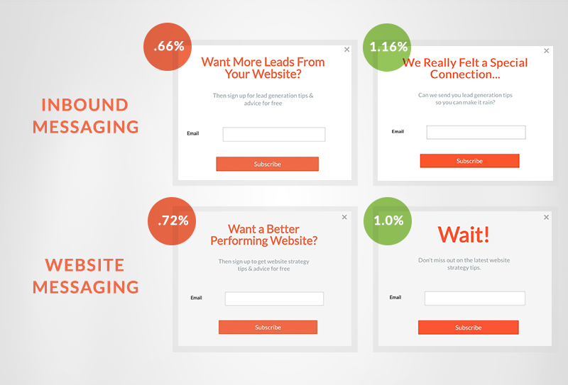
They also started A/B testing their marketing copy, which gave them valuable insight into the type of messaging that was most effective for their clients.
While the results didn’t surprise them (most at Vital guessed that the more humorous messaging would resonate more with their audience), it was still really helpful to put actual numbers to their hypothesis.
VTL wrote a full case study on this experiment, which you can read here on their blog: “How We Grew Our Email List Subscription Rate By 97%.”
Since they had such success with OptinMonster increasing conversions on their own site, they decided to start putting it to work for some of their clients.
B2C Restaurant Client — Conversion Rate of 5.59%
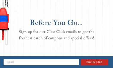
One of their B2C clients’ pop-up email subscription campaigns saw conversions at a rate of 5.59%, over a 30-day period after installing an OptinMonster exit pop-up.
One of the main reasons why this popup was so successful was a combination of a good design and a promise of a coupon for that restaurant. Since visitors to a restaurant website are already likely to be interested in eating there, the promise of an offer made for a really successful conversion rate for this email signup.
Another interesting note came from looking at the success differential between the three options designed.
The first two optins below used the Bullseye Theme, performing at 5.29% and 4.57%. The third optin used the Transparent theme, converting at 3.70% rate. The Transparent theme allows you to make the entire optin a clickable ad using a graphic.
This aligns with data they’ve seen over a number of other clients that’s why Bullseye is their preferred pop-up template in OptinMonster.
Results
Vital Design tested OptinMonster on their own website, and then started using it on their client’s sites.
- Vital Design increased their own email list 97% using well designed, exit-intent optins.
- Vital Design split tested their optins, increasing conversions 75% as a result.
- Vital Design’s clients gained 5.29% more conversions through an exit-intent optin.
Summary
Split testing different designs and offers can make a huge difference in your overall conversion rate.
We look forward to continuing to test various designs, messaging and options in OptinMonster. Another thing we say around these parts is “Plan the work; work the plan.” Data geeks that we are, we plan to work with awesome tools like OptinMonster in all sorts of ongoing digital marketing endeavors.
VTL Design


