Want to increase conversions on your thank you pages? Your thank you page has the potential to be one of the highest converting pages on your site, and yet it is often the most underutilized. In this article, we’ll share 11 ways to increase conversion rates on your thank you pages.
Your thank you page is more than just the confirmation of a transaction, such as downloading your lead magnet or registering for your event. It’s more than just a way to give a deserved “thank you” and create a great user experience. It’s even more than just a place to deliver the goods that you promised.
Your thank you page marks the exact moment when a cold visitor becomes a warm lead.
That person has just expressed an interest in what you have to say. And as marketing psychologists understand well, that is the moment when a prospect is the most receptive to anything you have to offer.
Simply put, leads are the most likely to convert on your thank you page.
But this isn’t just theory. In the span of 10 months after implementing a more effective thank you page, Snack Nation was able to convert 884 leads to their free sample. Out of those leads, they closed over 20 sales of their snack delivery subscription.
Their service starts at $249/month each, so that’s an increased revenue of at least $4,980/month! Not bad for just one tweak to the thank you page, is it?
So how about your thank you page? Does it seize the opportunity to convert, or does it leave your prospects stranded with nowhere left to go?
Here are 11 ways to uplevel your thank you page and start converting more leads to the next step in your sales process…
1. Prompt Them to Enable Push Notifications
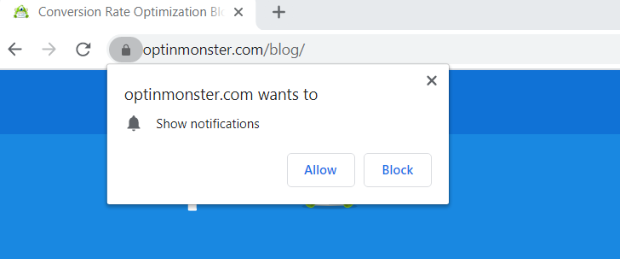
If you use Google Chrome or Firefox, you have probably come across a website that asked you if you wanted to enable push notifications.
Push notifications allow your website to send notifications to your users via their web browser, even when they aren’t on your website. It is an extremely powerful way to re-engage your users and keep them coming back to your site, and you don’t even have to wait for them to check their email: they will see your communication right on their browser in real-time.
Here’s an example of what a push notification prompt looks like:
However, most marketers don’t use push notifications effectively. You see, what most marketers do is add a push notification prompt on their homepage, but that isn’t a good place to put it.
Think about it: when you first land on a website you’ve never been to before, are you likely to give them permission to communicate with you directly? Of course not! You need to get to know them first. However, if you already know and like the website–in fact, you’ve given them your email address–then would you be more likely to allow them to send you push notifications? Well, yes!
That’s why the thank you page is the perfect place to prompt users to enable push notifications from your site. These visitors have just given you their email address, so they are only one small step away from giving you permission to communicate with them via their browser as well.
You integrate push notifications on your thank you page for free using PushEngage.
With the free plan, you can send up to 120 notifications per month to up to 2500 subscribers. It also includes features like the smart opt-in reminder and targeted opt-in trigger.
And for more information, check out this post on how to add push notifications to WordPress.
2. Bribe Them to Share
Did you know that you can actually use the thank you page to make your content go viral? All you have to do is get your new subscribers to share what they just opted in for.
While many marketers have gotten smart and have added social sharing buttons to their thank you page, most of them are still not getting nearly as many conversions as they could be.
That’s because they aren’t incentivizing their subscribers to share.
The best way to make your content go viral with your thank you page is by offering some sort of a bribe that they’ll only get access to once they share your content on social media, or by emailing their friends, etc.
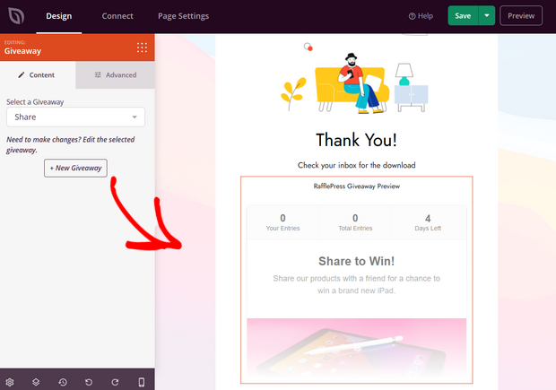
If you use SeedProd to create your thank you page, you can easily accomplish this.
SeedProd is the best landing page builder for WordPress and you can create a thank you page in no time thanks to the user-friendly drag and drop builder and the professionally-designed thank you page templates.
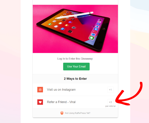
Plus, it seamlessly integrates with RafflePress so you can easily add a giveaway to your thank you page.
With RafflePress’ bonus actions, you can reward users with extra contest entries in exchange for sharing your content on social media.
It’s an extremely effective tactic because most people will gladly share your content to get a better chance of winning an awesome prize, and it makes your thank you page convert like crazy!
3. Ask for Feedback
It can be tough getting people to fill out your surveys, but someone who just opted in to your newsletter is likely to be the most willing participant.
Why not ask them a few questions while you have them there on the thank you page?
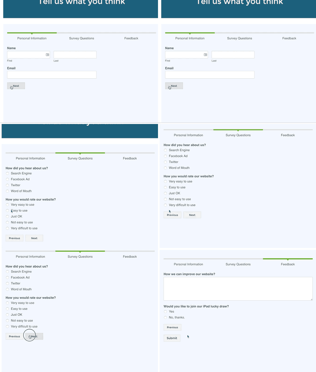
The key to making your survey-thank-you-page convert, however, is to spread out the questions across multiple pages rather than bombarding them with the entire survey all at once. By including just one question per page, you’ll keep your visitors from feeling overwhelmed, and they will be much more likely to complete the survey.
You can easily implement a multi-page survey on your thank you page using WPForms.
All you have to do is install the WPForms plugin on your WordPress site and select “Add New” to launch the Form Builder.
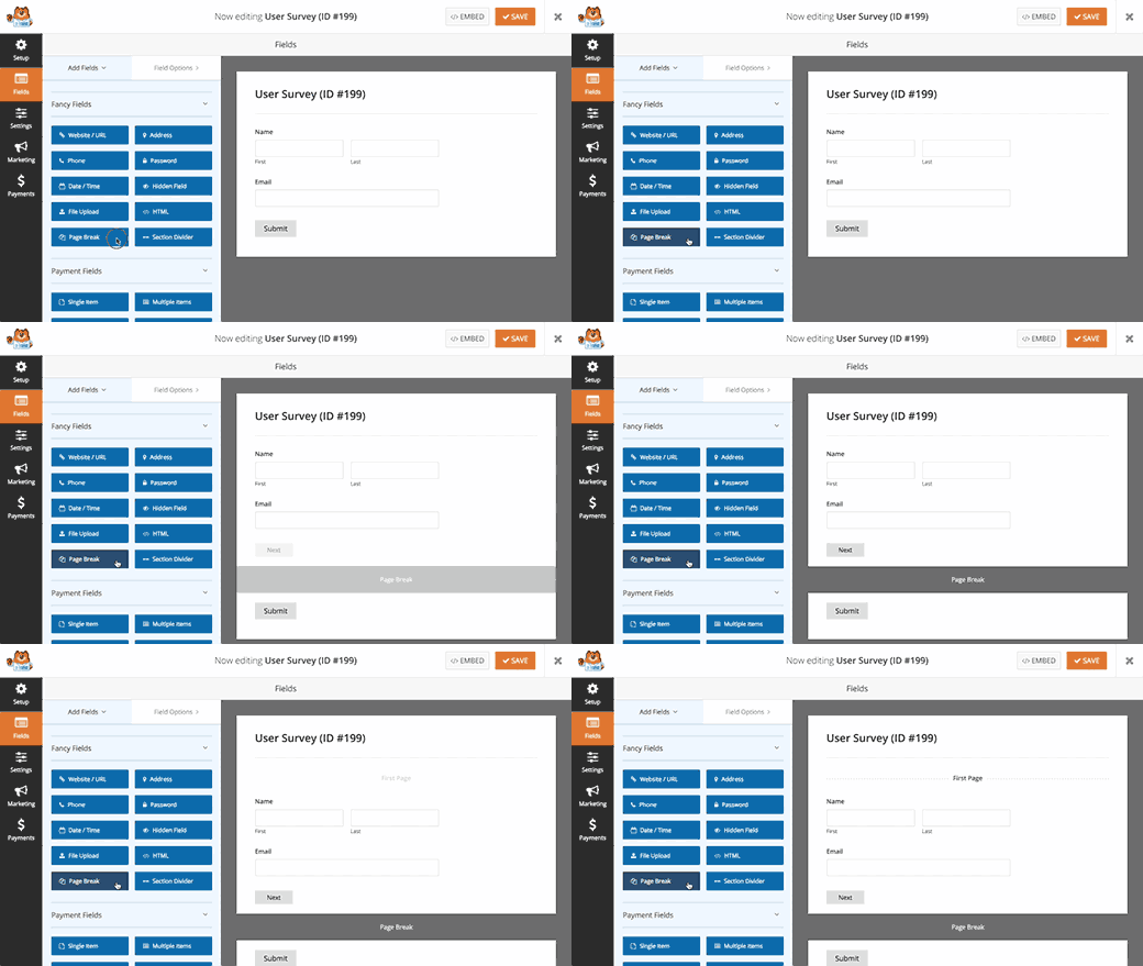
Drag and drop the fields you want to include for your survey questions, and click on the Page Break field to divide your survey up into multiple pages.
It will automatically add a “Next” button to all pages, except for the last page, which will have a “Submit” button.
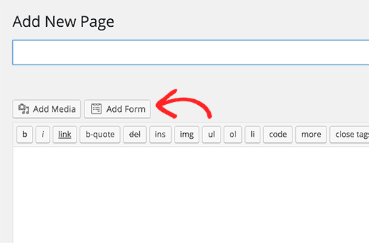
Then, to add your new survey to your thank you page, simply go to the edit screen for your thank you page and click on the Add Form button.
A dialog box will come up where you can select the survey you just created. Click on “Add Form” to insert it, and publish or update your thank you page to save the changes.
Now your thank you page should look something like this:
Voila! You can now start collecting valuable data about your prospects right after they subscribe.
4. Invite Them to a Webinar
For many online businesses, the majority of their income comes from sales made on webinars. For those businesses, one of the most important metrics is how many registrants they can get for their webinar.
A great (but often overlooked) opportunity is to funnel fresh, new subscribers straight to your webinar through the thank you page.
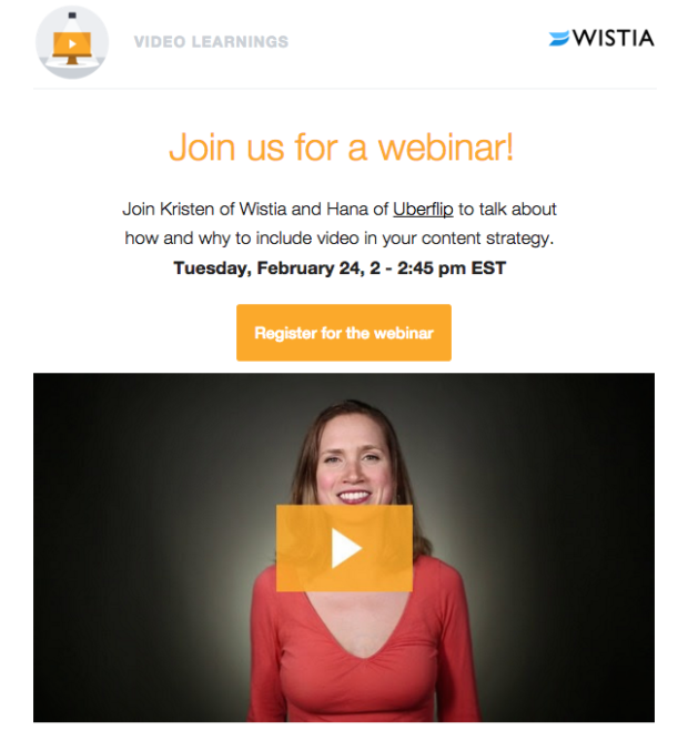
Here’s an example form Wistia:
You could have your developer create a thank you page like this that automatically inserts the registration information for your next live webinar.
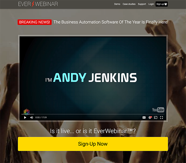
However, you can also accomplish this by recording your webinar ahead of time, and then setting it up with an automated system where people can register to watch it at a specific time. When they register, it will play for that person at that specific time without stopping, exactly like a live event.
EverWebinar does this for a yearly fee, and you can integrate it on your thank you pages.
5. Keep Them Browsing Your Site
Sometimes, your main objective is to keep visitors browsing your site for as long as possible.
For instance, if your website needs a lot of traffic for income (e.g. if you get a lot of revenue from ads), then you’ll want to make sure that you are keeping your visitors engaged at all times so that they keep clicking through to various pages on your site.
Don’t drop the ball on your thank you page!
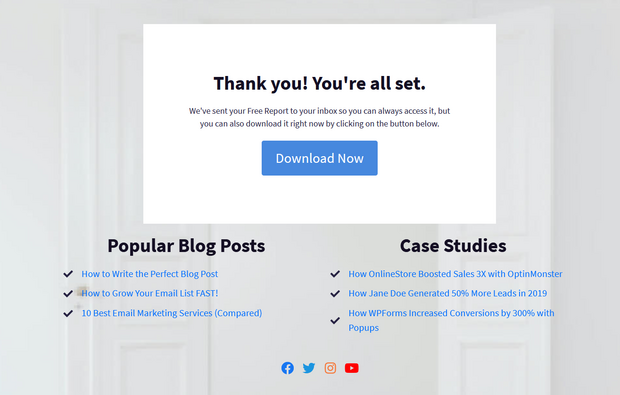
Instead, use your thank you page to present visitors with more things to look at. Here’s an example we created with SeedProd:
With SeedProd’s drag and drop builder, you can easily add links to other resources on your site like blog posts, case studies, white papers, and more.
If you use content upgrades, you could even include links to blog posts that are related to the one they were just reading before they downloaded their upgrade.
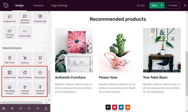
You can also display recommended products in less than a minute with SeedProd.
With SeedProd’s custom WooCommerce blocks, simply drag a block like Best Selling Products onto your thank you page and drop it into place.
Now, visitors to your thank you page can easily check out other important pages on your site and discover popular products they can buy.
6. Present a Tripwire
Psychologists know that people are more likely to commit to something after making an initial, smaller commitment. What this means for marketers is that people are more likely to buy something from you after they have already bought an initial, smaller item.
This small, inexpensive item is known as a “tripwire”.
Tripwires work by being so low-priced that they are a no-brainer to purchase. Then, once you’ve gained a commitment to that small item, you can gradually offer more and more expensive options.
However, this process of gradually asking for greater commitments doesn’t actually begin with the tripwire: it begins when someone opts in for your lead magnet.
When someone “pays” with their email address, they have made a small commitment, thereby opening the door to a larger one. The best place to take advantage of that open door is on your thank you page.
Here is an example of a tripwire that you could include on your thank you page:
The great thing about this tripwire is that the bracelet itself doesn’t cost anything, so they can still use the word “free” (a power word that boosts your conversions), while also charging a small fee for shipping and handling. This way, someone still has to pull out their credit card in order to get this item, making it an effective tripwire.
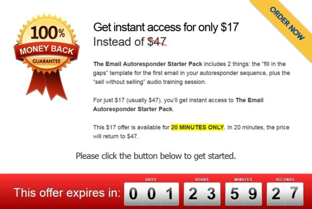
But tripwires don’t have to be physical items, they can be digital. Here’s an example of a digital product being used as a tripwire:
Make sure that when you offer the tripwire on your thank you page, you include a deadline for purchasing it. The above tripwire is only available for 20 minutes, so the new subscriber is forced to make a decision then and there.
(Even if someone doesn’t decide to buy, this is still a good exercise. The mere act of thinking about making a purchase will make the decision easier the next time around. That is, the next time you make them an offer, they won’t have to think about it as much because their brain has already made those connections.)
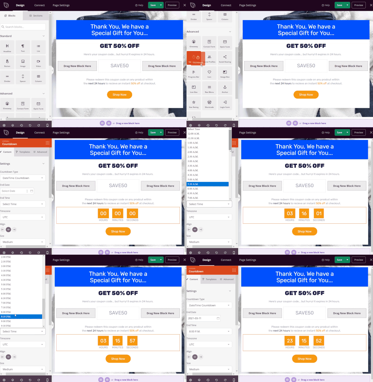
You can easily add a countdown timer to your thank you page with SeedProd.
Just drag the Countdown block onto your thank you page. Then, click on it to choose the end date, time, timezone, and configure other settings.
You can also choose what action happens when the deal expires. You can show a message or redirect users to a different page.
7. Offer a Free Discovery Call
If your sales occur over the phone, then you should offer a free discovery call on your thank you page.
A discovery call is the first call you have after connecting with a prospect. It is where you get to learn more about their situation, and they get to learn more about you and your product or service. It’s called a “discovery” call because the end goal of this call is to discover whether you and your prospect are a good fit.
By offering a free discovery call on your thank you page, you can get leads on the phone with you while they’re hot!
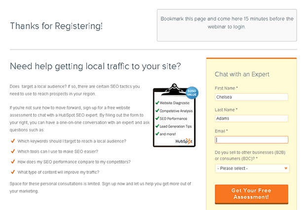
Here’s an example of a discovery call thank you page from HubSpot:
As you can see, you don’t need to call it a “discovery call” per se. Something like a “free assessment” can sound a whole lot more enticing.
To schedule your discovery calls straight from the thank you page, you can use a tool like Calendly.
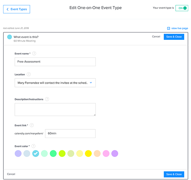
Start by creating a free account. Then, enter the details for your discovery call to create a new event type.
Now you will be given a unique link for your event where prospects can schedule their call with you (e.g. http://calendly.com/username/discoverycall/).
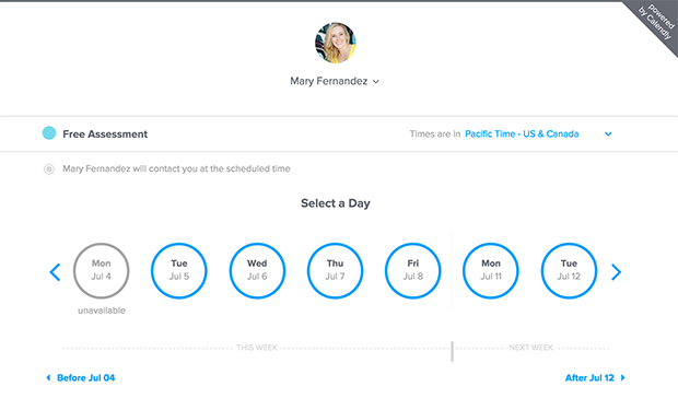
Here’s what that scheduling page looks like:
You can now link the call to action button on your thank you page to this Calendly page, and you’ll be notified by email whenever a prospect schedules a call.
8. Use a Video
According to a video benchmark report from Vidyard, 71% of marketers said that their video content converted better than other types of content. In fact, including video on a landing page can increase conversions by 80%!
What does this mean for your thank you page? It means that no matter what you want your prospect to do next, using video on your thank you page is the best way to get them to do it.
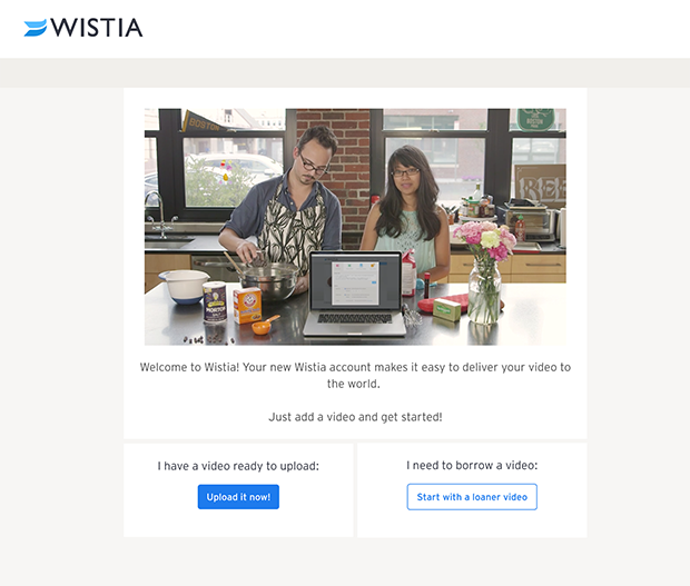
For example, when you sign up for Wistia, their main goal is to get you to start using their product. The way they do that is by showing you a complete video walkthrough of how to use their product, right on the thank you page.
Notice that they also included call-to-action buttons below the video to encourage you to upload your first video to their platform. Even if you don’t have a video to upload, they will provide you with a loaner video… anything to get users to start using their product right now!
You could also use video to walk your new subscribers through the process of finding their first email from you and whitelisting your email address. Or, you could give webinar registrants a preview of what you’ll cover on their upcoming webinar, so they’re even more excited and committed to attend it.
There is no limit to the possibilities of video… Use this powerful tool to your advantage!
9. Ask Them to Follow You
If you build relationships with your prospects primarily through social media, then the best move for your thank you page could be to invite them to follow your profiles.
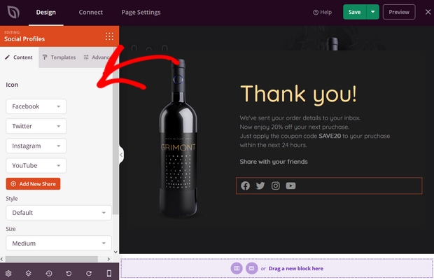
If you use SeedProd to create your thank you page, you can add social profiles in an instant.
You can add social profiles for Facebook, Twitter, Instagram, YouTube, Snapchat, LinkedIn, and many more. You can also choose the style of your social profile icons, size, icon color, and configure other settings.
Now you can use your thank you page to connect with your audience on social media and grow your following.
10. Invite Them to Join Your Private Community
Do you have a free, private community for your subscribers?
Private Facebook groups are the way that I, personally, like to continue the conversation with my subscribers and take my relationship with them to the next level. But you could also use a LinkedIn group or a private forum on your website to accomplish the same thing.
By providing an exclusive place for subscribers to interact with you, and with each other, you are giving them a huge amount of value for free, and they will be even happier that they joined your email list!
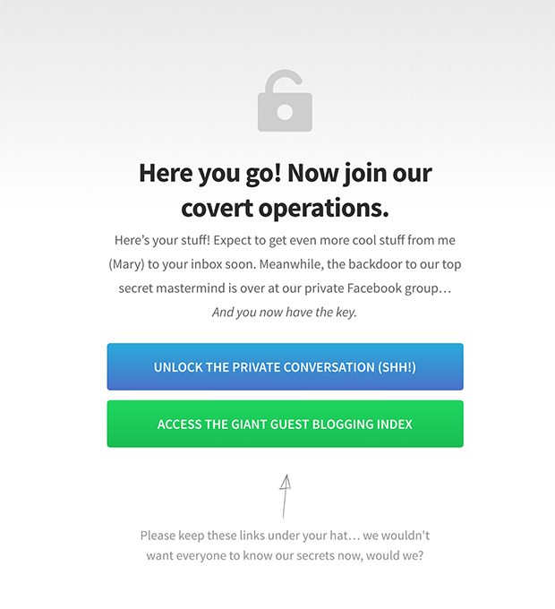
This is what my thank you page looks like on Mary Fernandez’s site:
As you can see, I’ve included a button for their download, but above that I’ve also included a call to action to join the private conversation over on my private Facebook group.
The copy on this page emphasizes the exclusivity of the group, helping to make new subscribers feel special, and making it more appealing to join the group.
11. Offer a Free Trial
Can you offer a free trial of your service? The most obvious opportunity for a free trial is when you sell software, however you can offer a free trial of just about anything if you get creative.
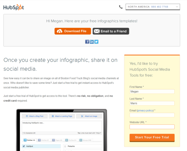
HubSpot offers a free trial of their social media tools on the thank you page after signing up for their free infographics templates.
Although I don’t know what their conversion rate is on this page, I imagine it converts quite well because continuing to the free trial feels like a natural progression from the templates download. As the headline says, “Once you create your infographic, share it on social media.” They have tied the lead magnet together with the free trial brilliantly!
And remember that case study from Snack Nation that we mentioned earlier? Well, all they did to acquire those 20 new subscriptions in 10 months was to offer a free sample of their snack box on the thank you page after a visitor downloaded a content upgrade from their blog.
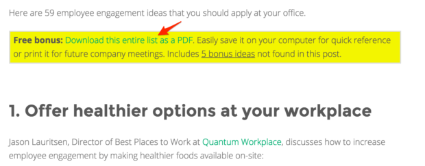
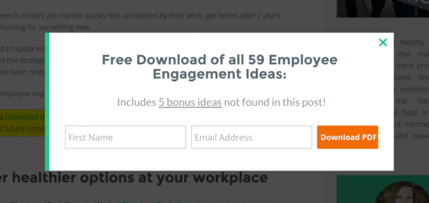
The content upgrade was “59 employee engagement ideas that you should apply at your office.” They used MonsterLinks to add a call to action embedded in the post content, which opened a popup with the optin form when clicked.
Embedded Call to Action:
MonsterLink Popup:
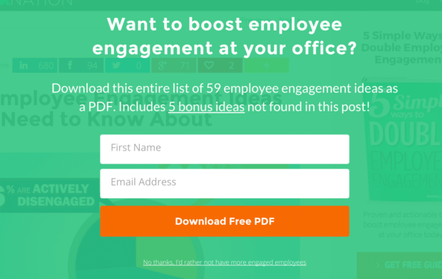
They also used a post-specific exit popup box (using OptinMonster’s Display Rules Engine) to further increase conversions to their content upgrade:
Exit-Intent Popup:
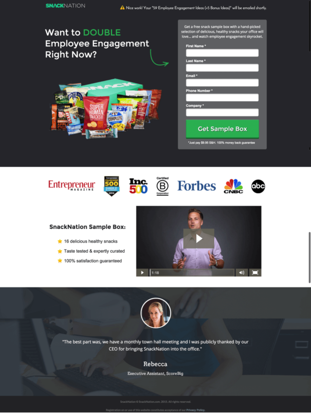
Finally, they used their thank you page to tie in the content upgrade with their free sample using the headline, “Want to DOUBLE Employee Engagement Right Now?”.
Here’s what that thank you page looked like:
This one tweak to their sales process dramatically shortened the typical time it took to convert a blog subscriber into a lead for their sales team, and they’ve been using these types of thank you pages ever since.
(This particular thank you page converted at 10.67%, and they are seeing conversion rates between 7.5-11% across similar thank you pages.)
So, are you ready to see similar results on your thank you pages? Choose one of the above goals that makes sense for your business and implement it on your thank you page. You’ll see increased conversions in no time.








Add a Comment