Looking for an OptinMonster case study? After seeing Yoast and Biddyco, TemplateMonster decided to share their results with our team, and they are huge – 600% increase in subscribers!
A large company like TemplateMonster understands the need for building an email list. Since they wanted to get more subscribers, they decided to give OptinMonster a try. Let’s take a look at what they did.
But before we do, let’s get a little background on TemplateMonster.
Who is TemplateMonster?
TemplateMonster is a depot of website templates, offering more than 46,000 designs to choose from. They started around May 2002 and offer templates for WordPress, Magento, Drupal, PrestaShop, Joomla, WooCommerce, and many more.
They have also expanded into offering HTML web templates, installation, hosting, customization, and more.
TemplateMonster’s Initial Use of OptinMonster
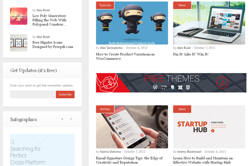
What motivated TemplateMonster to begin using OptinMonster was their low conversion provided by the default functionality of their blog. Previously, their signup form was in the left sidebar of their layout.
Due to this, their newsletter subscription form was almost unnoticeable and failed to foster a desirable growth of subscribers.
Related ContentHow to Create a Sidebar Widget in WordPress to Get More Subscribers
To improve its visibility, they chose to implement OptinMonster’s lightbox popup on the page.
Since OptinMonster is packed with multiple ready-made designs of optin forms, Template Monster started experimenting with them.
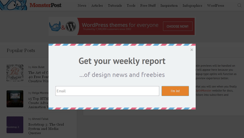
Having split-tested Postal, Case Study and Transparent themes, they found out that the user acceptance was the most effective with the Postal theme.
They decided to use the Postal theme lightbox on the front page, posts, pages, as well as archive and search pages.
This led to the significant growth of their subscriber base – each week around 400 web users joined their mailing list.
How TemplateMonster Gained 12,000 New Subscribers
Over a period of just 7 months, TemplateMonster company attracted 12,000 new subscribers by their use of OptinMonster.
Along with the growth of the subscriber base, the percentage of conversion reached 2.4% compared to 0.4-1.1% that the default subscription form produced.
What’s more important is that they used our native MailChimp integration to easily segment their email list for sending weekly newsletters.
Results
Template Monster increased their list by 600% using lightbox optins.
Summary
If your only subscription option is in the sidebar of your site, you’re missing a huge opportunity to capture your readers’ attention. Add a Lightbox optin, or a fullscreen optin and watch your email list grow.
Do you want to increase your conversions by 600% like ThemeMonster? Get started with OptinMonster today!


