Do you want to learn how to get more email subscribers? Or maybe you’re wondering how to grow an email list from scratch?
In my career as a digital marketer, I’ve certainly felt the frustration of seeing my number of subscribers stay stagnant.
But luckily, it’s entirely possible to increase your email subscriber list. And to do it fast.
In fact, Aish.com increased their email signups 10x by making a few simple additions to their website. Many of these changes took 5 minutes or less.
Here at OptinMonster, we work every day to help businesses and organizations transform their lead generation. More than 1.2 million websites use our email signup popups to skyrocket their email newsletter audience.
You don’t have to figure out how to grow your email list on your own. Instead, you can learn from our decade of experience.
So if you feel like your email marketing is at a standstill, don’t worry!
In this article, I’ll share 17 proven tips to get more email subscribers. These are strategies that OptinMonster has either used for our own email list or has helped our customers implement. And we’ve seen their success again and again.
- Add an Exit-Intent Popup
- Add an Optin at the End of Articles
- Turn Popular Posts Into Lead Magnets
- Use Gated Content (also known as Content Locking)
- Use a 2-Step Optin
- Run an Online Contest
- Try a Different Button Color
- Split Test Button Copy
- Show Off Your Testimonials
- Remove Distractions
- Stop Asking for Too Much Information
- Share Your Campaign Everywhere
- Link to a Campaign in Your Social Media Bio
- Add an Optin Link to Your Email Signature
- Be More Social
- Add a “Subscribe” Checkbox
- Add a “Thanks for Commenting” Redirect
How To Get More Email Subscribers
To get more email subscribers, you need to optimize your greatest marketing asset: your website.
The key to successful email marketing isn’t just a large list. You need a list that’s full of high-potential leads who want to see your email campaigns.
Visitors to your site are already interested in your content or products. That makes them great leads for building an engaged email list. When your subscribers are engaged, you’ll see higher open rates, click-through rates (CTR), and overall conversions.
That’s why many of the tips below explore how to get subscribers on your website. You’ll also find a few tips for leveraging your social media channels to increase your email subscribers.
Let’s get started!
1. Add an Exit-Intent® Popup
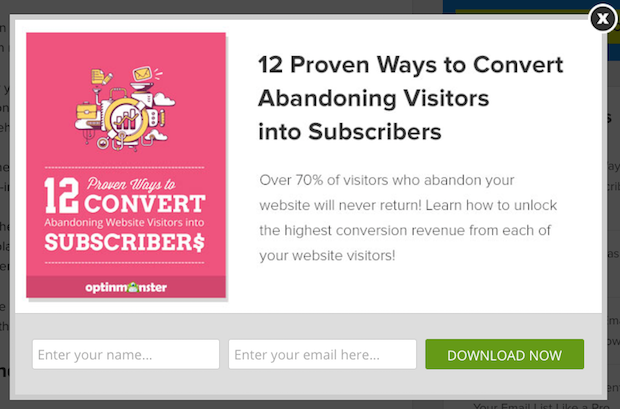
Hey, did you know that over 70% of the people who leave your website will never return?
You can convert many of these abandoning users into email list subscribers with one simple trick.
When a website visitor starts to leave your site, you can show them a popup message that asks for their contact info before they leave. You can offer them a special coupon or offer in exchange for their email address.
Then, instead of a lost visitor, you have a new email subscriber.
But how do these popups work?
It’s called Exit-Intent® Technology. It detects user exit behavior, such as moving the cursor toward the back button. On mobile devices, it can detect when someone quickly scrolls back up to the top of the page. Then it prompts your visitor with an optin form just when they’re about to leave.
Exit-intent is OptinMonster’s specialty!
OptinMonster is hands down the best way to grow your email list. We provide you with the tools you need to create high-converting optin campaigns that you can target to your site’s traffic.
The best part is how easy it is. We offer dozens of premade templates that you customize with drag-and-drop builder.
OptinMonster lets you personalize these campaigns to make sure you’re showing the right optin form to the right person at just the right time in their customer journey.
Plus, you don’t need any coding or tech skills to get started. Our drag-and-drop editor will have you creating beautiful popups, floating bars, inline campaigns, and much more in a matter of minutes.
Want to check it out? Click below to sign up for your risk-free OptinMonster account:
Here’s How You Do It
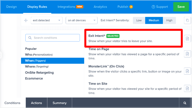
You can create an Exit-Intent® popup quickly with OptinMonster.
Just follow our guide to create your first campaign. Then follow these steps:
- Click the Display Rules tab at the top of the campaign builder.
- Select the Conditions tab at the bottom of the page.
- Click on one of the conditions listed.
- Select When (Triggers).
- Select Exit Intent.
Or, follow this easy video tutorial:
OptinMonster makes sure your popups are mobile-friendly so you can grow your audience no matter which device they’re using.
Don’t have OptinMonster yet? Click here to get started!
2. Add an Optin at the End of Articles
Readers who reach the end of your article are primed to act.
Your headline grabbed their attention. The introduction drew them in like moths to a flame. Your bullet points and anecdotes kept them on the edge of their seats.
Of the millions of articles they could have read, they read yours. And they read until the very end.
They like you. They really, really like you!
That’s why the end of your article is the perfect time to ask them to join your email subscription list.
Here’s How You Do It
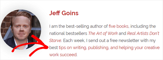
Adding a call to action in your author bio and the end of each article is a great way to strike while the iron is hot. Here’s how Jeff Goins does it:
But what if your blog’s theme lacks an author bio section? What if your website has numerous authors?
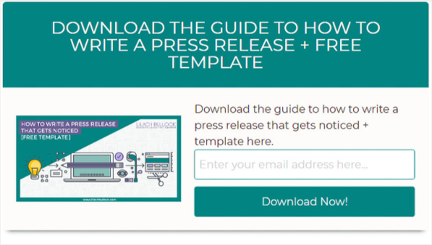
Then you can use OptinMonster to create an after-content widget with some enticing copy to get more email subscribers. All you need is an inline campaign and a compelling call to action (CTA).
Lilach Bulloch uses inline forms to help her convert 57% of website visitors.
Readers who make it to the end of your articles are focused. They’re engaged and looking for direction.
Direct them to your email subscription list.
3. Turn Popular Posts Into Lead Magnets
If you want to earn a spot in people’s email inboxes, then you need to offer them something valuable
That’s where lead magnets come in!
A lead magnet is an exclusive offer or content that users receive in exchange for their email address. In other words, you offer something for free, and you get a new email subscriber in return.
Lead magnets can be a coupon code or special discount. Or they can be special content, like a PDF guide, free ebook, or white paper:
“Subscribe to our mailing list, and get our Ultimate Guide to the Top X Ways to Z!”
But here’s the thing:
Creating lead magnets can be tricky.
What if you don’t have time to write an ebook or create a PDF checklist? Maybe producing a video series is more than you can do right now. And, what if creating dazzling infographics is beyond your current skill set?
If this describes you, it doesn’t mean you’re resigned to sitting on the sidelines while everyone gets more email subscribers.
Not if you have 30 seconds to spare.
That’s all the time it takes to convert one of your popular articles into a handy, easy-to-print PDF file.
Go to Print Friendly and enter the URL of the article you’d like to convert. Click the “PDF” button. Click “Download.”
Then all you have to do is offer it and deliver it to visitors. And that’s a simple process with OptinMonster.
Here’s How You Do It
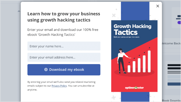
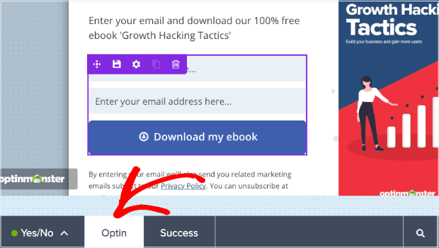
You can deliver your lead magnet with one of OptinMonster’s pre-made templates, such as the eBook Download template:
Go to the Optin View in the OptinMonster campaign builder.
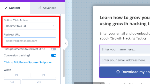
Click the button on your optin and scroll down in the left-hand settings bar until you see Button Click Action. Choose Redirect to a URL.
Then, in the Redirect URL field, enter the URL for your lead magnet download. When users enter their email address and click the button, they’ll immediately get your lead magnet.
Alternatively, you can use email automation to simply email your link to every user who signs up through this popup form.
Here are some more ways to deliver your lead magnet when people sign up.
Pretty easy, right? Almost as easy as our next way to grow your email subscription list.
4. Use Gated Content (also known as Content Locking)
Want a quick way to get more email subscribers without creating new content?
Try gated content, or content locking.
Content locking is where you block off part of the content visitors are reading, and visitors have to subscribe to unlock it. This is easy to do with OptinMonster. In fact, Trading Strategy Guides added 11,000 new subscribers by using this technique.
Here’s How You Do It
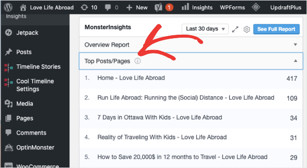
First, identify which blog posts bring in the most website traffic. If you’re using WordPress, you can easily see your most popular posts in your dashboard by using MonsterInsights:
MonsterInsights is the world’s best Google Analytics plugin for WordPress. With this, you can get all the data you need to make smarter marketing decisions. In fact, that data is right there in your WordPress dashboard.
Then, you can identify your most popular posts and pages:
With that information, you can quickly turn your best-performing posts into exclusive content for subscribers only.
Start by creating an inline campaign, and then follow these steps:
- Choose the Display Setting tab at the top of the OptinMonstercampaign builder.
- Select the Actions tab at the bottom of the builder.
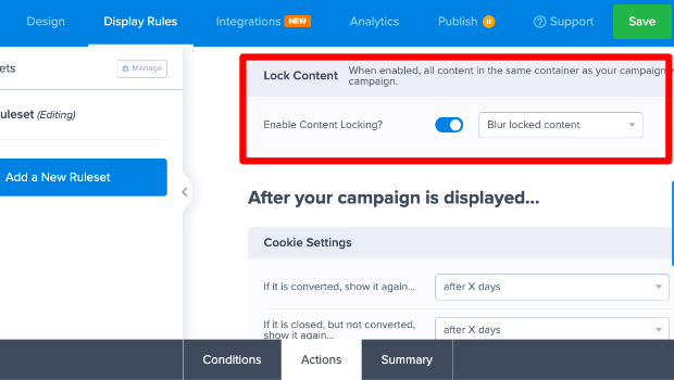
- Scroll down and turn on the Enable Content Locking? toggle. You can choose whether to blur the content or remove it completely.
That’s it! Once visitors subscribe, they’ll magically get access to the content, and you’ll increase your email subscription list.
When visitors have email subscription benefits like this, they’re less likely to unsubscribe. It’s much easier to grow your newsletter subscribers when your new subscribers stick around.
For more detailed step-by-step instructions, see our documentation on content locking.
5. Use a 2-Step Optin
Want to know a neat psychological trick that’s proven to increase email subscribers? It’s the Zeigarnik effect.
This bit of human psychology just means that once we’ve started an action or task, we’re more likely to complete it. And it’s why OptinMonster’s 2-step optins are so successful.
2-Step Optins let users click a CTA button on your website to trigger your optin popup. Once they’ve taken the step of clicking your CTA, they’ll be more likely to complete the process of signing up for your newsletter.
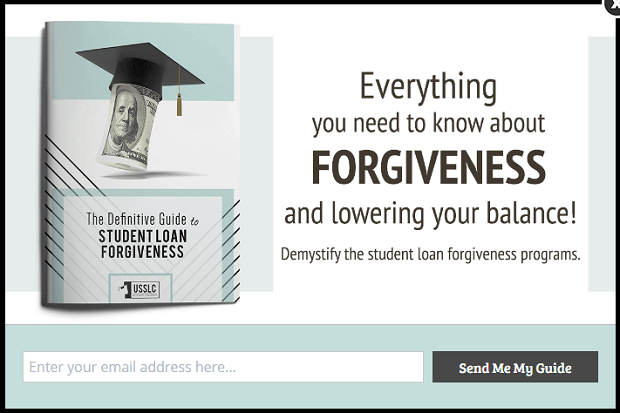
US Student Loan Center increased sales by 10% by using 2-step optins. They added a CTA on their website, and this is what visitors see when they click the link.
Here’s How You Do It
Use our MonsterLinks™ technology to create a button, link, or image that triggers your popup!
For instance, you can have a CTA button that says:
“Get Our Best Articles, Right in Your Inbox!”
When the user clicks that button, they will get your popup to subscribe to your newsletter.
You can accomplish this with just a few clicks in the Display Rules of your campaign.
Details instructions are available here: How to Use MonsterLinks™ to Load Your Popup with the Click of a Button
You can also integrate the campaign with your favorite email providers, such as Constant Contact or Brevo (formerly Sendinblue). You can then set up an automated email series, so your subscribers will receive emails as soon as they fill out this subscription form.
You can send a welcome email and then follow up with product updates, new posts on your blog, and recent launches.
6. Run an Online Contest
Online contests are one of the best ways to increase email optins. You can instantly boost your email subscription list by offering a prize that your target audience loves.
Plus, with an online contest plugin like RafflePress, you can put everything on auto-pilot:
RafflePress is the best giveaway and online contest plugin around.
It lets you create various entry options such as following you on social media, visiting certain web pages, sending referrals to your contest, and, of course, signing up for your email subscription list.
With RafflePress, contest automation is easy. You can gather entries and declare winners just by clicking a few buttons.
The tool works great for any WordPress site, including eCommerce stores, business sites, and blogs.
For more information, check out this post on how to run an online contest to grow your traffic and generate leads.
7. Try a Different Button Color
What color is your optin button?
If you answered “I don’t know” or “What does it matter?” you’re potentially missing out on an easy way to get more email subscribers.
I’ve done a good bit of research on CTA color, and I discovered that there’s no specific color that converts better.
What matters is that your button colors are high-contrast, on-brand, and consistent.
Basically, you want to make it easy for website visitors to find where they’re supposed to click.
When you make your next newsletter signup form, experiment with button colors that really stand out from the background of your website.
Here’s How You Do It
If you’re using OptinMonster, changing the button colors in any campaign is pretty easy:
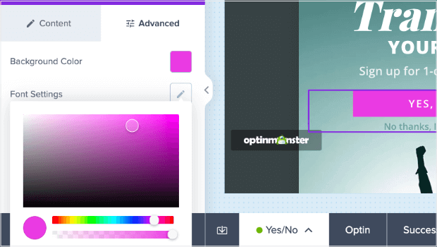
- Click on the button in your campaign.
- Select the Advanced tab in the left-hand editing bar.
- Choose your color beside Background Color.
And while we’re on the subject of buttons . . .
8. Split Test Your Button Copy
Do you use generic copy such as “Subscribe” or “Sign Up” for your optin buttons? If so, we have bad news for you:
It’s actually your CTA button’s copy, not color or positioning, that matters most.
If you’ve never given your button’s copy a passing thought, it’s time to remedy the situation.
Provide value and relevance, but be sure not to exaggerate.
Keep it simple, but don’t be boring. It’s okay to use two sentences so long as they are short.
One particularly effective digital marketing strategy is to personalize your optin button.
Joanna Wiebe of Copy Hackers suggests writing button copy in the first person. By personalizing the words, they become more appealing to the reader.
Let’s look at a few examples.
Which sounds better?
What wording do you relate to?
Which button would you rather click?
The differences are subtle, but during her a/b testing, Joanna found first-person pronouns (“I” and “my”) beat the competition by a whopping 24%.
Sometimes, “subtle” can be huge.
To get the same data on your button, you’ll need to split test. This is easy with OptinMonster.
Here’s How You Do It
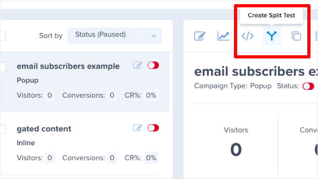
Login to OptinMonster, and click on the campaign that you want to A/B test. To the right, you’ll see different options for that campaign, including a Split Arrow Icon. Click this to begin setting up your Split Test.
Follow the prompts, and then change one element of your campaign, like the button wording. Save and publish the campaign, and OptinMonster will automatically divide your traffic and collect data, so you can learn which one works best.
Just follow the steps in this video:
9. Show Off Your Testimonials
Did you know OptinMonster is recommended by the likes of Michael Stelzner, Ian Cleary, and Yoast?
If you spend much time on our site, then you will learn it quickly.
OptinMonster prominently displays these heavy hitters on our homepage and Testimonials page. There’s no way you could miss them.
Why do we do this? Because it shows we’re the real deal.
People won’t give their hard-earned money or email address to simply anyone. They want to know you’re on the up and up.
Offering testimonials and case studies builds trust, and more trust means you get more email subscribers.
Here’s How You Do It
Go find a great endorsement you’ve received.
Look at the reviews and other social proof you have. Browse through your comments and emails. Search for mentions on social media.
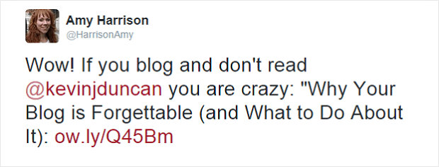
Be A Better Blogger found its featured testimonial when the great Amy Harrison tweeted the following:
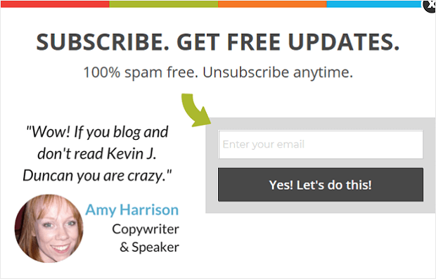
This tweet was turned into a testimonial that’s displayed whenever a reader clicks on one of Be A Better Blogger’s MonsterLinks™:
That optin form? It’s currently sporting an awesome 26.09% conversion rate.
The takeaway here? Testimonial + OptinMonster = Get More Email Subscriptions.
Of course, all the awesome testimonials in the world won’t help you if readers can’t see them, so this next tip is a great one!
10. Remove Distractions
How many widgets do you have on your website’s sidebar?
Do you use several calls to action at the end of your articles?
How many choices are your visitors given?
If you’re overwhelming your readers with options, how can they be expected to take the one action you want them to take?
If you want to grow your email subscriber list, you need to cut down on the clutter.
Here’s How You Do It
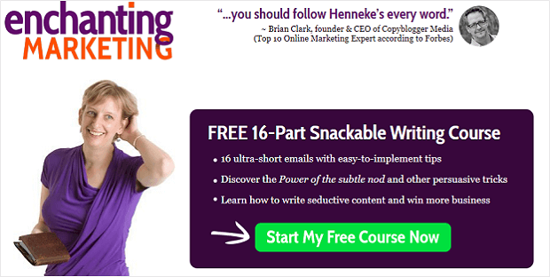
The following screenshot from Henneke Duistermaat is a perfect example of a landing page that optimizes for one thing: get more email subscribers.
Per Henneke, this landing page has converted as high as 59.6 percent.
It’s easy to see why. Every aspect, from the headline to the testimonial, is designed to build an email list. There are no social media icons, advertisements, or anything else to distract readers from the task at hand.
What lessons can we learn from Henneke’s landing page?
- Remove distractions
- Don’t prioritize social media icons
- Stick to one CTA for each article.
We should get rid of anything that doesn’t help us get more email subscribers.
Focus on making it easy for visitors to share their contact information without distractions.
On that note, here are some more tips on how to build an email list.
11. Stop Asking for Too Much Information
What information are you asking potential customers to provide on your lead generation and contact forms? Name, email, phone, more?
Now, let me ask you another question:
Do you need it? Do you do anything with that information?
If the answer is “no,” you need to stop asking people to provide it. A/B test after A/B test confirms that the more information you ask from readers, the less likely they are to optin.
Keep it short and sweet.
Stick to the bare essentials with a simple subject line. Only ask for the information you need to get started. If you’d like other information, you can ask for it later.
This is called progressive profiling, and it really works to create an email list!
Here’s How You Do It
Don’t need names? Don’t ask for them. Have no use for phone numbers? Don’t ask people to input them.
Just keep it simple.
The less data you request, the more email subscribers you’ll earn.
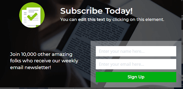
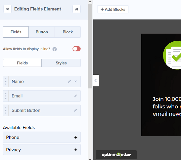
Customizing your optin form fields is easy with OptinMonster, and it works on any campaign. Simply choose the fields you want on your signup form. It’s all drag and drop.
12. Share Your Campaign Everywhere
It stands to reason that the more places you can display campaigns, the more chances you have to build your email list.
You can share them on your company’s LinkedIn profile, in the descriptions of YouTube videos, in the show notes of any podcast episodes you appear on, during webinars you host, and more. You can even link to campaigns from Facebook ads and other paid advertising.
Luckily, this couldn’t be simpler with OptinMonster.
Here’s How You Do It
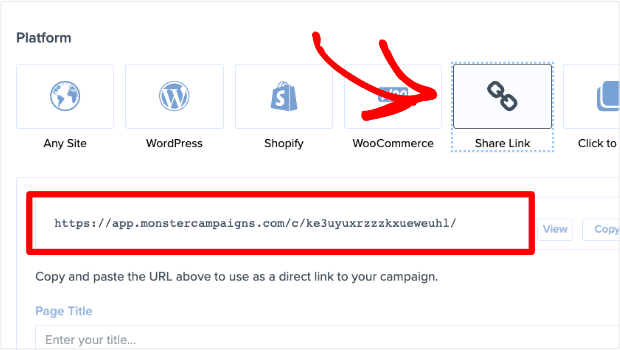
Once you’ve created a campaign you’re happy with, go to the publishing options. One of those is a Share Link.
Grab the link, and add it anywhere you want to show the campaign: social media, author bios, email signature, and more.
See how simple that was?
Using the MonsterLink™ functionality, you can boost your chances of getting more email subscribers fast.
13. Link to a Campaign in Your Social Media Bio
Right now, what information is in your X bio or Instagram bio? What information shows up on your Facebook page?
Your occupation? A personal quote that holds special meaning to you? Perhaps a hashtag or two or ten?
Why don’t you use that precious real estate to promote your email subscription list?
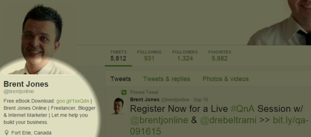
That’s how Brent Jones used his Twitter bio:
Simple, effective, and takes minutes to implement.
Here’s How You Do It
Every social media platform has some type of bio or about section. Simply edit that bio and add the direct link to your newsletter signup campaign. Get the direct link with the steps in our previous tip.
Here are some more ways to get leads from X (formerly Twitter). Does your audience live on Instagram? Here’s how to generate leads on Instagram.
14. Add an Optin Link to Your Email Signature
On any given day, how many emails do you send? 10? 20? More?
If you’re like most people, the answer is: “A lot. I send lots and lots of emails.”
What if we told you each of those emails you send is an opportunity?
You can turn your recipients into newsletter subscribers by placing a hyperlinked call to action in your email signature.
Here’s How You Do It
Each email provider is slightly different, but for Gmail, go to Settings » General. Scroll down, and you’ll find the Signature section:
The link in your signature could point to a landing page, your homepage (assuming it’s optimized), or an article with a particularly-appealing optin bribe. Or you can use MonsterLinks™ to link directly to your optin campaign.
15. Be More Social
Chances are you already spend several hours each week on various social media platforms.
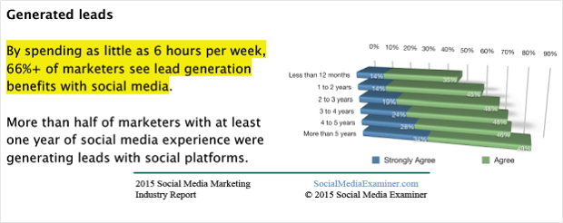
That’s good! Social Media Examiner noted how a majority of marketers increase leads when they use social media for 6+ hours each week:
But it matters how you’re using those hours.
Sharing even high-quality videos of kittens and puppies won’t help unless your business is related to kittens and puppies. Publishing food photos won’t help unless you’re a chef or restaurant owner.
To see how to grow your email list with social media, you need to be purposeful with those 6+ hours.
Here’s How You Do It
Be helpful. Answer questions. Share worthwhile content. Reach out to people. Make connections.
People who find you indispensable on social media will want more of you.
They’ll want MORE helpful advice. Answers to ALL their questions. More worthwhile content.
And where will they go to get “more?”
Your email subscription list.
16. Add a Subscribe Checkbox
If you’re a WordPress user, the WPForms plugin can boost optins with little-to-no upkeep. Just ensure plugin stay up to date, and you’re good to go.
But don’t worry; you’ll be notified when updates are available in your WordPress dashboard!
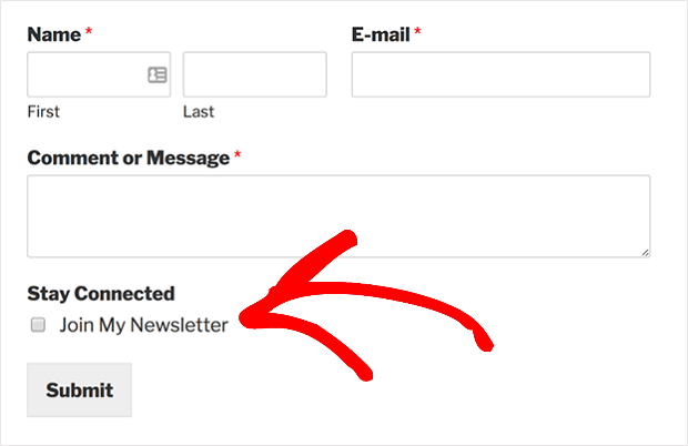
With WPForms, you can add a subscribe checkbox to any form on your site. This works with the most popular email service providers, including Brevo (formerly Sendinblue), Constant Contact, and AWeber.
With one simple click, readers can optin to your email subscription list while submitting your contact form or any other form. This is GDPR-friendly, and it makes building an email list extremely easy.
You can check out these step-by-step tutorials on how to add a Mailchimp signup checkbox to your contact form or see the tutorials for AWeber and Constant Contact instead.
Ready for another plugin to build your email list?
17. Add a “Thanks for Commenting” Redirect
Another excellent plugin is Yoast Comment Hacks.
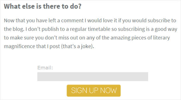
When someone leaves you a comment for the very first time, this plugin redirects them to a “thank you” page. Ramsay Taplin of Blog Tyrant used this thank you page to encourage newsletter subscriptions:
Check out these step-by-step instructions on how to set up an after-comment redirect on your WordPress site.
It’s vital to ask website visitors to subscribe when they’re most engaged. And it’s hard to get more engaged than making the choice to leave a comment! When you give them an optin at that moment, you have a high chance of gaining a new subscriber.
Skyrocket Your Email List With OptinMonster
And that’s it! You now know how to increase your email subscribers with these 17 proven tips.
We hope that you found this article helpful. If so, we encourage you to check out the following resources:
- Best Email Service Providers (ESP) for Small Businesses
- How to Run a Successful Email Marketing Campaign
- Best WordPress Email Plugins You Must Try
- Email Marketing for Beginners: A Step by Step Guide
- How to Create an Effective Email Autoresponder Series
These articles will teach you how to grow leads and monetize the new email subscription list to create new income streams for your business.
Again, like any job you do, using the right tool will make or break your success. Click below to start building your email database today with the world’s #1 lead generation software.










Add a Comment