Not sure how to increase conversion rate on your website?
The average website conversion rate is between 2-5%. Increasing conversions even by a little bit can add up to a large impact on your revenue and profits.
In this article, we’ll go over 17 simple ways to boost conversions on your website and throughout your sales funnel.
- Track Website Usage
- Create a Conversion Funnel
- Strengthen Your CTA
- A/B Test Everything
- Have a Clear Value Proposition
- Recover Abandoned Carts
- Add a Countdown Timer
- Create Urgency
- Upsell or Cross-sell
- Use Exit-Intent Pop-ups On Your Site
- Add Testimonials, Reviews, and Other Social Proof
- Offer a Money-back Guarantee
- Answer Questions Through Live Chat
- Make the First Step Simple
- Simplify Your Forms
- Optimize for Mobile Users
- Remove Distractions
But first, let’s quickly review what conversion rate is.
What is Conversion Rate?
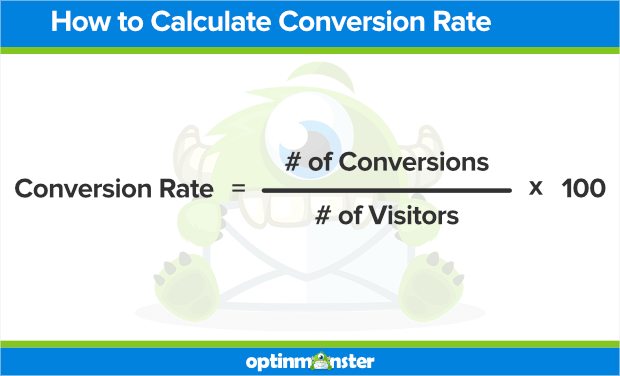
Conversion rate is the number of people who take a desired action, or conversion, divided by the number of people who COULD take that action.
For example, the conversion rate of an email signup form would be the number of website visitors who sign up on the form divided by the total number of visitors.
The conversion rate of a sales page would be how many people who see that sales page actually make a purchase.
A contact form’s conversion rate would be the percentage of site visitors who fill out the contact form.
For more detail, here’s how to calculate website conversion rate.
How to Increase Conversion Rates
What is a good conversion rate? The answer really depends on what is typical for your site. On average, most websites have a conversion rate between 2-5%. But there’s always room for improvement.
Mathematically speaking, there are 2 ways to increase your average conversion rate. You can increase the number of people converting, or decrease the total amount of traffic.
If your website’s conversion rate is currently 2%, that means 2 out of every 100 visitors are making a purchase, signing up for your email list, or some other conversion. To increase your conversion rate to 5%, you could either try to get 3 more people to convert, for a total of 5 out of 100. Or you keep the same 2 people signing up but only have 40 visitors to your site.
We don’t really want to decrease your traffic, so let’s focus on getting more visitors to convert.
17 Conversion Boosting Techniques Any Website Can Use
No matter what kind of website you have, you can apply or adapt most of these conversion tips for your business model. The reasons that people aren’t converting remain the same across industries:
- No need: This doesn’t mean customers don’t need your product or service, they just don’t realize that they do.
- No money: Again, it’s not that the customer doesn’t have money to spend, they just have other things they’d rather buy.
- No hurry or attention: Most people procrastinate decision-making and default to choosing nothing. There’s also so many distractions online that can cause lost sales.
- No trust: Shoppers feel more fear of loss than desire for gain. They’re reluctant to take on financial or emotional risk on something unknown.
- Too hard: Even the most determined customer who has the need, money, urgency, and trust needed to convert might give up if the process is too difficult!
Let’s look at some specific conversion rate optimization tips that address each of these reasons.
1. Track Website Usage
Before you do anything else, you need to understand if and how people are responding to the offers and content already on your website. In other words, you need to know if your customers feel a need for your product or service at all.
Google Analytics lets you track traffic and conversions from your website. It’s a great way to get a baseline for what’s working and what could be improved.
Google Search Console shows you important search engine optimization (SEO) insights, such as the keywords that bring the most traffic to your website. This gives you an idea of what your potential customers are searching for so you can make sure your messaging is aligned with their needs.
Heatmaps are another conversion rate optimization (CRO) tool that you can use to understand user behavior. A heatmap is a visualization of where visitors are scrolling and clicking on your website so you know where to place headlines, CTA buttons, and other elements.
You can also conduct your own user surveys to ask your website visitors exactly what they’re looking for. Check out our popup survey examples for inspiration if you need ideas.
Put together, all this data will let you know the best opportunities for improving conversion rates on your site.
2. Create a Conversion Funnel
Not every website visitor will need your product right this moment. But that doesn’t mean they won’t need it later!
For visitors who aren’t ready to buy yet, bring them into a conversion marketing funnel and nurture them over time. We’ve put together a whole list of ways to increase conversions throughout your sales funnel.
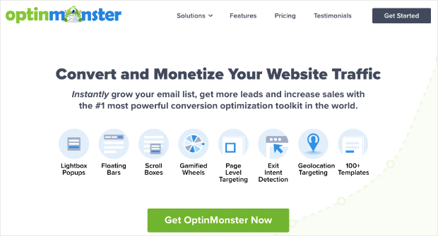
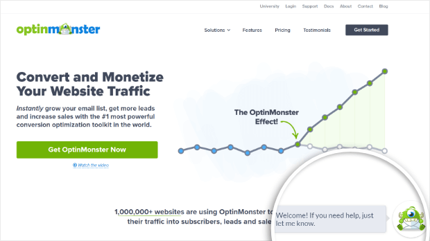
For capturing email addresses at the top of the sales funnel, there’s no better tool than OptinMonster.
OptinMonster is the #1 lead generation tool you can use to bring more traffic into your sales and marketing funnel.
With OptinMonster, you can add eye-catching popups for email signup, abandoned cart prevention, upselling, product recommendations, referral forms, and so much more.
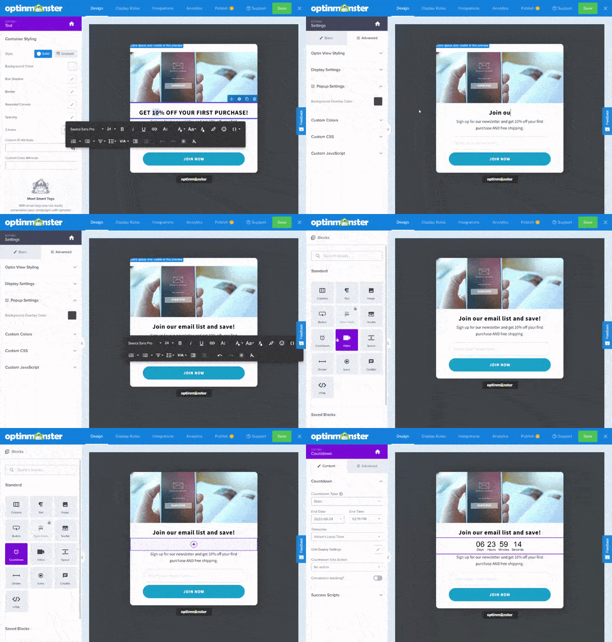
With its drag and drop builder and vast template library, you’ll be able to build a campaign in minutes.
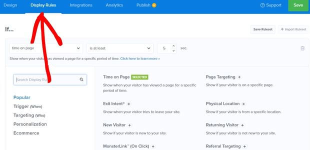
The powerful display rules engine lets you add campaigns to your online store, webpage, email marketing signup page, or anywhere else you’d like to get higher conversion rates.
In fact, Shockbyte doubled its conversion rate with OptinMonster. Check out their case study to see how they did it!
3. Strengthen Your CTA
CTA stands for “call to action.” You don’t want people to just read your website. You want them to do something:
- Join your email list
- Purchase a product
- Fill out a contact form
- Follow you on social media
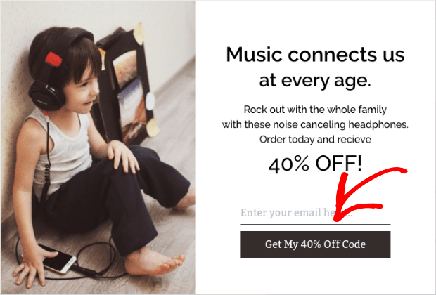
Your CTA is what invites the reader to take action. You want your CTA to be interesting and compelling, so try to focus on the benefits the reader will receive rather than just the action that you want them to take.
For example, instead of merely saying, “Sign up for my email list,” you could say, “Get my 40% off code!” The first CTA is boring and vague. Why should they sign up? What will they get in return? The second one is much more exciting and tells you exactly what to expect.
For more detail, we’ve got a complete guide on how to write the perfect call to action.
4. A/B Test Everything
Your conversion goals should be constantly evolving. There’s always room for improvement! To find the best messaging, try A/B testing.
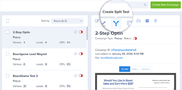
A/B testing, or split testing, means using different versions of the same element and seeing what performs better. You can split test anything and everything: headlines, CTAs, landing page layouts, popup campaign designs, and more.
With OptinMonster, you can add split testing to any campaign with a single click. Then you can test out different copy, design, and graphics so that you know exactly what works.
5. Have a Clear Value Proposition
When it comes to “no money” reasons for not buying, the issue usually isn’t that the customer actually can’t afford the purchase. They just don’t see the value of your offer yet. This is where a clear and convincing value proposition comes in.
A value proposition is a message that shows people the unique benefits of your product or service. It answers the question, “What will this do for me, the buyer?”
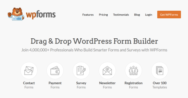
For instance, WPForms promises a drag and drop WordPress form builder. You know exactly what you’re getting and why you need it.
To write a strong value proposition, make sure your copy is written for your specific target audience in mind. Don’t try to convince the entire world to buy your product. Focus on who the product is really for.
Make sure you explain how the features meet the specific pain points of your buyers. When describing the benefits, use words and images to paint a picture of their life after they say yes. You can also inform them of the costs of saying no. Just try not to overdo the scare tactics, as that comes off as untrustworthy.
6. Recover Abandoned Carts
Cart abandonment is a huge issue for all eCommerce businesses, regardless of industry. If you’re selling online, recovering abandoned carts can seriously boost your eCommerce conversion rate.
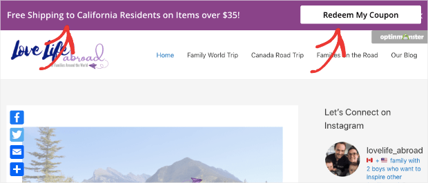
OptinMonster makes it easy to create abandoned cart campaigns such as a floating bar offering free shipping:
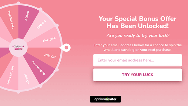
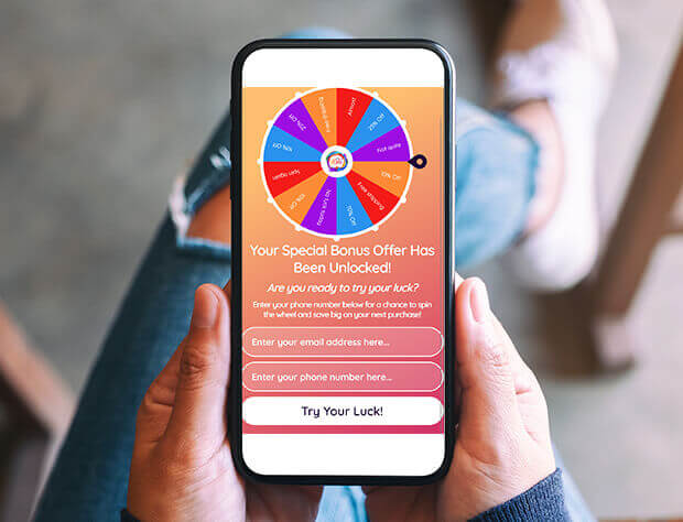
Or you can use an interactive discount spin wheel to entice customers to finish their purchase:
If the customer still leaves their cart behind, you may still be able to save the sale by sending targeted abandoned cart emails.
Most abandoning visitors never come back, so you have nothing to lose by trying to convert those abandoned carts!
7. Add a Countdown Timer
Online shoppers often say, “I’ll finish this later,” but never do. To counteract this tendency, you need to give them an incentive to act now.
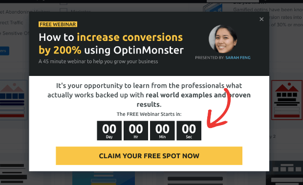
Countdown timers are the perfect way to drive more conversions in real-time. You can offer discounts, free shipping, or even product availability for a limited time.
8. Create Urgency
There are other ways to motivate customers to act now instead of later.
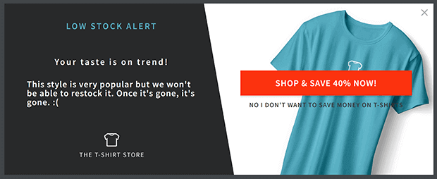
For example, you can offer lower prices or first access during a presale period. Another strategy is to display low stock notifications on your product pages or in popups.
Here are some more ideas for using urgency to improve conversion rates on eCommerce sites and other business sites.
9. Upsell or Cross-sell
Upselling is when you offer customers an upgraded version of what they’re thinking of buying. Cross-selling is recommending another product related to the item they were originally planning to buy, sometimes at a significant discount.
Upselling can have positive, negative, or no effect on your conversion rate. The only way to tell is by testing.
Sometimes adding an upsell or cross-sell deal right before checkout can tip the buyer into taking action. This is especially true if it’s a time limited discount that won’t be available after they check out.
Other times, in-cart upsells can feel pushy and turn customers off. In that case, you may be better off waiting until after the sale and offering 1-click post-purchase upsell.
10. Use Exit-Intent Pop-ups On Your Site
So many visitors abandon a site and never come back. Exit-intent popups can boost conversions by keeping these visitors on your site long enough to take an action.
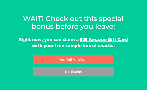
You can use exit popups to distribute lead magnets that grow your email list or coupons to improve conversions in your eCommerce store.
Make sure to keep user experience in mind when adding popups. The popup should connect to the user’s original intent for that page. For instance, if someone comes to your site looking for a dessert recipe, the best exit popup would also be related to desserts or perhaps entertaining. Check out these other exit popup hacks to help you make the most of this strategy.
You can also see how MedStar media increased conversions 500% with exit intent popups.
11. Add Testimonials, Reviews, and Other Social Proof
Lack of trust is a big issue with online business. To build trust, you need to provide external evidence, not just your own word about how good your product is. Of course you’re going to say the product is great, because you want to persuade people to buy it!
Authentic testimonials and customer reviews on your product pages can improve conversion rates by offering social proof. When a first-time visitor sees that hundreds of other customers have had a good experience with your brand, they’ll be more likely to believe they will also have a good experience. Here’s our complete guide to customer testimonial examples to help you get started.
Another simple way to build trust is to make sure your website and payment processors are secure and then display these security and privacy badges on your checkout page. Shoppers want to know that their payment and personal information are safe.
12. Offer a Money-back Guarantee
Customers are afraid of losing money on a solution that doesn’t work. That fear is usually greater than their desire for the solution itself.
A money-back guarantee can reduce that fear significantly. By offering to give their money back if they aren’t satisfied, you show that you really believe in your service or product. After all, who would offer such a guarantee on a terrible product? By taking on the risk, you also show that you care about delivering a good customer experience.
We practice what we preach around here! OptinMonster has a 14-day money back guarantee that if your leads, subscribers, or sales don’t go up in 14 days, you’ll get your money back!
13. Answer Questions Through Live Chat
Another way to build trust is through providing excellent customer service. Live chat is a great channel for answering pre-sale questions that customers might have and gently removing any objections they might have. Whether you use an automated chatbot or real-time chat tool, live chat can help you serve more customers quickly and efficiently.
14. Make the First Step Simple
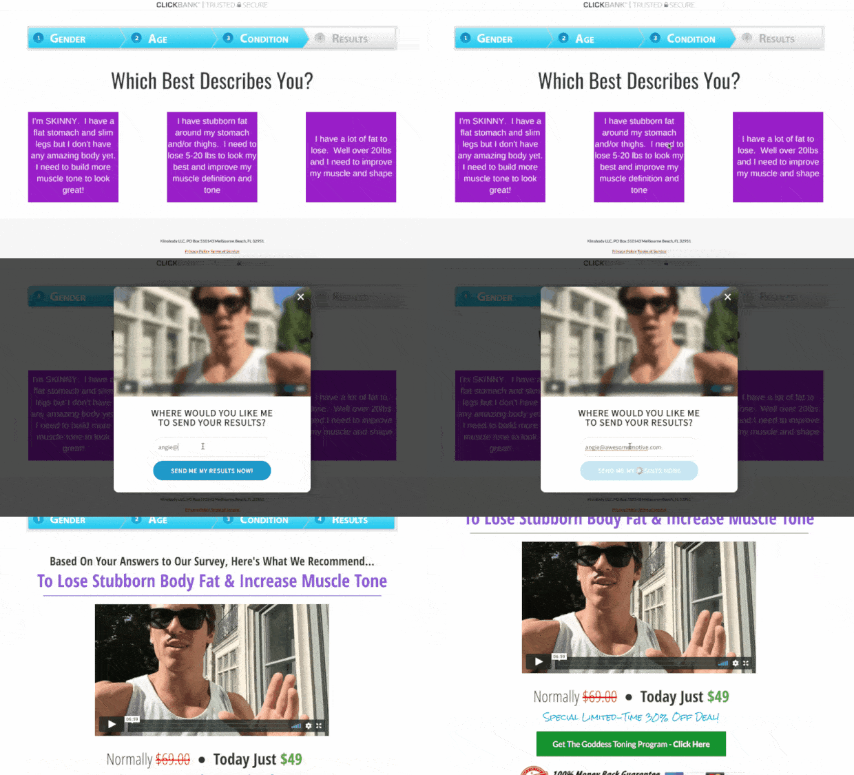
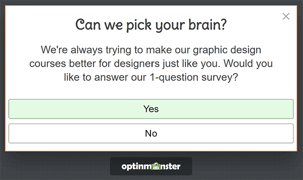
The first step in a conversion is always the hardest to persuade people to take. Keep it simple by using a Yes/No form.
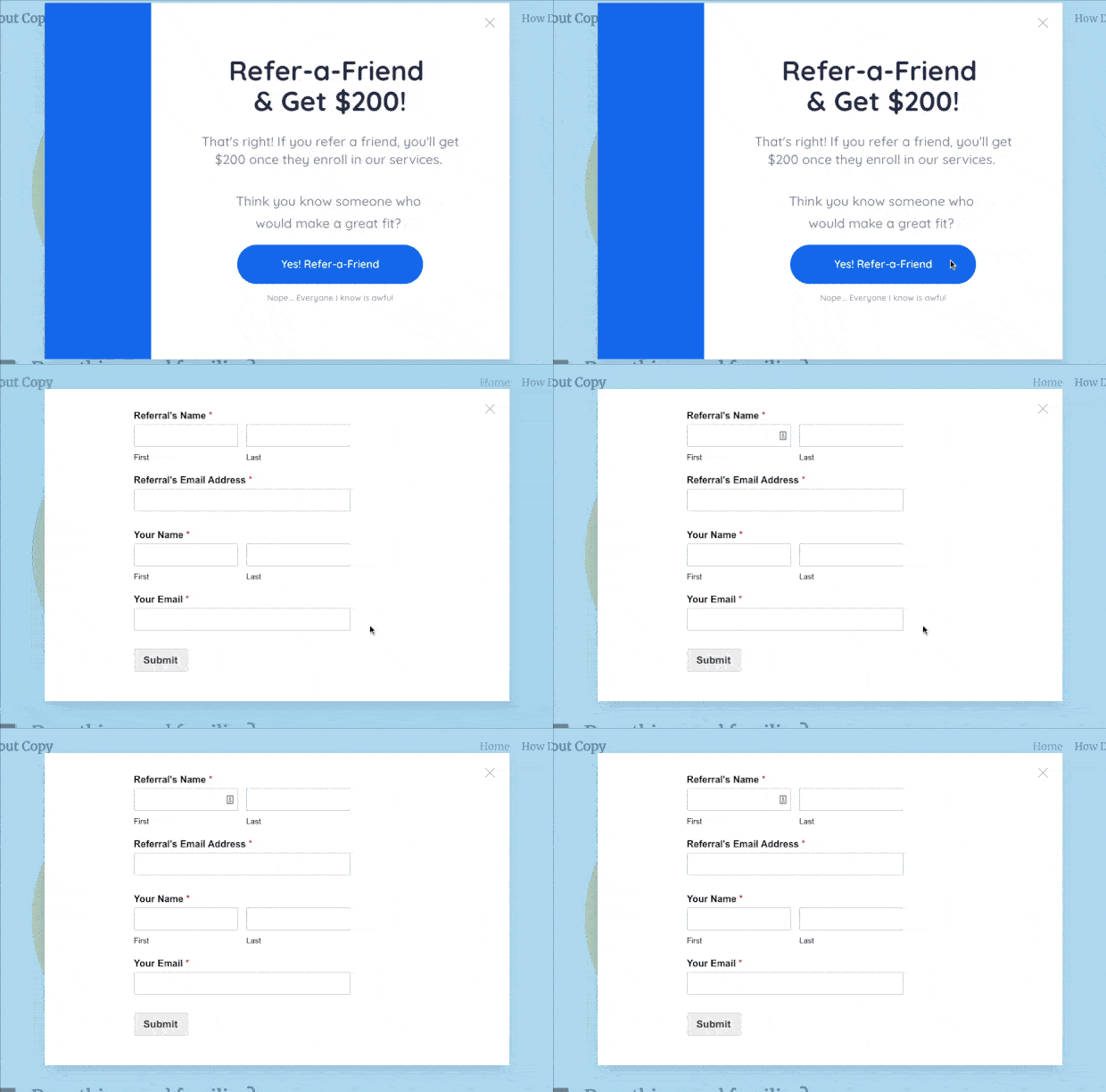
Also called a 2-step optin, Yes/No forms don’t ask for an email address or purchase right away. Instead, you ask a simple question that most people will say Yes to. Once the user clicks on Yes, the next action appears.
Clicking on the first Yes is a micro-conversion, which prepares the user for the next conversion. This is an example of the Zeigarnik effect in action, which is the human tendency to continue following a set of steps in order once the first step has been completed.
OptinMonster can add a 2-step optin to any campaign you want. You can also use MonsterLinks to turn any link or button on your site into a 2-step optin.
15. Simplify Your Forms
Long or complicated checkout processes are a key reason for cart abandonment. Likewise, overly complicated signup or contact forms can easily lead to form abandonment.
Simplifying your forms addresses both “no trust” and “too hard” barriers to conversion to improve your bottom line.
Keep things simple to build trust and reduce friction. For example, many customers don’t want to give out their phone number. If you don’t need it and aren’t going to use it, remove that field from your checkout and signup forms.
Similarly, many eCommerce checkouts have a Company Name field by default. Take this out if that information isn’t relevant to your business.
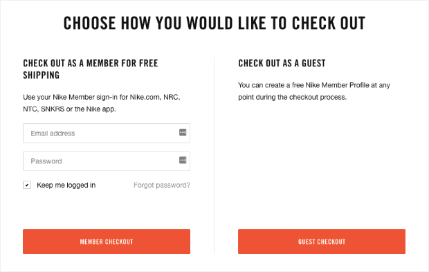
Guest checkout can greatly reduce your abandonment rate, especially from new customers who don’t want the hassle of creating an account just to buy one thing.
If you’re offering a free trial, don’t require a credit card if possible. Consumers are afraid of getting trapped in a contract when they aren’t sure they’re ready to commit yet.
Whatever information you do collect, be clear about how you’re going to use it and how you’ll keep the information secure.
16. Optimize for Mobile Users
More users than ever are browsing and shopping from mobile devices. Make sure your forms and pages look good and work properly on mobile just as they do on desktop. You’ll also want to pay attention to page speed since mobile users may be relying on data networks to load your site. A fancy web design won’t do you any good if the majority of your audience can’t see it!
You can also consider using mobile-specific marketing campaigns. You could send SMS marketing instead of email, or incorporate geolocation in your messaging since mobile users are more likely to be browsing away from home. OptinMonster makes it easy to create high-converting mobile exit-intent popups.
17. Remove Distractions
Finally, keep every page as simple as possible. Ask yourself what the goal of each page is, and if every element is serving that goal.
Unlike some marketing experts, we believe there are no absolute rules when it comes to how many CTAs to include on a page or when to add popups. Instead, we recommend basing your decisions on data such as heatmaps and click rates.
That’s why OptinMonster comes with detailed conversion rate metrics to help you make informed decisions about your marketing.
We hope this list has given you some ideas for meeting your conversion goals.
Here are some other resources for getting a good conversion rate on your website:
- Conversion Rate Optimization Tools That Pros Can’t Ignore
- How to Increase Your Mobile Conversion Rate
- Web Design Principles that Will Boost Your Conversion Rate
Conversion optimization is an ongoing process, so we encourage you to pick a few strategies from this article to try, observe the results, and tweak accordingly. Let us know how it goes and if you have any questions!









Add a Comment