Do you need some exit intent popup examples to inspire your next popup campaign?
Exit intent popups are an effective way to capture leads and increase sales on your website. It’s easy to add them to your website, but how do you know what to put on your popups?
Don’t worry, we’ve got you covered! In this article we’ll share the best exit intent popup examples we can find, as well as what makes them work and how you can create your own exit intent popups.
What Is an Exit Intent Popup?
An exit intent popup is a popup window that appears when a visitor is about to leave your website. You can put anything in an exit popup, from email signup forms to coupon codes to product or page recommendations.
Exit intent popups are great for reducing bounce rate and preventing cart abandonment in Shopify and other eCommerce sites. You can also use exit popups to grow your email list and increase traffic across your website.
How do exit intent popups work? The popup software tracks cursor movement and launches the popup when website visitors move toward closing the window or tab.
Do Exit-Intent Popups Work on Mobile?
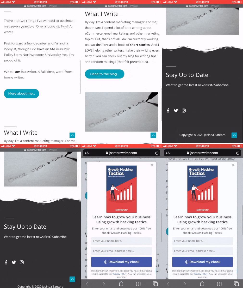
Yes, exit popups work on mobile devices too! There’s no cursor on a smartphone browser, but the popup software can detect cues like:
- use of the back button
- scrolling up instead of down
- switching between tabs
- leaving a page idle for a certain amount of time
You can learn how to create a mobile exit-intent popup from start to finish with our tutorial.
How Do Exit Intent Popups Work to Increase Conversions and Sales?
Even if you know how the tech works, you might be wondering why exit-intent popups work so well to boost your conversion rate. To understand that, consider the reasons potential customers might leave your website in the first place, such as:
- price is higher than they anticipated
- not interested in the content or product
- not sure if the content or product is what they really want
- not feeling a sense of urgency to act now
Exit intent popups work by addressing those reasons. For example, you could create exit popups with:
- Discount codes and countdown timers to encourage shoppers to complete their purchase
- Content recommendations for help new visitors find what they’re looking for
- Upsell and cross-sell offers to tempt bargain hunters
- Lead magnets to turn casual browsers into email subscribers
- Information that addresses hesitations about shipping costs and timing, product questions, and more
Let’s look at some examples to see how exit popups really work!
27 Exit Intent Popup Examples and Why They Work
eCommerce Exit Intent Popup Examples
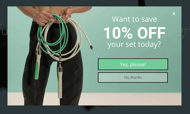
1. Crossrope
Crossrope uses a 2-step optin across their eCommerce website asking visitors if they’d like a discount. Visitors who click Yes are more likely to follow through with signing up to get the coupon and making the purchase.
2. Kinobody
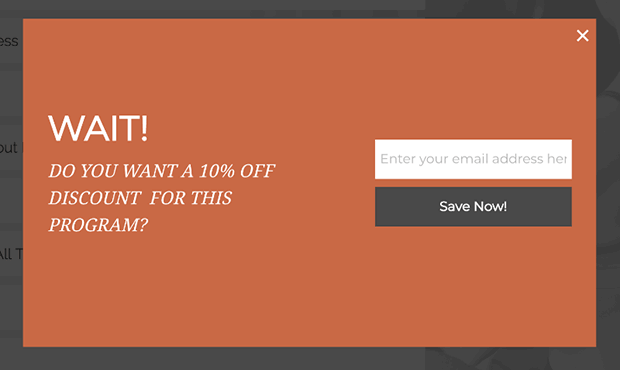
Kinobody’s simple discount popup helps reduce shopping cart abandonment with an offer specific for each of their fitness programs.
3. Skates.co.uk
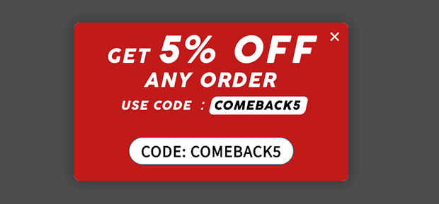
Skates.co.uk took a different approach to exit intent by launching their discount code after 25 seconds of inactivity on the cart or checkout page. It worked! They were able to convert more than 10% of abandoning visitors.
4. Kennedy Blue
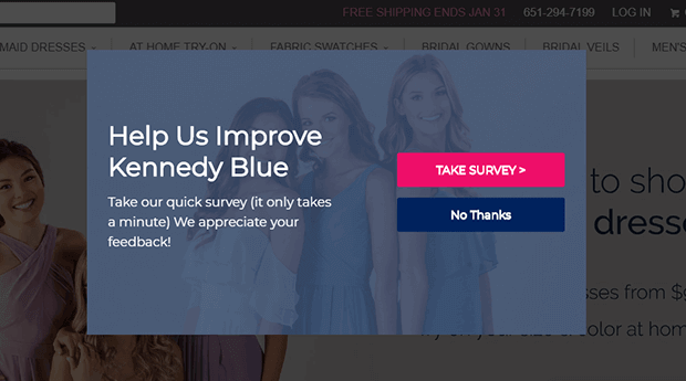
Kennedy Blue displayed a customer service survey, proving that exit popups aren’t just for boosting sales directly. When you can improve your customer experience, you’ll see more conversions and sales naturally.
5. EczemaCompany.com
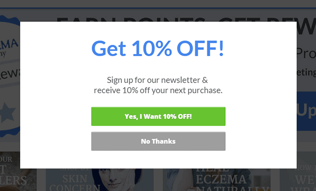
EczemaCompany.com split tested 2 different types of exit intent popups and found that the time-based targeting actually did better than the traditional exit intent!
6. Scott Wyden Imagery
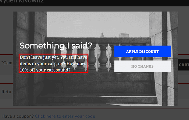
Scott Wyden Imagery uses OptinMonster’s eCommerce display rules to target users with items in their cart.
7. SnackNation
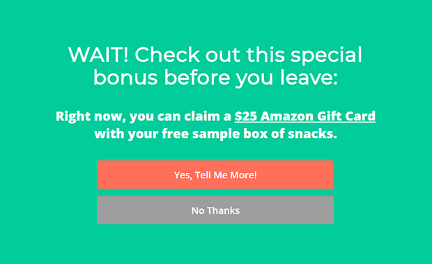
SnackNation offers a tempting gift for users who are about to leave without a free trial.
8. PortraitFlip
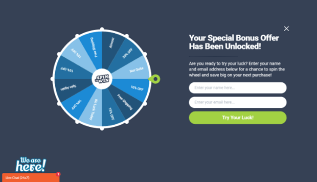
PortraitFlip spices up their product pages with an irresistible coupon wheel for desktop and a simple instant coupon popup for mobile users.
9. Cosmetic Packaging Now
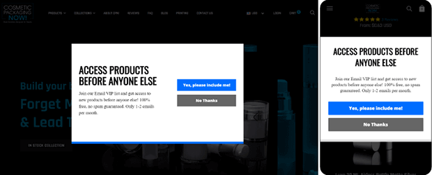
Even very niche retailers like Cosmetic Packaging Now can use exit intent to show exclusive offers. Their campaigns are targeted to engaged users who have been on a page for at least 7 seconds or scrolled at least 20% of the page.
10. Bauble Bar
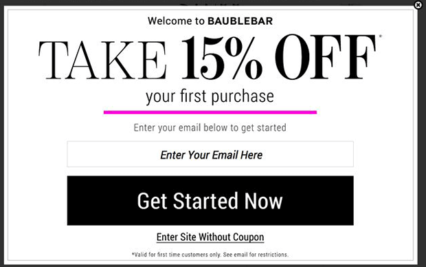
Jewelry and homewares retailer Bauble Bar offers first-time visitors a tempting discount that also creates a sense of urgency since it can only be used on their first order.
Blog & Publication Exit Intent Popup Examples
11. AdamEnfroy.com
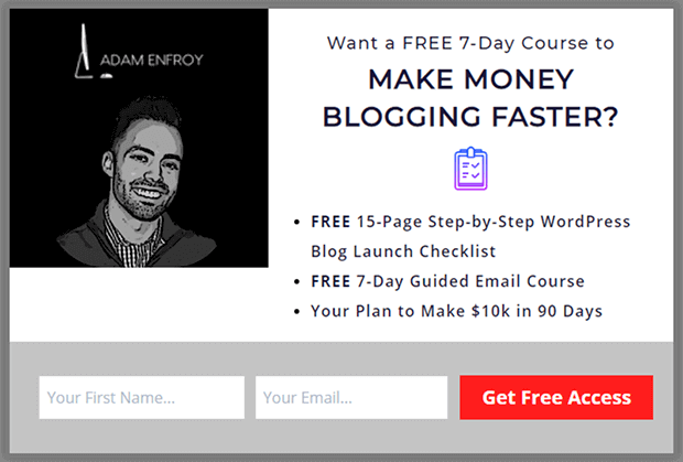
Blogger Adam Enfroy uses an exit popup to offer an irresistible lead magnet. We like how the popup clearly states the free course’s value proposition.
12. Brendan Hufford
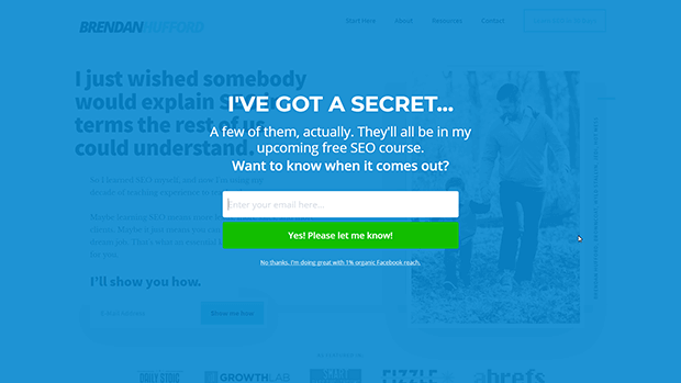
Brendan Hufford shows abandoning visitors a fullscreen welcome mat that builds the waitlist for a future course. Once the course is ready to launch, they can send email marketing campaigns promoting it.
13. BrianTracy.com
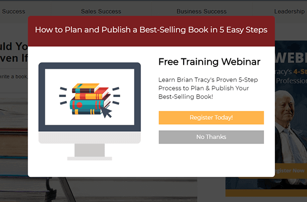
Brian Tracy has several exit popups for different segments of his target audience. This one offers a webinar for visitors interested in a specific topic, in this case book writing.
14. Ryan Robinson
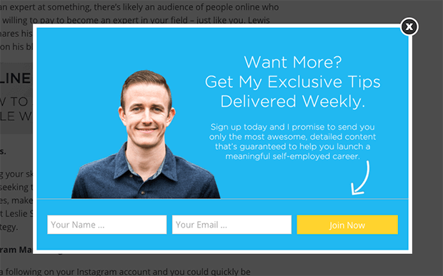
Ryan Robinson’s exit popup optin features a clear photo of the blogger so that new subscribers can match a name with a face. The copy promises the result of a meaningful self-employed career, not just the features in the weekly newsletter.
15. Neil Strauss
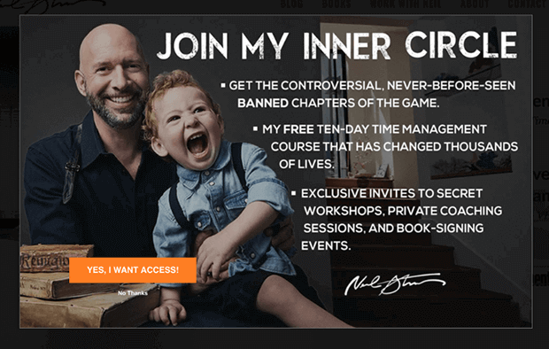
Neil Strauss’s attention-grabbing popup features a funny, relatable photo of the author and his child, an intriguing “controversial, never-before-seen, banned” lead magnet, and an enthusiastic call to action.
16. Bonjour Lisbonne
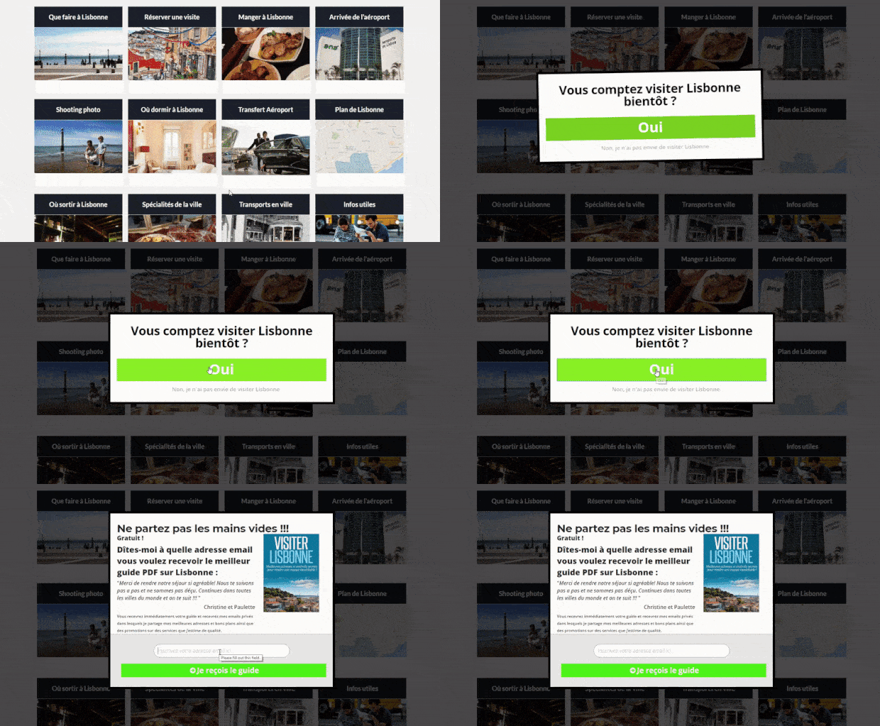
Bonjour Lisbonne uses an eye-catching MonsterEffect and a 2-step optin to grab visitors’ attention before they leave.
SaaS Exit Intent Popup Examples
17. Shockbyte
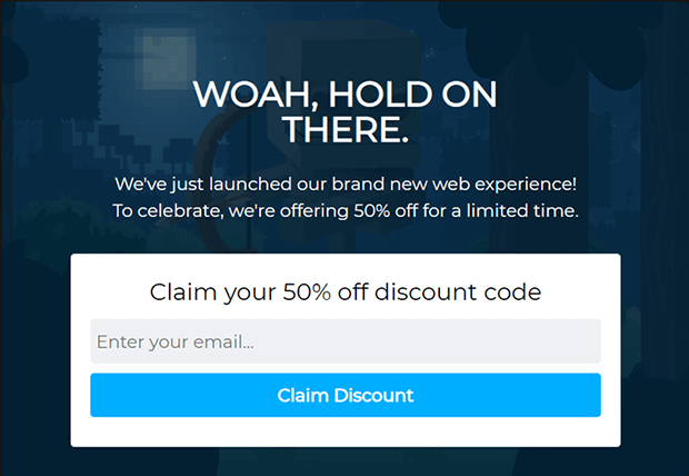
Shockbyte calls out to departing visitors with a straightforward headline asking them to wait. Then they present an offer that can’t be missed: 50% off for a limited time.
18. Hubstaff
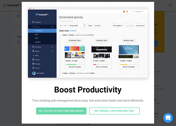
Hubstaff used A/B testing to improve their initial exit popup with real screenshots from their software and new button copy that emphasized the time-saving benefits. This campaign converted more than 20% of visitors to free trials.
19. Stays.net
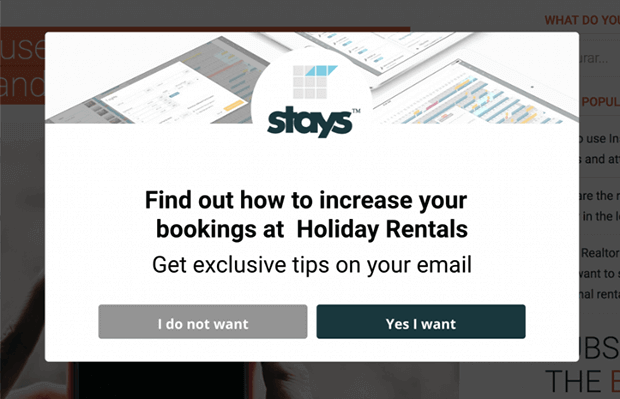
Stays.net presents abandoning visitors with a simple Yes/No choice and a compelling offer of increased bookings. This helped boost their monthly software sales by 10%.
20. Bulkly
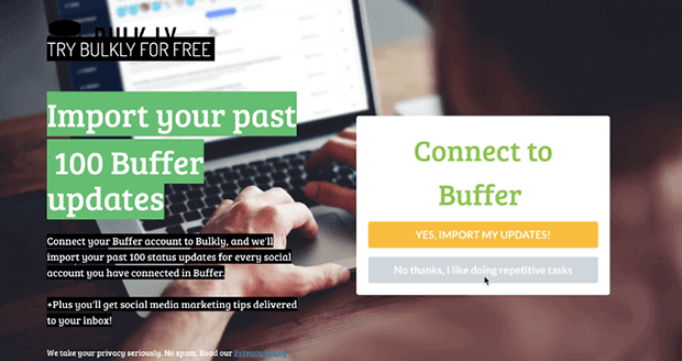
Bulkly increased lead generation 134% by offering to import 100 social media updates for free. As a mid to bottom of funnel campaign, this exit popup loads on high converting pages like the pricing and features pages.
21. DateID
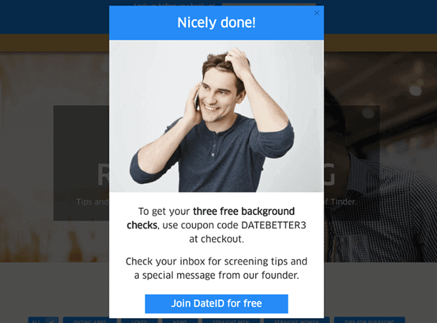
DateID cleverly customizes their success message with a happy-looking photo, a coupon code the new subscriber can use immediately, and a way to sign up for the software.
22. Chamaileon
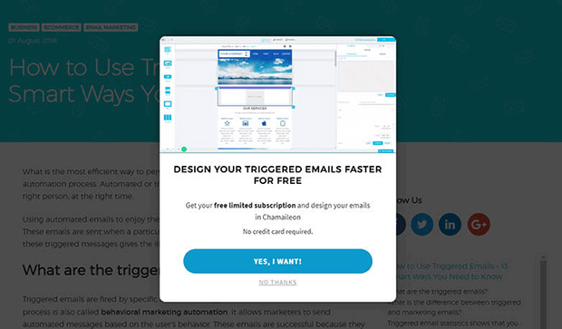
Chamaileon encourages trial signups with a Yes/No exit popup that includes an assurance that no credit card is required. Sharing how easy the process is to exiting visitors helped boost conversions from 5% to 16% of visitors.
23. Rocketbots
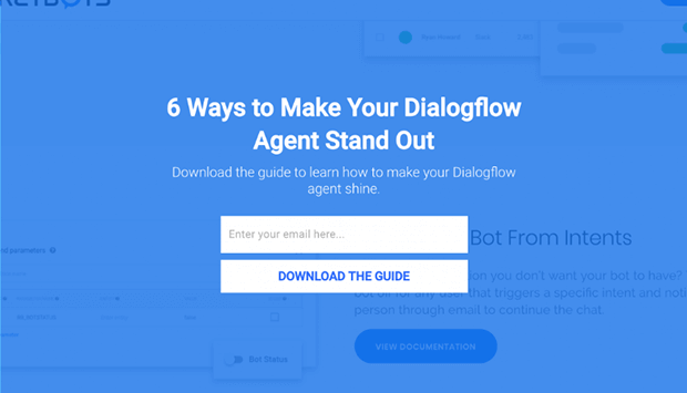
After placing exit intent popups on a variety of pages, Rocketbots found the highest-converting pages and created more targeted offers to segment their leads better. As a result, they saw 680% list growth!
24. Post Planner
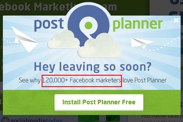
Post Planner’s exit popup targets social media marketers with a free trial of the software. With OptinMonster it’s easy to target users referred by Facebook who are more likely to be interested in Facebook marketing. The campaign also uses social proof by sharing how many users are planning their content with the software.
Agency Exit Intent Popup Examples
25. Fastrack
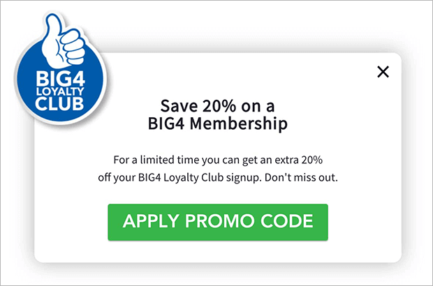
Digital marketing agency Fastrack used exit intent popups to promote their clients’ loyalty programs, with conversion rates increasing from 10-30% as a result.
26. Inbound Marketing
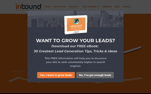
Inbound Marketing combined exit intent with geolocation to target qualified users from Australia with their free, informative lead magnets.
27. Whole Whale
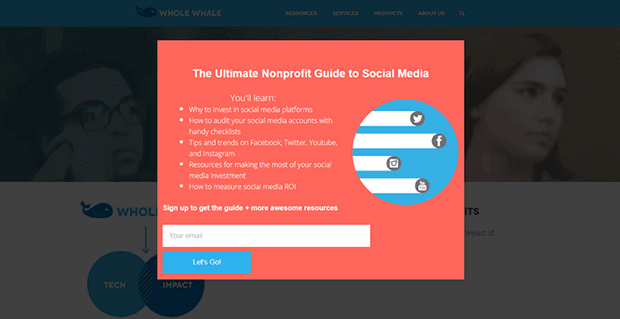
Whole Whale uses both page-level and referrer targeting to serve very specific exit popups. For example, this campaign only appears to users referred by Facebook and Twitter. Those users are more likely to be active on those networks and find the guide helpful.
Exit-Intent Popup Best Practices
Exit-intent popups can be extremely effective, as long as they contribute to a positive user experience on your website. Here are some general principles to help you be successful with exit popups:
- Text: Keep your copy and headlines clear, simple, and short.
- Popup Design: Use easy to read fonts, eye-catching imagery, and consistent branding.
- Call to Action (CTA): Make popup offers that align with the page and the reason they might be leaving.
- Timing: Let the visitor meet some of their goals before launching a popup, and don’t show exit popups to someone who’s already taken the desired action. (For example, don’t show an cart abandonment popup after a customer has checked out!)
- Testing: A/B testing different headlines, CTAs, and design elements can help you find the best combination.
For more ways to improve your exit popups, check out our full list of exit popup hacks to grow your subscribers and revenue.
How to Add an Exit Intent Popup to Your Website
If you’re worried about how hard it will be to imitate these exit intent popup examples, never fear! It’s incredibly easy to do with OptinMonster.
OptinMonster can create all types of popups, such as:
- Lightbox overlays (the traditional popup format)
- Floating bars
- Fullscreen welcome mats
- Slide-ins
- Inline forms
- Discount code wheels
And there are hundreds of templates and Playbooks to help you get started quickly.
OptinMonster can apply Exit-Intent Technology to any popup and on all devices, and combine exit intent with dozens of other display rules to show your special offers to the right visitors at the right time.
OptinMonster works on all website and online store platforms, from WordPress to Wix to Shopify.
Before we wrap up, we’ll show you how to use exit-intent popups on your site with OptinMonster.
Step 1: Create a New Campaign
First, sign up for an OptinMonster account. Exit-intent technology is available on Pro plans or above, along with plenty of other features like device targeting, cart and form abandonment, countdown timers, and much more.
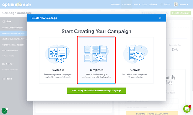
Once that’s done, log into your OptinMonster account and click on Create a New Campaign.
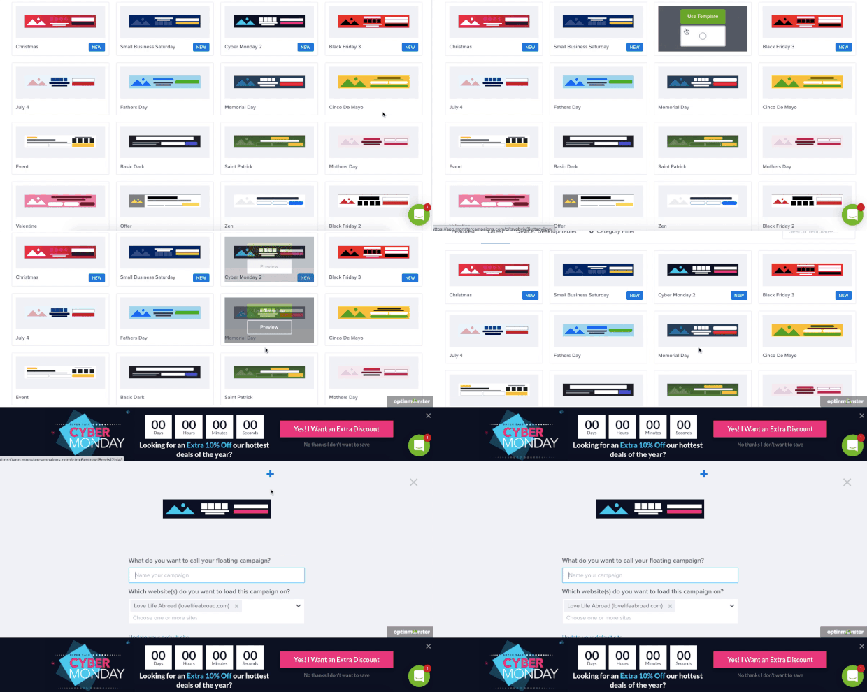
For this tutorial, we’ll choose from the template library. You can also select a Playbook, which have designs, copy, and display rules based on successful campaigns from top brands, or build your own from scratch with the Canvas template.
You can choose from different campaign types. We’ll use a popup for this tutorial.
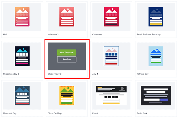
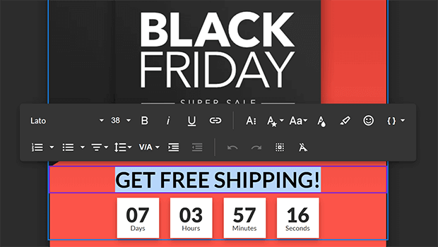
Find a template you like from the template library. We’ll be using the Black Friday 3 template in this example. Click Use Template.
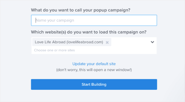
Give your campaign a name and assign it to your website. If you haven’t added a website yet, don’t worry! We can take care of that later.
Now let’s change your campaign design and copy!
Step 2: Customize the Campaign
OptinMonster has a drag and drop builder that makes it very easy to change the text, fonts, colors, and graphics on your campaign. Just click on any element to customize it.
You can add other form fields, countdown timers, images, and even video by dragging the appropriate Block from the left pane.
We won’t go into too much detail here since every campaign will be different. But once your exit intent popup looks the way you want it, you can set the display rules.
Step 3: Set the Exit Intent Display Rules
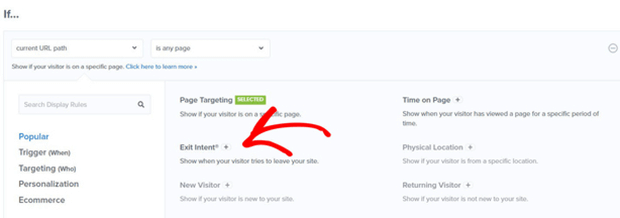
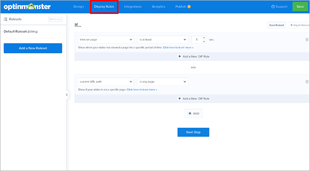
To access the display rules, click the Display Rules tab in the header. Then click on any of the dropdowns to pull up the list of rules.
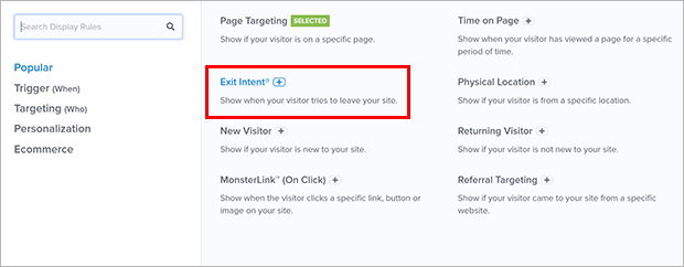
Search for or click on Exit Intent from the list of rules.
You can adjust the settings for device type and sensitivity. You can also combine exit intent with other display rules, such as specific URLs, items in cart or cart value, whether the user has converted other opt-in forms, and more.
Step 4: Connect Your Email Service Provider (Optional)
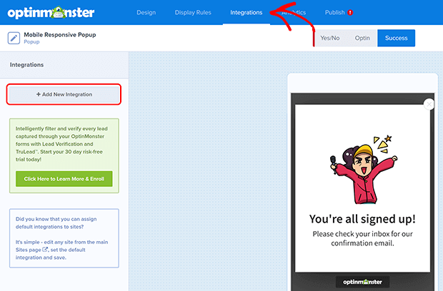
If you’d like to use exit popups to build your email list, you’ll need to connect your email service provider (ESP) with OptinMonster. Click on the Integrations tab in the header and then click on Add New Integration.
Look for your ESP in the list. OptinMonster supports integration with all kinds of marketing tools. Each integration is a little different, so we’ve provided full documentation for each tool if you need more help.
Step 5: Publish Your Exit Popup
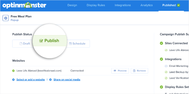
Finally, click on the Publish tab in the header and change the Publish Status to Publish.
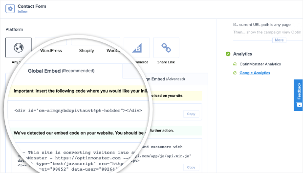
Then, scroll down to the section labeled Platform. You’ll see Global and Campaign Embed Codes. You’ll need to follow the integration directions for your specific website platform.
That’s it, you’ve added an exit intent popup!
Are Exit Intent Popups Worth It?
As you can see, it’s very easy to add an exit intent popup to your website with OptinMonster. We hope these exit intent popup examples inspire you to make your own. As you create exit intent popups, remember:
- Keep the messaging clear and simple
- Match the popup offer to the visitor’s needs
- Consider combining exit-intent with other timing and targeting rules for best results
If you’re ready to try it out yourself, get started with OptinMonster today!









Add a Comment