Do you want to get more feedback from visitors before they leave your site?
The best way to do this is with an exit survey, so customers can quickly rate and review their experience.
This will give you critical information about what customers like and don’t like on your site. That way, you can optimize for user experience (UX) and maximize revenue.
In this tutorial, we’ll show you the easiest and most effective way to display exit surveys on your site.
But first, let’s get clear on why you should use a web exit survey on your site at all.
Why Use an Exit Survey on Your Site?
Customers can give you great insights into your business by showing you what’s working and what’s not. They can also help you identify problems that you didn’t even know existed.
You can wait for people to leave a review on Google or Yelp, but stats show that only 10% of customers actually do.
And more often than not, it’s the people who have a bad experience who go online to rant.
A better way to get feedback and reviews is by asking for it yourself!
The best time to ask customers for their feedback is right before they leave your site. Their experience is fresh in their minds, so you’ll be likely to get more accurate answers.
And this is where a website exit survey comes in.
A website exit survey can help you:
- Get immediate and real-time feedback
- Identify existing problems that are disrupting UX
- Find opportunities for improvement to boost customer retention and engagement
- Segment your visitors for future marketing
Using customer insights, you can improve UX and remove any objections that get in the way of sales and conversions. This will instantly boost your revenue!
Now that you know how website exit surveys can work wonders for your site, let’s learn how to create one.
Choosing the Right Website Exit Survey Tools
There are quite a few web tools available to create exit surveys making it a challenge to pick the right one. To create the exit survey, we recommend 2 powerful lead generation tools that are popular choices on the market:
Both tools help you create awesome high-converting marketing campaigns to grow your subscriber base, increase conversions, and get insights from your audience.
Let’s take a quick look at each tool in a bit more detail.
1. WPForms
WPForms is the best form builder for WordPress. We recommend WPForms because it comes with pre-made templates for surveys and polls.
It also has a drag and drop builder to easily customize your forms.
Plus, this tool collects all form entries and organizes them for you in one place. That means it’s easy to access and understand your customer feedback.
WPForms also integrates with popular email marketing services like Mailchimp and Constant Contact. This lets you automate your email marketing campaigns as soon as people sign up through surveys and other forms.
Another great feature of WPForms is smart conditional logic.
This allows you to ask follow-up questions based on the customer’s response.
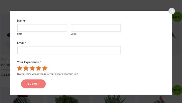
For example, when people leave a 5-star review, you could ask them to follow up with a more detailed review. That would look something like this:
These are just a few of the things that make WPForms the #1 tool for website exit surveys.
WPForms has a free version that gives you access to basic form needs for your site. To access survey and poll templates, you’ll want to get on the Pro plan.
Not using WordPress? No worries at all. You can use free software like Google Forms or a paid tool like Typeform.
Now that we’ve seen WPForms, let’s turn to our second tool on the list: OptinMonster.
2. OptinMonster
OptinMonster is the best lead generation tool on the market. It lets you embed your website survey into exit popups, fullscreen welcome mats, and much more.
OptinMonster comes with powerful features to target website visitors based on their activity and interests. Exit-Intent® is one such trigger to show a popup as a customer is about to leave your site.
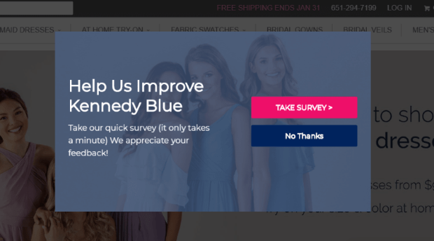
Exit-Intent® works so well that KennedyBlue increased sales by 50% through overcoming sales objections with website exit surveys.
OptinMonster also lets you show the popup only on specific URLs, such as the confirmation/thank you page on your site.
This means customers will only see the survey after they purchased a product.
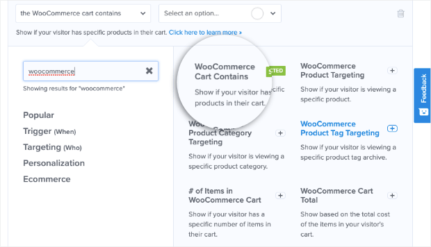
You can also target customers that have products in their cart and are leaving without checking out.
By targeting these visitors, you can find out why they’re leaving and what went wrong. You can also recover these abandoning users and get them to complete their purchase.
On top of that, OptinMonster comes with 50+ beautiful templates and 9 campaign types to choose from.
You can use the drag and drop builder to easily customize your campaigns, so they match your website theme and brand.
With OptinMonster, you’ll be able to set up high-converting exit popups in minutes. Ready to try it out, 100% risk-free?
Click below to start your OptinMonster account, backed by a 14-day money-back guarantee:
Now that we’ve seen the tools we’ll be working with, let’s dive into the tutorial.
How to Create a Website Exit Survey
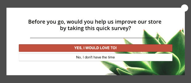
Today, we’ll create a 2-step exit survey campaign that asks customers to take a feedback survey.
If they choose to take the survey, they’ll be shown the next popup where they can rate and review their experience.
This survey form looks simple right now, but we’ll be using WPForms conditional logic to display follow-up questions based on the customer’s rating.
To follow along in this tutorial, you’ll need to sign up for WPForms and OptinMonster.
Both can be installed in a matter of minutes. And for added help, you can follow these guides to get set up:
When you’ve done that, you can get started with your web exit survey.
Step 1: Install WPForms Survey Addons
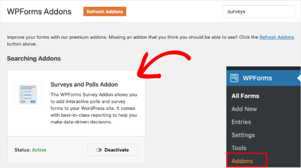
Log into your WordPress dashboard and navigate to WPForms » Addons page.
Search for the Surveys and Polls Addon and install it on your site:
When you activate this addon, you’ll get access to the survey and polls templates.
Step 2: Create a Survey Form
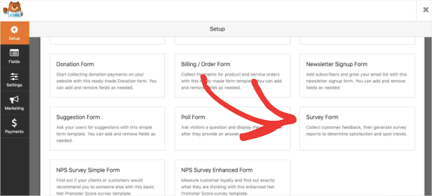
Navigate to WPForms » Add New page. This will open up a list of templates you can choose from. First, give your form a name and then select the Survey Form template.
When you do this, the form builder will open where you can customize the template.
Step 3: Customize the Survey Form
In the form builder, the default template will appear in a preview on the right, and you’ll see customization options in the left-hand side menu.
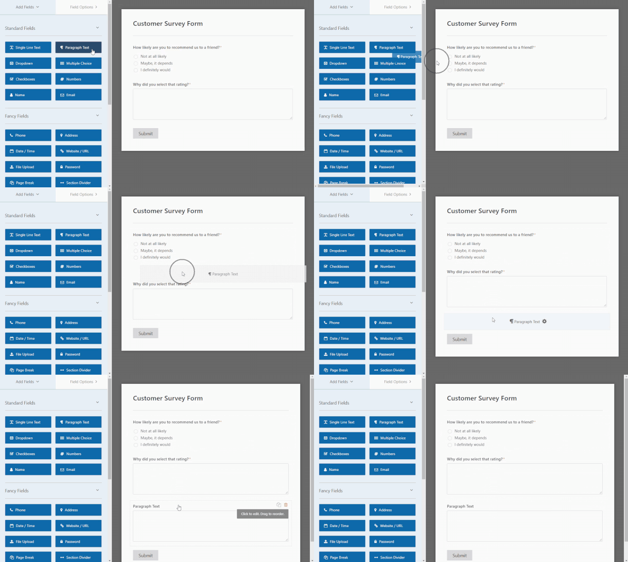
You can select any field in the preview to edit or delete it. You can even drag the fields up and down to change the order.
To add new fields, simply drag a field from the left and drop it into the form.
You can then change aspects of your form in the left-hand side menu.
For the survey form, we also recommend exploring a few advanced fields:
- Rating – Let your customers provide a rating of 1 to 5 stars.
- Likert Scale – Give your customers options to pick their level of satisfaction or how likely they are to recommend you.
- Net Promoter Score – Allow customers to give you feedback on a scale of 1 to 10.
These are great options to make your survey form more user-friendly.
Step 4: Enable Conditional Logic
Finally, we’ll explore conditional logic that lets you ask questions based on your customer’s response.
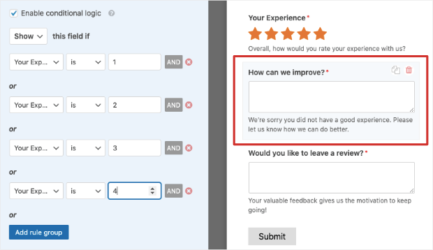
For customers who rate their experience below 4 stars, we’ll want to ask customers, ‘how can we improve?’.
To do this, create a ‘how can we improve’ field. You can do this by dragging a Paragraph field into your form (as we did earlier) and changing the name to “how can we improve” in the left-hand side menu.
Then we’ll need to add a conditional response to trigger that field to appear.
Open the Conditionals menu on the left-hand side and check the box to enable conditional logic.
Now you can create rules to display fields based on their experience. Add a rule to show this field if the ‘Your Experience’ field is 1.
Then, use the ‘Add New Rule‘ button to create the same rule for 2, 3, and 4-star rating rules.
The ‘how can we improve field’ will appear only to those who leave a 4-star rating or below.
We’ll ask customers who leave a 5-star rating if they would like to leave a review. To do this, first enable conditional logic for the ‘Would you like to leave a review?’ field.
We’ll ask WPForms to show this field only if the ‘Your Experience’ field is 5.
With that, your website exit survey form is ready. Hit the ‘Save’ button at the top of the page to store your customizations.
Click on the X button to exit the form and then copy the shortcode from the home screen.
Keep this code ready as we’ll need it to embed the survey form into our exit popup campaign.
Create the Web Exit Survey Popup
Now that we’ve made the survey form, we’ll want to add it to an OptinMonster popup.
Doing so couldn’t be more simple, and it doesn’t require any coding or “tech skills” to set up.
Let’s dive straight into the tutorial.
Step 1: Create a new campaign
To create an exit popup, log into your OptinMonster dashboard and create a new campaign.
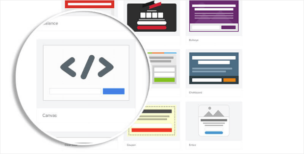
This will open up a page with campaign types and templates that OptinMonster has to offer. Today, we’ll create a Fullscreen popup so the website survey appears on the entire page.
Then select the Canvas template that lets you create a campaign from scratch.
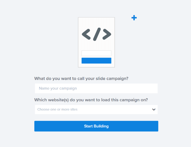
Next, you’ll need to add a name for your campaign, such as ‘Website Exit Survey,’ and click on the ‘Start Building’ button.
This will open the OptinMonster campaign builder, where you can customize the template.
Step 2: Customize the Fullscreen Campaign
Inside the campaign builder, you’ll see a preview of your campaign on the right with customization options on the left.
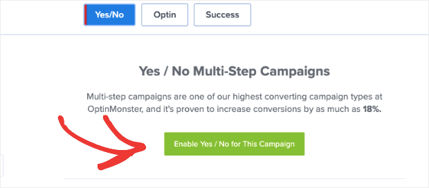
First, we’ll make this a 2-step option form. This means we’ll first ask customers if they would like to take the survey and then show them the survey form.
To do this, first, select the Yes/No tab from the top menu and click on the green button to ‘Enable Yes/No for this campaign.’
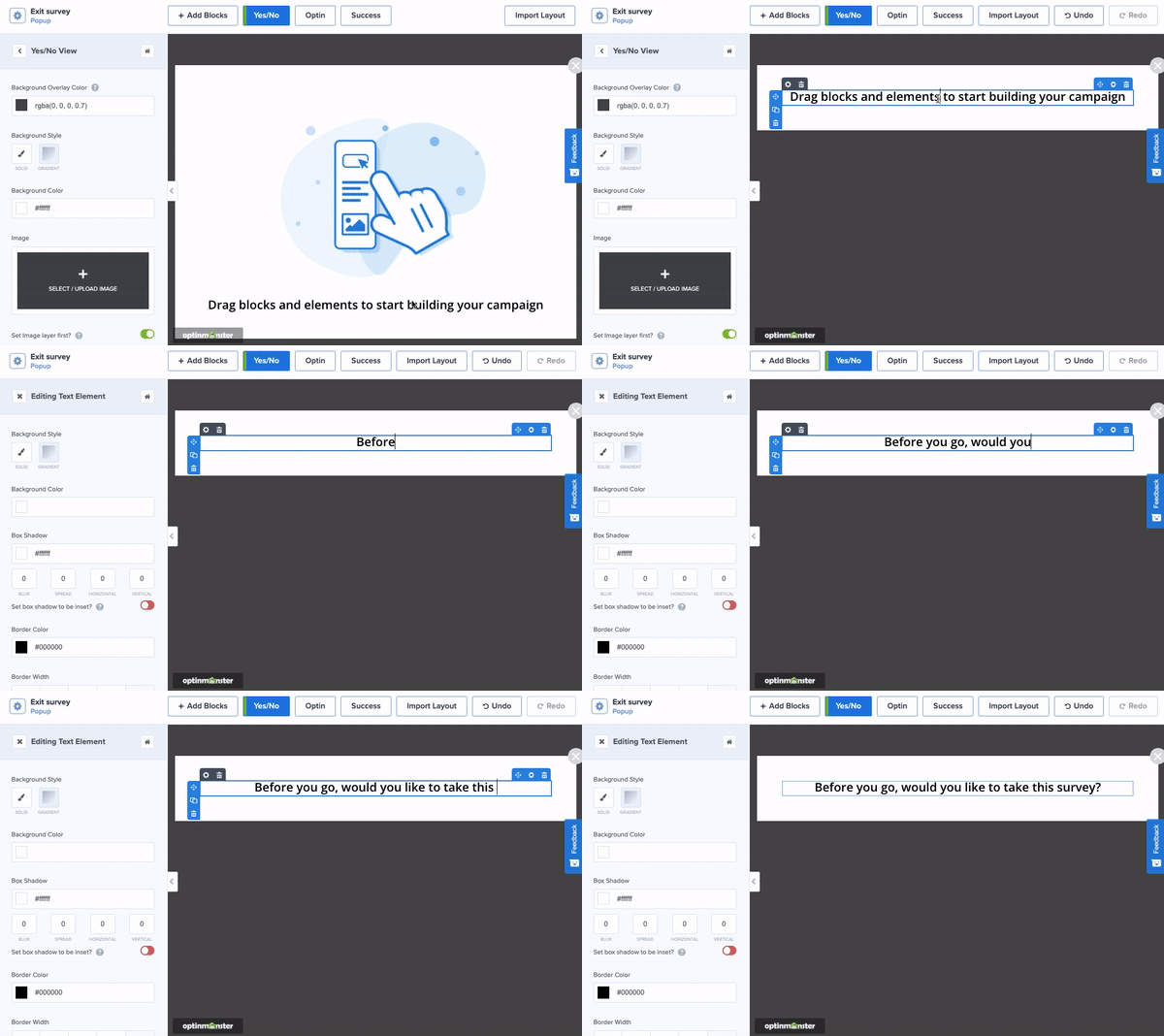
You can select elements here and use the trashbin icon to delete them.
Then you can change the text by replacing the existing text with your own.
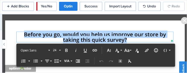
When you select the text, you’ll get a text editor bar that gives you options to customize the font, alignment, color, and more.
The inline text editor makes it incredibly easy to modify your messaging.
It also gives you total control over the language you use to connect with your audience and can help you increase survey responses over time.
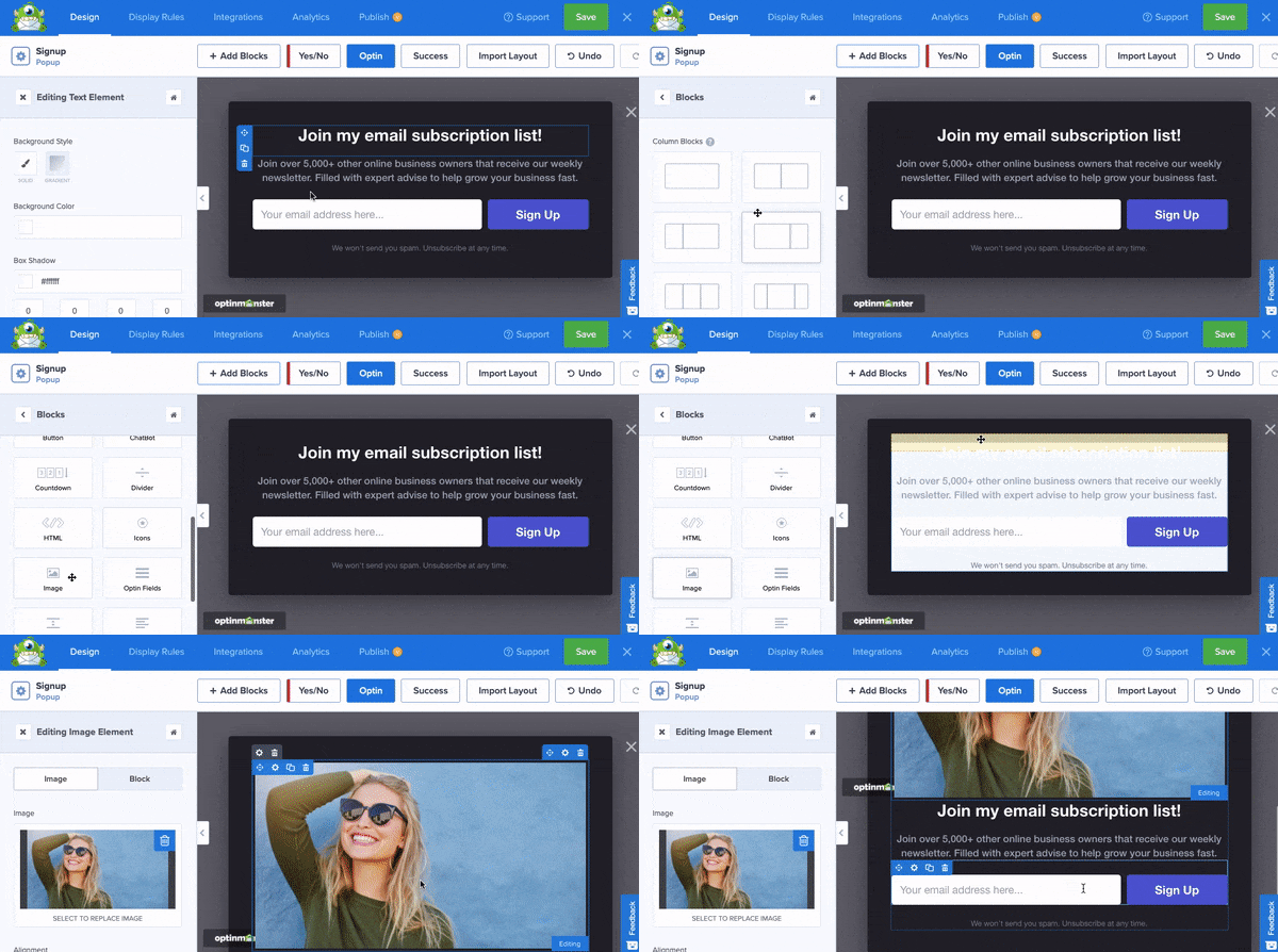
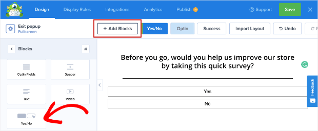
Next, you’ll need to add a new block using the Add Blocks button. Then drag and drop the Yes/No field into your campaign design.
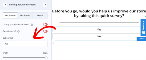
Select the Yes/No block to get customization options on the left.
You can change the text, color, font, and more.
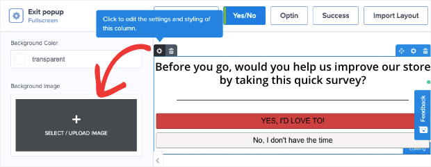
We’ve changed the text to ‘Yes, I’d love to’ and made the button color red to make it really stand out.
To add an image to the campaign, select the settings icon and then use the option in the left-hand side menu to upload your image.
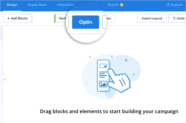
With that, the first step of your campaign is complete. Switch over to the Optin tab:
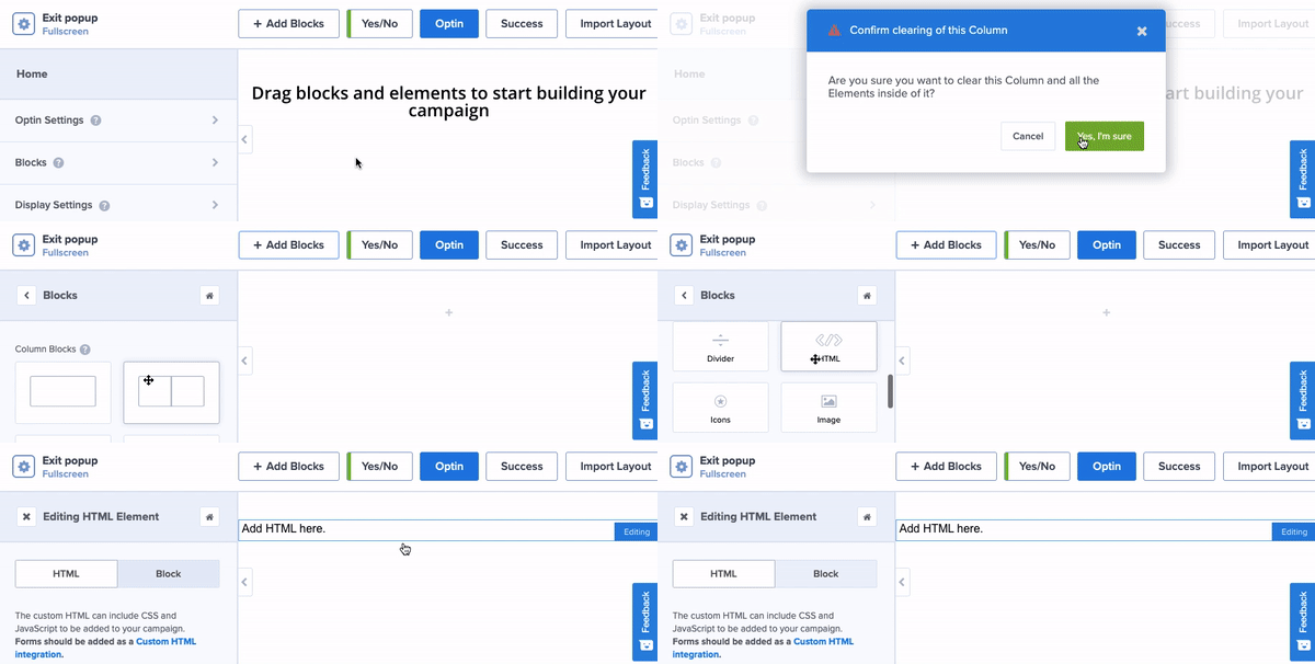
First, we’ll delete the elements here using the trashbin icon because we don’t need them. Then, add a new block using the Add Blocks button and drag and drop the HTML block into your campaign.
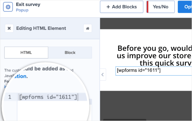
When you do that, you’ll see an HTML field appear on the left. You’ll need to paste the WPForms shortcode here.
When you use shortcodes in OptinMonster, you won’t see the survey form populated here. You’ll be able to see it when your campaign goes live.
Just know that your form is working on your site, and don’t let the preview of your shortcode through you off.
Now that your campaign is ready, save your design using the Save button on top.
Up next, we’ll show you how to control when and where this popup appears on your site.
Step 3: Create Exit-Intent® Display Rule
To make the survey we just created appear on exit, we’ll use OptinMonster’s powerful Exit-Intent® technology.
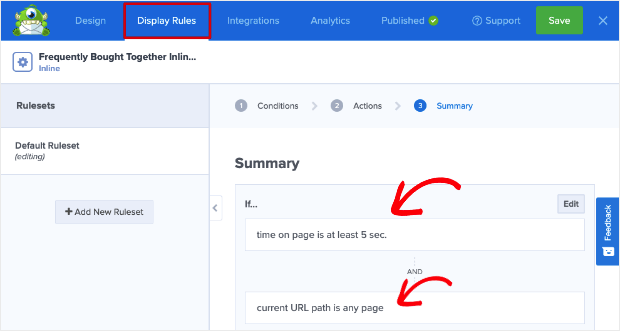
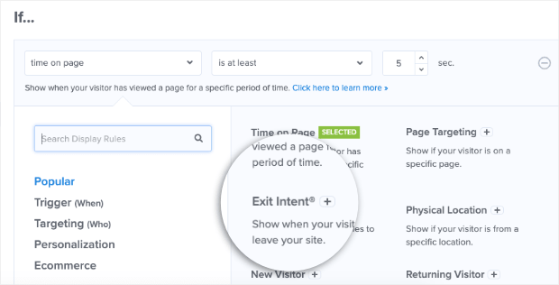
Switch over to the Display Rules tab, and you’ll see that, by default, the campaign appears to every visitor after they’ve spent 5 seconds on the page.
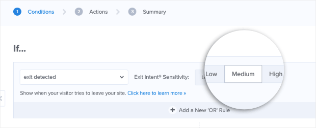
We’ll change that by editing the existing rule and choosing the Exit-Intent® option.
You can choose how sensitive you want the detector to be. We recommend leaving it on Medium level.
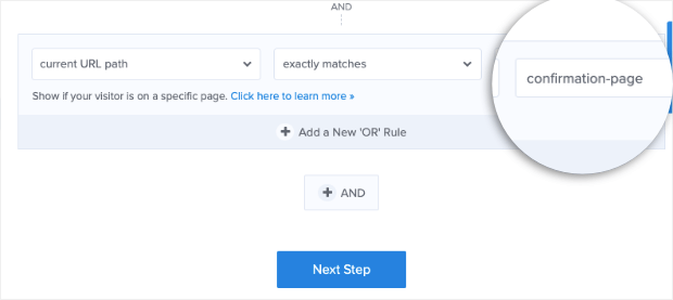
In the second default rule available, you can choose the ‘current URL path’ for this campaign. We’ll go ahead and select our confirmation/thank you page.
These rules will make the exit survey appear only to customers who made a purchase and are about to leave the site.
In this way, OptinMonster has tons of display rules you can use to target shoppers at the right time in their customer journey.
The more personalized you can make these targets and triggers, the higher engagement you can expect with your surveys.
Before publishing your campaign, there’s one last step: styling your form with a small bit of JavaScript.
Step 4: Style the Campaign With JavaScript
OptinMonster campaigns are designed to look great. But since you’re using a shortcode here, we recommend adding a small snippet of code to make sure the form appears nicely.
We’ll be using JavaScript today, but don’t worry if you don’t have coding experience.
All you need to do is copy and paste the code that we’ve created for you.
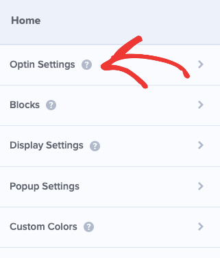
Go to the Design » Optin tab in the OptinMonster campaign builder. From the home menu on the left, open the Optin Settings tab.
Scroll down to the Custom JavaScript section, where you’ll see an empty field to enter your own code.
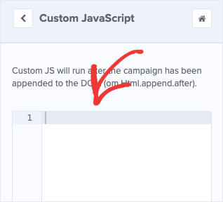
This will add a few styling rules to your website exit survey popup so that it looks much nicer.
This code is enough to style any form in most cases. However, if you’re experienced with Javascript and CSS, you can customize it even further.
Now you’re ready to publish your campaign.
Step 5: Publish Your Campaign
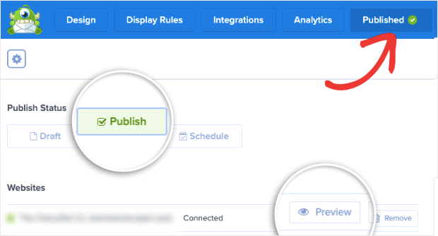
The exit survey campaign is ready to go live on your site. To do this, switch to the Publish tab.
You’ll see an option to preview your campaign. Then you can set the status to ‘Publish’ to launch your exit survey.
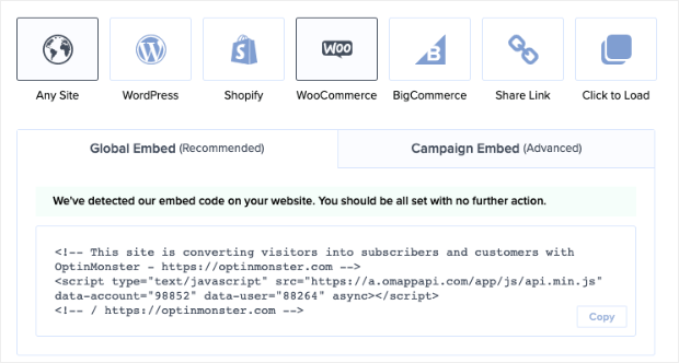
If you haven’t connected your website to OptinMonster yet, you’ll find instructions to do so at the bottom of this page.
We recommend heading to your OptinMonster dashboard and refreshing the page there. This will make sure the latest changes are reflected on your site.
If you’re using WordPress, you’ll need to visit the OptinMonster » Campaigns page in your WordPress admin area.
Make sure your campaign is set to ‘Published’ here as well.
Now you can visit your website, and you’ll see the exit survey appear according to the display rules you’ve set.
Step 6: View Customer Feedback
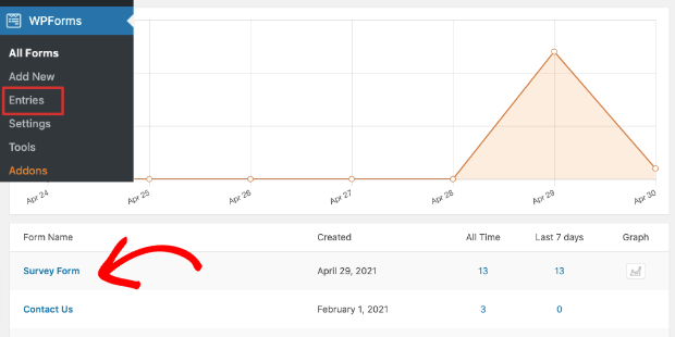
Once customers start filling out your survey, you can view their entries inside the WPForms dashboard.
Head over to your WordPress site and open WPForms » Entries page. You’ll see a list of forms that you’ve created using WPForms.
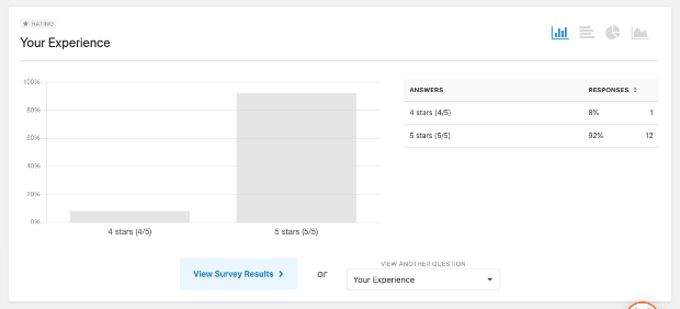
Select your form and, on the next page, you’ll see a report of your customer ratings.
Below that, you’ll see all your form entries with the customer’s name, email address, rating, and entry date.
You can click on the ‘View’ button next to an entry to see the customer’s review and suggestions.
That brings us to the end of this tutorial. You’ve now learned how to create a website exit survey to collect valuable feedback and opinions from customers.
If you haven’t signed up for OptinMonster yet, what are you waiting for? Click below to start your 100% risk-free OptinMonster account:
We hope you liked this post. Now that you know how to create website exit surveys, you may want to try your hand at creating follow-up campaigns with OptinMonster.
If you’re looking for more ways to get insights into your audience, then you’ll definitely want to check out these posts:
- 9 Best Ways to Collect Customer Feedback on Your Website
- How to Get Actionable Insights with a Custom Google Analytics Dashboard
- 9 Best Online Survey Tools for Small Businesses (Compared)
These articles will help you understand your audience better so you can boost sales, revenue, and growth!
















Add a Comment