Do you want to design a mobile popup to increase conversions across your site but not sure where to start?
Adding popups to your mobile strategy is an excellent way of getting new leads and driving sales. This is especially true as more online consumers access their favorite websites from mobile devices.
The problem? Creating a popup for mobile requires slightly altering your approach in design and messaging. Because if you don’t build your popup correctly, you could end up annoying visitors and losing customers.
That’s why, today, we’re going to cover 9 mobile popup best practices.
These actionable tips will ensure that your mobile popups look stunning and do what they’re supposed to: convert your traffic into new leads.
Before we dive into the list, though, let’s clarify why optimizing mobile popups is so important to your marketing strategy.
Why Optimizing Mobile Popups Matters
It’s no secret that the digital world is going mobile-first. As the mobile trend was picking up in the mid-2010s, even Google stepped up and announced it would index mobile-first content for the entire web.
And when Google makes a major shift like that, you know it’s for a reason.
But just how many people are accessing the web from their smartphones? According to Statista, mobile devices account for just over half the web traffic in 2020.
And that number has held fairly steady since 2017 without showing any signs of slowing down.
Plus, eCommerce sales have gone up for mobile devices, as well.
Oberlo points out that in 2020, 72.9% of all eCommerce sales came from mobile devices. This number has increased significantly from 2016 (when mobile sales were 52.4%).
That means nearly three out of every four sales online came from mobile devices, which is simply something you can’t ignore. Because if you’re not optimizing your entire mobile strategy, popups included, then you could be leaving 73% of your potential profits on the table.
Considering how easy it is to optimize your popups for mobile, there’s no reason for you to risk those kinds of losses.
So, now, let’s turn our attention to 9 mobile popup best practices that will ensure you’re boosting conversions and growing your business.
9 Mobile Popup Best Practices
Before anything, we should briefly discuss one critical issue with mobile popups: you can make them as easy or as hard to design as you choose.
Everything boils down to using the right tool. And for mobile popups, there’s no easier tool than OptinMonster:
OptinMonster is hands down your best solution for optimizing mobile popups. From the very start, you have prebuilt templates that optimize your popup campaigns for mobile.
From there, you can use our inline text editor and drag and drop builder. This allows you to customize your mobile templates to create a professional-looking and high-converting popup in a matter of minutes.
Plus, with our advanced targeting rules, you can display your campaigns specifically to mobile users.
This level of customization is guaranteed to increase conversions across your site. And it’s so easy to set up that you’ll have mobile popups running on your site in minutes.
Want to see it in action for yourself? Click below to start your OptinMonster account, 100% risk-free:
With that in mind, let’s look at 9 mobile popup best practices. Then, we’ll show you how easy it is to accomplish each of these tips with OptinMonster.
Let’s dive in!
1. Select the Right Type of Popup
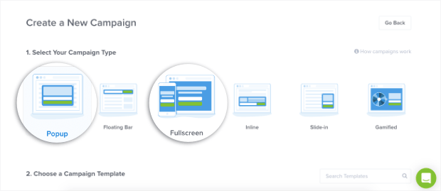
First and foremost, you need to decide which type of “popup” would be best for your campaign. For our purposes, we’re really talking about 2 types of popups for mobile:
- Traditional lightbox popup
- Fullscreen welcome mat
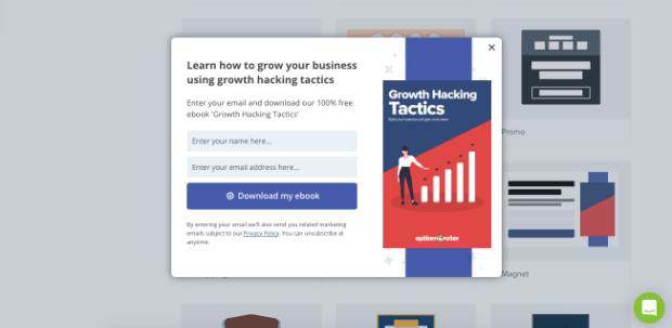
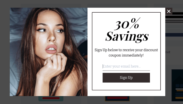
A traditional lightbox popup appears and darkens the browser screen in the background. These look something like this:
Notice that you can still see the background browser screen and that the popup only takes up about 50% of the page.
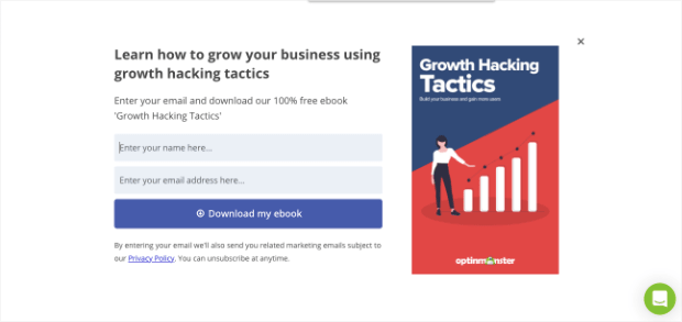
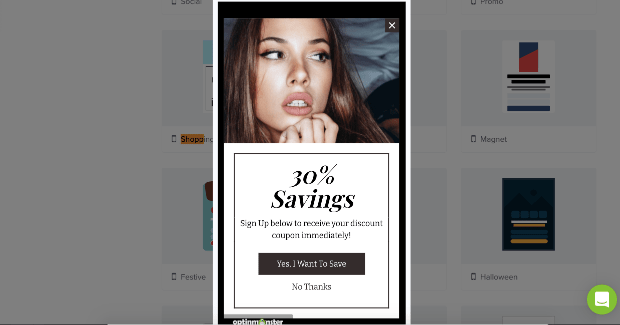
Fullscreen welcome mats, on the other hand, take over the entire screen. These look more like this:
You can see that the fullscreen example above and the lightbox popup example before that use the same template. The difference is how much of the user’s browser page they’ll cover.
There are advantages and disadvantages to each, and both types of campaigns require thorough testing across multiple devices (which we’ll cover in a later tip).
But one thing about fullscreen campaigns is that it gives you a little more room to play with. This is particularly helpful since your mobile popups will still include:
- Heading
- Sub-text
- Input fields (for name and email address)
- Call to action (CTA) button
You can try both campaigns, but for mobile popups, fullscreen might be your best bet.
How to Do This With OptinMonster
From the start, you can easily select the type of campaign you want to build.
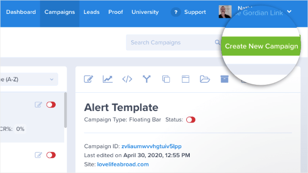
First, click Create New Campaign from your OptinMonster dashboard:
Then you can choose the type of popup you’ll want to create:
This lets you prepare your mobile popups for success straight from the get-go.
2. Choose the Right Template
Next, you need to make sure you choose the right template for your mobile popups. This is important because it will literally make or break your campaign’s success.
Here’s what we mean:
With desktop popups, you usually have campaigns that are wide and short. But for a mobile popup, you need a template that matches most modern phone screen sizes.
That means you need a template that thinner and taller.
In many cases, you need to make sure your template has a single column layout where images are either above or below your text (rather than side-by-side).
So rather than something like this:
You’d need a template layout that looks like this:
By choosing the right template from the start, you’ll save yourself hours of design frustration later on.
How to Do This With OptinMonster
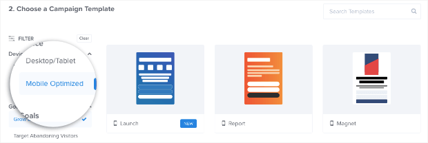
OptinMonster has over 50 prebuilt templates that are mobile-friendly. And as you’re selecting which template you want, you can click the Mobile Optimized filter from the left-hand side:
This changes the template’s layout and makes them longer and thinner, as you can see from the image above.
Again, the goal of these templates is to save you time and give you a mobile template that’s easy to modify.
3. Write Concise Copy
This is a good rule of thumb for both desktop and mobile popups, but you should keep your copy short.
“Copy” simply refers to the persuasive language you use to entice customers to click your call to action.
When you have a popup for desktop users, you’ll have a bit more space to play with. That means you can add more information about your offer or lead magnet.
But with mobile templates, you’ll need to be more creative. That’s because your mobile popups will, by nature, give you less space.
How to Do This With OptinMonster
OptinMonster gives you 100% control over the messaging of your campaigns.
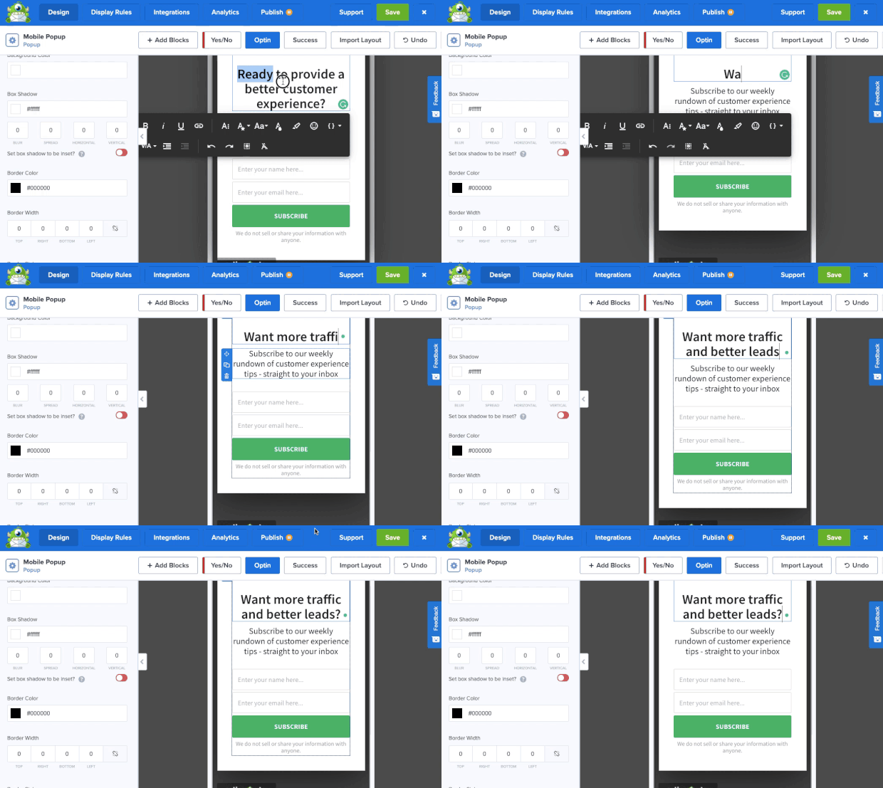
With our inline text editor, you can edit your mobile popup’s copy directly in OptinMonster’s campaign builder:
This lets you write the copy you need to get the conversions you want. And with our inline editor, you can also change anything about your text’s:
- Font-family
- Size
- Color
- Width
- Alignment
- And much more…
This gives you additional design components to your popup’s copy, so you can make a mobile popup that matches your site’s brand, style, and messaging.
4. Give Users a Way to Close the Campaign
This sounds obvious, but you’d be surprised how many companies forget to give users a way to close their mobile popups.
More often than not, this happens by accident. You’ll either forget to add a closing “X” button to your mobile campaign. Or, as often happens, the user’s screen size will cut this button off.
Again, this goes back to the importance of testing, which we’ll discuss in just a moment.
For now, remember to test your campaigns and specifically look for a way to close them. Otherwise, you’ll ruin the user experience (UX) and repel potential leads from your website.
How to Do This With OptinMonster
OptinMonster makes it incredibly easy to add or remove the closing “X” button to your mobile popups.
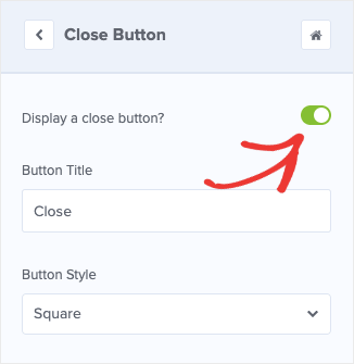
From the left-hand side menu in your OptinMonster editor, you can flip the toggle switch to On next to Display a close button:
You can also change the button’s:
- Style
- Position
- Size
- Weight
- Shadow
- And more
This lets you quickly and easily give users a way to close your mobile popup. In the end, this will improve UX across your site.
5. Limit the Information You Ask For
You’ve probably run across poorly-designed popups in the past. Rather than asking for your name and an email, they ask for your phone number, job title, gender, age, and tons of other unnecessary questions.
Let’s be clear: getting all that information about your leads is important, but it doesn’t have to be done at once.
This is particularly true for mobile popups where space is more of an issue.
We recommend going after what you need right now: the email address. All the other bits of data that you want can come later through progressive profiling.
But limiting the information you ask for to the user’s email address lets you add them to your contact list and gives you more room to write compelling copy on your mobile popup.
Plus, it will limit the amount of typing for your user to join your mailing list. This is important because, on mobile, keyboards are smaller, and typing is more difficult.
By only asking for an email address, you’ll remove a bit of friction from the signup process.
How to Do This With OptinMonster
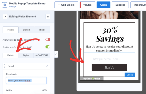
OptinMonster lets you change the input fields with just the click of the button. From your builder, you can click on the Optin block to pull up the editing tools on the left-hand side:
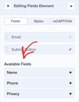
Then you can choose which fields you want to include or, for our purposes, remove:
By only asking for an email address, you’ll limit how much your user needs to type. This will make them more willing to join your mailing list and improves overall UX.
6. Make Your CTA Button Stand Out
When people see your popup campaign from their smartphone, you’ll usually be asking them to do 2 things:
- Enter their email address
- Click your CTA button
We just covered why it’s so important to limit the information you ask for to a user’s email address. Now, let’s talk about the CTA button.
It’s important to make sure your button is large enough that a thumb can easily click it. But also to make sure the button color stands out and is intuitive for users to push.
Remember, you’re trying to reduce as much friction for mobile users as possible. This means making every step of the signup process totally obvious, including how to submit their email address to redeem your lead magnet.
How to Do This With OptinMonster
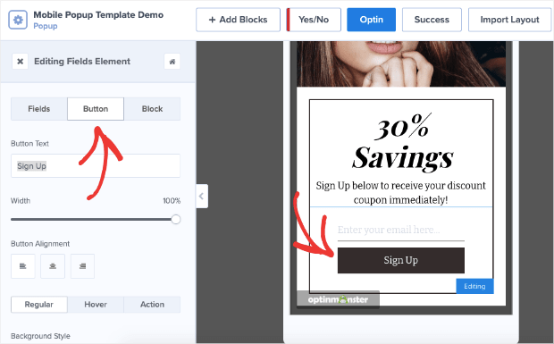
OptinMonster gives you 100% control over your mobile popup’s design. This includes the size, color, and wording for your CTA button.
Simply click on the Optin block in your OptinMonster builder (like you did earlier in this post). This will pull up the editing options on the left-hand side:
Now, you can change your button’s:
- Text
- Width
- Alignment
- Background color
- Font-family
- Font color
- And more…
This means you can change every aspect of your CTA button for mobile popups. By making it easier for your users to click your CTA, you’ll reduce friction in the signup process and get more conversions.
7. Select Smarter Targeting Rules
When you’re designing your campaigns for mobile users, you’ll still need to think about three things:
- Who is your target audience for that campaign?
- When should your popup appear?
- Where should your campaign display on your site?
By answering these questions, you’ll be able to show your mobile popup to the right people at just the right time in their customer journey.
This allows you to target specific users, so you can create the most compelling offers for your site’s traffic.
As a result of smart targeting, you can expect massive boosts in your conversion rates.
How to Do This With OptinMonster
OptinMonster offers more display rules than any other competitor on the market. We break down these rules into 2 categories:
- Targets
- Triggers
Targets use demographic information about your site’s traffic to determine whether or not a campaign should display.
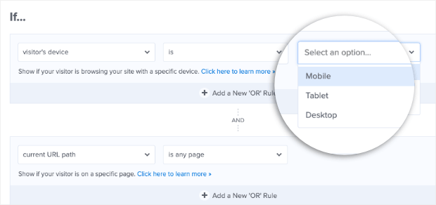
This would be things like what content they’re viewing, where they’re physically located, or what device they’re using.
That last one is particularly important. OptinMonster lets you quickly and easily target mobile users:
Fortunately, with OptinMonster’s mobile templates, it will automatically target users visiting your site from their smartphones.
On the other hand, Triggers rely on your users’ behavior to determine if a popup should appear. That would be things like how far down the page they scroll, which buttons they click (with MonsterLinks™), or if they’re trying to leave the browser page.
That last trigger is called Exit-Intent®, and it’s remarkably powerful.
In fact, the fitness company Crossrope was able to increase their email list by 900% with a simple exit-intent popup.
And now, you can use the same exit-intent technology for your mobile users with OptinMonster’s mobile exit-intent popups.
To learn more, check out this helpful post: How to Create Mobile Exit-Intent Popups That Convert.
These are just a few examples of the targeting rules you can use for mobile popups. There are, of course, many more.
The point is that OptinMonster gives you the most options for sending the right message to the right person at just the right time in their customer journey.
This gives you more leads and, ultimately, helps you grow your business faster.
8. Personalize the Campaign for Mobile Users
When you’re creating popups for desktop, personalization is key. It makes users feel like a valued customer rather than another metric in your marketing reports.
This same principle applies equally to mobile popups.
Where you can, you should personalize your campaigns to improve UX and connect more deeply with your site’s visitors.
Many popup building tools, like OptinMonster, allow you to add a user’s name, location, or other information directly in the popup campaign.
This is great for grabbing your user’s attention and getting them to engage with your mobile popup.
How to Do This With OptinMonster
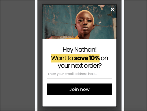
OptinMonster allows you to use something called Smart Tags to personalize your campaigns.
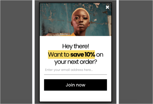
Smart Tags let you to insert your user’s name or location directly in the campaign. So rather than a popup with a general greeting that says, “Hey there!” like this:
You can have something that addresses the user with something that looks like this:
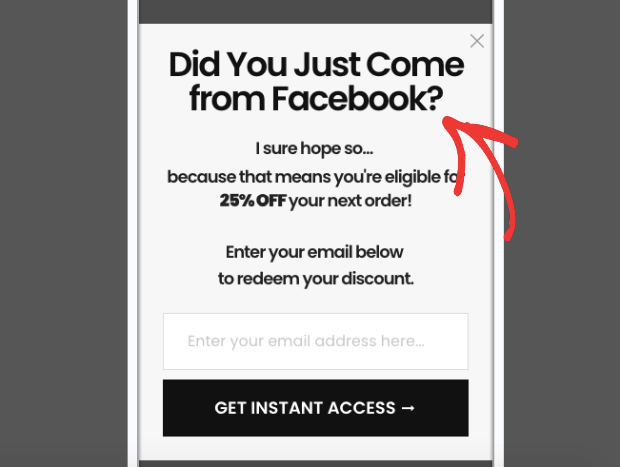
OptinMonster also gives you other ways to personalize your popup campaign to the user. One popular example is creating mobile popups that appear based on where your user is coming from.
So if someone finds a post on Facebook and visits your site, that user would see your mobile popup because they specifically visited from Facebook.
Here’s what that mobile popup could look like:
Again, these personalization strategies are perfect for grabbing your user’s attention. Once you’ve got them, you can more easily entice visitors to your CTA with a compelling offer.
9. Test Campaigns Across Multiple Devices
Last but certainly not least, we need to talk about testing your mobile popups. This is something that’s come up a few times throughout this post, and for good reason.
You need to test your mobile popup campaigns across a wide variety of devices. This will help you ensure that you keep UX high for all your mobile users.
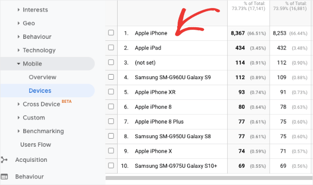
One thing you can do is go to your Google Analytics account to see which mobile device people are most likely to visit from.
You can find this under Audience » Mobile » Devices in your Google Analytics account:
This will give you a headstart while you figure out which screen sizes you need to test for your mobile popup campaigns.
And that’s it! These have been 9 best practices for designing mobile popups.
We hope you found this post helpful. If you did, you might also want to check out the following resources:
- How to Create Mobile Optins That Get More Leads and Grow Your Business
- White River Boosted Conversions by 150% with OptinMonster
- How to Engage Mobile Visitors by Showing a Popup After Inactivity
These articles will have everything you need to improve your mobile strategy, grow your mailing list, and drive more sales.







Add a Comment