Are you looking for the best landing page optimization tips to increase conversions?
Landing pages are a great way to boost newsletter signups and drive sales. But the hard part is creating a landing page that actually converts.
So, in today’s article, we’re going to give you 7 tips for optimizing your landing page. Then, we’ll dive into 5 case studies that achieved real success using those same tips.
But first, let’s make sure we understand exactly what a landing page is and how they work.
What Is a Landing Page?
A landing page is a stand-alone page on a website where your traffic “lands” when they arrive to your site. In other words, a landing page can technically be any page on your website, including your homepage.
That’s why you’ll often see marketers talk about different types of landing pages. You can have:
- Thank you pages
- 404 pages
- Unsubscribe pages
- Product feature pages
And more.
For today’s post, though, we’re going to simplify the term “landing page” to refer to a specific page that you’re building for 1 of 2 reasons:
- Squeeze Page: A landing page where the only goal is to get a piece of contact information like an email address
- Sales Page: A landing page where the only goal is to make a sale
Again, any page on your website can technically be a landing page. All that’s required is a portion of your traffic “lands” there from a 3rd-party source.
But squeeze pages and sales pages are the most common (not to mention most beneficial) in any marketing strategy.
With that in mind, we’re about to look at 7 tips you can apply to your landing pages to improve conversion rates. But most lists on landing page optimization include the same generic advice:
- Write better headlines
- Incorporate storytelling
- Use engaging videos and images to attract attention
And while all of this advice is good, we wanted to create a list of uniquely actionable tips for making landing pages better. And we wanted to be sure that the majority of these tips would be new for you.
If you need a quick brush up on the basics, though, no worries. Just read this post on the anatomy of the perfect landing page to get started.
Then, check out these 7 unique tips for creating the highest converting landing pages possible.
Landing Page Optimization: 7 Best Practices
1. Determine Your Goal for the Page
First and foremost, you need to decide on a specific purpose for your landing page. What do you want the page to accomplish?
Often times, marketers will give a landing page multiple goals, which creates poorly written web copy or weak calls to action (CTAs).
They’ll create a long-form sales page but, halfway through, include a CTA asking for an email address. It’s unclear if the goal of the page is to make a sale or to get more subscribers.
Instead, your squeeze or sales page should have one objective with a clear CTA. This may sound like basic advice, but this is the cornerstone on which all the other tips depend.
If your landing pages have too many goals, it’ll be hard to optimize the results you want.
2. Decide If You Need a Full Page
For both squeeze and sales pages, there are 2 types you can build:
- Long-form
- Short-form
Both of these terms simply refer to how long you make your landing page’s copy.
In many cases, a short-form landing page (with minimal information) will be all you need for squeeze pages. This is especially true as you can add a video to your landing pages, which requires less space for more information.
Sales pages, on the other hand, tend to rely on both long and short-form designs. It really depends on your product, your target audience, and how you’ve tested conversion rates for both types.
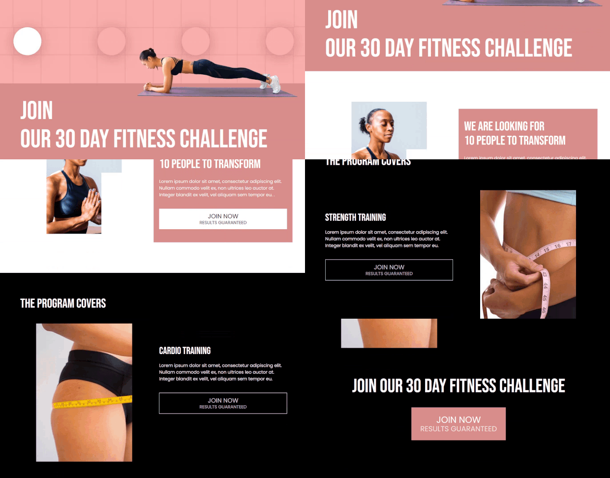
To create a long-form sales page, we recommend using SeedProd. SeedProd is the best landing page builder for WordPress. Using its drag and drop builder, you can easily create a landing page like the one below.
SeedProd offers ready-made landing page blocks you can use to increase conversions including buttons, contact forms, optin forms, testimonials, countdown timers, and more. There are also pre-built sections you can add like FAQs, Features, and Hero sections so you can really build out your landing page.
That said, you’ll find many situations where you need a short-form landing page. If that’s the case, you may want to consider trying something different:
Using an optin campaign like a lightbox popup or a fullscreen welcome mat instead of a landing page.
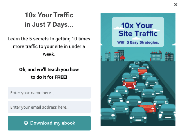
A lot of times, the same information on a short-form landing page can be conveyed with a single popup. Take this one for example that’s aimed to grow an email list:
This is a lightbox popup built with OptinMonster. It functions exactly like a squeeze page. But it has the added benefit of not having a fixed URL.
Rather than driving traffic from a 3rd-party site to your landing page, you can bring your optin campaign directly to your audience. How?
By using OptinMonster’s targeting and trigger options.
As your site gets traffic, you can look at how people are engaging with your content. Then you can show them specific campaigns based on:
- What page they’re on
- The region they’re from
- Which of your pages they’ve visited in the past
- The website they’re visiting from
And much more. These targeting rules give optin campaigns a huge advantage over traditional, fixed landing pages.
To learn more about how optin campaigns can get you more sales, check out the following post: How Does OptinMonster Work? (8 Benefits + 12 Case Studies).
If you decide all you need is a little information to make a huge impact, then optin campaigns may be your best bet.
Want to get started? Join OptinMonster risk-free today with our 14-day money-back guarantee!
3. Redirect Traffic to Your Landing Page
A lot of people think that the only way to drive traffic to your landing page is with paid ads or ranking on search engines like Google.
What they don’t realize is that you can drive traffic to your landing page with the traffic you already have. How can you do that?
There are several methods:
- Internal linking: This is a common strategy to direct visitors to a landing page, but least effective since it fails to attract most of your visitor’s attention.
- Floating bar: Highlight your offer in a sticky footer or header bars and encourage users to visit your laning page.
- Yes/No campaign: This is the best strategy in this list. It helps you direct tons of your existing traffic to your landing page. More on this below.
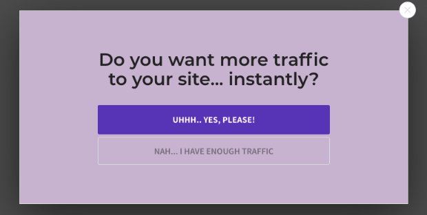
A Yes/No campaign is a specific type of optin campaign like a popup or fullscreen welcome mat. But rather than asking users to buy something or hand over their email address right away, a Yes/No campaign takes a softer approach.
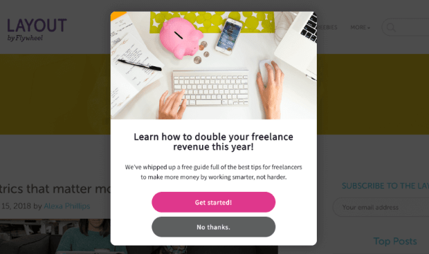
They simply pose a “yes or no” question that requires a single click. Here’s an example of a Yes/No campaign:
Usually, the “yes” option would take users to an optin form where they’ll be asked to provide their email address. But you can use these campaigns a bit differently.
Imagine using a popup like in the image above, but the “yes” option redirects users to a landing page. This would allow you to leverage the traffic you already have rather than relying on paid ads.
Plus, like we mentioned in the last tip, you can use targeting rules to make sure the right information gets to the right people at just the right time in their customer journey.
4. Use a 2-Step Optin to Boost Sales
Depending on the type of landing page you’re building, you’ll likely include 1 of 2 elements on the page:
- Call-to-action button
- A form to fill out
Out of those 2 choices, the better option is a call to action button. That’s because it can be off-putting to land on a page and get hit with a form to fill out right away.
The only downside to a call-to-action button is that it often redirects users to another page. This can add friction to the user experience (UX).
A good way around this problem is to add an optin campaign to your landing pages CTA using a MonsterLink™.
MonsterLinks™ lets you display an optin campaign whenever someone clicks on the link. In this case, that would be the button on your landing page.
The advantage is that you can build your landing page without including any forms asking for private payment or contact information.
That way, your users can view the content of your page without feeling pressured to sign up for anything.
Then, when they reach and click your CTA, the form will appear on the same page rather than redirecting them to a new one.
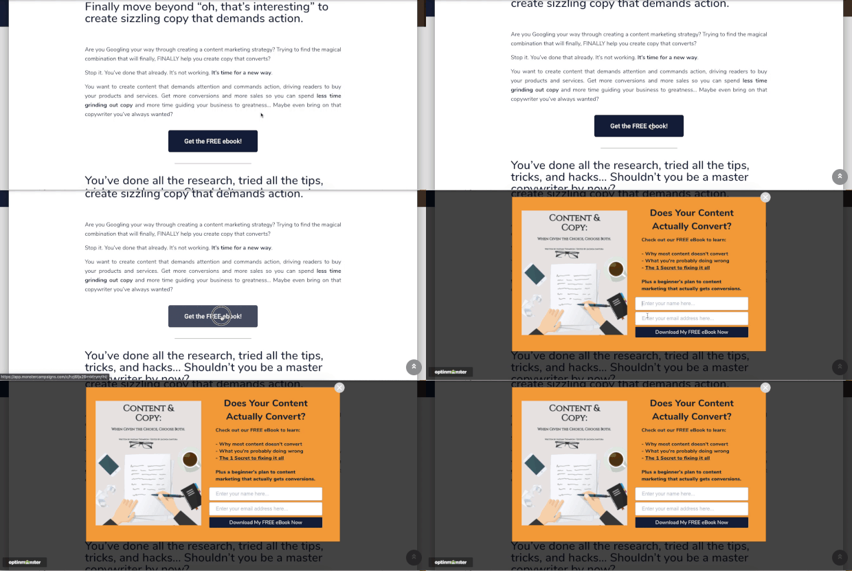
Here’s what a 2-step optin form looks like in action:
This boosts conversion rates for 2 reasons. First, it increases the odds that users who click the CTA will opt into your offer. That’s because the small act of clicking the call-to-action button shows a heightened interest in the page’s content.
The other reason is due to a psychological phenomenon known as the Zeigarnik effect. This shows that users are more likely to finish a process once they’ve started.
When users make that first small click, they’re more likely to finish opting in because they’ve already begun the process of doing so.
2-step optins can be an incredibly powerful tool to increase conversions on your landing pages. It’s actually how the online retailer Cosmetic Packaging grew its email list by 754%.
You can see the same results by using OptinMonster’s MonsterLinks™ today.
5. Include Social Proof
No matter what kind of landing page you build, you’re going to need social proof. That’s because no one will trust you with their money if they can’t even trust your website.
Fortunately, there are tons of ways that you can add social proof to your landing page. You can do this by including:
- Customer reviews and testimonials
- Positive feedback from social media posts
- Adding trust badges like “money-back guarantees”
- Displaying notable past and present clients
And much more. In fact, you may want to check out this article on how to use trust badges to boost sales and conversions.
But there’s another form of social proof that can have a huge impact on your landing page: a recent activity notification from TrustPulse.
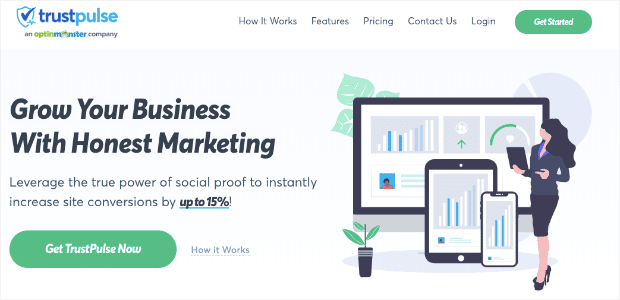
TrustPulse is the best social proof notification software on the market. It displays recent activity notifications across your site, which are small messages letting people know how others are interacting with your brand.
Here’s what recent activity notifications look like:
When someone takes an action that you want others to know about, these little notifications will appear on your customers’ browser.
So, for example, you could let your site’s traffic know anytime someone:
- Signs up for a newsletter
- Makes a purchase
- Leaves you a review
And much more. This creates something known as FOMO or “fear of missing out.” When people see these recent activity notifications, they can’t help but wonder if they’re missing out on some benefits of your product.
As a result, they’re more motivated to take action on your landing page.
The great thing about TrustPulse is that you get all the amazing features of social proof notifications at a fraction of the cost. Literally.
TrustPulse lets you get started for free for up to 500 sessions. Then, they’re first paid plan begins at $3.29/month. You can compare that with their competitors, who start at $19–$29 per month.
Just check out this review of FOMO vs. UseProof vs. TrustPulse for more information.
Want to add social proof notifications to your website? Sign up for your free TrustPulse account today!
6. Add Exit-Intent® to Recover Abandoning Users
One of the hardest parts of doing business online is knowing that most people who leave your site will never come back. So how do you make sure they don’t leave in the first place?
That’s where OptinMonster’s Exit-Intent® technology comes into play.
With Exit-Intent® technology, you can create campaigns to keep your traffic from leaving. As your traffic moves to hit the back button or close their browser, the campaign is triggered to re-engage their attention.
The best part is that this technology is now available for mobile devices as well. Read this article for more details on how to create a mobile exit-intent popup that really converts.
You can apply these campaigns to your landing pages. That way, if people try to leave your landing page, you have one last option to regain their attention.
As we’ll see from the case studies in just a moment, exit-intent popups can make a huge difference in your landing pages’ conversion rate.
7. Write Persuasive Copy
This last tip is standard among most landing page optimization lists. But it’s so important that it still needs a place here.
No matter what type of landing page you’re creating, the words you use are extremely important. You need to focus on getting great at writing persuasive web copy.
Again, the type of page you’re building will determine if you need a lot of web copy (for long-form pages) or just a little (for short-form pages).
Either way, most landing pages will include the following elements:
- Strong headlines
- Compelling sub-texts
- Clear calls to action
We won’t get into too much detail on how to write compelling web copy in this post. But here are a few resources you can check out if you need to brush up on your writing skills:
- 69 High-Quality Copywriting Templates Proven to Work
- How to Write a Sales Page That Actually Converts
- 700+ Power Words That Will Boost Your Conversions
These posts will have everything you need to improve your landing page copy.
Now that we’ve seen 7 ways you can improve your landing pages, let’s shift gears. We’re going to look at 5 companies just like yours and how they boosted conversions using the tips discussed in this article.
Let’s dive in.
5 Case Studies of Success With Landing Pages
1. Lead Guru
Lead Guru is a digital agency that helps companies get more leads and sales.
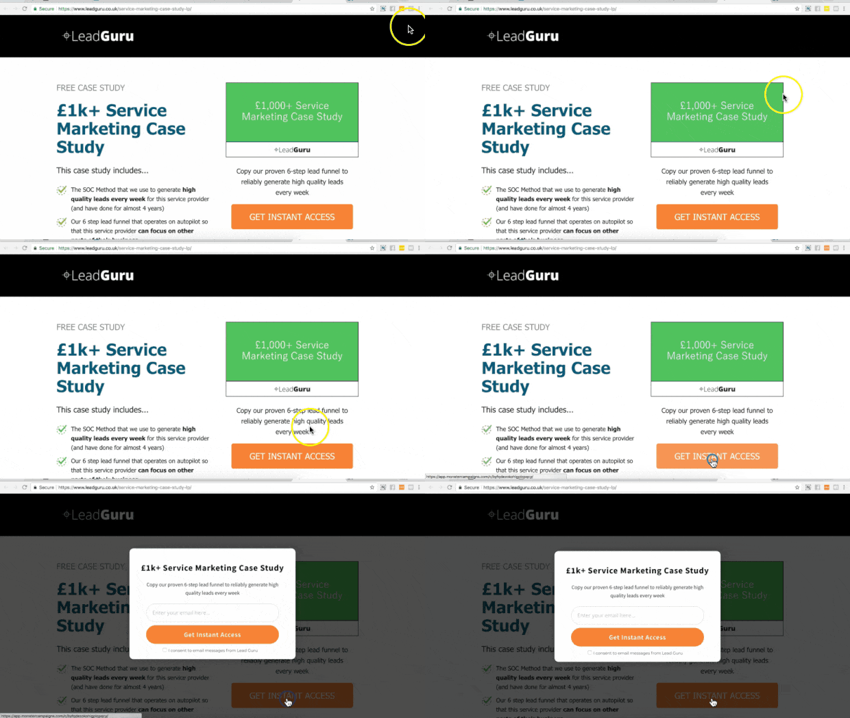
Initially, Lead Guru was using a static landing page with a lead magnet to grow their email list. At the time, this landing page was converting roughly 55% of its traffic.
That’s when they switched to using MonsterLinks™ on their landing page:
As a result, they began converting 81.8% of their landing page’s visitors.
2. Flywheel
Flywheel is a managed WordPress hosting company. They had 3 goals for using OptinMonster to increase conversions:
- Get more people in their marketing funnel
- Increase brand awareness and subscribers
- Provide content upgrades
They started driving traffic to different landing pages. Then, they would create optin campaigns with OptinMonster as a way to match their lead magnet with the content of the landing page.
Here are the results that they saw:
- 4.7% targeted conversions
- 660% increase in impressions
- 1% increase in conversions using split testing
To sum up, Flywheel’s landing pages got more exposure, and their conversions were highly increased.
3. InternetSuccesGids
InternetSuccesGids teaches people about affiliate marketing and how to find the right affiliate products. They are based in the Netherlands.
Before OptinMonster, InternetSuccesGids creator Jacko Meijaard built an independent squeeze page.
The goal was to get people’s email address.
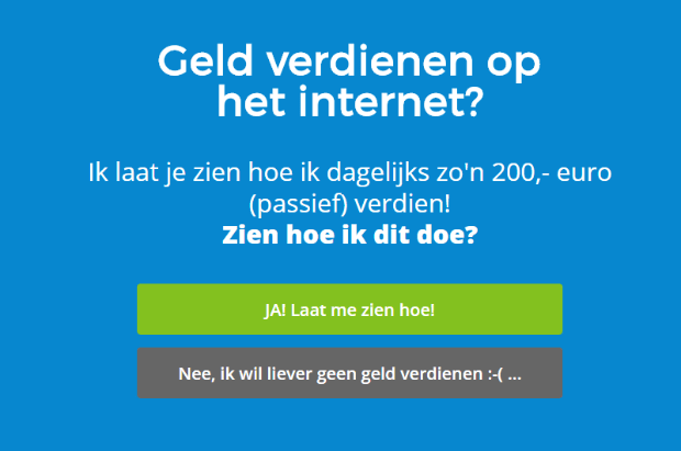
Then he used OptinMonster to add a few Yes/No campaigns like this one:
From these Yes/No campaigns, Jacko saw some amazing results:
- Converted 24% of abandoning visitors (using exit-intent Yes/No popups)
- Grew his email list by over 250%
You can get similar results by using Yes/No campaigns on your landing pages to get more conversions.
4. Rich Page
Rich Page is a conversion optimization expert. He shows companies how to get more subscribers and sales.
He was about to launch a product for his own website when he realized he needed some help with customers leaving before taking action.
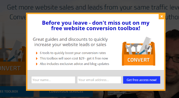
That’s when Rich settled on exit-intent popups like this one:
Rich then used split testing to make sure he was getting the highest conversions possible from people leaving his website.
Then what happened? Rich saw a 225% increase in conversions. Plus, he got a 316% improvement on his conversion rate due to split testing.
This allowed Rich to recapture many users who were actively abandoning his website and would have likely never returned.
You can see the same success by applying our Exit-Intent™ technology to your current landing pages.
5. SnackNation
SnackNation is a subscription service that brings healthy snacks to your home or office. Their goal is to make snacking a little bit healthier without sacrificing any of the guilty pleasure.
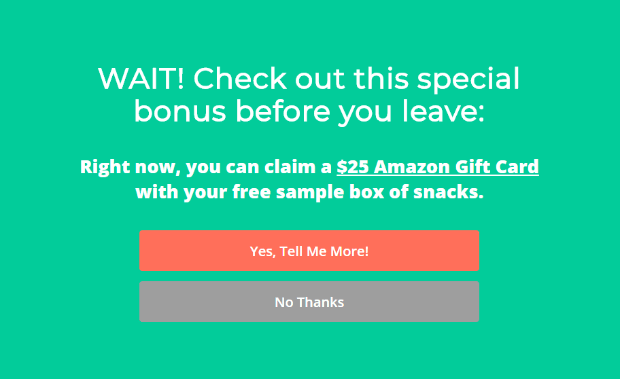
SnackNation uses just about every type of campaign OptinMonster has to offer. But they used this exit-intent fullscreen popup to help reduce the number of people who left their website:
Once they started using this campaign, they were able to recover and convert 38.5% of abandoning visitors.
This can be a powerful addition to your landing pages to boost your conversions.
And there you have it. 5 real-world examples of companies who increased their conversion rates through the tips we talked about in this article.
Remember, one of the main purposes of a landing page is to grow your email list. That means you may find the following resources helpful:
- Email Marketing Made Simple: A Step by Step Guide
- How to Run a Successful Email Marketing Campaign
- How to Create an Effective Email Auto Series
- 17 Tips for Writing Email Copy That Converts
Ready to get started optimizing your landing page? Join OptinMonster today risk-free with our 14-day money-back guarantee.








Add a Comment